The same technology that simplifies life by providing more functions in each device also complicates life by making the device harder to learn, harder to use. This is the paradox of technology and the challenge for the designer.
I really enjoyed this reading and it’s especially nice to read such a thorough and well-articulated explanation for something I’ve experienced in everyday life without having the words to describe them. This chapter immediately reminded me of this hilarious reel I saw the other day. While this isn’t my original video, I’ve had experiences with fancy washrooms being so confusing with their water faucets and sometimes even the flush.
My favorite thing about this reading is that it’s so easy to connect to real-life situations. The concept of Norman’s door is such a strong symbolism for the distinction between bad and good designs. What’s interesting is that in many cases, the solution to the problem is very simple: a handle for pull doors, and a flat plate for push doors. As we can derive from this chapter, though, bad designs either 1) does not consider functionality at all or 2) overconcern aesthetic that it takes priority over functionality.
My problems with doors have become so well known that confusing doors are often called “Norman doors.”
Although many of the examples from the chapter are of physical things, I find it super helpful to apply this principle of design on interactive media projects. It makes me think about when we design applications, websites, or games, when can we rely on affordances and signifiers, and when do we truly need written instructions?
Whenever you see hand-lettered signs pasted on doors, switches, or products trying to explain how to work them, what to do and what not to do, you are also looking at poor design.
It makes sense to me that visual cues should ideally guide the users, but I also wonder where exactly we should draw the line between written instructions and symbols and affordances. At the end of the day, the designers of the “bad” designs mentioned in this reading probably believed that their design made sense when they first designed them. I personally think that we shouldn’t completely abandon written instructions, because sometimes they are the only/most effective way to communicate something clearly! In my future IM projects, I hope to be able to step out of my perspective and imagine being a user interacting with my creation for the first time. Although this is easier said than done, this would be a really helpful step to refine my designs.
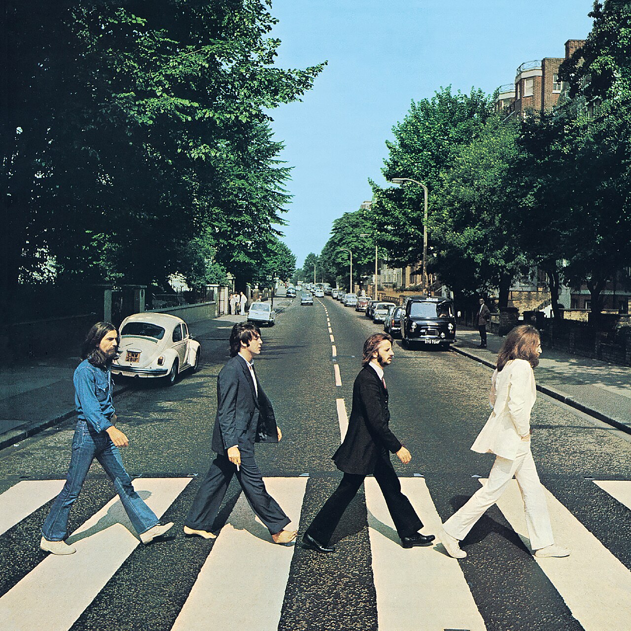
Since I am a huge Beatles fan, for this assignment I decided to use a dataset of Beatles songs popularity on Spotify and visualize it in p5. Each song is represented as a hoop, and the more popular the song is on Spotify, the bigger its hoop is. The hoops are all stacked on top of each other, and the colors show how many songs share that popularity range. A brighter, more solid white hoop means more songs fall into that range, while a more transparent, greyish hoop means fewer songs are in there. For the visual style, I designed it to resemble a vinyl record, using the Abbey Road album cover as the center label.
The Beatles, Abbey Road (1969)
Code Highlight
let popularity = float(songs.getColumn("Popularity"));
let minPop = min(popularity);
let maxPop = max(popularity);
let minRadius = 82;
let maxRadius = 240;

for (let i = 0; i < rowsNum; i++) {
    let radius = map(popularity[i], minPop, maxPop, minRadius, maxRadius);
    noFill();
    stroke(255, 30);
    strokeWeight(2);
    circle(0, 0, radius * 2);
  }
This part of the code is one of the main things that allows me to visualize the numbers from my .csv file on my actual sketch canvas. It basically converts the raw popularity numbers into a range that fits the canvas, scaling each song’s popularity into a radius between 82 and 240.
I used translate to move the origin from the default top left corner (0,0) to (300, 300) which is the center of my canvas. I did this so the vinyl record spins properly around its own center, instead of spinning from the upper left corner and taking the whole thing off the canvas.
How this was made
This sketch loads a Beatles songs dataset and turns it into a spinning vinyl record visualization. In setup, the .csv file with songs and Spotify popularity values is loaded using loadTable, and the Abbey Road logo is loaded using loadImage.
Then I used min and max to find the largest and smallest numbers in the popularity column, and used the map function to stretch those values so they fit properly within my canvas. Using these mapped values as the radius, I created white hoops with slight transparency, where each song gets its own hoop sized according to its popularity. Every hoop uses no fill and a low opacity white stroke, so they visibly stack on top of each other and kind of display the quantity of songs within a specific popularity range.
In the middle of my vinyl record, I added the Abbey Road logo image that I loaded in setup. Then, to make the vinyl record rotate, I used the rotate function paired with translate, changing the origin point to the center of my canvas so the disc spins around its own center instead of the corner.
Reflection
The main issue my current sketch has is that the hoops are all perfectly symmetric circles, and because of that, it is actually impossible to see that the record is rotating at all. To fix this I think I could add some kind of texture to the hoops, or maybe add a light glare effect or small visual markers that would make the spinning motion noticeable.
Another problem I ran into was a performance difference between operating systems. The sketch runs completely smooth on macOS, but when I tried running it on a Windows laptop, it became very laggy, even though the Windows laptop has much stronger specs than the MacBook I initially built and tested this sketch on. This came as quite a surprise to me, and I was not able to find a fix for it. Most likely, the issue lies in how the two operating systems handle rendering differently.
The reading really opened my eyes on many things that I have been overlooking. But it is exactly because good design is invisible. We are often made to believe that bad design is bad on purpose or we are the ones in the wrong.
This reminds me of my hometown’s funny souvenirs. Gabrovo, Bulgaria offers a variety of illogical items like a spoon with a hole, cups for uninvited guests (with a zig-zag rim), the stingy sugar bowl (which is restricted to giving one sugar grain per shake) and more, showing Gabrovians’ painful stinginess. After reading this text, I wholeheartedly believe that at least some of these items were accidental discoveries that made their way in the Museum of Humour and Satire.
Design from everyday live that bother me a lot are the European bottles, whose caps are attached to them and the disposable cutlery sets that break during usage. Hopefully one day day they also go to the Museum.
I can apply what I read in Interactive Media though clear signs what everything is and its placement (affordances and signifiers). Additionally, I would try to incorporate familiarity with mental models or easy-to-follow instructions. Overall, I will do my best not assume the users’ needs, but rather investigate and accommodate. A system should work for the people and not against them.
I wanted to create a short story with many variables that change with each click. The story had to make sense no matter how the variables changed. I asked friends to tell me random words for each of the categories without letting them know what I need them for, so that it was more authentic. (They are not to be held accountable for stories that turn into thrillers.) With this I tried avoiding bias, through which I would subconsciously choose words that would go together in some context (and make no sense in another). This way the only constant is the base of the story. With each click there were 8 words in the text that would switch to a different word in the same category, completely changing the plot.
Code I am proud of
//ninth line
  singleRow = splitTokens(strings[int(random(strings.length))], ",");
  let exclamation = singleRow[EXCLAMATION];
  text ("not help but exclaim:" + exclamation, 50,250 );
As simple as this is I was proud that I remembered to put the exclamations in inverted commas in the words.csv file, instead of doing it here, because it would mark it as part of the text. It would have been something like: “We could not help but exclaim: “exclamation”. ”
How this was made
I used the knowledge from class to make the text change and I also dowloaded a font from Google Fonts, which I liked, to make it seem like it is written with a typewriter. It fits the theme of constantly changing the story by clicking, right?
No AI was used in the making of this sketch.
Reflection
If I were to start this assignment from the beginning I would add more variables, so the reader gets a completely new story every time.
After completing the reading, I now have a better understanding of the factors that go into making an everyday product. I will admit, the more I read, the more overwhelmed I got as the requirements needed to make a useful and understandable product became more extensive. I never thought about all the different components that go into design and how different perspectives and cultures can also have an impact. One thing that personally drives me crazy is my oven back at home. It is a newer model and therefore has many features that are not directly visible. Me and my mom only know how to change the temperature and where the heat comes from (up, down, up and down, etc). However, there is a QR code on the side of the oven with a manual that is 30 pages long with all the different settings you can turn on. Some of these involve holding different buttons, rotating a wheel, etc. It is very confusing! Every time I wanna use it I end up scanning the QR code to read the manual.
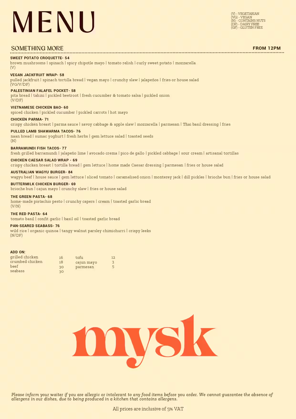
Consequently, this has got me thinking about how whether or not my assignments are easy to understand and interact with. For this weeks assignment, I recreated mysk’s menu. It is displayed on the screen where the user can hover over different menu items. If they click on it, the menu will slide down revealing food on the table. If they click on the menu again (in the bottom left corner of the screen) it will slide back up. I will admit, unless you read my blog post or this reading response, you may not know how to navigate through the artwork. However, I think my work allows for ‘discoverability’ like Norman mentions. If the user simply moves the mouse across the screen, they will see that the menu items enlarge (signifier for the affordance) when hovered over. Hence, they would then try clicking on it which results in the sliding menu. What I think is less intuitive is how to display the menu on the screen again. This is a discoverability failure because there is no signifier indicating that the menu can be reopened by clicking it. Unlike the hover-enlarge cue for individual items, there is no visible signal that the closed menu remains interactive. However, I think after multiple tries, the user would eventually think to click on the menu again which reveals it. But this has definitely got me thinking as to how I can develop my future work.
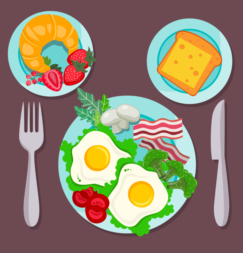
This week, we were told to create an artwork containing text. I initially struggled to think of something that would include text, then I thought, why not recreate the mysk menu! I really enjoy going there so this was fun to recreate. I wanted to create an artwork that displays the menu, lets the user click on an item, then the menu slides down and displays the food item (in this case I had a burger for all items but in the future I would expand this). For the menu, I have a table with multiple menu items that are randomly selected on execution. When the user clicks an item and the menu slides down, new ones appear when the menu is clicked again.
Here are some reference pictures:
Red and white classic checked tablecloth texture with copy space
How this was made
I first started by recreating the menu. This was done using rectangles (for the base) and text. I then realized that in order for me to be able to do the animations, I will need to store each menu item as an object. So I created a class called MenuItem and used it to store each items’ name, description, tags (if any) as well as x and y positions. I then created a Menu class that stores a list of these items, x and y positions, and other variables. Within the MenuItem class, I have a function that draws the item on the menu. Certain values such as text size will vary depending on whether or not the mouse is hovering over the item. Another function exists called checkHover(), which takes x and y positions and checks to see if it is within the range of the menu item, if so hover = true.
I had a table with each menu item and their type (breakfast, greens, main) I loaded these value into an array then created an object for each item and stored it into an array called allItems. I then call a method called refreshItems() which shuffles the array and selects the first 11 items. Then I added them to the Menu class.
Within the Menu class, there is a function called checkMouseInMenu(), this was created because initially when I was testing the hover the coordinates were not matching onto the menu. This is due to the menu being displayed at an angle, so I asked Claude to help with writing a function that takes mouseX and mouseY and maps it onto the menu. The display function draws the menu on the screen and translates and rotates the menu depending on varying x,y and angle parameters.
In the update function, it checks to see if the menu is being displayed (this is a variable called state) and checks if the user is hovering over any item. In addition, it checks if the menu is currently hidden, if so it will check if the user is hovering over the menu at the bottom of the screen (this is to allow for the user to click on the menu so it reappears). The menu can also have 2 states, “sliding” or “returning”. If the user clicks on a menu item, the angle and y position of the menu will go from 330 -> 360 degrees and 70->290 respectively. I initially had it so that these values were incremented by a constant value, however I didn’t like how that looked, so I asked Claude if there was a way to increase by a percentage of the remaining distance each frame, so it naturally slows down as it approaches the target. Claude showed me the Lerp function. So in the code below you can see that Lerp() takes 3 values, this is the start position, end position and the increment. So in each frame the angle and y position increase by that percentage. This created a smoother animation. Once the angle of the menu is approximately 360, the angle and y value will be locked to the final positions and the state will be moved to “hidden”. The menu items will also be refreshed/randomly selected again.
Code:
// if sliding, moves the angle and y position of the menu
// to create a sliding effect down , once done, menu is now in
// the hidden state
if (this.state === "sliding") {
    this.angle = lerp(this.angle, 360, 0.08);
    this.y = lerp(this.y, this.startY + 220, 0.08);
    if (abs(this.angle - 360) < 0.05) {
        this.angle = 360;
        this.y = this.startY + 220;
        this.state = "hidden";
        this.refreshItems();
    }
}
For the returning state, this is the exact same, except instead of moving down, it moves up.
I also had functions for when the mouse was pressed, this checked that if the mouse was pressed, the menu was display, and it was over a menu item, then the menu would be moved to the sliding state. Otherwise, if the mouse was clicked, the menu was hidden, and the mouse was within the menu range, it would be moved to the returning state.
I then drew the background using nested for loops to created a checkered tablecloth.
I also drew the plate using circles and the fork and knife using beginShape(), vertex(), and endShape().
Final result
Reflection
Overall, I am really happy with how this turned out! I feel like the menu looks very similar to the real thing, and after the help of Claude, I am also satisfied with the sliding animation. In the future, I would add that when the user clicks on a menu item, it would then display that item on the plate instead of the same burger emoji for each item. This would obviously take some time, but I believe it would make the result more statisfying.
Something that drives me crazy actually happened when I was playing Hogwarts Legacy, which is a video game. I was doing a side quest where I had to get to another area that I could see on the map, but every time I tried to fly there, I would just reach the border of the map and could not go any further. Usually, there are checkpoints that let you travel to different areas, but because I had not discovered this area yet, I had to figure out how to get there myself. Eventually, I found out that I had to go through an underground tunnel to reach it. It was so frustrating because I knew where I needed to go, I just had no idea how I was supposed to get there. I think even a small hint telling me that I needed to go underground would have made it much easier. This made me think about the idea of discoverability in the reading because the game showed me where I needed to go, but did not really help me understand how to get there.
For interactive media, I think one thing I took from the reading is thinking more about whether people actually know how to interact with what you make. There are so many ways someone can interact with something, like clicking or even moving, and I think it can be easy for the person making it to assume that people will just know what to do. This actually made me think about some of my p5 projects because I obviously know how they work since I made them, but someone seeing them for the first time might not. Even adding small instructions or text telling someone what they can do could make the interaction clearer. Once they interact, there should also be some kind of response so they know that what they did actually worked.
Important Note: The dataset is HUGE and sometimes it takes a couple of seconds for the sketch to load. Please do not SPAM the checkboxes, and kindly wait 1 to 2 seconds before clicking/unclicking a checkbox.
My concept
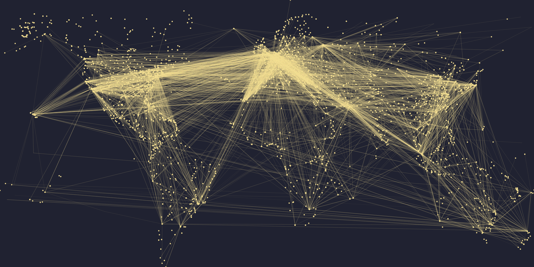
I was inspired by the demo of world population we did in class and I really wanted to try something similar yet still distinct. The moment I thought of flight pathways, I knew I had to do this. I love traveling and flying and I knew that visualizing all the flight pathways could create the outline of the world map, and create a neural-network-looking artwork.
One of the difficulties I had was searching for a comprehensive dataset. I simply wanted the coordinates of the starting point and coordinates of the ending point for every flight, but most datasets I found organized the data a bit differently. I asked ChatGPT to help me find a dataset that has the structure I was looking for, and it suggested me this dataset on DataBazaar, which I end up did using.
what my sketch looks like with both checkboxes checked!
My highlight code
The highlight of my code is my checkboxes and how they function. There are 2 checkboxes, one to show the airports (as dots) and one to show the flight routes (lines). You can check none, one, or both. The checkboxes are in the setup() function, and I essentially want the map to change depending on which box(es) are checked.
Normally, I could have if check_routes.checked() in the draw() function to indicate what I want to happen based on the status of the boxes. However, I have a noLoop() at the end of the draw(), otherwise it would be too computationally expensive to have dots and lines being mapped out and drawn 60 times every second. But because I had noLoop(), the draw() function only draws once and stops, which means that checking the checkboxes does not have any effects. This was also a major bug in my code, so I had to ask ChatGPT for help and it taught me about the changed() function! So, when the checkboxes are changed (aka clicked/unclicked), the sketch draw() will resume in looping. It has a noLoop at the end though, so technically it only loop once.
How this was made
My dataset has 4 columns: the longitude and latitude for the start, and the longitude and latitude for the end (destination). I extract each column into their respective arrays: start_lng, start_lat, dest_lng, dest_lat.
The next step was to find the maximum and minimum of the latitudes and longitude. Because I had 2 arrays for latitudes and 2 arrays for longitude, I had to repeat this process 3 times for each value. For example, in the code below, I find the maximum latitude value in start_lat and the maximum latitude value in dest_lat, then comparing them to get the actual maximum latitude. This process is then repeat for min_lat, max_lng, min_lng.
let max_start_lat = max(start_lat);
let max_dest_lat = max(dest_lat);
let max_lat = max(max_dest_lat, max_start_lat);
Then, with these values, I can draw the flight lines and airport endpoints using the map() function. I loop from 0 to the numRoutes (the number of rows = the number of flight paths in the dataset) and in every iteration, I extract the coordinates into x1, x2, y1, y2. These x and y variables are then used to draw a line that resembles one flight route.
if (check_routes.checked()) {
    //loop every entry in numRoutes
    for (let i = 0; i < numRoutes; i++) {
      //save the coordinates in a variable and print the line connecting the points
      let x1 = map(start_lng[i], min_lng, max_lng, 0, width);
      let y1 = map(start_lat[i], min_lat, max_lat, height, 0);
      let x2 = map(dest_lng[i], min_lng, max_lng, 0, width);
      let y2 = map(dest_lat[i], min_lat, max_lat, height, 0);
      line(x1, y1, x2, y2);
    }
  }
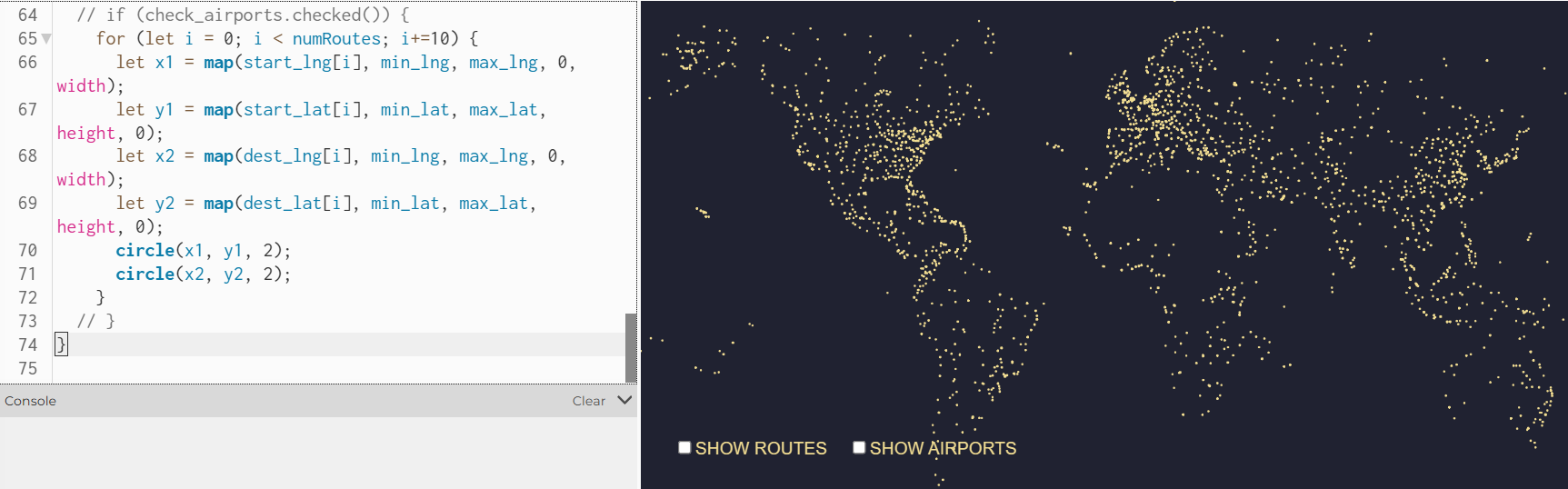
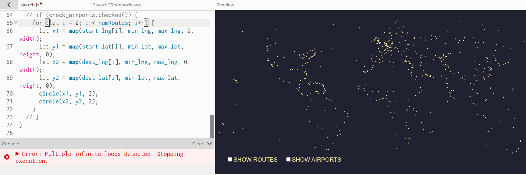
The block of code to draw airports is also very similar; instead of drawing the line, I draw 2 circles with radius of 2, whose centers uses (x1, y1) and (x2, y2). There was one bug, though. For some reason, the p5 editor is unable to handle the amount of iterations in the drawing of the circles. If the loop had i increment by 1 (i++), the p5 would only draw some of the circles. When I changed it to i+=10, I reduced the number of circles it has to draw by 1/10, and ironically it displays more circles than when I had i++. I decided to keep it at i+=10, and I think this bug is most likely because my dataset has ~66K rows, which is a lot to handle.
when I had “i+=10”when I had “i++”
Reflection
I think it looks incredibly cool, and I personally like how abstract the sketch is with just the routes mapped. I was a bit worried that my assignment would be quite similar to what we did in class initially, so I incorporated the checkboxes as a way to 1) challenge myself and take the visualization a step further, 2) encourage meaningful interactivity, and 3) create an opportunity to learn about new things. Compared to the demo population example you have us in class, drawing the flight pathways is also quite different. Most importantly, I learned new things in the process of this assignment, which is always a win :))
If I had more time, I would love to have a search bar where the user types in the code of the departure and arrival airport (e.g.: DXB, JFK, LAX), and the sketch would make that route a different color if a direct flight is available. I think that this is feasible, since the original dataset does come with airport codes. It would be quite complex though, since it involves searching, I think.
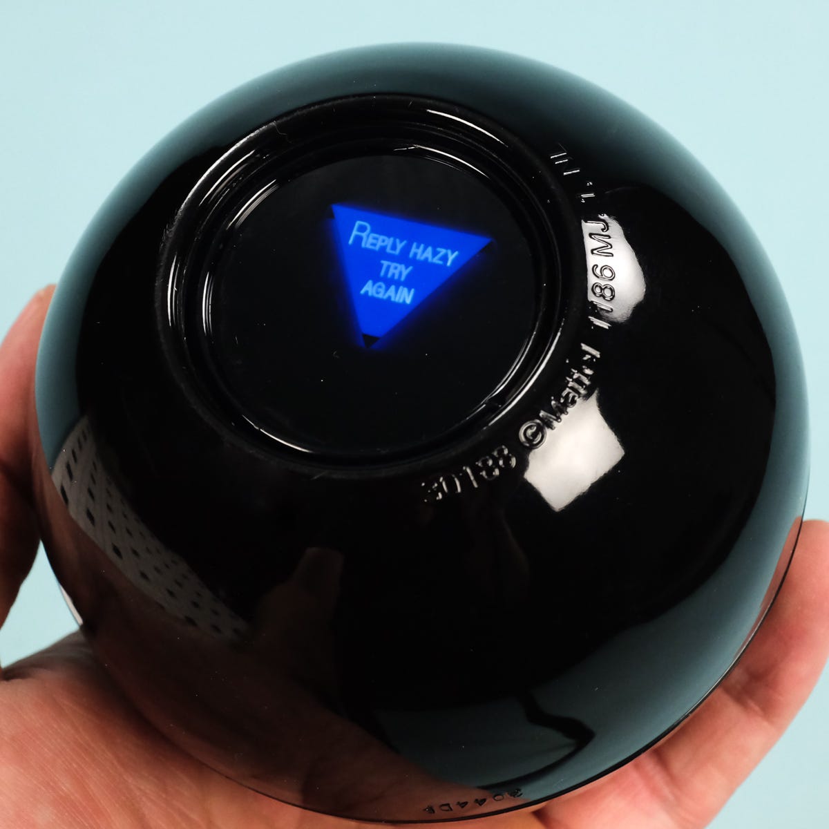
For this assignment I wanted to create something that generates an answer for the user rather than just displaying random pieces of text. I knew that I wanted to make some type of interactive answer giving experience for the user so I thought of making an affirmation box, or some type of fortuneteller and this eventually led me to the idea of a magic 8 ball, since its whole purpose is to answer questions with random responses. My assignment allows the user to think of a yes or no question and then after they click the magic 8 ball, it would give them an answer. The responses are stored in a CSV file and can either be positive, negative, or an unsure answer. I wanted this assignment to feel more alive and playful so I added a moving star background.
Highlight code
// generating answer
  function generateAnswer() {

  let singleRow = [];

  // choose one random row
  singleRow =
  splitTokens(strings[int(random(strings.length))], ",");

  // get the 3 parts from the SAME row
  let start = singleRow[START];
  let middle = singleRow[MIDDLE];
  let end = singleRow[END];

  // put sentence together
  answer = start + "\n" + middle + "\n" + end;
}

// CLICK THE BALL
function mouseClicked() {
  generateAnswer();
}
CSV:
definitely,yes,go for it
most likely,yes,signs look good
without a doubt,yes,you can count on it
probably,yes,things look promising
maybe,yes,but give it time
honestly,no,don't count on it
probably,no,try again later
definitely,no,not this time
unclear,maybe,ask again later
hard to tell,maybe,wait and see
The part of my code that I’m proud of the most has to be the generating answers. I especially enjoyed understanding how random() and splitTokens() work together, with the help of the professors presentations and p5’s reference pages. The program first randomly chooses one row from my CSV filed. SplitTokens() then separates that row wherever there is a comma, allowing me to access each part individually. I learned that this feature is a way to split strings into pieces. One thing I changed from the class example was how the randomness worked. In the poetry example, different rows could be randomly selected, and mixing unrelated words was part of the generation of the poem. But for my magic 8 ball, I didn’t really want to create answers that didn’t make sense and contradicted itself. For example, if I didn’t use split tokens, I could end up with a result saying
Definitely
No
You can count on it
And that wouldn’t have made sense. Instead, I randomly select one row and keep all three parts of that row. This allows the result to be random but still making sense as an answer. I think this was the part where I understood the purpose of the CSV and arrays the most.
Embedded sketch
How this was made
I started by drawing the magic eight ball using the basic P5.JS shapes. I used a reference photo from online to try to mimic the colors and shapes included. I also added a custom font from Google fonts for the title. At first, the font was not working and I wasn’t really sure why. I realized that the name I was using in P5 did not match the actual name of the font file I uploaded. So all I had to do was change the name to make sure both uploads are the same. Once I fix the file name, it worked. I also learned that after using textFont() for the title, P5 continued using that font for the other texts. I only wanted that font for the title so I had to change the font back to Ariel before displaying the magic 8 balls answer.
I wanted the background to have some movement and motion instead of being completely still, so I used everything that I learned last week about classes and raise to create the stars. Each star object has its own x and y position and speed and I stored the stars inside in array and used a loop to move and display all of them. It’s similar to my last assignment, where when it reaches the end of the canvas it returns to the bottom so the movement continues.
For the main text generation, I used loadStrings() to load the responses from a CSV file. Each rule contains three parts of one answer separated by commas and when the user clicks, random() selects a row and splitTokens() separates it into three parts. I then combine these parts with \n so they appear on separate lines inside the triangle. I used P5.JS and the code examples from class as references for the code structure, Google fonts for the title, and ChatGPT to clean up silly mistakes I made when it came to writing the code.
I enjoyed this assignment because I initially thought generating text would mostly just be putting random words together, but this assignment showed me that text is organized in its own way, depending on how you decide to use it. One challenge was making sure the random answers actually made sense. At first I was selecting each section from a different random row, but that created contradicting answers. If I continue working on this project I would like to make the magic 8 ball to be more interactive. For example I could make it shake for a few seconds before reviewing the answer. Overall I’m very proud of how it turned out and how I use my creativity when it came to displaying text.
While reading the chapter I really enjoyed how conversational it felt. Instead of overwhelming me with a bunch of theories, the author used stories about everyday things that included confusing doors, and the hotel sink that he couldn’t figure out how to drain. I felt like those examples were funny and lighthearted but at the same time they made his ideas much easier to understand. Before reading this, I honestly thought that if I could not understand how to use something, it was probably just my fault. Something that drives me crazy is when I click a button on a website, and nothing happens, so I don’t know if my click actually worked or not. This could be improved by giving immediate feedback, like changing the button or showing a loading symbol. Norman made me realise that sometimes the design itself is failing to communicate with the user. The quote that really stuck with me was, “profound ideas are always obvious once they are understood.” This really emphasised how good design can feel obvious even though a lot of thought goes into making it that way. The whole point is for it to look effortless and feel like it’s easy to apply, in the users point of view.
I wanted to connect this to my assignments that I’ve been doing on P5, I realise that I usually focus a lot on aesthetics, like colors, fonts, and how the layout looks like overall. Now I am thinking more about whether someone opening my project for the first time would actually know what to do. Norman explains that good designs should communicate what actions are possible and how to perform them. That made me really focus on how I want my assignment this week (and the rest of the weeks) to be shown. I want my instructions and interactive elements to feel natural instead of making the user guess. This reading changed how I think about design because now I see that the visual part isn’t always the most important part, even though it’s the first thing you see, it’s still needs to be understandable in order for the experience to be clear.