P5js Link: https://editor.p5js.org/meeraa/full/umLuxqZZ5
YouTube Game Demo:
Concept:
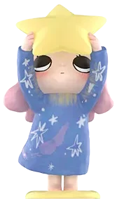
For my midterm project, I came up with the game called Star Catcher. This idea came to mind from this Nyota Pop Mart figurine that I own (check 2nd link in Resources section), which sparked the idea of making a game that catches stars. I started brainstorming the story and came up with the story that this girl was stuck on the moon and the only way to go back is to regain her power using the stars. It will ask the user to help her by moving left and right on the arrow keys to “catch” 30 of the falling stars from space. With every caught star, the star power increases by 1. However, there are also meteors/rocks falling that the user has to watch out for or they will lose 2 points. There is also a 45 second countdown for the game to add more pressure and make it fun.
Design:
For the title screen, I initially was just going to add text for the title but since drawing became a major part of the code, it only felt right and consistent to draw it out. 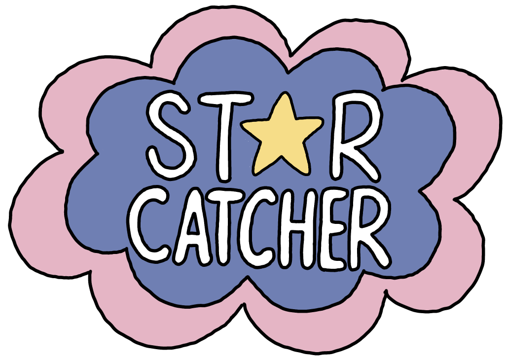
For the instructions screen, I added text to describe the story of the game and also how to play, win, and what to avoid. I also remembered the Week 4 creative reading by Norman and made sure to specify how the game works (using LEFT and RIGHT arrow keys) as signifiers for the user to know how to actually play. I drew the moon in the bottom right corner and the planet in the top left corner but smaller
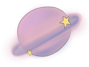
to show that the user is stuck in the moon and trying to get back to home.
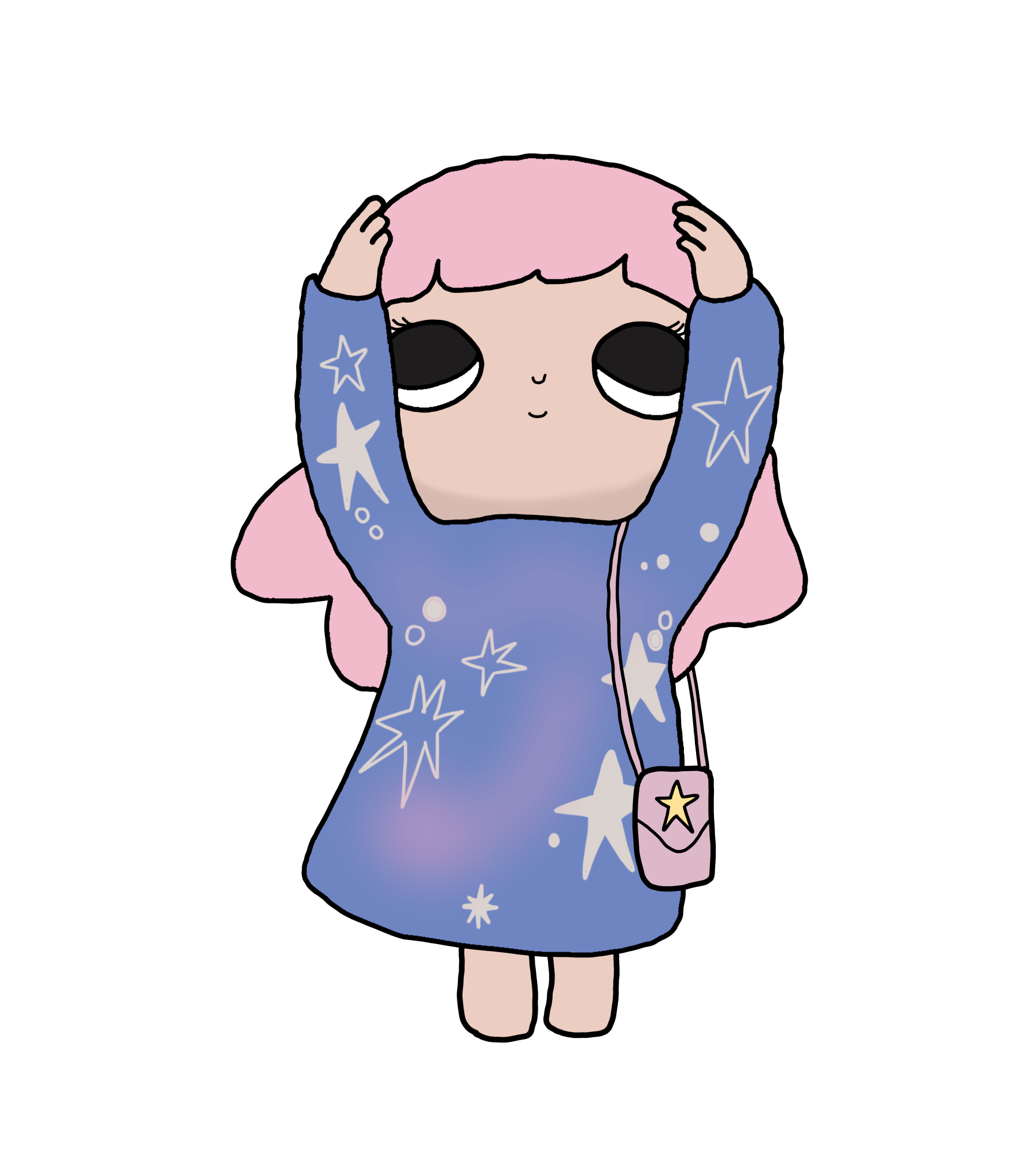
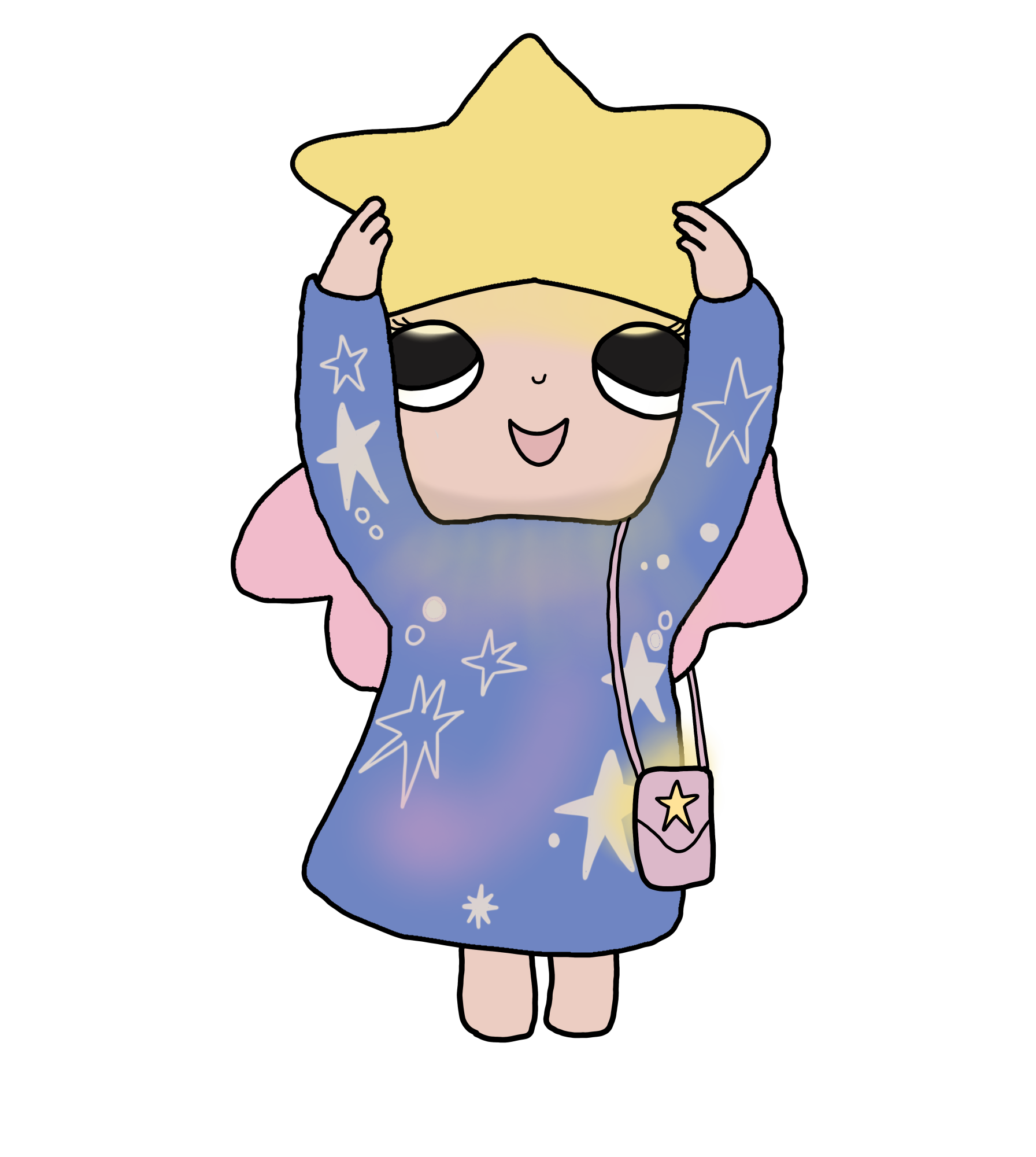
For the game, I traced the girl on my iPad because I wanted a drawing rather than an image. I think it looks better and more game-friendly. It was also a fun, creative process that I think adds a more personal touch to this project. 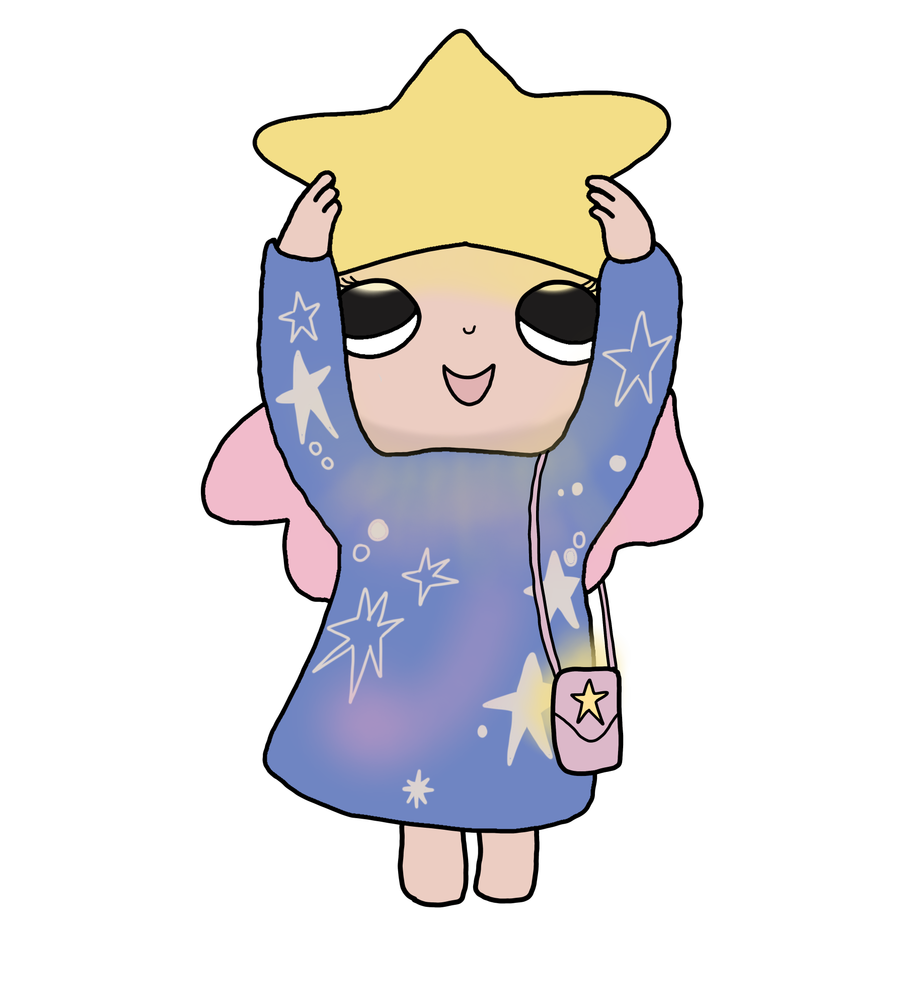
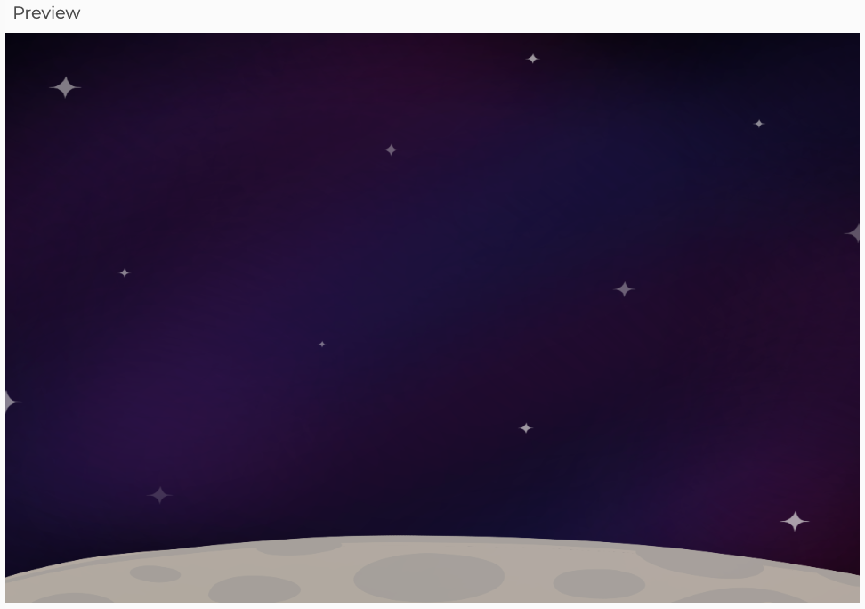
I initially also drew the background but after loading it in, I did not like how it looked like just because I drew it as a square almost, so it stretched out. I also felt like the quality would be better if I just coded the gradient background.
 The moon part in the bottom is quite easy with just a bunch of ellipses.
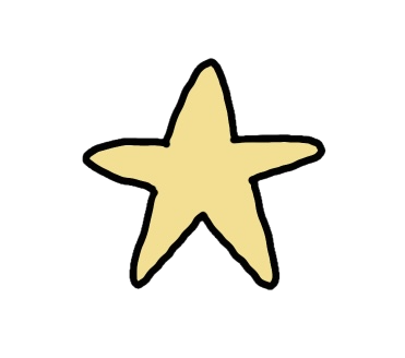
I also redrew the stars because I did not like how it looked before. They play a sparkle sound when hit as a signifier that the user caught it.
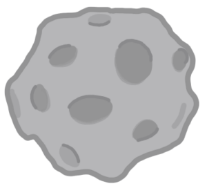
I drew and added meteors/rocks in the game as the obstacle.
They also play a rock thud sound when hit as a signifier that the user hit it.
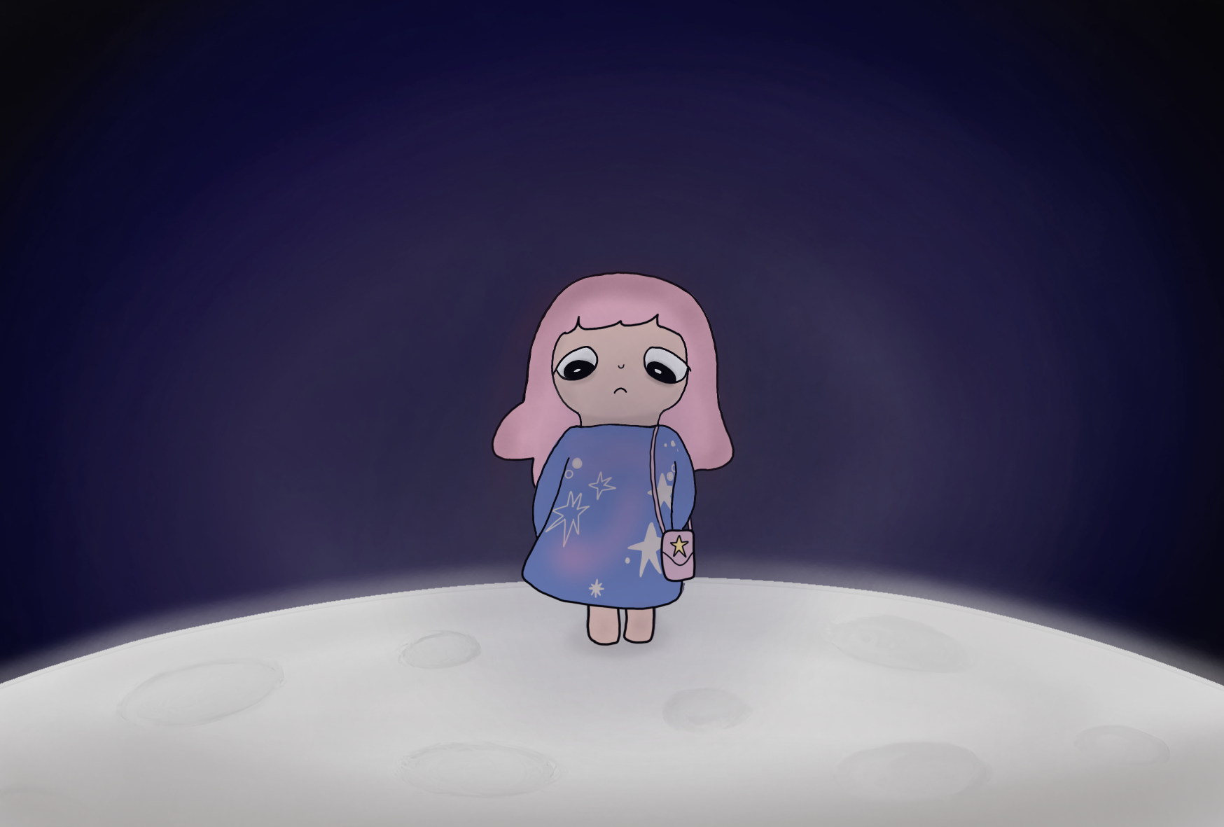
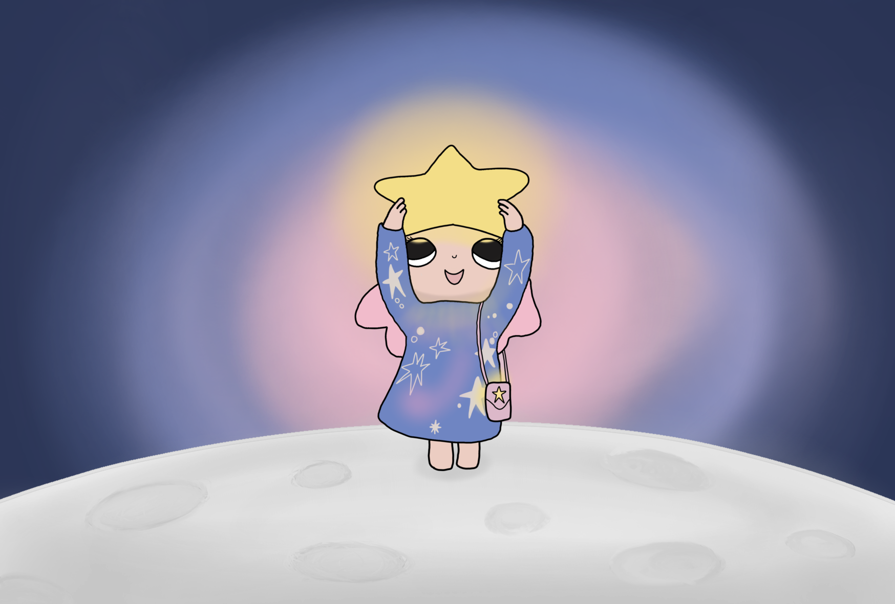
For the winning ending screen, I edited it from last time and added a background to the girl as if the star is shining bright against the galaxy sky. I did the same for the losing ending screen but made it more dark and drew vignette to add a sad, disappointing feel for losing/ not being able to make it back to home, planet ST4R-17.
Highlighted Code:
class Star {
  constructor(x, y, speed) {
    this.x = x;
    this.y = y;
    this.speed = speed; // falling speed
  }

  // this is what makes the star fall down
  move() {
    this.y = this.y + this.speed;

    // once it reaches the bottom it goes back up, had to add this because the stars stopped appearing
if (this.y > height) {
  this.y = 0;
  this.x = random(width - 100);
    }
  }

  // displays the star
  show() {
    image(star, this.x, this.y, 80, 80);
  }

  // checks if girl caught star
  checkCatch() {
    if (
      this.x > girlX && // left
      this.x < girlX + 120 && // right
      this.y +100> height-275 && // reached girl's hands
      this.y < height-280 // but not too far down
    ) {
      // adds to starCount so the displayed text updates & plays the sparkle sound
      starCount = starCount + 1;
      sparkleSound.play();

      // send it to the top randomly so it seems like the star disappeared
      this.y = random(-300, 0);
      this.x = random(width);
    }
  }
}
I am proud of this code because it is the main interaction of my game. I used OOP to make my Star class and that it what makes the stars fall. Then, show() is what displays the star at a size of 80×80 and checkCatch() uses an if statement to see if the star is within the girl’s parameter and if it is it adds the starCount so the user knows they caught it as well as by the sparkle sound that plays right after. This took me a while to figure out just because the girl’s image is slightly bigger than where she actually is, so I could not just plug in the image’s x, y, and height. I explain more in depth in the Problems section below. Then the stars go back up to this.y= a random number between -300 and 0 so they do not all fall back down at the same time. It was so fun writing these codes because I initially did not have that last line so the stars never appeared again but when I realized what I could do–with the help of Gemini–and fixed the issue, it was really satisfying to see it work out. I was not going to add the rocks/meteor obstacles in the game but because I had this code ready and working, I figured why not! It is basically a copy except I named the collision checkHit() instead of checkCatch() and made the starCount decrease by 2 and the rock sound play.
How This Was Made?
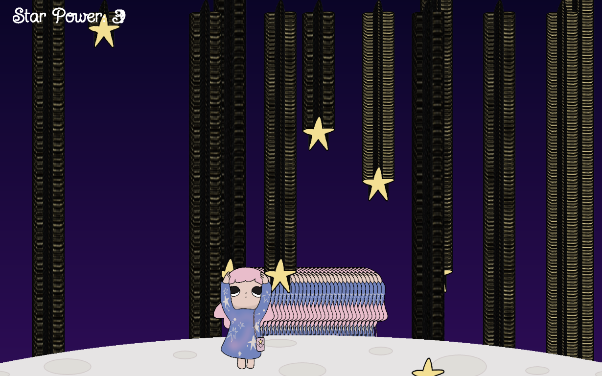
Space background: As I mentioned in the previous blog post, I had a different code for the gradient at first—like the one I used in my Bubbles project—but it caused the stars and girl to infinitely draw, creating a trail for some reason. I figured it was because I put it in setup but putting it in draw caused the same problem so I just searched for a new reference instead (P5js example gradient background in Resources section).
Character movement: This was done using the keyIsDown(LEFT_ARROW) and and keyIsDown(RIGHT_ARROW) to move her horizontally across the bottom screen. I changed girlX by 16 points to control her speed because it initially was around 8 maybe and it worked fine, but when I played in fullscreen, it was so slow.
Falling stars and meteors: This part was done using OOP to create the Star and Rock classes. 15 stars fall in the title screen and 7 stars in the game and 5 rocks in the game as well and that is done using the for loops in lines 66-78 of my code. This was similar to the code we did in class for week 3.1 and similar to my Bubble assignment 3. I stored all the objects in arrays using push() then another for loop (in lines 144-154 + 216) goes through each object in the array and does move() to make it fall, checkHit or checkCatch depending if it is a star or rock and if it is true, if it is within the girl’s parameters, the starCount increases by 1/decreases by 2 and the corresponding sound effect plays. Then the star/rock goes back to the top randomly between -300 and 0 to make it seem like it disappeared. Then show() to actually display it.
Score and countdown: The variable starCount, as I mentioned is what tracks the amount of stars caught or rocks hit and that is what is displayed in the text on the top left of the game so the player knows how much is needed to win. For the countdown, I used millis() to calculate how much time has passed since the game started (startTime) and divided it by 1000 to turn it into seconds, which is also subtracted by 45 because that is the intended duration of the game I wanted to set. I asked Gemini to explain the class example we talked about and how I could apply it to mine since my circumstances were different with the screens. It responded with “Since your game has multiple screens, you should start the timer only when the player clicks the START GAME button, rather than when the sketch first opens. You can use startTime = millis() inside mousePressed() to record when gameplay begins.” So, I proceeded to do that and put it under the if statement for screen === instructions in mousePressed() in line305. It worked and I understood the logic behind it!
Buttons: For the buttons, I made them before we learned about the button code in class so what I did instead was just have a basic rect() and utilized mousePressed() and the mouseX and mouseY to check if the user clicked within the parameters of the button. For all the buttons, I did it by taking and checking with mouseX the rectangle’s x position for the left boundary and the opposite sign of that number because all the rectangles are set at width/2 for the right boundary. To check mouseY if it is within the rectangle’s top and bottom boundary, I did the same by taking the y value of the rectangle and plus its height.
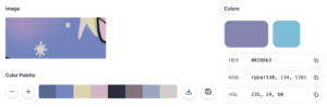
Also, for the button colors, I used Image Color Picker website and uploaded the picture of the girl to select the colors the colors in it and have it match and be consistent with the overall color scheme of the background since the end screen shares the same button regarding the outcome (line 422). I recommend everyone to use it! It is so helpful when it comes to styling the code.
Problems
While coding, the part I was unsure about was the collision detection part—when the game knows that girl “caught” the star—just because it kept confusing me as to which numbers would work best. At first, it was very sensitive and rather kind because it was pretty easy to catch the star from afar or after it had passed the girl’s reaching hands, which looked wrong. I had to keep changing the numbers to make sure it is fair and actually within the girl’s parameter. The same situation happened with the rocks/meteors but it was easier because I already had the parameters closest to it from the Star class.
Another issue I had was the background images of the winning and losing screen where it would fill the entire screen but it would be cut off because it is not the same size of the screen. I did not know how to fix this issue so I asked Gemini what to do and it told me about the max() code. That code chooses the largest size to cover the entire screen.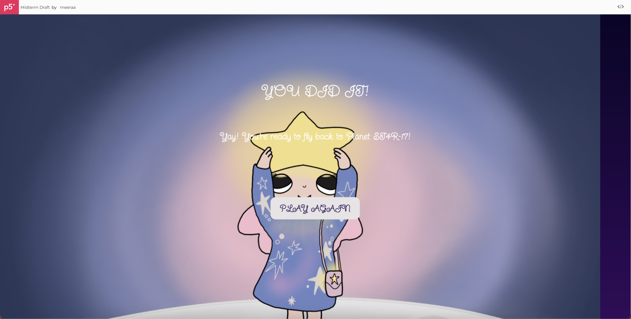
Another error I had was that the audio was not playing but when I removed the .loop and put .play instead, it worked for some reason.
Reflection
Overall, I am really happy with how my game turned out, especially since my vision came to life. I am most proud of the game section of my code and all the visual elements I drew. Although it was a long process, it was definitely worth it. I initially was not going to draw but after I drew the girl from the first draft, I felt like it was only right and consistent to keep going with that style so the game feels like a whole and not in parts. I also really love all the music/effects I chose because I feel like they are the perfect sounds for the game vibe I was going for.
Some improvements of the game I thought of was add a limit for how many meteors the user can hit. So, if starCount reaches like -14, the game ends rather than waiting till the 45 seconds are up. I could also add levels with maybe more rocks falling or less stars or less time to make it harder. Another thing I wish I did was draw at the same size of a usual desktop size for the background because that is what caused the background to stretch and me using AI to fix it. It also caused it to slightly zoom in more for that reason.
Resources:
ibis Paint X: app used to draw
Pop Mart’s Nyota “Dream”: character reference https://www.popmart.com/us/pop-now/set/122
P5js example gradient background: https://editor.p5js.org/adriennecassel3/sketches/b7FTa6sF_
Class: https://editor.p5js.org/Aya_Riad/sketches/Wky6-ythQ
Key movement: https://editor.p5js.org/Aya_Riad/sketches/XtHkp-A7N
https://editor.p5js.org/Aya_Riad/sketches/vgp-dlvea
millis() https://editor.p5js.org/Aya_Riad/sketches/qZsp9Qete
Title/Cursive Font: https://fonts.google.com/specimen/Twinkle+Star?preview.script=Latn
Main font: https://fonts.google.com/specimen/Sour+Gummy?preview.script=Latn
Sparkle sound: https://pixabay.com/sound-effects/film-special-effects-sparkle-355937/
Lose sound https://pixabay.com/sound-effects/film-special-effects-marimba-game-over-250960/
Win sound https://pixabay.com/sound-effects/musical-fairy-dust-magical-chime-576279/
Game sound https://pixabay.com/music/fantasy-dreamy-childrens-magical-storytime-389087/
Main sound https://pixabay.com/music/fantasy-dreamy-childrens-magical-sparkling-orchestral-music-192725/
Image Color Picker: https://imagecolorpicker.com/
Google Gemini for errors unable to resolve as mentioned in blog post


 y of different colors that picks between them randomly