Concept
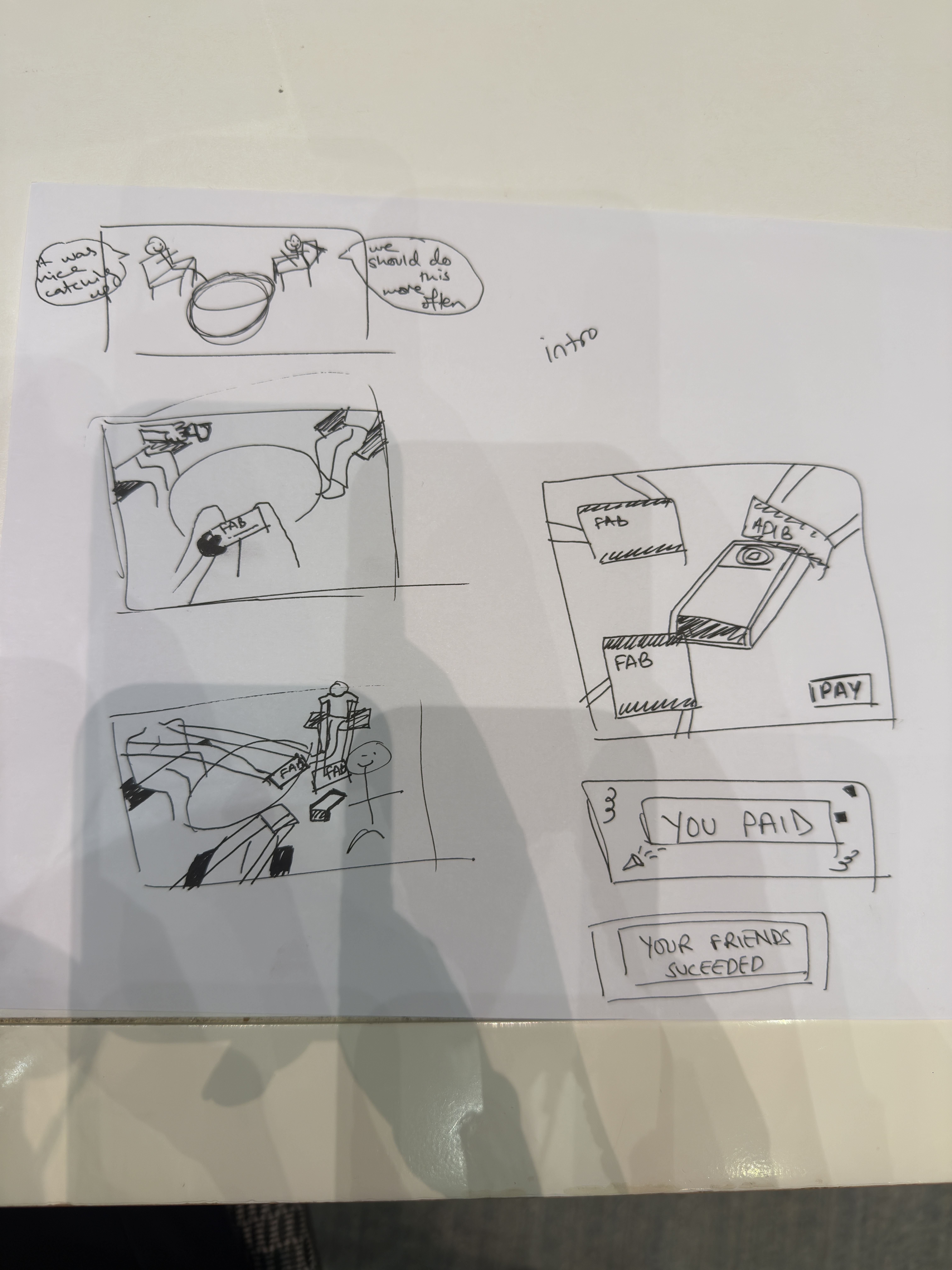
Who Pays? is about the fight that happens at the end of every meal with my friends. Nobody wants to split the bill. Everyone wants to be the one who pays, and it turns into an actual race to get your card to the card machine first. So in this game, paying is winning.
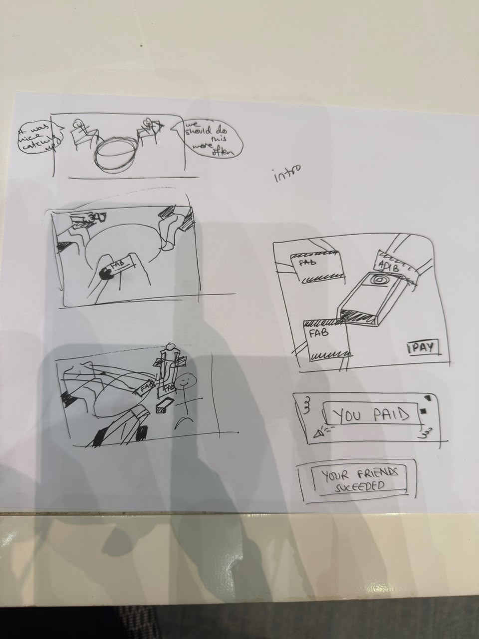
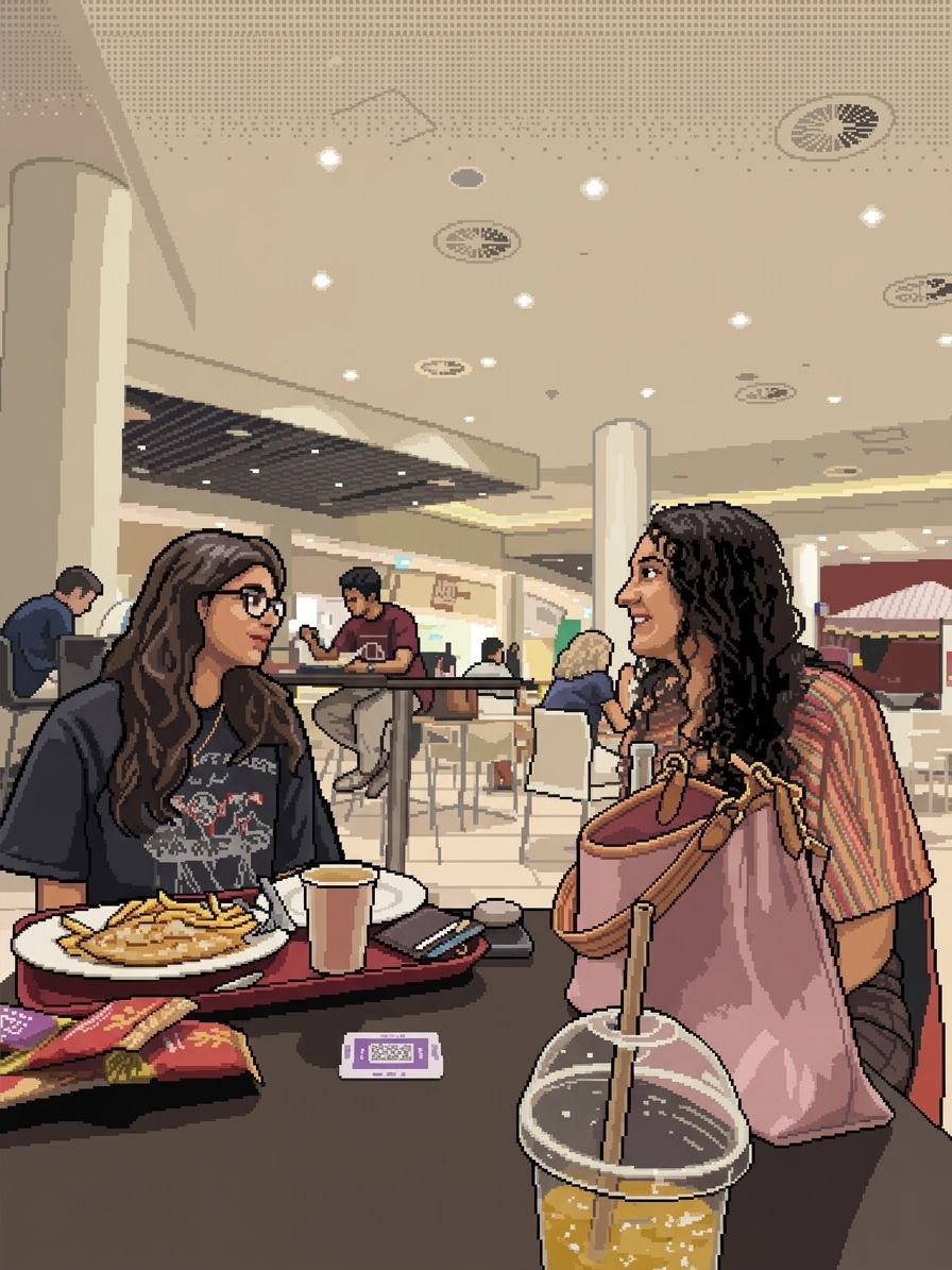
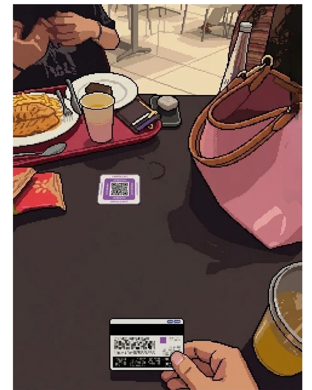
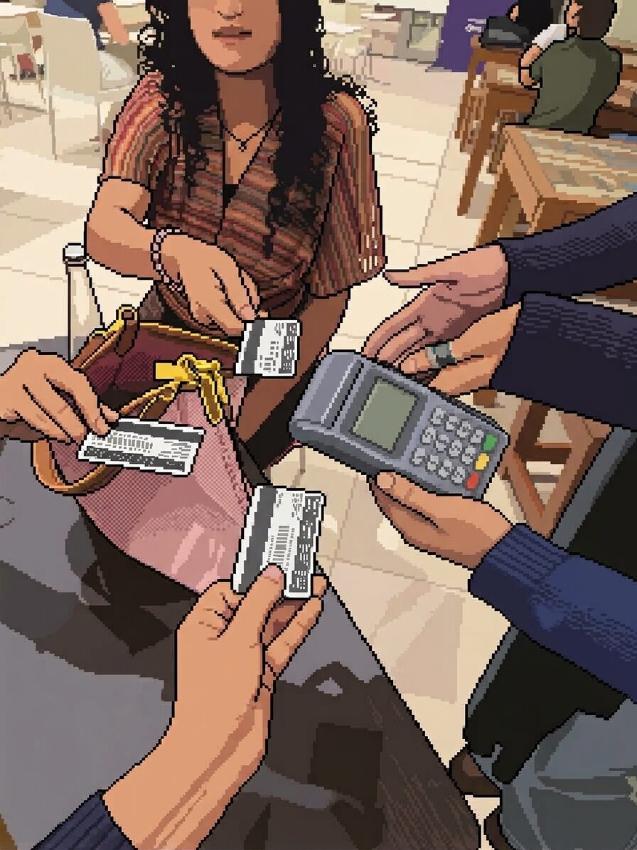
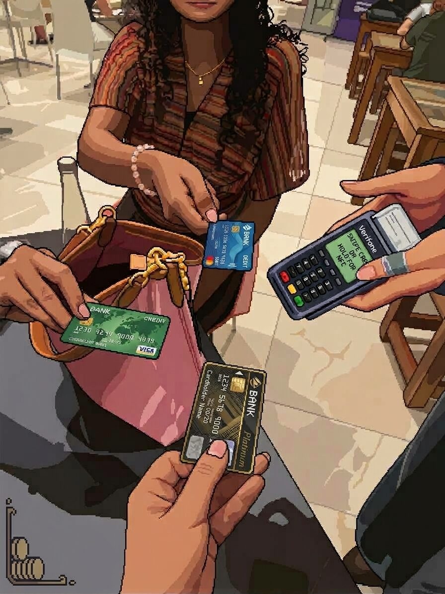
The project starts as a short comic. Four pixel art frames I made tell the story of one lunch at Campus East. The food is gone, you casually reach for your uni card, everyone notices, and suddenly three real cards are out and pointed at the machine. The game happens inside that fourth frame. You hold the black card and race Eshaal and Eman by mashing Space, and whoever’s card touches the card machine first pays.
How it works
The sketch has three scenes, and a variable called scene decides whether draw() shows the title screen, the story or the race. Each story frame is a Panel object that knows its picture, its caption and the frame it came on screen. That’s all it needs to type the caption out one letter every two frames. The title screen is frame 1 blurred with grain on top, and it waits for Enter or a click before anything starts.
Each hand in the race is a Racer object. It holds the hand picture cut out of frame 4, where it starts, how far it has to travel to reach the card machine, and a progress number from 0 to 1. Pressing Space adds 0.045 to your progress, and Eshaal and Eman add a small random amount every frame. Where a card sits on screen is just its start position plus the distance times its progress.
Problems and what I’d improve
The hardest design problem was three cards racing toward one small card machine. If they all moved toward the same point, they’d pile on top of each other halfway through and you couldn’t tell whose card was ahead. So each hand got its own straight path, measured from frame 4: mine comes in from the right, Eshaal’s from the left and Eman’s from below, and each path ends at a slightly different spot on the machine. The cards only really meet at the very end. When they do overlap, the draw order decides who’s on top, and your card is drawn last so it’s always the one you can see.
Then I had to decide what “winning” actually means in a mashing game. My first thought was to check when a card entered the card reader’s area on screen. But the cards are tilted and come from three directions, so that area would be a different shape for each of them. It was much simpler to make each path end exactly where the card touches the machine. That way reaching the machine just means progress hits 1, and after every frame checkforWInner() looks for the first card that got there.
Most of the other problems came from the p5 web editor. An older version of the grain effect looped over every pixel on the screen, and the editor stopped it for running longer than 100 milliseconds and called it a “potential infinite loop”. Drawing a few thousand random dots each frame fixed that.
There’s still a lot I’d change. Eshaal and Eman add a random amount every frame, but over a whole race that averages out, so they move at an almost steady speed. Random bursts of speed would make them feel more like people. A tie goes to whoever is first in the racers list, which isn’t really fair. The speeds are also per frame, so on.
Code I am proud of
The part I’m proudest of is the arm stretching in the Racer class. It was the trickiest thing to get right, and you can see it every time the cards move.
// in the constructor, the forearm slice gets cut out of the hand picture once
this.armSlice = this.img.get(this.armX - this.x, this.armY - this.y, info.arm[2], info.arm[3]);

show() {
  // The forearm slice is drawn again and again, from where the hand started to where
  // it is now. Stacked up like that it looks like the arm is stretching toward the machine.
  for (let step = 0; step < this.progress; step += 0.01) {
    image(this.armSlice, this.armX + this.reachX * step, this.armY + this.reachY * step);
  }

  // hand and card go on top, moved along by however far they've got
  image(this.img, this.x + this.reachX * this.progress, this.y + this.reachY * this.progress);
}
When the hands first moved, they floated away from their arms and left a gap in the drawing. The fix was a thin slice of each forearm, taken from exactly where the hand was cut out, drawn over and over along the path behind the hand. Because the slice comes from the real drawing, the arm keeps its shading and outline, and it looks like everyone is actually leaning across the table.
Reflection
I made this game because of how every meal with my friends ends. In Pakistan, paying is hospitality. Covering the bill is how you show someone you care about them, and letting them pay can feel like you’ve failed as a host, even when nobody was hosting anyone. So nobody splits. Everyone reaches for their card at the same time, someone says put that away, someone tries to sneak their card to the cashier before the bill even comes, and it turns into a full fight that everyone is secretly enjoying.
I wanted the game to work the same way, so winning means you’re the one who pays. In most games you win something. Here you win by being the first to give your money away, and that’s honestly what it feels like at the table. Even the second frame, where you casually go for your uni card, is a move every one of us has tried at some point.
References
These Coding Train videos cover the parts of p5.js this project leans on.
Classes in ES6, for the Panel and Racer classes. https://thecodingtrain.com/tracks/code-programming-with-p5-js/code/6-objects/2-classes
Constructor Arguments with Classes, for giving each Racer its name, hand image and path. https://thecodingtrain.com/tracks/code-programming-with-p5-js/code/6-objects/3-constructor
Arrays of Objects, for the racers and panels arrays and looping over them. https://thecodingtrain.com/tracks/code-programming-with-p5-js/code/7-arrays/3-arrays-objects
Objects & Images, for each Racer drawing its own hand picture. https://thecodingtrain.com/tracks/code-programming-with-p5-js/code/7-arrays/8-objects-images
p5.js Web Editor: Uploading Media Files, for getting the frames, hands and sounds into the editor. https://thecodingtrain.com/tracks/code-programming-with-p5-js/code/7-arrays/upload-editor
random(), for Eshaal and Eman’s speed and the grain on the title screen. https://thecodingtrain.com/tracks/code-programming-with-p5-js/code/2-variables/4-random
while & for Loops, for the grain loop and the arm loop. https://thecodingtrain.com/tracks/code-programming-with-p5-js/code/4-loops/1-while-for
Loading and Playing, for loadSound(), play(), loop() and setVolume(). https://thecodingtrain.com/tracks/sound/sound/1-loading-and-playing
Adding Sound Effects, for the beep, approved and declined sounds. https://thecodingtrain.com/tracks/sound/sound/5-adding-sound-effects
Press Start 2P by CodeMan38, the pixel font. https://fonts.google.com/specimen/Press+Start+2P
Improve loop protection warning for slow loops, a forum thread that helped me understand the “infinite loop” warning. https://discourse.processing.org/t/improve-loop-protection-warning-for-slow-loops-that-are-not-infinite/49147
AI Usage
It was most useful when something broke or confused me. It found that the preload error came from the editor defaulting to p5.js 2.0, that my uploads weren’t loading because file names have to be typed out in full in quotes, and that the “infinite loop” was the editor’s 100 millisecond limit. When I switched to portrait frames, it worked out that my frame 4 was still landscape inside the file and rotated the cut outs and every hand position to match. When I didn’t understand the grain, it pulled the title screen apart into layers so I could see it’s just thousands of faint random dots drawn on top of the blurred frame. It also explained how frameCount controls the flicker, and gave me simple pseudocode for the moving hands (start position plus distance times progress), which is the line in show().
I also used gemini to help me generate the graphics, so like that is why the hands or fingers may not be complete haha.