Concept
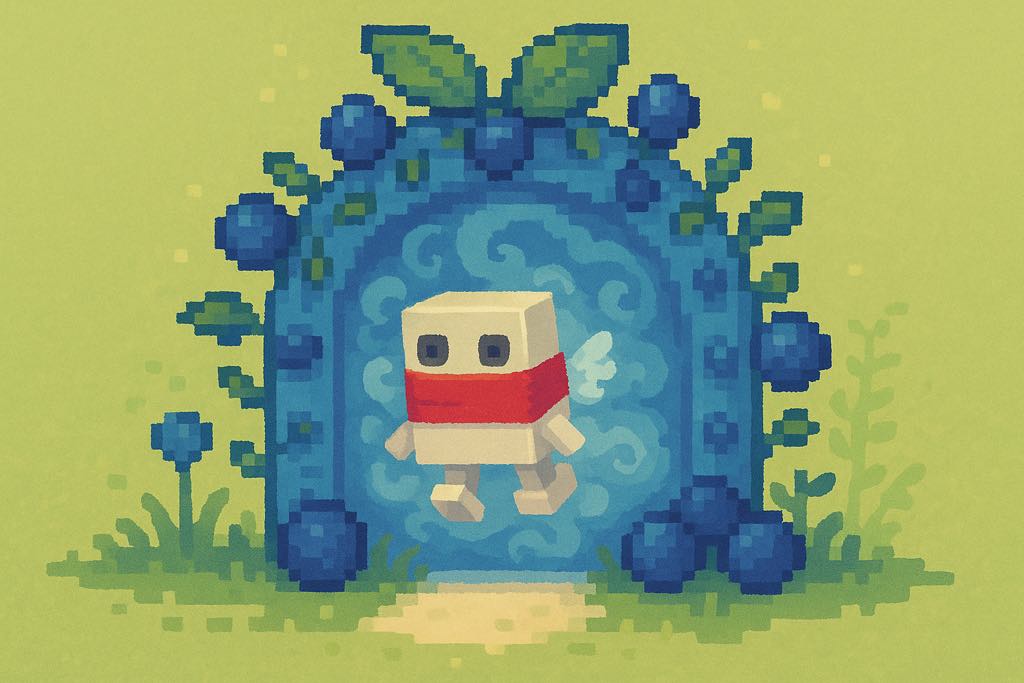
This is a self-love journey starring a little duckling who dreams of escaping its own pixel-art world for the “real world.” To unlock the portal, the duck must collect 10 berries scattered across the landscape avoiidng cats that steal berries. Once the portal opens and the duckling arrives in our world… it discovers that transformation comes at a cost. Its body literally changes and it loses control- brought to life by an Arduino-powered robot. Was the price worth it?
( one thing i was proud of is how self sufficient my set up was, i made sure to make an immersive self directed experience by having notes guiding the user/ help buttons that help you out)
The Storyline was massively tweaked last minute since the servos burnt and due to the lack of same servos available in IM lab, the robot became unstable. “Every bug is an opportunity to learn something new” – yep, I turned it into a real life learning objective. the tagline went- Dont try to blend in to a world you dont belong in, Stay true to yourself.
honestly, this storyline made a lot of people smile big and I consider a design success.
IM SHOWCASE
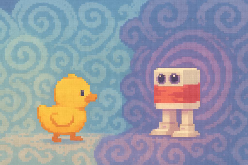
P5.Js Form:
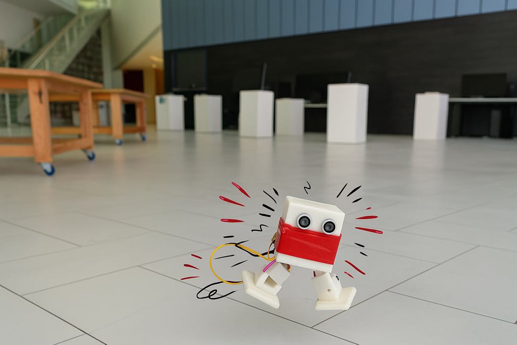
Real Life form:
this is when I tried the robot after changing into new servos that arent as powerful ( It got a muffler as a makeover later on, dont worry)
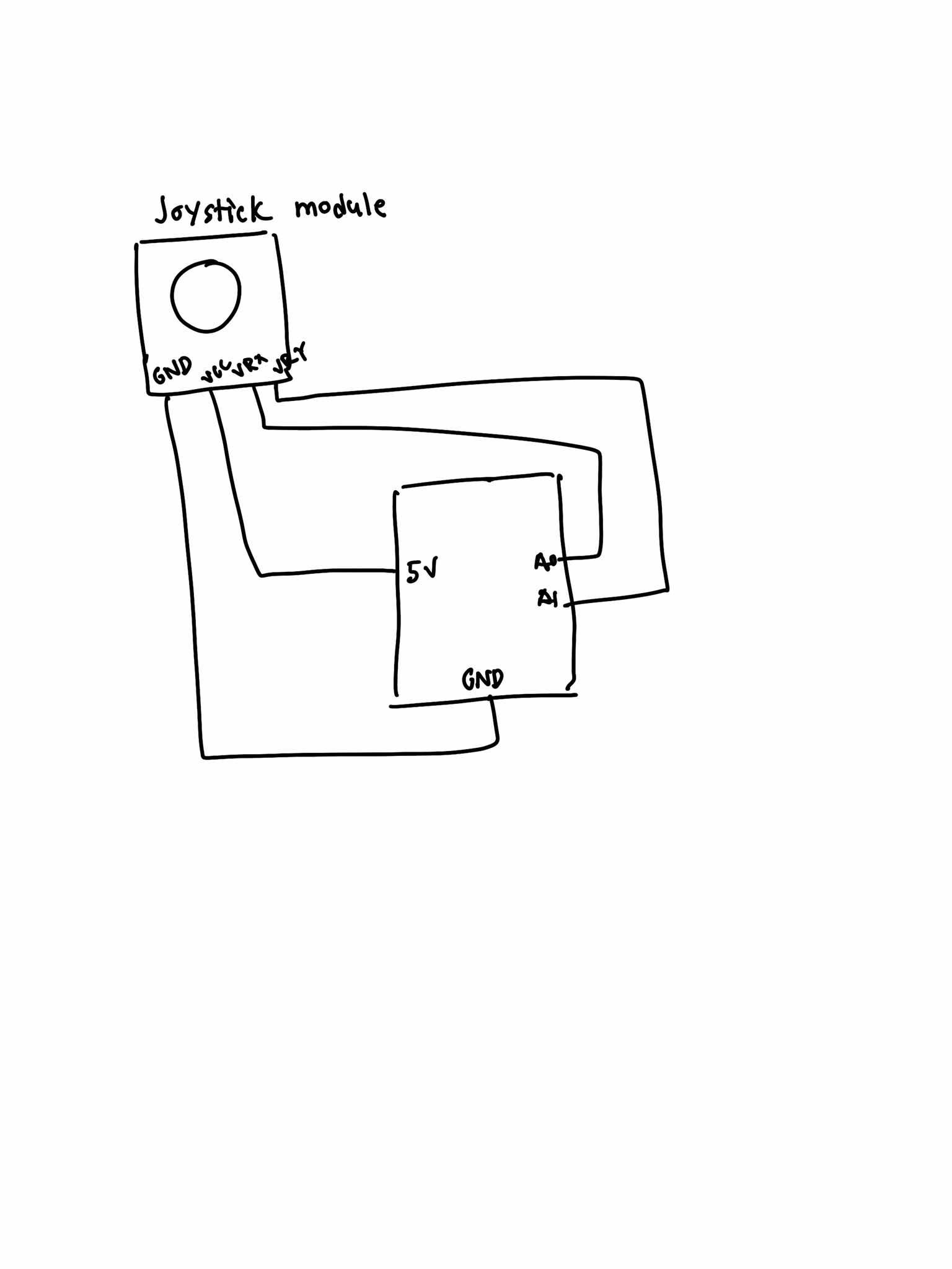
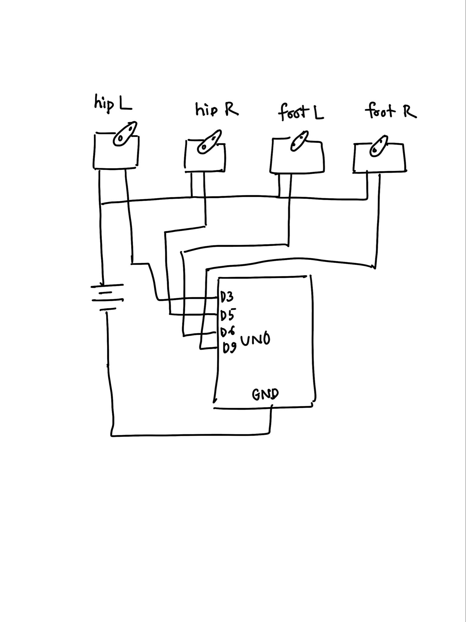
Schematic
Implementation Overview
This project brings together a browser-based p5.js game and a physical Arduino robot in four main stages:
-
Player Input
-
Mouse clicks for UI controls (Start, Help, Retry).
-
Joystick module for duck movement.
-
Arcade button for jump/interact actions.
-
-
p5.js Game Loop
-
The
draw()function renders the environment (drawEnvironment()), duck (drawDuck()), berries (drawBerries()), and portal (drawPortalAndSign()). -
Berry collisions are detected via simple bounding-box checks; when
berriesCollectedreaches 10, thePortalanimation kicks in and p5.js sends the signalPORTAL\nover serial.
-
-
Serial Communication
-
Uses the Web Serial API at 9600 baud.
-
p5.js → Arduino: Sends the line
PORTAL(terminated with\n). -
Arduino → p5.js (optional): Could send back status messages like
READYorDONEto sync up visuals.
-
-
Arduino Reaction
-
Listens on
Serial1at 9600 baud inloop(). -
On receiving
"PORTAL", it:-
Reads a HC-SR04 distance sensor to confirm the duckling’s “arrival” position.
-
Commands four TowerPro SG90 servos (hipL, hipR, footL, footR) through a custom
transformDuck()routine to animate the body-change sequence.
-
-
Interaction Design
You guide the duckling with the joystick, steering it through the world until it picks up the tenth berry. The moment that last berry is collected, the portal opens and the duckling automatically steps through. The game then shifts into a brief slideshow that reveals how the duckling’s body changes and what it pays for its journey. When the slideshow ends, the view fades out and your Arduino-powered biped robot springs into motion, reenacting that very transformation in the real world.
Arduino 2 Code
#include <Servo.h>

// Servo setup
Servo hipL, hipR, footL, footR;

// offsets
int hipLOffset  = -3;
int hipROffset  = 6;
int footLOffset = 0;
int footROffset = 4;

// Helper to apply offset
void writeCorrected(Servo s, int angle, int offset) {
  s.write(angle + offset);
}

// Neutral standing pose
void standStill() {
  writeCorrected(hipL, 90, hipLOffset);
  writeCorrected(hipR, 90, hipROffset);
  writeCorrected(footL, 90, footLOffset);
  writeCorrected(footR, 90, footROffset);
}

void setup() {
  hipL.attach(3);
  hipR.attach(5);
  footL.attach(6);
  footR.attach(9);

  standStill();
  delay(500);
}

void loop() {
  // Left leg forward
  writeCorrected(hipL, 55, hipLOffset);     // swing left
  writeCorrected(hipR, 90, hipROffset);     // right still
  writeCorrected(footL, 90, footLOffset);
  writeCorrected(footR, 92, footROffset);   // small push
  delay(150);

  standStill();
  delay(80);

  // Right leg forward
  writeCorrected(hipL, 90, hipLOffset);     // reset left
  writeCorrected(hipR, 55, hipROffset);     // swing right
  writeCorrected(footL, 96, footLOffset);   // stronger push
  writeCorrected(footR, 90, footROffset);
  delay(150);

  standStill();
  delay(80);
}
Honestly, this project went through a bit of an identity crisis — just like the duck. What started as a simple p5.js game about collecting berries turned into a weirdly emotional tech-story about self-love, malfunctioning servos, and a robot duck with a muffler.
When the servos burnt out last minute and I had to rewrite the whole ending, I was this close to panicking. But instead, I leaned into the chaos and built a new storyline around it. And somehow… it worked better than the original. People loved it and I made so many new contacts through the IM showcase becausue we got to talk about the project. Some even laughed at the transformation twist. That was enough for me.
The duckling wanted to escape its pixel world, but maybe it didn’t need to.
And maybe I didn’t need everything to go perfectly for the idea to land either.
So yeah — the duck glitched, the servos wobbled, but the message came through.
Stay weird. Stay you.
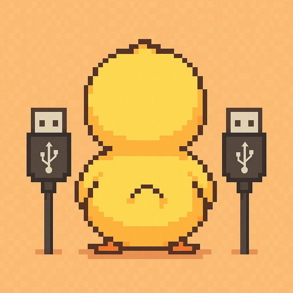
Enjoy some of the artworks used-