Final Project Documentation

Inside Your Mind – Interactive Fluid Typography Experience

Introduction

Imagine how many thoughts are running through your mind every day. How many memories are replaying without your permission. How many feelings are sitting quietly beneath the surface, waiting. How many processes – conscious and unconscious – are happening all at once, shaping how you see the world, how you move through it, how you feel.

We talk about the mind constantly, but we rarely feel it. We describe it in words but what if you could actually move through it?

That’s what this project asks. Let’s have a look – together.

Project Description

Inside Your Mind is an interactive fluid typography experience built in p5.js. It is not a game. There are no rules, no score, no way to win or lose. It is a guided journey through four psychological stages of the mind rendered through particle-based text and cursor interaction and sound. The experience opens with a cinematic intro sequence: a personal greeting, a typewriter reveal of my name, a search bar that slowly types “inside your mind”  before the background fades to black and the particle world begins. From there, users navigate four chapters by scrolling:

Stage 1 – Noise: The state of mind this stage represents is the one most people know intimately but rarely name: moment when there are too many thoughts happening at the same time. Not anxiety exactly just overwhelm. The cognitive noise of existing. Everything arriving at once with equal urgency.

The design decision for this stage was to make the particles rain. They fall from above, guided by Perlin noise so their path is irregular and organic rather than mechanical each particle taking a slightly different route down, bumping and drifting as it descends. Once they land and form the text, they don’t rest. A constant random jitter force kicks each particle slightly every single frame, meaning the text is technically legible but permanently restless. It holds its shape just enough to be read, but never settles. You can feel it trying to stay coherent and failing slightly, constantly.

The cursor scatters particles on approach, because that is exactly what external input feels like in this state one more thing arriving, breaking whatever fragile order existed. The soundscape is a deep. It is the sound of pressure. Of weight. The cursor sound is wind: a pink noise burst filtered through a bandpass, airy and formless. You are moving through something thick.

The color palette is deep violet and soft lavender, the color of a headache, of overstimulation, of a mind working too hard at the wrong hour.

Stage 2 – Overthink: “you replay every moment”

Overthinking is not the same as noise. Where noise is chaotic and arriving, overthinking is circular. It is the experience of returning, repeatedly and involuntarily, to the same thought, the same conversation, the same moment, unable to leave it behind or fully process it.

The particle behavior for this stage is orbit. Every single particle loops a small ellipse around its home position continuously, the orbit radius and speed are randomized per particle, but the character is circular. Going around. Coming back. Going around again. The ambient sound is a slow pad chord progression. It is not unpleasant, but it is repetitive by design. You start to recognize it coming around again. The cursor sound is a soft water drop. Small. Like a single thought landing. And then another. And another.

The color palette shifts to ice blue cooler, more cerebral than Stage 1.

Stage 3 – Break:

“it’s too much you shatter”

Every state of overthinking and overwhelm eventually reaches a threshold. Stage 3 is that threshold. The design principle here was simple and deliberate: before the breaking, I thought there must be stillness. Tension requires silence before it can release.

When you arrive in Stage 3, nothing moves. The particles sit perfectly at their home positions, forming the text with complete stillness. The spring force in this stage is the strongest of all four as particles snap back to home almost instantly if disturbed. The text holds. Then the user clicks and the wave fires from the cursor position. An expanding ring of force radiates outward, hitting each particle as it passes through them and sending them flying. In the wave,  particles at different distances react at different times, which created an effect of shattering rather than a single simultaneous blast. The spring forces pull everything home afterward, so the text reforms. It always reforms.

I think this stage is the most interactive because breaking is an active thing. You have to choose to do it. You have to click. The experience gives you the tension and then waits for you. The cursor sound is distorted white noise. The color palette is deep crimson and warm pink. The only warm colors in the entire experience, and they are the color of something going wrong.

Stage 4 – Quiet:

“finally silence”

After noise,  after breaking – quiet. Quality of silence that follows intensity. The silence that has weight because of what came before it.

The particle behavior in this stage is breathing. Each particle oscillates slowly outward and inward along the radial vector from the canvas center to its home position pushed by a wave timed with a personal phase offset so the motion feels organic. The result is that the entire text gently expands and contracts, like a chest rising and falling feeling. It is the only stage where the motion is cyclical. The cursor behavior inverts here. In every other stage, the cursor repels particles, In Stage 4, the cursor gently attracts nearby particles toward it. You can gather them. Hold them. A warm golden glow appears under the cursor. The relationship between the user and the text changes from conflict to softness.

The cursor sound is a bell chime. The color palette is amber and warm white. After the cool blues and violent reds of the earlier stages, I wanted to design and show the warmth of silence.

For full experience click the embed </> for audios to work,

Demo Video Link:

https://drive.google.com/file/d/1pU6o5wXnE2DPwy-biGNz1qMbYGnZOFqN/view?usp=sharing

Process

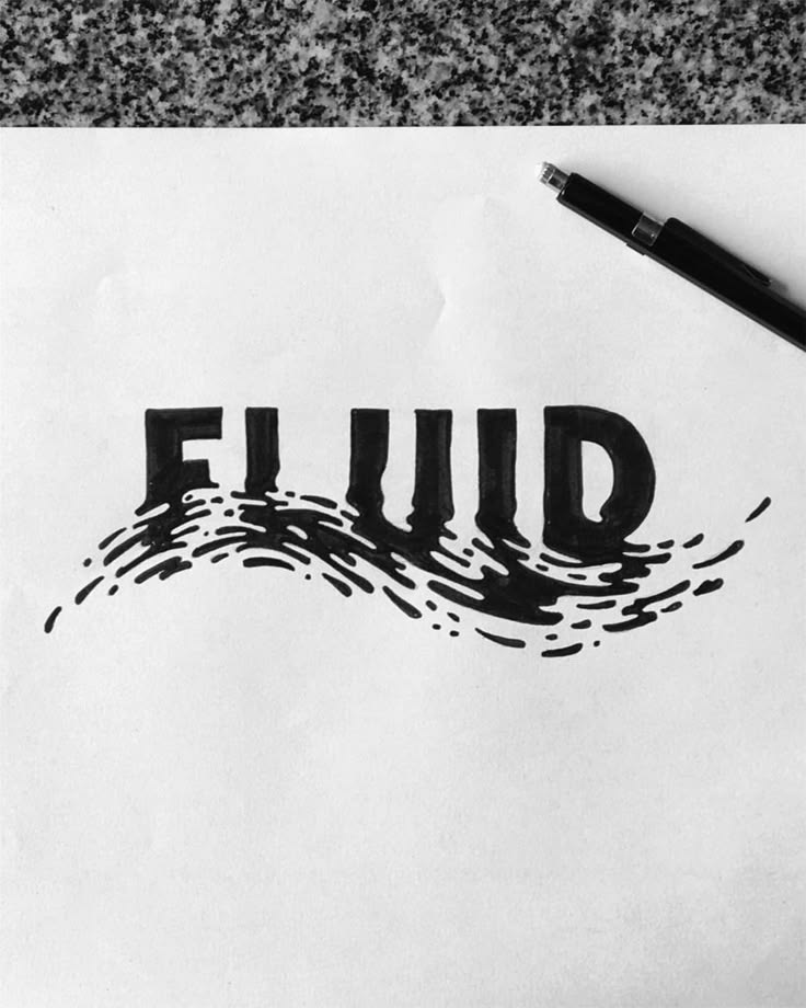
The Idea – Fluid Typography

My starting point was my new obsession: fluid typography. I had come across a tiktok video examples of text that showed letters that flow and that was fluid typography and I was completely drawn to it. I wanted to make my own version. But as I started building it, I realised that fluid typography on its own, as beautiful as it is, is like a visual demo and for my project it needed a reason to exist, a stpry.

what story would make this feel necessary?

The mind. A mind felt like the most honest container for this kind of experience. Thoughts scatter when you try to hold them. They orbit obsessively. They shatter under pressure. They eventually go quiet. I wrote 4 stages once I had that theme. And, the theme meant that the fluid text was a tool of metaphor. The particles are the thoughts.

Adding Sound

Once the visual system was working, I experimented with adding sound and  it was the right decision. Without sound, the experience was impressive but slightly cold . With sound, it gave a feelinf you were inside something.

I built the audio system using Tone.js, giving each stage its own soundscape and its own cursor sound. The cursor sounds were particularly important wind for Stage 1 (the noise, the overwhelm), water drops for Stage 2 (the repetition, the dripping thought), glitch crackle for Stage 3 (the breaking point), and bell chimes for Stage 4 (the clarity, the resonance after silence). Every time you moved the cursor you were making sound specific to where you were in the emotional journey. The sounds definetenly deepened the preoject at some point.

The Intro Sequence

As I was developing the project, I noticed a pattern on my social media feeds, motion design ads for brands, cinematic, typographic intro sequences that brands and motion designers were using to create instant atmosphere and identity. I was watching a lot of these and I thought: this is what my project needs. I don’t want just a start button, but an experience that begins before the experience begins.

So I built a full kinetic typography intro using a separate canvas: a large “hi!” that scales into view, a medium line  “first lemme introduce myself” that slides up, then a typewriter effect that slowly reveals “madina” letter by letter with a blinking cursor, and finally a minimal search bar that expands from the center and types “inside your mind” before the whole screen fades to black and the landing screen unfurls. That intro turned my sketch into an authored experience and i liked it.

The Result

And then there it was.  Four stages, a full narrative arc, a kinetic intro, generative sound, and 7000 particles all moving with intention. I was genuinely proud of it.

Code Deep-Dive

How the Fluid Typography Works

The core technique behind the fluid text is particle-based font sampling. it works like this:

  1. The text is rendered invisibly onto an offscreen p5.js graphics buffer at full canvas size
  2. Every pixel of that buffer is scanned, and any pixel that is lit (part of the rendered letter) becomes a target point a “home position” for a particle
  3. Each of the 7,000 particles is assigned one of these home positions
  4. Every frame, physics forces are applied, and then a spring force pulls each particle back toward its home. It took my quite time to understand the physics of it, hah.

The text only exists as the collective shape of 7,000 individual points, each with their own velocity and position.

function sampleText(lines) {
  var W  = sk.width;
  var H  = sk.height;
  var pg = sk.createGraphics(W, H);
  var lh, sy, pts, y, x;
  
  pg.pixelDensity(1);
  pg.background(0);
  pg.fill(255);
  pg.noStroke();
  pg.textAlign(sk.CENTER, sk.CENTER);
  pg.textStyle(sk.BOLD);
  pg.textSize(FONT_SZ);
  
  // render each line of text centred on the canvas
  lh = FONT_SZ * 1.32;
  sy = H / 2 - (lines.length - 1) * lh / 2;
  lines.forEach(function(l, i) { pg.text(l, W / 2, sy + i * lh); });
  
  pg.loadPixels();
  pts = [];
  
  // scan every 4th pixel — lit pixels become home positions
  for (y = 0; y < H; y += STEP) {
    for (x = 0; x < W; x += STEP) {
      if (pg.pixels[(y * W + x) * 4] > 128) {
        pts.push({ x: x, y: y });
      }
    }
  }
  
  pg.remove(); // clean up offscreen buffer
  return pts;
}

The next piece of code is what I’m proud of. Each stage changes the physics personality of every particle. Four different motion systems, selected by a r string:

Particle.prototype.update = function(mx, my, t) {
  var beh = CHAPTERS[currentCh].beh;

  // ── NOISE: rain from top, then constant random jitter ──
  // Feels overwhelming — particles never fully settle
  if (beh === 'noise') {
    if (this.falling) {
      this.y += 3.6 + sk.noise(this.x * 0.005, t) * 2;
      this.x += (sk.noise(this.y * 0.004, t + 99) - 0.5) * 1.2;
      if (this.y >= this.hy) { this.falling = false; }
      return;
    }
    // random kick every frame — text is alive but unstable
    this.vx += (Math.random() - 0.5) * 0.50;
    this.vy += (Math.random() - 0.5) * 0.50;
    this.vx += (this.hx - this.x) * 0.018; // very weak spring
    this.vy += (this.hy - this.y) * 0.018;
    this.vx *= 0.88; this.vy *= 0.88;

  // ── ORBIT: each particle loops a small ellipse around home ──
  // Feels obsessive — thoughts that won't stop circling
  } else if (beh === 'orbit') {
    this.orbitAngle += this.orbitSpd;
    var tx = this.hx + Math.cos(this.orbitAngle) * this.orbitR;
    var ty = this.hy + Math.sin(this.orbitAngle) * this.orbitR * 0.55;
    this.vx += (tx - this.x) * 0.055;
    this.vy += (ty - this.y) * 0.055;
    this.vx *= 0.82; this.vy *= 0.82;

  // ── FRACTURE: completely still — tension before the click ──
  // Strong spring, high damping: text holds its shape perfectly
  } else if (beh === 'fracture') {
    this.vx += (this.hx - this.x) * 0.10;
    this.vy += (this.hy - this.y) * 0.10;
    this.vx *= 0.78; this.vy *= 0.78;

  // ── BREATHE: slow radial sine pulse from canvas centre ──
  // The entire text expands and contracts like breathing
  } else if (beh === 'breathe') {
    var pulse = Math.sin(t * 0.62 + this.breathePhase) * 6.5;
    var cx2   = sk.width  / 2;
    var cy2   = sk.height / 2;
    var dhx   = this.hx - cx2;
    var dhy   = this.hy - cy2;
    var dhLen = Math.sqrt(dhx * dhx + dhy * dhy) + 0.001;
    // target = home position + outward pulse along radial direction
    var btx   = this.hx + (dhx / dhLen) * pulse;
    var bty   = this.hy + (dhy / dhLen) * pulse;
    this.vx  += (btx - this.x) * 0.026;
    this.vy  += (bty - this.y) * 0.026;
    this.vx  *= 0.88; this.vy *= 0.88;
  }

  this.x += this.vx;
  this.y += this.vy;
};

Reflections

I actually didn’t start with this idea. My original plan was to build my final project in Tinkercad – a 3D interactive game. I started the initial stages of it and then stopped: what is this going to feel like? And I didn’t love the answer. A game in Tinkercad felt too rigid for me, and I realized that what I actually care about in design is feeling. Evoking something. Making someone feel.

Aaaand this led me to p5. And once I chose it, I never looked back. Not once did I regret the pivot.

The Hard Parts

The hardest technical challenge was the fluidity itself, figuring out how to decompose text into a particle system that still read as text, while also having enough physical personality to feel alive. Getting the balance between spring force (which pulls particles home) and behavioral force (which gives each stage its character) took a lot of iteration. Too much spring and the particles snap back robotically. Too little and the text becomes unreadable. The current values are the result of many hours of tuning.

The second major challenge was performance. After building the full experience with 10,000 particles and the Tone.js audio system running simultaneously, I noticed the experience would start to lag particularly in the final Quiet stage, which has the most computationally gentle motion but was hitting the limit of what a standard laptop could handle. I solved this with two techniques: reducing the particle count from 10,000 to 7,000, and implementing a frame-rate adaptive physics system that skips physics updates on alternate frames if the frame rate drops below 40fps.

What I Learned

This project taught me that the most powerful interactive experiences are the ones where the interaction means something where what you do with your cursor is narrative. Every movement in Inside Your Mind is part of the story. That’s the principle I want to carry forward.

References

Inside Your Mind – Interactive Fluid Typography Experience and User Testing

As I was experimenting with m project, I built Inside Your Mind – a second-person psychological narrative experience created in p5.js. I felt like with the creativity I developed in the class Tinkercad would not be enough to show my ideas, altough I tried to make a project on Tinkercad I did not open fully with it, so I chose to do my interactive experinec in p5. The project moves away from game mechanics and goals, and toward something more expressive and open-ended: a guided journey through four emotional stages of the mind, rendered through fluid particle typography and sound.

The experience opens with a kinetic typography intro sequence a personal greeting, a typewriter reveal, a search bar that types “inside your mind” — before transitioning into the main particle world. From there, users navigate different stages of mind, noise, overthink, break and finally silence.

User Testing

User testing was conducted with participant who experienced the full interactive sequence from the intro through all four stages. My little brother.  Participant were observed interacting freely with no instructions given beyond “explore it.”

The response was overwhelmingly positive.

Tester consistently described the experience as something they hadn’t encountered before, not a game, not a website, something in between that felt genuinely immersive. My brother spent more time in the experience than expected, going back and forth between stages to compare how the particles moved differently in each one. The fluid typography was the element that resonated most strongly. Tester were drawn to how the text was simultaneously readable and alive. The sound design was a notable highlight. Tester immediately noticed that each stage sounded different, and several remarked that the cursor sounds made the experience feel tactile, like they were touching something. The wind sound in Stage 1, the water drops in Stage 2, the glitch crackle in Stage 3, and the bell chimes in Stage 4 each reinforced the emotional tone of that chapter which made it more cohesive.

Link to user testing video: https://drive.google.com/file/d/1y8koBlJ7WqWSgiGLDeGFhjZYJn5P-0Ib/view?usp=drivesdk

Areas noted for potential refinement:

I am considering to add an introduction to the experience explaining more about the interactivness, I am inspired by motion design, lately have been watching different motion design ad proposals for brands and I enjoyed the animations, so I would want to implement it to my project by learning and applying it.

Interactive Fluid Typography Experience Idea

For my final project, I will create an interactive fluid typography experience built in p5.js. For my midterm I made a game, so for the final I want to move in a different direction away from rules and goals, and toward something more expressive and open-ended. The project will let users interact with text that behaves like a physical, fluid material, responding to their cursor and input in real time. Letters and words will be broken down into particles that scatter, stretch, and reform based on mouse movement and clicks. The user won’t be trying to win anything, they’ll explore what happens when language loses its fixed shape.

Tools & Approach

  • p5.js for rendering and interaction

  • Font path decomposition to turn letters into manipulable point clouds

  • A particle system with spring forces so letters distort and snap back

  • Smooth morphing between words or phrases over time

Why This Project

This is a natural evolution idea from my midterm project, I’ve explored interactivity through game mechanics, now I want to explore it through pure experience design. Typography as material.

Harry Potter Theme Musical Instrument

Learning Tinkercad, I built a Harry Potter theme song musical instrument that uses both digital and analog sensors to play the iconic melody. The PIR motion sensor (digital) detects when someone is nearby to trigger the song, while the potentiometer (analog) allows dynamic control over the playback speed and pitch variation, creating an interactive magical experience.

Check the Tinkercad here: https://www.tinkercad.com/things/7rPWu9K1P2T/editel?returnTo=%2Fdashboard&sharecode=CMCKEgjwUaqW1OCp9xhFPli3PX6svXP-iPPxgq9R69U

Digital Circuit

The circuit is built on a breadboard connected to an Arduino Uno. The design features: PIR Motion Sensor connected to Digital Pin 2 – detects motion to trigger song playback, Potentiometer connected to Analog Pin A0 – adjusts playback tempo/pitch modulation, Piezo Buzzer connected to Digital Pin 8 – outputs the Harry Potter theme frequencies, Power connections from 5V and GND to the breadboard power rails

The PIR sensor acts as a motion detector-when someone waves their hand over it, the circuit recognizes movement and initiates playback of the Harry Potter theme. The potentiometer serves as a control dial; turning it varies the speed at which notes are played or adjusts the pitch offset, giving the player expressive control over the melody.

PIR detection → Read potentiometer value → Play frequencies on buzzer.

Highlighted Code Snippet (Proud of This!)

// PIR sensor triggers playback
if (pirSensor == HIGH) {
  int tempo = map(potValue, 0, 1023, 200, 600);  // Potentiometer controls speed
  
  for (int i = 0; i < melodyLength; i++) {
    int notePitch = melody[i] + pitchOffset;  // Add potentiometer-based pitch variation
    tone(buzzer, notePitch, tempo);
    delay(tempo);
  }
}

The map() function elegantly connects the analog potentiometer reading to playback tempo, so rotating the dial smoothly speeds up or slows down the song. This creates a responsive, instrument-like feel rather than fixed playback.

int pirSensor = 2;
int potentiometer = A0;
int buzzer = 8;

// Harry Potter theme frequencies (simplified)
int melody[] = {294, 330, 392, 440, 494, 523, 587, 659};
int melodyLength = 8;

void setup() {
  pinMode(pirSensor, INPUT);
  pinMode(buzzer, OUTPUT);
  Serial.begin(9600);
}

void loop() {
  int motionDetected = digitalRead(pirSensor);
  int potValue = analogRead(potentiometer);
  
  if (motionDetected == HIGH) {
    int tempo = map(potValue, 0, 1023, 150, 500);
    int pitchOffset = map(potValue, 0, 1023, -50, 50);
    
    for (int i = 0; i < melodyLength; i++) {
      int notePitch = melody[i] + pitchOffset;
      tone(buzzer, notePitch, tempo);
      delay(tempo + 50);
    }
    noTone(buzzer);
  }
}

Reflection

This project taught me how digital and analog sensors complement each other. The PIR sensor provides binary input (motion yes/no), while the potentiometer gives continuous analog data for fine-tuning. I was initially unsure if the PIR sensor would register properly in simulation, but discovered that sensor sensitivity is crucial – sometimes you need to calibrate which digital pin captures the signal. The biggest challenge was mapping the potentiometer smoothly to tempo without the song becoming too fast or choppy. Using Arduino’s map() function solved this.

Screen Recording 2026-05-01 at 12.13.31


Reading Reflection

The readings made me rethink what interaction design is and what it could become. Bret Victor’s main idea that computers should help people think, not just react stood out to me the most. It made me realize that many of my own projects focus on simple interactions, like clicking or triggering events, rather than supporting deeper understanding. This distinction between reactive systems and thinking tools feels important, especially for someone studying interactive media.

Another key idea is visibility in design. Victor argues that systems should show how they work instead of hiding their processes. I strongly relate to this from a learning perspective when I can see changes happen in real time, I understand concepts much faster. This connects interaction design with education, suggesting that good design is not just about usability, but also about helping users learn and explore. At the same time, I found myself questioning some of Victor’s ideas, especially about using the full human body in interaction. While designing for human capabilities is powerful, it can also exclude people who are not able-bodied. I agree with my peer’s point that accessibility should be central to design. Technology exists to expand access, not limit it. For example, devices like the Meta Quest offer adjustable and inclusive features, showing that immersive design and accessibility can coexist.

I was also interested in discussions about touch and sensory interaction. Technologies like haptic feedback and VR controllers show how physical sensation can enhance digital experiences. The example of devices that simulate textures or resistance demonstrates how interaction can go beyond screens and become more embodied. However, these ideas still feel experimental, and it is unclear how widely they can be applied in daily life.

Week 10 – Reading Response

Reading “Physical Computing’s Greatest Hits (and Misses)” made me feel exposed in a funny way, because I recognized so many of my own “original” project ideas in his list. I have thought about wearable sensors, glowing LEDs that react to touch, and emotional “helper” objects as if they were fresh directions, and seeing them framed as patterns that show up every semester forces me to admit how predictable I am as a beginner. At the same time, I agree with Igoe that giving up once you discover a similar project is a weak response, because what matters is the specific gesture, the context, and the meaning you build around a pattern, not the bare pattern itself. I think he is a bit biased toward downplaying the emotional impact of “shallow” projects like video mirrors or remote hugs, because for someone encountering them for the first time those can still feel meaningful, even if the interaction structure is simple. Still, his critique of projects that start and end at “wave your hand and watch something blink” matches what I have seen in exhibitions and online: I often remember the visual trick but not what I was supposed to feel or think. The reading pushes me to treat “greatest hits” gestures as starting points instead of endpoints, and to ask earlier in my own process what kind of bodily action I am inviting and why that action fits the idea, not only whether the sensor–actuator chain works.

“Making Interactive Art: Set the Stage, Then Shut Up and Listen” challenged a habit I have of over‑explaining my work to classmates. I go into detail about the concept, the symbolism, and the “correct” way to interact, because I am afraid people will miss what I intended, but Igoe argues that this kind of control kills the interaction and turns the piece into a lecture. I find his rule “do not interpret your own work” a bit extreme, and I do think he is biased toward audience freedom over author intention, yet his comparison to directing an actor makes sense to me. I have seen how different people behave in front of the same sketch or installation, and their “wrong” uses often reveal more interesting possibilities than my original script. This reading changes my view of success: instead of asking whether people understood my planned narrative, I want to pay more attention to the patterns of behavior that appear around my work, and treat those as data that should inform the next version rather than mistakes to correct. It also raises practical questions for me: how much ambiguity is productive before people give up, and when is a short label useful support rather than an unwanted explanation.

Week 9 – Reading Response

Her Code Got Humans On The Moon

This reading changed how I think about the Moon landing. I used to focus on rockets and hardware. The text shows software played a central role. At first, NASA did not even include software in the plan or budget. Later, engineers understood software controlled critical operations during the mission. What stood out most was Hamilton’s thinking about human error. NASA assumed astronauts would not make mistakes. Hamilton assumed the opposite. She designed systems to handle failure. During the Apollo 11 landing, the computer became overloaded and produced errors. Her software focused on the highest priority tasks and allowed the landing to continue.

This idea still applies to programming today. Systems must handle incorrect inputs and unexpected actions. At the same time, the reading focuses strongly on Hamilton. The project involved hundreds of engineers. Her role was critical, but the mission depended on teamwork.

Attractive Things Work Better

This reading made me think about how design affects behavior. The author explains that positive emotions improve thinking. People become more flexible and open to solutions. Negative emotions narrow attention and reduce creativity. I see this in daily use of apps and devices. When a design looks clean and organized, I spend more time using it. I feel more patient with small issues. The reading explains this effect. People tolerate minor problems when they feel comfortable. The teapot example shows how people choose based on context. Some designs look appealing but are less practical. People still use them depending on mood.

At the same time, the idea has limits. I think design must also focus on clarity. For example emergency tools use simple and direct layouts. Users need fast understanding, not only visual appeal. Both readings focus on human behavior. Hamilton accounts for human error in systems. Norman explains how emotion shapes interaction with design. Together, they show that good design must consider how people think and act.

Midterm Project – Strawberry Yurt Cafè

Concept

For my midterm, I created Strawberry Yurt Cafè, a cozy cafe game. I was inspired by a vlog by Gazi (https://youtu.be/eBt0nV0Y1Y0?si=4Hjy9PetN7n4hHwU) where she coded a game in one night, and that made me want to create a game for my own project too. I did not make mine in one night, but that idea encouraged me to build atmospheric game. I was also inspired by lo-fi playlists, and I wanted the game to feel soft and calm.

This project ended up being very different from what I originally thought I was going to do when I first posted my midterm ideas. My direction changed a lot during the process, but I think that actually helped me find a project that I enjoyed. Since I have been studying in cafes a lot recently, I liked the idea of making a cafe game ran by someone who loves strawberries.

Process

I started by outlining the main parts of the game that I would need to make:

  1. The cafe environment
  2. The kitchen area,
  3. The drinks,
  4. The recipe book, the ingredients
  5. The customers

After planning those pieces, I moved into sketching.

I first drew the strawberry-themed cafe, the seller. I decided that the cafe would sell cakes and drinks, but the player would be the barista helping the seller prepare drinks for customers. Since the cafe has a dome-like shape, it reminded me of a yurt from my home country, Kazakhstan, which is a traditional home that my ancestors used to live in, so that is why I decided to call the game Strawberry Yurt Cafè.


After that, I chose the main color palette of the project. I focused mostly on pink, brown, and beige tones because I wanted the game to look warm and cozy.


Then I started drawing the individual assets so the drinks, ingredients, and customers. I also sketched the different stages of making drinks, so the player could visually see the process step by step.


I sketched the ingredients for the drinks like strawberry jam, matcha, milk, ice cream, strawberries, tea, whipped cream.


After I designed a variety of animal customers and ended up making nine different versions. I also created the recipe book logo in Adobe, which helped give the interface a more finished look.

How the Project Works

The game begins on an intro screen with instructions. After the player clicks Start Shift, the game moves into the cafe scene, where a customer appears with an order bubble. The player can open the recipe book, choose a drink, and then move into the kitchen scene. In the kitchen, the player has to click the ingredients in the correct order to prepare the drink before the timer runs out. If the correct recipe is followed, the customer reacts happily; if the wrong ingredient is added or time runs out, the customer reacts negatively.

One part I am proud of is how the game combines visuals, interaction, and sound to create a full atmosphere. I used my drawings to build the aesthetic of the game, and I also found sound effects for the ingredients, recipe book interactions, and customer mood changes. The game includes cozy background music when it starts, which helps support the feeling I wanted the player to have. Even though the gameplay is simple, I think it succeeds in giving the user a cute and relaxing experience.

Code Snippets

I structured data for the drinks so each one could have its own recipe and ingredient positions:

const DRINKS = {
  "strawberry latte": {
    steps: ["tea", "strawberry milk", "cold milk"],
    ingredients: [
      { target: "strawberry milk", ingredient: "strawberry milk", x: -155, y: -110 },
      { target: "cold milk", ingredient: "cold milk", x: -4, y: -107 },
      { target: "tea", ingredient: "tea", x: 139, y: -109 },
    ],
  },
};

By I creating a DRINKS object where each drink stores its ingredient order and the positions of the ingredient icons in the kitchen scene. Each drink has a recipe, and the game checks whether the player clicks the ingredients in the same order as the steps array. The ingredients array also tells the game where to place each ingredient on the screen. Because of this, I could add multiple drinks without rewriting the whole game logic every time.

Another code section I found important is the function that handles what happens after the player delivers a drink.

function finishDrink(deliveredCorrectDrink) {
  state.scene = "cafe";
  state.recipeBookOpen = false;
  state.ingredientsVisible = false;

  if (deliveredCorrectDrink) {
    state.goodDrinksMade += 1;
    state.reactCostume = "love";
    playEffect("sound-effect-twinklesparkle-115095", 1);
  } else {
    state.badDrinksMade += 1;
    state.reactCostume = "mad";
    playEffect("551543__philracoindie__8-bit-denyerror-sound", 1);
  }

  clearCurrentDrink();
  scheduleNextCustomer();
}

This function basically controls the result of the player’s action. After the player delivers a drink, the game goes back to the cafe scene. Then it checks if the drink was correct or not. If it was correct, the game adds one point to the good drinks counter, changes the customer reaction to happy, and plays a positive sound. If the drink was wrong, it adds one point to the missed drinks counter, changes the reaction to mad, and plays a different sound.

Reflection and improvements

One of the main problems I ran into was with the visual side of the project. At first, I wanted to create and draw some of the assets directly with code, but the results looked off and did not match the soft, cozy style I imagined. Because of that, I decided to draw the assets myself instead. After that, I also had some issues with image transparency, since some files showed unwanted white backgrounds or did not blend well into the game at first. Fixing those problems took time, but it helped me understand that sometimes hand-drawn assets and image cleanup work better for a project like this than trying to build everything only through code.

There are still many things I would like to improve in the future. I would like to add more drinks, more customer reactions, and more animations in the environment. I also think the game could cooler if I added more interactions in the cafe itself. Still, I am very proud of this project because it gives the exact kind of cozy experience I wanted to give to the user.


Week 5 – Midterm Progress

For midterm project, I am currently working on an interactive artwork called “Space Mood Garden”. The basic idea is to have a space‑themed screen where the user’s voice plants glowing orbs in a starry background, so their sound gradually turns into a kind of visual garden. Right now I am exploring how different levels of voice loudness can map to the size and color of these orbs, with quieter sounds creating smaller, cooler orbs and louder sounds creating larger, warmer ones. I like that the main input is the voice rather than the mouse, because it feels more personal and connects to the idea of mood, but I am still experimenting with how strong or subtle the visual changes should be.

The interaction design is starting to take shape using a three‑screen structure. The sketch begins with a start screen that shows a space background image and some simple instructions, and it waits for the user to press S and allow microphone access before moving on. In the main state, the sketch listens to the microphone using p5.sound and reads the current sound level, and whenever the volume goes above a threshold it creates a new “mood orb” at a random position on the canvas. At the moment I am mapping the volume at that moment to the orb’s size and color, and I have added a gentle pulsing animation so they look like they are breathing.

On the coding side, I have already set up the basic structure in p5.js using a state variable to switch between the start and play.. I also created a star class for the small moving stars in the background. The microphone input is working using p5.AudioIn and getLevel when the user gives access to microphone, and I am mapping the raw volume values to the visual parameters with map. The overall system is running, but I still want to tune the timing, the cooldown between orb spawns, and the visual style so it feels more like a coherent “garden” and less like scattered dots.

For this project, the most uncertain part for me is actually how the artwork will look and feel when someone really uses it, not just the technical side of the microphone. I know in theory that the sketch will create orbs based on the user’s voice, but I am still unsure whether the final garden will feel coherent and expressive, or just like random circles scattered on a space background. Because the orbs appear at random positions and their size and color depend on sound levels that I cannot fully predict, it is hard to imagine in advance what kind of compositions people will end up with and whether those compositions will really communicate a sense of “mood”. Overall I am still actively working on the project, trying different parameter values and small design tweaks, but I feel more confident now that the core idea is solid and that with a bit more tuning the project will turn out well.

Week 5 – Reading Reflection

The reading shows computer vision as a set of simple tricks for finding motion, color, and change in an image, not as a rich way of seeing like humans have. We can still recognize a friend if the light changes or the background is messy, but a computer vision system often fails unless we control the scene and use tools like frame differencing, background subtraction, and blob tracking. How literal and fragile machine vision really is: it does not “understand” what it sees, it just reacts to pixel changes and thresholds. As designers, we then adjust our projects around these limits, asking people to stand in certain places or wear certain colors so the system can pick them up, which can make the computer seem smarter than it is. The reading also made me realize that even these basic choices what to track, what to ignore already decide which movements and bodies are visible in an artwork and which are not.

The author sounds very hopeful about giving artists and beginners easy tools for using computer vision, and this focus on access feels positive but also a bit one-sided now. The text treats these methods mainly as creative building blocks, but today we know similar techniques are used in security cameras, public-space monitoring, and commercial tracking. Because of that, the cheerful tone around “playful” tracking feels incomplete to me since it does not fully address how normal it can make constant watching feel. The reading did not change my view that computer vision is tied to power and control, but it did sharpen it by showing how quickly simple tools in art and education can be connected to serious surveillance uses. I finished feeling that if we use these techniques in interactive art now, we should make engaging, responsive pieces and try to reveal and question the act of tracking itself.