Concept
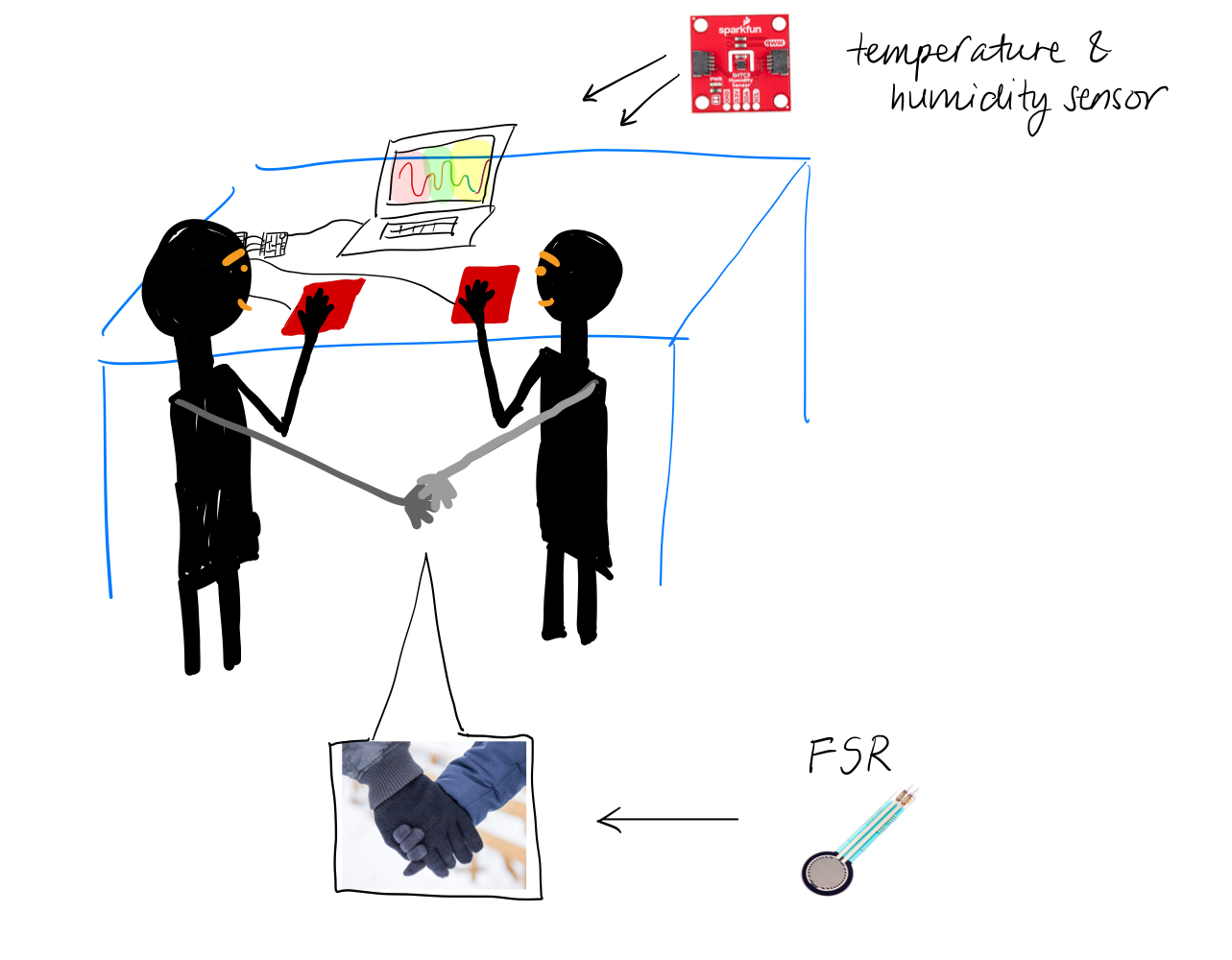
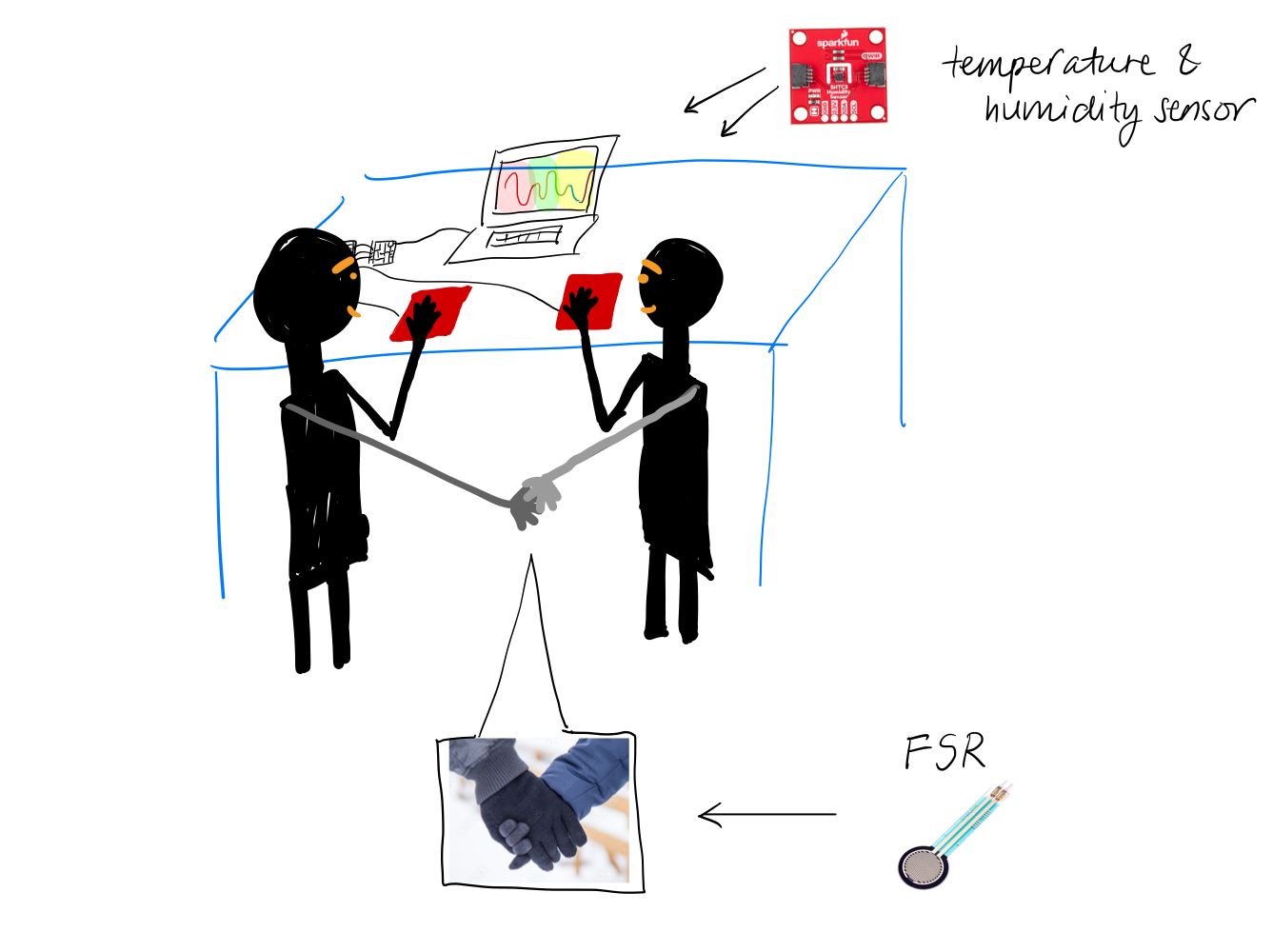
For my final project, I created an interactive art that aims to celebrate friendship and togetherness. The main idea of the art is that a tree branch appears from the 2 sides of the screen and grows towards each other; once they connect, a flower blooms. Consistent with the theme of togetherness, the project requires 2 people to hold hands together and the strength of their hold influences how fast the branches grow – force sensitive resistor (FSR) is sewed into a glove, which one person puts on and holds the other person’s hand with. With the free hands, each person puts a finger on the temperature sensor and the resulting reading from each sensor is mapped to a color (darkish pink = warm, light yellow = cool) and lerped together to generate a live color gradient for the background.
Implementation
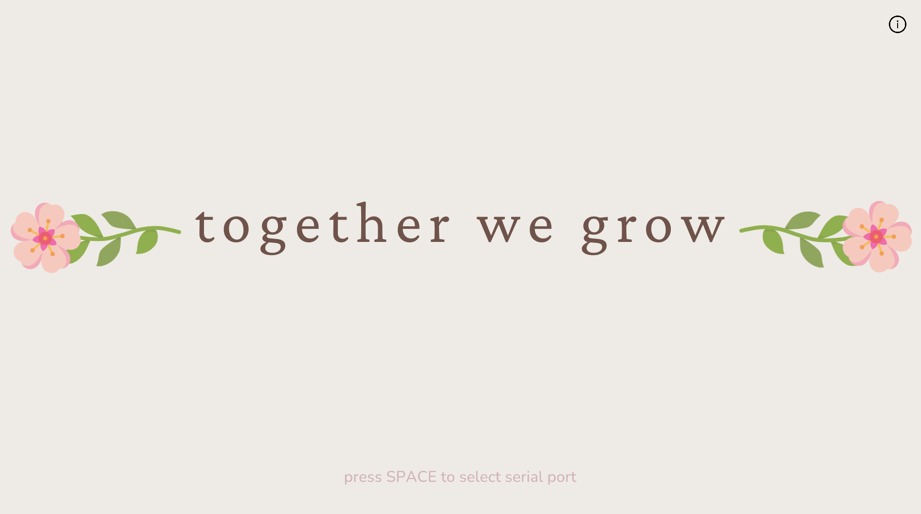
I wanted the user interface to be minimal but pretty, so the homepage, the instructions page and the main sketch are all designed to have minimal text and soft color palette.
homepage
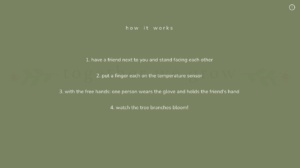
instructions page
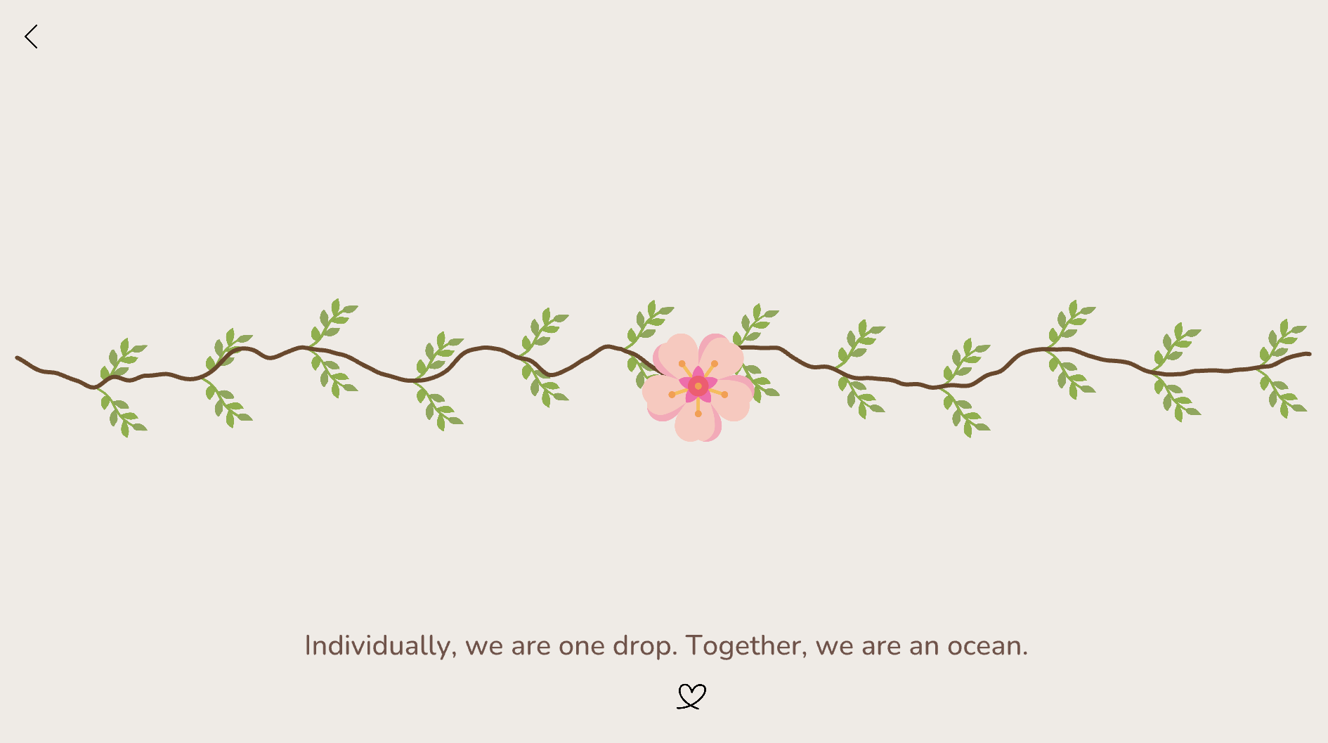
main sketch (after the branches have connected together)
At the end of the sketch after the branches connect, a quote about friendship and togetherness is randomly chosen from a text file and appears at the bottom of the screen.
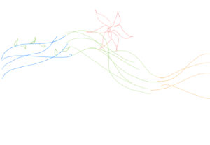
initial hand sketches
Interaction design
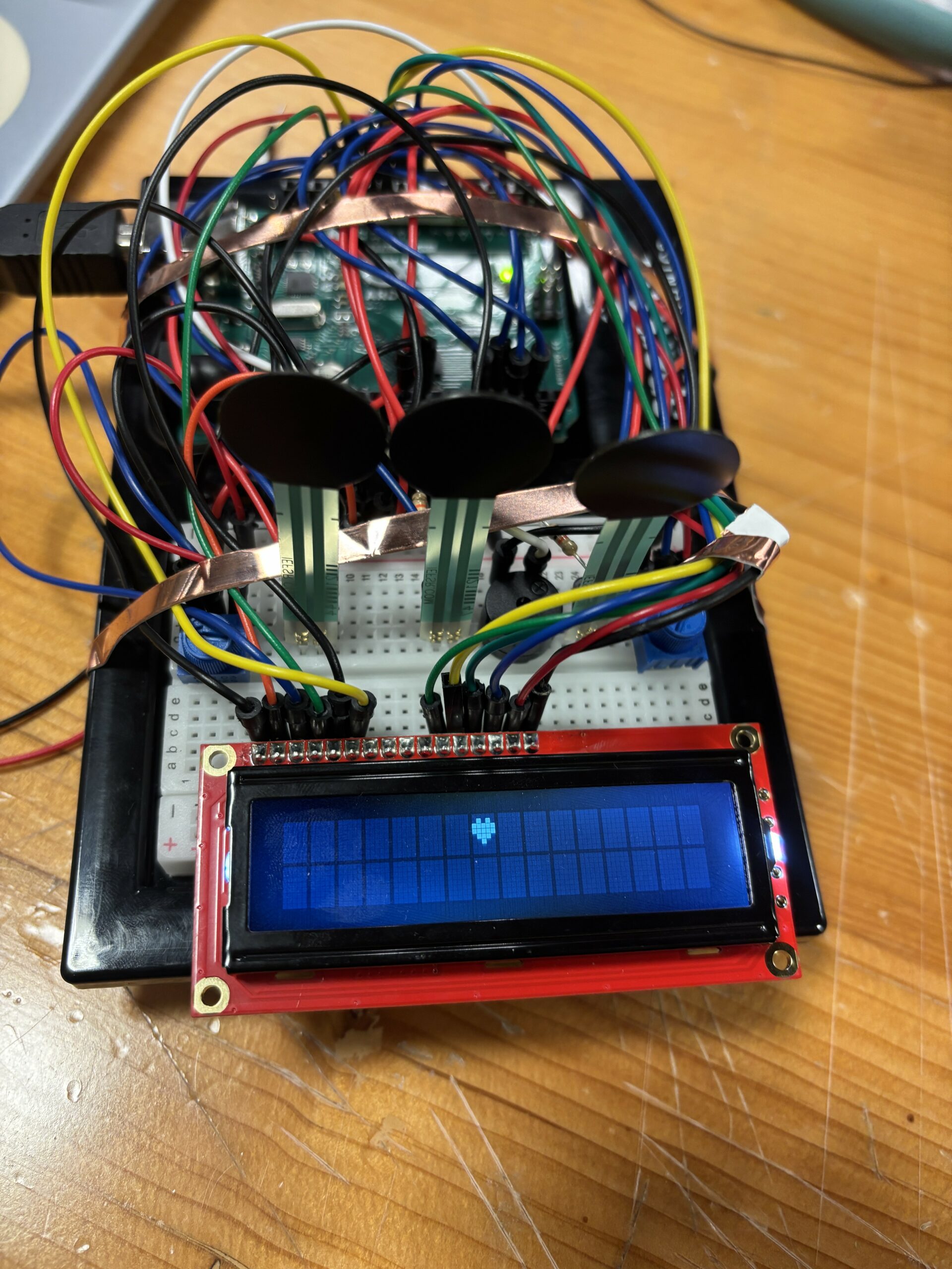
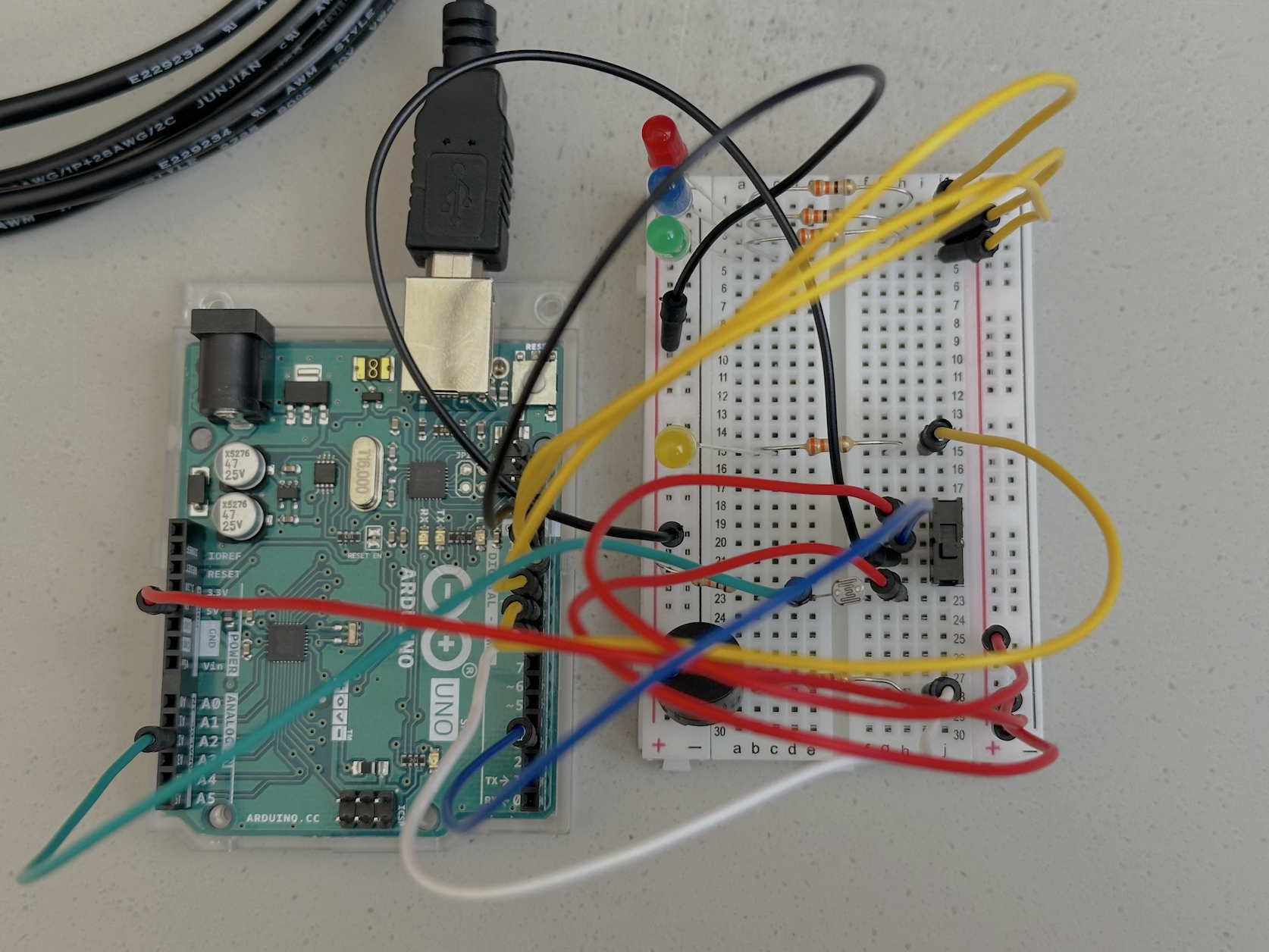
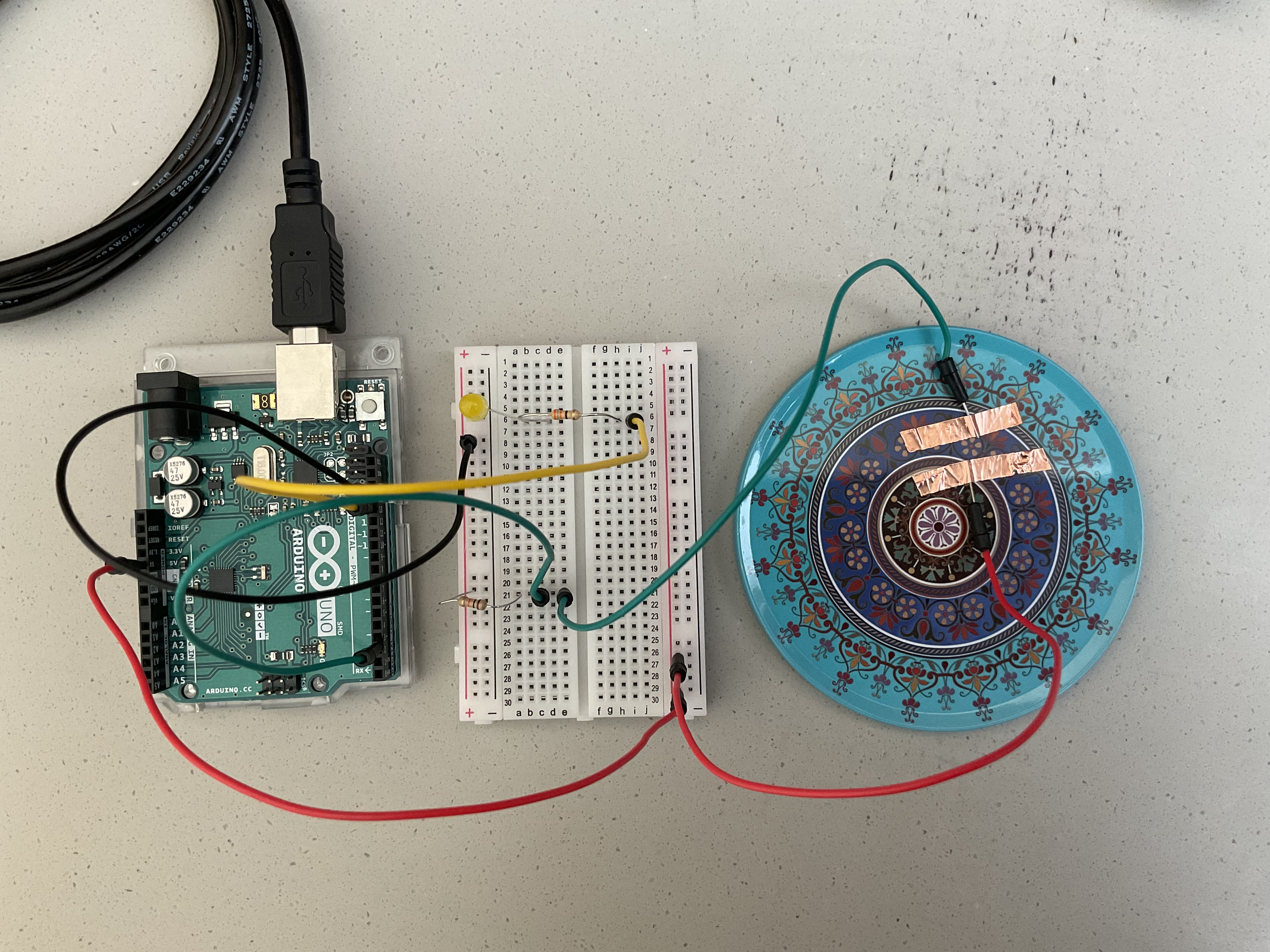
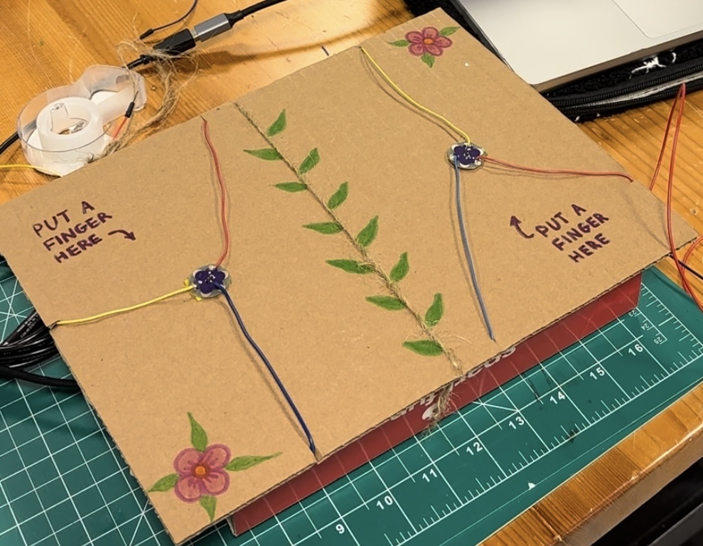
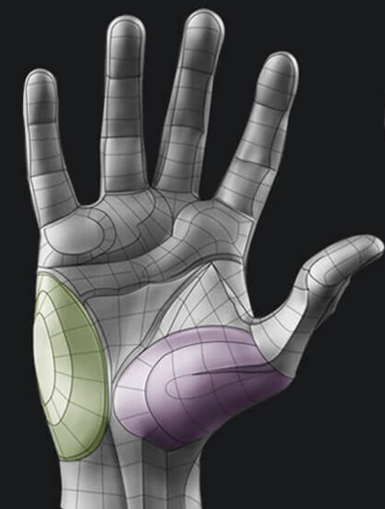
As the project is about friendship and togetherness, the interaction is designed to involve 2 people’s participation. I was initially using alligator clips for connecting the temperature sensors, but they felt very frail to the hands and got disconnected easily, so I soldered wires into both of the temperature sensors and taped them on top of a cardboard to make sure they are in place. As for the FSR, my very first idea was to place it inside a soft thin object so that the users can put it in between their palms and then hold hands. I could not think of a suitable and meaningful object to place the FSR, not to mention realized it would be strange to ask people to put a random object in between their holding hands. The best option seemed to be using a glove and attaching the FSR inside it. I tested different ways of holding hands and figured that the location where the contact point is highest when holding hands with another person is the purple area in the picture below. This is where I placed the FSR and sewed it on with a thread. During the IM showcase, some people held hands very very faintly, so I had to jump in and demonstrate how they should hold hands to ensure that force was being applied to the FSR. It made me realize that it may have been helpful if there was an image depiction of proper hand holds in the instructions page.
-
Arduino code
-
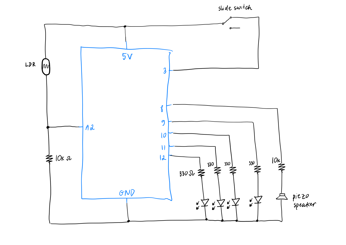
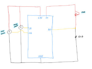
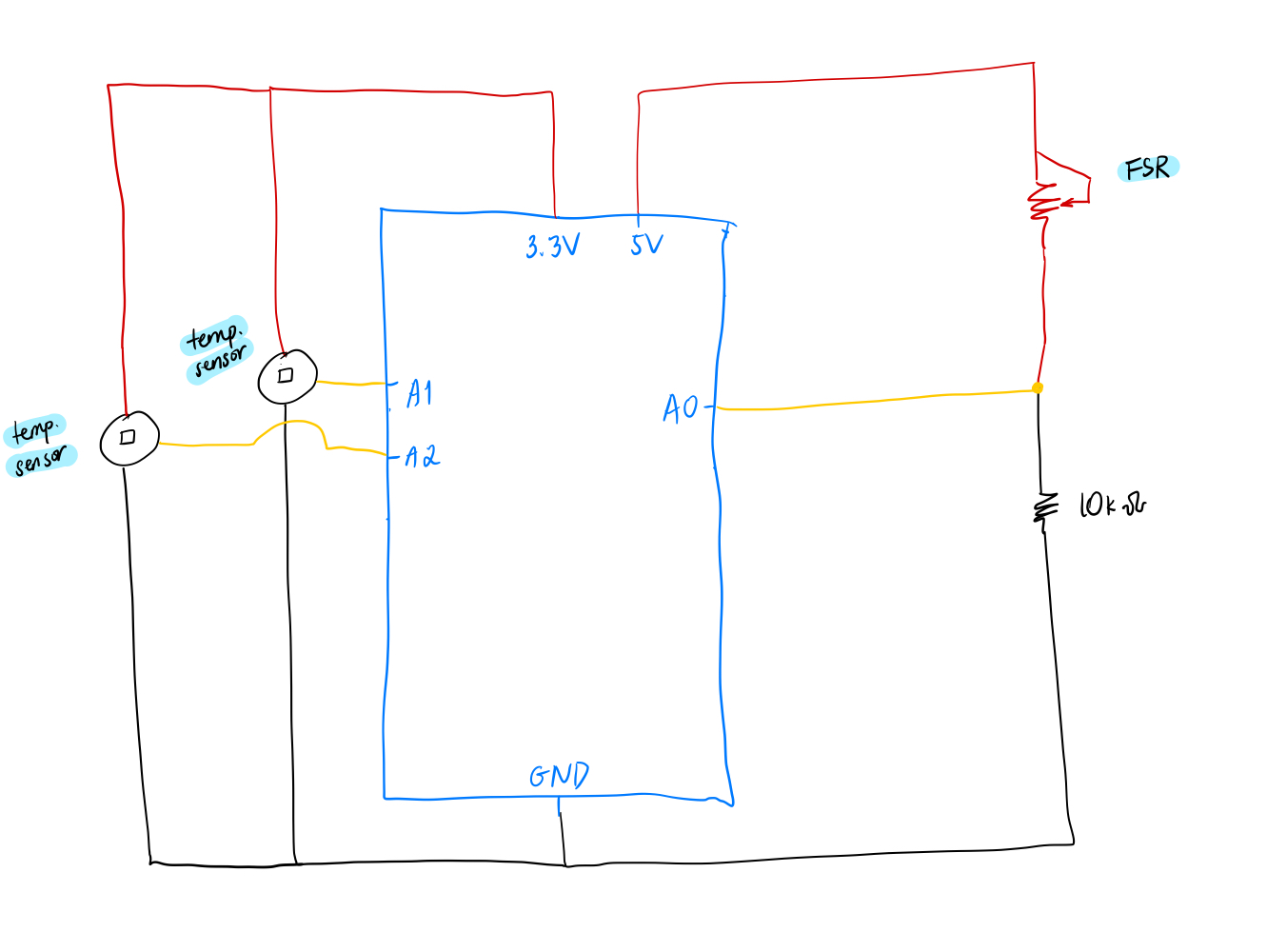
int fsrPin = A0;
int tempSensorPin = A1;
int tempSensor2Pin = A2;
int fsrReading;    // variable to store the FSR reading
float fsrVoltage;     // variable to store the voltage value
float tempSensorVoltage;
float tempSensorReading;
float temperature;
float tempSensor2Voltage;
float tempSensor2Reading;
float temperature2;

void setup() {
  // Start serial communication so we can send data
  // over the USB connection to our p5js sketch
  Serial.begin(9600);

  // We'll use the builtin LED as a status output.
  // We can't use the serial monitor since the serial connection is
  // used to communicate to p5js and only one application on the computer
  // can use a serial port at once.
  pinMode(LED_BUILTIN, OUTPUT);
}

void loop() {
  // read the FSR value (0–1023)
  fsrReading = analogRead(fsrPin);
  fsrVoltage = fsrReading * (5.0 / 1023.0);

  tempSensorReading = analogRead(tempSensorPin);
  // convert the analog reading to a voltage (0–5V)
  tempSensorVoltage = tempSensorReading * (5.0 / 1023.0);
  temperature = (tempSensorVoltage - 0.5) * 100.0;

  tempSensor2Reading = analogRead(tempSensor2Pin);
  // convert the analog reading to a voltage (0–5V)
  tempSensor2Voltage = tempSensor2Reading * (5.0 / 1023.0);
  temperature2 = (tempSensor2Voltage - 0.5) * 100.0;

  // send the FSR reading and 2 temperatures to p5.js
  Serial.print(fsrReading);
  Serial.print(",");
  Serial.print(temperature);
  Serial.print(",");
  Serial.println(temperature2);

  // blink the built-in LED to show activity
  digitalWrite(LED_BUILTIN, HIGH);
  delay(100);
  digitalWrite(LED_BUILTIN, LOW);

  delay(200);
}
Circuit
-
 p5.js code
// interface variables
let homepageImg, backButtonImg, infoButtonImg, infoButtonWhiteImg, gloveImg, sensorImg;
let ambienceSound, endingSound;
let backButtonX = 20;
let backButtonY = 20;
let backButtonW = 20;
let backButtonH = 20;
let infoButtonX = 920;
let infoButtonY = 20;
let infoButtonW = 20;
let infoButtonH = 20;
let fontNunito, fontNunitoLight;
// transparency variable for the fading start text
let alphaValue = 0;
// variable used for the fade effect of the start text
let fadeDirection = 1;
let c;
let startMsgColor = "#c27e85";
let titleColor = "#745248";
let instructionsBoxColor = "#738059";
let backgroundColor = "#F0EBE5";
let vizOver = true;
let vizStarted = false;
let instructionsOn = false;
let endingSoundPlayed = false;
let ambienceSoundPlaying = false;
let homePage;
let viz;

// illustration variables
let branchGrowth = 0.1;
let maxGrowth;
let leafGrowth;
// for tracking if the branches have connected at the center
let connected = false;
// for storing the coordinates of left branch points
let leftPoints = [];
// for storing the coordinates of right branch points
let rightPoints = [];
let leafImg;
let leadImgFlipped;
let temperature_1;
let temperature_2;
let quotes = [];
let chosenQuote = "";

// arduino variables
let fsrValue = 0;
let temperature = 0;
let temperature2 = 0;
let arduinoConnected = false;

// map the sensor readings to a different range
function mapVals(sensorType, val) {
  // map temperature to colors
  if (sensorType == "temperature") {
    // lowest reading on the temp sensor was 18
    // highest reading on the temp sensor was 29
    // so these are mapped to a number on a wider scale
    // to ensure that the background color changes are more visible/stronger
    return map(val, 18, 30, 1, 38);
  // map fsr reading to branchGrowth
  } else if (sensorType == "fsr") {
    // bound the branch growth to maximum 0.5 to make sure that
    // the visualization doesn't end too quickly
    return map(val, 0, 1023, 0.1, 0.5);
  }
}

function preload() {
  homepageImg = loadImage("/assets/homepage.png");
  backButtonImg = loadImage("/assets/left.png");
  infoButtonImg = loadImage("/assets/information.png");
  infoButtonWhiteImg = loadImage("/assets/information_white.png");
  fontNunito = loadFont("/fonts/Nunito-Medium.ttf");
  fontNunitoLight = loadFont("/fonts/Nunito-Light.ttf");
  leafImg = loadImage("/assets/nature.png");
  leafImgFlipped = loadImage("/assets/nature_flipped.png");
  flowerImg = loadImage("/assets/flower.png");
  gloveImg = loadImage("/assets/glove.png");
  sensorImg = loadImage("/assets/sensor.png");
  ambienceSound = loadSound("/sounds/ambience_long.mp3");
  endingSound = loadSound("/sounds/ending.mp3");
  quotes = loadStrings("/assets/quotes.txt");
  heartImg = loadImage("/assets/heart.png");
}

function setup() {
  createCanvas(960, 540);
  background(0);

  homePage = new HomePage();
  viz = new Visualization();

  // each branch can only grow for a length that's half of the screen
  maxGrowth = width / 2;
  chosenQuote = random(quotes);
}

class HomePage {
  constructor() {
  }

  display() {
    image(homepageImg, 0, 0, width, height);
    image(infoButtonImg, infoButtonX, infoButtonY, infoButtonW, infoButtonH);
    // fade effect on the "Press Enter to start" text
    // by varying the transparency
    alphaValue += fadeDirection * 3;
    if (alphaValue >= 255 || alphaValue <= 0) {
      fadeDirection *= -1;
    }

    push();
    textAlign(CENTER);
    textFont(fontNunito);
    textSize(16);
    c = color(startMsgColor);
    c.setAlpha(alphaValue);
    fill(c);
    // ask user to select serial port first
    if (!arduinoConnected) {
        text("press SPACE to select serial port", width / 2, 500);
    // once serial port selected, show a different text
    } else {
        text("press ENTER to start", width / 2, 500);
    }
    pop();
  }

  showInstructions() {
    this.display();
    let c = color(instructionsBoxColor);
    c.setAlpha(245);
    fill(c);
    noStroke();
    rect(0, 0, width, height);
    image(
      infoButtonWhiteImg,
      infoButtonX,
      infoButtonY,
      infoButtonW,
      infoButtonH
    );

    // instructions text
    push();
    textAlign(CENTER);
    textFont(fontNunito);
    textSize(16);
    fill(color(backgroundColor));
    text("h o w    i t    w o r k s", width / 2, 100);
    text(
      "1. have a friend next to you and stand facing each other",
      width / 2,
      200
    );
    text("2. put a finger each on the temperature sensor", width / 2, 250);
    text(
      "3. with the free hands: one person wears the glove and holds the friend's hand",
      width / 2,
      300
    );
    text("4. watch the tree branches bloom!", width / 2, 350);
    pop();
  }
}

class Visualization {
  constructor() {
  }

  start() {
    // play the ambience sound if it's not playing
    if (!ambienceSoundPlaying) {
      ambienceSound.play();
      // use a boolean variable to ensure it's only played once
      ambienceSoundPlaying = true;
    }

    // stop the sound if visualization is over
    if (connected || vizOver) {
      ambienceSound.stop();
    }

    noStroke();

    // map the temp sensor readings
    temperature_1 = mapVals("temperature", temperature);
    temperature_2 = mapVals("temperature", temperature2);
    // map each person's temperature to colors
    let color1 = mapTempToColor(temperature_1);  // color for person 1
    let color2 = mapTempToColor(temperature_2);  // color for person 2

    // smooth gradient blending between the two temperatures
    for (let x = 0; x < width; x++) {
      // lerp factor based on x position (left to right transition)
      let lerpFactor = map(x, 0, width, 0, 0.5);

      // blend between color1 and color2
      let col = lerpColor(color1, color2, lerpFactor);

      // apply the color vertically to the canvas
      stroke(col);
      line(x, 0, x, height);  // vertical lines for smooth gradient
    }

    // go back to homepage button
    image(backButtonImg, backButtonX, backButtonY, backButtonW, backButtonH);

    // map fsr reading
    let growthSpeed = mapVals("fsr", fsrValue);
    // use the mapped fsr value to grow the branch
    branchGrowth += growthSpeed;

    if (branchGrowth < maxGrowth) {
      // introduce noise to left branch
      let noiseOffsetLeftBranch = branchGrowth * 0.01;
      // introduce noise to right branch
      // slightly change the noise offset so that branches don't grow symmetrically and instead looks different
      let noiseOffsetRightBranch = branchGrowth * 0.01 + 1000;

      // generate x, y coordinates for points for both branches
      let yLeft = height / 2 + map(noise(noiseOffsetLeftBranch), 0, 1, -40, 40);
      let yRight =
        height / 2 + map(noise(noiseOffsetRightBranch), 0, 1, -40, 40);
      let xLeft = branchGrowth;
      let xRight = width - branchGrowth;

      // once the branches are nearing the center, reduce the noise and make them remain near the horizontal middle of the canvas to ensure they connect everytime
      let easingZone = 30;
      if (branchGrowth > maxGrowth - easingZone) {
        let amt = map(branchGrowth, maxGrowth - easingZone, maxGrowth, 0, 1);
        yLeft = lerp(yLeft, height / 2, amt);
        yRight = lerp(yRight, height / 2, amt);
      }

      // add the points to the array
      leftPoints.push({
        pos: createVector(xLeft, yLeft),
        // randomly decide if the leaf will be growing on the top or on the bottom
        flip: int(random(2))
});
      rightPoints.push({
        pos: createVector(xRight, yRight),
        flip: int(random(2))
});
    } else if (!connected) {
      connected = true;

      // play the ending sound if the branches have connected
      if (!endingSoundPlayed) {
        endingSound.play();
        endingSoundPlayed = true;
      }
    }

    // draw branches
    push();
    strokeWeight(3);
    stroke(110, 70, 40); // brown
    noFill();

    beginShape();
    // draw the left branch
    for (let ptObj of leftPoints) {
      let pt = ptObj.pos;
      vertex(pt.x, pt.y);

      // for every 75th x coordinate, draw an image of a leaf
      // position of leaf is stored in the flip attribute
      if (int(pt.x) % 75 == 0) {
        if (ptObj.flip === 0) {
          image(leafImgFlipped, pt.x, pt.y - 2, 40, 40);
        } else {
          image(leafImg, pt.x, pt.y - 37, 40, 40);
        }
      }
    }
    endShape();

    // draw the right branch
    beginShape();
    for (let ptObj of rightPoints) {
      let pt = ptObj.pos;
      vertex(pt.x, pt.y);

      if (int(pt.x) % 75 == 0) {
        if (ptObj.flip === 0) {
          image(leafImgFlipped, pt.x, pt.y - 2, 40, 40);
        } else {
          image(leafImg, pt.x, pt.y - 37, 40, 40);
        }
      }
    }
    endShape();
    pop();

    let leftEnd = leftPoints[leftPoints.length - 1].pos;
    let rightEnd = rightPoints[rightPoints.length - 1].pos;

    let d = dist(leftEnd.x, leftEnd.y, rightEnd.x, rightEnd.y);

    // determine if the branches have connected by finding the distance between the 2 branch end points and checking if it's less than 5
    if (d < 5) {
      push();
      rectMode(CENTER);
      image(flowerImg, leftEnd.x - 15, (leftEnd.y - 30), 80, 80);

      // console.log(chosenQuote);

      // show the quote
      if (chosenQuote !== "") {
        textAlign(CENTER, CENTER);
        textFont(fontNunito);
        textSize(20);
        fill(titleColor);
        text(chosenQuote, width / 2, height - 80);
      }

      // heart image at the bottom of the quote
      image(heartImg, width / 2, height - 60, 40, 40);
      pop();
    }
  }
}

function draw() {
  if (instructionsOn) {
    homePage.showInstructions();
  } else if (!vizStarted || vizOver) {
    homePage.display();
  } else {
    viz.start();
  }
  // print(mouseX + "," + mouseY);
}

// map temperature to color which will be used to control the color of the background
function mapTempToColor(temp) {
  let coolColor = color("#F0EBE5");
  let warmColor = color("#dea0a6");

  // lerp the light yellow color with the dark pink color based on the temperature
  return lerpColor(coolColor, warmColor, map(temp, 1, 38, 0, 1));
}

function readSerial(data) {
  ////////////////////////////////////
  //READ FROM ARDUINO HERE
  ////////////////////////////////////

  if (data != null) {
    let fromArduino = split(trim(data), ",");
    // if the right length, then proceed
    if (fromArduino.length == 3) {
      fsrValue = int(fromArduino[0]);
      temperature = int(fromArduino[1]);
      temperature2 = int(fromArduino[2]);
    }
    //////////////////////////////////
    //SEND TO ARDUINO HERE (handshake)
    //////////////////////////////////
    // let sendToArduino = left + "," + right + "\n";
    // writeSerial(sendToArduino);
  }
}

function keyPressed() {
  // if the enter key is pressed, reset state and start the visualization
  if (keyCode === ENTER) {
    if (vizOver && !instructionsOn) {
      // reset visualization state
      branchGrowth = 20;
      leftPoints = [];
      rightPoints = [];
      connected = false;
      ambienceSoundPlaying = false;
      endingSoundPlayed = false;
      chosenQuote = random(quotes);
      vizStarted = true;
      vizOver = false;
    }
  }

  // if space is pressed, setup serial communication
  if (key == " ") {
    setUpSerial();
    arduinoConnected = true;
  }
}

function mousePressed() {
  // if mouse is pressed on the < button, go back to the homepage
  if (
    mouseX >= backButtonX &&
    mouseX <= backButtonX + backButtonW &&
    mouseY >= backButtonY &&
    mouseY <= backButtonY + backButtonH
  ) {
    vizOver = true;
    ambienceSound.stop();
    vizStarted = false; // Reset visualization state when returning to homepage
    console.log("back button pressed");
  // if mouse if pressed on the information button, show the instructions page
  } else if (
    mouseX >= infoButtonX &&
    mouseX <= infoButtonX + backButtonW &&
    mouseY >= infoButtonY &&
    mouseY <= infoButtonY + backButtonH
  ) {
    instructionsOn = !instructionsOn;
    console.log("info button pressed");
  }
}
-
Communication between Arduino and p5.js
3 readings from Arduino (2 temperature sensors and 1 FSR) are sent in a X,Y,Z format with commas separating them to p5.js using serial communication. The p5.js code then maps these values to their respective values for color and speed. I could not think of meaningful data to send from p5.js to Arduino that doesn’t just send data for the sake of having a two-way communication. I considered using the LCD to show text (names of the users, reading values etc), buzzer to play music, but as professor mentioned in our chat on the initial evaluation day, these things can be done on the screen as well and does specifically require to be implemented on the hardware. Thus, I decided to continue using Arduino as input only and I think it worked well at the end.
Reflection and Proud Moments
I like how the p5.js interface and the hardware interface ended up looking from a visual standpoint. I put an effort into choosing the visual assets, the fonts and the different colors I used across the sketch to create a coherent visual experience that is simple yet visually pleasing to look at, and I was very happy when people complimented on it! I decorated the cardboard casing covering the Arduino to match the artwork by drawing leaves and flowers, and I think that turned out successfully as well.
For the p5.js artwork, it was tricky to connect the 2 branches every time. The way the drawing of the branches work is that a variable, called branchGrowth, increases every frame, and its speed is determined by the FSR reading. For each new value of branchGrowth, the code calculates a new point for the left and right branches. To ensure that the branches look organic and not like a straight line, Perlin noise (noise(…)) is introduced to create smooth vertical variation in the branches. As each point of the branch is generated randomly (to a certain degree), unless the last segment of each branch was somehow smoothed out and maintained near the horizontal middle, the 2 branches always ended up at different heights. To solve this issue, I eased the y values of both branches toward the center as they approached close each other. This helped to make the branch growth to appear organic but also controlled so that they connected every time.
Overall, I had a lot of fun working on this project and it was a genuinely rewarding experience watching people’s reactions and seeing how they interact with the piece (including finding some loopholes!). I am glad I stuck with the interactive artwork idea and the theme of togetherness, because I got to see some cute interactions of friends who tried out my project <3
Future Improvements
If I were to continue with the project and develop it further, I think I would explore ways of adding more physical components (other than sensors) that people could interact with. One example could be a flower that blooms when the branches meet by using a servo motor. I would also make improvements to the instructions page because it seemed like people didn’t easily see that there was an info button. Even when they did see the button and press on it, there was a tendency for people to take a quick glance at it and head straight into starting the sketch.