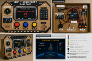
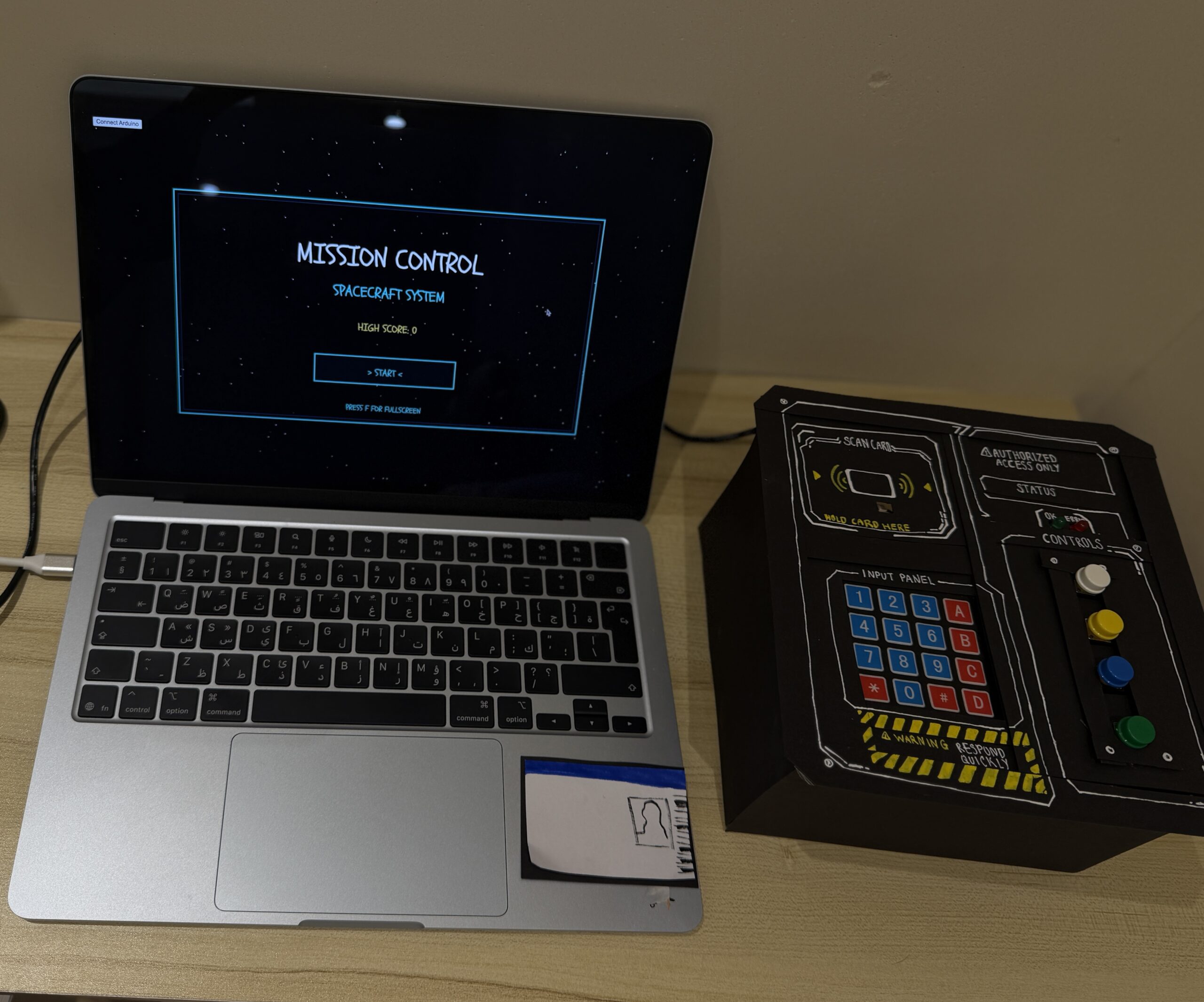
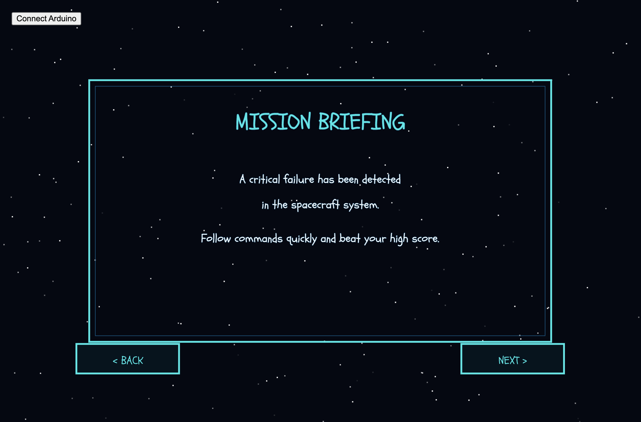
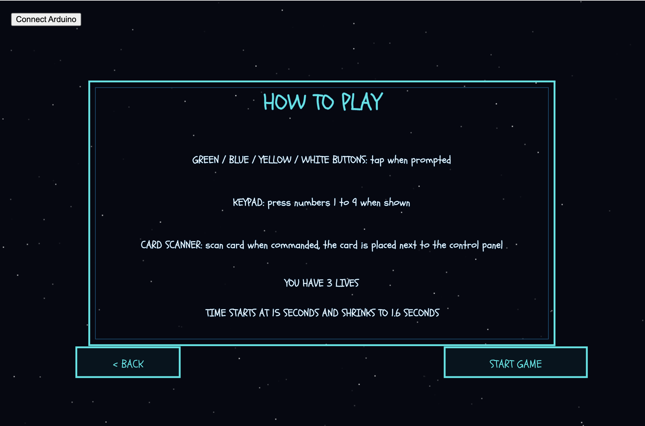
1.Concept
This project is a fast reaction game where the user controls a spacecraft without seeing the controls directly. The screen gives instructions like “press red, “flip switch,” or actions using Arduino sensors like “cover the light sensor” or “move closer.” The user has to read the command and quickly do the action on a physical console. It’s timed, so you need to react fast and accurately. If you’re right, the game continues, and if not, you lose. The idea is to make simple actions feel intense and engaging using both physical controls and sensor based interaction.
The idea for this project came from two places. First, Project Hail Mary inspired the feeling of controlling something important without fully seeing or understanding the whole system, just like how the main character has to react quickly and solve problems using limited tools. Second, the game Bop It influenced the fast‑reaction style of the gameplay. I liked how Bop It gives quick commands and forces the player to respond immediately, and I wanted to bring that same energy into a physical console using Arduino sensors and buttons.
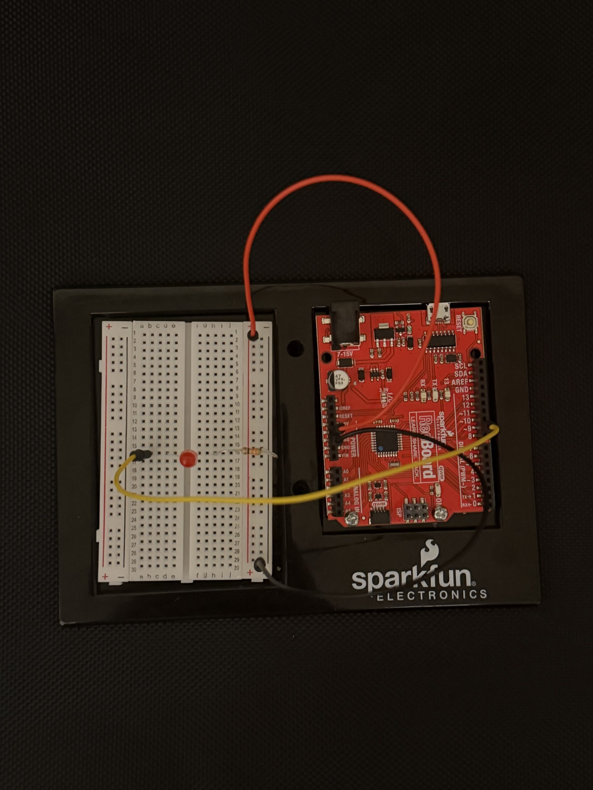
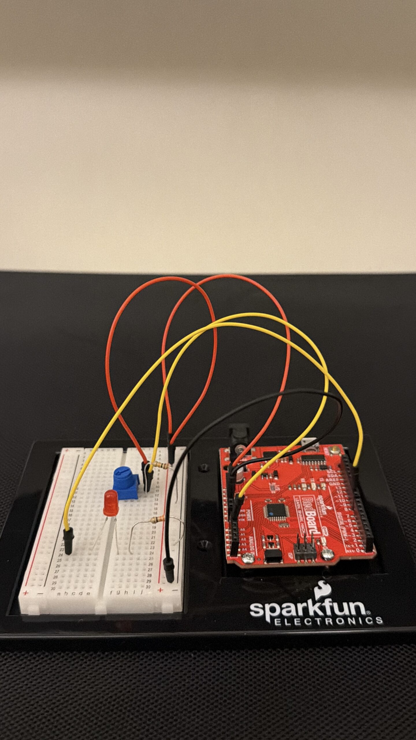
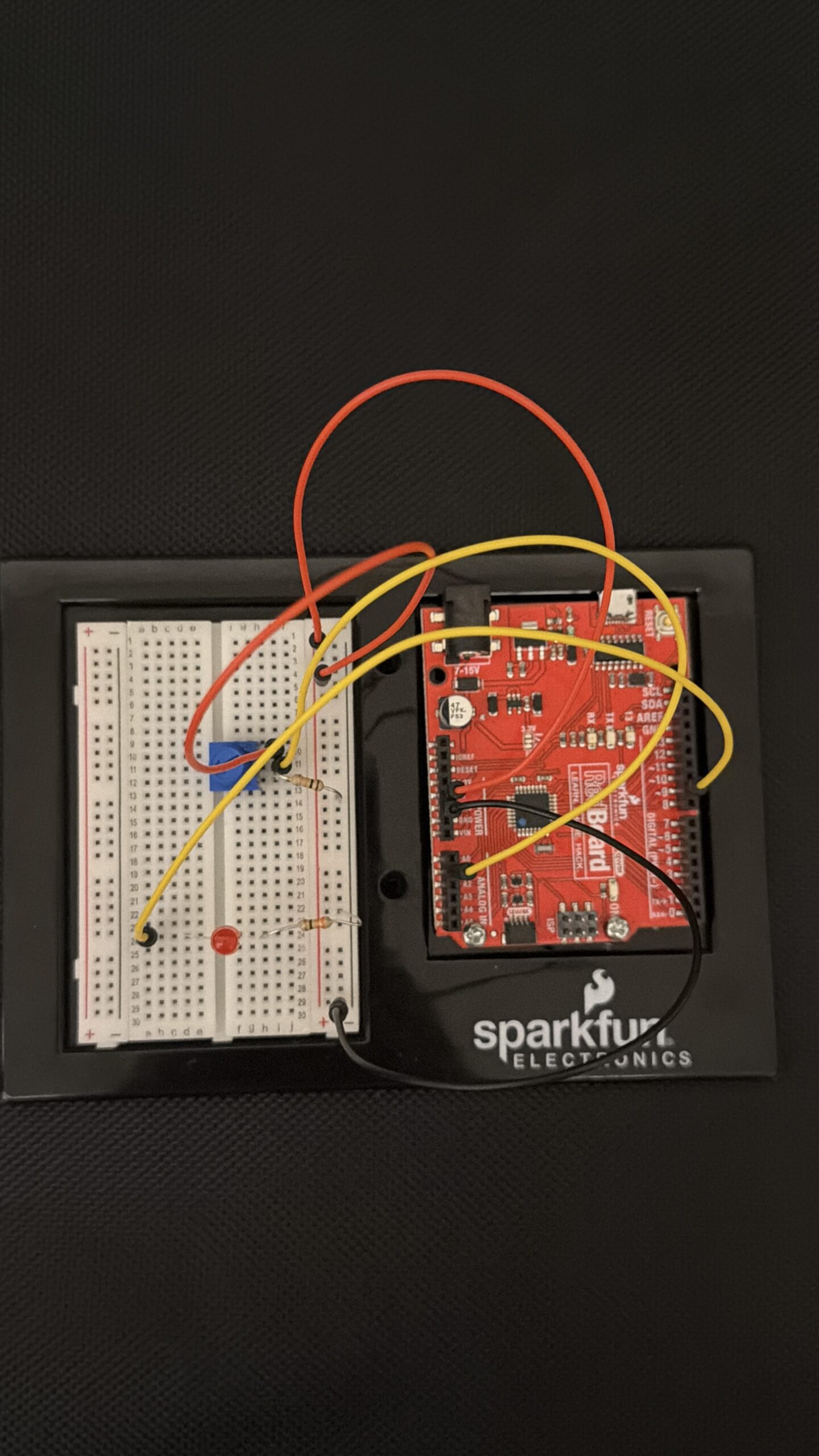
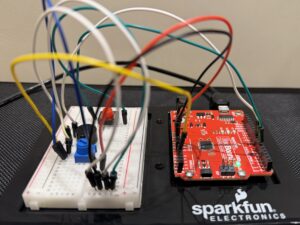
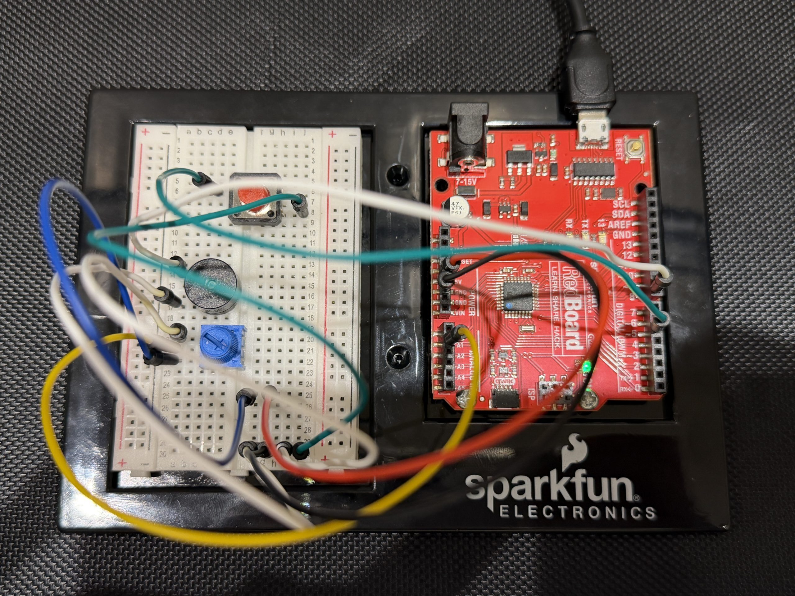
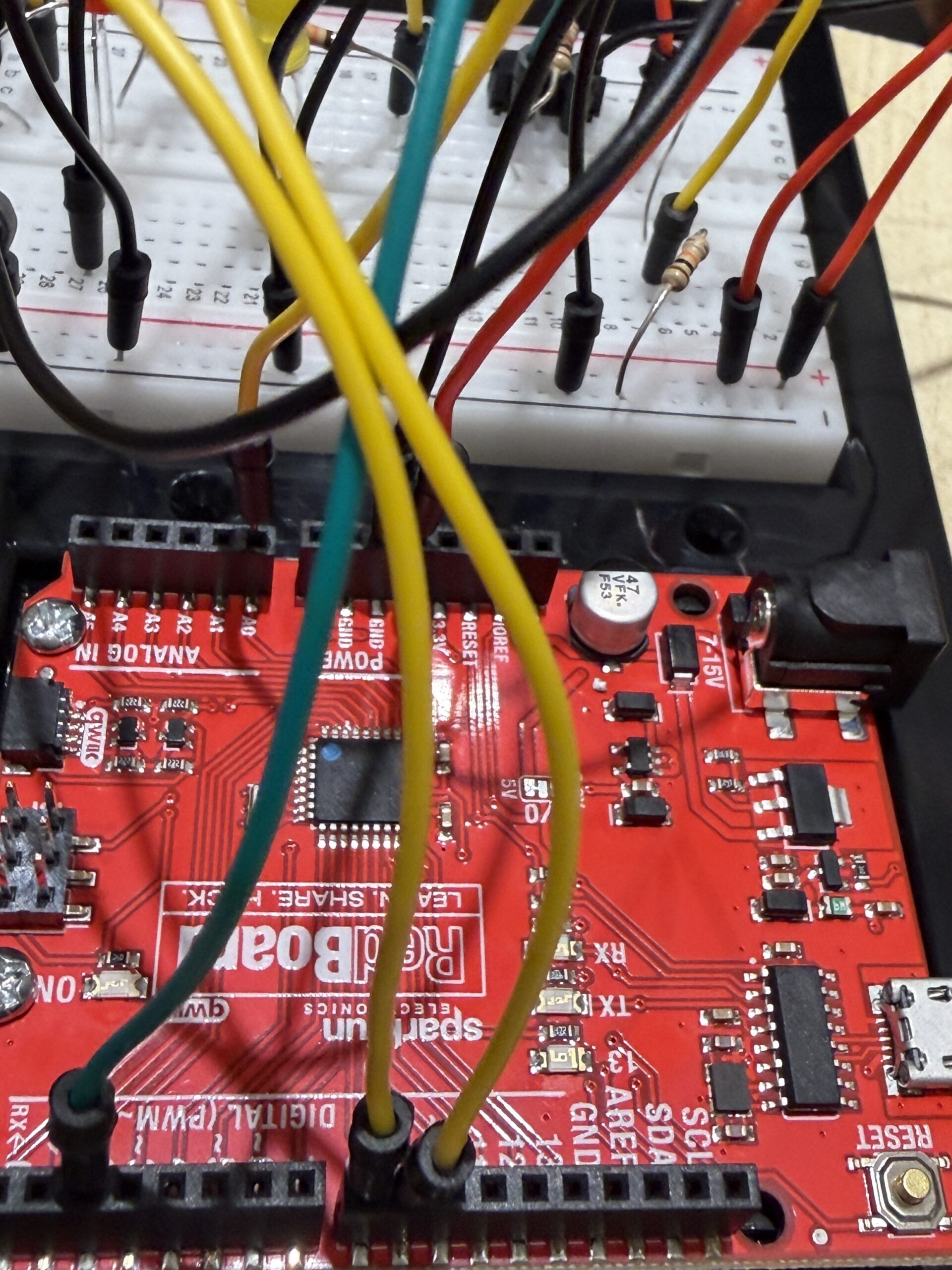
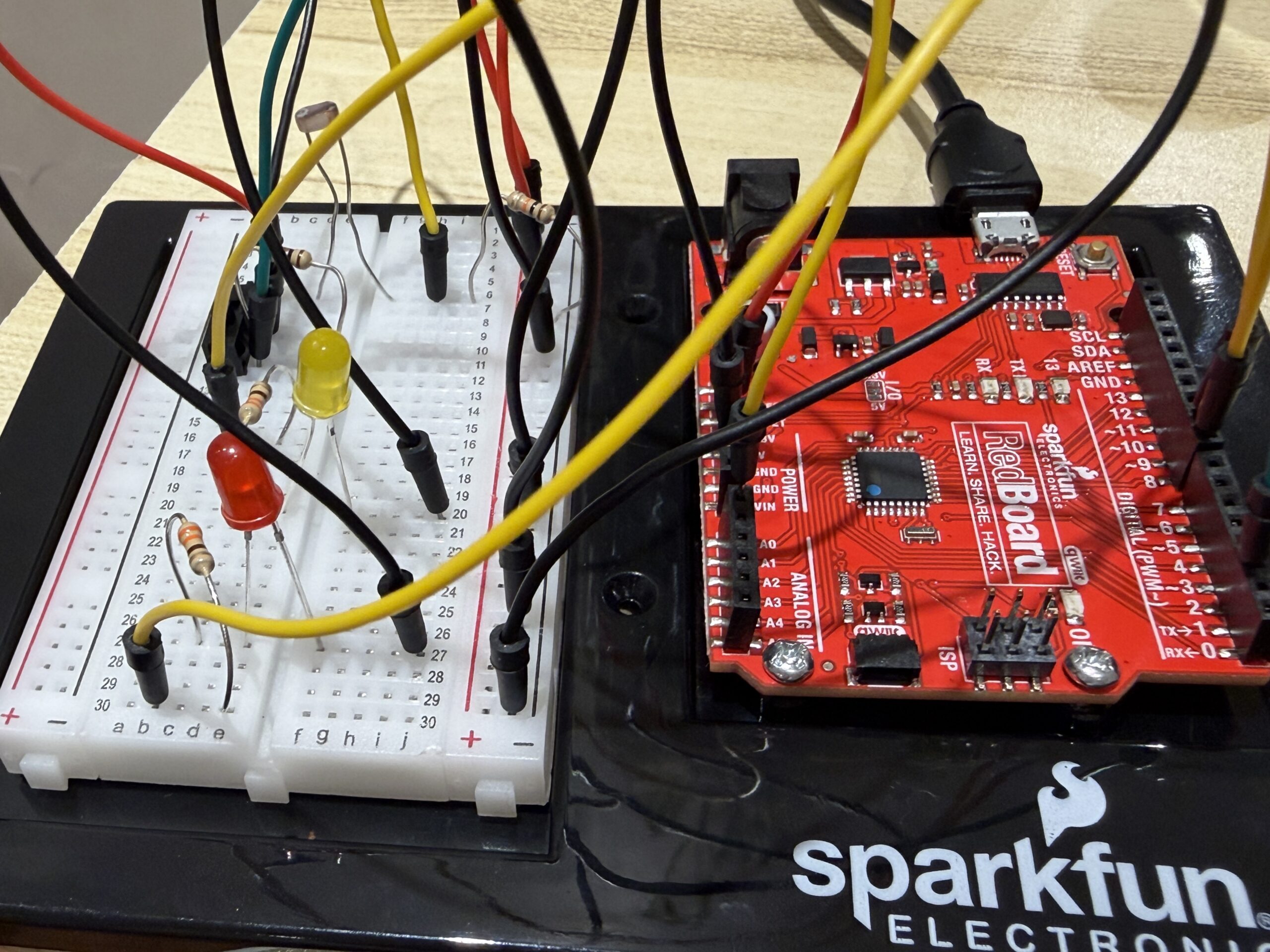
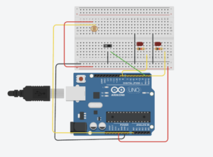
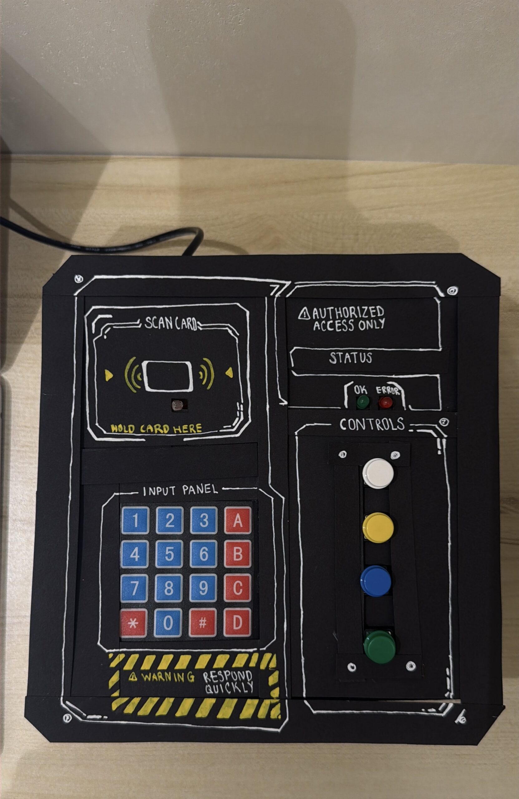
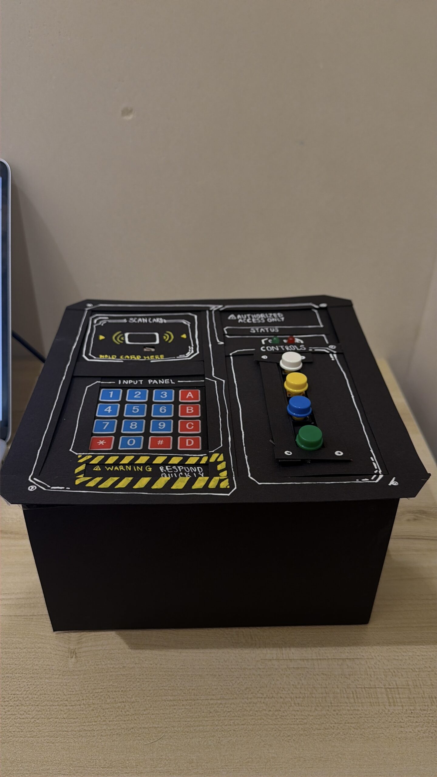
2. Images/videos of project
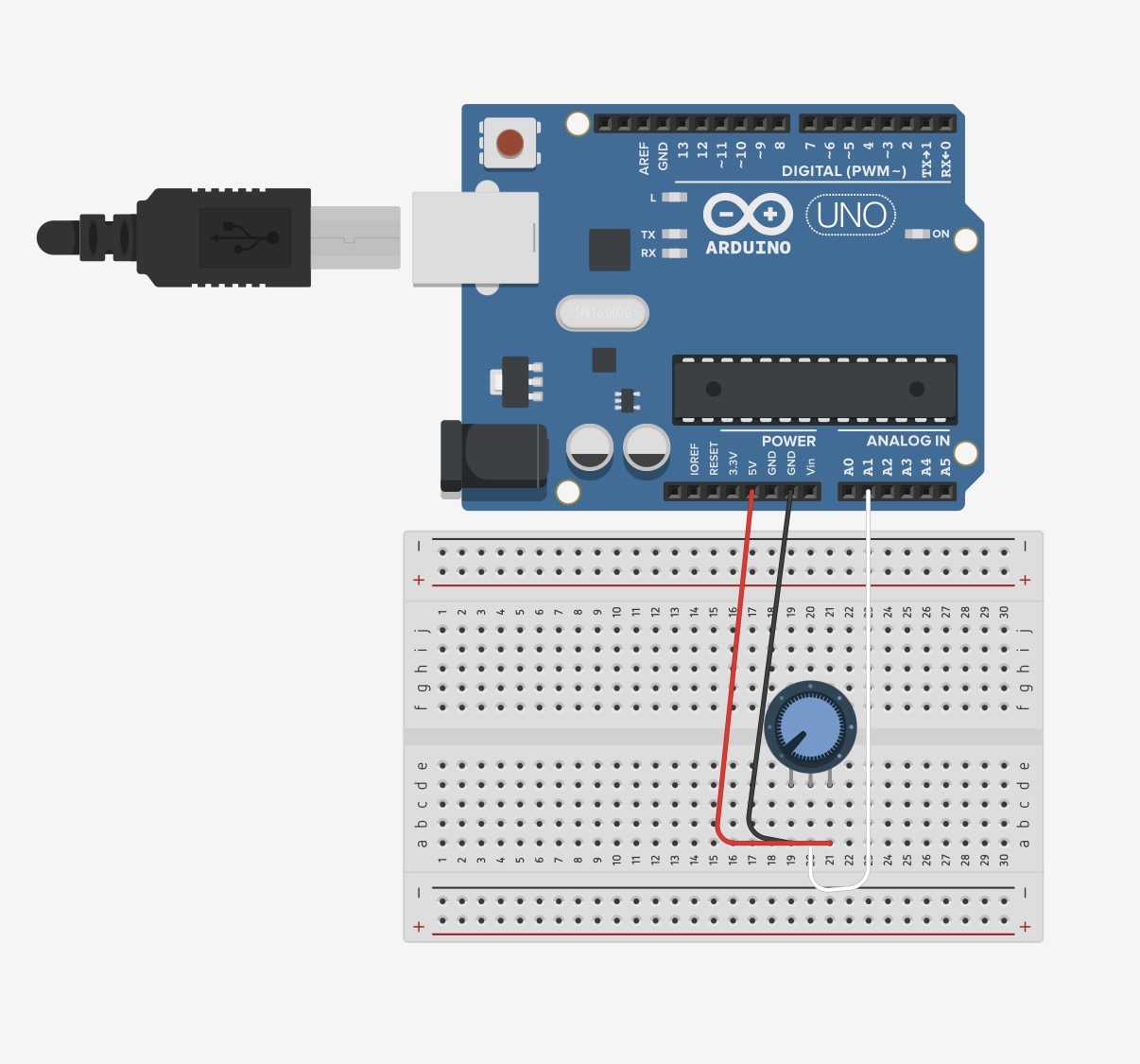
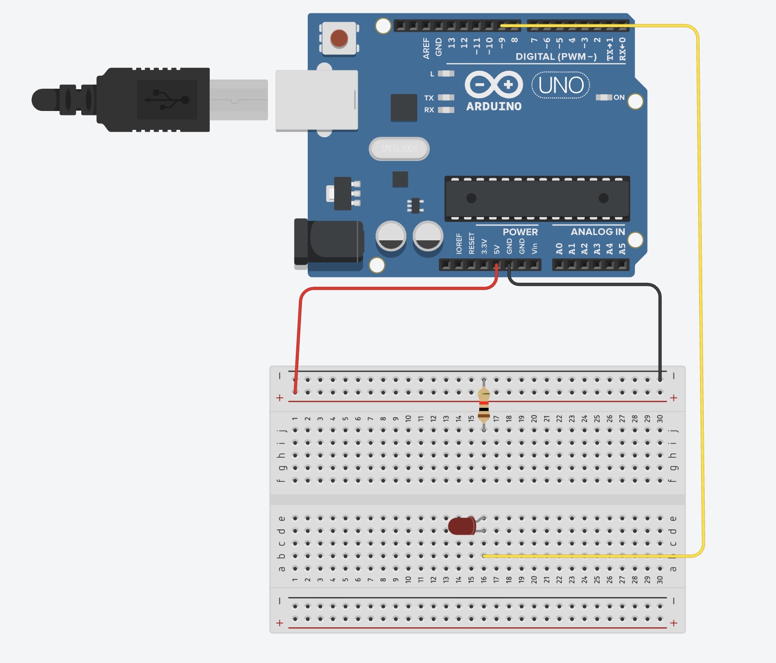
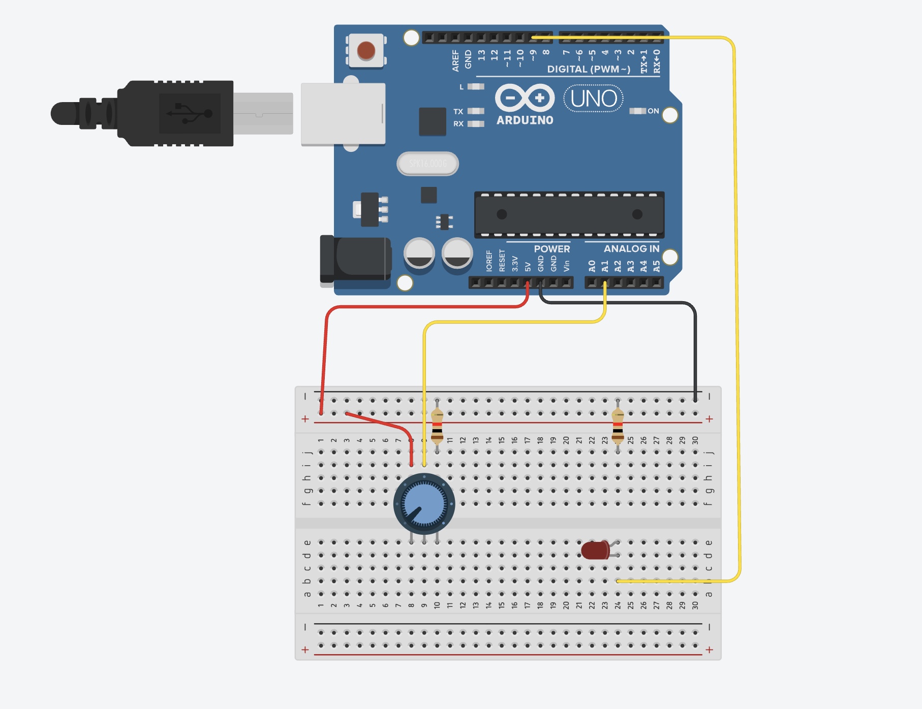
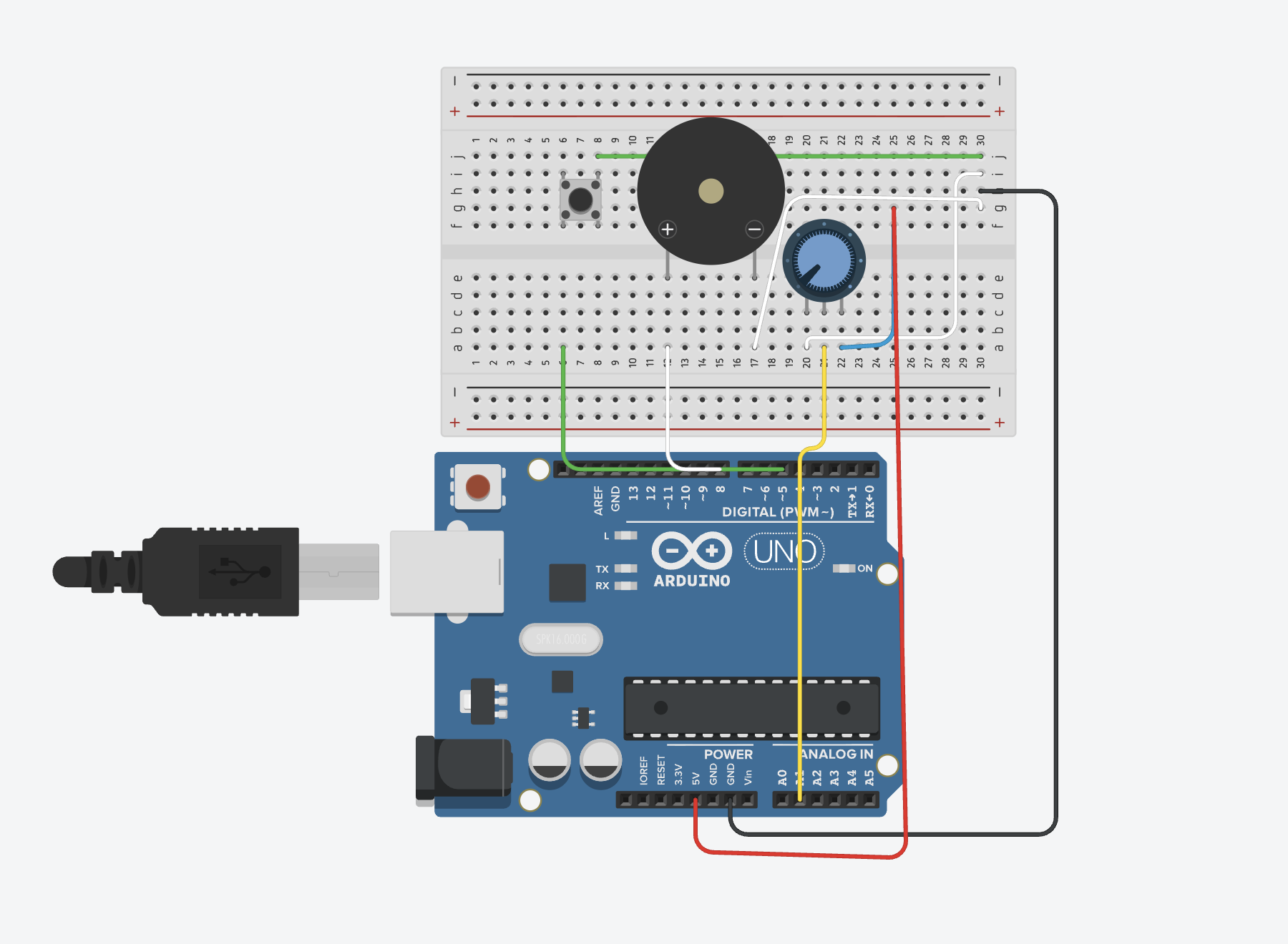
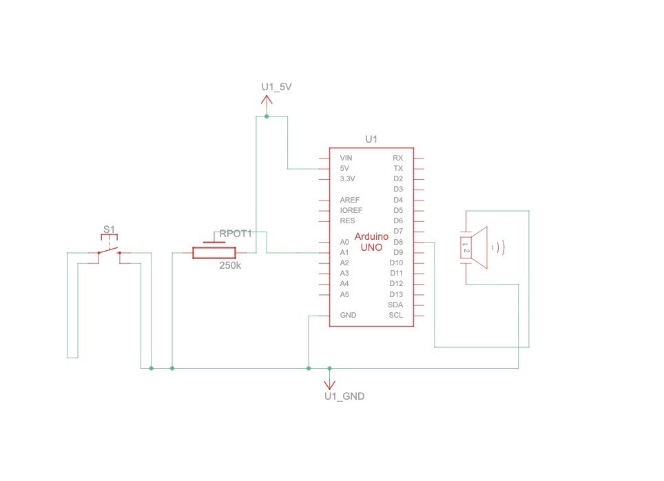
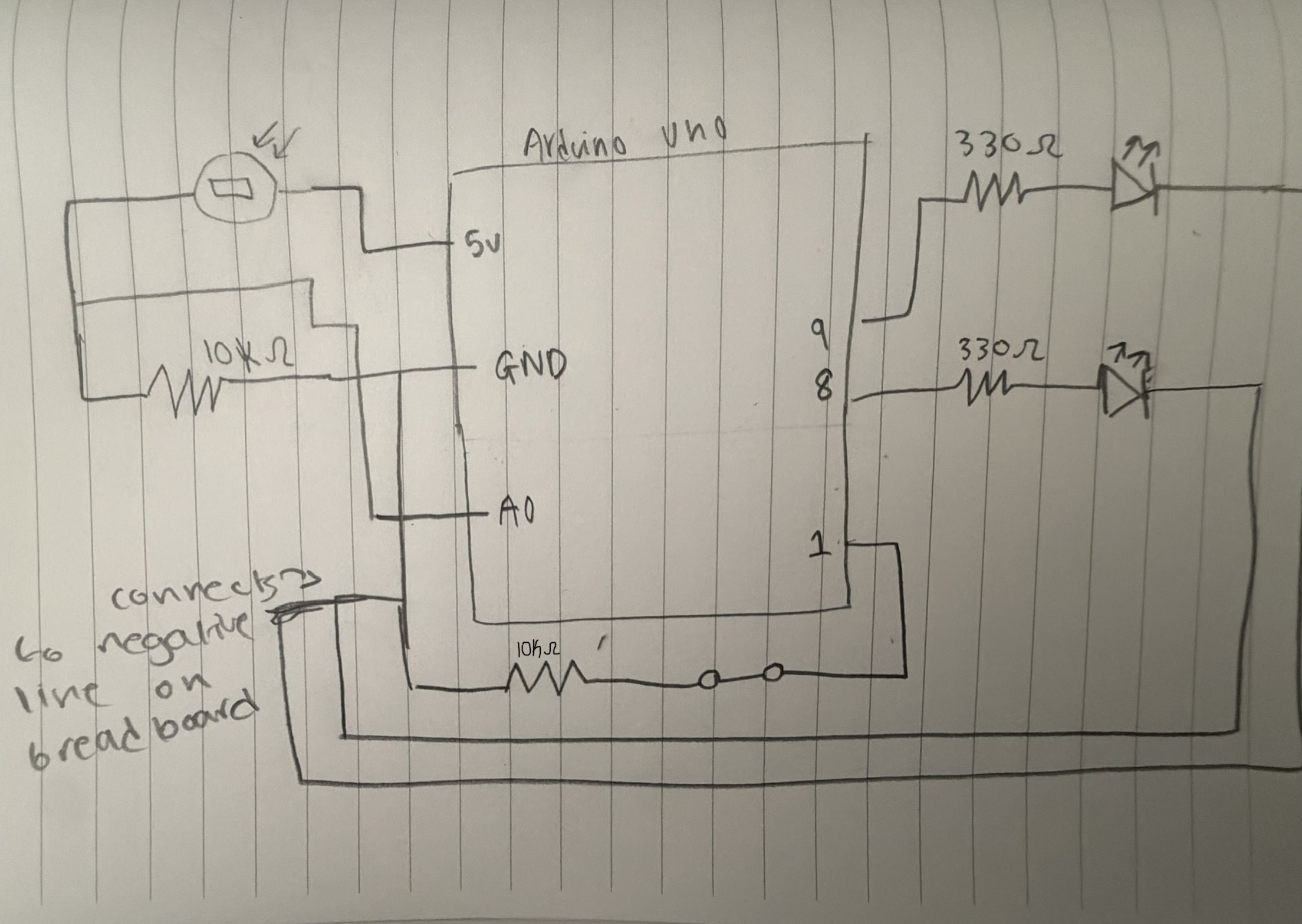
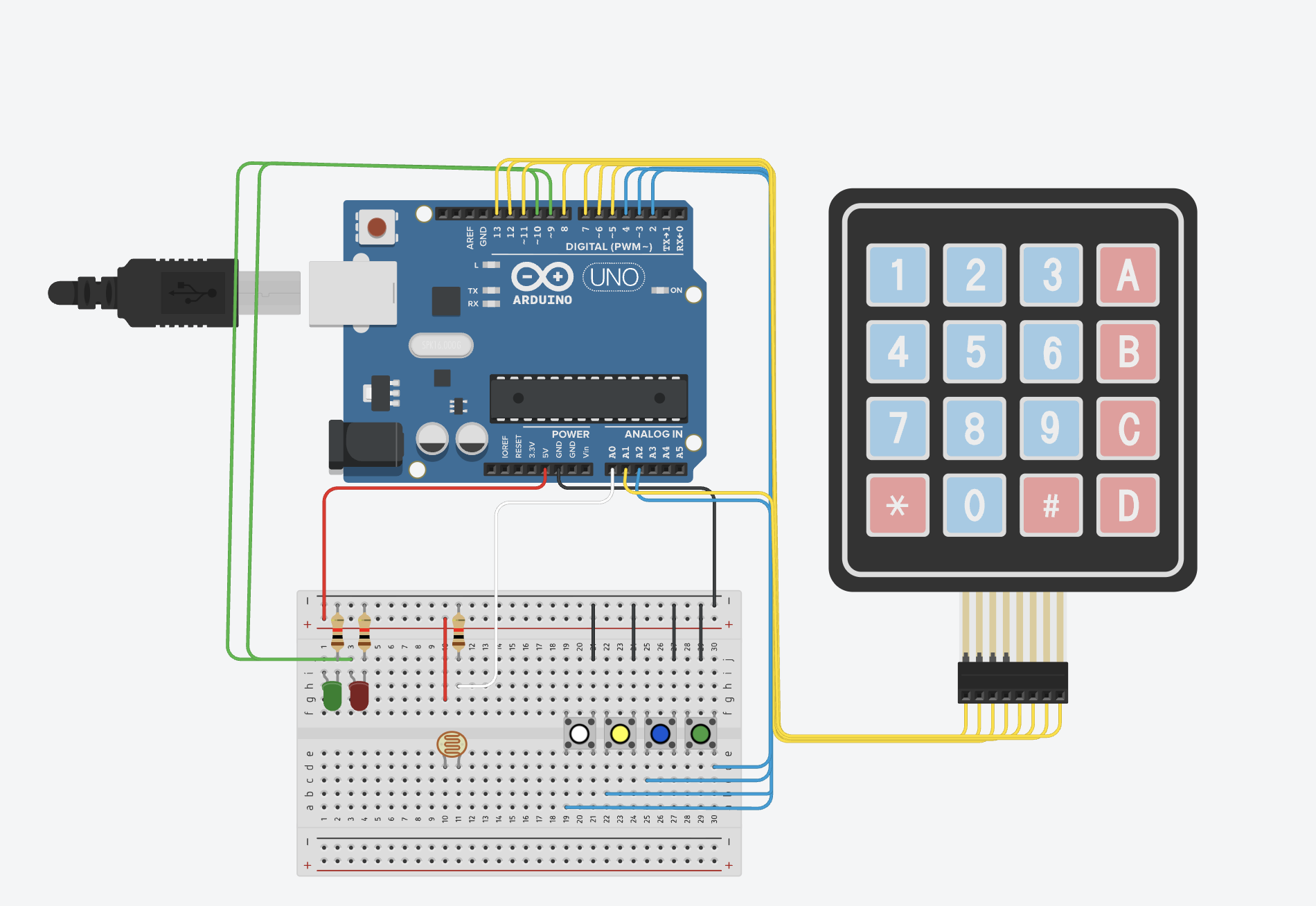
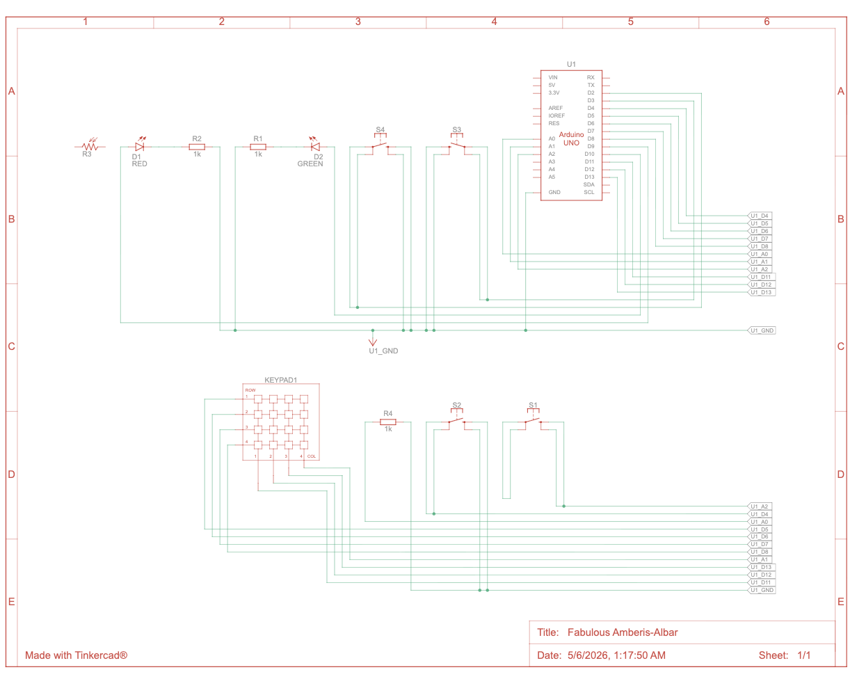
3. A clear and well labeled schematic
4. User Testing videos (I need to see the whole experience/interaction in documented videos)
User testing
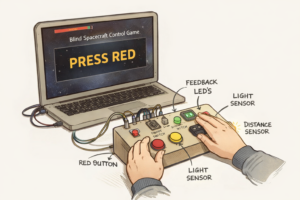
During user testing, I focused on watching how people actually interacted with the console. Most testers understood the button tasks immediately, but the light sensor and keypad made them pause for a second, which helped me confirm that the timing and difficulty were working as intended. I also noticed that some players pressed the buttons too lightly or at an angle, which made me reinforce the button mounts and secure the wiring so every press registered cleanly. This made the console feel more reliable and confident to use. Overall, the testing helped me refine the physical build.
5. How does the implementation work?
• Description of interaction design
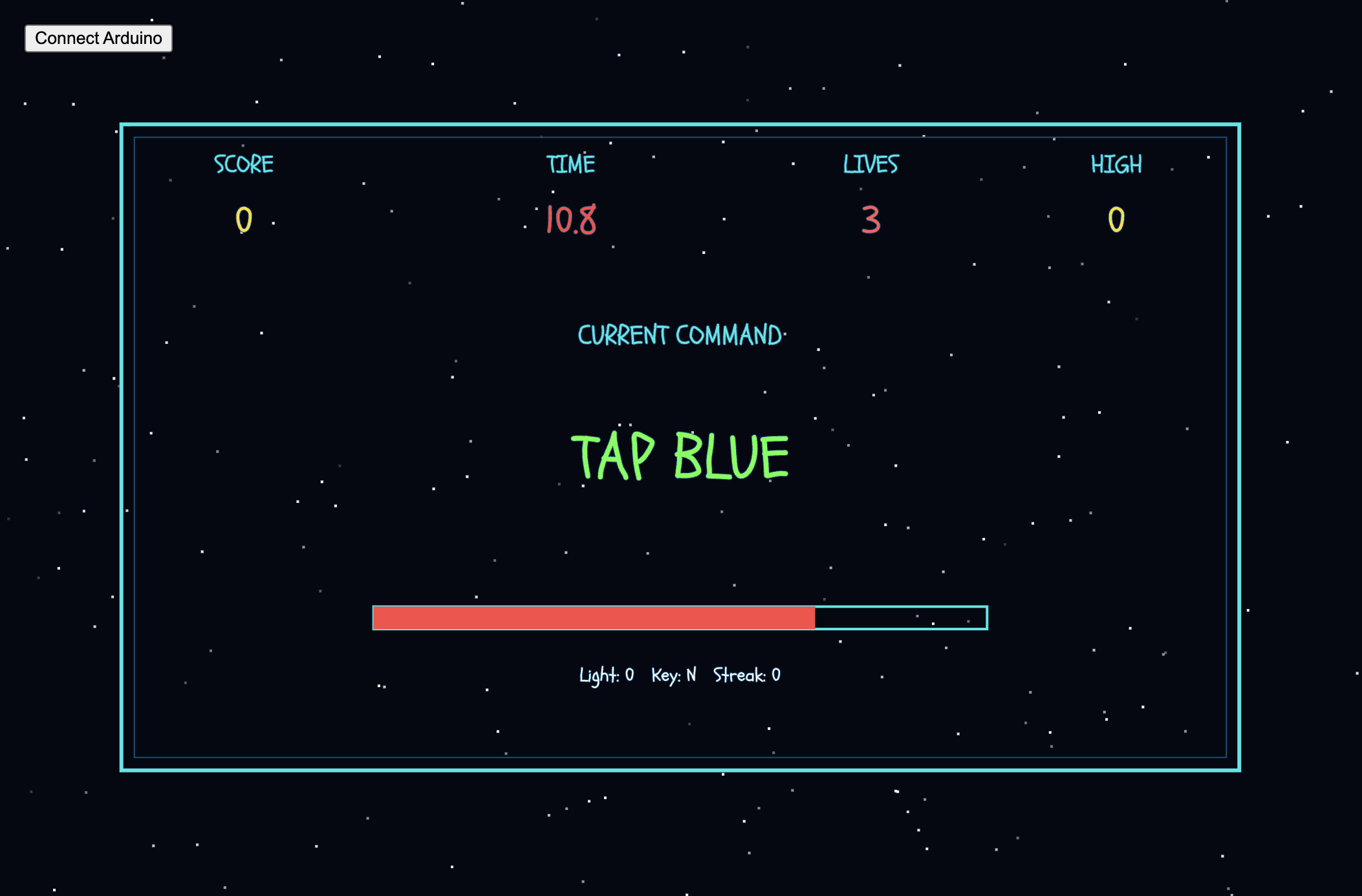
The system works in a loop. First, the screen shows a command. Then the user reacts using the console or sensors. Arduino reads that input and sends it to p5. p5 checks if it’s correct and responds with the next step or a fail. This repeats quickly, so the user is always reacting and the system is always responding.The interaction design focuses on making the player react fast while switching between different types of physical actions. The player looks at the laptop for the command, but all the actual actions happen on the console, so there’s this constant back‑and‑forth between reading and doing. Each input feels different on purpose: buttons give a quick click, the light sensor needs a hand movement, and the keypad needs a press. This mix keeps the player alert because they never know what type of action is coming next. The Arduino keeps sending all the sensor and button data to the laptop, and the laptop checks if the player did the right thing. If they did, the game continues; if not, it stops. The LEDs give simple feedback so the player knows what’s happening without needing extra text. Overall, the interaction is meant to feel fast, physical, and a little stressful in a fun way, similar to the quick‑reaction style of Bop It but with the more “mission‑like” feeling inspired by Project Hail Mary.
• Description of Arduino code + code snippets + add link to Github full code
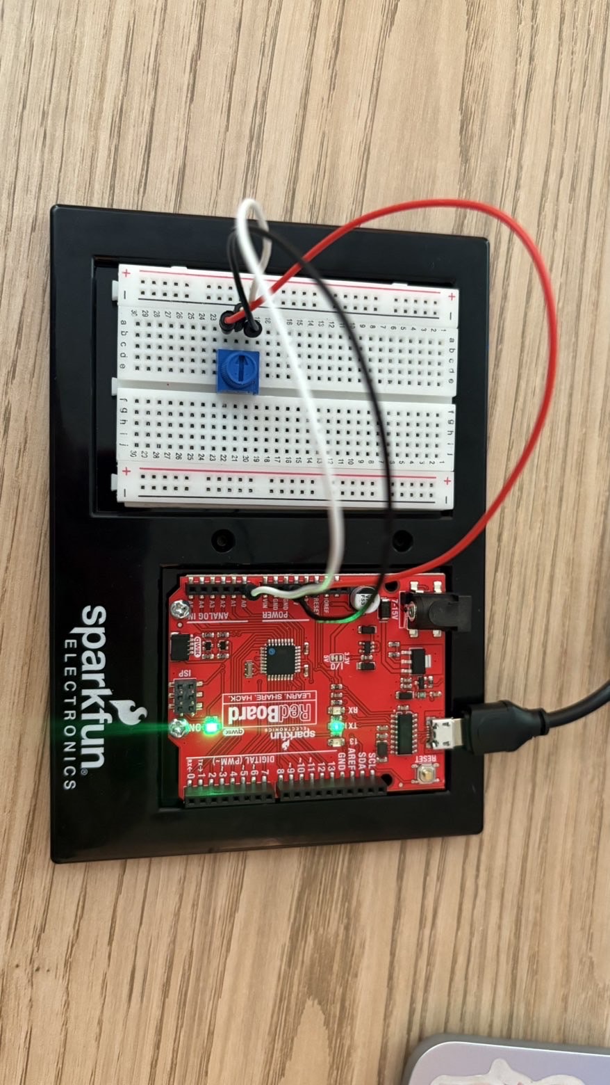
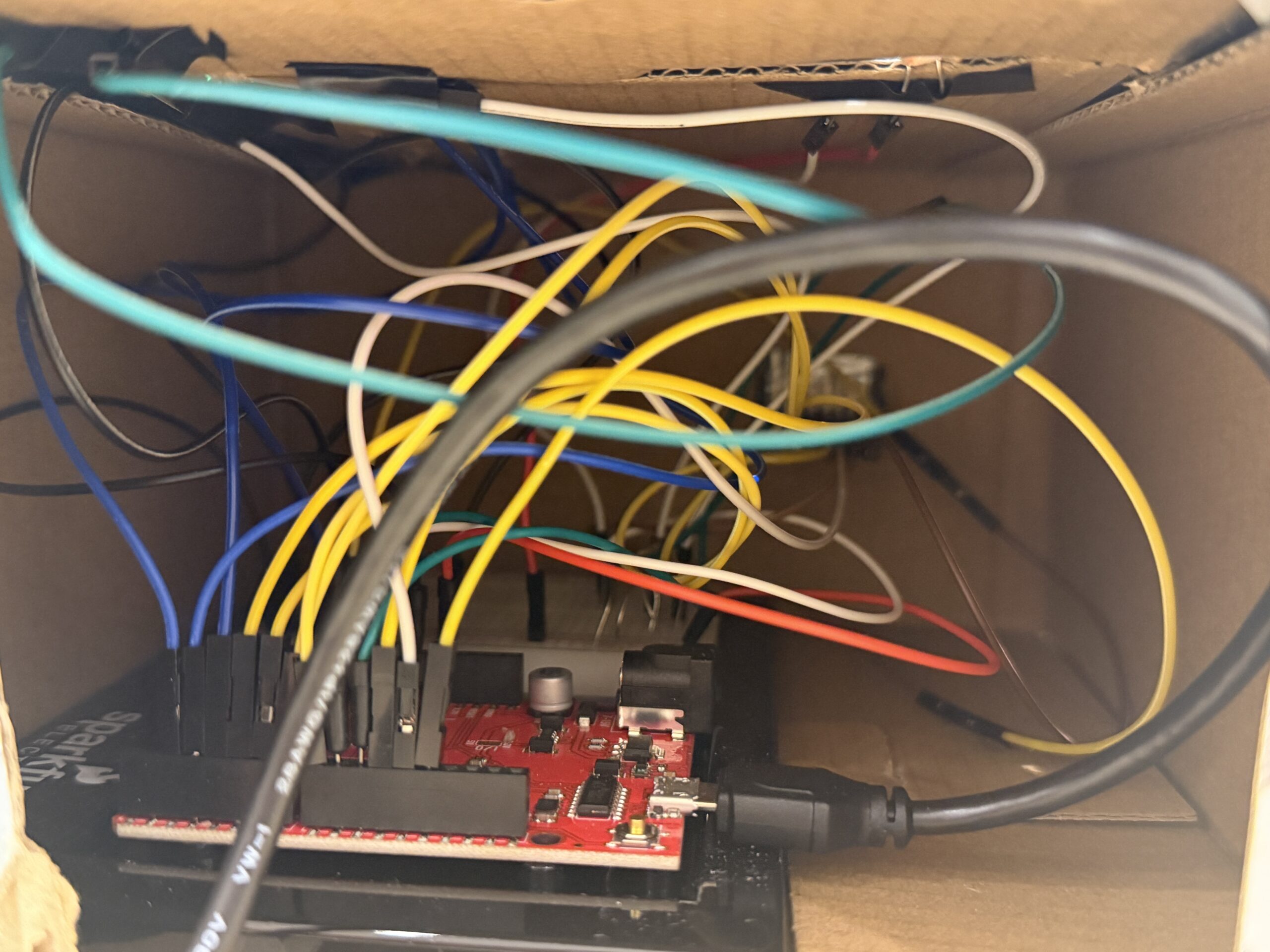
The Arduino code handles all the physical inputs and sends them to the laptop so the game can check if the player reacted correctly. It reads the buttons, the light sensor, and the keypad, then sends everything in one line over serial. I also remap the keypad using a small function so the keys match the layout I want. The Arduino listens for simple commands from the laptop to turn the LEDs on or off, which gives quick feedback to the player.
char fixKey(char key) {
  if (key == '1') return '1';
  if (key == '4') return '2';
  if (key == '7') return '3';
  if (key == 'A') return '4';
  if (key == 'B') return '5';
  if (key == 'C') return '6';
  if (key == '3') return '7';
  if (key == '6') return '8';
  if (key == '9') return '9';
  return 'N';
}
Code snippet I’m proud of
This was actually the part of the code I struggled with the most. My keypad didn’t match the number layout I wanted, and the values it was giving me felt completely random at first. I kept getting letters like A, B, C instead of the numbers I needed for the game. I tried rewiring and changing the library settings, but nothing fixed the layout. In the end, I realized the simplest solution was to write my own mapping function. So I made fixKey(), which basically translates the raw keypad output into the numbers I want. It looks simple now, but it took a lot of trial and error to figure out which key was actually sending what value.
Serial.print(ldrValue);
Serial.print(",");
Serial.print(greenState);
Serial.print(",");
Serial.print(blueState);
Serial.print(",");
Serial.print(yellowState);
Serial.print(",");
Serial.print(whiteState);
Serial.print(",");
Serial.println(lastKey);
I’m also proud of this part where I send all the sensor values, button states, and the last keypad key in one clean line. It took a lot of testing to get the order right and make sure nothing broke when the laptop tried to read it. This line basically keeps the game and the Arduino in sync, and if anything here is off, the whole game stops understanding the player’s actions. Getting this to work smoothly felt like a big win for me.
Github Link:https://github.com/MouzaAlMheiri/Intro-to-IM/blob/main/Final%20Project
• Description of p5.js code + code snippets + embedded sketch
My p5.js code controls everything the player sees and interacts with. It reads the data coming from the Arduino the light sensor, the four buttons, and the keypad and turns those raw values into actual gameplay. The code constantly listens to the serial port, updates the variables, and then checks if the player did the correct action based on the current command. It also sends simple characters back to the Arduino to trigger the LEDs, so the physical console reacts instantly when the player is right or wrong. All the timing, scoring, lives, and task switching happen inside p5.js, so this file is basically where the whole game logic lives.
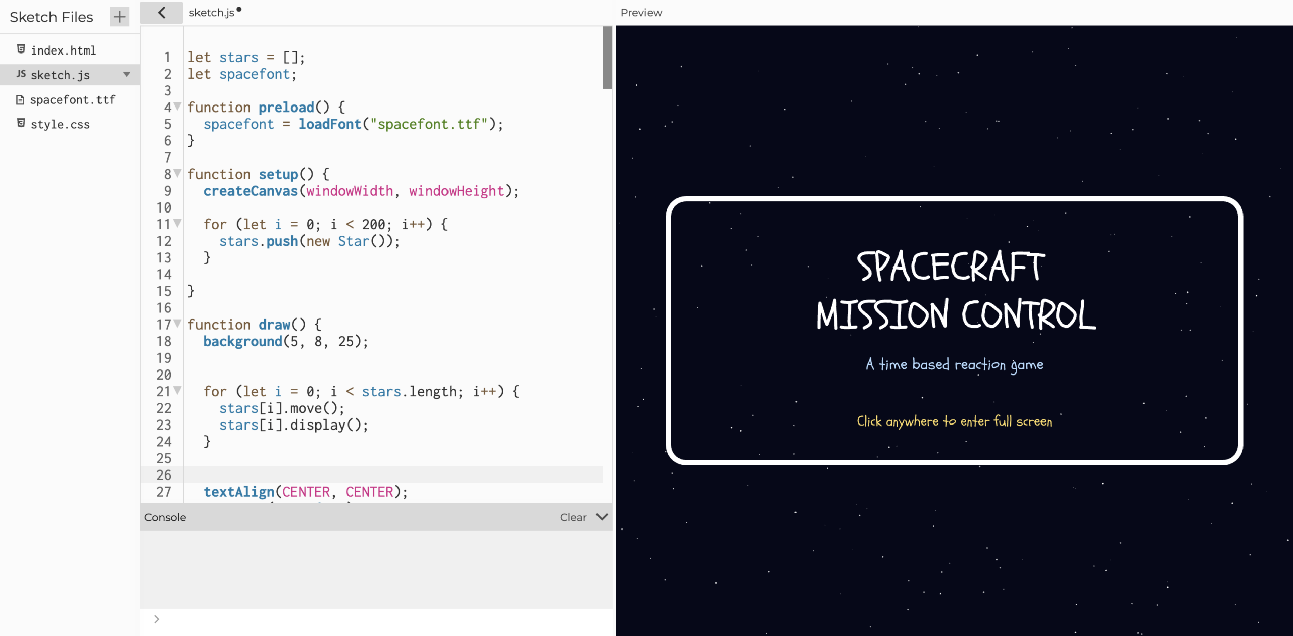
The rest of the code handles the visuals and the flow of the game. I built multiple screens like the home page, instructions, how to, the main game, and the lose screen, and I switch between them using a simple screen variable referencing to my midterm since it had a similar game logic. I also added a star background animation to match the space theme, and I used sounds and a custom font to make the game feel more polished. Overall, the p5.js file ties the hardware and the visuals together so the game feels smooth and responsive.
let data = port.readUntil("\n");
if (data) {
  let values = data.trim().split(",");
  if (values.length == 6) {
    ldr = int(values[0]);
    greenButton = int(values[1]);
    blueButton = int(values[2]);
    yellowButton = int(values[3]);
    whiteButton = int(values[4]);
    keypadKey = values[5].trim();
  }
}
This snippet reads one full line from the Arduino, splits it into the six values, and updates all the inputs in the game. It’s the part that makes the whole system feel connected, because every button press and keypad input shows up instantly in p5.js.I’m proud of this part because it took a while to get the serial format stable, and once I figured it out, the game finally started responding smoothly. It made the whole project feel like a real interactive system instead of random signals.
function newTask() { //resets lights and picks a new task type
  send("r");
  send("g");

  let tasks = ["GREEN", "BLUE", "YELLOW", "WHITE", "LIGHT", "KEYPAD"];
  currentTask = random(tasks); //chooses one random task
  taskStart = millis(); //records when the task started

  if (currentTask == "KEYPAD") { //special case for keypad tasks
    let keys = ["1", "2", "3", "4", "5", "6", "7", "8", "9"];
    targetKey = random(keys);
    taskText = "Press " + targetKey;
  } else {
    taskText = "Tap " + currentTask.toLowerCase();
  }
}
This snippet shows how the game picks a new task by choosing one option from a list. It also resets the Arduino lights, saves the start time, and updates the text on the screen. For keypad tasks, it chooses a random number the player must press. This keeps the game unpredictable and makes sure every round starts with a simple, clear instruction
function correct() { //handles the whole reward flow when the player answers correctly
  feedbackActive = true; //activates the green feedback state
  score++; //adds one point to the score
  streak++; //increases streak because the answer was correct

  if (score > highScore) { //updates high score if the new score is higher
    highScore = score;
  }

  timeLimit = max(minTime, timeLimit - timeDecrease); //speeds up the game but never below minTime which I set

  if (warningSound && warningSound.isPlaying()) { //stops warning sound if it's still playing
    warningSound.stop();
  }

  if (correctSound && correctSound.isLoaded()) { //plays the correct-answer sound if it's ready
    correctSound.play();
  }

  send("G"); //tells Arduino to turn green light on
  send("r"); //tells Arduino to turn red light off

  setTimeout(() => { //waits before resetting lights and generating next task
    send("g"); //turns green light off on Arduino
    newTask(); //moves to the next task immediately after correct answer
    feedbackActive = false; //turns off feedback state
  }, 400); //delay for feedback animation
}
This snippet shows what happens when the player gets a task right. The game adds to the score, increases the streak, and updates the high score if needed. It also makes the game a little faster by lowering the time limit, but never below the minimum you set. The function stops any warning sound, plays the correct sound, and sends signals to the Arduino to show green feedback. After a short delay, it turns the light off, starts a new task, and ends the feedback state so the game can continue smoothly..
Screen shots from p5js:
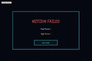 •
•
Description of communication between Arduino and p5.js
The Arduino and p5.js talk to each other through the serial port. The Arduino sends one line of data every loop that includes the light sensor value, all the button states, and the last keypad key. p5.js reads that line, splits it by commas, and uses each value to check if the player did the right action. When p5.js needs to give feedback, it sends a single character back to the Arduino, like “R” or “G,” and the Arduino turns the LEDs on or off. The whole game depends on this back‑and‑forth, and once the format was stable, everything stayed in sync.
6. What are some aspects of the project that you’re particularly proud of?
I’m proud of three main things in this project. The first is fixing the keypad. It gave me the most trouble because the values didn’t match the layout at all, and it took a lot of trial and error to figure out a mapping system that actually worked. It looks simple now, but getting there took patience.
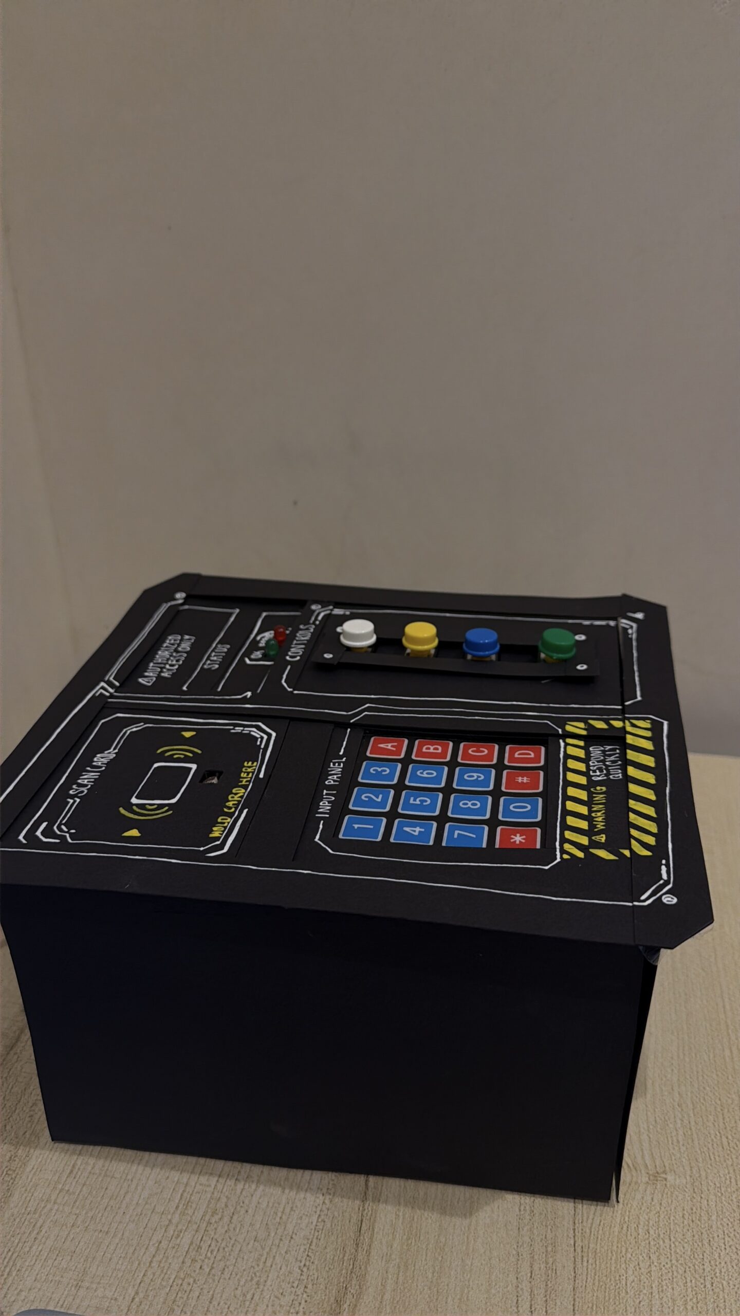
The second thing is the physical design of the console. I wanted it to feel clean and easy to use, and I think the mix of buttons, the light sensor, the keypad, and the LEDs makes it feel like a real control panel. Seeing it come together physically was really satisfying.
The third thing I’m proud of is getting the communication between Arduino and p5.js to work smoothly. At first, the data kept breaking or coming in the wrong order, but once I figured out a stable format, everything synced perfectly. It made the whole game feel responsive and reliable.
7. Links to resources used
Fullscreen:
https://p5js.org/reference/p5/fullscreen/#:~:text=fullscreen,such%20as%20a%20mouse%20press.
Stars background:
https://editor.p5js.org/robert0504/sketches/srSzgJcCS
Game concept:
https://editor.p5js.org/skgmmt/sketches/Sk5VaX2yN
For Keypad:
https://www.circuitbasics.com/how-to-set-up-a-keypad-on-an-arduino
https://www.ibm.com/docs/en/zos/2.5.0?topic=statements-return-statement
Arduino:
Analog input:https://docs.arduino.cc/built-in-examples/basics/AnalogReadSerial/
Button:https://docs.arduino.cc/built-in-examples/basics/DigitalReadSerial/
P5js:
Connecting arduino :https://editor.p5js.org/aa11972/sketches/YcwX3DgTK
Audio:https://p5js.org/reference/p5/loadSound/
Light Sensor:https://www.build-electronic-circuits.com/arduino-light-sensor/
8. Proper and detailed referencing of any use of AI tools (how were they used? Where?)
I used AI for fixing the keypad. The keypad was completely bugging, and nothing I tried was working. I rewired it, changed the rows and columns, and even tested different key pads, but the keys were still giving random values that didn’t match the layout. I used Ai to help me understand how to check each key through the Serial Monitor and see what character it was actually sending. Once I had that information, I mapped the keys myself and translated it into my official Arduino code using the fixKey() function.
9. Challenges faced and how you tried to overcome them
The biggest challenge I faced was the keypad. It was giving completely wrong values, and nothing I tried fixed it. I rewired it, flipped the rows and columns, and even tested different libraries, but the keys still didn’t match the printed layout. It was honestly really frustrating. I ended up using the Serial Monitor to check what each key was actually sending, and once I had that, I created my own mapping system in the Arduino code. That finally made the keypad usable.
Another challenge was one of the buttons breaking. It kept giving inconsistent readings, and sometimes it wouldn’t register at all. I tested the wiring, changed the resistor, and eventually replaced the button completely. After that, the input became stable again. Both issues took time, but solving them helped me understand the hardware better and made the final console more reliable.
10. What are some areas for future improvement?
For future improvement, I would like to add more diverse interactions so the game feels less predictable. Right now, the inputs work well, but adding things like sliders, switches, or buttons with built‑in LEDs would make the console more interesting to use. I also want to upgrade some of the components so they feel more solid and don’t break as easily. Overall, the system works, but adding more variety and better hardware would make the whole experience smoother and more fun.