Final Project: Flame Keeper

Flame Keeper is a browser-based game controlled by a physical Arduino. A potentiometer and a push button are the only inputs. There is no keyboard, no mouse, no touchscreen. Your hands are on hardware, and what happens on screen responds directly to what you do with them.

The goal is simple: keep a candle flame alive as long as possible. The flame slowly dies if you neglect it and gets destroyed quickly when wind gusts hit. Your job is to manage both threats at the same time using two very different physical actions.

Demo Video

Concept

A candle flame is fragile. It responds to the air around it, flickers under pressure, and goes out if conditions get bad enough. I wanted to recreate that fragility as a game mechanic where the player feels like they are genuinely tending to something.

The project is meant for anyone who picks it up with no instructions. The two inputs are immediately physical and tactile. Turning a knob and pressing a button are things people already know how to do. The challenge is learning what those actions mean on screen, and then staying coordinated under pressure.

It is a single-player survival game. There is no finish line. You survive as long as you can and your best time is saved so you can try to beat it.

How It Works

The system has two parts: an Arduino that reads sensors and sends data, and a p5.js sketch running in the browser that receives that data and runs the game.

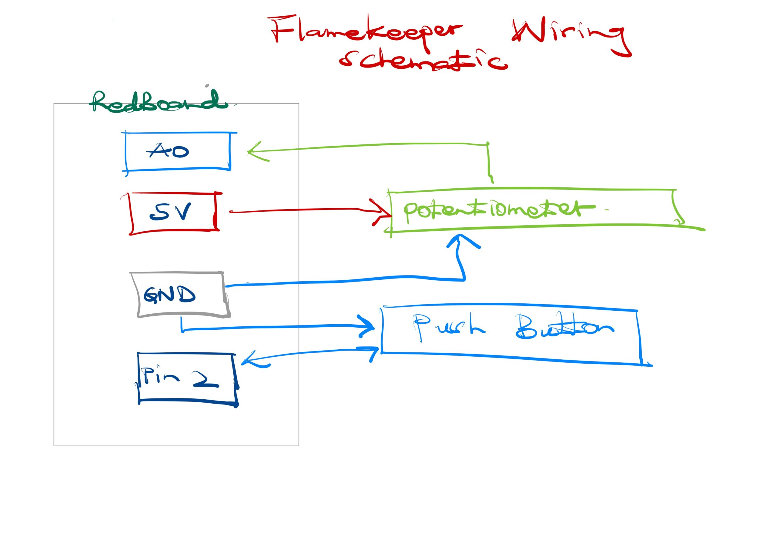
The Arduino reads a potentiometer on pin A0 and a push button on pin 2. Every 30 milliseconds it sends the potentiometer value as POT:value over serial. When the button is pressed or released it sends PRESS or RELEASE. The browser connects to the Arduino using the Web Serial API, available in Chrome and Edge. No app or driver is needed beyond a USB cable.

Inside the game, the potentiometer value maps to a cursor on a horizontal bar. A green zone moves slowly back and forth across that bar. If the cursor is inside the green zone, the flame heals. If it drifts out, the flame slowly loses health. Every 2 to 4 seconds a wind gust arrives. During a gust the flame loses health rapidly unless the player holds the button. Holding the button raises a shield that blocks all gust damage. Difficulty increases over time as gusts come more frequently.

Interaction Design

The two inputs are intentionally asymmetric. The potentiometer requires continuous attention and fine motor control. The button requires a fast reaction to a visual cue. During a gust the player must do both at once, which is where the tension of the game lives.

Feedback is layered so the player always knows what is happening without reading text. The flame shrinks visually as health drops. The screen edges pulse red when damage is being taken. Wind lines fly across the screen during gusts. Animated rings appear around the flame when the shield is active. A status pill at the top of the screen confirms the current threat and whether the shield is up.

The start screen shows both controls and what they do before the game begins, so no explanation from me is needed. The game over screen shows the player’s score and their all-time best, which gives a reason to replay.

Arduino Source Code

Full source code is on GitHub: github.com/EnockMagara/IM_FINAL

const int BUTTON_PIN = 2;
const int POT_PIN    = A0;

bool wasPressed = false;

void setup() {
  pinMode(BUTTON_PIN, INPUT_PULLUP);
  Serial.begin(9600);
}

void loop() {
  bool pressed = (digitalRead(BUTTON_PIN) == LOW);

  if (pressed && !wasPressed)  Serial.println("PRESS");
  if (!pressed && wasPressed)  Serial.println("RELEASE");
  wasPressed = pressed;

  Serial.print("POT:");
  Serial.println(analogRead(POT_PIN));

  delay(30);
}

Wiring Schematic


How This Was Made

The game runs entirely in the browser using p5.js 1.9.3 and the p5.sound addon, both loaded from CDN. The Web Serial API handles communication between the browser and the Arduino with no additional libraries.

The flame is drawn each frame using layered ellipses with positions driven by Perlin noise, which gives it organic flickering motion. The glow effect is a series of concentric ellipses drawn from the outside in with decreasing opacity. The shield uses sine-wave-animated rings. All color is in HSB mode so hue shifts naturally as flame health changes from red to amber to gold.

The sweet spot bar maps the raw potentiometer value (0 to 1023) to a pixel position on screen. The green zone has a target position that slowly lerps toward a new random target every four seconds, creating the moving challenge.

Audio uses two p5.Oscillator instances. A sine wave plays as an ambient hum tied to flame health. A sawtooth wave plays during gusts. Both are initialized on the first user click to satisfy browser autoplay policy.

Best score is stored in localStorage so it persists across page reloads without a server.

Libraries used: p5.js, p5.sound. Fonts: Cinzel and Cinzel Decorative from Google Fonts. Web Serial API documentation from MDN. AI (GitHub Copilot) was used throughout development for debugging serial communication, structuring the game loop, and designing the UI layer.

What I Am Proud Of

The physical-to-digital mapping feels genuinely tight. When you turn the potentiometer, the cursor on screen moves exactly as fast as your hand does. There is no noticeable lag. That responsiveness is what makes the interaction feel real rather than simulated.

I am also proud of how the difficulty curve works without any explicit levels. The gust interval shrinks by five frames every time you survive a gust, so the game gets harder the longer you last without me having to design separate stages.

The start screen and the game-over card both came together better than I expected. Having the controls explained before the game starts removed the need for me to stand next to it and explain anything, which was the main lesson from user testing.

Areas for Future Improvement

The potentiometer-to-cursor mapping is linear, which means the sweet spot is equally difficult everywhere on the bar. A nonlinear mapping that makes the center zone slightly easier and the edges harder would create more interesting tension.

I would add a second visual reading of flame health beyond the bar. Right now the flame shrinks as health drops, but that change is subtle. A visible glow radius that shrinks more dramatically would communicate danger faster.

The button currently has one function: shield during gusts. A second mechanic tied to a short button tap versus a long hold would add depth without adding more hardware.

The game has no sound design beyond two oscillators. Real flame crackling and wind sound effects would make the experience significantly more immersive.

Reflection

The biggest thing I learned is that physical input is unforgiving in a way that keyboard input is not. A keyboard always registers. A breadboard button that is rotated 90 degrees reads as permanently pressed and the game never starts. Debugging hardware and debugging software at the same time is a different skill from debugging software alone.

User testing taught me that what is obvious to the maker is not obvious to the user. I knew what the sweet spot bar meant because I built it. My tester had never seen it before. Adding one line of explanatory text on the start screen solved the confusion completely. It cost almost nothing to add and made the project function without me in the room.

If I had two more weeks I would add a two-player mode where one person controls the potentiometer and the other controls the button, forcing coordination between two people instead of one person managing both inputs alone.

Week 13: Flame Keeper User Testing

This week I had my sibling try Flame Keeper without any explanation. The project is a browser-based game controlled by an Arduino: a potentiometer steers a cursor into a moving sweet spot to heal a digital candle flame, and a button shields the flame during wind gusts.

Demo

What I Observed

My sibling picked up the button quickly once a gust appeared and the screen said “GUST! HOLD BUTTON!” The text made the action obvious. The potentiometer was more confusing. My sibling turned it but did not immediately connect the movement of the on-screen cursor to the knob in their hand. It took a few seconds before the mapping clicked.

My sibling did not understand the sweet spot bar without being told. They could see a green zone and a moving dot, but did not know the goal was to keep the dot inside the green zone. Once that was explained, gameplay became intuitive immediately.

What Worked

The gust warning text and the shield effect gave instant visual feedback. My sibling felt the button had a clear purpose. The HP bar draining created genuine urgency, and the candle flame shrinking alongside it reinforced that something was wrong without any text needed.

What Needs Improvement

The sweet spot bar needs a short label or tooltip on first load that explains what it is. A simple line like “keep the dot in the green zone” on screen at the start would remove the confusion entirely. I also felt the need to explain the potentiometer every single time, which means the physical-to-visual mapping is not clear enough. A brief intro screen before the game starts would solve both issues.

Next Steps

I will add a short start screen that shows the two controls and what they do before the game begins. That way the project can speak for itself without me standing next to it.

Building a Theremin-Style Musical Instrument with Arduino

For this week’s assignment, I built a simple musical instrument using an Arduino SparkFun RedBoard. The goal was to make something you actually play in real time, not just a melody that runs on its own.

The Idea

I wanted the instrument to feel intentional. You turn a knob to pick a pitch, then press a button to sound it. Release the button and it goes silent. It is a small but satisfying loop that mimics the feel of a real instrument. The design was loosely inspired by a theremin, where pitch is continuous and the player decides when to trigger sound.

Components

The build uses five parts: a SparkFun RedBoard, a piezo buzzer, a 10k ohm potentiometer, a tactile push button, and a breadboard with jumper wires. The potentiometer is the analog sensor and the button is the digital sensor, which together satisfy both requirements for the assignment.

Demo

The Code

The sketch reads the potentiometer value on every loop, maps it to one of 22 notes across a C major scale from C3 to C6, and plays that note with tone() only while the button is held down. No extra libraries are needed beyond pitches.h for the note frequencies.

#include "pitches.h"

const int BUZZER_PIN = 8;
const int BUTTON_PIN = 2;
const int POT_PIN    = A0;

int scale[] = {
  NOTE_C3, NOTE_D3, NOTE_E3, NOTE_F3, NOTE_G3, NOTE_A3, NOTE_B3,
  NOTE_C4, NOTE_D4, NOTE_E4, NOTE_F4, NOTE_G4, NOTE_A4, NOTE_B4,
  NOTE_C5, NOTE_D5, NOTE_E5, NOTE_F5, NOTE_G5, NOTE_A5, NOTE_B5,
  NOTE_C6
};
const int SCALE_SIZE = sizeof(scale) / sizeof(scale[0]);

void setup() {
  pinMode(BUZZER_PIN, OUTPUT);
  pinMode(BUTTON_PIN, INPUT_PULLUP);
  Serial.begin(9600);
}

void loop() {
  bool buttonHeld = (digitalRead(BUTTON_PIN) == LOW);
  int  potValue   = analogRead(POT_PIN);
  int  noteIndex  = map(potValue, 0, 1023, 0, SCALE_SIZE - 1);
  int  currentNote = scale[noteIndex];

  if (buttonHeld) {
    tone(BUZZER_PIN, currentNote);
  } else {
    noTone(BUZZER_PIN);
  }

  delay(20);
}

How It Works

The potentiometer outputs a voltage between 0V and 5V as the knob turns. analogRead() converts that into a number from 0 to 1023, and map() scales it down to an index between 0 and 21, selecting a note from the scale array. The button uses Arduino’s built-in INPUT_PULLUP setting, so it reads HIGH when open and LOW when pressed, with no external resistor required. While the button is held, tone() drives the buzzer at the selected frequency. Letting go calls noTone() and the sound stops immediately.

Reflections

The trickiest part was getting comfortable with the breadboard layout. Once that clicked, the wiring became straightforward. If I were to extend this project, I would add a second button to switch between different scales, which would open up more musical variety without much added complexity.

Digital Candle – Project Proposal

For my final project, I want to create a digital candle that responds to natural interaction. The idea is that the candle appears on screen, flickers like a real flame, and the user can blow toward a microphone sensor to turn it off. After a few seconds, the flame slowly comes back. I chose this idea because it is familiar and calming, and it uses a very natural gesture that people already understand.

Technically, I will use a microphone sensor connected to Arduino to detect blowing. The Arduino will send this data to p5.js, where the visuals are created. The flame will be drawn using simple shapes and animation, with small changes in size and movement to simulate flickering. When the system detects a strong breath, the flame will fade out smoothly. I may also add a soft ambient sound to make the experience feel more immersive.


WEEK 12 – Reading Response

Design Meets Disability

This article made me rethink how I see design and disability. At first, I used to think of design for disability as something separate or special, but the article shows that it actually influences mainstream design in powerful ways. For example, ideas that started from solving disability-related problems have inspired everyday products and furniture. This made me realize that designing for disability is not a limitation. It can actually lead to more creative and useful solutions for everyone.

One idea that really stood out to me was the tension between hiding disability and expressing it. Some designs try to make disabilities invisible, like hearing aids that are hard to notice. Others, like stylish glasses or expressive prosthetics, embrace visibility. This made me think about how design can shape how people feel about themselves. If something is always hidden, it can feel like it is something to be ashamed of. But if it is designed in a beautiful or expressive way, it can become something empowering instead.

Inclusive design should not feel like an extra feature. It should be part of normal design thinking. Going forward, I would want to design things that include everyone and make people feel confident using them, not just functional.

WEEK 11 – Reading Response

A Brief Rant on the Future of Interaction Design

This article argues that current ideas about future technology are not truly innovative. Instead of creating new ways for people to interact with technology, many designs simply improve what already exists. The author criticizes “pictures under glass,” meaning touchscreens, because they ignore how humans naturally use their hands. I found this argument interesting because I had never questioned touchscreens before. They feel modern, but the article shows they may actually limit human ability.

A key idea in the article is that tools should match human capabilities. The author explains that our hands are powerful because they can feel and manipulate objects in rich ways. In contrast, sliding a finger on a flat screen is very limited. This made me reflect on how much we lose when we move from physical interaction to digital screens. The examples, like holding a book or a glass of water, helped me understand how important touch and feedback are in everyday actions.

This article made me rethink what “innovation” really means. True progress is not just about better technology, but about better interaction between humans and tools. The future should not ignore the human body but should work with it. In my own thinking, especially when building products, I would try to design systems that use natural human abilities instead of reducing them.

Responses: A Brief Rant on the Future of Interaction Design

This article responds to criticism of the original rant and clarifies its purpose. The author explains that the goal was not to give a solution, but to highlight a problem. I found this honest and realistic because not all problems have immediate answers. Instead, the author encourages more research and exploration into better interaction methods. This shows that progress often starts with asking the right questions, not having perfect solutions.

Another important idea is that current technologies, like the iPad, are good but not final. The author compares them to early black-and-white photography, which was useful but later improved. This perspective helped me understand that we should not become too comfortable with current technology. Just because something works well now does not mean it cannot be improved. Innovation requires continuing to question and push boundaries.

This article emphasizes the importance of long-term thinking. It reminds us that technology should evolve to better match human abilities, not replace them. I also liked the discussion about the human body, showing that interaction should involve more than just a finger or voice. This reflection encourages me to think more critically about design and to aim for solutions that fully use human potential rather than limiting it.

WEEK 10 – Reading Response

Physical Computing’s Greatest Hits (and Misses)
This article talks about common ideas used in physical computing projects. It shows that many students often repeat similar themes, like musical instruments, gloves, or interactive mirrors. At first, I thought repeating ideas meant a lack of creativity. However, the article explains that even common ideas can still be original if you add your own variation. This changed my thinking. I now see that creativity is not always about doing something completely new, but about improving or reimagining existing ideas.

Another important point is that not all projects offer meaningful interaction. Some projects look beautiful but do not give users much to do. For example, video mirrors are interesting to look at, but they often lack depth in interaction. This made me realize that good design should not only focus on appearance, but also on how users engage with the system. A successful project should balance aesthetics and interaction, making sure the user feels involved and not just entertained.

This article made me reflect on how I approach building projects. Instead of trying to avoid common ideas, I should focus on making them better and more meaningful. It also reminded me to think about the user experience, not just the technical side. In the future, I would aim to design projects that are both creative and interactive, where users can clearly understand and enjoy their role in the system.

WEEK 9 – Reading Response

Reflection on “Attractive Things Work Better”

The article explains that design is not only about how something works, but also how it feels. The author shows that attractive things can actually work better because they make people feel good. When people feel positive, they think more creatively and are more patient with small problems. I found this idea interesting because it challenges the common belief that function is more important than appearance. The example of the teapots helped me understand how design, usability, and beauty can all matter in different ways.

Another important idea is how emotions affect behavior. The article explains that when people are stressed, they focus more but become less flexible. In contrast, when people are relaxed and happy, they can think more broadly and solve problems better. This made me realize that good design should consider the emotional state of the user. For example, tools used in stressful situations should be simple and clear, while tools used in relaxed settings can focus more on enjoyment and beauty.

The article made me think differently about design. I used to think that beauty was just extra, but now I see that it plays an important role in how people interact with things. Good design is a balance between usability and aesthetics. In my own work, especially in building products, I would try to create designs that are both functional and pleasant to use.

Reflection on “Her Code Got Humans On The Moon – And Invented Software Itself”
This article tells the story of Margaret Hamilton and her important role in the Apollo space program. I was impressed by how she worked in a time when women were not encouraged to join technical fields. Despite these challenges, she became a leader in software engineering and helped make the moon landing possible. Her dedication and courage stood out to me, especially how she balanced her work and her role as a mother.

One key idea from the article is how new and uncertain software engineering was at the time. There were no clear rules, and Hamilton and her team had to figure things out as they went. This shows how innovation often comes from stepping into the unknown. I also found it interesting how software, which was once not taken seriously, became critical to the success of the mission. It highlights how important behind-the-scenes work can be.

This article inspired me to think about persistence and impact. Margaret Hamilton’s work not only helped humans reach the moon but also shaped modern software development. It reminds me that important contributions are not always recognized immediately. Her story encourages me to take risks, work hard, and believe that my efforts can have a lasting impact.

Midterm Project – Rooftop Rush

Concept

Rooftop Rush is a fast rooftop runner where every second feels like a chase scene. You play as a street runner jumping across city rooftops, dodging obstacles, and grabbing coins while the world keeps speeding up. Since each run is slightly different, you never know exactly what is coming next.

The main idea is simple: the more points you earn, the farther you can jump. At first, your jumps are short and careful. As your score rises, your movement starts to feel powerful and confident. But there is a catch: the city also gets faster. That push and pull is what makes the game exciting.

To keep every run exciting, I added extra moves and features:

  • Double Jump: Jump once more in the air for extra control.
  • Grapple Hook: Swing across very wide gaps using crane points.
  • Wall-Run and Wall-Jump: Use building walls to climb and launch back into the air.
  • Dash: A quick burst forward to escape danger.
  • Slide Kick: Slide into some obstacles to break them and gain points.
  • Tricks: Do flips and spins in the air for bonus points.
  • Near-Miss Bonus: Get rewarded for narrowly avoiding obstacles.
  • Power-ups: Temporary boosts like speed, shield, and coin magnet.
  • Upgrade Shop: Unlock permanent upgrades by playing well over many runs.
  • Day/Night Cycle: The background slowly changes from sunset to night.

Code I Am Proud Of

getJumpForce() {
  let base = CFG.BASE_JUMP * this.jumpMult;
  let bonus = CFG.JUMP_SCORE_K * Math.log(1 + this._score);
  return max(base - bonus, CFG.MAX_JUMP);
}

This is the code I am most proud of because it controls the feeling of the whole game. It decides jump strength each time the player jumps.

In simple terms, the game checks your score and makes your jump stronger as you improve. It also has a safe limit, so the jumps never become wild or unfair. Players can clearly feel their progress, but they still need timing and focus to survive.

How It Was Made

I built Rooftop Rush in p5.js and kept the project organized by splitting it into small parts. One part handles the player, others handle buildings, obstacles, effects, sound, and the game screens.

The hardest part was balancing the jump feel. I wanted players to feel stronger as they scored more points, but I also wanted the game to stay fair. I tested many versions until the movement felt fun, smooth, and controllable.

Another challenge was making movement feel responsive. Wall-running, dashing, grappling, and trick moves all had to work together without glitches. I used AI tools to help with some tricky parts, then tuned and tested everything by hand.

I also made sure random level generation stays fair. Gap sizes and building heights are controlled so the game does not create impossible situations.

The visual style was drawn directly in p5.js, including the runner, skyline, and effects. Sound effects were generated directly in code using p5.js sound tools.

Reflection

This project taught me a lot about game design and creative problem-solving. Keeping the game organized helped me test faster, fix bugs faster, and stay motivated.

I am most proud that the main mechanic works in real playtests. Players could feel their jump getting stronger as they scored more points, which was exactly the feeling I wanted to create.

In the future, I want to add more power-ups, a second playable character, and a mobile version with touch controls. I also want to improve character animation so tricks and wall-runs look even more dynamic.

Play Rooftop Rush

You can play the game directly below:

Live Project URL: https://enockmagara.github.io/Rooftop-Rush/


p5.js v1.9.0 · March 2026 · Intro to IM, NYUAD

Midterm 3 Progress: ROOFTOP RUSH

The Concept

ROOFTOP RUSH is a side-scrolling parkour runner built in p5.js. The player controls a free-runner crossing a city skyline at dusk. The city scrolls to the right at increasing speed. The player must jump between rooftops, avoid obstacles, and collect coins. Each run generates a different sequence of buildings, gaps, and obstacles, so no two runs are the same.

The central idea is one core mechanic: the more points you earn, the farther your jumps carry you. Score is not just a number in the corner. It directly changes how far the player can jump. Early in a run, jumps are short and the player must plan each crossing carefully. As the score grows, the jumps grow with it. The player gains the ability to clear gaps that were not possible at the start. At the same time, the world speeds up. The game becomes harder and more powerful at once. The tension between those two forces is what makes each run feel urgent.

The planned interactive features are:

  • Grapple Hook (G key): A crane will spawn automatically over any gap that is too wide to jump. Pressing G will lock onto the crane and swing the player across.
  • Wall-Run (Up key on a wall): Touching a wall will trigger a wall-slide. Holding Up will convert it into a wall-run, carrying the player upward before launching off.
  • Trick System (F for flip, R for spin): Performing tricks in mid-air will award bonus points. Chaining multiple tricks in one jump will multiply the reward.
  • Slide Kick: Sliding into certain obstacles will destroy them and award points instead of dealing damage. This turns a defensive move into an offensive one.
  • Upgrade Shop: Coins will carry over between runs. The player will spend them on permanent upgrades such as stronger jumps, longer dashes, or a larger coin magnet range.
  • Day and Night Cycle: The sky will shift from sunset to night over time. Stars will appear and a helicopter with a spotlight will patrol the skyline after dark.

The Riskiest Part: The Jump Curve

The most uncertain part of this project is the score-to-jump-force progression curve. This mechanic is the entire point of the game. If the curve is wrong, nothing else works. If it is too flat, the player will not notice the progression. If it is too steep, the player will overshoot buildings and the game will break.

The challenge is not technical. It is perceptual. Jump force is measured in pixels per frame. That number has no intuitive meaning to a player. The curve needs to satisfy three conditions:

  1. The change must be noticeable early. A player who earns 500 points should feel a real difference in jump distance.
  2. It must plateau at high scores. The growth must slow down so the game stays controllable.
  3. The maximum jump height must stay within the bounds of the level. Buildings differ in height by at most 90px. The widest gap will be 180px.

I plan to use a logarithmic curve. Logarithms grow fast near zero and flatten at large values. This matches both requirements. The formula will be:

jumpForce = max( BASE_JUMP - K * ln(1 + score) , MAX_JUMP )

Planned constants: BASE_JUMP = -11.0, K = 0.0004, MAX_JUMP = -18.5. The negative sign follows the p5.js convention where upward velocity is negative.

To test this before building the game, I wrote a standalone sketch. It plots jump height in pixels against score so I can read the curve visually and check the numbers at key milestones.

// Risk-reduction test sketch
// Paste into p5.js editor to visualize the jump progression curve
// before writing any game logic

const BASE_JUMP = -11.0;
const MAX_JUMP  = -18.5;
const K         = 0.0004;
const GRAVITY   = 0.62;

function getJumpForce(score) {
  return max(BASE_JUMP - K * log(1 + score), MAX_JUMP);
}

// Physics: h = v^2 / (2 * gravity)
function jumpHeight(score) {
  let v = abs(getJumpForce(score));
  return (v * v) / (2 * GRAVITY);
}

function setup() {
  createCanvas(700, 400);
}

function draw() {
  background(20, 20, 30);

  // axis labels
  fill(180); noStroke(); textSize(12);
  text("Score ->", 600, 390);
  text("^ Jump Height (px)", 10, 20);

  // reference lines
  stroke(60, 60, 80);
  for (let h = 50; h <= 300; h += 50) {
    let y = map(h, 0, 300, height - 40, 20);
    line(40, y, width - 20, y);
    fill(100); noStroke(); text(h + "px", 2, y + 4);
    stroke(60, 60, 80);
  }

  // curve
  stroke(255, 160, 40);
  strokeWeight(2.5);
  noFill();
  beginShape();
  for (let score = 0; score <= 10000; score += 50) {
    let x = map(score, 0, 10000, 40, width - 20);
    let y = map(jumpHeight(score), 0, 300, height - 40, 20);
    vertex(x, y);
  }
  endShape();

  // milestone markers
  let milestones = [0, 500, 1000, 2500, 5000, 10000];
  for (let s of milestones) {
    let x = map(s, 0, 10000, 40, width - 20);
    let h = jumpHeight(s);
    let y = map(h, 0, 300, height - 40, 20);
    stroke(255, 80, 80); fill(255, 80, 80); ellipse(x, y, 7);
    noStroke(); fill(220);
    text("s=" + s + "\n" + nf(h, 0, 1) + "px", x - 10, y - 16);
  }

  noLoop();
}

The sketch produces the following numbers:

Score Jump height What the player will feel
0 97 px Short. The player must judge each gap carefully.
500 116 px Noticeably higher. The reward is felt immediately.
1,000 128 px Confident. Medium gaps are now comfortable.
2,500 147 px Strong. Most gaps are within reach.
5,000 163 px Powerful. Wide gaps feel manageable.
10,000 177 px Near the ceiling. The curve has flattened.

The hard cap at MAX_JUMP = -18.5 gives a maximum jump height of 277px. That is just under half the canvas height and within the maximum building height of 360px. A player at any score will never jump off screen. The widest gap in the level will always be crossable. These numbers confirm the curve is safe to use before writing a single line of game logic.

The second risk is procedural level generation. A bad sequence could produce an impossible gap or a long boring flat stretch. To address this, I will clamp the height difference between adjacent buildings to 90px. I will also write a query function that automatically places a crane anchor over any gap wider than 110px. The grapple hook will always be reachable from that gap, so no run will ever be blocked by the level generator.

Next Steps

The concept and design are clear. The riskiest algorithm has been tested and validated. The next step is to build the full game system: the player state machine, the building generator, the collision detection, the scoring logic, and the upgrade shop.


p5.js v1.9.0 · February 2026 · Intro to IM, NYUAD