Concept and Implementation
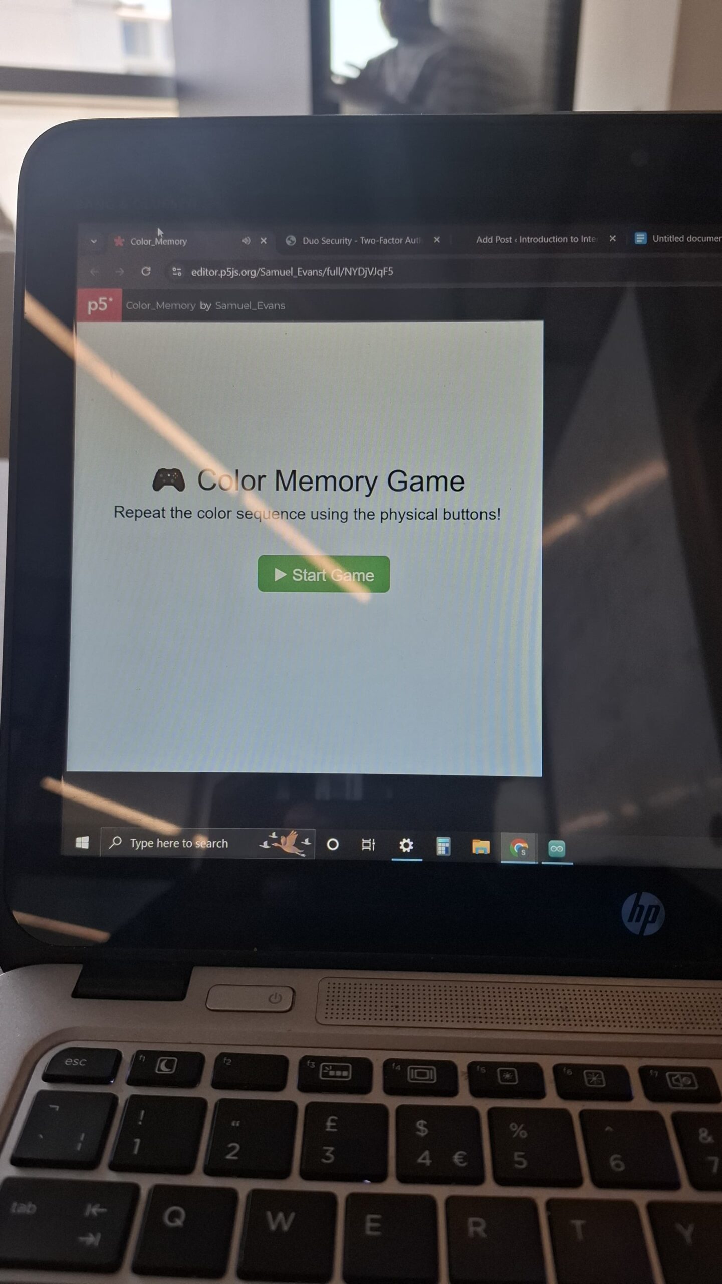
The game begins with a start page where the user gets enough time to read through the instructions.
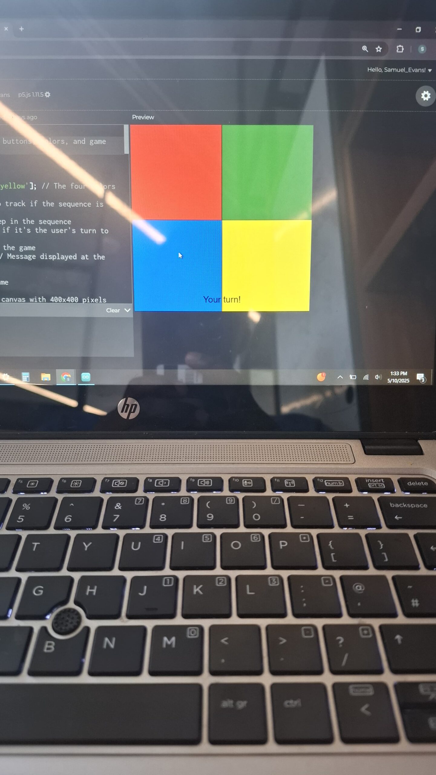
Upon clicking start the game begins with a sequence of one color; say blue. The color is highlighted with a black stroke. The user is supposed to press the same color. If they get it right they proceed to the next round which appends one more color to the sequence say green and now the player sees two colors blue and green. If they had gotten it wrong on the first try the sequence repeats at the expense of one out of the three lives that the player has. This is to say that the player has got only two passes to get it wrong. The game continues until all the colors have been highlighted and well matched by the players. At the side there is a score tracking progress bar that fills depending on the number of colors that the player gets right. When the player successfully fills the bar by getting all the colors right, the game ends and the player wins. If the player gets it wrong three times the game ends and they have the option to restart.
VIDEO/ IMAGES
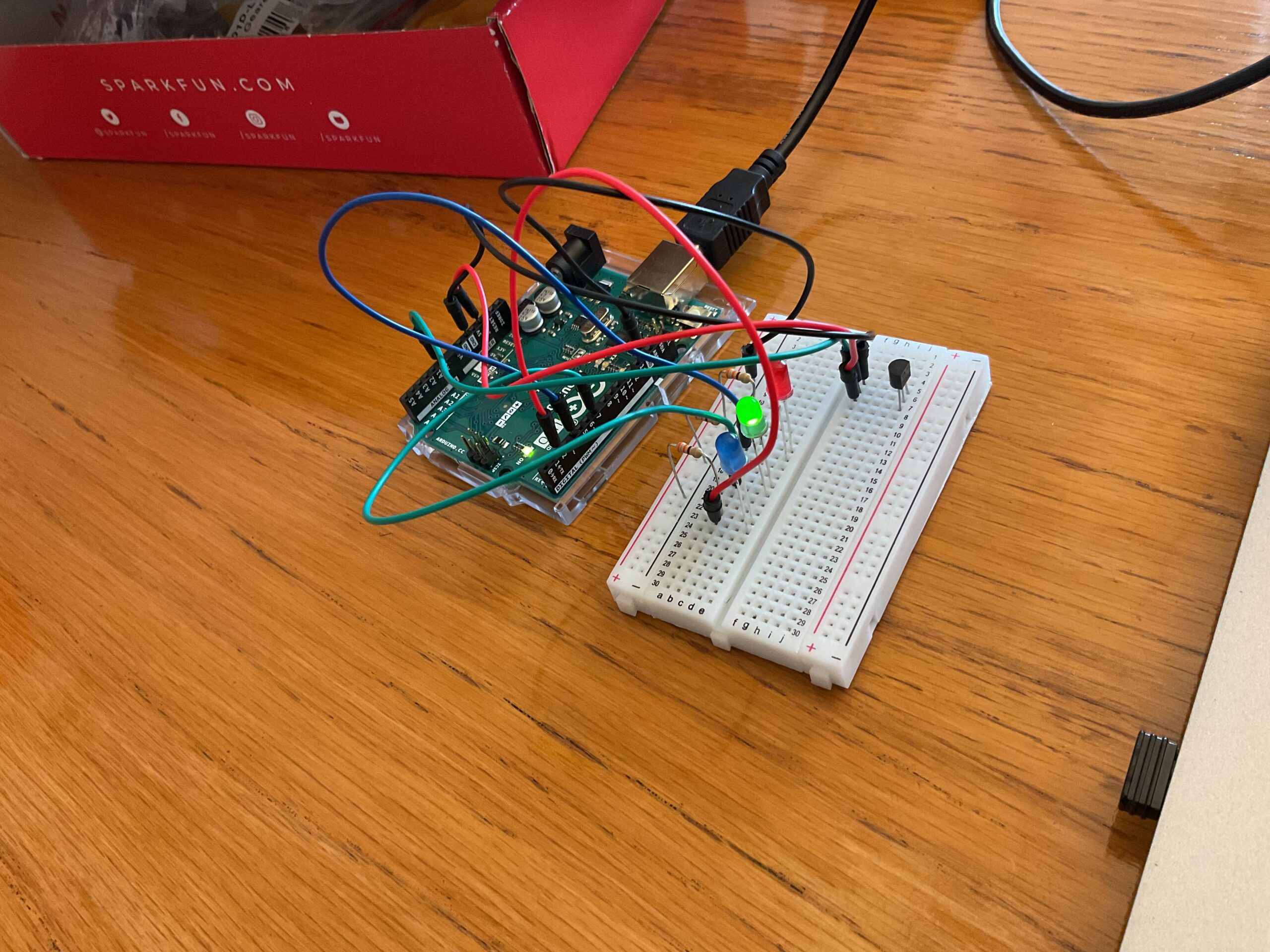
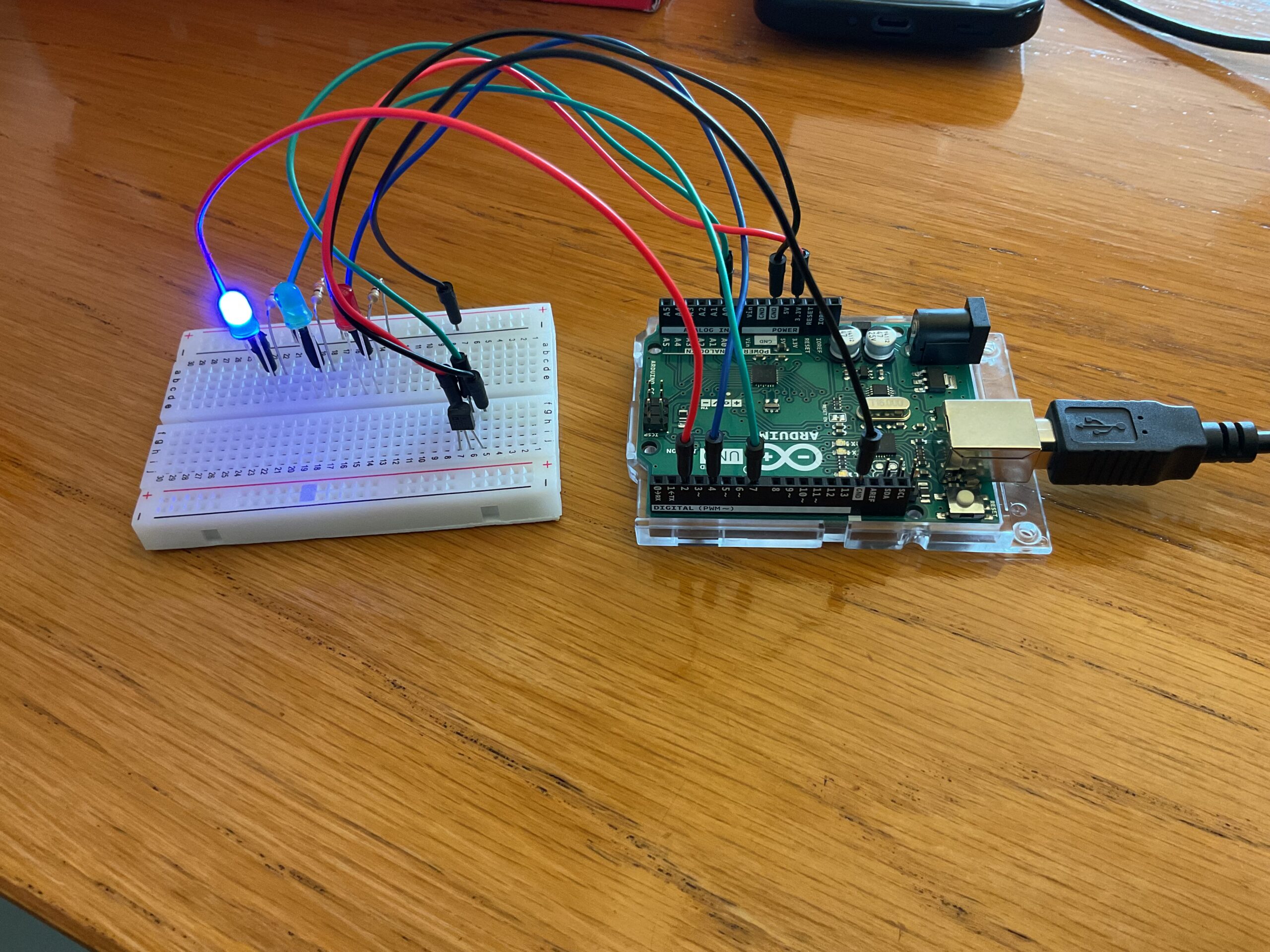
ARDUINO
The arduino code is less complicated compared to the p5js code. The connections involved
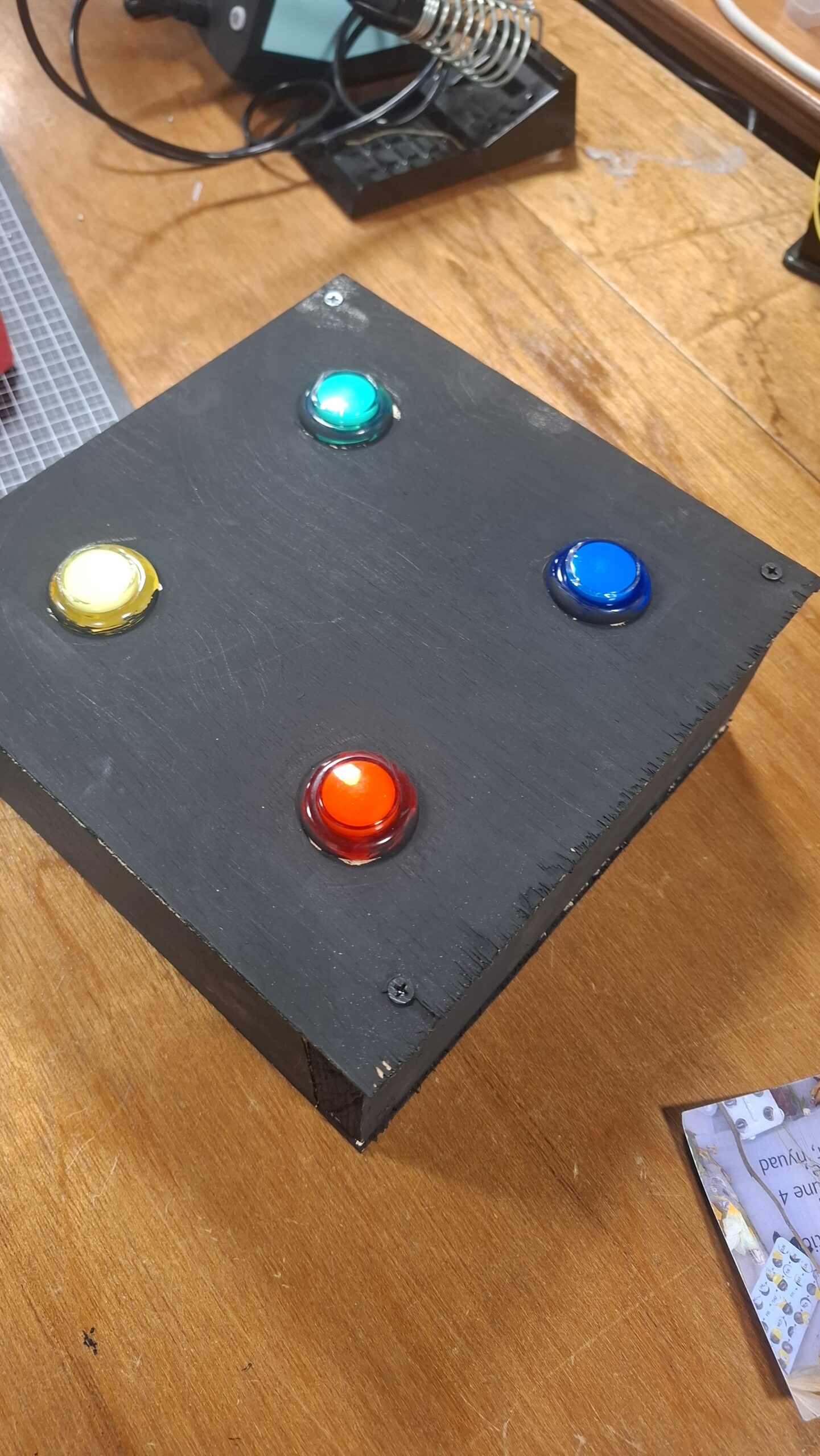
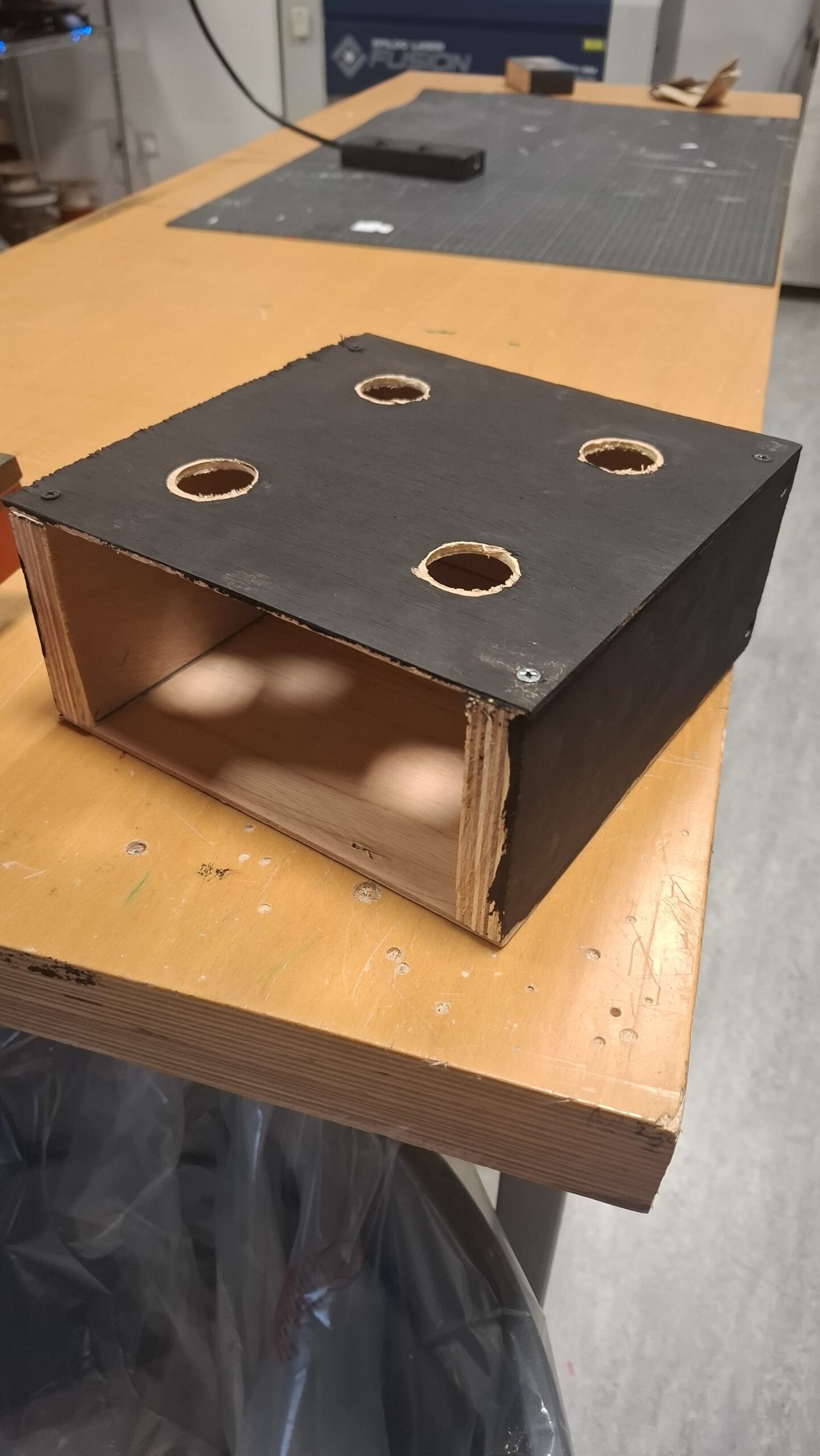
- 4 led push buttons
- Buzzer
- Jumper wires
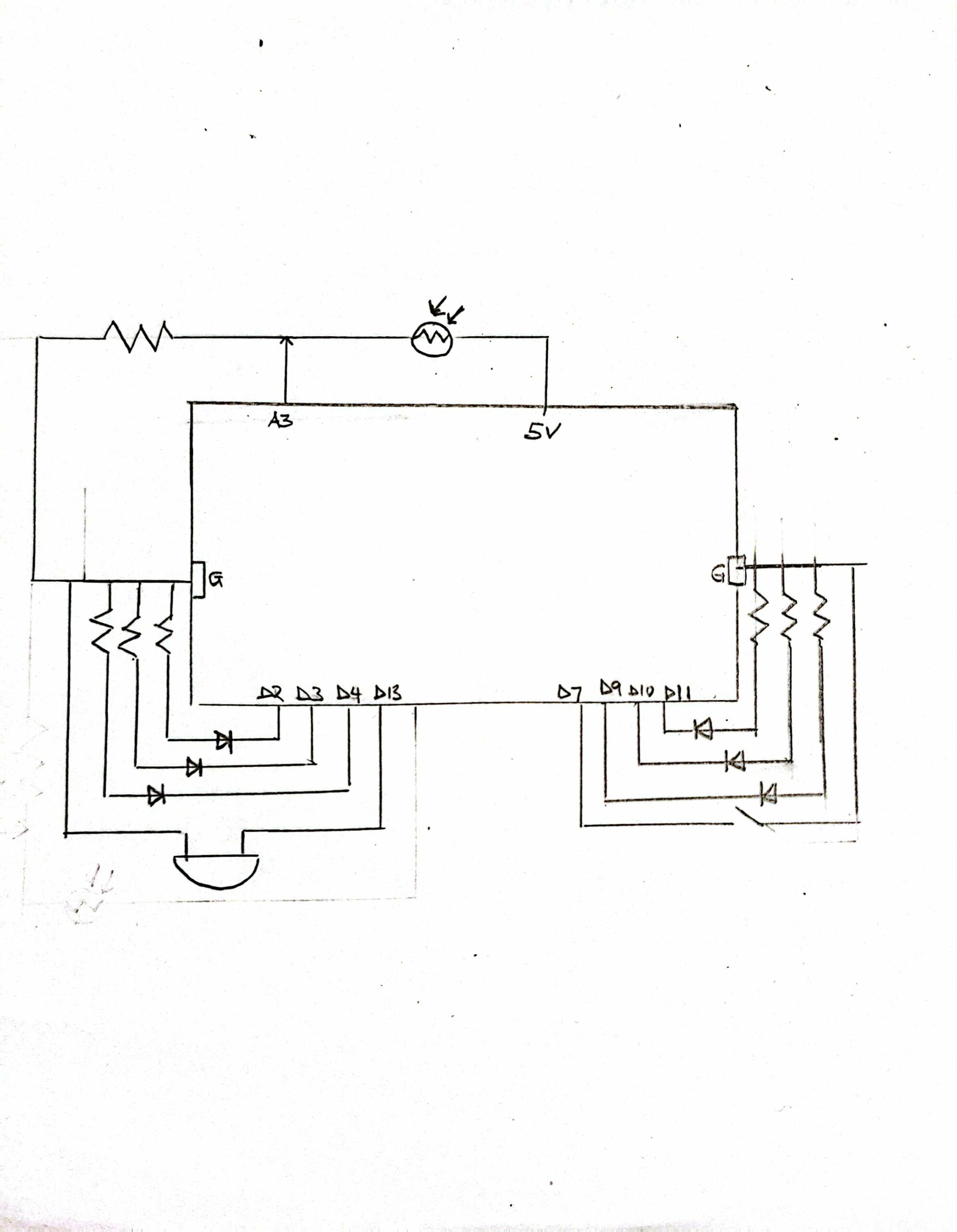
SCHEMATIC
For my scematic I used normal push buttons as I could not find the led-push buttons for representation.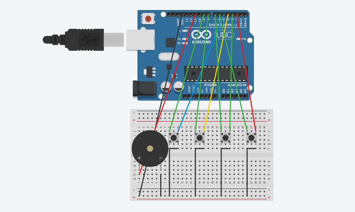
ARDUINO CODE
// Pin Definitions
const int redPin = 6;
const int greenPin = 7;
const int bluePin = 8;
const int yellowPin = 9;
const int buzzerPin = 11;

const int buttonPins[] = {2, 3, 4, 5};  // Red, Green, Blue, Yellow
const char* colorNames[] = {"red", "green", "blue", "yellow"};

// Frequencies for different colors (in Hz)
const int tones[] = {262, 330, 390, 494}; // A4, C5, D5, E5

int lastButtonState[4] = {HIGH, HIGH, HIGH, HIGH};  // For edge detection
String colorSequence = "";  // Collects pressed color names

void setup() {
  // LED outputs
  pinMode(redPin, OUTPUT);
  pinMode(greenPin, OUTPUT);
  pinMode(bluePin, OUTPUT);
  pinMode(yellowPin, OUTPUT);
  pinMode(buzzerPin, OUTPUT);

  // Button inputs
  for (int i = 0; i < 4; i++) {
    pinMode(buttonPins[i], INPUT_PULLUP);
  }

  Serial.begin(9600);
}

void loop() {
  for (int i = 0; i < 4; i++) {
    int currentState = digitalRead(buttonPins[i]);

    // Detect new button press (from HIGH to LOW)
    if (lastButtonState[i] == HIGH && currentState == LOW) {
      // Turn on the LED
      if (i == 0) digitalWrite(redPin, HIGH);
      if (i == 1) digitalWrite(greenPin, HIGH);
      if (i == 2) digitalWrite(bluePin, HIGH);
      if (i == 3) digitalWrite(yellowPin, HIGH);

      // Play tone on buzzer
      tone(buzzerPin, tones[i], 150);  // Play for 150 ms

      // Append to sequence and send it
      if (colorSequence.length() > 0) {
        colorSequence += ",";
      }
      colorSequence += colorNames[i];

      Serial.println(colorSequence);  // Send entire sequence
    }

    // Turn off LED if button is released
    if (currentState == HIGH) {
      if (i == 0) digitalWrite(redPin, LOW);
      if (i == 1) digitalWrite(greenPin, LOW);
      if (i == 2) digitalWrite(bluePin, LOW);
      if (i == 3) digitalWrite(yellowPin, LOW);
    }

    lastButtonState[i] = currentState;
  }

  delay(50);  // Short delay for debouncing
}
P5JS
For my p5js I mainly used functions to help with handling of data and processing from the arduino and to display. In the sketch I had html, a webserial library, music(background, correct and incorrect sounds), and the actual p5js sketch code. Some of the notable portions of the p5js code include music handling, serial communication, game start page, button handling and game over page.
Below are the different code portions.
HTML
<!DOCTYPE html>
<html lang="en">
  <head>
    <script src="https://cdnjs.cloudflare.com/ajax/libs/p5.js/1.4.0/p5.js"></script>
    <script src="https://cdnjs.cloudflare.com/ajax/libs/p5.js/1.4.0/addons/p5.sound.min.js"></script>

    <!-- Load the web-serial library -->
    <script src="p5.web-serial.js"></script>

    <link rel="stylesheet" type="text/css" href="style.css">
    <meta charset="utf-8" />

  </head>
  <body>
    <main>
    </main>
    <script src="sketch.js"></script>
  </body>
</html>
WEBSERIAL LIBRARY
let port, reader, writer;
let serialActive = false;

async function getPort(baud = 9600) {
  let port = await navigator.serial.requestPort();

  // Wait for the serial port to open.
  await port.open({ baudRate: baud });

  // create read & write streams
  textDecoder = new TextDecoderStream();
  textEncoder = new TextEncoderStream();
  readableStreamClosed = port.readable.pipeTo(textDecoder.writable);
  writableStreamClosed = textEncoder.readable.pipeTo(port.writable);

  reader = textDecoder.readable
    .pipeThrough(new TransformStream(new LineBreakTransformer()))
    .getReader();
  writer = textEncoder.writable.getWriter();

  return { port, reader, writer };
}

class LineBreakTransformer {
  constructor() {
    // A container for holding stream data until a new line.
    this.chunks = "";
  }

  transform(chunk, controller) {
    // Append new chunks to existing chunks.
    this.chunks += chunk;
    // For each line breaks in chunks, send the parsed lines out.
    const lines = this.chunks.split("\r\n");
    this.chunks = lines.pop();
    lines.forEach((line) => controller.enqueue(line));
  }

  flush(controller) {
    // When the stream is closed, flush any remaining chunks out.
    controller.enqueue(this.chunks);
  }
}

async function setUpSerial() {
  noLoop();
  ({ port, reader, writer } = await getPort());
  serialActive = true;
  runSerial();
  loop();
}

async function runSerial() {
  try {
    while (true) {
      if (typeof readSerial === "undefined") {
        console.log("No readSerial() function found.");
        serialActive = false;
        break;
      } else {
        const { value, done } = await reader.read();
        if (done) {
          // Allow the serial port to be closed later.
          reader.releaseLock();
          break;
        }
        readSerial(value);
      }
    }
  } catch (e) {
    console.error(e);
  }
}

async function writeSerial(msg) {
  await writer.write(msg);
}
p5js SKETCH
gridSize = 5;
squareSize = 100;
colors = ['red', 'green', 'blue', 'yellow'];
grid = [];
sequence = [];
playerInput = [];
showingSequence = false;
showIndex = 0;
showTimer = 0;
inputEnabled = false;
currentRound = 1;
gameOver = false;
gameStarted = false;

serialMessage = '';
messageColor = 'black';
confetti = [];
startButton = null;
restartButton = null;

statusTimer = 0;
statusDuration = 2000;

roundStartTime = 0;
timeLimit = 10000;
timeLeft = timeLimit;

let bgMusic, correctSound, incorrectSound;

lives = 3;

function preload() { //loading the music
  soundFormats('mp3', 'wav');
  bgMusic = loadSound('music/background.mp3');
  correctSound = loadSound('music/correct.mp3');
  incorrectSound = loadSound('music/incorrect.mp3');
}

function setup() {
  createCanvas(gridSize * squareSize + 80, gridSize * squareSize + 60);
  noStroke();

  startButton = createButton('▶ Start Game');//start button
  styleButton(startButton, width / 2 - 60, height / 2 + 10, '#4CAF50');
  startButton.mousePressed(async () => {
    await setUpSerial();//using the start button to initiate serial comm
    startGame();
  });

  bgMusic.setLoop(true);
  bgMusic.play();// playing the background music throughout
}

function styleButton(btn, x, y, color) {// styling code function for all the buttons
  btn.position(x, y);
  btn.style('font-size', '20px');
  btn.style('padding', '10px 20px');
  btn.style('background-color', color);
  btn.style('color', 'white');
  btn.style('border', 'none');
  btn.style('border-radius', '8px');
}

function startGame() { //initializing the game
  gameStarted = true;
  startButton.remove();// moving from the start page to the grid
  initGrid();
  nextRound();
}


//game loop
function draw() {
  background(220);

  if (!gameStarted) {
    drawStartScreen();
    return;
  }

  if (gameOver) {
    drawEndScreen();
    return;
  }

  drawGrid();
  drawProgressBar();
  drawTimeBar();
  drawSidebar();

  if (showingSequence && millis() - showTimer > 800) {
    showTimer = millis();
    showIndex++;
    if (showIndex >= sequence.length) {
      showingSequence = false;
      inputEnabled = true;
      showIndex = 0;
      roundStartTime = millis();
    }
  }

  if (inputEnabled) {
    timeLeft = timeLimit - (millis() - roundStartTime);
    if (timeLeft <= 0) {
      handleIncorrect('Time Up!');
    }
  }

  clearSerialMessageIfDue();
}

function drawStartScreen() {
  drawBackgroundGradient();
  fill(30);
  textAlign(CENTER, CENTER);
  textFont('Helvetica');
  textSize(36);
  text(' Color Memory Game', width / 2, height / 2 - 80);
  textSize(20);
  text('Repeat the color sequence using the physical buttons!', width / 2, height / 2 - 40);
}


//---------------END SCREEN-------------------------------
function drawEndScreen() {
  drawBackgroundGradient();
  drawConfetti();
  drawGameOverArt();
  textAlign(CENTER, CENTER);
  fill('#2E8B57');
  textFont('Georgia');
  textSize(36);
  text('Game Over!', width / 2, height / 2 - 80);
  fill(50);
  textSize(16);
  text('Press the button to restart', width / 2, height / 2 - 40);
  if (!restartButton) {
    restartButton = createButton(' Restart');
    restartButton.id('restartBtn');
    styleButton(restartButton, width / 2 - 60, height / 2 + 20, '#f44336');
    restartButton.mousePressed(() => {
      restartButton.remove();
      restartButton = null;
      resetGame();
    });
  }
}

//--------------------BOTTOM BAR--------------------------
//Displaying the message
function updateSerialMessage(msg, color) {
  serialMessage = msg;
  messageColor = color;
  statusTimer = millis();
}
//Clearing the message
function clearSerialMessageIfDue() {
  if (millis() - statusTimer > statusDuration && serialMessage !== '') {
    serialMessage = '';
  }
}

//---------------------SIDE BAR---------------------------------
function drawSidebar() {
  let barWidth = 60;
  let barX = width - barWidth;
  fill(240);
  rect(barX, 0, barWidth, height);

  let progress = sequence.length / grid.length;//filling with the progress bar
  fill('#2196F3');
  rect(barX + 10, 20, 40, height * progress);

  textAlign(CENTER, CENTER);
  textSize(20);
  for (let i = 0; i < 3; i++) {
    let y = height - 40 - i * 30;
    fill(i < lives ? 'red' : 'lightgray');
    text(i < lives ? '❤️' : '', barX + barWidth / 2, y);// representing lives with red heart emojis
  }
}

// -------------------TIME BAR---------------------------------------
function drawTimeBar() {
  let barHeight = 10;
  let barY = height - 60;
  let progress = constrain(timeLeft / timeLimit, 0, 1);

  fill(200);
  rect(0, barY, width - 80, barHeight);

  fill(progress < 0.3 ? '#F44336' : progress < 0.6 ? '#FFC107' : '#4CAF50');
  rect(0, barY, (width - 80) * progress, barHeight);///changing color depending in the time left
}


//-------------------PROGRESS BAR-----------------------------
function drawProgressBar() {
  let barHeight = 30;
  let barY = height - barHeight;
  let progress = sequence.length > 0 ? playerInput.length / sequence.length : 0;

  fill(200);
  rect(0, barY, width - 80, barHeight); // filling the bar proporionally to the progress

  fill(messageColor === 'green' ? '#4CAF50' : messageColor === 'red' ? '#F44336' : '#2196F3');
  rect(0, barY, (width - 80) * progress, barHeight);

  fill(255);
  textAlign(CENTER, CENTER);
  textSize(16);
  text(serialMessage, (width - 80) / 2, barY + barHeight / 2);
}

//-------------------GRID SET UP-------------------------------------
function drawGrid() {
  for (let i = 0; i < grid.length; i++) {
    let sq = grid[i];
    let x = sq.x;
    let y = sq.y;
// highlighting square by a black stroke and appending them to the sequence.
    if (showingSequence && i === sequence[showIndex]) {
      let sw = 6;
      strokeWeight(sw);
      stroke(0);
      let inset = sw / 2;
      fill(sq.color);
      rect(x + inset, y + inset, squareSize - sw, squareSize - sw);//fitting the stroke within the square
    } else {
      noStroke();
      fill(sq.color);
      rect(x, y, squareSize, squareSize);
    }
  }
  noStroke();
}

function initGrid() {
  grid = [];
  for (let row = 0; row < gridSize; row++) {
    for (let col = 0; col < gridSize; col++) {
      let availableColors = colors.slice();
      if (row > 0) { //avoiding the same colors being next to each other in a row
        let aboveColor = grid[(row - 1) * gridSize + col].color;
        availableColors = availableColors.filter(c => c !== aboveColor);
      }
      if (col > 0) {//avoiding the same colors being next to each other in a col
        let leftColor = grid[row * gridSize + (col - 1)].color;
        availableColors = availableColors.filter(c => c !== leftColor);
      }
      grid.push({ x: col * squareSize, y: row * squareSize, color: random(availableColors) });
    }
  }
}

//---------SERIAL COMMUNICATION MANAGEMENT----------------------------
function readSerial(data) {
  if (!inputEnabled || gameOver) return;
  let colorClicked = data.trim().split(',').pop().trim();//reading the serial port for the color pressed and printed out by arduino
  let expectedIndex = sequence[playerInput.length];
  let expectedColor = grid[expectedIndex].color;// checking if the colors match
  if (colorClicked === expectedColor) {
    playerInput.push(expectedIndex);
    correctSound.play();
    updateSerialMessage('Correct', 'green');//updating the message.
    if (playerInput.length === sequence.length) {
      inputEnabled = false;
      setTimeout(nextRound, 1000);
    }
  } else {
    handleIncorrect('Incorrect');
  }
}


// checking if the pattern by the player is incorrect
function handleIncorrect(message) {
  incorrectSound.play();
  updateSerialMessage(message, 'red');
  lives--;
  playerInput = [];
  inputEnabled = false;
  if (lives <= 0) { // they have no more lives end game
    gameOver = true;
    spawnConfetti();
  } else {
    setTimeout(replayRound, 1500);
  }
}


//playing the next round when the player gets it right
function nextRound() {
  currentRound++;
  playerInput = [];
  if (sequence.length >= grid.length) { //checking if all the squares have been matched
    gameOver = true;// end game if true
    spawnConfetti();
    return;
  }
  sequence.push(floor(random(grid.length)));// append one more random square if the game is not over
  showingSequence = true;
  showIndex = 0;
  showTimer = millis();
}
// Repeating the round when the player gets it wrong
function replayRound() {
  playerInput = [];
  showingSequence = true;
  showIndex = 0;
  showTimer = millis();
}

function drawBackgroundGradient() {
  for (let y = 0; y < height; y++) {
    let c = lerpColor(color(255), color(200, 220, 255), map(y, 0, height, 0, 1));
    stroke(c);
    line(0, y, width, y);
  }
}


//-----------------CONFETTI FOR GAME OVER------------------------------------
function spawnConfetti() {
  confetti = [];
  for (let i = 0; i < 100; i++) {
    confetti.push({
      x: random(width),
      y: random(-200, 0),
      speed: random(2, 5),
      size: random(5, 10),
      color: random(colors)
    });
  }
}


function drawConfetti() {
  for (let c of confetti) {
    fill(c.color);
    noStroke();
    ellipse(c.x, c.y, c.size);
    c.y += c.speed;
    if (c.y > height) {
      c.y = random(-100, 0);
      c.x = random(width);
    }
  }
}

function drawGameOverArt() {
  for (let i = 0; i < sequence.length; i++) {
    fill(grid[sequence[i]].color);
    ellipse(50 + (i % 10) * 25, 50 + floor(i / 10) * 25, 20);
  }
}

//-------------- RESETTING THE GAME------------------------------------------
function resetGame() {
  lives = 3;
  sequence = [];
  playerInput = [];
  showingSequence = false;
  showIndex = 0;
  inputEnabled = false;
  currentRound = 1;
  gameOver = false;
  timeLeft = timeLimit;
  serialMessage = '';
  messageColor = 'black';
  initGrid();
  nextRound();
}
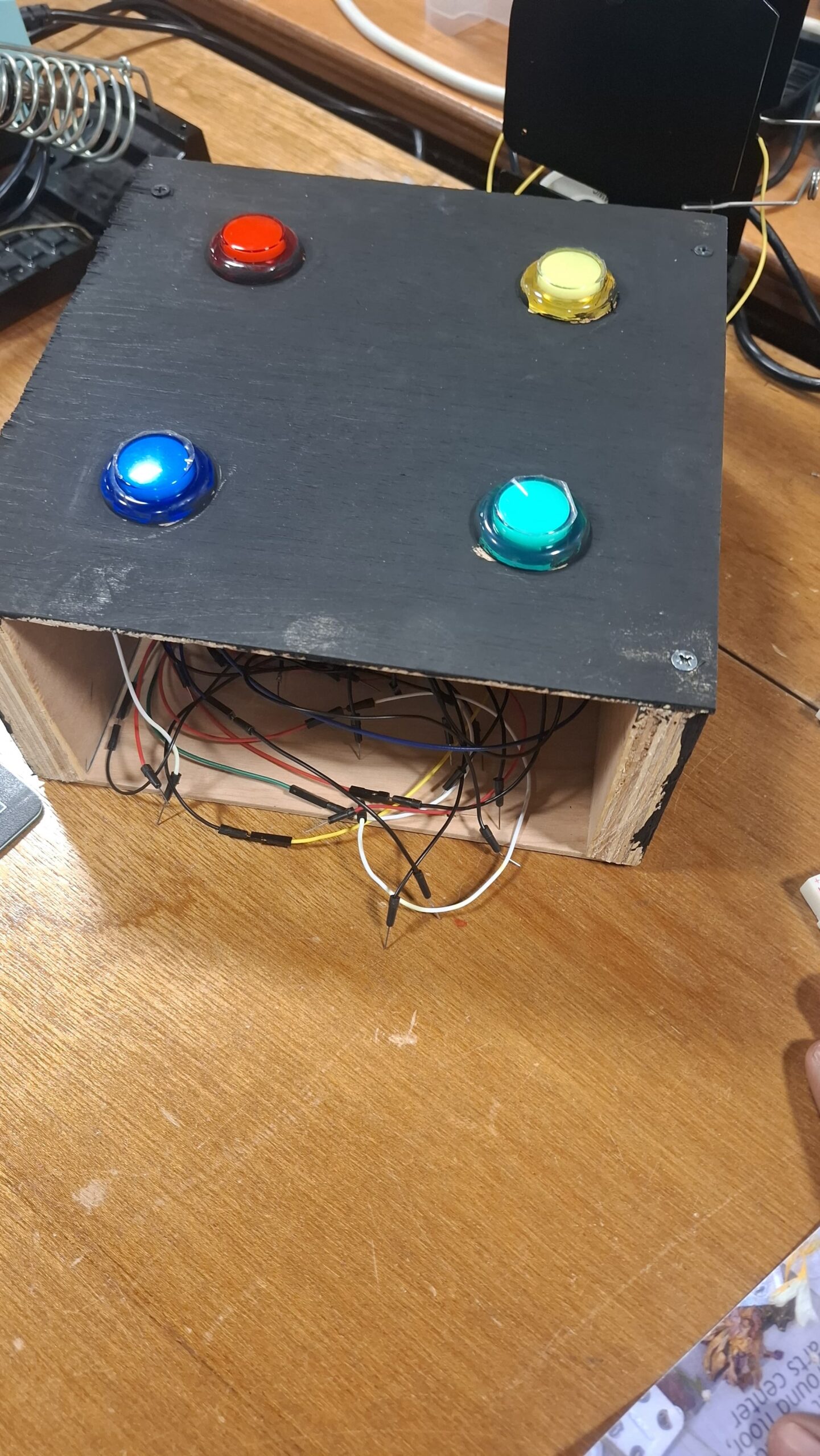
Areas I am proud of and areas for future improvement
I am really proud about how the game graphics turned out. That is; buttons, score recording and representation, start page, game over page, restart logic, “lives” handling and the game progression loop. On the hardware arduino side, I was proud of the carpentry and design of the wooden platform that held the push-buttons. However, I think there’s still more that could have been done on the aspect of aesthetics to make my projects more appealing and attractive. I also need to work on communicating instructions more effectively and intuitively. Also it was in my very initial idea to 3D print so that I can automate a robot following the progress of the game. I was limited however because of the high demand of the 3D printers. I hope to one day finish what I have started.