
I’m putting my proposal, user testing and documentation in one post, for the primary reason that when we were supposed to come up with our proposal, I knew that my next two weeks were too unpredictable (traveling, moving back in with my family, somehow catching a fever last week, the campus going on lockdown again just the day after I emailed if I could pick up my Arduino kit, being forced into babysitting during classes? etc.) for me to come up with a fixed project idea, and hence, changed my project far too many times to count before finally deciding on one.
The Final Project
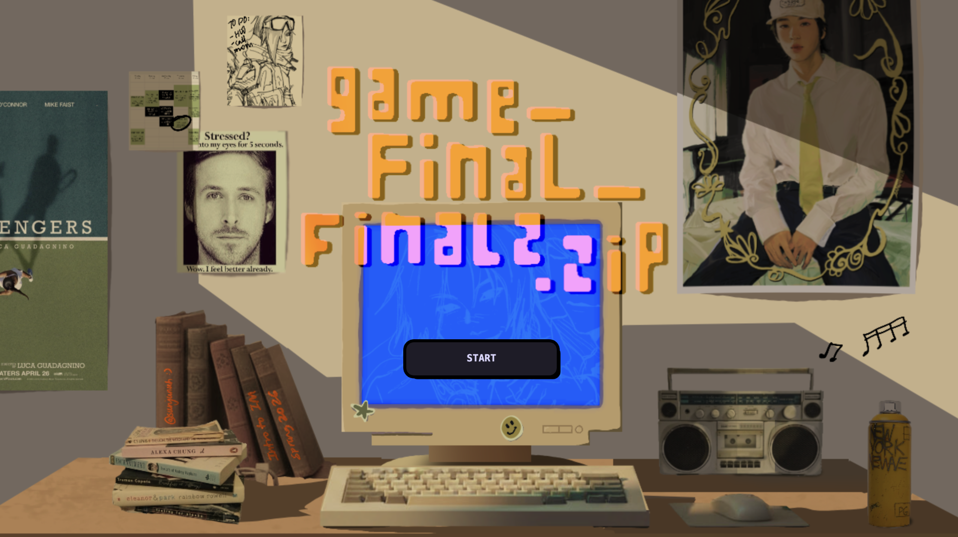
(I recommend playing on the link above, on a laptop. I didn’t put a demo, because the microphone settings wouldn’t work, so please do play!) (And, also, please be a bit patient with some parts. The game kind of lags, but not as much as it did in the first few attempts of coding.)
Proposal (and preface… and concept… etc.):
I originally wanted to make a video game that could be controlled by a physical Arduino, but I wasn’t able to get my kit, because 1) when I was in India, by the time I got the money in my card, I found out I was traveling back home and all the shipping dates shown were after I would have already left India and 2) the day I was available to go to campus, campus shut down. Hence, I had to change my mind very late about making my project completely on P5.js.
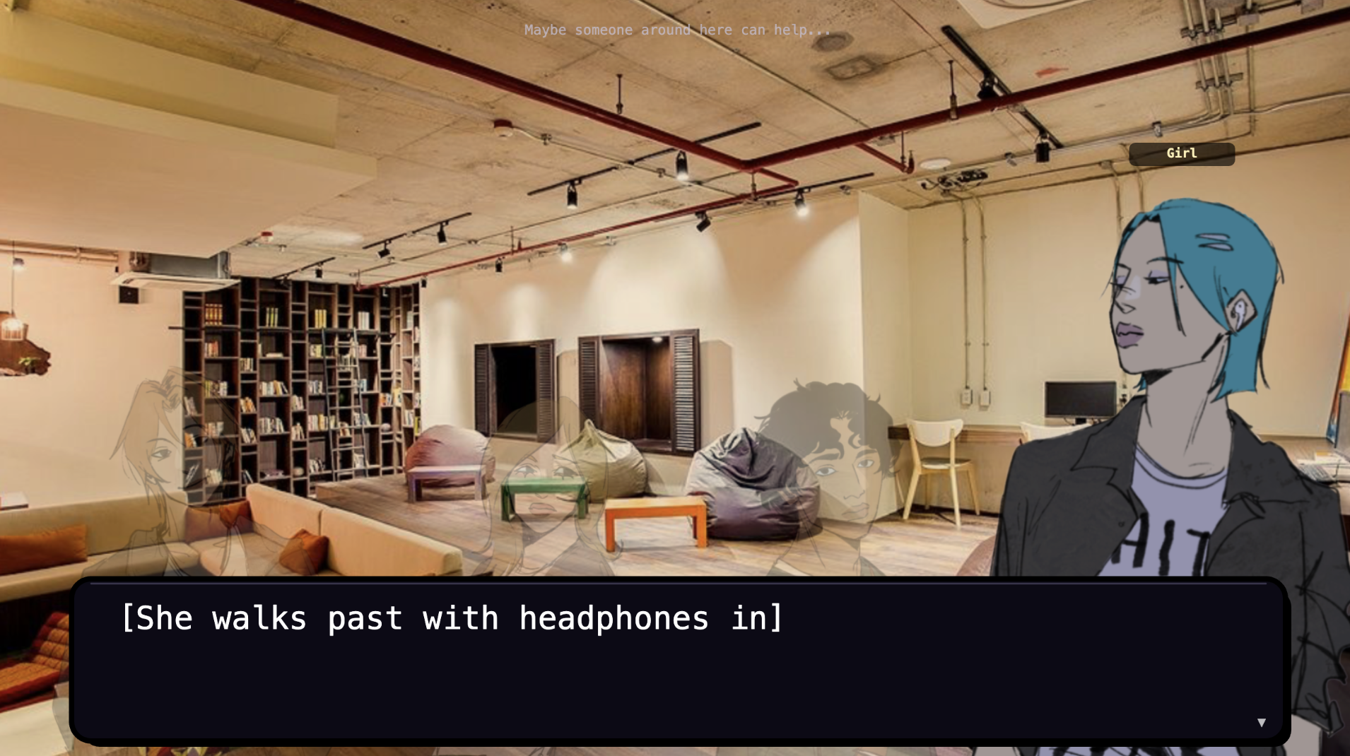
Since I was relying only on P5.js, I realized I had to go above and beyond for my project to fit the criteria (and extend beyond my midterm). Thus, I decided to make a visual novel with mini games inside. If this hasn’t been established already from my other documentation posts, I’m a huge visual novel fan. I originally was conflicted between different ideas for what the game should be about, but eventually settled on making a game that goes through a day in a random college student’s life. I also wanted to draw a lot of parts of this game (especially sprites), so settled on a more animated art style with some parts that weren’t as animated (due to 1) time constraints and 2) my own limited knowledge of coding some parts).
I saved up for and bought a Nintendo Switch Lite for my birthday this month and got to play some of my favorite games (esp. Persona 4 Golden), which helped me understand what I wanted my gameplay to be like (compared to just watching the run-through on YouTube).
There were several scenes and mini-games I wanted to be included:
(* = idea that changed from original plan , * = first run-through , * = second run-through, * = final project)
- Wake up scene (no action)*
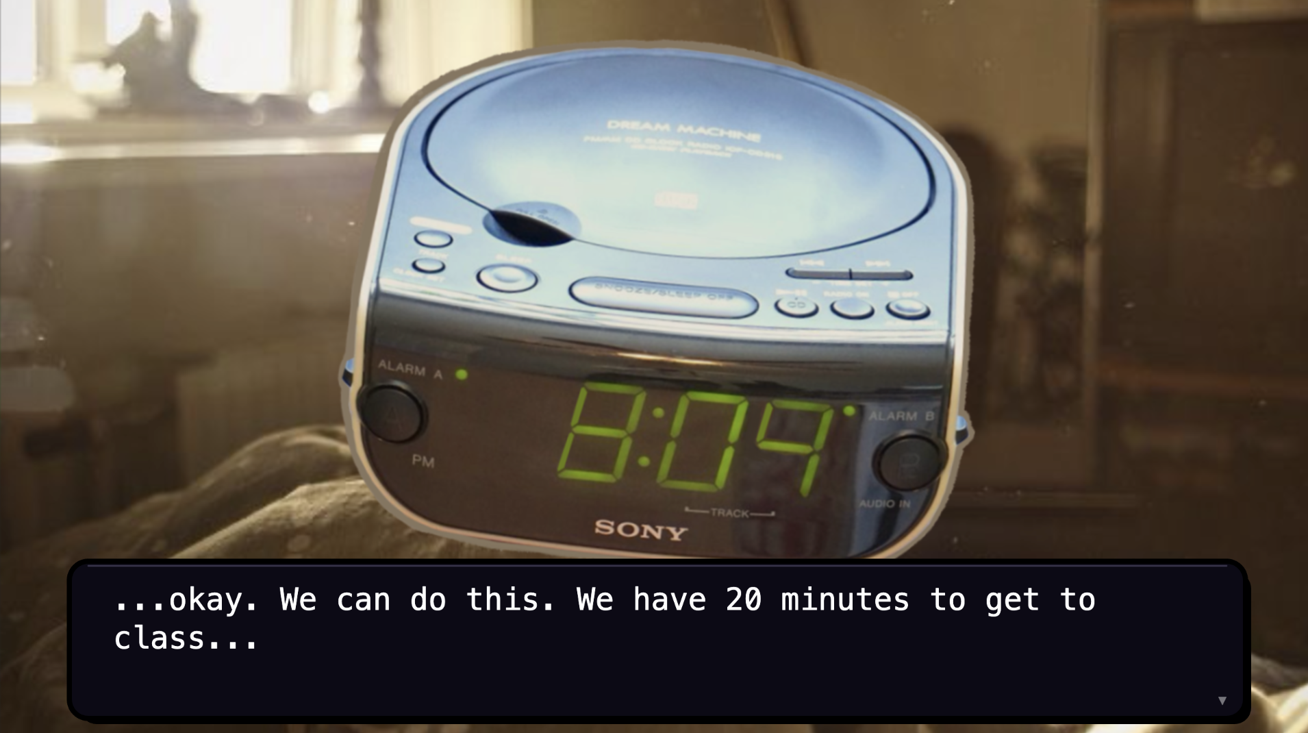
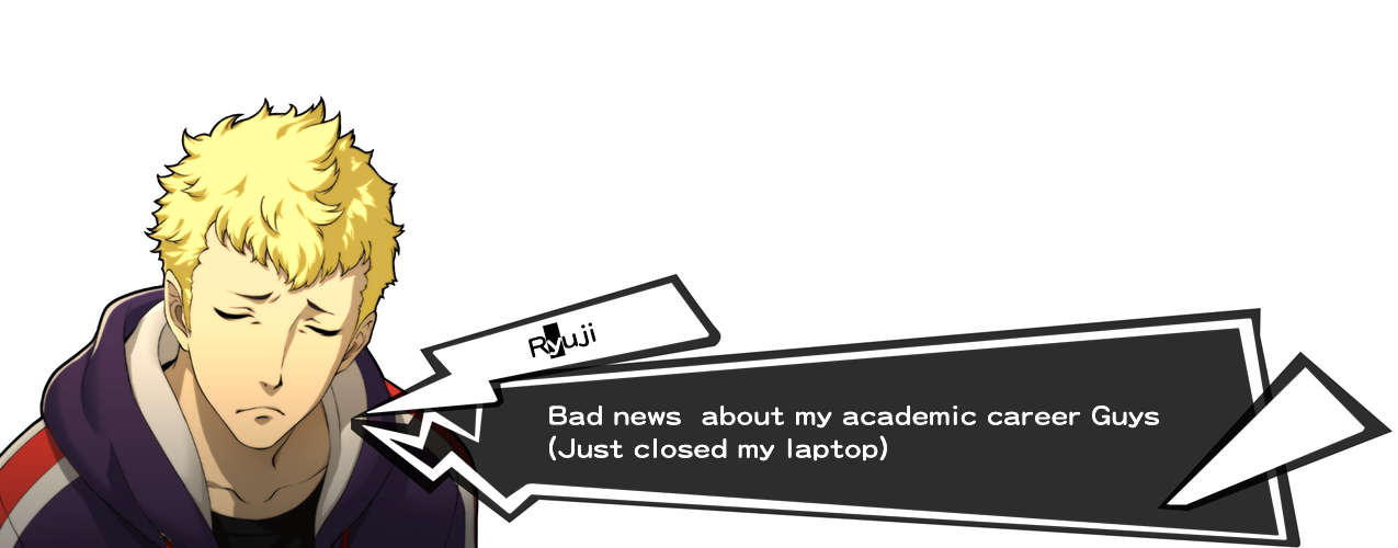
- Waking up to an alarm which you stop with a sound trigger (input)*
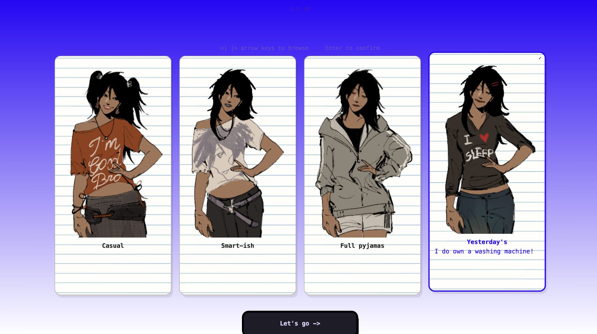
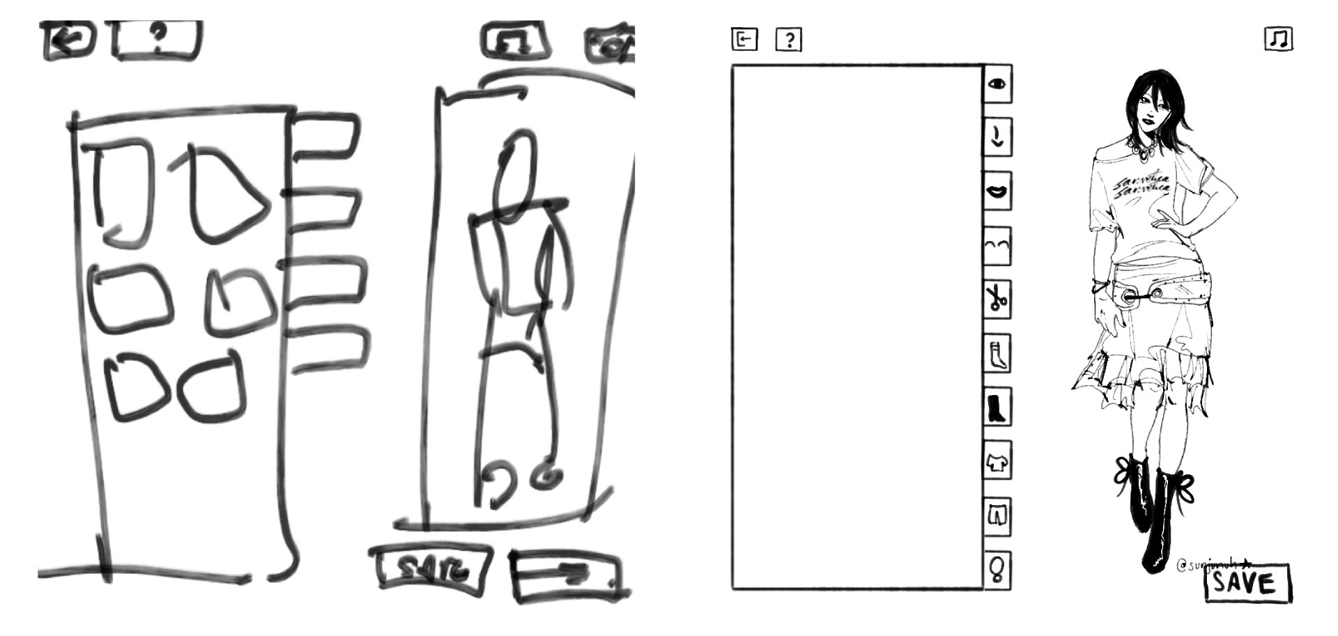
- A dress-up game * (this was modified to become much more simple: I originally intended to do a mechanism similar to my midterm and tragically realized that the file would explode if I overwhelmed it this much)
- Turned into picking an outfit from a selection of fixed outfits. *(clicking) *(scroll mechanism)
- Skip Breakfast*
- Mention in passing that you ate an apple *
- Computer Vision, grab any of the fruits on the table*
- Running to class, Subway Surfers edition?*
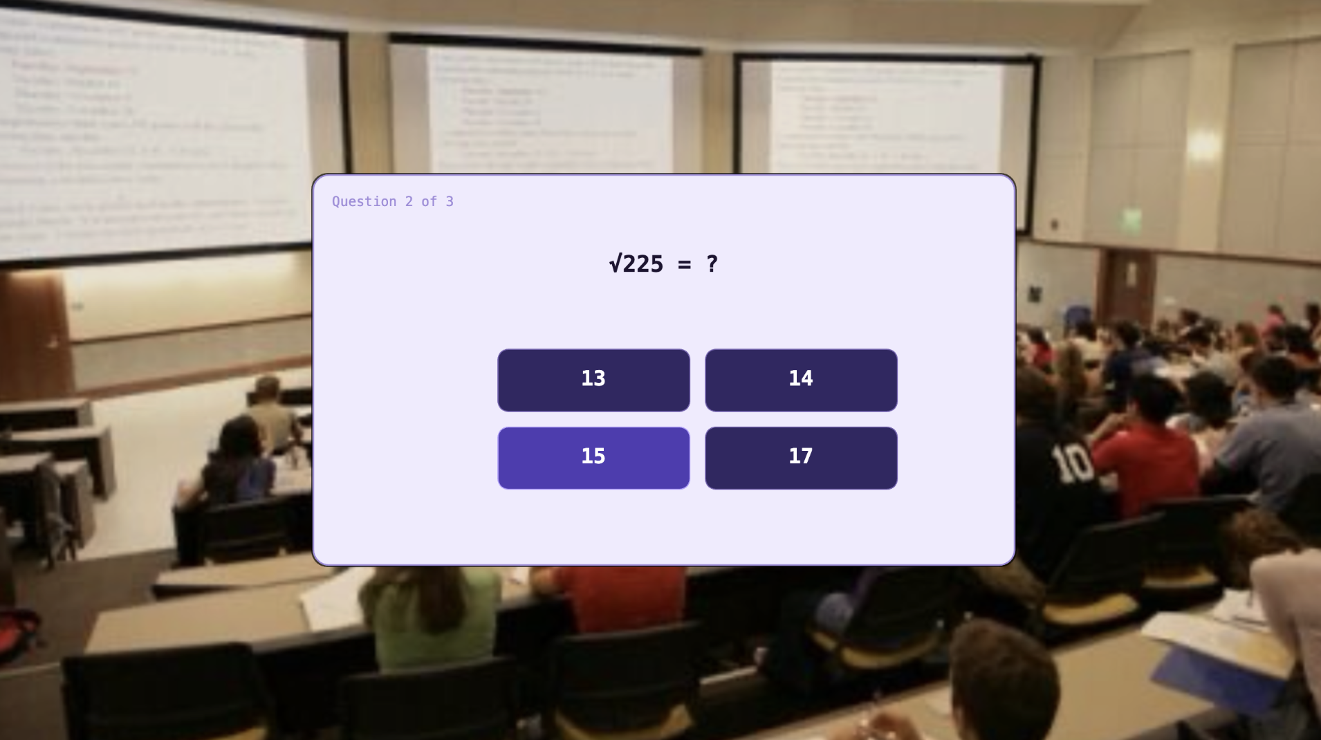
- Sit in Math class *
- Play a game! In math class.*
- Lunch, Subway Surfers edition?*
- Art Class, recreate MS Paint/digital painting softwares*
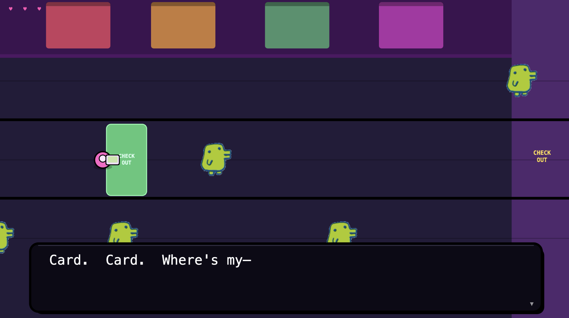
- Library Dash – run to find a seat *
- Don’t run, but click to find a seat *
- Scrap the library completely and just mention you spent time there *
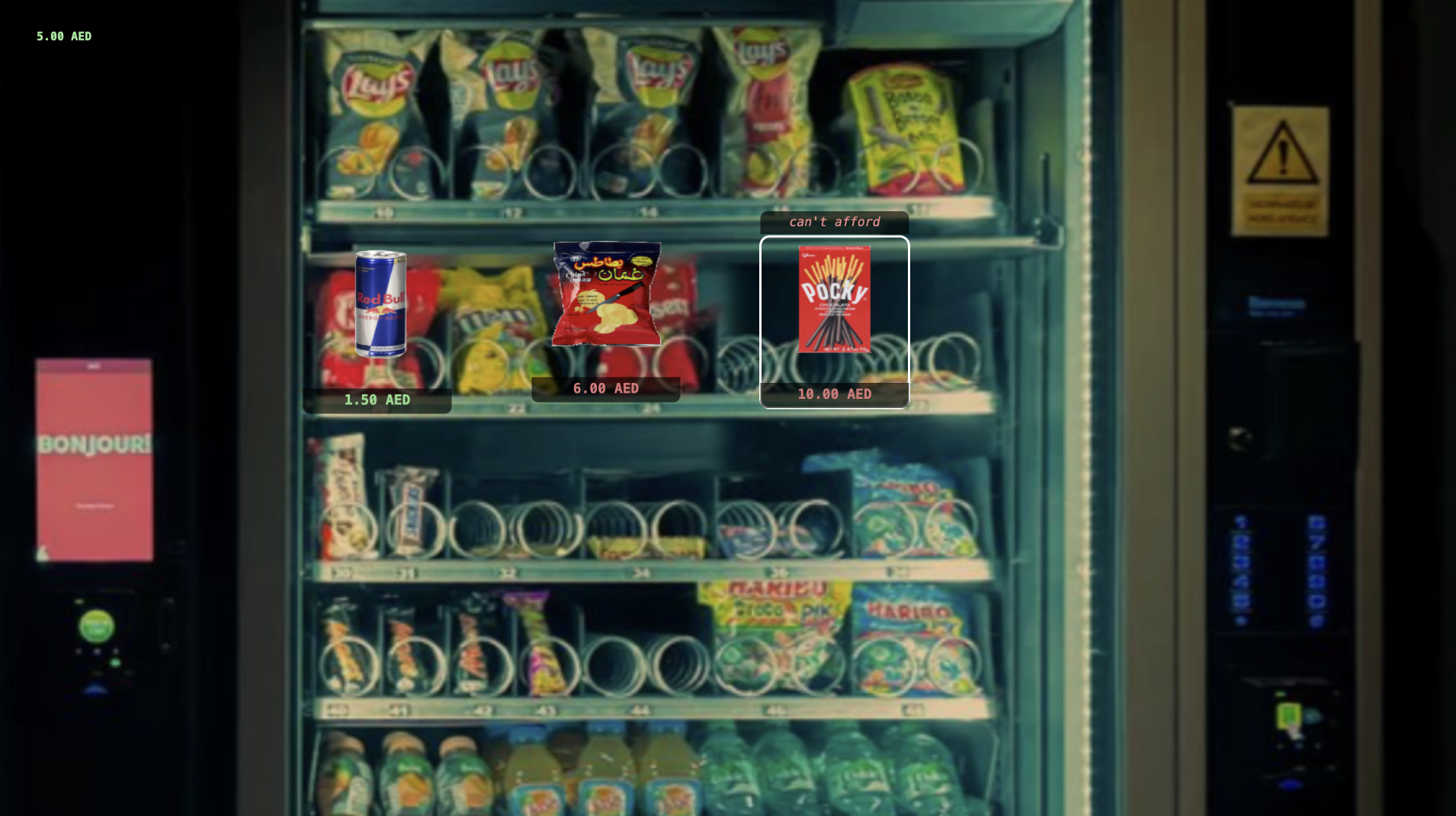
- Vending Machine: pick a snack, if you can’t afford it then ask people around you to lend you some money *
- Get dinner, make a noodle bowl (drag and drop)*
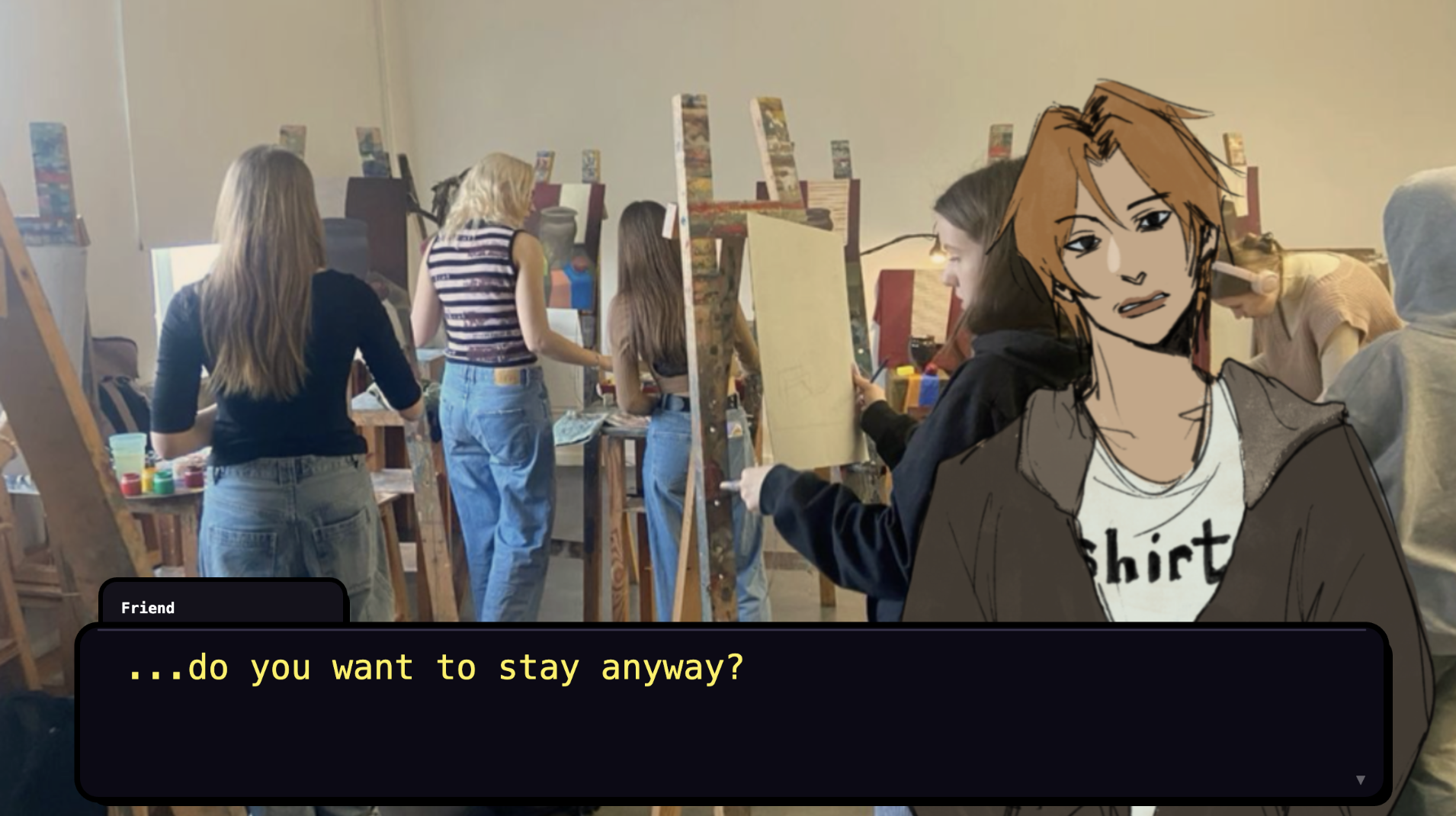
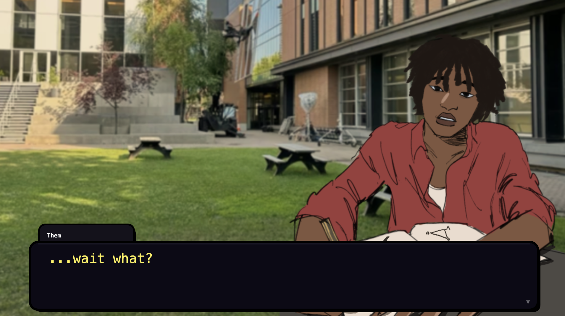
- Get some social interaction, 3 different conversation options*
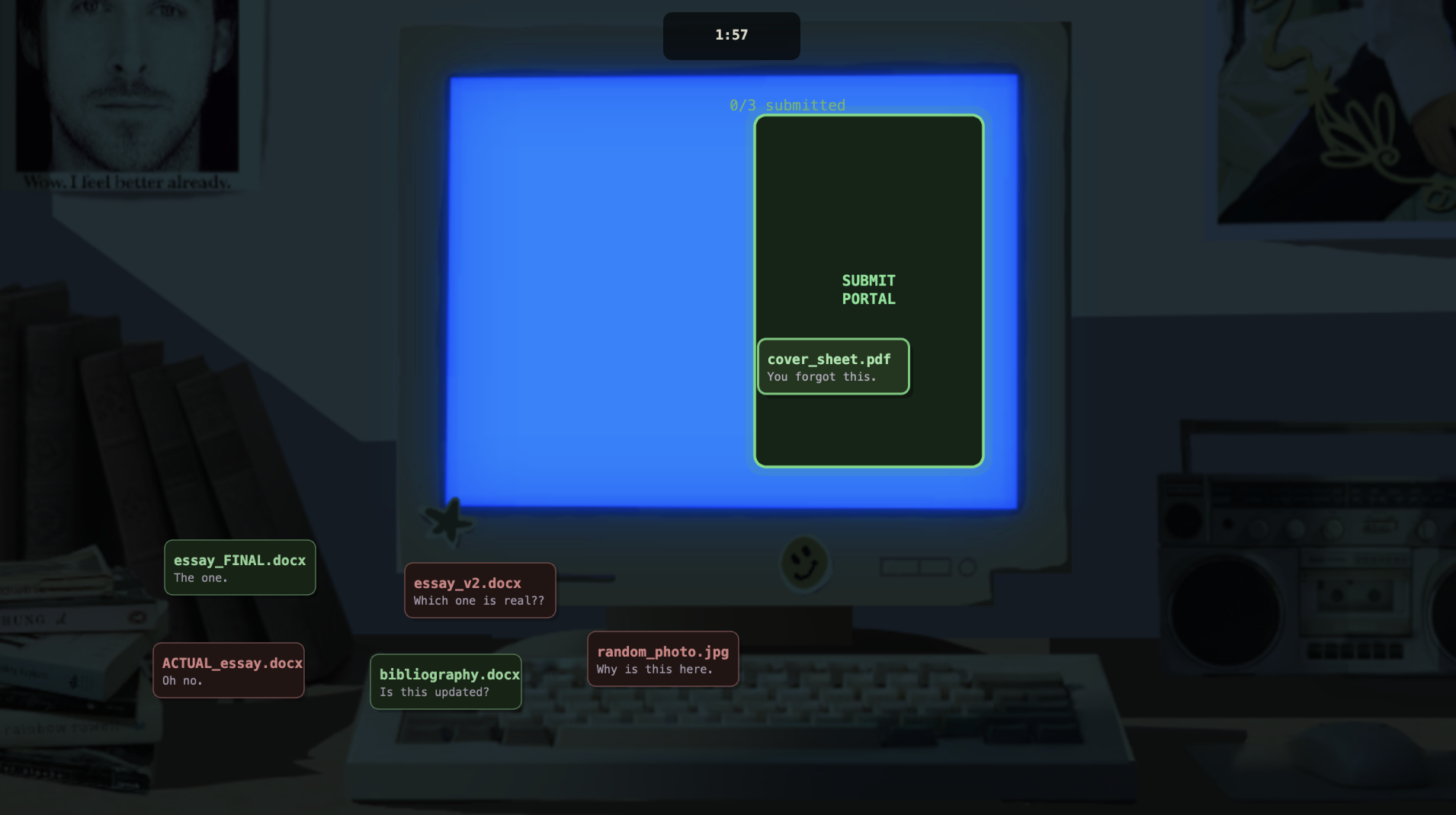
- Forget you have a submission and submit assignment by drag and drop*
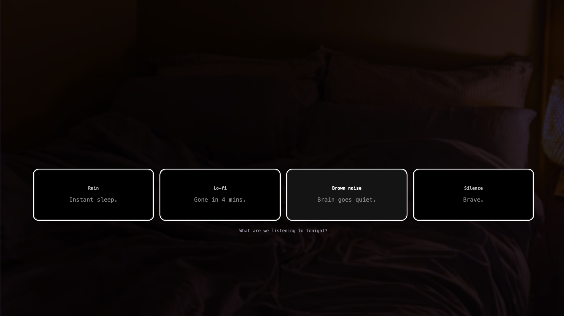
- Sleep*
- Pick a plushie*
- Pick a lighting*
- Pick a sleep song*
When coming up with this, I knew the hardest part would be finishing everything on time. To overcome this, I made sure to plan out everything before and start drawing + coding the aspects I knew wouldn’t be affected by any changes in plans.
Process:
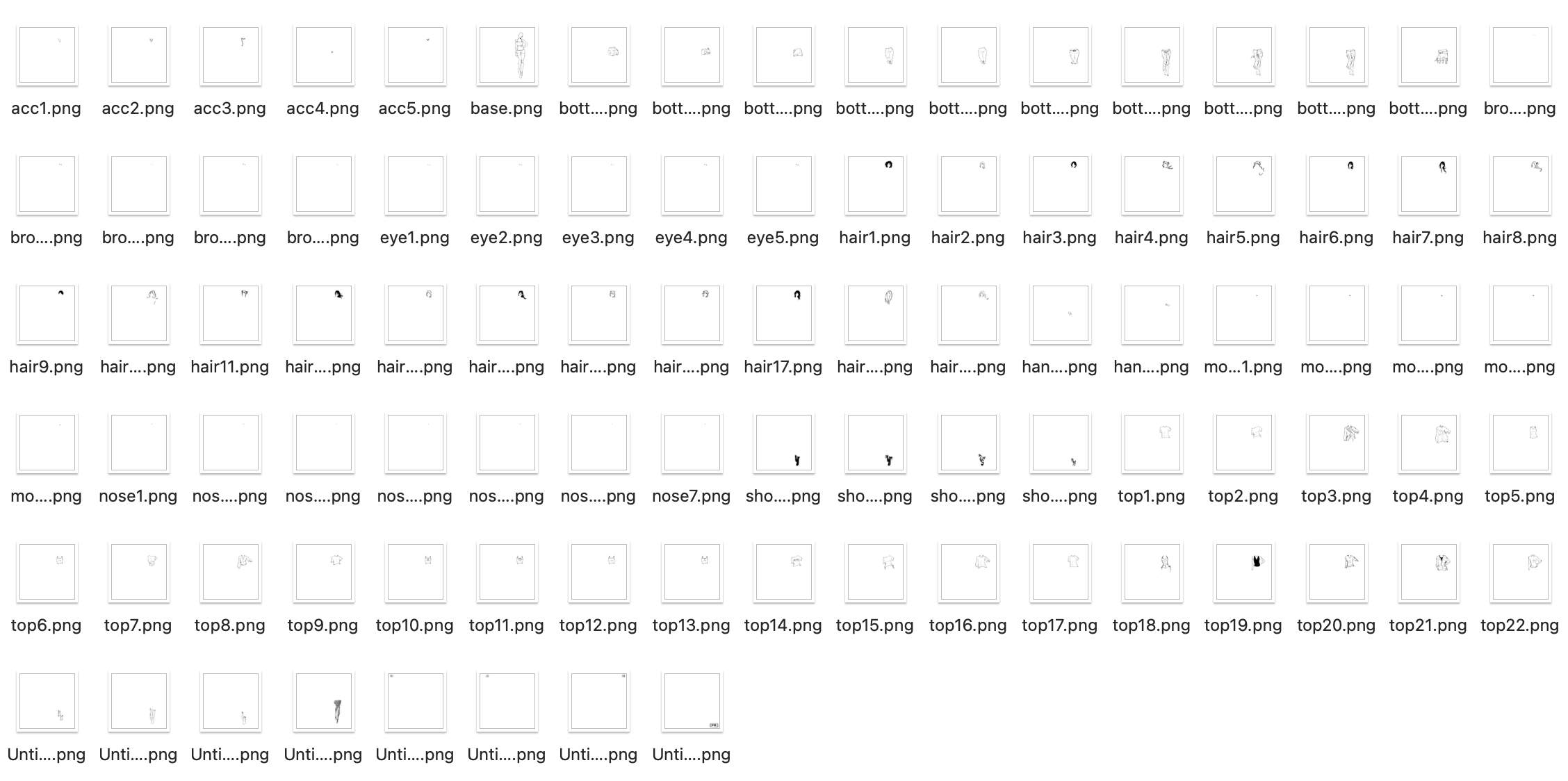
After writing down the skeleton of my game onto a word document (with whatever dialogue I had to put in), I drew all my animated assets out and found images for whatever assets I wasn’t drawing or coding. Some of the sprites had multiple expressions, so I had around 2-4 expressions per sprite.
After assembling all my assets (backgrounds, characters, items (e.g. snacks, fruits etc.), I uploaded & preloaded them into my P5.js file. I started with a scene manager and creating a fixed style for the text box for most of the dialogue and main character’s internal thoughts. I also built a shared fade system for all of the scene transitions. I used ml5.js handPose for the breakfast scene, and implemented speech recognition for the alarm dismissal. I coded each scene individually (made the mistake of starting with the first scene because then that meant that I needed to play the whole run-through every time just to check for errors at the very END. I think a lot of my time was spent on this). There were a lot of times where I had to change the location of assets, which I felt took the most amount of time while making the game. I added sound at the very end, because I was more focused on finishing the game first. After adding sound (after the presentation in class), the game seemed a lot more put-together. You can find the full code here. (I would add it directly here but it’s over a 1000 lines of code…) I wanted to break down each part but it might take me a while, so my code has small //notes on what each section shows on the game.
Parts I’m proud of:
I wouldn’t say I’m most proud of any part of the project, but there were parts I was happiest with. I was very happy with the Art Class Paint Tool, and I do think that’s also my favourite part. It turned out the cleanest aesthetically, and all the functions worked well. It’s also cool that I could get it to download the image (like in my midterm!).
I’m also very happy with the submission scene, and I like the drag drop mechanism I came up with for it. When you release the file, the code checks whether the file landed inside the portal rectangle, and only correct files disappear and stack up as a checklist.
if(mouseX>p.x&&mouseX<p.x+p.w&&mouseY>p.y&&mouseY<p.y+p.h){
  if(f.correct&&!sub.submitted.includes(sub.dragging)){
    sub.submitted.push(sub.dragging);
    f.gone=true;
    if(sub.submitted.length>=SUB_CORRECT_COUNT) sub.state="submitted";
  } else if(!f.correct){
    f.shake=30;
    sub.shakeTimer=30;
  }
}
if(!f.gone){ f.x=f.ox; f.y=f.oy; }
User Testing:
Unfortunately I do not have videos for user testing but I do have notes app testimonies from my sister. My only option available was her, as the rest of my family have been busy and she lives right next to my room (haha), but she played the game while I was either doing house chores or helping my mom and here’s what she had to say for the three run-throughs, TL;DR-ed from her testimonies. (This is vaguely reminding me of Goldilocks):
First run-through
is this supposed to be slow or is it just loading (fixed the size, she was right because the game had started lagging a LOT) / what if i want to eat breakfast hello (I added the apple option after) / the run scene is bad (a nicer word for what she originally said) pls remove it (I did agree with her, so I did remove it). / color of bg in dress up game is weird (I changed it from peach to blue-white gradient, which fit the game much better) / there’s too many parts so the game gets too long (removed things mentioned in list at the top)
Second run-through (the short-er version):
this is so much better. / the colors of the dining dash scene isn’t good, and feels off (this is the version I showed in class, and changed the general vibe of it) / i think you should completely remove the library scene. I don’t get it and it doesn’t add anything (That made sense, so I removed it. I didn’t like it much while playing it as well.) / I know you said you were gonna add song but you should REALLY add song (Thanks for letting me know. Again.)
note: I also realized after editing and adding and removing some scenes during class that the art style wasn’t consistent, but I couldn’t change it until class ended so I showed a version that I wasn’t 100% happy with in class and changed some parts while waiting in the hospital for my sister.
Third run-through (the current final version), post glue-gun burn incident:
the game’s length is okay but dining dash takes WAY too long (and she is correct. I should probably add a skip button.) / can I play again but pick different things? (If I had more time, I would definitely add more options :/) / some of the instructions aren’t that clear to read (I realized this a bit too late as well)
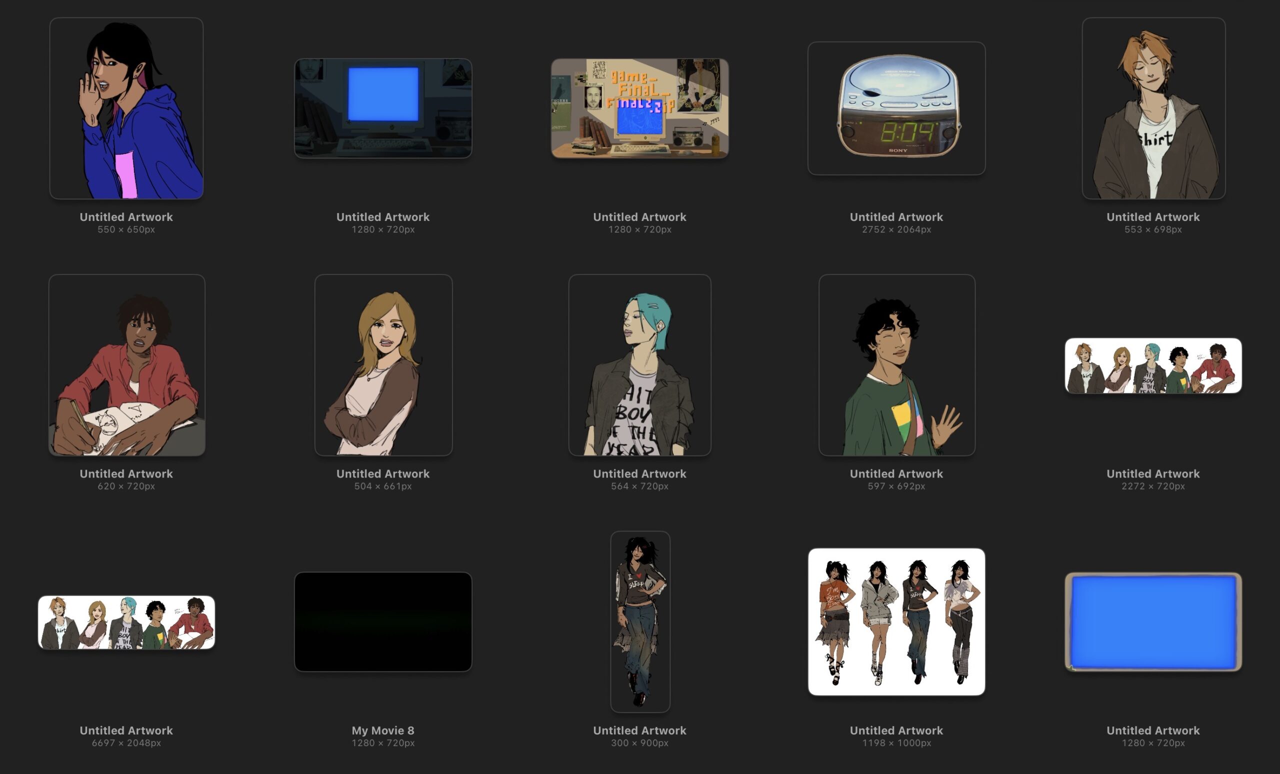
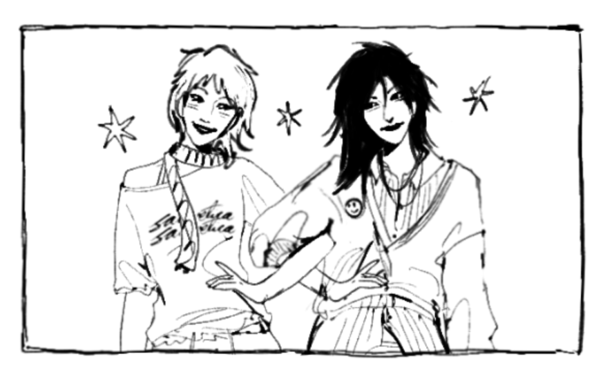
Pictures and Screenshots from the game:
Reflection:
- This project was a good way for me to figure out how I can build larger projects of my own. I wanted to experiment with making a video game like this so I can spend more time coming up with better storylines and illustrations (to make better games).
- I liked the scene-per-mechanic structure, I think giving each moment of the day its own interaction meant no single mechanic overshadowed anything else. I liked how the visuals turned out, but I feel it would have been better if I drew things for dining dash rather than just coding the elements.
- The dining dash game still loads quite slowly. So does the computer vision part for the fruits (and it’s not consistent). If I had more time, I would definitely look into those, because it affects user experience.
- I would want to add more pathways (similar to the social scene). This game still feels quite safe in the sense that it is predictable, and you end up on the same outcomes each time.
- What I learnt from this is that interaction design is stressful! Aaaaaaah! I need to be more mindful of what interactions to put where. I feel like I could have added more meaningful ones.
- I need to make sure I write clearer instructions on the screen. I kept forgetting to do this.
Credits To: Freesound (for all audio files) | Claude (for help in the Dining Dash part, helping me figure out my errors while creating the paint part, and helping me figure out why some parts weren’t working) | Pinterest (for image assets) | My Sister (for begrudgingly helping with user testing not once, or twice, but thrice)

 SORRY! This was not intentional at all… I probably can’t even make myself on this, to be honest. This IS a prototype so I promise if I make a proper version, it’ll be very diverse.