Week 5: Midterm Updates

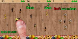
For my midterm, I want to work on a super pumped up, full specs, IM-ified, super ultra Ant Smasher. I played Ant Smasher a lot as a kid, and it was awesome. I want to replicate that experience with p5.js.

The goal is to have ants / enemies run down from the top of the screen at various speeds/patterns, have them explode when smashed, and include sounds, animations, and various themes (e.g. not just ant smasher, but fruit slicer, rocket shooter, butterfly catcher, etc.) or levels of difficulty to make the game more fun. I also want to store high scores and names in a quasi-leaderboard to make it feel like a real game.

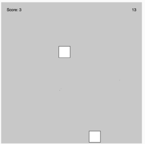
So far, I’ve built out a basic version where the ants / enemies are objects that randomly fall down, and there is a very simple login screen. There is a timer, a score counter, and a way to stop ants and count them in the score.

I’m planning to work on it over the weekend to add animations, levels, different kinds of enemies, perlin noise, skins, 3 “lives” that you can deplete, and game over screens. I’m also planning to illustrate my own ants, rockets, etc. in my own game sheets if I have time.

I’m expecting to face some challenges with keeping everything organized, so I might break up the code files or make a game design document to remind myself of all the mechanics going on.

Aisha Response – Design Of Everyday Things

In this reading, Don Norman emphasizes the importance of a good design: discoverability and understandability. Is a design really good if users can’t comprehend it? Let’s imagine a swinging door; it has no signs to indicate whether users should push or pull and has big large handles. This creates frustration for the users as they have no idea whether they should push or pull them. Thus, they are not able to discover was actions should be used leading to a lack of understanding of what to do with the door. However, a good design would have a sign clearly indicating whether users should push or pull, helping them discover the action they should take, and leading to them understanding whether they should push or pull. This is also true for light switches. If a room has multiple complex light switches users could be confused and frustrated as to which switch corresponds to which light. Designers should focus on the psychological needs of humans when building something to decrease frustration and increase satisfaction. There are five psychological concepts: Affordances(cues that users can pick up), Signifiers (determine where the action will take place), Mapping (grouping and proximity), Feedback, and Constraints (Limitations). Conceptual Models are simplified explanations of how something works in users’ minds. We recall this information when interacting with different things. Overall, I agree with what Don Norman is stating in this text. Although a good design should look good it doesn’t only rely on that.  A good design means that users can comprehend it easily making life easier for them. I’d rather have a simple easy object than a complex-looking object with a lack of clarity

OOP project

Concept:

For object oriented programming my initial idea was to create a circle within a circle, something like this https://dribbble.com/shots/13450284-Creative-Coding-Tusi-Couple. I ran into some problems with the addition of line and dots when the mouse was clicked.

Reflections and improvements:

I would like to improve skills in interactivity between user and program, how to incorporate simple methods and have a successful outcome.

Assignment 4: Data Visualization

I took inspiration from Dan Shiffman’s coding challenge on ‘Mapping Earthquake Data’ to try and map COVID19 spread from 2020 t0 2022. Using mapbox’s api and csv file from CSSEGISanddata by John Hopkins University Center for System Science and Engineering, I mapped out the number of people infected with COVID19 in all countries as a circle.

As mentioned in Shiffman’s video, I used Web Mercator to convert the longitude and latitude of each country to x and y coordinates. I then mapped out the coordinates on static map imported from mapbox.

Shiffman’s video:

Coding Challenge: Mapping Earthquake Data

I struggled to get an actual mapping at first but eventually figured I have to change the constant provided by the Web Mercator to 256. I eventually ended up with this equation for the x and y coordintes.

After successfully mapping the coordinates the static map, I decided to draw a red circle over the coordinates with the radius as the amount of people infected by the covid19 over the past 3 years.

The embedded sketch:

This version of the assignment has less interactivity, I plan to add features that will enable to user get the number of people infected by covid19 in a particular country upon clicking on a circle. I’ll also make the map dynamic, changing the zoom as the user zooms in with the mouse.

Assignment 4: Text

Inspiration:

I was inspired by the chorus of Halsey’s “Could have been me”(https://www.youtube.com/watch?v=fowcj6Swn84) song which follows this:

I wanna taste love
I wanna feel pride and shame
I don’t wanna take my time
I don’t wanna waste one night
I wanna live better days

I decided to play around with lyrics and randomly generate endings for the phrases “I wanna…” and “I don’t wanna…”

So the lyrics will be generated in this form:

I wanna VERB1 WORD1

I don’t wanna VERB2 WORD2

Code

When the user clicks on the mouse, either phrase with “I wanna” or “I don’t wanna” randomly appears on the screen. The code for that is:

function mouseClicked() {
  let randnumber=int(random(1,3));
  if (randnumber==1){
    text(message,mouseX,mouseY);
  }
  else if(randnumber==2){
    text(message2,mouseX,mouseY);
  }

My CSV file has this list of words:

feel,love,cross,door
dream,future,waste,night
live,happiness,close,Disney
see,sunshine,limit,life
win,butterfly,hate,sky

Code to access each of the words and randomly generate the phrase:

strings = loadStrings("words.csv");
let singleRow=[];


  message = "I wanna " ;
  singleRow = split(strings[int (random(strings.length))], ',');
  message += singleRow[VERB1];
  message+=" ";
  singleRow = split(strings[int (random(strings.length))], ',');
  message += singleRow[WORD1];

Future improvements

This was a great way to learn important components for the midterm game program, as users need instructions. I think that taking data from global dictionaries or common lists would produce interesting results.  Also, playing around with the text on the screen will be so sophisticated upgrade. For example, letters move when the mouse hovers the word, changes the color, or adds other effects.


Assignment 4: Text & Data

I was very drawn to the ramen ratings dataset on Kaggle and initially thought of a lot of ambitious ideas for it, like making an interactive map of  ramen distribution, a ratings chart linked to the actual images (pulled from Google Search?) of the ramen, and grouping ramen by brand or flavor.

However, upon closer analysis of the dataset, I realized that I didn’t have enough clean information to do those things, and therefore narrowed my focus to one question: what name words are most commonly used and loved in instant ramen? I assumed that these would be fancy Japanese words like “tonkotsu”, but was curious to see what the dataset would reveal.

With this in mind, I went through the CSV of the ramen ratings to split the names into their individual words. I then turned each of these into objects (checking first if they were repeated) so that I could store their name, rating, and other attributes like x and y position.

I ranked words more highly if they were used in more highly-rated ramen, but more generally gave them points as long as they were used in a name. I also only displayed words above a certain threshold of ratings; otherwise, the entire screen would be consumed by words.

I’m most proud of how I was able to split the words and sort them out so that there were no duplicates and ranks cumulatively added into ratings with each time a word was passed into the loop.

//if the word not yet in list, add it
for (let i=0; i<ramen.length; i++) { //for each word in name
  
  let inList = false;
  //check if it's in the list
  for (let k=0; k<ramenWords.length; k++) { //for each entry in list
    if (ramenWords[k].name==ramen[i]) {
      inList = true;
    }
  }
  
  //if it's not in the list, add it; if it is, update the rating
  if (inList == false) {
    let x = new ramenWord(); //new word
    x.name = ramen[i];
    x.rating = ramenRank;
    ramenWords.push(x)
  } else {
      for (let k=0; k<ramenWords.length; k++){
        if (ramen[i] == ramenWords[k].name) {
          ramenWords[k].rating += ramenRank; //add rank to rating
        }
      }
  }
}

I had the most trouble with presentation. I found a cool ramen-related font and knew I wanted to use it, which was the easy part. Then, I really wanted to present the words in a word cloud so that I could essentially show the data swimming in a soup bowl. However, I had a lot of trouble with presenting the data in that way, mostly because my data (a list of objects) prevented me from using many common solutions I found in p5.js examples and stack overflow (which often “deleted” overlapping values; I couldn’t do this because my values are unique rather than identical.) After a few hours of trying, I eventually decided to shelve the idea.

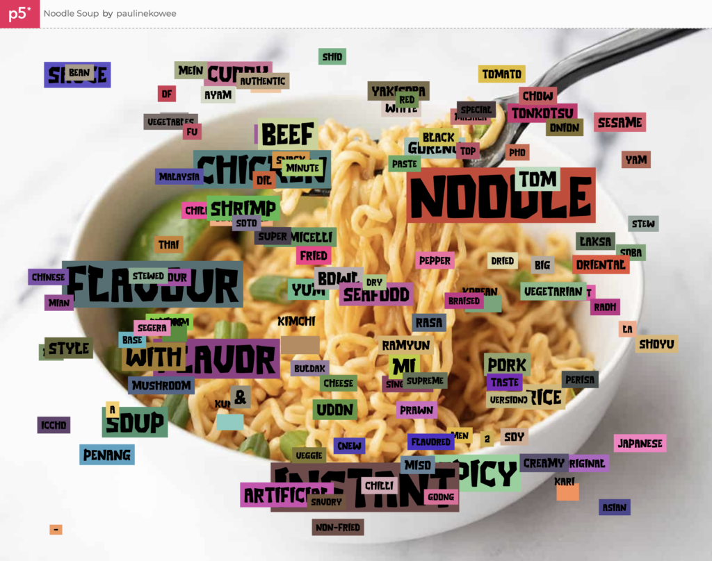
Instead, I ran with the more wild-city-signage look of the overlapping words, gave them background fills, and put a ramen picture in the back. While it wasn’t the vision I initially imagined, it has its own charm as a dataviz project that generates a new layout and color scheme each time it runs.

I’m pretty happy with the final work. I think the colors help make the entire piece look more interesting, and while the data isn’t perfect, it reveals some interesting insights: chicken seems to be the most popular (or at least more well-represented) as compared to beef, seafood, or fish, “flavour”/”flavor” is king, and “artificial” isn’t as big of a deterrent to good ramen as I thought it would be.

Some cool words that I wasn’t as familiar with also made it through the threshold, like Ayam, Rasa, and Goong. It made me realize that even though I’m a college student who’s quite often in the instant ramen aisle, I still don’t actually know much about the world of ramen, the various types that are out there, and what people actually like.

Final Sketch

View it in Fullscreen (A lot better since the image is so big)

In a future iteration of this project, I’d try to make my noodle word soup happen for real, probably by reworking my data structure or finding a smarter solution for all the crashing while loops I had to deal with. I’d also play with using sine waves for “noodles” or making the piece more interactive; right now it’s more of a generated work than an experience.

Assignment 4 – Daniel Basurto

concept

The inspiration for this project came from this Friday’s rooftop-rhythms, as seeing the poems and poets gave me the idea of generating ones based on some of the most common words of the english language. I wanted to make them funny, however as you’ll soon see, that did not work out.

code

The code was a bit difficult to get, but I managed to make it so that every time you click the screen it will refresh and generate a new one.

The code ended up looking like this:

// I made a haiku generator (though they don't make much sense). I set the variables based on the structure: I [verb] a [adjective] [noun]
//         And I [verb] a [adjective] [noun] too
//         I feel like a [noun]
// While it does follow the rhytmic stucture of a Haiku, it is neither deep/thought-provoking or artistic

let NOUN1 = 0;
let VERB1 = 1;
let ADJ1 = 2;
let NOUN2 = 3;
let VERB2 = 4;
let ADJ2 = 5;
let NOUN3 = 6;

let strings = [];

function setup() {
  strings = loadStrings("words.csv");
  createCanvas(400, 400);
  background(
    random(150, 255),
    random(150, 255),
    random(150, 255),
    random(50, 100)
  );
  textSize(20);
  for (let i = 0; i < 200; i++) {
    push();
    noStroke();
    fill(255, 255, 255);
    ellipse(random(0, width), random(0, height / 2 - 40), random(2, 5));

    pop();
  }
}

let csvRowNumber = 0;

function draw() {
  let singleRow = [];
  fill(0);
  // First message/rhyme
  singleRow = split(strings[int(random(strings.length))], ",");
  let verb1 = singleRow[VERB1];
  singleRow = split(strings[int(random(strings.length))], ",");
  let adj1 = singleRow[ADJ1];
  singleRow = split(strings[int(random(strings.length))], ",");
  let noun1 = singleRow[NOUN1];
  text("I " + verb1 + " a " + adj1 + " " + noun1, 0, height / 2);

  // Second message//
  message = "And I ";
  singleRow = split(strings[int(random(strings.length))], ",");
  message += singleRow[VERB2];
  message += " a ";
  singleRow = split(strings[int(random(strings.length))], ",");
  message += singleRow[ADJ2];
  message += " ";
  singleRow = split(strings[int(random(strings.length))], ",");
  message += singleRow[NOUN2];
  message += " too";
  text(message, 0, height / 2 + 25);

  //Third message//
  singleRow = split(strings[int(random(strings.length))], ",");
  let noun3 = singleRow[NOUN3];
  text("I feel like a " + noun3, 0, height / 2 + 50);

  noLoop();
}

function mouseClicked() {
  background(random(150, 255), random(150, 255), random(150, 255)); //refreshes the background
  for (let i = 0; i < 200; i++) {
    push();
    noStroke();
    fill(255, 255, 255);
    ellipse(random(0, width), random(0, height / 2 - 40), random(2, 5));
  }
  loop();
}

EMBEDDED code

future IMPROVEMENTS

Personally, I wish I could have made the backgrounds have a color gradient to make it look prettier. However, it will be something I’d have to learn.

Another area for improvement would be the haikus themselves, since they are usually senseless, I’d like to make them more concrete.

Assignment 4: Data Visualization of World Cities

Inspiration/ Concept

For this assignment, I opted for data visualization. During the pre-coding phase, I stumbled upon a GitHub repository consisting of numerous datasets. The data has been scraped from Aneki World Cities site and comprises information on 10, 567 unique cities (a total of 170 countries). Thus, I cloned the repository and used its CSV file as my primary data source. Using the CSV file, I have displayed a simple world map and plotted all the cities and their information on the map; furthermore, inspired by last week’s reading, the project intends to provide a level of user interaction to receive additional information on each city.


Code

The project was relatively simple in nature. Before I started writing code, I divided the project into three primary sections, where each functionality depends on one or more than one functions. 

  1. Data Processing
  2. Data Representation
  3. User Interactions

Data Processing

This is the building block of the entire project. In this section, using the inbuilt preload() function of p5.js, the dataset is loaded into the system (in a variable named ‘table’), and using one single for loop (thus, the time complexity is maintained on a linear scale), data are extracted from each row and stored in their respective arrays. For instance, when the program goes through line one, names of countries and cities are stored in country_arr[] and city_arr[] arrays respectively, whereas latitude, longitude and elevation data are stored in lat_arr[], long_arr[] and elevation[] arrays respectively. 

Then, the findMinMaxVal() function is used to find the minimum and the maximum values for each numerical element (longitude, latitude and elevation). 

function findMinMaxVal()
{
  for (let r = 0 ; r < num_rows; r++)
  {
    // If latitude information in the current row is greater than the value stored in max_lat, update max_lat
    // Similary for longitude and elevation
    if (table.getNum(r, lat_col) > max_lat)
      max_lat = table.getNum(r, lat_col);
    
    // If latitude information in the current row is lower than the value stored in min_lat, update min_lat
    // Similary for longitude and elevation
    if (table.getNum(r, lat_col) < min_lat)
      min_lat = table.getNum(r, lat_col);
    
    if (table.getNum(r, long_col) > max_lat)
      max_long = table.getNum(r, long_col);
    
    if (table.getNum(r, long_col) < min_long)
      min_long = table.getNum(r, long_col);
    
    if (table.getNum(r, elevation_col) > max_elevation)
      max_elevation = table.getNum(r, elevation_col);
    
    if (table.getNum(r, elevation_col) < min_elevation)
      min_elevation = table.getNum(r, elevation_col);
  }
}


As seen in the code, the program loops through individual arrays mentioned above and use if-conditions to determine if the values being read are greater or less than the values stored in the variables — if the condition is true, the variable is updated and the program continues to the next iteration. For example, in the first conditional, the program checks if the latitude currently being read is greater than the maximum latitude recorded so far; if there is a new maximum (i.e. the condition evaluates to true), max_lat is updated. In the same way, the function checks for minimum and maximum values for longitude, latitude and elevation data. 

After going through the entire CSV file, the global variables (max_lat, min_lat, max_long, min_long, max_elevation and min_elevation) represent the maximum and the minimum values of their own types. 

Finally, using an additional for-loop, the program iterates through each array, maps the value onto a new range (such that it is representable on the canvas of size height by width) and stores them in new arrays. For instance, elevation is mapped to a new range from 0 to 100 and the modified value is stored in the elevation_arr_mapped[] array, longitude is mapped onto a new range of 10 to width divided by 1.2 and so forth. 

Data Representation and User Interactivity 

All the data processed in the first step is used here to graphically represent the data. I included all the code for this step in the draw() function. Although it makes the overall program more processing-intensive, it assists in the next step (which is user interaction). Thus, each line of code in this step is refreshed a certain number of times every second. 

At first, the program checks if the elevation is higher than 80% or not – thus dividing the entire dataset into two halves. Then, different fill() colors are selected for each half — red color is used for the former and green for the latter. 

Then, the program checks if the cursor is close to any x and y positions of cities (x position is analogous to longitude and y position to latitude). If the distance between them is less than 0.5 pixels, the radius of the circle is increased to 20 and the fill color is changed to purple; otherwise, the radius is kept at 5 and the fill color is either green or red. 

// Store x and y position for each city using mapped arrays, where longitude = x and latitude = y
let point_x = long_arr_mapped[i];
let point_y = lat_arr_mapped[i];
let circle_radius;


// HOVER EFFECT
// find the distance between cursor and each city
let distance = dist(mouseX, mouseY, point_x, point_y);

// If the distance is less than 0.5, call hover_info() function, increase circle radisu and use different fill color
// Otherwise, lower the circle radius and use green as fill color
if (distance < 0.5)
{
  fill("purple");
  circle_radius = 10;
  circle(long_arr_mapped[i], lat_arr_mapped[i], circle_radius);
  
  hover_info(i);
}
else
{
  circle_radius = 5;
  circle(long_arr_mapped[i], lat_arr_mapped[i], circle_radius);
}


Afterward, the inbuilt circle() function is called using the aforementioned parameters and a map of the world, with city information, is displayed on the canvas. 

The user-interactivity involves a hovering feature on the canvas. If the user wants to receive more information about a city, the cursor can be moved above a particular city and as soon as it is close to the desired location, the dot pops up (i.e. its radius increases as described earlier) and a text box appears displaying its name, location and elevation. The functionality is implemented using a function titled ‘hover_info()’ which is called inside the draw() function. It takes the index of a city as a parameter and the said index is used to locate values (city name, country name and elevation data) located at the position “index” in city_arr_mapped[], country_arr_mapped[] and elevation_arr_mapped[] arrays respectively. 

function hover_info(index)
{
  // Text Settings
  textSize(20);
  textAlign(LEFT);
  textFont(myFont);
  fill("white");
  stroke(2);
  
  let text_box_pos_x;
  let text_box_pos_y;
  
  // Conditionals to ensure text stays within the canvas. 
  // If cursor is to the extreme right, reset x and y positions for text accordingly
  if (mouseX < (w/2))
  {
    text_box_pos_x = (150);
  }
  else
  {
    text_box_pos_x = (w - 350);
   
  }
  text_box_pos_y = (40);
  

  // Call text() to display the required information
  // Displaying just the name of the country and its elevation
  text("Location: " + country_arr[index] + "\n" + "Elevation: " + elevation_arr[index] + " m", text_box_pos_x, text_box_pos_y, w/4);
    
}


Reflection

The project involved straightforward coding; however, the part that took a significant amount of time was finding an appropriate dataset. Since the dataset found either lacked longitude-latitude information or elevation data, research took a noticeable amount of time. I was initially planning to plot information on at least 30,000 cities, but finding enough data was another nuisance, as a result, I had to settle for 16,000 rows (approximately). Thus, one improvement could be finding a fresh dataset that covers more cities. 

Similarly, the dataset seems to be concentrated on a particular location. Consequently, while hovering over each location, different points overlap and the text being displayed seems buggy — along with the draw() function, the hover_info() is also called 24 times every second, thus removing this bug proved to be a task. In the future iteration of this project, an appropriate algorithm can be developed to either remodify the hover_info() function or to opt for other modes of interactivity such as data input using text input area and using it to display additional information on each city. For now, the cursor needs to be kept steady as each circle has a radius of 5 pixels to avoid clustering of points. With more investment of time, the project can be further polished.  

For better interactivity, zoom in to differentiate between points and use full-screen mode using this link here.


That said, this was an interesting project. I learned a lot of back-end things apart from the actual programming – whether it be going through countless dataset collections or refining my code to make it more interactive. Overall, I am happy with the final outcome, and I look forward to working on my research as well as my coding skills. 


Data & Text

THE SKETCH 

This week’s project utilizes both data files and text to create a sketch that generates thousands of possible Chinese adoptee names. The link to the sketch on the web editor can be found here.

INSPIRATION & DESIGN 

What I love so much about IMA is its power to tell stories, particularly stories of marginalized identities. Being a Chinese adoptee, I had always found that there was enough material about Chinese adoption that was widely available, be it articles, research, books,  films, art, etc. Hence, my goal with my artwork is to always uplift Chinese adoptee voices and shed light on aspects of the industry that have so long been kept secret. For this project, I wanted to highlight a part of the adoptee experience that can be a very emotional, and in some cases controversial, topic: our names.

I discern now that the sketch does not represent any real data on adoptee names; rather, I have created imaginary data on imaginary orphans, including name and gender. The sketch is made to look as if it were an official government document, but the fact that none of the names are real sheds light on the fact that what is available inside and outside of China regarding the adoption industry is extremely limited. One may be able to find charts, graphs, and infographics that include some statistics about Chinese adoption, but it is extremely difficult to find raw data. The reasons behind this are quite complex and beyond the scope of this paper but are important to note.

Not only are there limited resources on adoptee names, but the system for naming real orphans is highly superficial and formulaic. As explained in more detail in the CODING section, the program works by generating 150 names based on randomly selecting characters from various data files. The seemingly arbitrary way of generating names is representative of the sad truth that orphans are not named out of emotional or personal reasons, but out of practicality and convenience.

SOME BACKGROUND ON CHINESE NAMES

Since the 1970s and into the early 2010s, orphanages all over china have had a uniform way of naming children. The first part was the surname, which in Chinese, is the first character of a 3 character name. The surname was if not always the first character of the city, district, or province they were found in. For example, I was born in Maoming (茂) city in Guangdong province, and my name is 茂欢贵. My adoptive brother was born in Wanzhou (万), Sichuan Province, and his surname in chinese is also 万. Since there are only so many cities in China in comparison to the thousand upon thousand different surnames in China, the surname for adoptees is the most generic, and it is often easy to tell who was an orphan once just based on surname.

The second part is the “first” name, which really consists of 2 characters. The first character of the two is only slightly less generic than the surname, often being shared by a handful of babies born in the same year, found in the same part of the city, etc. These characters are often commonly used characters such as 福 (fu), which means good luck, or 喜(xi), which means happy. In my case, all the girls at the orphanage born in 2002 share the second character of their name 欢 (huan).  The second character of the first name is usually the most unique of the three and has the most possibility for variance. Unlike normal Chinese names though, in which the final character is supposed to be representative of the child’s personality, the way they are selected for orphans is quite different. Sometimes orphanages might chose one common or “lucky” character such as 花(hua, flower) and utilize all characters with the same phonetic pronunciation hua. Sometimes they may want all babies of the same year to have charcters with similar meanings, and limit possible names with that. In other cases it may be randomly selected from a dictionary.

CODING

The “data” that was used to generate the names comes from 3 files. The first file is simply a .txt that lists all the cities in the province of Guangdong. I chose 1 province to condense the amount of data and to emphasize the commonality among adoptee names. From this file is where I created an array to hold all possible surnames, as shown below :

//DATA FOR FIRST CHARACTER (least personalized)
//get the first character of all cities in Guangdong province 
for (let i = 0; i < province_outfile.length; i++) { 
  first_char.push(province_outfile[i][0]); 
}

The second and third characters are pulled from a project I found on Github, which has data from the most common Chinese names from 1950 to 2000. The file top50char.year.csv contains the most popular characters used in personal names sorted by year and gender. I sort through each line of the file until reaching the desired indexes and push the values  into separate arrays for male and female middle names, named middle_char_m and middle_char_f respectively.

//DATA FOR MIDDLE CHARACTER (second-most personalized)
//get the top characters for male first names from 1950-2000
for (let i = 1; i < top_50_outfile.length; i++){     
  //read each row individually 
  current_row = split(top_50_outfile[i], ",");
  
  //search through each row and only push the elements which correspond to names into the middle_char_m array 
  for (el = 0; el < current_row.length; el++) {
    //indexes for male character
    if ((el >= 13) && (el <=18)){ 
      middle_char_m.push(current_row[el]); 
    }
    //indexes for female character 
    if ((el >= 25) && (el <=30)) { 
      middle_char_f.push(current_row[el]); 
    }
  }
}

Note that again, the data from this file contains the top names from Chinese citizens, not orphans, but because this dataset was on the smaller end (only about 300 characters total), I decided to use this to generate the second character.

The final characters were pulled from a file called givenname.csv, which contains popular names that correspond to all phonetic possibilities for a character. This file was not sorted by gender however, but by the number of times it was used in a male and female. By iterating over each line in the file and comparing the values, names are sorted into arrays last_char_f for female names, and last_char_m for male names.

//DATA FOR LAST CHARACTER (most personalized)
for (let i = 0; i < givenname_outfile.length; i++) { 
  //read each row 
  current_row = split(givenname_outfile[i], ","); 
  //determine whether it is male or female name based on     number of occurence 
  if (current_row[3] > current_row[4]) { 
    last_char_m.push(current_row[0]); //push to male
  }
  
  else { 
    last_char_f.push(current_row[0]); //push to female 
  }
}

All of the above arrays were created in the setup() function, while each name is generated in the draw() function.

Inside draw(), each unique name is generated using a two step process. The first step is to determine the gender of the name, which is decided by a function called male_or_female(), shown below:

function male_or_female() { 
  let num = random(); 
  if (num <=0.6) { 
    return 'f'; 
  }
  else { 
    return 'm'; 
  }
}

The condition if (num <=0.6) is used so that names will be female 60% of the time. This is based on the logic that 60% of orphans in China are baby girls.

The second step is to randomly pick surnames and personal names from the arrays built in setup. This is done using a simple for loop:

for (let i = 0; i < 155; i++ ){ 
  //decide gender of the name to be generated 
  gender = male_or_female();
  //randomly get a surname
  surname = first_char[int(random(first_char.length))];

  //if name is female, pull characters from f arrays
  if (gender == 'f') {
    middle = middle_char_f[int(random(middle_char_f.length))]; 
    last = last_char_f[int(random(last_char_f.length))]; 
    personal_name = middle+last; 
    gender= '(女)';  
  } 

  //otherwise pull characters from m arrays 
  else { 
    middle = middle_char_m[int(random(middle_char_m.length))]; 
    last = last_char_m[int(random(last_char_m.length))]; 
    personal_name = middle+last; 
    gender = '(男)'; 
  }
  let full_name = surname+personal_name
  results.push([full_name, gender]);

In the last line, we push the full name and gender into a results array, which is what is used to display the names on the canvas. Hence, each time the program is run, a new set of names is created.

REFLECTIONS

While the code of this project is not particularly challenging, it was challenging finding data to work with. Once I found material to work with though, I thoroughly enjoyed every step of this project. Reading through the names the program generated was a very self-reflective experience for me, it made me think about how my name simultaneously holds so much and so little meaning, and how any one of the names generated could be the name of a real-life adoptee somewhere in the world. While I understand that most people know little to nothing about Chinese adoption, let alone the naming system, my hopes are that this piece can open the conversation to all who are interested in thinking critically about adoption.


REFERENCES

https://github.com/psychbruce/ChineseNames


[Assignment 4] Population By Cities

Concept

For this assignment, I did data visualization of population by cities based on this dataset: Population by Cities (downloaded from https:// www.kaggle.com/data sets/i2i2i2/cities-of-the-world?select=cities15 000.csv). The inspiration came from pointillism, an art technique in which small dots are used to form an image. I was curious if I would be able to draw a world map by putting points on where the cities are located. I marked cities with large populations in red and blue colors to indicate these cities are large. In the end, I was able to generate a world map only using small points on the canvas as shown above.

Code

This assignment was rather straightforward to code because it did not require any mathematical logics, unlike my previous works. This code starts by loading dataset into an array. Then, the program will find minimum and maximum values of latitude, longitude, and population of the cities. Different from the class example, I used an array to store minimum and maximum values, because I would have to declare 6 different variables without arrays. Function findMinMax() is used to find these values from the dataset. The function will break down each row of dataset for every “,” it has. Then, the program goes through the entire entity in a given index to find min and max. In the end, the function returns an array that contains min and max values.

let dataArr = []; //Stores city population and location data

//0: min value, 1: max value
let latRangeArr = []; //latitude range
let longRangeArr = []; //longitude range
let popRangeArr = []; //population range

//In preload()
dataArr = loadStrings("data.csv"); //load data

//In setup()
latRangeArr = findMinMax(dataArr, 1);, 
longRangeArr = findMinMax(dataArr, 2);
popRangeArr = findMinMax(dataArr, 3);

function findMinMax(myArr, index) {
  let returnArr = [];

  let minN = Number.MAX_VALUE;
  let maxN = Number.MIN_VALUE;

  for (let i = 1; i < myArr.length; i++) {
    row = split(myArr[i], ",");

    let temp = float(row[index]);

    if (temp < minN) minN = temp; if (temp > maxN) maxN = temp;
  }

  returnArr[0] = minN;
  returnArr[1] = maxN;

  return returnArr;
}

Calculated min and max will be used to scale up or down the data based on the canvas size.

Very next step I took is to put points on the canvas using latitudes and longitudes. Each point was created using classes because each point must contain information about latitude, longitude, and population. Class method drawCity() will actually draw points on a canvas when called.

class City {
  constructor(long, lat, pop) {
    this.long = long;  //longitude
    this.lat = lat;  //latitude
    this.pop = pop;  //population
  }

  drawCity() {
    //I removed some part for the purpose of demonstration
    circle(this.long, this.lat, r);  //draw circles
  }
}

Using for() loop, the program creates City objects and stores them into an array. map() was used to scale longitude and latitude data relative to the width and height of p5js canvas. The population data was scaled from 0 to 100, so I can known population of cities in percentile for later.

for (let i = 1; i < dataArr.length; i++) {
    row = split(dataArr[i], ",");
    //create City object and store in array. map() is used to fit values into a given range
    cityArr[i] = new City(
      map(float(row[2]), longRangeArr[0], longRangeArr[1], 0, width),
      map(float(row[1]), latRangeArr[0], latRangeArr[1], height, 0),
      map(float(row[3]), 0, popRangeArr[1], 0, 100)
    );

    cityArr[i].drawCity();  //draw City objects
  }

At this point, I was able to generate a world map using only points. Then, I changed drawCity() as shown below to mark large population cities in reds and blues. Top 30% cities is drawn red and top 30%~60% cities were drawn blue. For cities that are not within the range was drawn in grey circles. Not to mention, because there were so many cities, I had to increase the size of red/blue circles in order to make them visible.

drawCity() {
    let r = 0.5;
    noFill();
    strokeWeight(1.25);
    stroke(100, 100, 100);
    if (this.pop > 70) {  //display top 30% (population) cities as red circles 
      strokeWeight(2.5);
      stroke(220, 0, 0);
      r = 4;
    } else if (this.pop > 40) {  //display top 30%~60% (population) cities as blue circles
      strokeWeight(2.5);
      stroke(0, 0, 220);
      r = 3;
    }
    circle(this.long, this.lat, r);  //draw circles
  }

Reflection / Future Improvements

This project was very satisfying to just look at it. I really like the fact that small points placed in different coordinates can actually produce a map of our world. Though some countries, such as Greenland, is not visible due to the missing information, anyone who sees this project will be able to recognize the world map. It was also surprising to see capital of my home country—Seoul, South Korea—is within top 30%~60% cities in terms of the population size.

In the I would like find a more complete dataset, which will allow me to make a better map that includes countries that are not displayed in this project. Not to mention, I do not like the colors used here. Although I wanted highly populated cities to be visible on the map, red and blue are not in harmony with grey color. Next time, I would like to find a better color combination.