Week 1 – Self Portrait

// eyes
fill('#ffffff');
ellipse(250, 175, 40, 24);
ellipse(350, 175, 40, 24);
fill('#44382c');
ellipse(250, 175, 22, 22);
ellipse(350, 175, 22, 22);
fill('#090806');
ellipse(250, 175, 12, 16);
ellipse(350, 175, 12, 16);

This week in class, we learned how to use basic shapes, colors, and drawing functions in p5.js. I started my self-portrait by creating the face using an ellipse to make an oval shape. After that, I worked on the hair. I realized that the hair looked better when I put its code before the face, because this allowed the hair to be behind the face. I then changed the order of my code.

For the hair, I used an arc for the top part and a rectangle to fill in the rest of the hair. I chose a brown color and used a color code with the ‘#’ to allow me to select a specific color instead of guessing colors with the numbers. For the face, I added a skin-tone color and then created the eyes. I used three ellipses for each eye to create the white part, the brown eye color, and the black for the pupil. For the nose, I used two simple lines. For the lips, I used two arcs and a line in the middle to create the shape of the mouth. Finally, I used a rectangle to create the neck.

A piece of code that I am particularly proud of is the code I used to create the eyes. Although it was basic, I was proud that I was able to make them and experiment with different colors and eye shapes. It took a lot of trial and error to get them the way I wanted, but I was happy with the final result.

I used AI for a small amount of help with creating the lips and eyebrows through this I was able to solidify my understanding of the two_Pi feature. I needed help understanding how to use arcs to create the shape I wanted. Other than that, I did not rely heavily on AI. I understood the basic concepts we learned in class and used them to create the portrait myself.

Reflecting upon this week’s tasks, I enjoyed learning how to code shapes and colors through p5.js. I feel my work is very basic, but for a start, I think it is okay. It has given me ideas for future work and improvements. I would like to become better at placement and using numbers, as I tend to guess the numbers rather than calculate them. I would also like to learn how to add motion and movement within my code and work.

Weel 1 Self Portrait photo

During my time of creating the self-portrait, I had to use the code practice from last class for reference; the reason being that the code would allow me to remember certain commands that I ended up using to make my portrait. For example, the commands from the practice code, “// Body fill(‘orange’) rect (etc.)” allowed me to get an idea of how I can create a body for my portrait which is then followed by creating said-rectangular body. This proved to be very helpful for me because what I was aiming for within my portrait was a kind of modern look; by modern look, I mean by how in most social media platforms, some people choose to have a blank profile picture that only depicts an almost rectangular body and circular head. It may sound boring, but I personally like to think of it as a reminder of how times around the world are so drastically different than how one can imagine. Speaking of circular head, i was originally going to use the “circle()” command to create my head, until I found out that the command best suitable for the requirement is the “ellipse” command since it had proven to me that it can create a far more accurate shape of the head for me. This wasn’t the only time I replaced a shape during the whole process, because when I was creating the nose, I almost went with an oval circular shaped nose. However, some part of me felt as if it were “too clownish” to say the least; hence why i decided to go with the triangle since it just felt more respectful with the nonchalant tone that i have been trying to keep up rather than a tone similar to that of an off-brand circus. As for eyes, my original goal was to create 2 big white circles and then create 2 smaller black circles that would be placed on top of the white ones in the middle; yet I remembered the “ellipse” command and how it would prove to be a more beneficial tool if it slipped horizontally, shrinked by eye-size, and then be placed in their respective spots all while the idea of 2 smaller black circles being centralized within the 2 white sclera of the eyes remained. Lastly, with the hair, this the most difficult for me, since I could not figure out which series of commands to use in order to replicate my hair as need be. Since I am not the most experienced artist in the room, I had no choice but to go forward with the decision to create those lines of hair that perhaps would at least resemble my short bangs.

Despite the headache from all the creation of shapes after shapes, a code series that I can’t help but feel happy about is the creation of the smiling mouth that you may see in the portrait. Before the mouth was even formed, I nearly went with the idea of using the “line()” command to form my mouth and perhaps stretch upwards. But of course, I would come to realize that the lines are meant to be nothing more than straight, thus enabling as incapable of being bent/altered further. When hope seemed lost, that is when I stumbled upon the command of “arc()” from the coding’s list of references. There, I would discover how certain arcs of line in this different command can be altered just in the way I desired! Thus, that is how I was able to get the smiling mouth as you would see here in the portrait!

Despite the work being done, I do want to mention that not only did I use the code practice and the coding site’s references as my guide, but I also had ai (one that I paid for), check my work to see if I must either change a coordinate or correct a common usually wrongly. This is because I saw that through my time working, my weakness has been second-guessing certain coordinates for certain shapes for too many unnecessary times. I just could not tell which coordinate was the right way to write in order to set the shape and/or color as I wanted. Therefore, that is why for each coordinate of each part of the portrait that I write, I would share it with the AI and simply hear its advice of what I can keep and what I must modify. Even though it has helped me recognize my mistakes, it still serve as a signal for me that what I should be working on for this class is a better understanding of how shapes must be correctly positioned/modified as for each project I work on. After all, this idea of improvement should help prepare me for possibly more complex projects that require more shapes somewhere in the future.

function setup() {
  createCanvas(640, 580);
}

function draw() {
  // background set-up
  background(135, 206, 235);
  // sun at the top right corner
  noStroke();
  fill("yellow")
  circle(40,40,180);

  // Head
  fill("tan");
  ellipse(300, 300, 250, 300);

  // Body
  noStroke();
  fill("green");
  rect(210, 430, 180, 220);
  
  // Hair 
  stroke("Black");
  strokeWeight(5);

  line(260, 190, 250, 150);
  line(280, 180, 275, 140);
  line(300, 175, 300, 135);
  line(320, 175, 320, 135);
  line(340, 180, 345, 140);
  line(360, 190, 370, 150);

  // Sclera of eyes
  fill("white");
  ellipse(250, 300, 65, 38);
  ellipse(350, 300, 65, 38);

  // Pupils of the eyes
  fill("black");
  circle(250, 300, 14);
  circle(350, 300, 14);

  // Nose
  fill("brown");
  triangle(300, 320, 285, 335, 315, 355);

  // Smiling mouth
  noFill();
  stroke("black");
  strokeWeight(5);
  arc(300, 370, 90, 60, 0, PI);
}


Inside Your Mind – Interactive Fluid Typography Experience and User Testing

As I was experimenting with m project, I built Inside Your Mind – a second-person psychological narrative experience created in p5.js. I felt like with the creativity I developed in the class Tinkercad would not be enough to show my ideas, altough I tried to make a project on Tinkercad I did not open fully with it, so I chose to do my interactive experinec in p5. The project moves away from game mechanics and goals, and toward something more expressive and open-ended: a guided journey through four emotional stages of the mind, rendered through fluid particle typography and sound.

The experience opens with a kinetic typography intro sequence a personal greeting, a typewriter reveal, a search bar that types “inside your mind” — before transitioning into the main particle world. From there, users navigate different stages of mind, noise, overthink, break and finally silence.

User Testing

User testing was conducted with participant who experienced the full interactive sequence from the intro through all four stages. My little brother.  Participant were observed interacting freely with no instructions given beyond “explore it.”

The response was overwhelmingly positive.

Tester consistently described the experience as something they hadn’t encountered before, not a game, not a website, something in between that felt genuinely immersive. My brother spent more time in the experience than expected, going back and forth between stages to compare how the particles moved differently in each one. The fluid typography was the element that resonated most strongly. Tester were drawn to how the text was simultaneously readable and alive. The sound design was a notable highlight. Tester immediately noticed that each stage sounded different, and several remarked that the cursor sounds made the experience feel tactile, like they were touching something. The wind sound in Stage 1, the water drops in Stage 2, the glitch crackle in Stage 3, and the bell chimes in Stage 4 each reinforced the emotional tone of that chapter which made it more cohesive.

Link to user testing video: https://drive.google.com/file/d/1y8koBlJ7WqWSgiGLDeGFhjZYJn5P-0Ib/view?usp=drivesdk

Areas noted for potential refinement:

I am considering to add an introduction to the experience explaining more about the interactivness, I am inspired by motion design, lately have been watching different motion design ad proposals for brands and I enjoyed the animations, so I would want to implement it to my project by learning and applying it.

Week 14 – Final Project (PawPortion)

🐾 PawPortion🐾 Smart Pet Feeding Assistant

Concept

I started this project from a very simple everyday problem: feeding a pet on time. It sounds like something that should be easy to remember, but in real life, routines can get busy, and small responsibilities can be delayed or forgotten. I did not want to make a fully automatic feeder because that would remove the user from the process completely. Instead, I wanted to create a system that supports the user while still keeping them involved in the act of care.

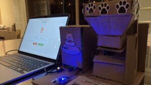
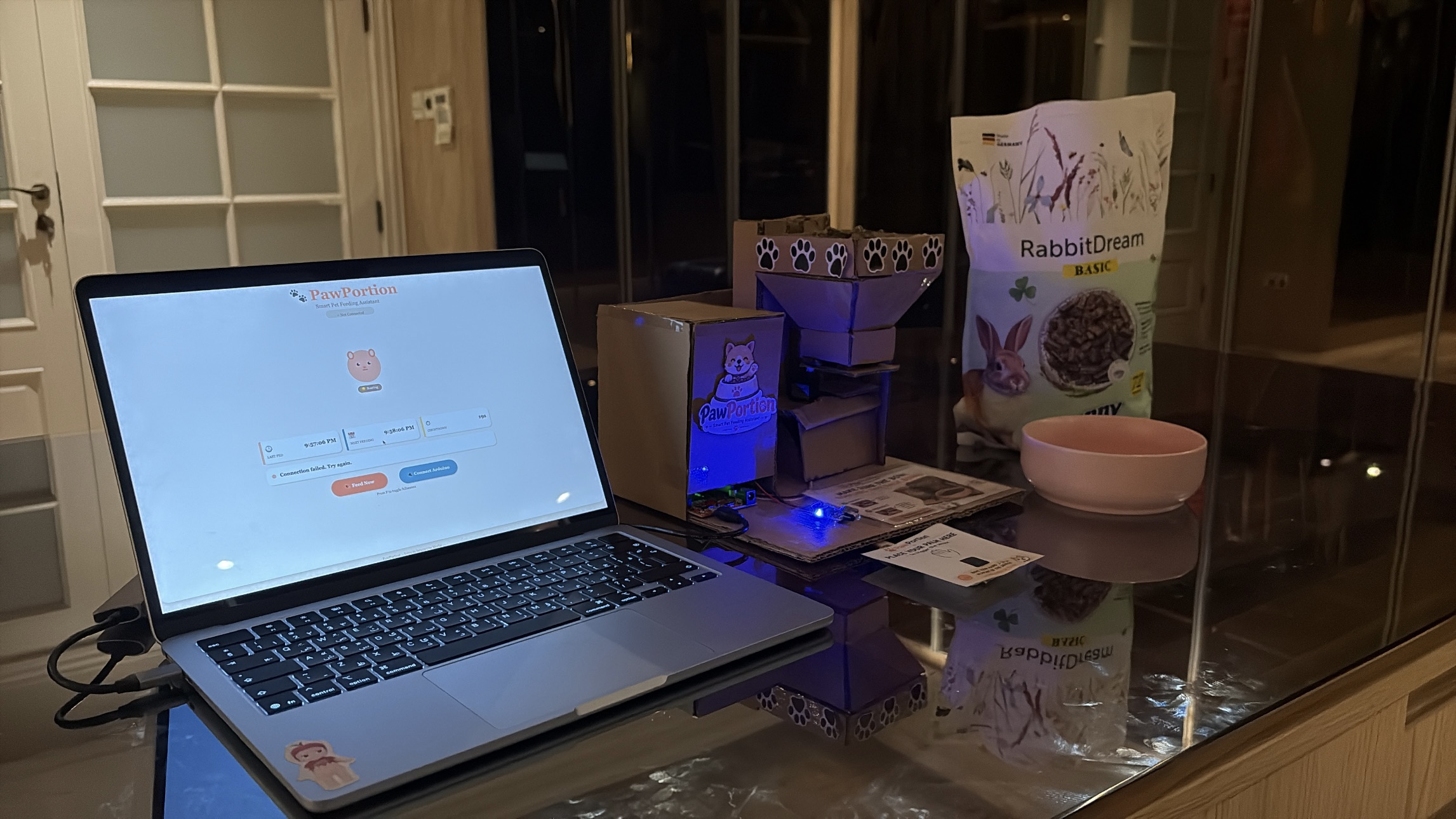
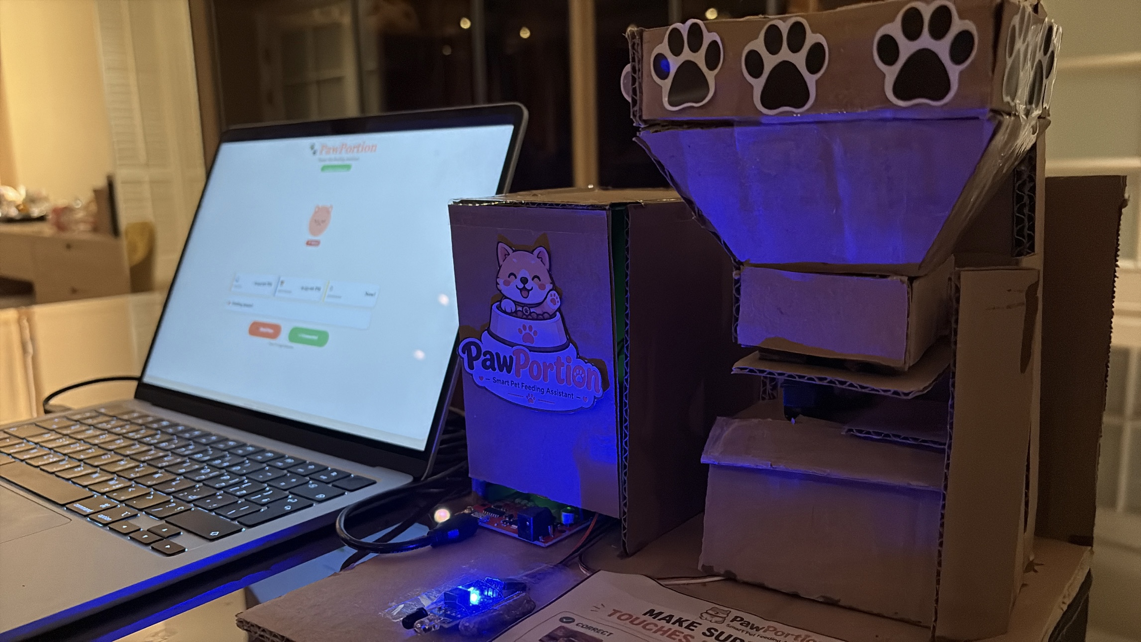
PawPortion is an interactive pet feeding assistant that combines an Arduino-controlled physical feeder with a p5.js digital dashboard. The system keeps track of feeding time, reminds the user when it is time to feed, and responds when the feeding action is completed. The project is not just about dispensing food. It is about creating a clear relationship between the user, the interface, and the physical machine.

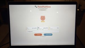
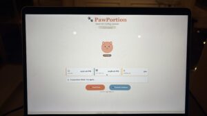
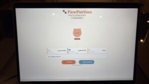
The main idea behind PawPortion is assisted responsibility. The system does not take over the task entirely, but it helps make the task more visible, structured, and responsive. The user can see when the pet was last fed, when the next feeding should happen, and whether the feeding has been missed. The pet’s mood on the screen also changes depending on the state of the system, which makes the interaction feel more emotional and less robotic.

Video of Project

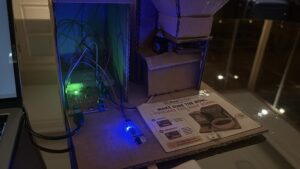
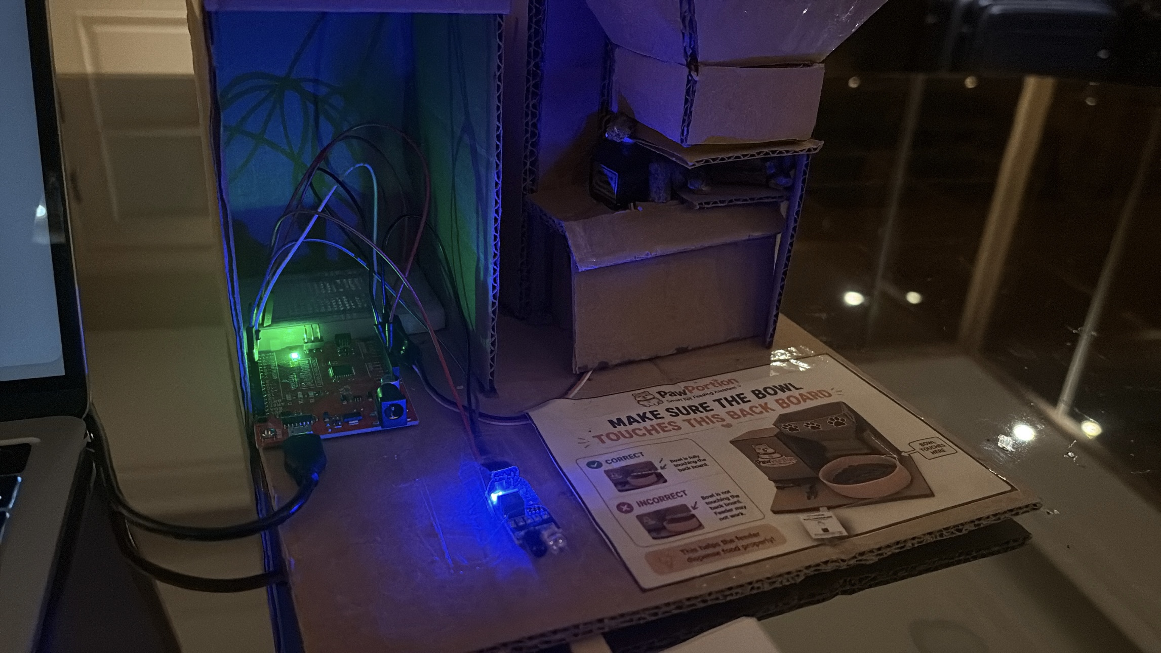
Images of Project

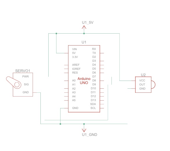
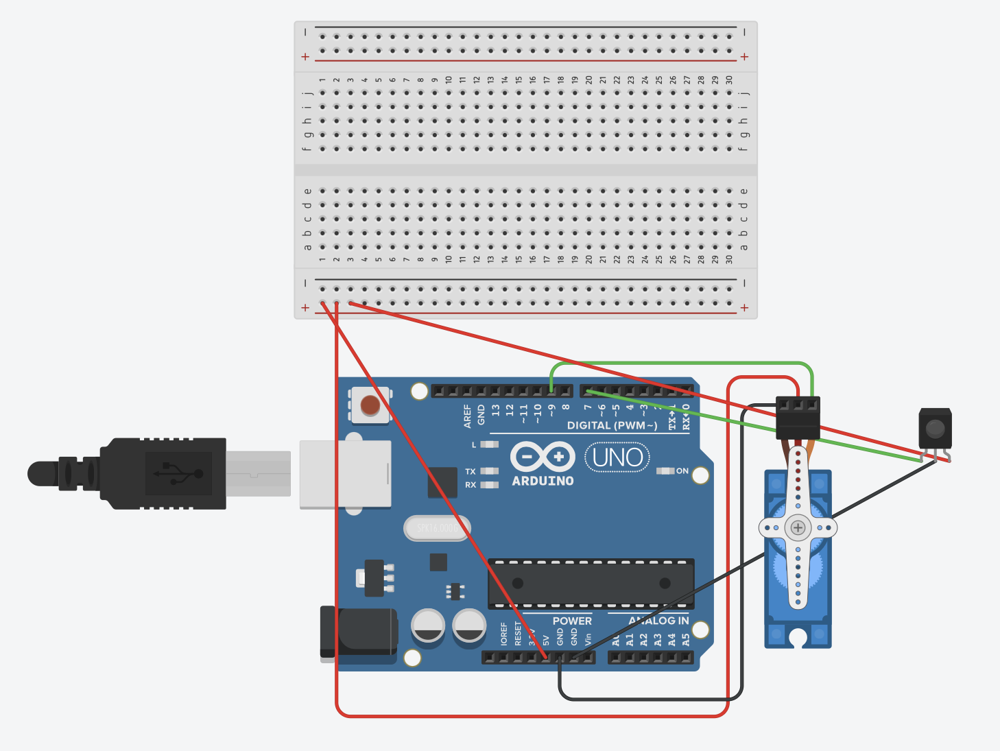
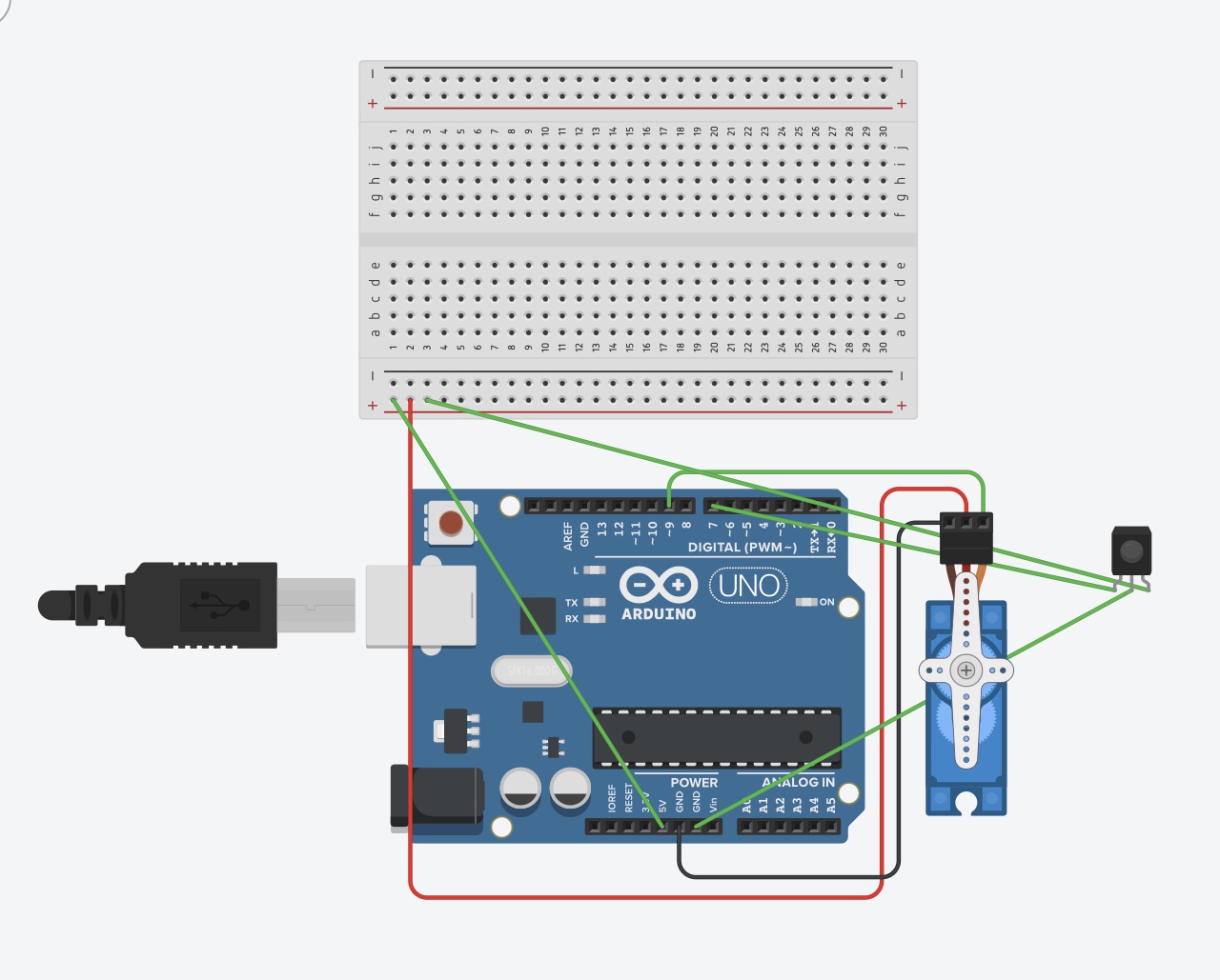
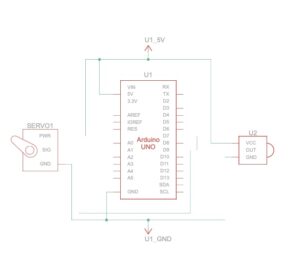
Schematic


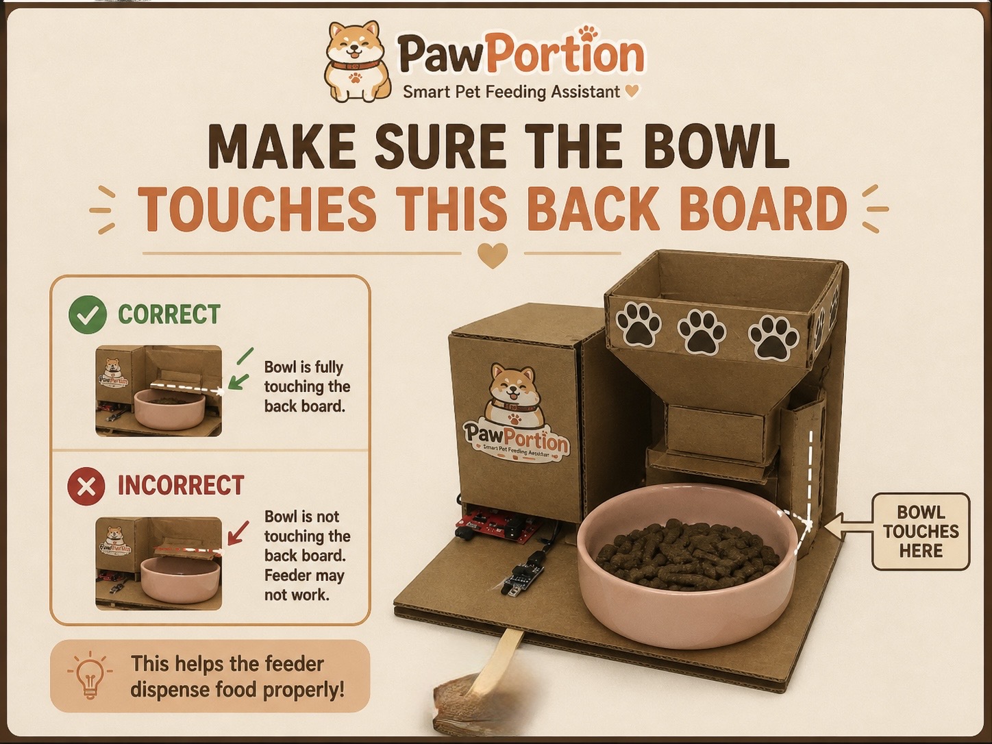
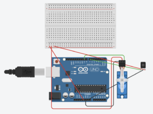
Assembly Instructions 

User Testing Videos

During user testing, I wanted to see whether people could understand the system without me explaining every step. The main interaction was mostly clear. Users understood that the p5 dashboard was giving them feeding information, and they were able to recognize the “Feed Now” button as the main action. Once the servo moved and food was released, the connection between the digital interface and the physical feeder became much clearer.

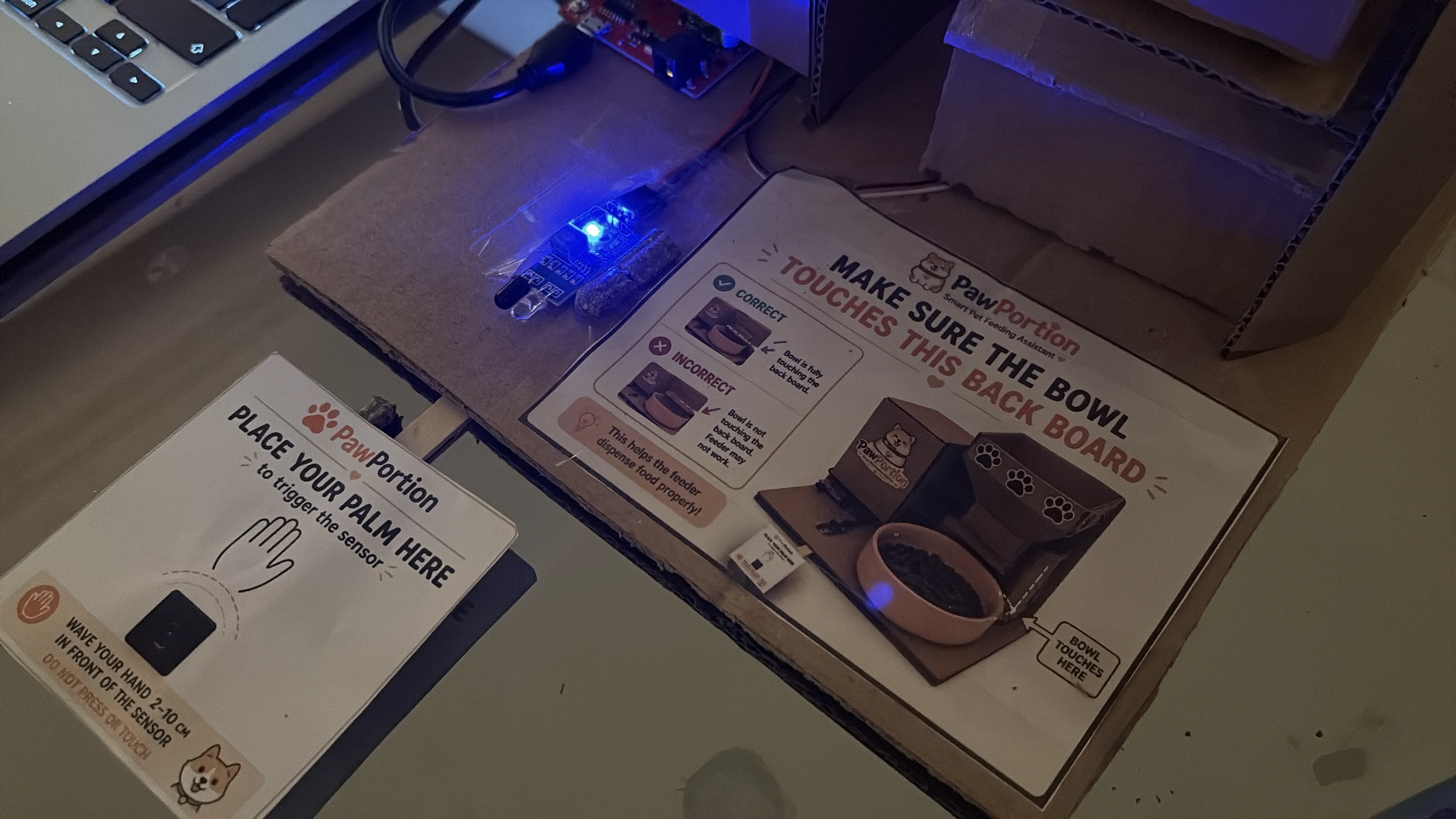
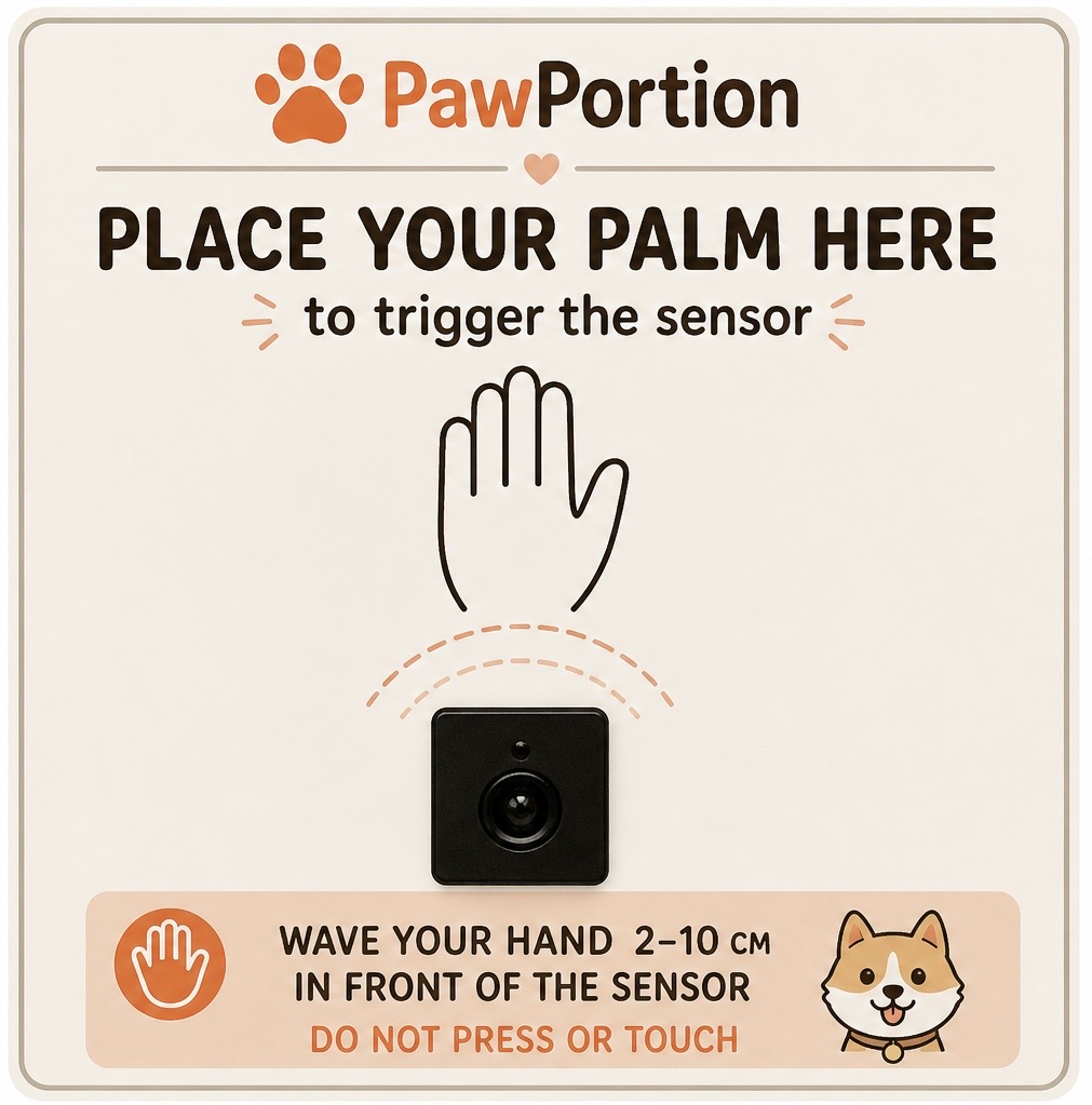
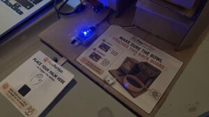
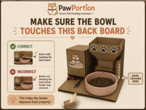
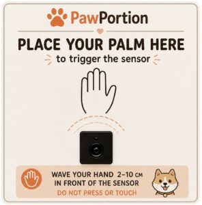
One important issue appeared during testing with the IR sensor. I had placed a printed image near the sensor to guide the user, but the image made some people interpret the IR sensor as a physical button. Instead of triggering it by placing something near it, they tried to press it directly. The problem was not that the sensor failed. The problem was that my visual instruction gave the wrong impression.

This taught me that physical interaction is not only about whether the circuit works. It is also about how the user reads the object. A small label, icon, or printed sign can completely change how someone understands what they are supposed to do. After seeing this confusion, I changed the printed label so it was clearer that the sensor detects presence rather than pressure. This made the interaction easier to understand and reduced the need for verbal explanation.
How Does the Implementation Work?

Description of Interaction Design

The interaction is built around a cycle between the user, p5, and Arduino. First, the p5 dashboard tracks time and displays the feeding schedule. The user can see when the pet was last fed, when the next feeding is due, and how much time is left. This makes the system readable before anything physical happens.

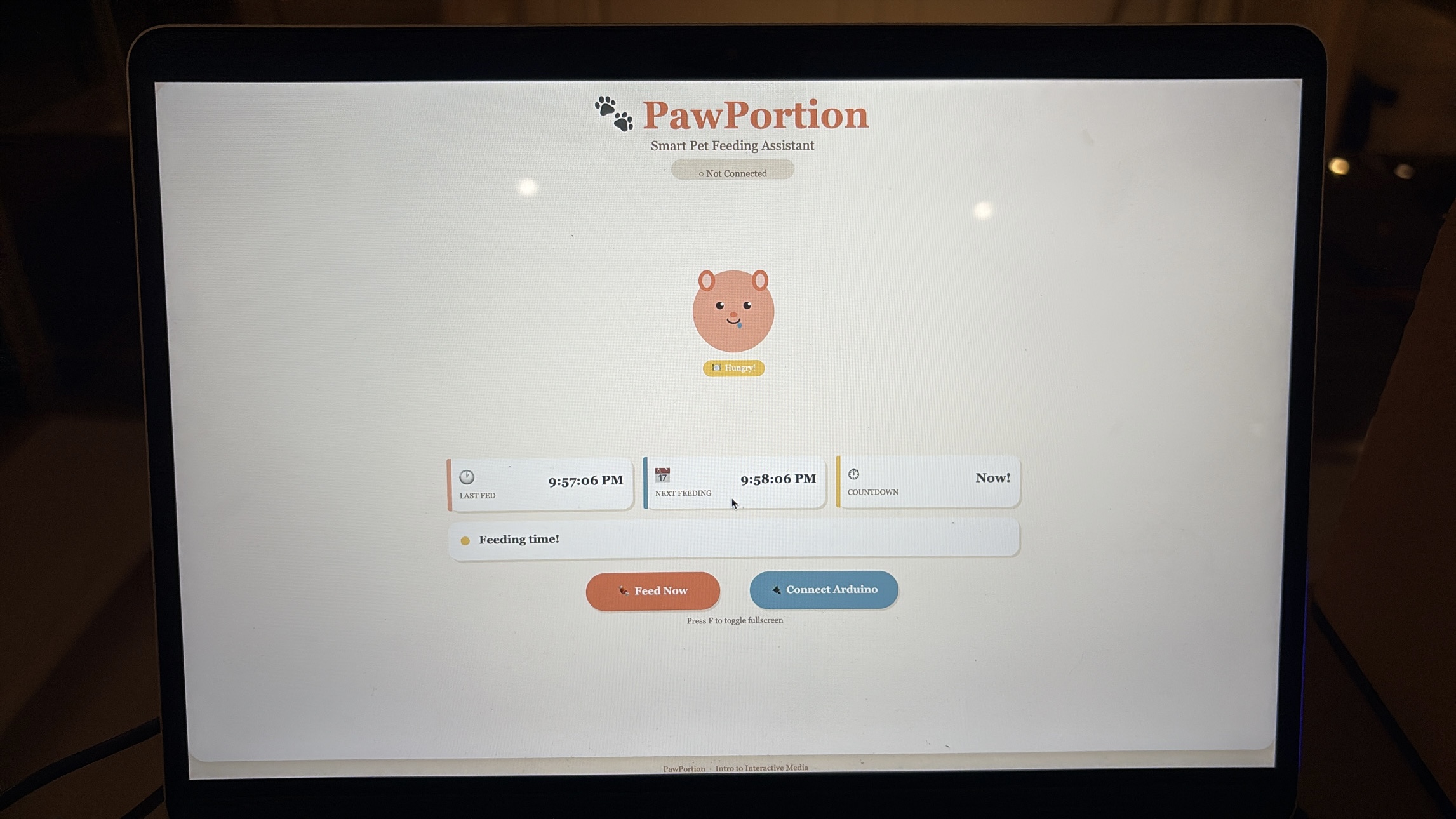
When feeding time arrives, the dashboard changes state. The pet becomes hungry, and the status message tells the user that it is feeding time. This is meant to guide the user instead of forcing the system to act automatically. The user then presses the “Feed Now” button on the p5 interface, which sends a command to Arduino.

Arduino receives the command and moves the servo motor. The servo acts like a small door or gate that opens to release food, then closes again. When Arduino finishes dispensing, it sends a message back to p5. After p5 receives that message, the dashboard updates the last feeding time, resets the countdown, and changes the pet’s mood to happy.

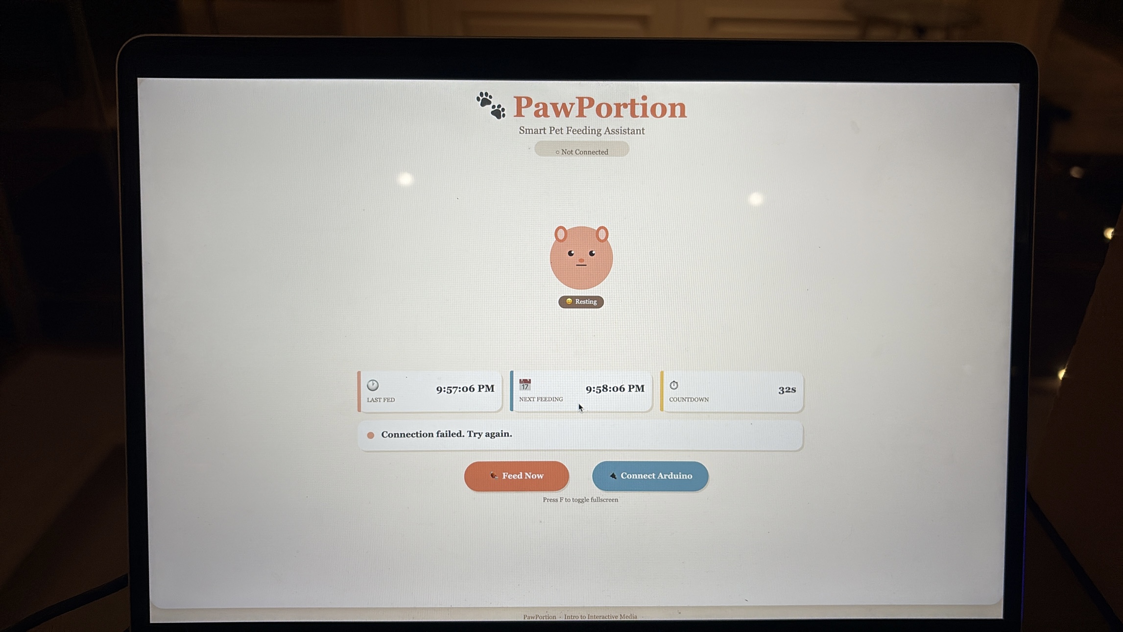
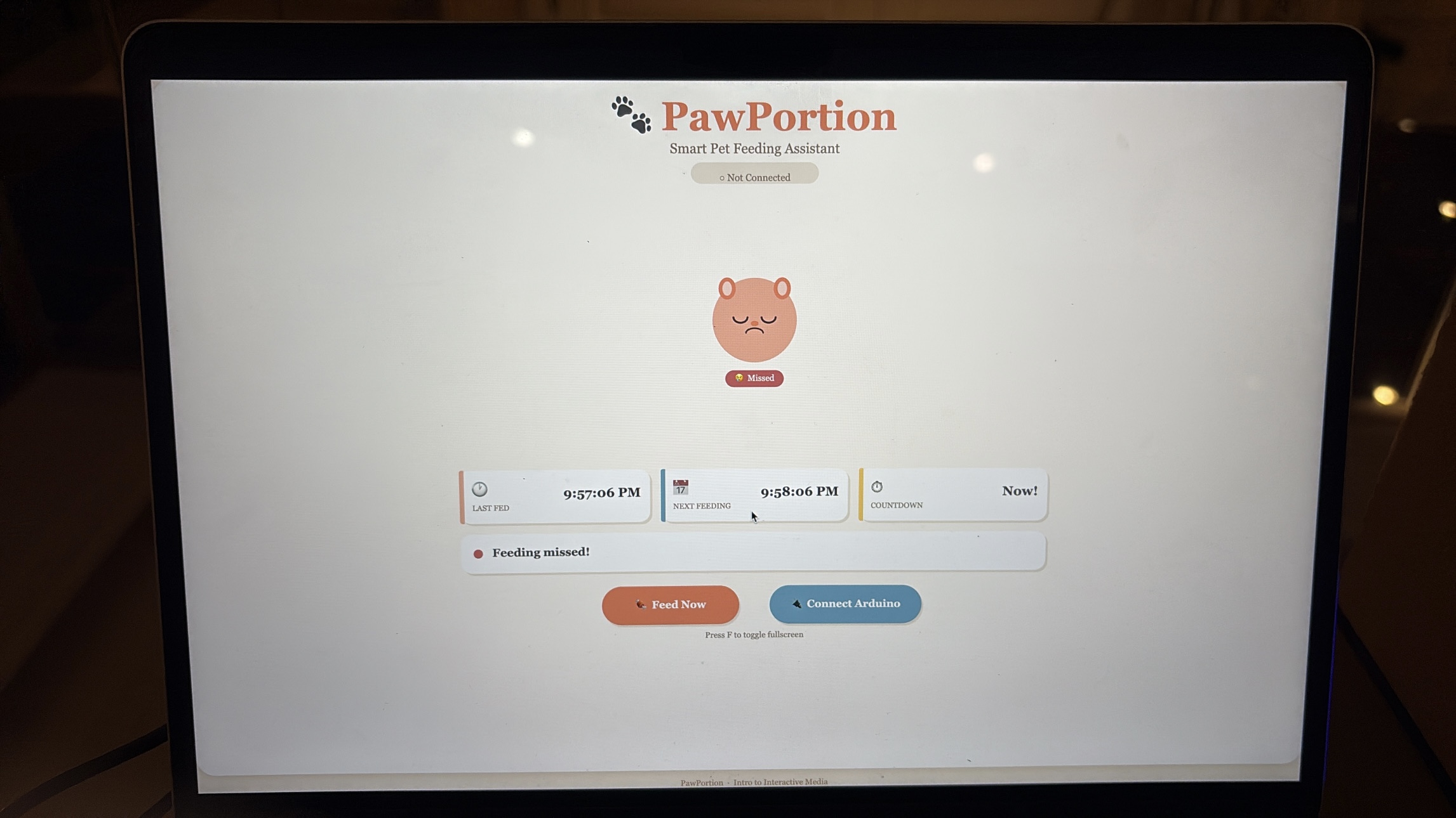
If the user does not feed within the grace period, the system marks the feeding as missed. The pet becomes sad, which makes the missed action more visible. I wanted this to feel gentle, not dramatic, but still noticeable enough that the user understands the consequence of ignoring the schedule, and that they should probably feed their pet.

Description of Arduino Code

Github Full Code

The Arduino code controls the physical side of the project. It is responsible for reading the IR sensor, controlling the servo motor, and communicating back to p5 when feeding is complete. I used named constants for the pins instead of random numbers, which makes the code easier to understand and edit later.

Snippet: defining the sensor pin, servo pin, and servo object.

#include <Servo.h>

const int SENSOR_PIN = 7;

const int SERVO_PIN  = 6;

Servo tap_servo;

The main function in the Arduino code is dispenseFood(). This function opens the servo, waits while food is released, closes the servo, and then sends “DONE” to p5. This message is important because it tells the dashboard that the physical feeding action has finished.

Snippet: the feeding function that opens the servo, closes it, and sends confirmation to p5.

void dispenseFood() {

  isDispensing = true;

  tap_servo.write(110);

  delay(2000);

  tap_servo.write(0);

  delay(300);

  lastFedTime = millis();

  isDispensing = false;

  Serial.println("DONE");

}

The Arduino also listens for serial messages from p5. When p5 sends “FEED”, Arduino immediately calls the feeding function. This is what connects the digital button to the physical movement.

Snippet: receiving the FEED command from p5.

if (Serial.available() > 0) {

  String cmd = Serial.readStringUntil('\n');

  cmd.trim();

  if (cmd == "FEED") {

    dispenseFood();

  }

}

I also added a cooldown so the IR sensor does not trigger repeatedly if something stays in front of it. Without this, the servo could keep dispensing again and again. The cooldown makes the physical interaction more controlled.

Description of p5.js Code


The p5.js code controls the digital dashboard. It handles the schedule, the pet mood, the buttons, and the communication with Arduino. The dashboard shows the last feeding time, the next feeding time, and a countdown. It also shows the pet’s mood, which changes depending on what is happening.

Snippet: timing values for the feeding schedule.

const FEED_INTERVAL_SEC = 60;

const MISSED_GRACE_SEC = 15;

The main schedule logic checks whether feeding time has arrived. If there is still time left, the pet stays neutral. If feeding time has arrived but is still within the grace period, the pet becomes hungry. If the grace period passes, the pet becomes sad.

Snippet: schedule logic that updates the pet mood.

if (secUntilFeed > 0) {

  petMood = "neutral";

  if (serialConnected) {

    statusMsg = "Waiting for next feeding";

  }

} else if (secUntilFeed > -MISSED_GRACE_SEC) {

  petMood = "hungry";

  statusMsg = "Feeding time!";

} else {

  petMood = "sad";

  statusMsg = "Feeding missed!";

}

When the user clicks “Feed Now,” p5 sends the word “FEED” to Arduino through serial communication. I used a newline at the end because it helps Arduino read the command as one complete message.

Snippet: sending the FEED command to Arduino.

const encoder = new TextEncoder();

const writer = port.writable.getWriter();

await writer.write(encoder.encode("FEED\n"));

writer.releaseLock();

The p5 code also listens for messages from Arduino. When it receives “DONE”, it updates the dashboard. This is what makes the interface respond only after the physical action finishes.

Snippet: checking for DONE from Arduino.

if (line === "DONE") {

  onFeedingDone();

}

I also added fullscreen functionality using the F key. This makes the dashboard easier to present during the final demo and makes it feel more like a complete interface rather than just a small sketch window. The course documentation specifically mentions fullscreen and responsive resizing as part of final project programming considerations.

Description of Communication Between Arduino and p5.js

The communication between Arduino and p5.js is one of the most important parts of the project. The system works through a two-way serial communication loop. p5 sends “FEED” to Arduino, Arduino moves the servo to dispense food, and then Arduino sends “DONE” back to p5.

This means the dashboard does not simply assume that feeding happened. It waits for Arduino to confirm that the physical action was completed. This made the project feel more reliable because the screen and the machine were connected through actual feedback.

This was also one of the hardest parts of the project because if the serial communication failed, the entire interaction felt broken. The dashboard could look fine, and the Arduino could work alone, but the project only felt complete when both sides were speaking to each other correctly.

Aspects Of The Project I’m Proud Of 

One of the strongest parts of this project is how far it goes compared to where I started at the beginning of the course. If I had seen this project in week one, I genuinely would not have believed that I could build it. It combines physical computing, serial communication, a digital dashboard, user interaction, timing logic, an animated interface, and a mechanical feeding system. That feels ambitious for me, and I am proud that I was able to execute it in a way that actually works.

I am also proud of how complete the project feels as an experience. It is not just Arduino moving a servo, and it is not just a p5 interface on a screen. The two parts depend on each other. The dashboard guides the user, the Arduino performs the physical action, and the screen updates after receiving confirmation. That connection makes the project feel like a full interactive system.

Another part that I think worked well is the personality of the interface. The pet mood makes the system feel more alive, and it helps communicate the feeding state without needing complicated instructions. The sad, hungry, happy, and resting states make the dashboard easier to understand and more engaging.

I am also proud that I improved the project through user testing. The IR sensor confusion could have been ignored, but I used it as a design lesson. Changing the printed label made the interaction clearer, which showed me that the physical design and the code are equally important.

Resources Used

p5.js

https://p5js.org/reference/ https://p5js.org/tutorials/get-started/ https://www.youtube.com/watch?v=c3TeLi6Ns1E

Serial Communication

https://itp.nyu.edu/physcomp/labs/labs-serial-communication/lab-webserial-input-to-p5-

js/https://itp.nyu.edu/physcomp/labs/labs-serial-communication/lab-webserial-output-from-p5-

js/https://makeabilitylab.github.io/physcomp/communication/p5js-serial.html

https://medium.com/@yyyyyyyuan/tutorial-serial-communication-with-arduino-and-p5-js-cd39b3ac10ce

Servo Motor

https://docs.arduino.cc/tutorials/generic/basic-servo-control/

https://learn.adafruit.com/adafruit-arduino-lesson-14-servo-motors/overview

https://www.youtube.com/watch?v=1mDnaiEytAI

IR Sensor

https://arduinogetstarted.com/tutorials/arduino-infrared-obstacle-avoidance-sensor

https://projecthub.arduino.cc/aboda243/obstacle-detector-using-ir-module-tutorial-101320

https://www.youtube.com/watch?v=vi4hkrrkwkY

https://www.youtube.com/watch?v=ESqhOKgKt5c

AI Usage

I used AI as a support tool during the development of this project. The most important use was debugging my p5.js code, especially because this was one of my first larger coding projects involving serial communication between Arduino and p5. Debugging was difficult because problems could come from the Arduino code, the p5 code, the serial connection, or the browser. AI helped me break down the problem and understand where the issue might be coming from.

AI also helped me understand how to structure parts of the p5 dashboard, especially the schedule logic, and serial communication. I still tested, adjusted, and integrated the code myself to make sure it worked with my actual Arduino setup.

if (secUntilFeed > 0) {
  petMood = "neutral";

  if (serialConnected) {
    statusMsg = "Waiting for next feeding";
  }

} else if (secUntilFeed > -MISSED_GRACE_SEC) {
  petMood = "hungry";
  statusMsg = "Feeding time!";

} else {
  petMood = "sad";
  statusMsg = "Feeding missed!";
}

I also used AI to generate visual design elements for the project, including the PawPortion logo and printable signs for the physical machine. These visuals helped make the project feel more polished and easier for users to understand.
Challenges Faced and How I Tried to Overcome Them

The biggest challenge was serial communication between Arduino and p5. This was one of the first times I worked on a larger project where hardware and software had to communicate continuously. When something did not work, it was hard to know whether the problem was in the Arduino code, the p5 code, the USB connection, or the browser’s serial port.

I overcame this by testing each part separately. First, I tested the servo on Arduino by itself. Then I tested whether p5 could connect to the Arduino. Then I tested sending one simple command. After that, I tested receiving “DONE” back from Arduino. Breaking it into smaller steps made the project less overwhelming.

Another challenge was making the interaction clear to users. The IR sensor confusion showed me that a working sensor does not automatically mean a clear interaction. Users interpreted the printed image as a button because that was the visual language I accidentally created. I fixed this by changing the label and making the physical instruction clearer.

A third challenge was making the project feel polished. Since the project includes both physical and digital parts, it needed to look intentional from both sides. I worked on the dashboard design, printable labels, and project logo so the final setup felt like one system rather than separate pieces.

Future Improvements

If I had more time, I would improve the physical build of the feeder. I would make the container more stable, the food release cleaner, and the overall structure more durable. Right now, the prototype communicates the idea, but a more refined version could look and function more like a real product.

I would also improve the interface by adding sound feedback. For example, a small sound could play when feeding time arrives, when food is dispensed, or when feeding is missed. This would make the system more noticeable and more satisfying to use.

Another future improvement would be adding more customization to the schedule. Instead of using a short demo interval, the user could choose real feeding times, like morning and evening. This would make the system more practical outside of the class demo.

I would also conduct more user testing with people who have not seen the project before. Watching how people understand the physical setup, the IR sensor, and the dashboard would help me refine the interaction even more.

Overall, I am very very proud of how far i’ve come and can confidently say that this class was a very formative step for me in my university journey and the first step to taking on my passion for Interactive Media. 

Stipend Breakdown (50$):

Total Spend: 47.92$

Week 13: Flame Keeper User Testing

This week I had my sibling try Flame Keeper without any explanation. The project is a browser-based game controlled by an Arduino: a potentiometer steers a cursor into a moving sweet spot to heal a digital candle flame, and a button shields the flame during wind gusts.

Demo

What I Observed

My sibling picked up the button quickly once a gust appeared and the screen said “GUST! HOLD BUTTON!” The text made the action obvious. The potentiometer was more confusing. My sibling turned it but did not immediately connect the movement of the on-screen cursor to the knob in their hand. It took a few seconds before the mapping clicked.

My sibling did not understand the sweet spot bar without being told. They could see a green zone and a moving dot, but did not know the goal was to keep the dot inside the green zone. Once that was explained, gameplay became intuitive immediately.

What Worked

The gust warning text and the shield effect gave instant visual feedback. My sibling felt the button had a clear purpose. The HP bar draining created genuine urgency, and the candle flame shrinking alongside it reinforced that something was wrong without any text needed.

What Needs Improvement

The sweet spot bar needs a short label or tooltip on first load that explains what it is. A simple line like “keep the dot in the green zone” on screen at the start would remove the confusion entirely. I also felt the need to explain the potentiometer every single time, which means the physical-to-visual mapping is not clear enough. A brief intro screen before the game starts would solve both issues.

Next Steps

I will add a short start screen that shows the two controls and what they do before the game begins. That way the project can speak for itself without me standing next to it.

Week 12 – Final Project Idea – Kamila Dautkhan

Project Concept

I’m creating an interactive data sonification tool that transforms real time stock and cryptocurrency market data into synchronized visual and audio experiences. The project will allow users to “hear” and “see” market movements in real time,  so that it’s easier to understand financial data.

The core idea is to make abstract numerical data (stock prices, trading volume, market volatility) tangible through sound and visual patterns. Instead of just reading numbers on a screen, users will experience the market as a living system.

What the Program Will Do

The p5.js sketch will fetch live market data and translate it into multi-sensory output: Data Layer is going to be:

  • Connecting to a financial data API (such as Alpha Vantage, CoinGecko, or Yahoo Finance API)
  • Pull real-time price data for selected stocks/cryptocurrencies
  • Calculating derived metrics

Code structure for demo:

// Fetch data from API
function fetchBitcoinPrice() {
  // API call to get current BTC price
}

// Map price to frequency
function priceToFrequency(price) {
  // Convert dollar value to Hz (e.g., 30000-60000 → 200-800 Hz)
}

// Play the tone
function playPriceTone(frequency, volume) {
  // Use p5.Oscillator to generate sound
}

// Keyboard interaction
function keyPressed() {
  if (key === 'r') refreshData();
}


Bidirectional

EXERCISE 01: ARDUINO TO P5 COMMUNICATION

For this exercise, we used a potentiometer as our sensor to control an ellipse in p5.js. As the knob is turned, the Arduino reads the changing analog values and sends them to p5 through serial communication.

let x = map(sensorValue, 0, 255, 50, width - 50);

  ellipse(x, height / 2, 50, 50);

The values are mapped to the x-position of the ellipse, allowing it to move horizontally across the screen while staying centered vertically.

P5 Code | Demo  | Github

We also did another version of it which basically uses an ultrasonic sensor. The P5 code is same for both, just the mapping is different. You comment out the one user using for a smoother response. The ball movement is corresponding to the the distance detected by the sensor.

Arduino:

Sketch:

EXERCISE 02: P5 TO ARDUINO COMMUNICATION

For Exercise 2, we used a slider in p5 to control the brightness of an LED connected to the Arduino. As the slider moves, it sends values from 0 to 255 through serial communication. The Arduino reads these incoming values and uses them to adjust the LED brightness using PWM, making the LED appear dimmer or brighter depending on the slider position.

if (Serial.available() > 0) {

int brightness = Serial.parseInt();

analogWrite(9, brightness);

This part of the code checks if there is incoming data from p5. When a value is received, it reads the number using parseInt() and uses it to control the LED brightness through analogWrite, which determines how bright or dim the LED will be.

P5 Code | Demo | Github

EXERCISE 03: BI-DIRECTIONAL COMMUNICATION

For Exercise 3, used a simple setup of an LED, a 330 ohm resistor and an ultrasonic sensor. The core logic is the LED is by default on and turns off for the split second when the ball touches the ground giving a blinking effect. The wind is mapped to the distance detected by the sensor. A distance of less than 40cm cause left winds and vice versa. The wind strength is proportional to the distance. The ball is meant to bounce off the walls. There is some issue about the right wall, we couldn’t fix it because of lack of understanding of the velocity method.

The arduino code is rather simple, if an object is detected the distance is written to the serial communication, and if an input is read on serial communication the light is blinked. The most interesting part about the arduino code is how the distance is measured using the pulse

  long duration = pulseIn(ECHO, HIGH, 30000); // 30 ms timeout

On the P5 ending smoothening of the input by the distance sensor was important because otherwise the the was getting abrupt

        latestData = lerp(latestData, val, 0.2);

This was suggested by Chatgpt. It defines a number between basically gets an average but using linear interpolation.

The most challenging part of the code was managing the movement of the ball when the bounce is dying off. As in the last second there were a lot of bounces happening. We dealt with that by instead of blinking the LED on each bounce, we kept the led on and just turned it off when the ball was in contact with the ground.

Sketch

DemoP5| Arduino

Week 10 Musical Instrument – Deema & Dina

Github Link

https://github.com/da3755-ui/intro-to-im/blob/c068b1ccbdb5f327243be9640104c9f9cde83fe1/IntroToIM_MusicalInstrumentAssignment.ino 

Demo on Deema’s page

Concept

For this week’s assignment, we had to create a musical instrument that incorporates both digital and analog input. The concept we came up with was inspired by the floor piano tiles that play notes when you step on them. So, we built a similar concept where we created tiles that produce musical notes when stepped/pressed on AND we incorporated a potentiometer that changes the pitch of the note depending on how you twist and turn it. 

We created three tiles in total. We built it so that no specific tile is linked to a specific note. Just that when you press any tile, a note plays; and if you step again on any other tile, the next note in the sequence plays.

Schematic 

The Process

First, for the piano tiles, we decided to follow the same logic we used in the invisible switch assignment: foils attached to wires that generate power when they make contact, once that was complete, we moved on to incorporating the analog component. We placed the potentiometer and connected it to an analog pin, a 5V pin, and a GND pin. 

For the code:

In order for the arduino to not translate every single LOW reading from a single step into multiple notes, we included a lastTileState component, where the buzzer will only translate the LOW reading to a note if the previous state of the tile was HIGH. This would prevent the tiles from playing multiple notes in one single press.

We had to figure out a way to change the pitch of the notes without completely changing what the note was. Since there is a trend among the notes where if you want to move from a note from higher pitch to a lower or vice versa, the note’s pitch value/frequency would need to either be divided by 2 or multiplied by 2. 

For example: standard Do sound = C4; a lower pitch would be C3. The difference between the pitch of the two is that C4 is double C3

For that we mapped the potentiometer’s input values (0, 1023) to (50, 200) and divided by 100, this allows us to shift between notes and their pitches smoothly using the potentiometer. 

We multiplied this factor to the original note that would have been played and set the tone to include the multiplied value as the frequency in the tone statement.

Originally I had the pitch and factor as just mapping the potentiometer values to the values of all the notes (31, 4978) so the note that is played would correspond to the values of the potentiometer. But then I realized this would change the notes altogether instead of just changing the pitches of the specific notes I chose, that’s when I used chatgpt and it suggested creating a factor component which is where I got the idea from.

I also initially tried keeping the analog and potentiometer section separate from the digital section of the code, adding a separate tone statement for the pitch and another one for the regular notes, but it caused an error, so I had to resort to figuring out a way to incorporate the pitch and analog section in the same section as the digital input.

I also tried incorporating a step counter within the if statement, but it practically added nothing and was not communicating anything to the code so I just removed it entirely.

Code Snippet

I’m personally proud of this if statement snippet because it helped me solve the problem of when to detect if the tiles were JUST pressed instead of if it’s pressed in general, which helped me avoid many problems. It also helped me to get rid of many variables I tried to include to keep track of the steps and presses.

if (
  (tileOneState==LOW && lastTileOneState==HIGH) ||
  (tileTwoState==LOW && lastTileTwoState==HIGH) ||
  (tileThreeState==LOW && lastTileThreeState==HIGH)
)


Week 10 reading response: A Brief Rant on the Future of Interaction Design & it’s follow up

This was the first time I’d ever seen that Microsoft Productivity of Future vision video, and though I know it wasn’t their intention, it felt incredibly depressing and even somewhat dystopian to me. Something about a world so sanded down in its aesthetics and devoid of any rich sensory experiences – all in the name of efficiency.

It makes me think of the minimalism movement that’s been slowly eating away at our world for the past several decades. Creative shapes and textures and architecture have been replaced by simple, monotone geometric shapes and plain, shiny surfaces. You may have seen these a bunch of times already, but just take a look at what popular businesses like McDonald’s and Hot Topic used to look like a couple of decades ago or so:

And compare that to what they look like now.

It’s not just technology; everything is turning as flat and smooth and understimulating as possible. But why? I mean the answer is the same as it always is: money. It’s easier to sell blank slates, so it’s safer to keep your real estate as generic as you can get away with than to allow room for creativity and differentiation. And speaking of money, I think the reason technological advances are continuing to shift towards the “pictures under glass” format the author was talking about is probably, in part, due to the fact that it just sells better.

Humans are fundamentally lazy creatures, in an adaptive sense. We subconsciously try to spend fewer resources for the same results – and those resources includes mental and physical energy. It’s an evolutionary trait obviously, the more efficient we are the more resources and energy we have to shift focus to other things (the industrial revolution, for example). So it follows that the simplest, most brain-rotting designs that require the least amount of physical and mental effort will sell the best.

We’ve almost given up on the body already. We sit at a desk while working, and sit on a couch while playing, and even sit while transporting ourselves between the two. We’ve had to invent this peculiar concept of artificial “exercise” to keep our bodies from atrophying altogether.

It won’t be long before almost every one of our daily activities is mediated by a “computer” of some sort. If these computers are not part of the physical environment, if they bypass the body, then we’ve just created a future where people can and will spend their lives completely immobile.

This applies to you and me just as much as it does anyone else. We have to make an active effort not to get sucked in by the allure of algorithms that spoon-feed us simple mind-numbing social media content, (which, by the way, is associated with gray matter atrophy*). In a way, this instinct for efficiency is what keeps us advancing as a species. However, if left unchecked, we might end up giving up things we value about ourselves, our creativity and imaginations… or our ability to think critically.

Also, the author accidentally predicted AI slop:

Creating: I have a hard time imagining Monet saying to his canvas, “Give me some water lilies. Make ’em impressionistic.”


*Not to imply a causal relationship, there isn’t enough data to come to any severe conclusions.