Week 10 reading response: A Brief Rant on the Future of Interaction Design & it’s follow up

This was the first time I’d ever seen that Microsoft Productivity of Future vision video, and though I know it wasn’t their intention, it felt incredibly depressing and even somewhat dystopian to me. Something about a world so sanded down in its aesthetics and devoid of any rich sensory experiences – all in the name of efficiency.

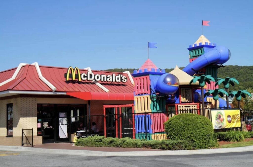
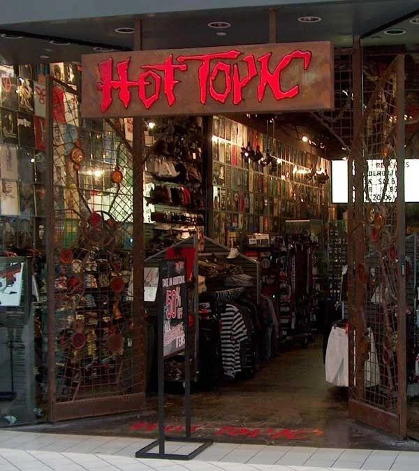
It makes me think of the minimalism movement that’s been slowly eating away at our world for the past several decades. Creative shapes and textures and architecture have been replaced by simple, monotone geometric shapes and plain, shiny surfaces. You may have seen these a bunch of times already, but just take a look at what popular businesses like McDonald’s and Hot Topic used to look like a couple of decades ago or so:

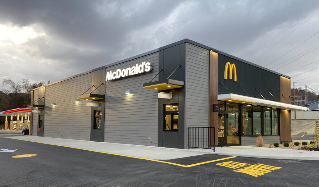
And compare that to what they look like now.

It’s not just technology; everything is turning as flat and smooth and understimulating as possible. But why? I mean the answer is the same as it always is: money. It’s easier to sell blank slates, so it’s safer to keep your real estate as generic as you can get away with than to allow room for creativity and differentiation. And speaking of money, I think the reason technological advances are continuing to shift towards the “pictures under glass” format the author was talking about is probably, in part, due to the fact that it just sells better.

Humans are fundamentally lazy creatures, in an adaptive sense. We subconsciously try to spend fewer resources for the same results – and those resources includes mental and physical energy. It’s an evolutionary trait obviously, the more efficient we are the more resources and energy we have to shift focus to other things (the industrial revolution, for example). So it follows that the simplest, most brain-rotting designs that require the least amount of physical and mental effort will sell the best.

We’ve almost given up on the body already. We sit at a desk while working, and sit on a couch while playing, and even sit while transporting ourselves between the two. We’ve had to invent this peculiar concept of artificial “exercise” to keep our bodies from atrophying altogether.

It won’t be long before almost every one of our daily activities is mediated by a “computer” of some sort. If these computers are not part of the physical environment, if they bypass the body, then we’ve just created a future where people can and will spend their lives completely immobile.

This applies to you and me just as much as it does anyone else. We have to make an active effort not to get sucked in by the allure of algorithms that spoon-feed us simple mind-numbing social media content, (which, by the way, is associated with gray matter atrophy*). In a way, this instinct for efficiency is what keeps us advancing as a species. However, if left unchecked, we might end up giving up things we value about ourselves, our creativity and imaginations… or our ability to think critically.

Also, the author accidentally predicted AI slop:

Creating: I have a hard time imagining Monet saying to his canvas, “Give me some water lilies. Make ’em impressionistic.”


*Not to imply a causal relationship, there isn’t enough data to come to any severe conclusions.

Week 9 Reading Response – Kamila Dautkhan

Response 1: Attractive Things Work Better by Don Norman

What stood out to me the most was Norman’s “heretical” claim that attractive things actually work better. I always thought of usability and beauty as two totally separate things like a tool is either pretty or it’s functional. But the way he explains how positive affect (basically just feeling good) makes us more creative and tolerant of minor glitches really clicked for me. It’s funny how he used to be a “usability bigot” who didn’t even see the point of color screens but now he’s out here admitting he owns teapots just because they’re sculptural art. It made me realize that when I’m happy using a well-designed app or object, I really do find it easier to navigate, even if it has a few flaws.

Response 2: Her Code Got Humans On The Moon by Robert McMillan

The most interesting thing about Margaret Hamilton’s story is how she was essentially one of the guys in a field that didn’t even have a name yet. It’s wild that when the Apollo mission started, software wasn’t even in the budget or the schedule. I loved the detail about her bringing her daughter Lauren to the lab and how a mistake the four year old made while playing actually helped save the Apollo 8 astronauts later on. It shows how Hamilton’s intuition for human error was way ahead of its time, especially since NASA’s higher-ups insisted astronauts were trained to be perfect and wouldn’t make mistakes. She didn’t just write code, she basically invented the rigor of software engineering because she knew that in space, there is zero room for any flops.

Lighting Loop or Disco

Github

Concept

I was initially thinking of making a a lamp which turns on in dark and can be manually turned on. But that seemed very boring. Then I thought that why don’t I use a light from one LED and use it as an input to for the LDR which can ultimately effect a second LED. While thinking about this, I thought that I can just create a switch like that using code. Along the lines, It came to me what I can do is make the light light fluctuating by making it fade in and out. So the LDR reading will change within a range and I can make the second LED a blink. This reminded me a party or disco lights where  different lights turn on and off at different rates.

Work

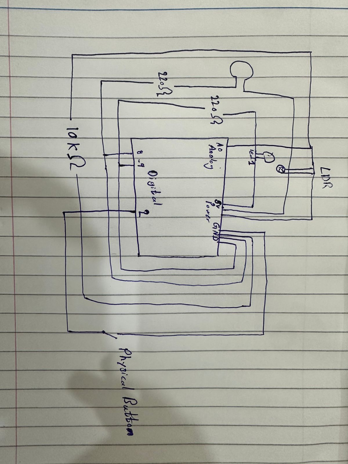
Both circuits were relatively simple as we did in the class, and the connection between them was through the code. To add more to it I used INPUT_PULLUP instead of a resistor. I had a conversation with GPT about this. It took me some time to get a grasp of regarding how it work. The next was putting the led close to the LDR. Now this was a bit tiring because the LDR was also detecting the room light. So I couldn’t have a fixed range, and the code needs to be updated if the location changes and new light in the room is introduced. I would regard this as the most challenging part.

On the other hand the part I am most proud of is dealing with multiple kinds of input. I was indeed relieving when my design did not require mapping of analog inputs and outputs. Initially I thought that I had to deal with all these multiple inputs but with just few lines of code, I was able to accomplish what I had in mind without nest if and loop blocks.

Sketch


Working Demo


Week 7 – Midterm Project! – Megan Del Villar

“Salteñada”

Concept

For this project I wanted to create something that actually represents me. I thought about my culture and also something I really enjoy which is cooking. So I asked myself what are my favorite Bolivian dishes and which one feels the most iconic. For me that is the salteña. It is a type of empanada but very unique because it is juicy and has a mix of different ingredients inside.

From that idea I decided to turn it into a game where people can learn how to make salteñas. I was also inspired by a game I used to play when I was younger called Papa’s Pizzeria, where you receive orders and have to complete them correctly. I liked that structure a lot so I adapted it into my own concept but based on Bolivian food.

The main goal of the game is to complete four salteñas correctly by following the recipes shown in the tickets. Each time you play the orders are random so the experience changes every time.

Implementation

I started by thinking about the aesthetic of the game. I wanted it to match the same style I have been using in my other works which is clean, flat, and stylized with shadows made using shapes instead of realistic textures. That is why I built everything using p5.js shapes instead of drawing or importing detailed images.

I created different classes like Ingredient, Dough, and Order so I could organize the logic better. This helped me control how things move, how they are displayed, and how the player interacts with them.

One of the hardest parts at the beginning was figuring out how to drag the ingredients and the dough. I wanted it to feel smooth but also controlled. Designing the ingredients was also challenging because I wanted them to be recognizable but still look like part of a stylized game.

Then I worked on the main mechanics of the game. I created a system where orders are randomly generated so every game is different. I also built a system that stores the ingredients inside each dough and then checks if they match the recipe. This is a simplified version of how salteñas are actually made but it still represents the main ingredients.

For the visual part I used an image of an aguayo as the background and applied a pointillism effect to make it look more organic and consistent with the rest of the aesthetic. I also added a custom font that matches the vibe of the game and background music to make the experience more immersive.

I did not rely too much on external sources. Most of what I used was the p5.js library for things like collision detection and interaction, class notes, and inspiration from Papa’s Pizzeria and Bolivian cooking. I also spent a lot of time experimenting to make everything look visually consistent.

Another important source was actually my younger brother. I made him play the game when it was almost finished to see how a real user would interact with it. This helped me realize several issues like missing instructions or unclear elements. Because of that I ended up spending more time improving the tutorial than the game itself, since I wanted the player to clearly understand what to do and feel rewarded when they succeed.

I also used AI tools like ChatGPT and Claude mainly for debugging (a big part of this project was honestly debugging haha) and understanding certain technical problems and knowing what function, variable or tool would be useful for what I wanted to do.

Code that I am proud of

The part of the code I am most proud of is the recipe validation system. I had to create a way to store all the ingredients that the player places inside each dough and then count them correctly. After that I needed to compare those counts with the order requirements.

This was challenging because it connects multiple parts of the game. The interaction of dragging ingredients, storing them inside the dough, closing the salteña, and finally checking if everything is correct. Making all of that work together correctly took me a lot of time to understand and debug.

function checkRecipe(dough, order){
  let counts = {};

  for(let ing of dough.ingredients){
    counts[ing] = (counts[ing] || 0) + 1;
  }

I am also proud of the full game logic that decides if the player wins or loses. It checks if all salteñas are closed, if they have the correct ingredients, and also handles the timer and the Done button.

for(let d of doughBalls){
  if(!d.closed){
    loseReason = "Some salteñas are not closed";
    endGame(false);
    return;
  }

Finally, one that seemed so simple but it took soooo much time out from me was this multi – clicking to close the salteña

if(now - d.lastClickTime < 400){
  d.clickCount++;
}

Reflection

I really enjoyed making this project and I think I challenged myself a lot. There are still things I would improve. For example there was a moment where I did not like the dragging interaction and I wanted to change it to a pick and release system. However that was very difficult to implement and I was already deep into the project and felt like I was going down a rabbit hole while debugging that, so I decided to keep the drag system to avoid breaking everything.

It bothered me because when I played the game myself I noticed that dragging a lot can get tiring, especially because you are trying to finish quickly. So I think a different interaction system would make it more user friendly.

I also would have liked to add sound effects and more steps to the cooking process. Right now when you close the salteña it is assumed that it already has the juice and is baked. Ideally I would add another stage where the player adds the juice and then bakes the salteña to make the experience more complete.

Another challenge I faced was organization. Because of time changes and breaks in between working on the project, my coding process was not as consistent as before. Sometimes I would go a long time without looking at the code and then come back and work for many hours. That made the code feel a bit disorganized and sometimes I would get lost.

I also struggled at the beginning with making the design responsive to different screen sizes. I could not rely on fixed dimensions like before, so I had to adapt everything to the window size. That was difficult at first but I eventually got used to it.

Overall I am very proud of this project. Even though there are things I would improve, I feel like it represents me, my culture, and my interests. It is also a game that I would actually enjoy playing and I think my friends and family would too.

Midterm – Mohamed Sunkar

Overall Concept

links:

https://editor.p5js.org/mss9452/sketches/OTs6tFggnA

https://editor.p5js.org/mss9452/full/OTs6tFggnA

For my project, I redesigned the classic Snake game, with more focus on the atmosphere and visual experience rather than just the gameplay. For the design I added geometric patterns for the background with music playing as well. The game also changes themes by pressing the t button to either light or dark. Instead of the usual blocky snake I made it with a glowing circular shape to represent light movement through an environment.

I wanted the experience to feel somewhere between calm and intense. The background slowly shifts between geometric patterns, creating subtle motion without distracting from the game itself. At the same time, the gameplay remains simple and familiar, allowing the user to focus on both playing and experiencing the visuals. Overall, my goal was to take a very well-known game and transform it into something more immersive while still keeping it intuitive.

How the Project Works / What I’m Proud Of

The game is built using p5.js and uses object-oriented programming to organize the main elements. I created separate classes for the Snake and the Fruit, which made the code easier to manage and extend. The snake moves across a grid system, updating its position each frame, while collision detection checks for walls, self-collision, and fruit collection. When the snake eats the fruit, it grows, the score increases, and a sound effect plays to give feedback to the player.

One part I am particularly proud of is the visual design. I replaced the traditional square snake with glowing circular segments that create a layered light effect. This connects back to my concept of light moving through darkness. I also added two background images that slowly fade into each other, which gives the game a more dynamic and atmospheric feel without interfering with gameplay. The dark/light mode toggle was another feature I liked, since it allows the user to switch between two different moods.

Another aspect I think works well is the overall structure of the program. I used a game state system (start, playing, and game over), which made it easier to control what is displayed at different times. I also added background music and sound effects, which made the game feel more complete and interactive rather than just a basic version of Snake.

Code Snippets

Fruit interaction + sound

if (snake.getHead().equals(fruit.position)) {
  score += 1;
  snake.grow();
  fruit.relocate();

  eatSound.play();
}

Snake movement

move() {
  this.segments.pop();

  let head = this.segments[0].copy();
  this.segments.unshift(head);
}

Areas for Improvement / Challenges

One of the biggest challenges I had to deal with was the interaction between the different parts of the program, especially when incorporating new features such as the use of sound, images, and different game states. There was also the time when some of the functions were not recognized, as well as the issue with the game over screen not displaying as desired. This was easily solved by organizing the code in such a way that the state system is utilized.

Another challenge I encountered was dealing with the images and the sound files with the p5.js library. There was some difficulty with the formats as well as ensuring that the sounds do not overlap. This made me think more critically about the use of the sounds.

If I had more time, I would definitely consider incorporating some new features such as the difficulty level as well as the level. This would definitely make the gameplay experience more interesting. In addition to this, I would consider further improving the looks as well as incorporating some interactive elements. While the atmosphere is good, there is still room for improvement with regard to the gameplay experience.

Week 5: Reading Assignment

Computer vision differs from human vision in that it does not fully understand the context of what it is seeing. Humans rely on memory, context, and storytelling to understand what they see. What stood out to me is that computer vision depends less on artificial intelligence and more on borders, corners, contrast, intensity, and brightness. Computer vision sees pixels in small details, while we as humans might overlook small details and focus more on the bigger picture.

A technique I recently learned about in computer vision is body pose detection, which is used in many games such as Xbox 360 Kinect and Just Dance. The reading made me think that this is a useful tool in the field of interactive art. The author also seems optimistic about democratizing these tools for artists. Like many things in life, it is a double-sided sword—it can be used for good or bad. I am not only talking about computer vision, but also surveillance and tracking in general. These technologies can be used to harm individuals, or they can be used to improve safety within society. Context matters, and that is why humans have the privilege of detecting and evaluating ethical issues.

Week 5 — Midterm Project Progress

https://editor.p5js.org/MariamBarakat/sketches/5sXlvsZ0U

1. Project Concept and User Interaction

The Secret Garden will be an immersive resource-management game that utilizes a point-and-click adventure interface. The core concept revolves around the “journey of growth” — shifting the focus from instant gratification to the physical labor of gardening. To successfully cultivate life, the player must navigate a layered world, traveling between different locations to collect raw materials. The gameplay loop requires the player to visit the River to fetch water, the Pottery Studio to craft vessels (may or may not include), and the Forest to gather nutrient-rich soil.

The interaction is designed around a “Layered Scene” system. The player navigates by clicking on specific environmental “portals,” such as a path leading to the woods or a bridge crossing the river. Within each scene, the cursor acts as a tool: clicking the river fills a bucket, while clicking a potter’s wheel initiates a crafting sequence. In the central Garden hub, interaction is more tactical, requiring the player to drag and drop collected resources from their inventory onto active plant plots to trigger growth stages.

2. Code Design: Functions, Classes, and Interactivity

The technical architecture of the game will rely on a Scene Manager class to maintain the game state. This class will store boolean flags for every location, ensuring that the program knows exactly which background to render and which set of interactive hitboxes to activate. A global inventory object tracks the count of water, soil, pots, and seeds, acting as the bridge between the gathering scenes and the planting scenes.

The plants themselves will be managed through a Plant Class, which will encapsulate all the logic for individual growth. Each instance of a plant tracks its own unique needs and developmental progress. A central mouseClicked() function serves as the primary input handler, using conditional logic to determine what action to take based on the currently active layer. Furthermore, a persistent HUD runs every frame to provide the player with a clear view of their current resources, regardless of where they are in the world.

3. The Most Uncertain Part
    • Asynchronous Growth Logic: In a multi-scene game, the player spends significant time away from the Garden. If growth is tied to the Garden’s display loop, plants will “freeze” in time whenever the player leaves the room. Ensuring plants age accurately in the background across different layers is a major logic hurdle.
    • Interactive Pottery and Asset Alignment: Designing a pottery mini-game that feels tactile — such as requiring the player to click and hold to “shape” clay — risks being buggy or unintuitive, so I’m still in the process of figuring out how exactly I want to introduce “interactivity” there. Additionally, finding specific sprites for for everything and ensuring they align perfectly is difficult.
3. Risk Minimization and Test Implementation
    • By using the millis() function, each plant records the exact moment it was last nurtured. This creates a “real-time” clock for every organism. When the player returns to the Garden, the class calculates the difference between the current time and the recorded timestamp to determine growth, ensuring the world feels persistent and alive even when the player is at the River or Studio.
    • To handle the pottery mini-game, I plan to use a “fill-bar” logic where mousePressed increments a shaping variable. This avoids complex physics and keeps the interaction reliable.

Week 4 – Data Visualization

Data Visualization

For this week’s assignment, an animated visualization of global temperature data from 1880 to today. The sketch fetches real data from NASA’s GISS API and draws it as a bar chart. Blue bars mean cooler-than-average years. Red bars mean warmer-than-average years. As the bars animate in, poetic phrases appear based on the temperature, giving the data a human, storytelling feel.

Controls: Click to pause/play · Hover bars for details · Press R to restart · Press S to save · Spacebar to toggle

Code I Am Proud Of

The part I am most proud of is how the bars get their color. Instead of just picking “blue” or “red,” I used lerpColor() to blend between shades based on the actual temperature value. Colder years get a deeper blue, and warmer years get a more intense red. It makes the warming trend really pop visually:

// Color: blue for cold, red for warm
let barColor;
if (d.anomaly < 0) {
  barColor = lerpColor(
    color(70, 130, 200, 200),
    color(40, 80, 160, 200),
    map(d.anomaly, 0, -0.5, 0, 1)
  );
} else {
  barColor = lerpColor(
    color(200, 100, 70, 200),
    color(240, 60, 40, 220),
    map(d.anomaly, 0, 1.5, 0, 1)
  );
}

I also like the generative text system. Each time a new data point appears, the sketch picks a phrase from a pool that matches the temperature: cold, warm, or neutral. It is a simple idea but it adds a lot of personality to the piece:

function triggerPhrase(anomaly) {
  if (millis() - lastPhraseTime < 1200) return;

  let phrases;
  if (anomaly < -0.1) {
    phrases = coldPhrases;
  } else if (anomaly > 0.3) {
    phrases = warmPhrases;
  } else {
    phrases = neutralPhrases;
  }

  activePhrase = random(phrases);
  phraseTargetAlpha = 255;
  lastPhraseTime = millis();
}

What I Learned

Working with a real API changed everything. The full 145-year dataset tells a story on its own. You can see the blue bars dominate the early decades, then the reds creep in and accelerate. I did not need to editorialize; the shape of the data is the narrative. The hardest part was dealing with CORS issues and making sure broken data rows do not crash the sketch.


Data: NASA GISS Surface Temperature Analysis · Built with p5.js · February 2026

Week 4 – Reading Response – Kamila Dautkhan

1. Something that drives me crazy (not mentioned in the reading) and how it could be improved

One of the problems that drive me crazy is the touch screen controls in cars because many new cars have replaced physical buttons and knobs with a large screen for everything (like changing the AC or the radio). This is frustrating because you have to take your eyes off the road to look at the screen. You can’t feel where the button is like you could with a real knob.

I think the solution for this problem can be bringing back physical knobs for the most important things like volume and temperature. This uses what Norman calls “tactile feedback” so that you can feel the click of the knob and know exactly what you’re doing without looking away from the road.

  1. How can you apply some of the author’s principles of design to interactive media? 

On a website buttons should look like buttons (maybe with a shadow or a bright color). This provides the user a visual cue. When you click “Submit” on a form, the button should change color or a loading circle should appear. This lets you know the website actually giving you an instant response and is actually working. Also, I found natural layout principle very useful because now I know that controls  should be placed in a logical way. For example, I should put important buttons on the right side of the screen because that’s the direction we read and move forward. Moreover, Conceptual I would use icons that people already understand. A trash can icon for deleting files or a house icon for the home page helps users understand how the app works instantly because it is already familiar to them.


Week 4- Reading response

One thing that drives me crazy is self-checkout and checkout lanes in general. Stores build 30 checkout stations but only use two. Now we have self-checkout, and still the process is confusing and slow. This problem is not about the technology itself. It is about poor design. The system does not clearly show how to use it efficiently. It lacks good signifiers. Simple visual cues, clear instructions, or intuitive layout would solve the problem. The action should be easy to understand without guessing.

From the reading, I learned that good design depends on affordances, signifiers, mapping, feedback, and clear conceptual models. In the case of self-checkout, the affordance exists because you can scan items and pay. But the signifiers are missing. The design does not communicate the correct sequence of actions. The mapping between the screen, the scanner, and the bagging area is also unclear. If designers focused more on discoverability and understanding, these everyday frustrations would not happen.

I can apply these principles to interactive media. In digital design, buttons, gestures, and workflows should clearly show what they do. Users should not guess how to swipe, click, or complete a task. Good feedback is also important. When a user takes an action, the system should respond immediately. Finally, the interface should support a simple conceptual model. Users should understand how the system works just by looking at it and trying it. If I design with clear signifiers, natural mapping, and strong feedback, I can create interactive work that feels simple, clear, and easy to use.