STEER_OS34 v1.2 – Final Project

Concept

My initial concept was an Arduino hardware controller pad paired with a generative audio-visual system in p5, where physical input through knobs and buttons shape a particle world that produces atmospheric jazz sound in real time.

However, as I made the serial communication working, and started experimenting with sound, the synth music ambient was so good I fell in love with it. This type of music I also really like, and I immediately had an idea for the visual p5.js part, so I changed my concept a little bit.

An interactive audio-visual installation with a control panel based on Arduino and a generative p5.js audio and visual system that continuously produces synth ambient sound and visuals in real time. The system is autonomous, so the user just “steers” it since it can already exist on its own. Through knobs and buttons, the user shapes the conditions of the system: changing tension, density, speed, tone, and other behaviors that simultaneously affect both the soundscape and the visual particle environment. The interaction is more like a conducting and not performing or creating.

Recording


Implementation & Proccess
Serial Communication

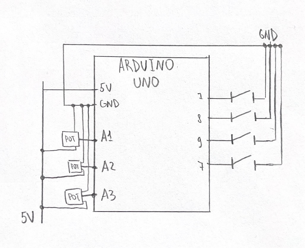
My serial communication was built on the code we reviewed in class, so I can’t say much about this implementation other than that I adjusted the speed of serial communication from 9600 to 115200 baud, and that I added controls for all of my buttons and knobs.

const int BTN1 = 7;
const int BTN2 = 8;
const int BTN3 = 9;
const int BTN4 = 10;

void setup() {
  Serial.begin(115200);

  pinMode(BTN1, INPUT_PULLUP);
  pinMode(BTN2, INPUT_PULLUP);
  pinMode(BTN3, INPUT_PULLUP);
  pinMode(BTN4, INPUT_PULLUP);
  pinMode(LED_BUILTIN, OUTPUT);
}

void loop() {
  // read all sensors and buttons
  int knob1 = analogRead(A1);
  delay(1);
  int knob2 = analogRead(A2);
  delay(1);
  int knob3 = analogRead(A3);
  delay(1);
  int b1 = !digitalRead(BTN1);
  int b2 = !digitalRead(BTN2);
  int b3 = !digitalRead(BTN3);
  int b4 = !digitalRead(BTN4);

  // send 7 values
  Serial.print(knob1);
  Serial.print(',');
  Serial.print(knob2);
  Serial.print(',');
  Serial.print(knob3);
  Serial.print(',');
  Serial.print(b1);
  Serial.print(',');
  Serial.print(b2);
  Serial.print(',');
  Serial.print(b3);
  Serial.print(',');
  Serial.println(b4);
  
  delay(50);
}


Audio

The audio system is built entirely in p5.sound, and honestly it was the part of this project I liked the most.

The core is a drone layer made of two sawtooth oscillators running at slightly different frequencies (73.42 Hz and 73.86 Hz). The tiny gap between them creates a natural beating effect that makes the sound feel more alive and warm instead of flat. Both oscillators feed into a shared lowpass filter, which then goes into a reverb. This routing includes everything: knob controls, button effects, so it hits the whole sound at once.

On top of the drone, there’s a triggered note system with three layered oscillators: a triangle wave at the base frequency, another triangle slightly detuned (*1.005), and a sawtooth an octave up (*2). All three fire together on every collision event, with slightly different envelope timings so the sound blooms rather than stabs. The notes are constrained to D Dorian scale, which is why nothing sounds random even though the note selection itself is random — the scale does the harmonic work let dorianScale = [146.83, 164.81, 174.61, 196.00, 220.00, 246.94, 261.63, 293.66];

Each physical control maps to a certain audio parameter:

    • SCAN RADIUS (knob 1) — shape size, which directly affects collision frequency, which affects how often notes fire
    • CLARITY (knob 2) — lowpass filter cutoff, from more muffled (60 Hz) to open (6000 Hz)
    • DEPTH (knob 3) — reverb decay time, from dry (0.5 sec) to full cathedral (8 sec)
    • ALERT (btn 1, hold) — overrides the filter to a narrow cutoff with high resonance, adding tension
    • HOLD POSITION (btn 2, hold) — slows particle movement so notes fire less, also mutes new note triggers entirely
    • AMBIENT MUTE (btn 3, toggle) — fades the drone down to near-silence
    • INTERFERENCE (btn 4, hold) — pushes osc1 and osc2 apart by 15 Hz each, causing beating/wobble

One thing I learned that made a big difference: the reverb can’t be re-processed every frame or it crashes the audio engine. I had to track the previous knob value and only update reverb when the knob moved by more than a threshold:

if (audioStarted && abs(knob3 - lastKnob3) > 30) { 
    let decayTime = map(knob3, 0, 1023, 0.5, 8); 
    reverb.process(filter, decayTime, 2); 
    lastKnob3 = knob3; 
}
Visual

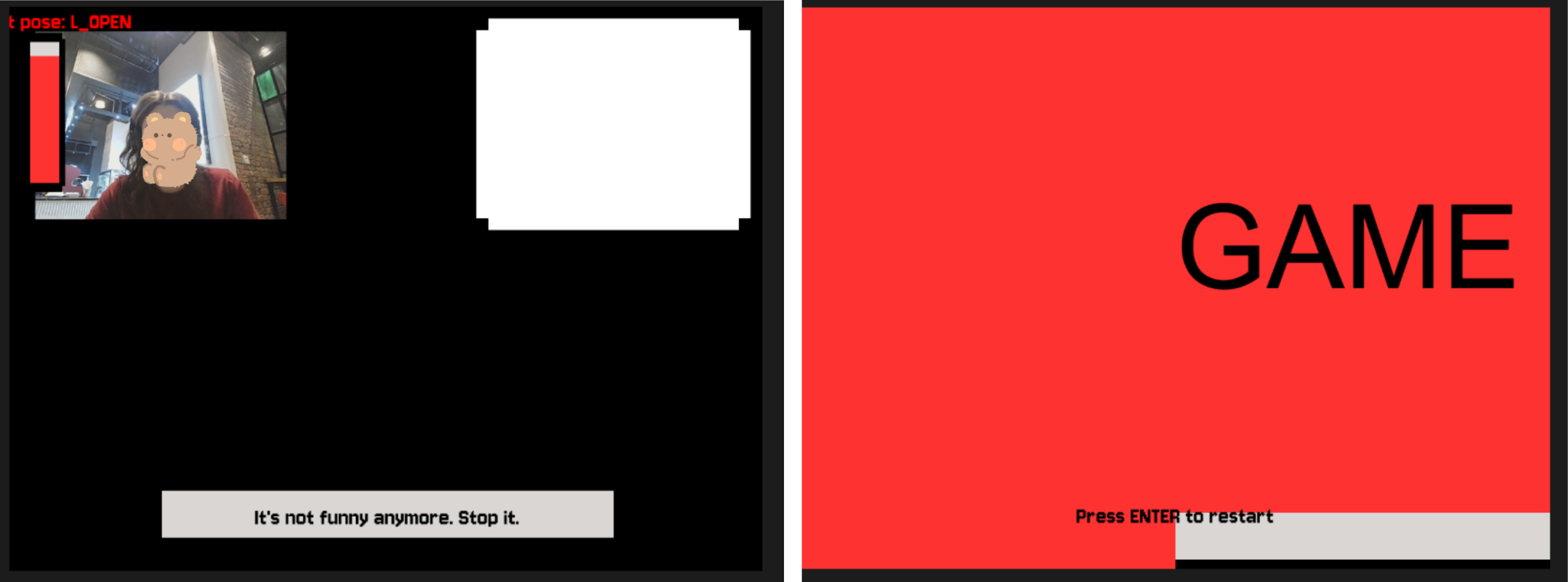
Visual part came to me after I heard the audio, so I immediately had a clear idea of what I wanted to see on screen. I already had a debug panel just to figure out if the Arduino sends anything to my p5 sketch, so I just played around with colors, and some other effects, and left it be.

The shapes is basically the integration of my previous project (Week 2 assignment) with shapes connections. I copied the class inside this sketch, deleted the connection-building parts so only the shapes are floating around the screen with coordinates. I decided to use this sketch because it fit in the style really well and made my life with developing this project a little bit easier with that solid visual foundation.

One fun thing I use there is the CRT scanlines, and it is a really easy built that was a nice detail of the overall design. Basically it just moves a line depending on the y-variable that is changing each frame inside the draw() loop.

scanY += 1.5;
if (scanY > windowHeight) scanY = 0;


stroke(0, 174, 64, 80);
strokeWeight(1);
line(0, scanY, windowWidth, scanY);

stroke(0, 0, 0, 60);
strokeWeight(1);
for (let y = 0; y < windowHeight; y += 3) {
  line(0, y, windowWidth, y);
}

The trail effect tied to DEPTH (knob 3) was actually just changing the background opacity. Instead of background(10)which clears the canvas completely, I use background(10, 10, 10, trailAlpha)where the alpha is mapped from knob 3. Low alpha means the background barely paints each frame, so old shapes linger as ghostly trails. It’s a really simple trick that makes a big visual difference.

Other than that, all the visual responses from the Arduino knobs and buttons was pretty simple and was achieved just by substituting hardcoded values for strokeWeight, backgroung opacity, size etc. for the value received from Arduino.

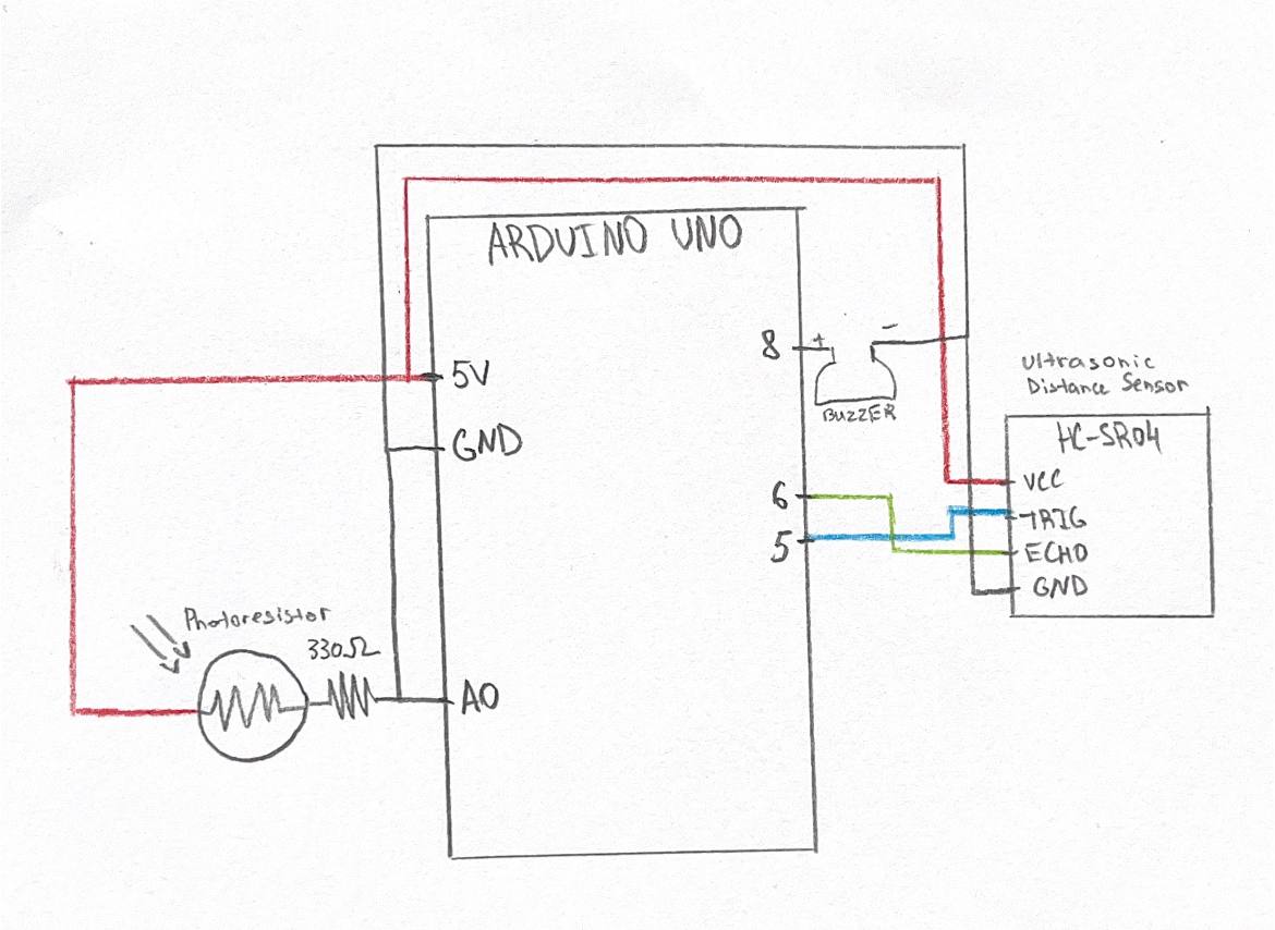
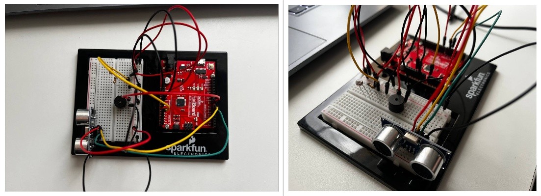
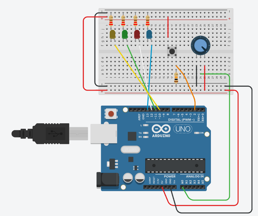
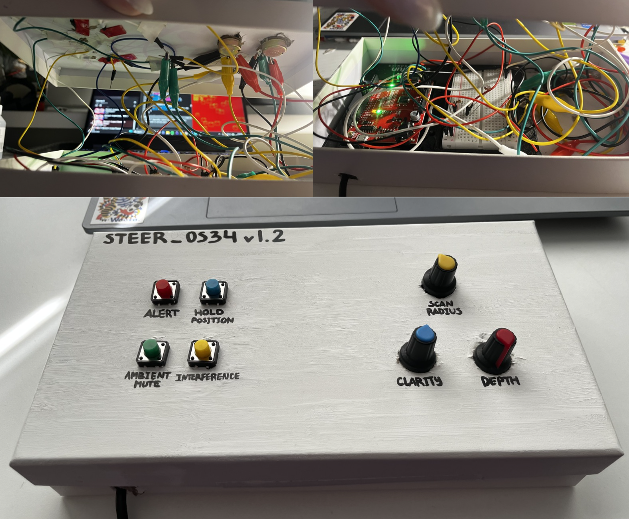
Hardware Setup & Schematic

The setup first was made on breadboard and then mounted on the box. I used hobby-knives to crave out the holes for buttons and knobs, I painted the box, and used POSCO market to write on top.

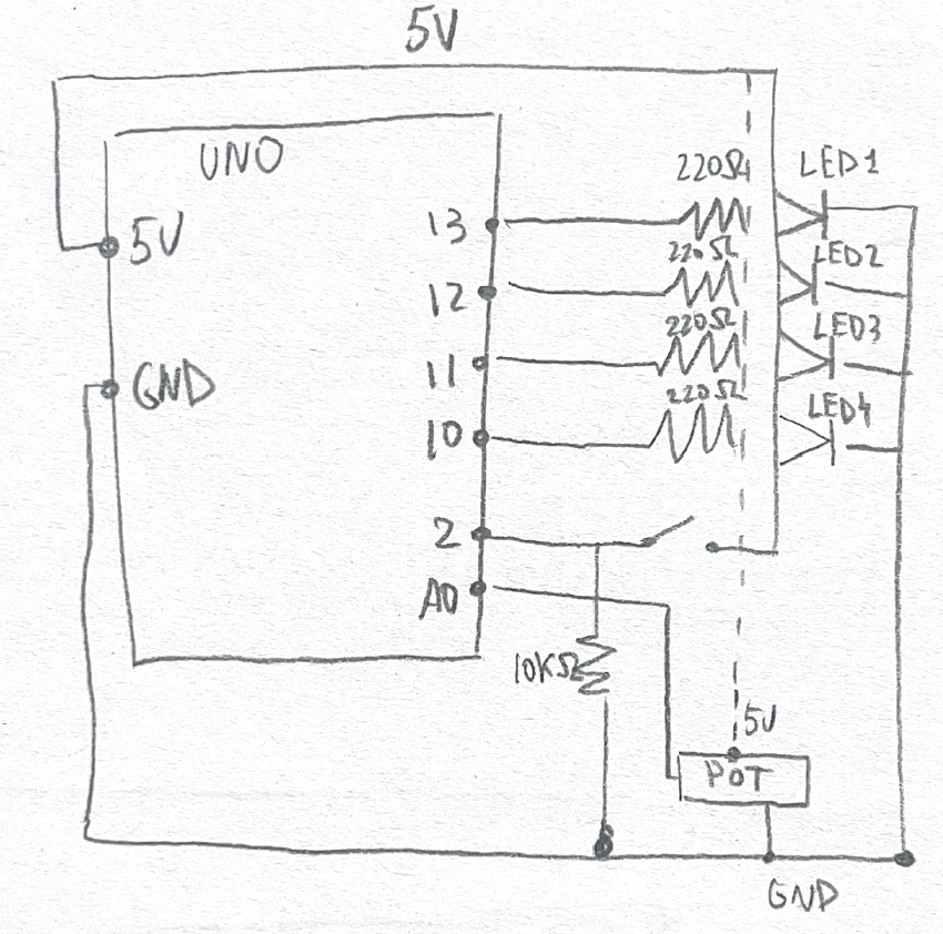
The Arduino board is hidden under the lid, and is wired to the components in 2 ways:

    • Big external modular knobs are connected with alligator wires and regular jumper wires with each other; as well as some of the jumper wires (mostly the ground wires) are also connected to one ground jumper wire via both parts of the alligator clip.
    • Other than that, the buttons are connected to digital pins via the jumper wire being bent like a hook around the button’s leg, and sticked together with all different types of insulating tape I found in my dad’s instruments. One of the biggest challenges was to maintain good contact of wires and it took me literally HOURS to make it work. Since my cardboard box is quite dense and thick, the button’s legs sticking out were really tiny, so actually connecting them properly with the jumper wires from Arduino kit with thick cap was really hard. The contact was constantly disappearing and it was really annoying and it wasn’t working even with a lot of tape. This is why I switched it with alligator wire where I could, but I ran out of them so I found a stronger tape so it held all the buttons together properly so they were actually working

References
Parts I’m proud of

The part I’m SO PROUD of is actually the physical setup.

I don’t really like how it look, I believe I could have made it look 10 times better, but with the scarce amount of time and resources it turned out pretty well.

First of all, even though that the overall box is not really neat, I think the way I managed to cover something is actually successful; and the handwritings with my shaky hands are also not the best but it all look together quite well. Also, I felt like I managed to maintain the aesthetic I was striving to achieve in the beggining with the design of the panel too. I intentionally left out the buttons on top, and ordered the caps that look very tech-y because it was a great alignment with Teenage Engineering designs, especially their PO series with buttons out.

Also, the part I actually think I did very good job is what hidden inside the box. The wiring and making everything have contact with each other, working consistently and not crashing, as well as not being just super-glued to the surface was extremely hard. I spend almost 10 hours on just doing this setup. I had to give up on a lot of features that would elevate the design and idea but the hardware part just didn’t allow it.

I managed to wire it all up somehow, so it doesn’t even look bad, works consistently okay and is responsive at all times, has some management inside, and is not too messy, and is hidden from the user’s eyes! It was the hardest task throughout this semester for me and I’m happy I managed to do this all by myself with literally no help.

This is how the box looks inside and outside, and I think it’s pretty impressive how something so simple and minimalistic has that huge messy wired system inside.


Reflection

I am happy that I managed to experiment with physical sound control, and built such a “synth”. I think it turned out quite good, with coherent style, and the music works really well with the visuals on p5. I feel like the vibe and style I wanted to see was maintained so I’m happy. I’m also proud about the fact that I managed to make the music sound not random but actually in one scale, style, and proper music-like sound with just notes and layering of a few oscillators.

I believe there’s a lot of room for improvement, with visuals mostly. First of all, the physical panel can be much neater and stable, and probably the LEDs as response could be implemented if I had more time. The box can be moved from cardboard box to wooden/plastic one and it would certainly eleveate the project’s overall vibe. Another idea that I’m sad I gave up on is the photoresistor impact of dark/light room, I think it would bring a different edge to the project, especially with that agent/CIA vibe the p5 sketch has.

I also think I could have added more response to the screen. Right now it is not obvious that the note is triggered on the collision of the shapes, so maybe having some feedback like a slight vibration animation or a different color outline would make it more clear.

User Testing

I built the most part of my project, and now I just need to tune up the visual aesthetics of it on the screen, and to mount the controls up on the panel that is external to the breadboard.

I asked my mom to test my project, but I can’t say that the this is really representative because language was a bit of a barrier in understanding this experience.

However, I tested it anyways and I also gained some insight. It was obvious even on the breadboard with no labels at all that you need to click, rotate, tune and just keep doing something with the controls to run the experience. My mom sat down and immediately started tryng to hold, press, toggle, rotate different buttons and the potentiometer, so I think this is really obvious but I will need to label the buttons with “HOLD” or “PRESS ONCE” because it was not really intuitive.

I also noticed that she mostly was looking at the breaboard and controls and didn’t pay much attention to the screen or music there, probably waiting for some physical output. To fix that I think I will need to position the panel and the screen in a certain way, so the panel feels like the “keyboard” for the screen and the user understands that they need to look at the screen in order to understand what happens. Also, maybe having earphones as a part of the experience also will make the user pay more attention to the sound and audio changes.

The fact that it is a musical instrument that controls audio and some particles on the screen. It was not obvious that these particles produce the sound though. So, I realized I need to have some animation on the screen when the note is triggered so it is more obvious.

As I said, I don’t think my user was too focused, but this also gave me the insight of making the experience more isolated: to have screen and panel on in one place and close to each other, and offering headphones so the user is actually paying attention to the project and don’t ignore it.

Also, labeling the controls with “HOLD” or “PRESS ONCE” but maybe avoid labeling what they directly do and label it more vaguely. I feel like my mom was actually curious to figure out what each thing does so she kept tinkering with it so I guess this is a nice part of the experience I didn’t expect.

I needed to explain in the end what’s the idea of the experience, so I figured that maybe I need to run some “intro” on the screen, so the user gets the idea of what is happening, and then run the experience itself. And also more visual feedback would be a big change because it will give the user the idea of how what they do is impacting the sound I think.

I will work on the p5 visual part for now to make the design visually responsive, and add LEDs and button labels on the physical panel once new knobs and some additional equipment arrive.

Video on Google Drive

Week 12 – Design meets Disability

A richer balance between problem solving and more playful explorarion could open up valuable new directions

I really liked this reading and it really brought me a lot of interesting idea about the design of things.

First of all, when the author writes about disability and design for it, I think that the trend in this sphere that he describes is really traceble right now. He talks about glasses that made the “disability” treatment a universal accessory. Nowadays a lot of people wear glasses with no lenses or with no vision correction, and glasses are seen as a part of style. When I told my family I want some nice-looking glasses (that I wear for vision correction), my parents told me that in their childhood you would get laughed at and mocked for wearing them. And now this is a trend. I have to say that not a long while passed since their teenage, so this is really interesting how the perspective changes over the years. Additional, maybe more subtle “disability” to an extent, is teethwear. People use different things to cure their teeth/jaw, and also, I know that in my parents’ childhood it also was something people would laught at you for. Now people wear grillz, tooth gems, fashion fake braces, and this again shows how something evolved from disability to fashion.

I believe that bringing fashion and style in things like that is really important. It allows people with disabilities like that not to stand out in a bad way, it allows them to not be scared and insecure of their peculiarities. Protheses that are shaped in some beautiful forms or that are looking cool are all around now: I saw so much very cool looking leg and arm protheses on social media. However, this is also important to not cross the line: some things should kind of distinguish people with real disabilities from people who wants to be fashioable in a way just for safety reasons. It is important to know who needs some help or accomodations, and who is totally alright.


As for design simplicity, I also agree a lot with the author. I feel like most designs of technology are pretty simple but not always very accessible, especially for people with some special needs. Beside Apple, I think a lot of tech companies and developers adopt this philosophy. PS4 and PS5 are really simply designed: sleek silouhette with minimal distractions. But, such minimalism can cause a lot of confusion, where’s the buttons, how to insert the disk, how to turn it on, and how to connect the controller. It is not intuitive to someone who sees it for the first time. But the design is very simple, though I wouldn’t say it’s super accessible or universal.

On the other hand, there are devices that are not very simple but very accessible. Headphones like ones from JBL which has some icons on every button on the right side earphone: super intuitive and useful. And even like that, it is probably not the most accessible piece for left-handed people.

I think a lot of thought is needed to make the design simple, intutitve, and accessible at the same time. Even if it turns out out not to be “all things to all people”, if it “some things for some people” it is successful already. However, I think it is also worth mentioning that simplicity is not always the best choice. I think that sometimes more burdened and robust, complex designs can be both accessible and exteremely good. In the world where everything simplifies and is minimalistic it’s really important to not forget that something more pompous can be simple and accessible too.

Week 12 – Final Project Proposal

Late Hour Steer

Concept

I adore music, and I truly think that the art of making and producing music is something magical. I always listen to different kinds of music, and when I listen to jazz specifically, I think about how cool it would be if I could make music like that.
I don’t know how to play instruments, but sometimes the desire to make, adjust, produce something sounding so beautiful strikes me.
Looking at different animations, cinematics, and paintings makes me feel exactly the same.
This is how my idea emerged: I want to make an Arduino hardware controller pad paired with a generative audio-visual system in p5, where physical input through knobs and buttons shape a particle world that produces atmospheric jazz sound in real time.

Some of the core traits I want to maintain in this work are:

    • The user isn’t playing note by note, and they neither record anything. What they do is steer the autonomous system that can exist and work on its own by always producing sound and image
    • Rather than “performing” type of interaction, this is closer to “conducting”: the user shapes conditions, and the system acts within them
    • The overall vibe and aesthetic I want to maintain is moody, slow, noir-jazz, dark-tech style. Music references to Bohren & der Club of Gore or something close, and visual references to Y2K Sony industrial design, and physical instruments like the OP-1
    • The core of the idea is that both generative parts (audio and visuals) are controlled by physical tactile control, neither of them is most important. One of my main goals is to build system where both parts are equally important and depend on each other but can be autonomous at the same time

Interaction

The way I see the interaction is the following:
As user approaches the small panel, laptop screen can still show a dark, moving visual world that produces sound and visuals. The audio playing should be some slow, almost ambient, jazz that stays neutral if nothing is happening in the hardware. As the user turns the knob or presses a button, both the visuals and the sound will shift accordingly: is the “tension” knob raised, the sound becomes more dissonant and the the visuals become tighter.

Some technical parts of the interaction are the following:

    • Arduino reads knobs and buttons states somewhere around ~30 times per second
    • p5 receives this data via p5.serialport library (most probably), updates a shared state object, and then runs both audio and visual engine based on this state
    • Audio will play via laptop speakers, and visuals will render on screen. Some LEDs integration right in the panel to show the state of the knobs/buttons can be implemented, but I’m not fully sure about it yet

In terms of design, I want to maintain the following:

    • Macro controls and not direct micro controls: each knob and button affects multiple parts of the system and not just one minor thing
    • Both audio and visuals will depend on one state, so the system will have one “brain” every other “organ” will refer to in order to act
    • The system is autonomous, so even with no input, it will run on its own, idle behavior will be implemented as part of the design

Technical Implementation

Arduino:

    • Microcontroller: Arduino UNO
    • Components on panel:
      • 3-4 potentiometers: continuous parameters (density, tension, register/tone, etc.)
      • 4-6 buttons: discrete actions (mode change, reset, accent triggers, acceleration)
      • **1-2 indicator LEDs: mode/state feedback on the panel (up to consider)
    • Components hidden under the panel:
      • Breadboard with all wiring
      • Wires running from panel components to breadboard
    • The panel: cardboard (or wood if possible) as the surface, and breadboard mounted underneath
    • The design aesthetic: clear tech, dev-kit with labeled controls, clean layout, visible&intentional construction

p5.js:

    • Architecture: a single shared state object holds all current parameters: both the audio engine and the visual engine read from it
    • Serial communication: p5.serialport library (?) receives strings from Arduino, parses them, smooths the values, updates state
    • Generative engine: particle system
      • Particles drift in 2D space
      • Particles have properties (size, speed, color) influenced by state (impacted via physical input)
      • Collisions, threshold crossings, or other particle events trigger audio events
      • Behavior parameters (count, attraction/repulsion, speed) controlled by state
    • Audio engine: using p5.sound
      • Multiple voices: a sustained drone layer, a triggered note layer, possibly a percussive layer
      • All notes constrained to a single scale (Dorian or natural minor) to allow randomness only within this constraint
      • Regulated timing: events trigger on a slow tempo grid (~60-80 BPM) so rhythm feels intentional
      • Sound design: detuned sine/triangle oscillators, lowpass filter, reverb to maintain the dark jazz aesthetic
      • I need to research more on the sound design and p5 sound library

References

    • Sound: Brian Eno (Music for Airports), Tim Hecker, William Basinski, Bohren & der Club of Gore
    • Visual: Lacuna’s interface aesthetic, Signalis, Y2K-era Sony industrial design, OP-1

    • Hardware: Teenage Engineering Pocket Operators, Monome Norns

Risks

There are quite a lot of risks I need to mitigate in order for this project to not sound like random sounds but a cohesive melody with the intendent mood

    • Serial latency or audio glitches
      • Prototype the serial connection and audio engine first and then move to the design
    • Generative system feels random rather than intentional
      • Scale constraints, quantized rhythm, careful voice design — needs additional research on music design, p5 sound and overall music rules I might not be familiar with + a lot of tuning and testing needed
    • Knob mappings feel unintuitive
      • Spend some time on parameter tuning and intentional design of the panel: first sketch it, prototype the best and ask family/friends for feedback to choose the final version
    • Physical build looks rough
      • Design the panel layout on paper first, source proper knob caps and clean labels, hide the breadboard; Maybe consider painting some materials, asking dad for some wood-cutting help or consider using ready for implementation materials (old plastic boxes as a panel) — needs some brainstorm

Overall Review

I believe this project can become a really cool one if I spend enough time on music tuning and design prototyping, as well as on doing some proper research both on the aesthetic and how to maintain it with the available materials for now.
I will start off with some simple pseudo-code algorithms to structure the code I will need to write, and sketching the visual generative system and the physical panel. Then, I’ll move onto the coding, and finally, when everything will work properly (hopefully) I will build the design of the panel itself and try to organize everything so it looks good.

Week 11 – Reading Reflection

A Brief Rant on the Future of Interaction Design

I really liked this text, and I strongly agree with the author. The fact that a lot of people envision our future of interaction and technology as just super-powerful phones and laptops isn’t really encouraging. I believe that even now we have so much technologies and innovative interactive things, that saying that in the future, the superior one, it’s just a phone is really not right.

Even now people use a lot of motion, body, voice driven technology. For instance, scrolling using your head, if I recall it correctly, you bow your head up and down to control the screen. Of course, it’s not the most creative, and obviously not the best way to interact but it is still more interesting than just tapping. Voice input is also really crazy that by commanding we can control devices, even if they’re as simple as smart speakers. This just shows that there’re a lot of ways to interact beside simple “tap here, tap there”.

I also find the author’s point on touching and physical response really interesting. This is true that the senses we have in our hands is something we shouldn’t ignore, since it allows for so many ways to interact and so much new technology and art. However, I find it hard to imagine what exactly “useful” or widespread, as smartphones, we can do using these sensations. Maybe it is the reason the author talks about the future and not the present.

This part about hands made me remember some technologies from Professor Eid’s lab once again. As I wrote in the last week’s reading response, they have a device that also triggers vibrations on the fingertips of the user if they touch the object in the VR.

They also had a really cool technology I think can be expanded a lot and that fit the idea of the author perfectly: there was some kind of a handle, and an app where you can choose a texture, for instance, some kind of hard jelly. So, the handle controls a ball that you see on the screen. As you move the handle, the ball moves also. And the thing is, that this handle was also “mimicing” the texture: when you try to push the ball through the jelly, you have some resistance and even that “bouncy” feeling, and when it finally comes through — lightness and 0 resistance. I find it to be SO COOL, and the fact that it’s made using only one handle is mind-blowing. I think if it’s possible to expand this technology to make this object-control dependent on the hands, and passing these sensations to the hands, it will be exactly what the author of the text was describinng.


*This is a short video I filmed of using this device so you can see how it works

Week 11 – Musical Device

Concept

I really liked the Ultrasonic Distance Sensor, and I really love the idea of using the outer environment and motion capturing. First, I wanted just to make a device controlled by buttons/potentiometer, but then the idea of using something less obvious came to me. I thought that trying to play sound without touching anything can be really interesting. I decided to use Distance Sensor and Photoresistor for this device.

The musical device is pretty simple: the photoresistor has a threshold of 900 (basically the light that it gets if you point the flashlight right at it), and if it receives light that is higher than this value, it will make the device play. Otherwise it will be silenced. The distance sensor converts the distance into frequency: the farther the object is from it, the lower frequency will be played.

Code

The code is pretty simple. It assigns global variables, has some local variables assigned in the loop() (like the distance and the frequency). Frequency that will be output by the buzzer is determined by the distance. I used distance = duration * 0.0343 / 2; to convert the distance to cm depending on the output of the Ultrasonic device, and then freq = map((int)distance, 5, 200, 800, 200); to map the distance to frequency, so that the distance from 5 to 200 is assigned to frequencies from 800 to 200.

There’s a small block in the beggining of my loop() part to turn off and on the buzzer. It’s made like that so it can change the frequency that it will be outputting.

int lightVal = 0;
bool lightOn = false;

int trigPin = 6;
int echoPin = 5;
long duration;
float distance;
int freq;

int soundPin = 8;

void setup() {
  pinMode(trigPin, OUTPUT);
  pinMode(echoPin, INPUT);
  Serial.begin(9600);
}

void loop() {
  Serial.println(lightVal);
  digitalWrite(trigPin, LOW);
  delayMicroseconds(2);

  digitalWrite(trigPin, HIGH);
  digitalWrite(trigPin, LOW);

  duration = pulseIn(echoPin, HIGH);
  // Calculate distance in cm
  distance = duration * 0.0343 / 2;
  freq = map((int)distance, 5, 200, 800, 200);

  lightVal = analogRead(A0);
  lightOn = lightVal > 950;

  if (lightOn) {
    tone(soundPin, freq);
  } else {
    noTone(8);
  }
}

I was mainly referencing tutorials on Arduino website, like this one for the distance sensor and this one for the photoresistor, to figure out how do I mke them work.

Schematic & Preview

The schematic of the device looks like this (I tried my best to draw it correctly):

This is how it looks in real life:

And this is how it works:

Reflection

I really like how it turned out. My main goal was to use the components of Arduino we haven’t worked in the class with, so I achieved this objective. I also like the fact that I can actually “play” this instrument without even touching it – I think it’s pretty cool.

For further improvement, I believe I can make the device more “usable” because right now pointing the phone right in the middle of bunch of wires doesn’t seem too good. Also, I think I can work with the short delays the device has because now if I flicker the light, it wouldn’t catch it being turned off.

Week 10 – Reading Reflection

Making Interactive Art: Set the Stage, Then Shut Up and Listen

I strongly agree with the author of this text especially about the fact that the artist should let the audience to experience, interpret, and feel the artwork without any instructed guidance.

Ideally they will understand what you’re expressing through that experience“. I really believe that if the artist wants the audience to really engage with the artwork on a deeper level, they should give them some space. Through the interaction, through emotions and reactions most of them who really make this interaction thoughtful will get the feeling or at least abstract idea behind the artwork, while still having their own interpretation and emotional feeling attached to that. Instructions kill the emotions, and personally I believe that artworks in the first place should make people feel.

What I noted down, it is really important to set up and design the experience in the way that will make people do the interactions that you want them to do. It goes back to our previous readings, and having this concept mentioned again only amplifies its importance.

Physical Computing’s Greatest Hits (and misses)

What’s great about the themes that follow here is that they allow a lot of room for originality

I believe that the “core” concepts that are used in many physical computing works are just like the core concepts and principles of any science or form of traditional art. “Everything is a remix” is basically telling the same thing: core concepts that artists are inspired by becomes the basis to which they add new unique ideas.

As for the works provided in the text, I really like “gloves” concept. I really like the idea of interacting with art and tech with your body, either it’s a projection, or something else, but I find this idea of just using your limbs to produce something without any additional “parties”. I know a lot of projects that are dependent on this technology, or that use kind of similar technique, not only for art but for more practical use. If I recall correctly, in NYUAD at Professor Eid’s Lab around a year ago I saw a project that was basically some training for children with CP transferred from offline to online VR experience. To keep the “senses” in the hands while completing the exercise, they made a technology that sends vibrations to the fingers when you touch something in VR, and depending on the touch, the vibrations frequency and power was adjusted. This is just another example of how the “gloves” concept was used in physical computing, even though it’s not really about art. However, I believe that the same “vibration” or mimicking a certain touch-sense technology can be really wisely applied in immersive and interactive art — letting the user to interact with the object while also letting them “feel” the object even if it’s not real is a really strong and impressive idea one could apply.


Week 10 – Analog and Digital Input

Concept

I wanted to create something we haven’t done yet with potentiometer and multiple LEDs. I thought that it would be cool if I manage to create a circuit that will control multiple LEDs through one input that was mainly used for only one LED. This circuit takes the analog input from potentiometer, and depending on its value chooses which LED to light up, so when you spin it they all light up one by one. If you press a button, all LED light up. This circuit reminded me of DJ-board with these switches and button you can press anytime, so by tinkering with this some nice sequence of lights can be created.

How this was made

To make this circuit, I googled how potentiometer works and what values it can output, and then I reffered to Week 9 tutorials on TinkerCad for references on how to connect buttons and potentiometer, and to remind myself on how this works in code.

// C++ code
//
int sensorValue = 0;
int buttonState = 0;

void setup()
{
  pinMode(A0, INPUT);
  pinMode(2, INPUT);
  pinMode(13, OUTPUT);
  pinMode(12, OUTPUT);
  pinMode(11, OUTPUT);
  pinMode(10, OUTPUT);
}

void loop()
{
  sensorValue = analogRead(A0);
  buttonState = digitalRead(2);


  if (buttonState == HIGH) {
    digitalWrite(12, HIGH);
    digitalWrite(11, HIGH);
    digitalWrite(13, HIGH);
    digitalWrite(10, HIGH);
  } else {
    if (sensorValue >= 0 && sensorValue < 256) {
      digitalWrite(12, LOW);
      digitalWrite(11, LOW);
      digitalWrite(10, LOW);
      digitalWrite(13, HIGH);
    }
    
    else if (sensorValue >= 256 && sensorValue < 512) {
      digitalWrite(13, LOW);
      digitalWrite(11, LOW);
      digitalWrite(10, LOW);
      digitalWrite(12, HIGH);
    }
    else if (sensorValue >= 512 && sensorValue < 768) {
      digitalWrite(12, LOW);
      digitalWrite(13, LOW);
      digitalWrite(10, LOW);
      digitalWrite(11, HIGH);    
    }
    else {
      digitalWrite(12, LOW);
      digitalWrite(11, LOW);
      digitalWrite(13, LOW);
      digitalWrite(10, HIGH);
    }
  }
}

To control 4 LEDs with potentiometer, I wrote a sequence of if-else blocks that light up certain LED depending on the value the potentiometer outputs, and turns off all the other LEDs. These if-else blocks are wrapped into a bigger if-else: if the button is not pressed, these blocks execute, otherwise — all LEDs switch up.

My schematics look the following way:


And here’s the simulation and how it works on physical Arduino:

Reflection

I’m really happy of how it turned out and that I was able to do both online and real version of this small task. It was a bit hard to assenble it all on the Arduino because all the parts are really small, but it works so I’m happy. For further improvement, I wonder if there is a more efficient way with less wires to assemble this project because right now it looks a bit messy.

Week 9 – Reading Reflection

Norman,“Emotion & Design: Attractive things work better”

It is really nice to hear that Don Norman who is making a big emphasis on usability also care a lot about design and aesthetics.
The part that stuck with me most was the teapot example: how he owns three completely different ones depending on his mood and the context. It made me realize that “good design” isn’t this one-size-fits-all thing. Sometimes you need efficiency, sometimes you need beauty, sometimes you need practicality. And the fact that aesthetic appeal actually makes people more tolerant of design flaws is wild to me. It’s not shallow to care about how something looks since it genuinely changes how we interact with it.
I think what Norman’s saying challenges this weird guilt that exists around caring about appearance. Like, designers (or developers, or whoever) sometimes act like prioritizing beauty over pure function is superficial. But he’s providing actual evidence that positive emotion broadens our thinking, makes us more creative, more forgiving. A pleasing interface isn’t just nice to look at, it actually changes your cognitive state, and I believe it is really important to remember when creating designs and art pieces.
The contrast between tools for stressful situations versus relaxed ones was helpful too. I hadn’t thought about it that way before, but it makes sense that your design goals shift based on context. This really shifts the understanding of usability: thinking about how people feel when they’re using something can completely change the interaction in the first place. I believe this is something really usable lesson for us to consider when creating our designs and art pieces.

Her Code Got Humans on the Moon

I really liked this text. Not only because it tells an encouraging story about a woman in a field that is still male-dominated, even decades after the Apollo program, who was a key contributor to something as important as Moon travel, but also because it teaches valuable lessons.

One part that stood out to me was when her daughter accidentally discovered a “bug” in the code. I think error-handling is something that doesn’t get enough attention. If users were perfectly rational and never made mistakes, just like astronauts were assumed to be, then systems wouldn’t need to handle unexpected behavior. But in reality, humans are unpredictable and encountering errors is inevitable.

I think developers don’t always fully account for these cases, which is why serious issues, like the P01 mode problem, can be overlooked sometimes. This shows how important testing is, especially as technical field is growing so much now. Today, developers run huge beta tests for games, and I can’t even imagine how huge testing must be for projects as critical as the Apollo mission that Hamilton worked on.

The fact that such a serious issue was discovered accidentally by a child, and that the assumed “perfection” of astronauts didn’t prevent it, shows that systems should be designed to anticipate anything. There should always be built-in behavior to handle errors, no matter how unlikely they seem.

Midterm “Ladushki”

Sketch

* In order to play the game, go to p5 sketch and give access to the camera!

Concept

I created a game that is controlled by user’s video input. In Russia, we play a clapping game called “Ладушки” (ladushki; in English it’s called Patty Cake), where you need to match the rythm of the other person clapping, as well as their hands (right to right, left to left, two hands to two hands). A cute kind girl in the room welcomes the player to play this game with her, starting the game after a short tutorial.

However, if the player fails to match the girl’s rythm and handpose, she will get more and more upset. With more mistakes, the girl will clap faster, and her anger will distort the environment and sound around her. What happens if you manage to fail so many times that she reaches the boiling point? Play and find out.

Proccess of Development & Parts I’m Proud of
Sprites & Design

To create the sprites, I first created a character on Picrew, so I can later edit the image of a complete, well-designed in one style character. I chose the design of the girl to be cute-classy to fit the mood of the game.

After that, I inserted the photo to Nano Banana to pixelate to 16-bit and extend the image. After that, I edited the image in Canva, so all the faces, hands positions are properly aligned, and the image has all 4 positions with 4 different faces.

Sound

The sounds from the game were generated and/or taken from open-source copyright free resources. The background music was created using Suno AI using the following prompt:

Dreamy chiptune instrumental, midtempo, modular sections built for easy tempo shifts, Playful square leads carry a singable main motif, doubled an octave up on repeats, Soft, bouncy drum kit with rounded kicks and brushed snares; bubbly sub-sine/square bass locks to a simple walking pattern, Light 8-bit arps and gentle pitch bends sparkle at phrase ends while warm, detuned pad layers smear the edges for a cozy, nostalgic arcade glow, Occasional breakdowns thin to arps and pad swells before the full groove pops back in with extra countermelodies for an intensifying, joyful loop, playful, nostalgic, light, warm, soft, gentle, bright

Other sounds, such as clapping sounds, screaming sound were taken from Pixabay.

I had a lot of manipulations with sound for its speeding up/distortion for creepy effect.

update() {    
  //for sounds
  let current_rate = map(this.level, 50, 100, 1.0, 1.3, true);
  soundtrack.rate(current_rate);
  if (this.level >= 70) {
    let intensity = map(this.level, 70, 100, 0, 0.3); 
    distortion.set(intensity); // set the distortion amount
    distortion.drywet(map(this.level, 70, 100, 0, 0.2));
  } else {
  distortion.drywet(0); // keep it clean under level 70
  }

Here, I use few methods from p5.js sound reference page. Background soundtrack is connected to the distortion variable that can be seen in the code. By mapping the rate (speed of the soundtrack) and intensity (the distortion amount), as well as drywet value (for reverbing) and connecting all these values to the background soundtrack, the sound effect and background music slow but noticeable change is created.

ml5

The fundamental part of my project is hands tracking, which was implemented using ml5.js HandPose ML model.

The implementation process was carefully explained in my previous post since it was the first step in the development. I didn’t change this part since then, but I built up on closed palm pose detection: I added the following condition:

//DISTANCE BETWEEN THUMB AND PINKY is also counted for state of the hand
//define what means when hand is open and set status of the user's hand positions
if (hand.keypoints && hand.keypoints.length >= 21) {
  let isHandOpen = (
    hand.keypoints[4].y < hand.keypoints[2].y &&   
    hand.keypoints[8].y < hand.keypoints[5].y &&   
    hand.keypoints[12].y < hand.keypoints[9].y &&  
    hand.keypoints[16].y < hand.keypoints[13].y && 
    hand.keypoints[20].y < hand.keypoints[17].y &&
    abs(hand.keypoints[4].x - hand.keypoints[20].x) > abs(hand.keypoints[5].x - hand.keypoints[17].x));

  if (isHandOpen) {
    if (hand.handedness === "Right" && hand.keypoints[20].x - hand.keypoints[4].x > 0) {
      leftOpen = true;  
    } else if (hand.handedness === "Left" && hand.keypoints[20].x - hand.keypoints[4].x < 0) {
      rightOpen = true; 
    }
  }
}

The condition  abs(hand.keypoints[4].x - hand.keypoints[20].x) > abs(hand.keypoints[5].x - hand.keypoints[17].x));  measures the distance between pinky tip and thumb tip and compares it with the distance between knuckle of index finger and pinky, ensuring that the palm is fully open and not tilted. The condition  hand.keypoints[20].x - hand.keypoints[4].x < 0  checks if the distance between pinky and thumb tip is positive, ensuring that the user shows the inner side of the palm to the camera, not its back side.

Other parts

One part that I’m proud of in this code is the typewriter text effect in pixel dialogue window.

//draw text like a typewriter
function draw_text(t, anger_level) {
  //add shaking for higher anger levels
  let shakeAmount = 0;
  if (anger_level > 40 && anger_level < 100) {
    shakeAmount = map(anger_level, 40, 99, 0, 5, true); 
  }
  // random offset
  let offsetX = random(-shakeAmount, shakeAmount);
  let offsetY = random(-shakeAmount, shakeAmount);

  let currentIndex = floor(text_counter / text_speed);
  if (currentIndex < t.length) {
    text_counter++;
  }
  let displayedText = t.substring(0, currentIndex);

  push();
  translate(offsetX, offsetY);
  
  textFont(myFont);
  textSize(19);
  noStroke();
  
  fill(0);
  textAlign(CENTER, CENTER);
  rect(width/2, height*0.9, width*0.6+15, 40); //lines from side
  rect(width/2, height*0.9, width*0.6, 55); //lines from up/down
  //dialogue window
  fill(237, 240, 240);
  rect(width/2, height*0.9, width*0.6, 40);
  fill(0);
  text(displayedText, width/2, height*0.9);
  pop();
}

Here, if-condition checks on which index in the text we are currently on (default is set to 0 since text_counter = 0), if it’s less that the length of the desirable output string. If it is, it increments a counter. The counter is being divided by text speed (set to 2 frames), and the current index displayed is a rounded to lower number result of this division with the help of floor() function. Substring function converts the initial string to an array of characters using starting index (0) and ending index which is exactly the current index we’re reevaluating every time, and then it outputs the string captured between these indices. This way, a small pause (of 2 frames) between drawing each letter is created, creating an effect of typewriting.

In the final part of the function black rectangles are created under the main gray dialogue window, creating a pixel-style border to it.

Another valuable part of the code here is the shaking. In other parts of the code the shaking technique is almost the same: the offsets by x and y that depends on the anger level are passed to translate() function, changing the coordinates origin. Thanks to that, the whole dialogue window displayed has this new coordinate origin each time the function runs if the condition is satisfied, creating an effect of shaking.


Apart from that, the core of my code is the class “Girl” which controls almost everything connected to the girl charachter, from her speech to comparing handpose states. Also, I have some independent functions, like detect() that recognizes and returns the handpose state of the player and tutorial running that explains the player the rules of the game (by controlling and modifying some class public variables as well).

To control the game state, when it should run the tutorial, when the main part is being played, and when it’s over and needs a restart I use game states. For resseting, player is prompted to press “ENTER” on the final screen to fully restart the game by triggering the resetting function that sets all global variables back to default state and creates a new Girl object with new default attributes:

//reset the whole game upon calling this function
function resetGame() {
  // reset global variables
  game_state = "START";
  state = "CLOSED";
  text_counter = 0;
  screenFlash = 0;
  girlImages = [];
  
  girl = new Girl();
  
  // reset girl's variables
  girl.current_state = 0; 
  girl.level = 0;
  girl.change_state();
  endStage = 0;
  endTimer = 60;

  
  // reset the audio
  soundtrack.stop();
  soundtrack.rate(1.0);
  soundtrack.setVolume(1.0);
  distortion.set(0);
  distortion.drywet(0);
  soundtrack.loop();
}

...

function keyPressed() {
  ...
  if (keyCode === ENTER) {
    if (game_state === "GAME_OVER") {
      resetGame();
    }
  }
...
}

My code is pretty big but I feel like explained parts are the most interesting ones. I believe I have some inefficient parts in my code (such as hardcoded ending speech and its progression) but they all work now without lagging or taking long time to load, so I believe that at least for this projects it is fine to leave them like that.

While writing the code, I used the following resources:

    1. p5.js reference
    2. ml5.js reference
    3. The Coding Train Handpose video
    4. Gemini (Guided Learning Mode) for debugging and searching for functions of p5.js (such as substring function in typewriter, for example)

+just googling some methods and clarifications

Problems

Throughout the development of the project I ran into a lot of problems and small bugs but I will describe one that actually taught me a very useful trick.

I had a lot of visual parts that required precise positioning of the object, as well as I had different effects applied to them. Offsets of the object that were limiting its shaking, the mode of displaying the object (rectMode, imageMode), aligning, the translating conditions etc. were different for many parts. However, when you assign imageMode in one place globally, and then somewhere else you set another imageMode, and then in the third place you just use it without assigning expecting the default mode — the whole sketch turns to complete chaos. As you can see on the photos, I had video being aligned to another part of the screen, the textMode being set to some weird value, font style dissapearing, and textbox moving out of the screen. I learned how to isolate the styles (with the help of Gemini), as in this example:

function draw_video() {
  push();
  imageMode(CORNER);
  image(bg_img, 0, 0, width, height);
  
  //layer that gets the room darker as the anger level rises
  rectMode(CORNER);
  let mask_level = map(girl.level, 20, 100, 0, 180);
  noStroke();
  fill(0, mask_level);
  rect(0, 0, 640, 480);
  pop();

By surrounding the code block with push() and pop(), the style and code inside the block becomes isolated and doesn’t impact other parts of the code. It was really helpful, so I used it almost everywhere in my project!

Areas for Improvement

There’re some parts of my project that can be significantly improved and parts I don’t really like.

First of all, the final screamer, I feel like it is not scary enough to really make a great impact on the user. The concept was to have that cuteness vs. creepiness contrast. So, in contrast for a small childrens’ game and cutesy design, I wanted to make a really impactful and creepy screamer in the end, additional to other glitch/creepy effects. Turned out that making a scary screamer is actually a very hard job. I tested a few of the screamers versions, asking my friends to test the game so they can tell which one is scarier. I stopped on the current version because it was more unexpected, since it appears mid-sentence and has some stop-frame picture and not zoomed video or something else. Still, I feel like there’re ways to make this part much more surprising and scary that I wasn’t able to come up with.

Another part I could work on more is the design. I can’t draw, so in order to create visual assets I used picrew, editing AI (described earlier). However, I think that sprites created could be more fitting, and maybe I could have added additional sprites for more smooth pose-change, and sprites of a “still” pose. It is a bit hard to do in time-constraits and lack of skill, but I’m sure it’s something I can think about in the future.

Also, I believe I could introduce more unified control system. While playing, the user doesn’t touch the keyboard and only show their hands to the screen, but to progress through the tutorial and ending scene they need to press some buttons. I believe it is not really good to have these two controls systems mixed so maybe one of the improvement can be introducing some additional poses (like peace sign, maybe?) instead of keyboard pressing.