Concept
My project is a DIY Disco that combines Arduino and p5.js to create an interactive audio-visual experience. The Arduino handles the physical buttons, DC motor and controls a NeoPixel LED strip, while p5.js is responsible for generating a visualizer that reacts to the music.
How It Works
The project consists of two main components:
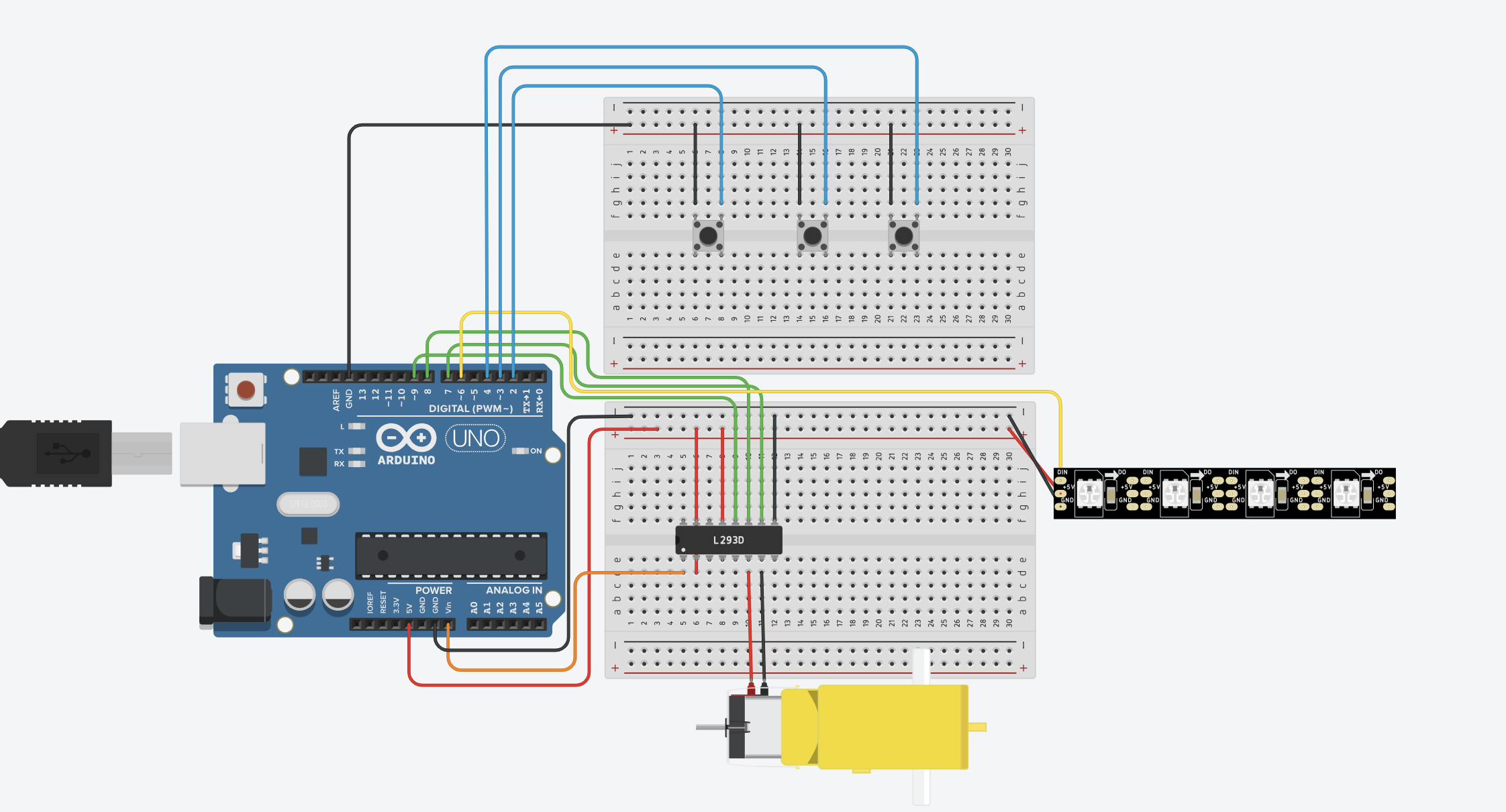
Arduino Control and LED Display
- Three physical buttons are connected to the Arduino:
-
- Button 3: Activates the airhorn sound effect
- Button 2: Increases the speed of the music
- Button 1: Shuffles to a different song
-
- The NeoPixel strip lights up with different patterns that shuffle when Shuffle button is pressed
p5.js Visualizer and Music Control
- p5.js generates a circular music visualizer that responds to the song’s frequencies. It receives signals from the Arduino through serial communication to trigger changes in the visualizer based on button presses.
Interaction Design
The interaction design is simple and engaging: pressing physical buttons on the Arduino changes the music’s speed, shuffles the track, or plays a sound effect while the NeoPixel lights and p5.js visualizer respond instantly.
Arduino Code
My project features three physical buttons connected to the Arduino. Button 1 triggers a signal (1) that is sent to p5.js and triggers the airhorn effect, Button 2 sends a different signal (2) to p5.js, which affects the speed of the song playing. Button 3 sends a signal (3) to shuffle to the next song as well as cycles through five distinct LED animation patterns. Alongside this, the Arduino also manages the motor that spins the vinyl. Through serial communication with p5.js, the motor’s state is toggled based on signals received. A ‘1’ signal turns the motor on, while a ‘0’ stops it and clears the LED display. Below is the code:
#include <Adafruit_NeoPixel.h>

const int button1Pin = 2;
const int button2Pin = 3;
const int button3Pin = 4;
const int bin1Pin = 8;
const int bin2Pin = 7;
const int pwmBPin = 9;
bool motorRunning = true;

#define NEOPIXEL_PIN 6
#define LED_COUNT    60
#define Num_LED      56

Adafruit_NeoPixel strip(LED_COUNT, NEOPIXEL_PIN, NEO_GRBW + NEO_KHZ800);

unsigned long lastButtonPress1 = 0;
unsigned long lastButtonPress2 = 0;
unsigned long lastButtonPress3 = 0;
unsigned long lastActionTime1 = 0;
unsigned long lastActionTime2 = 0;
unsigned long lastActionTime3 = 0;
const unsigned long debounceDelay = 100;
const unsigned long cooldown = 1000;

int currentPattern = 0;
const int totalPatterns = 5;

unsigned long lastPatternUpdate = 0;
const unsigned long patternInterval = 80;

int snakeIndex = 0;
float hueOffset = 0;

void setup() {
  Serial.begin(9600);
  pinMode(button1Pin, INPUT_PULLUP);
  pinMode(button2Pin, INPUT_PULLUP);
  pinMode(button3Pin, INPUT_PULLUP);
  pinMode(bin1Pin, OUTPUT);
  pinMode(bin2Pin, OUTPUT);
  pinMode(pwmBPin, OUTPUT);
  strip.begin();
  strip.show();
  strip.setBrightness(180);
}

void loop() {
  unsigned long currentMillis = millis();

  handleButtons(currentMillis);
  handleSerial();
  controlMotor();

  if (currentMillis - lastPatternUpdate >= patternInterval) {
    lastPatternUpdate = currentMillis;
    runPattern(currentPattern);
  }
}

void handleButtons(unsigned long currentMillis) {
  if (digitalRead(button1Pin) == LOW && currentMillis - lastButtonPress1 >= debounceDelay && currentMillis - lastActionTime1 >= cooldown) {
    Serial.println("1");
    lastButtonPress1 = currentMillis;
    lastActionTime1 = currentMillis;
  }

  if (digitalRead(button2Pin) == LOW && currentMillis - lastButtonPress2 >= debounceDelay && currentMillis - lastActionTime2 >= cooldown) {
    Serial.println("2");
    lastButtonPress2 = currentMillis;
    lastActionTime2 = currentMillis;
  }

  if (digitalRead(button3Pin) == LOW && currentMillis - lastButtonPress3 >= debounceDelay && currentMillis - lastActionTime3 >= cooldown) {
    Serial.println("3");
    currentPattern = (currentPattern + 1) % totalPatterns;
    lastButtonPress3 = currentMillis;
    lastActionTime3 = currentMillis;
  }
}

void handleSerial() {
  if (Serial.available() > 0) {
    char incomingByte = Serial.read();
    if (incomingByte == '1') {
      motorRunning = true;
    } else if (incomingByte == '0') {
      motorRunning = false;
      digitalWrite(bin1Pin, LOW);
      digitalWrite(bin2Pin, LOW);
      analogWrite(pwmBPin, 0);
      strip.clear();
      strip.show();
    }
  }
}

void controlMotor() {
  if (motorRunning) {
    digitalWrite(bin1Pin, HIGH);
    digitalWrite(bin2Pin, LOW);
    analogWrite(pwmBPin, 50);
  } else {
    digitalWrite(bin1Pin, LOW);
    digitalWrite(bin2Pin, LOW);
    analogWrite(pwmBPin, 0);
  }
}

// === Pattern Dispatcher ===
void runPattern(int pattern) {
  switch (pattern) {
    case 0: discoFlash(); break;
    case 1: snakeCrawl(); break;
    case 2: colorWave(); break;
    case 3: sparkleStars(); break;
    case 4: fireGlow(); break;
  }
}

// Pattern 0: Disco Flash
void discoFlash() {
  for (int i = 0; i < Num_LED; i++) {
    strip.setPixelColor(i, randomColor());
  }
  strip.show();
}

// Pattern 1: Snake Crawl
void snakeCrawl() {
  strip.clear();
  int snakeLength = 6;
  for (int i = 0; i < snakeLength; i++) {
    int index = (snakeIndex + i) % Num_LED;
    strip.setPixelColor(index, Wheel((index * 5 + hueOffset)));
  }
  snakeIndex = (snakeIndex + 1) % Num_LED;
  hueOffset += 1;
  strip.show();
}

// Pattern 2: Smooth Rainbow Wave
void colorWave() {
  for (int i = 0; i < Num_LED; i++) {
    int hue = (i * 256 / Num_LED + (int)hueOffset) % 256;
    strip.setPixelColor(i, Wheel(hue));
  }
  hueOffset += 1;
  strip.show();
}

// Pattern 3: Sparkle Stars
void sparkleStars() {
  for (int i = 0; i < Num_LED; i++) {
    strip.setPixelColor(i, (random(10) < 2) ? strip.Color(255, 255, 255) : strip.Color(0, 0, 10));
  }
  strip.show();
}

// Pattern 4: Fire Glow
void fireGlow() {
  for (int i = 0; i < Num_LED; i++) {
    int r = random(180, 255);
    int g = random(0, 100);
    int b = 0;
    strip.setPixelColor(i, strip.Color(r, g, b));
  }
  strip.show();
}

// Helpers
uint32_t randomColor() {
  return strip.Color(random(256), random(256), random(256));
}

uint32_t Wheel(byte WheelPos) {
  WheelPos = 255 - WheelPos;
  if (WheelPos < 85) {
    return strip.Color(255 - WheelPos * 3, 0, WheelPos * 3);
  }
  if (WheelPos < 170) {
    WheelPos -= 85;
    return strip.Color(0, WheelPos * 3, 255 - WheelPos * 3);
  }
  WheelPos -= 170;
  return strip.Color(WheelPos * 3, 255 - WheelPos * 3, 0);
}
P5 code
The code uses createSerial() to open a serial port, allowing it to send and receive data between the p5 sketch and the arduino. The sensor values received from the Arduino (via serialPort.readUntil(“\n”)) trigger different actions within the p5 sketch based on specific sensor inputs. For example, a sensor value of 1 plays an airhorn sound, 2 toggles the playback speed of the song, and 3 shuffles to a new random song. The sensor values are continuously checked in the checkButtonPress() function, which responds accordingly by performing actions like playing sounds or changing song attributes.
The logic behind the visualizer relies on the FFT (Fast Fourier Transform) analysis of the audio. The fft.analyze() function breaks the audio into different frequency bands, so it will give a spectrum that represents the amplitude of different frequencies in the sound. The visualizer then maps these frequency intensities, for my project I decided to do so in a circular arrangement around the center of the screen, where each bar’s height is determined by the amplitude of its corresponding frequency band. The visualizer is updated in real time, so if the music is changed, or the speed is changed it will reflect those changes.
// === GLOBAL VARIABLES === //
let state = "landing";
let song;
let fft;
let selectedSong = "";
let sensorValue = 0;
let serialPort;
let serialSpeed = 9600;

let partySongs = ["nowahala.mp3", "umbrella.mp3", "yeah.mp3", "onlygirl.mp3", "hips.mp3","feeling.mp3","romance.mp3","monalisa.mp3","move.mp3","saywhat.mp3","yamore.mp3","adore.mp3","gorah.mp3"];
let airhornSound;

let startButton, continueButton, restartButton;
let isFastSpeed = false;

let bgImg;
let Instructions;
let vis;

// === PRELOAD === //
function preload() {
  bgImg = loadImage('bg.png');
  Instructions = loadImage('instructions.png');
  vis =loadImage('vis.png')
  airhornSound = loadSound("airhorn.mp3");
}

// === SETUP === //
function setup() {
  createCanvas(1460, 760);
  textAlign(CENTER, CENTER);
  angleMode(DEGREES);
  colorMode(HSB);

  // Start Button
  startButton = createButton("Start");
  styleButton(startButton, width / 2 - 45, height / 2 + 200);
  startButton.mousePressed(() => {
    state = "instructions";
    hideAllButtons();
    continueButton.show();
  });

  // Continue Button
  continueButton = createButton("Continue");
  styleButton(continueButton, width / 2 - 60, height / 2 + 200);
  continueButton.mousePressed(() => {
    selectedSong = random(partySongs);
    state = "visualizer";
    hideAllButtons();
  });
  continueButton.hide();

  // Restart Button
  restartButton = createButton("Restart");
  styleButton(restartButton, 20, 20, true);
  restartButton.mousePressed(() => {
    if (song && song.isPlaying()) song.stop();
    song = undefined;
    state = "landing";
    isFastSpeed = false;
    hideAllButtons();
    startButton.show();
    if (serialPort.opened()) serialPort.write("0");
  });
  restartButton.hide();

  // Serial setup
  serialPort = createSerial();
  let previous = usedSerialPorts();
  if (previous.length > 0) {
    serialPort.open(previous[0], serialSpeed);
  }
}

// === STYLE BUTTONS === //
function styleButton(btn, x, y, small = false) {
  btn.position(x, y);
  btn.style("padding", small ? "8px 16px" : "12px 24px");
  btn.style("font-size", small ? "16px" : "18px");
  btn.style("background-color", "#ffc700");
  btn.style("border", "none");
  btn.style("border-radius", "12px");
  btn.mouseOver(() => btn.style("background-color", "#FFFF"));
  btn.mouseOut(() => btn.style("background-color", "#ffc700"));
  btn.hide();
}

function hideAllButtons() {
  startButton.hide();
  continueButton.hide();
  restartButton.hide();
}

// === DRAW === //
function draw() {
  let data = serialPort.readUntil("\n");
  if (data.length > 0) {
    sensorValue = int(data);
    checkButtonPress(sensorValue);
  }

  if (state === "landing") {
    showLanding();
    startButton.show();
    if (serialPort.opened()) serialPort.write("0");
  } else if (state === "instructions") {
    showInstructions();
    continueButton.show();
  } else if (state === "visualizer") {
    restartButton.show();
    if (song === undefined) {
      loadSong(selectedSong);
    }
    runVisualizer();
    if (serialPort.opened()) serialPort.write("1");
  }
}

// === LANDING SCREEN === //
function showLanding() {
  image(bgImg, 0, 0, width, height);
}

// === INSTRUCTIONS SCREEN === //
function showInstructions() {
  image(Instructions, 0, 0, width, height);
}

// === LOAD SONG === //
function loadSong(songName) {
  song = loadSound(songName, startSong);
  fft = new p5.FFT();
}

function startSong() {
  song.rate(isFastSpeed ? 1.5 : 1.0);
  song.loop();
}

// === VISUALIZER === //
function runVisualizer() {
  let spectrum = fft.analyze();
  let lowerLimit = 0;
  let upperLimit = Math.floor(spectrum.length / 2);
  let numBars = upperLimit - lowerLimit;
  let radius = 70;
  let angleStep = 360 / numBars;
  let maxBarHeight = height / 1.8;


  image(vis, 0, 0, width, height);

  push();
  translate(width / 2, height / 2);

  for (let j = 0; j < 4; j++) {
    push();
    rotate(j * 90);
    for (let i = lowerLimit; i < upperLimit; i++) {
      let angle = (i - lowerLimit) * angleStep;
      let barHeight = map(spectrum[i], 0, 500, 15, maxBarHeight);
      let xEnd = cos(angle) * (radius + barHeight);
      let yEnd = sin(angle) * (radius + barHeight);
      stroke('#ffc700');
      line(0, 0, xEnd, yEnd);
    }
    pop();
  }

  pop();
}

// === CHECK SERIAL INPUT === //
function checkButtonPress(sensorValue) {
  if (state === "visualizer") {
    if (sensorValue === 1) {
      playAirhorn();
    } else if (sensorValue === 2) {
      toggleSpeed();
    } else if (sensorValue === 3) {
      shuffleNextSong();
    }
  }
}

// === SHUFFLE SONG === //
function shuffleNextSong() {
  let nextSong = random(partySongs);
  if (song && song.isPlaying()) song.stop();
  selectedSong = nextSong;
  isFastSpeed = false;
  loadSong(selectedSong);
}

// === TOGGLE SPEED === //
function toggleSpeed() {
  if (song) {
    isFastSpeed = !isFastSpeed;
    song.rate(isFastSpeed ? 1.5 : 1.0);
  }
}

// === PLAY AIRHORN === //
function playAirhorn() {
  if (airhornSound.isLoaded()) {
    airhornSound.play();
  }
}
Reflection/Difficulties
The project was not without its difficulties. One of my primary challenges involved oversensitive buttons. The issue arose because the buttons were triggering multiple actions from a single press, causing these unintended rapid cycling of effects. To address this, I implemented a debounce mechanism and a cooldown timer, which made sure that each button press only activated an action once and prevented continuous cycling. This solution helped smooth out the interaction, making the experience more intuitive for the user.
Navigating the FFT (Fast Fourier Transform) in this project was also a challenge, as it involves converting an audio signal into its frequency components, which then drive the visual effects. The concept of analyzing an audio signal in terms of its frequency spectrum was at first a bit tricky to grasp. The FFT function takes the sound data, decomposes it into various frequency bands, and produces an array of amplitude values that represent the strength of each frequency. The biggest hurdle was understanding how to properly interpret and map these frequency values to create my visuals. For instance, the fft.analyze() function returns an array of amplitudes across a range of frequencies, but to effectively use this data, I needed to determine which frequency bands would be most useful for creating the visualizer’s elements. After some experimentation, I decided to focus on the lower and mid-range frequencies, which seemed to correspond best with the types of beats and musical elements I wanted to visualize.
Another significant issue was the motor’s weakness, which required a jump start for it to function properly. This created confusion for users, as they struggled to understand why the motor wasn’t working correctly.
Overall, I am very happy with how my project turned out, as it encompassed most if not all the things I wanted it to do. If I were to improve it however, I would maybe make the neopixels visualize the music as well, get the data from the FFT and send it to arduino to visaulize the changes in music. Maybe also add more sound effects, and additional interactive physical elements.