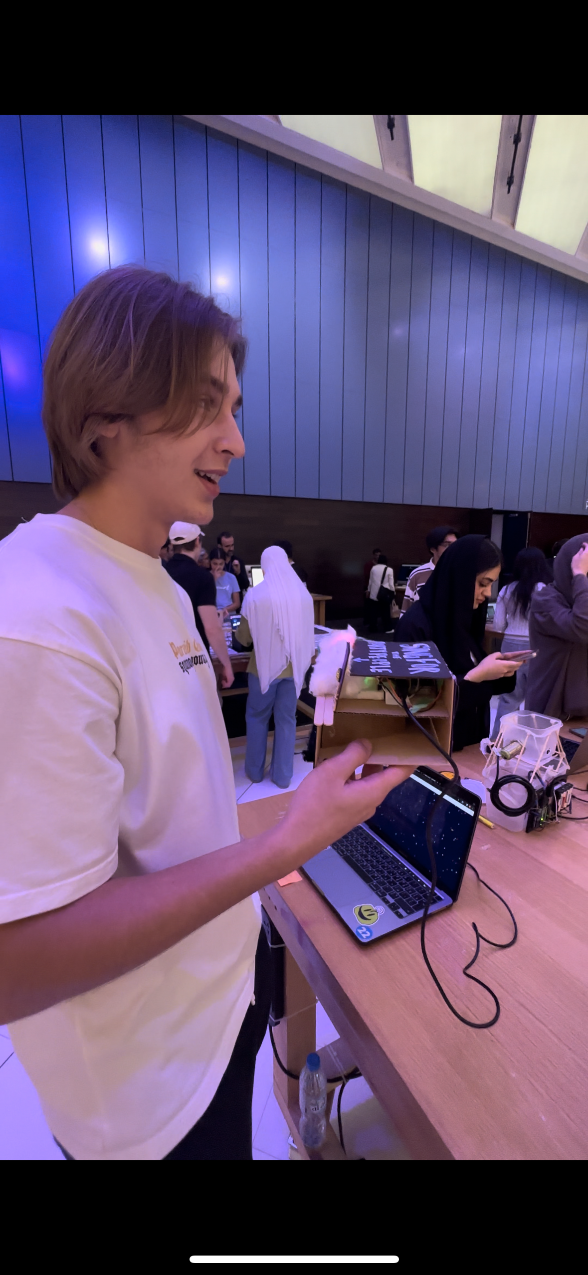
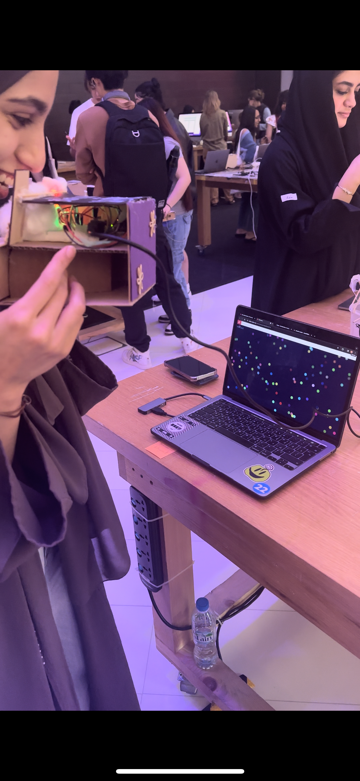
Mini Disco
User testing:
Reflecting on the user testing of my Mini Disco project with my friend, I found that the experience was quite self-explanatory and intuitive. The design, featuring an arrow pointing towards the sound sensor, seemed to effectively guide the user without the need for additional instructions. My friend was able to figure out the interaction – singing or making noise to trigger the light show – quite easily.
From this testing, I realized the strengths of my project lie in its simplicity and the immediate engagement it offers. Users can interact naturally without needing a detailed explanation, which I believe is a key aspect of a successful interactive design.
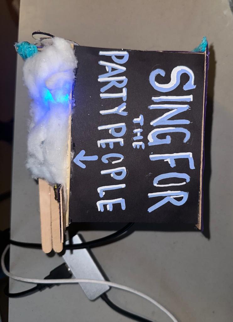
However, I see an opportunity for improvement in the visual aspect of the project. Initially, I used cotton to diffuse the light from the RGB LED, but I think what might have been the better option was to replace it with a dome however with the lack of materials I wasn’t able to. My aim is to enhance the visual impact of the light display. and so I envision that a dome could better reflect and spread the light, creating a more immersive and expansive effect that more closely mimics the vibrant atmosphere of a disco.
This change, I believe, could elevate the overall experience, making it not just an interactive piece but also a more captivating visual spectacle. The challenge will be to integrate the dome in a way that complements the existing design while also enhancing the interplay of light and sound.
Concept:
Originally, I envisioned creating a dynamic light source that would visually respond to sound. My plan was to set up a microphone/sound sensor(analog signal) to capture the surrounding audio vibes, where different frequencies and volumes would trigger varied light displays in an RGB LED. For instance, high-pitched sounds would shift the LED towards blue hues, while deep bass notes would turn it red.
I intended to use P5.js for color mapping, transforming the intensity and frequency of the captured sound into dynamic, responsive color schemes. The idea was to have the visuals come alive with vibrant colors and gradients, creating a visually harmonious representation of the audio.
Despite a minor adjustment in my original plan, the essence of the project remains intact. Initially, I intended to use a frequency-sensitive sound sensor, but due to its malfunction, I had to opt for a readily available sensor that operates on a digital signal. This new sensor, while not detecting varied sound frequencies, adeptly measures volume levels furthermore the color transitions of the LED now respond to the loudness or softness of the surrounding sounds.
How does the implementation work?
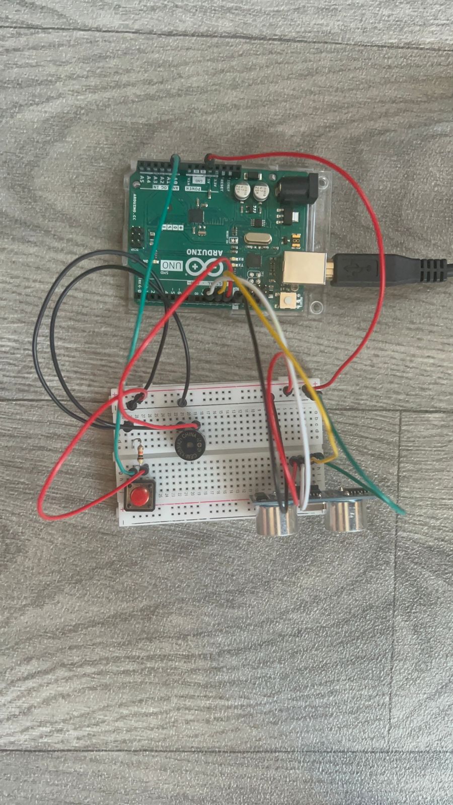
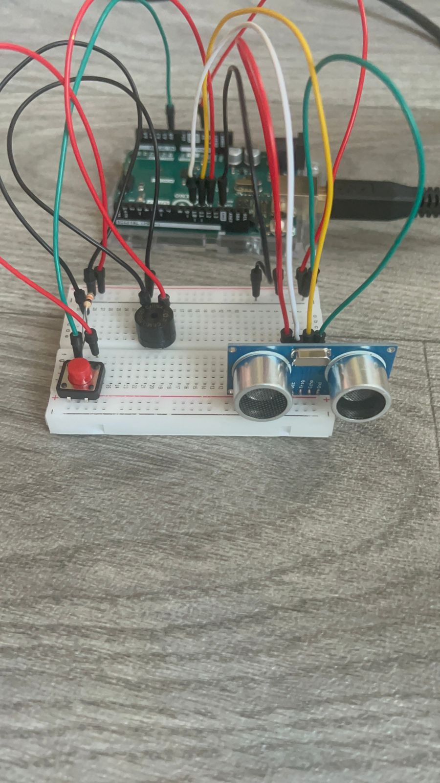
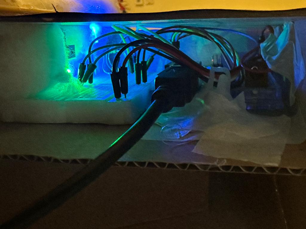
Arduino Implementation:
In my Arduino setup, I began by establishing serial communication at a baud rate of 9600, a crucial step for enabling data exchange between the Arduino and my computer. I configured pin 8 as an input to connect my digital sound sensor, which serves as the project’s primary interactive element. Additionally, pins 9, 10, and 11 were set as outputs for controlling the red, green, and blue channels of an RGB LED, allowing me to create a wide range of colors. In the loop function, I constantly read the state of the sound sensor. If no sound is detected (soundData == LOW), I programmed the RGB LED to emit a blue light, however with sound, it glows red. This immediate visual feedback is achieved by manipulating the LED’s color through the changeLEDColor function, using analogWrite to adjust each color channel. Alongside controlling the LED, I also send the sound sensor’s state as serial data to my computer, where it’s utilized in the p5.js sketch for a corresponding visual display.
p5.js Sketch Implementation
In parallel with the Arduino setup, I developed a p5.js sketch to create a digital visual representation corresponding to the physical inputs from the sound sensor. The sketch initializes by creating a canvas and populating it with a series of particles, each represented by an instance of the Particle class. These particles are given random positions across the canvas, along with properties for size, color, and movement speed. The heart of the sketch lies in the readSerial function, responsible for reading and processing the serial data sent from the Arduino. This data, indicating the presence or absence of sound, is used to dynamically alter the behavior of the particles on the canvas. In the draw function, I update the background and set the text properties. If the serial connection is not yet established, the sketch prompts the user to initiate the connection. Once connected, the sketch confirms this with a display message and starts animating the particles based on the sensor data. The particles grow in size and move smoothly across the canvas when sound is detected, creating a visually engaging and responsive digital environment that mirrors the physical inputs from the Arduino.
Schematic

Description of Arduino code
Arduino code:
void setup() {
  Serial.begin(9600);
  pinMode(8, INPUT); // Sound sensor input

  // RGB LED pins
  pinMode(9, OUTPUT); // Red
  pinMode(10, OUTPUT); // Green
  pinMode(11, OUTPUT); // Blue
}

void loop() {
  int soundData = digitalRead(8); // Read the sound sensor
  Serial.println(soundData);      // Send sound data to serial for debugging

  if (soundData == LOW) {
    // Sound not detected - change LED to one color
    changeLEDColor(0, 0, 255); // Blue
  } else {


    // sound detected - change LED to another color (e.g., red)
    changeLEDColor(255, 0, 0); // Red
     delay(50);
  }


}

void changeLEDColor(int redValue, int greenValue, int blueValue) {
  analogWrite(9, redValue);   // Red channel
  analogWrite(10, greenValue); // Green channel
  analogWrite(11, blueValue);  // Blue channel
}
Setup Function:
void setup() {
  Serial.begin(9600);
  pinMode(8, INPUT); // Sound sensor input
  pinMode(9, OUTPUT); // Red
  pinMode(10, OUTPUT); // Green
  pinMode(11, OUTPUT); // Blue
}
- Initializes serial communication at a baud rate of 9600. This is used for debugging purposes to send data to the serial monitor of the Arduino IDE.
- Configures the pin connected to the sound sensor (pin 8) as an input.
- Sets up the RGB LED pins (pins 9, 10, and 11) as outputs. Each pin controls one color component of the RGB LED (red, green, and blue, respectively).
Loop Function:
void loop() {
  int soundData = digitalRead(8); // Read the sound sensor
  Serial.println(soundData);      // Send sound data to serial for debugging

  if (soundData == LOW) {
    // Sound not detected - change LED to one color
    changeLEDColor(0, 0, 255); // Blue
  } else {


    // sound detected - change LED to another color
    changeLEDColor(255, 0, 0); // Red
     delay(50);
  }
- Continuously reads the state of the digital sound sensor.
- If sound is detected the LED changes to red by calling
changeLEDColorwith(255, 0, 0), which are the RGB values for red. - If no sound is detected the LED (
soundDataisLOW) the RGB LED is set to blue. This is achieved by calling thechangeLEDColorfunction with the parameters(0, 0, 255), representing the RGB values for blue. - There is a short delay (
delay(50)) at the end of the loop for stability and to control the rate at which the sensor reads data.
changeLEDColor Function:
void changeLEDColor(int redValue, int greenValue, int blueValue) {
  analogWrite(9, redValue);   // Red channel
  analogWrite(10, greenValue); // Green channel
  analogWrite(11, blueValue);  // Blue channel
}
- A helper function that takes three parameters:
redValue,greenValue, andblueValue, each representing the intensity of the respective color channel of the RGB LED. - The
analogWritefunction is used to set the brightness of each color channel. For example,analogWrite(9, redValue);sets the brightness of the red channel.
Description of the p5.js Sketch
p5.js Sketch:
let serial;
let latestData = "waiting for data";
let particles = [];
let cols, rows;
let particleCount = 100; // Adjust for more/less particles
function setup() {
  createCanvas(windowWidth, windowHeight);

  // Create randomly positioned particles
  for (let i = 0; i < particleCount; i++) {
    let x = random(width);
    let y = random(height);
    particles.push(new Particle(x, y));
  }
}

function readSerial(data) {
  console.log(data);
  latestData = data.trim();
}

function draw() {
  background('#00003f');
  textSize(30);
  textFont('Courier New');
  textAlign(CENTER, CENTER)

  if (!serialActive) {
      fill(0, 102, 153);
    text("Press Space Bar to select Serial Port", width / 2, height / 2);
  } else {
    text("Connected", 20, 30);

    let sensorValue = parseInt(latestData);
    particles.forEach(p => {
      p.update(sensorValue);
      p.display();
    });
  }
}

function keyPressed() {
  if (key === ' ') {
    setUpSerial();
  }
}
class Particle {
  constructor(x, y) {
    this.x = x;
    this.y = y;
    this.baseSize = 10; // Base size of the circle
    this.size = this.baseSize;
    this.color = color(random(255), random(255), random(255));
    this.xSpeed = random(-1, 1);
    this.ySpeed = random(-1, 1);
  }

  update(sensorValue) {
    // Resize based on sensor value
    this.size = sensorValue === 1 ? 30 : 10;

    // Update position for smooth floating
    this.x += this.xSpeed;
    this.y += this.ySpeed;

    // Bounce off edges
    if (this.x > width || this.x < 0) {
      this.xSpeed *= -1;
    }
    if (this.y > height || this.y < 0) {
      this.ySpeed *= -1;
    }
  }

  display() {
    fill(this.color);
    noStroke();
    ellipse(this.x, this.y, this.size, this.size);
  }
}

// Resize canvas when the window is resized
function windowResized() {
  resizeCanvas(windowWidth, windowHeight);
}
- Setup and Particle Creation:
- The
setup()function initializes the canvas to cover the entire window. Within this function, I create multiple particles, each represented by an instance of theParticleclass. The number of particles is determined byparticleCount. - Each particle is randomly positioned across the canvas. This is done by assigning random x and y coordinates within the canvas’s dimensions.
- The
- Serial Data Handling:
- The
readSerial(data)function is responsible for processing incoming serial data from the Arduino. This data represents the state of the sound sensor. The function trims any whitespace from the received data and stores it inlatestDatafor further processing.
- The
- Drawing and Animation:
- In the
draw()function, the background is set to a dark blue color ('#00003f'). - The sketch checks the
serialActiveflag to determine if the serial connection is established. If not, it prompts the user to activate the serial port. Once connected, it displays “Connected” on the canvas. - The particle behavior is updated based on the parsed sensor value (
sensorValue). Each particle’s size and position are adjusted accordingly.
- In the
- Particle Class:
- The
Particleclass defines the properties and behaviors of individual particles. Each particle has its position (x,y), base size, color, and speed (xSpeed,ySpeed). - The
update(sensorValue)method adjusts the particle’s size based on the sound sensor input. It also updates the particle’s position to create a floating effect. If a particle reaches the edge of the canvas, it bounces back, creating a dynamic, contained animation within the canvas boundaries. - The
display()method draws each particle as an ellipse with its respective properties.
- The
- Interactivity:
- The
keyPressed()function listens for a spacebar press to initiate the serial connection setup, a key part of the interaction between the Arduino and the p5.js sketch.
- The
- Responsive Design:
- The
windowResized()function ensures that the canvas size adjusts appropriately when the browser window is resized, maintaining the integrity of the visual display.
- The
Description of Interaction Design
- Engaging Invitation:
- Users are greeted with an inviting message on the project box, clearly stating: “Sing for the Party People.” This message sets the tone and clearly communicates what is expected from the user.
- Sound Trigger:
- As soon as the user starts singing or making noise, the embedded digital sound sensor within the box detects this audio input. The sensor is finely tuned to respond to a range of sounds from soft humming to loud singing.
- Responsive Light Display:
- Upon detecting sound, the sensor triggers a colorful light show from the RGB LED. The LED cycles through colors, creating a mini disco effect that transforms the space with vibrant hues.
- The intensity, frequency, and duration of the user’s singing directly influence the light patterns, making each experience unique and personal.
- Visual Feedback:
- The LED serves as immediate visual feedback for the user’s actions. This feedback loop encourages continued interaction and exploration of different volumes of sound.
- The changing colors of the LED create a playful and immersive environment, enhancing the joyous atmosphere of a disco.
Description of communication between Arduino and p5.js
Arduino to p5.js Communication:
- Serial Communication Setup:
- On the Arduino side, I initialize serial communication in the
setup()function usingSerial.begin(9600);. This sets up the Arduino to send data over the serial port at a baud rate of 9600 bits per second. - In the main loop (
void loop()), the Arduino reads data from the digital sound sensor connected to pin 8 usingdigitalRead(8);. This sensor detects the presence or absence of sound, returning either a HIGH or LOW signal.
- On the Arduino side, I initialize serial communication in the
- Sending Data from Arduino:
- Depending on the state of the sound sensor, the Arduino sends this information to the connected computer via the serial port using
Serial.println(soundData);. The data sent is a simple numerical value (0 or 1) representing the absence or presence of sound.
- Depending on the state of the sound sensor, the Arduino sends this information to the connected computer via the serial port using
- Receiving Data in p5.js:
- On the p5.js side, the sketch establishes a serial connection to receive data from the Arduino. This is done using the
p5.SerialPortlibrary, which facilitates serial communication in a web environment. - The
readSerial(data)function in the p5.js sketch is responsible for reading incoming serial data. It processes the data received from the Arduino, trims any whitespace, and stores it in thelatestDatavariable.
- On the p5.js side, the sketch establishes a serial connection to receive data from the Arduino. This is done using the
p5.js Processing and Visualization:
- Data Interpretation:
- The p5.js sketch interprets the received data (
latestData) as the state of the sound sensor. This data is then used to influence the behavior of visual elements within the sketch, such as the size and movement of particles. - The
draw()function continuously updates the canvas, where each particle’s appearance and behavior are adjusted based on the sensor data. For instance, the presence of sound might cause the particles to increase in size or change position, creating a dynamic and responsive visual effect.
- The p5.js sketch interprets the received data (
- Feedback Loop:
- The seamless exchange of data between the Arduino and the p5.js sketch creates an interactive feedback loop. Physical input from the sound sensor directly influences the digital visualization, making the experience responsive to real-world interactions.
What are some aspects of the project that you’re particularly proud of?
Reflecting on my project, I feel a deep sense of pride, particularly in the creation of the physical component – the mini sound-activated disco club. This aspect of the project was not only a challenge but a testament to my creativity and technical skills. The process of bringing a conceptual idea to life, blending interactive technology with artistic design, was immensely fulfilling. Another aspect I’m especially proud of is my adaptability and problem-solving skills. When faced with the unexpected challenge of the original sensor breaking, I quickly adapted, demonstrating resilience and quick thinking, hallmarks of a true interactive media student. Utilizing a different sensor and modifying my project accordingly, I managed to preserve the essence of my initial concept. This ability to think on my feet and craft a functional and engaging project with the available resources, even though it diverged from my original plan, is something I take great pride in. It underscores my capacity to innovate and create meaningful interactive experiences, regardless of the obstacles encountered.
What are some areas for future improvement?
Reflecting on my project, I recognize several areas for future improvement, particularly influenced by the challenges and lessons learned during its development. One key area is the need for contingency planning in hardware-based projects. The unexpected malfunction of my original sensor forced me to significantly simplify my original idea, mainly due to time constraints and the limitations of the replacement sensor. This experience taught me the importance of having spare parts and tools readily available. It’s a lesson that will influence my approach to future projects, ensuring I’m better prepared for unforeseen setbacks.
Additionally, the limitations imposed by the replacement sensor, which could only read binary values (0s and 1s), restricted my ability to create a more complex and visually appealing p5.js sketch. This constraint became particularly evident in my efforts to craft a visually aesthetic sound visualizer. The binary input didn’t allow for the nuanced interpretation of sound that I had initially envisioned. Moving forward, I aim to explore more advanced sensors and input methods that offer a wider range of data. This will enable me to create more intricate and engaging visualizations in my p5.js sketches, aligning more closely with my original vision of an interactive and visually rich experience.
IM SHOWCASE