Describe your concept
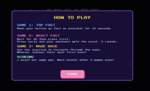
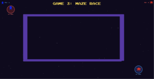
My project is an arcade-style multi-player game. The project consists of 3 mini-games, a tap fast game where the player who presses their button the most is the winner, react fast where the player who presses their button first after the LEDs light up is the winner, and finally a maze race where players race to the other side of the screen using joysticks.
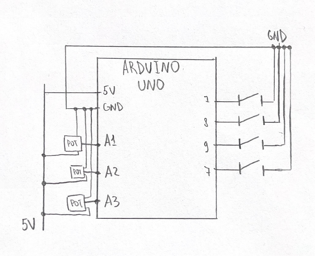
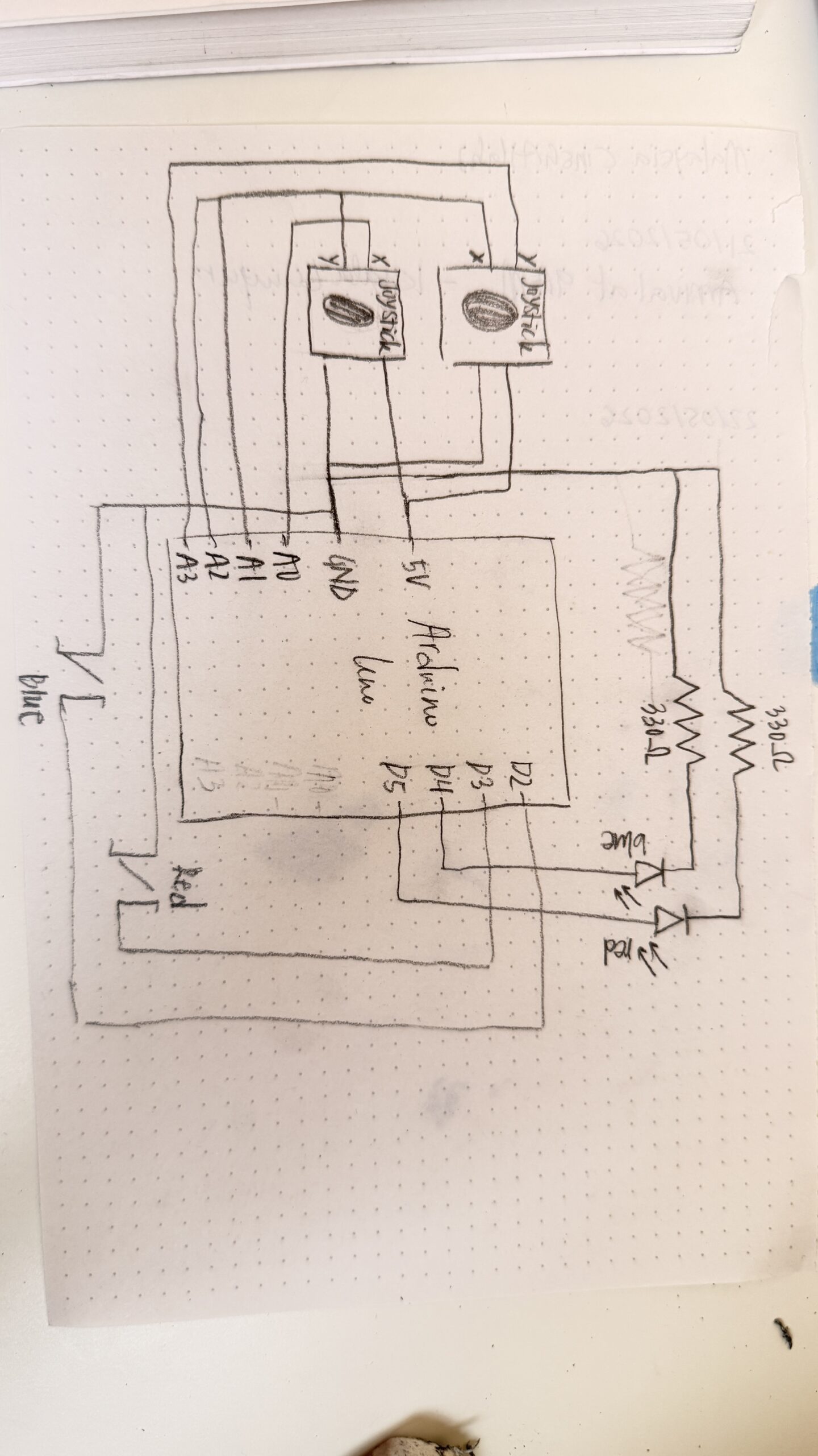
My project is an Arduino + p5.js project. The users only interact with the Arduino components which includes a button and joystick for each player. There’s also an LED to support the games functionality. The p5.js sketch shows each player’s scores and displays the maze for the final game.
The final game has stayed mostly the same since my initial proposal, the main difference is that I did remove the memory game. This was because it required too many buttons, and the wires we’re getting really confusing to follow. It also did require at least 4 LEDs, and honestly I wasn’t even sure if there was enough pins on the Arduino Uno to include all these components. Hence, I ended up settling for the react fast game since I could reuse the same button from tap fast! I also came to be really really grateful that I made this decision early on because when I was trying to put my components into a cardboard box, the buttons were the most difficult and were constantly getting disconnected, so truly I would’ve lost it if I had to deal with FIVE buttons PER player.
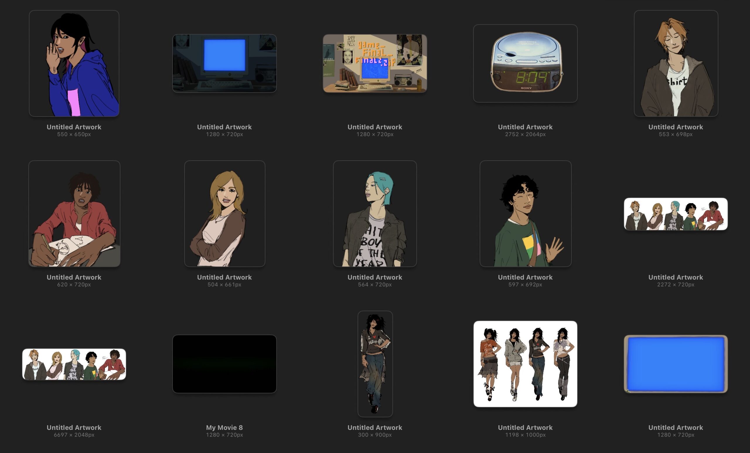
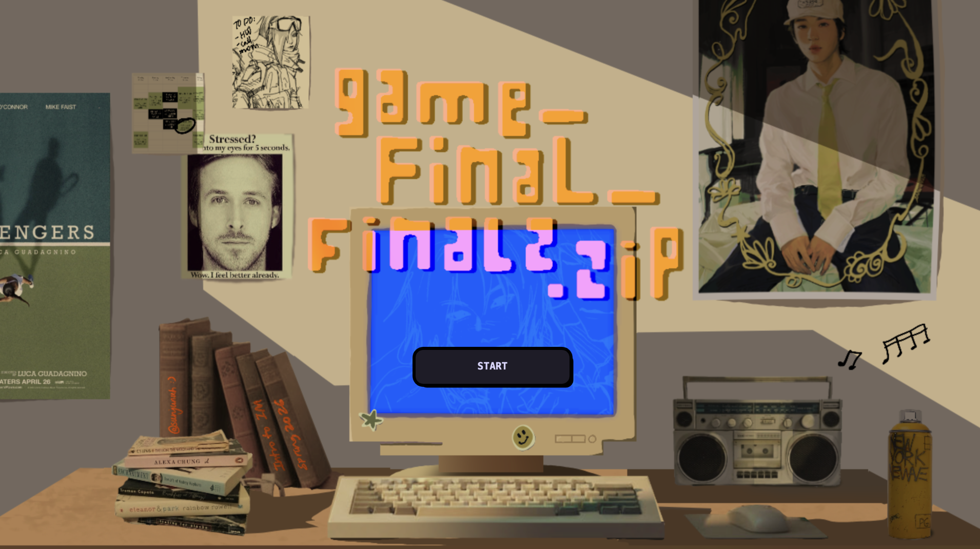
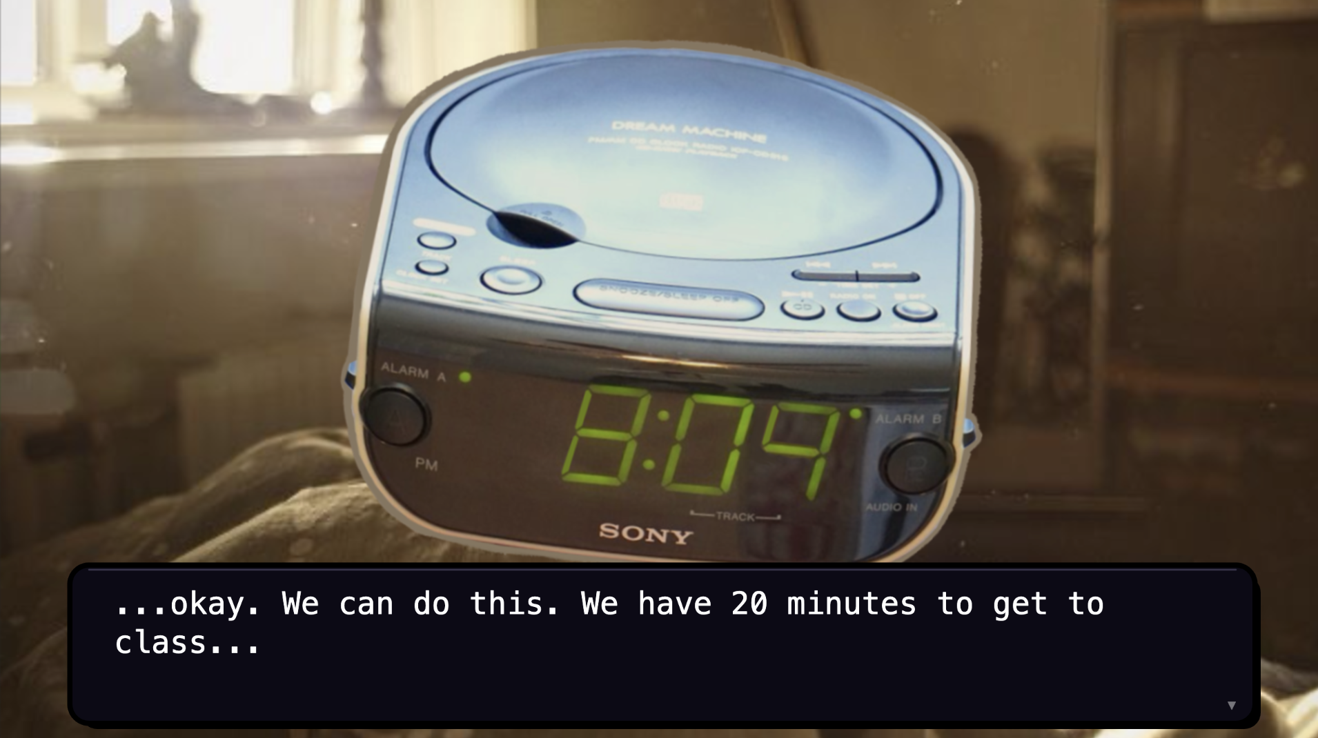
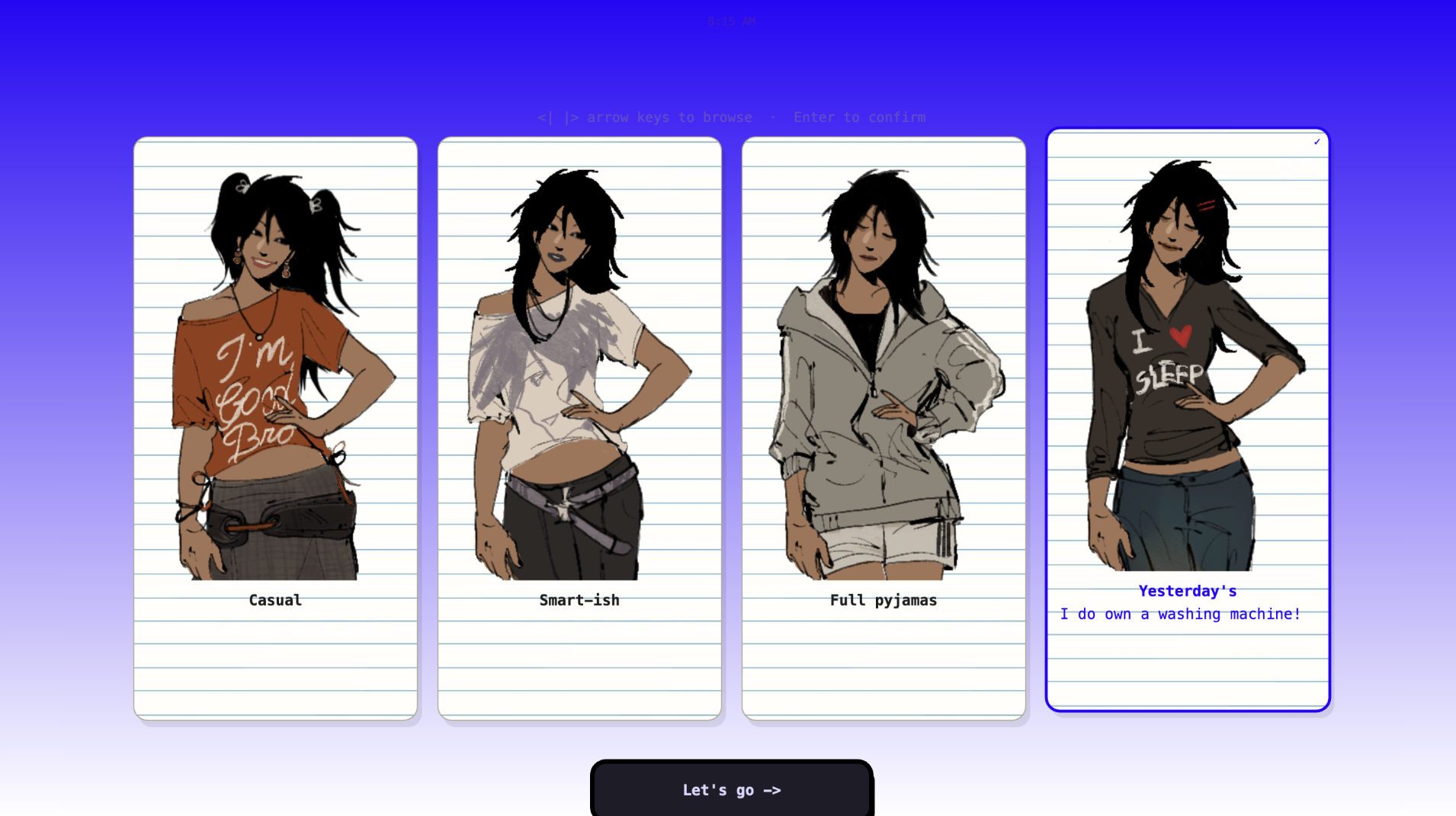
Pictures & screenshots of my physical game and the p5.js sketch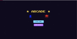
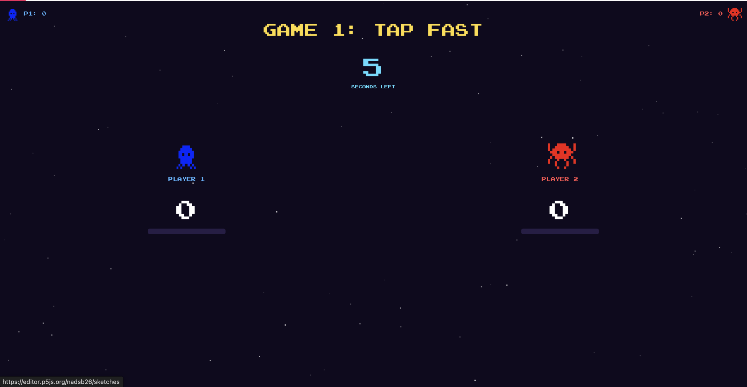
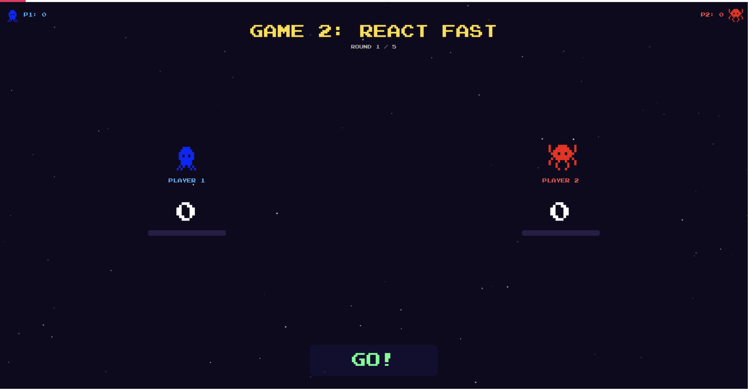
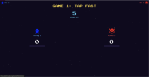
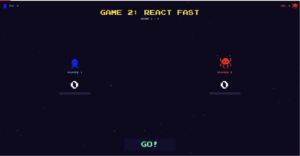
The layout for games 1 & 2 is very similar, however, there are few minor details (that are not very visible below but are more noticeable when you play the game). For game 1, there is a timer in top center that counts down from 10 seconds, when it reaches 3 seconds, the text color changes to red. In game 2, there is a signal box at the bottom that has instructions. When the LEDs are lit up, the signal box also says GO. There are a few other states such as, waiting, timeout (when neither player presses for 3 seconds), early (if either player presses before the LEDs light up), win, and gameover. In both games, there is a scorebar below the character figures that fill up when the players get points in each game.
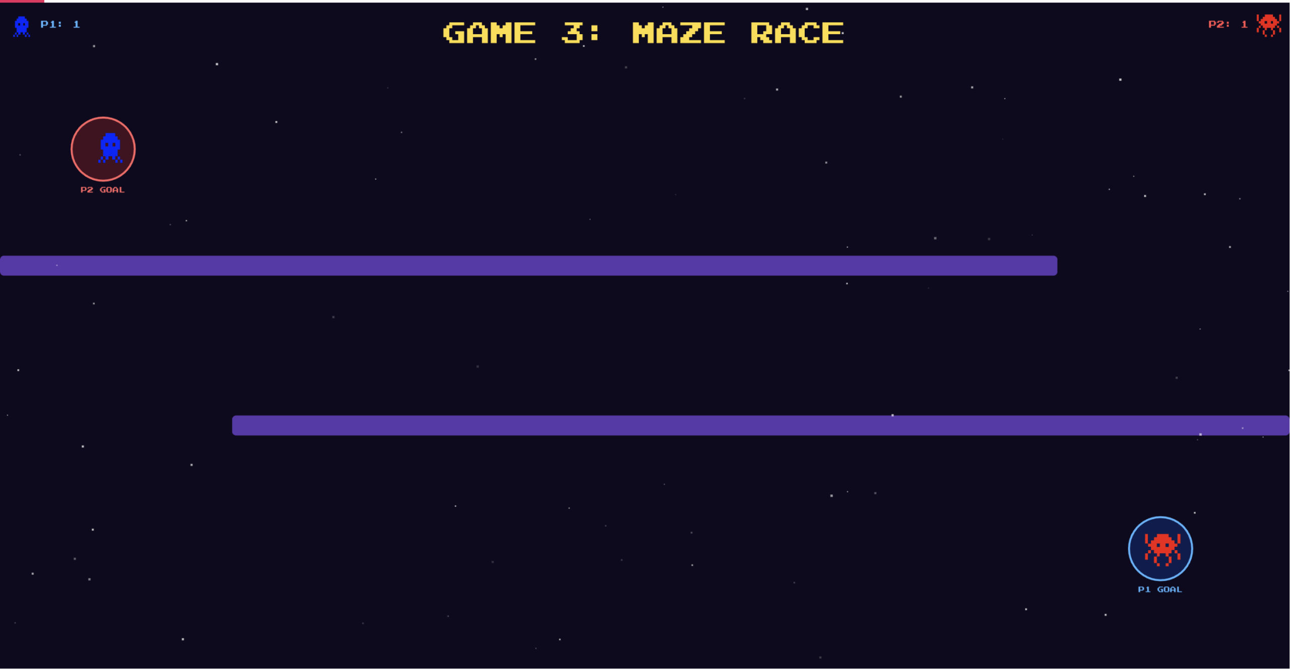
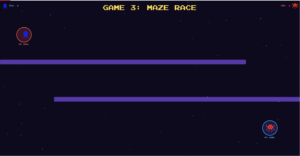
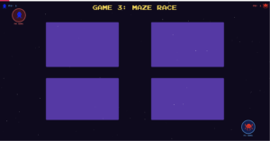
There are three different possible maze layouts, these are randomized each game. You can see how each one looks below:
You can see more of how the physical game works through the video demo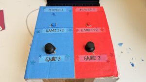
Full Arduino source code
// pins:
const int button1 = 2; // blue
const int led1 = 4; // blue

const int button2 = 3;  // red
const int led2 = 5; // red

const int joy1_x = A0;
const int joy1_y = A1;

const int joy2_x = A2;
const int joy2_y = A3;

// state
int gamePhase = 0;   // 0 = waiting, 1 = game1, 2 = game2, 3 = game3
int scoreP1 = 0, scoreP2 = 0;

// game 1
// number of presses of each player
int countP1 = 0, countP2 = 0;

// last state of each button
int lastP1 = HIGH;
int lastP2 = HIGH;

unsigned long g1Start = 0;
const unsigned long g1Duration = 10000;
bool g1Running = false;

// game 2
// score of each player
int g2ScoreP1 = 0, g2ScoreP2 = 0;
int g2Round = 0; // game 2 has multiple rounds
const int totalRounds = 5;
bool g2WaitingForPress = false;
bool earlyPress = false;   // if pressed before GO signal
unsigned long goTime = 0;

// game 3
// joystick data is just sent to p5.js every frame
// p5.js handles all game logic and sends WIN when done
bool g3Running = false;

void setup() {
  Serial.begin(9600);

  pinMode(button1, INPUT_PULLUP);
  pinMode(button2, INPUT_PULLUP);
  pinMode(led1, OUTPUT);
  pinMode(led2, OUTPUT);

  allOff();
  Serial.println("READY");
}

void loop() {
  // reads serial commands from p5.js
  if (Serial.available() > 0) {
    String cmd = Serial.readStringUntil('\n');
    cmd.trim();
    handleCommand(cmd);
  }

  if (gamePhase == 1 && g1Running) {
    runGame1();
  }
  if (gamePhase == 2 && g2WaitingForPress) {
    runGame2();
  }
  if (gamePhase == 3 && g3Running) {
    runGame3();
  }
}

void handleCommand(String cmd) {
  if (cmd == "START" && gamePhase == 0) {
    startGame1();
  }

  // RESET is sent by p5.js when the user clicks "play again"
  // resets all scores and puts Arduino back to the waiting state
  if (cmd == "RESET") {
    scoreP1 = 0;
    scoreP2 = 0;
    gamePhase = 0;
    g1Running = false;
    g3Running = false;
    g2WaitingForPress = false;
    allOff();
    Serial.println("READY"); // confirms reset to p5.js
  }

  // p5.js tells us game 3 is over
  if (cmd.startsWith("G3:WIN:") && gamePhase == 3) {
    int winner = cmd.substring(7).toInt();
    endGame3(winner);
  }
}

// helper functions:
void allOff() {
  digitalWrite(led1, LOW);
  digitalWrite(led2, LOW);
}

// used at the end of game 2 & 3
void flashLED(int times, int ms) {
  for (int i = 0; i < times; i++) {
    digitalWrite(led1, HIGH);
    digitalWrite(led2, HIGH);
    delay(ms);

    digitalWrite(led1, LOW);
    digitalWrite(led2, LOW);
    delay(ms);
  }
}

// game 1: tap fast
void startGame1() {
  gamePhase = 1;
  countP1 = 0; countP2 = 0;
  lastP1 = HIGH; lastP2 = HIGH;

  Serial.println("GAME:1");

  g1Start = millis(); // saves start time for game 1
  g1Running = true;
}

// this function runs repeatedly as long as game 1 is active
void runGame1() {
  // checks how much time has passed since game 1 started
  unsigned long elapsed = millis() - g1Start;
  if (elapsed >= g1Duration) {
    endGame1();
    return;
  }

  // current button states
  int s1 = digitalRead(button1);
  int s2 = digitalRead(button2);

  // if button was pressed, increase player's count and led is lit up
  // the logic is opposite since we are using INPUT_PULLUP, to avoid using resistors
  if (s1 == LOW && lastP1 == HIGH) {
    countP1++;
    digitalWrite(led1, HIGH);

    Serial.print("G1:A:");
    Serial.println(countP1);

  } else if (s1 == HIGH) {
    digitalWrite(led1, LOW);
  }

  if (s2 == LOW && lastP2 == HIGH) {
    countP2++;
    digitalWrite(led2, HIGH);

    Serial.print("G1:B:");
    Serial.println(countP2);
  } else if (s2 == HIGH) {
    digitalWrite(led2, LOW);
  }

  // save the current state for the next loop
  lastP1 = s1;
  lastP2 = s2;

  delay(8); // reduces button bouncing
}

void endGame1() {
  g1Running = false;
  allOff(); // turns leds off

  int winner = 0;
  if (countP1 > countP2) {
    winner = 1;
    scoreP1++;
  } else if (countP2 > countP1) {
    winner = 2;
    scoreP2++;
  }

  // print winner
  Serial.print("G1:WIN:"); Serial.println(winner);

  // print score of each player
  Serial.print("SCORE:"); Serial.print(scoreP1);
  Serial.print(","); Serial.println(scoreP2);

  if (winner > 0) {
    // flash winner's LED
    for (int i = 0; i < 4; i++) {
      if (winner == 1) {
        digitalWrite(led1, HIGH);
        delay(150);
        digitalWrite(led1, LOW);
        delay(150);
      } else if (winner == 2) {
        digitalWrite(led2, HIGH);
        delay(150);
        digitalWrite(led2, LOW);
        delay(150);
      }
    }
  }

  flashLED(4, 150);
  delay(2000);
  startGame2();
}

// game 2: react fast
void startGame2() {
  gamePhase = 2;
  g2ScoreP1 = 0;
  g2ScoreP2 = 0;
  g2Round = 0;

  Serial.println("GAME:2");
  delay(1000);
  nextReactionRound();
}

void nextReactionRound() {
  // game 2 ends when all rounds are complete
  if (g2Round >= totalRounds) {
    endGame2();
    return;
  }

  g2Round++;
  earlyPress = false;
  g2WaitingForPress = false;

  Serial.print("G2:ROUND:"); Serial.println(g2Round);

  // wait a random time before 'go'
  int waitMs = random(1500, 4000);
  unsigned long waitStart = millis();

  // during wait, check for early presses (penalty)
  while (millis() - waitStart < waitMs) {
    if (digitalRead(button1) == LOW || digitalRead(button2) == LOW) {
      earlyPress = true;

      // find who pressed early
      int earlyPlayer;

      if (digitalRead(button1) == LOW) {
        earlyPlayer = 1;
        g2ScoreP2++;
      } else if (digitalRead(button2) == LOW) {
        earlyPlayer = 2;
        g2ScoreP1++;
      }

      Serial.print("G2:EARLY:"); Serial.println(earlyPlayer); // who pressed early
      Serial.print("G2:SCORE:"); Serial.print(g2ScoreP1);
      Serial.print(","); Serial.println(g2ScoreP2);

      delay(1000);
      nextReactionRound();
      return;
    }

    delay(10);
  }

  // Fire GO signal
  digitalWrite(led1, HIGH);
  digitalWrite(led2, HIGH);

  Serial.println("G2:GO");

  goTime = millis();
  g2WaitingForPress = true;
}

void runGame2() {
  // times out after 3 seconds if no one presses
  if (millis() - goTime > 3000) {
    allOff();
    g2WaitingForPress = false;
    Serial.println("G2:TIMEOUT");
    delay(500);
    nextReactionRound();
    return;
  }

  int s1 = digitalRead(button1);
  int s2 = digitalRead(button2);

  // if someone presses after go
  if (s1 == LOW || s2 == LOW) {
    allOff();
    g2WaitingForPress = false;

    int winner;

    // if both press at the same time, Player 1 wins by default
    if (s1 == LOW && s2 == LOW) {
      winner = 1;
    } else if (s1 == LOW) {
      winner = 1;
    } else if (s2 == LOW) {
      winner = 2;
    }

    if (winner == 1) {
      g2ScoreP1++;
      digitalWrite(led1, HIGH);
    }
    else {
      g2ScoreP2++;
      digitalWrite(led2, HIGH);
    }

    Serial.print("G2:WIN:"); Serial.println(winner);
    Serial.print("G2:SCORE:"); Serial.print(g2ScoreP1);
    Serial.print(","); Serial.println(g2ScoreP2);

    delay(800);
    allOff();
    delay(600);
    nextReactionRound();
  }
}

void endGame2() {
  int winner = 0;
  if (g2ScoreP1 > g2ScoreP2) {
    winner = 1;
    scoreP1++;
  }
  else if (g2ScoreP2 > g2ScoreP1) {
    winner = 2;
    scoreP2++;
  }

  Serial.print("G2:GAMEOVER:"); Serial.println(winner);
  Serial.print("SCORE:"); Serial.print(scoreP1);
  Serial.print(","); Serial.println(scoreP2);

  flashLED(4, 150);
  delay(2000);
  startGame3();
}

// game 3: dodge
// p5.js handles all collisions/game logic, arduino just sends joystick values
// p5.js sends back G3:WIN:<#> when game ends
void startGame3() {
  gamePhase = 3;
  g3Running = true;
  Serial.println("GAME:3");
  delay(500);
}

void runGame3() {
  int x1 = analogRead(joy1_x);
  int y1 = analogRead(joy1_y);

  int x2 = analogRead(joy2_x);
  int y2 = analogRead(joy2_y);

  Serial.print("G3:JOY:");
  Serial.print(x1); Serial.print(",");
  Serial.print(y1); Serial.print(",");
  Serial.print(x2); Serial.print(",");
  Serial.println(y2);

  delay(33); // ~30fps
}

void endGame3(int winner) {
  g3Running = false;
  allOff();

  if (winner > 0) {
    if (winner == 1) {
      scoreP1++;
    }
    else {
      scoreP2++;
    }
  }

  Serial.print("SCORE:"); Serial.print(scoreP1);
  Serial.print(","); Serial.println(scoreP2);

  int overall = 0;
  if (scoreP1 > scoreP2) {
    overall = 1;
  }
  else if (scoreP2 > scoreP1) {
    overall = 2;
  }

  flashLED(5, 200);

  Serial.print("OVERALL:"); Serial.println(overall);
  gamePhase = 0;
}
Hand-drawn schematic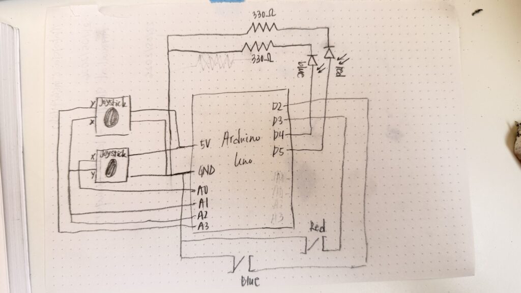 p5.js sketch
“How this was made” section explaining how the code was made and sources of media assets (i.e. use of tools, libraries, online sources, and AI)
I started working on the Arduino first. I experimented with different games, and followed online tutorials as well as the Starter Kit book to implement a few games to get me started.
To get familiar with the joysticks, I referred to this video. I referred to this to implement tap fast. There was probably a few other videos that I referred to here and there to resolve minor issues, however, I cannot find the links for them now.
Once I got the hang of each component individually and mastered a few games as one-player games, I started working on creating each game as a two-player game and connecting everything with p5.js. To get started with this, I followed the recording where you went over serial communication and made sure everything worked before jumping to my own games. Luckily, this wasn’t as difficult as I expected it to be!
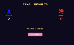
In my game, arduino handles all the physical inputs such as button presses, joystick movements, and runs the timing logic. These results are sent over serial to the p5.js sketch to be able to align the visuals, the different screens for each game, score updates, game states, and character movements. To manage the different phases of the game, I had an integer gamePhase which decided which screen to show at any point, 0 represents the main menu, 1,2,3 represents each mini-game, and 4 represents the final result screen. draw() checks the gamePhase variable at every frame and calls the right function to start that specific game, or switch to the main menu / final screen.
// current screen is based on the gamePhase
function draw() {

  // print(mouseX, mouseY);

  background(15, 10, 30);
  readSerial();

  if (gamePhase === 0)
    drawMenu();
  else if (gamePhase === 1)
    drawGame1();
  else if (gamePhase === 2)
    drawGame2();
  else if (gamePhase === 3)
    drawGame3();
  else if (gamePhase === 4)
    drawOverall();

  if (gamePhase >= 1 && gamePhase <= 3)
    drawScoreBar();
  if (showInstructions)
    drawInstructions();

  // draw stars, each one pulses slightly using sin wave
  noStroke();
  for (let s of stars) {
    let alpha = 120 + 80 * sin(frameCount * 0.02 + s.x);
    fill(255, 255, 255, alpha);
    rect(s.x, s.y, s.s, s.s);
  }

  // serial communication
  function readSerial() {
    while (port.available() > 0) {

      let msg = port.readUntil("\n");
      if (msg)
        handleSerial(msg.trim());
    }
  }
}
Also in the draw() function is the readSerial() function. This function reads any messages being send from the Arduino and sends it to handleSerial() which actually checks the text. Using JavaScript’s startsWith() and substring(), I extracted the needed data from each message.
// handles the serial messages between the arduino IDE and p5.js
function handleSerial(msg) {
  if (!msg || msg === "READY")
    return;

  if (msg === "GAME:1") {
    // assigns gamePhase to 1, and sets all related variables to starting values
    gamePhase = 1;
    countP1 = 0;
    countP2 = 0;
    g1Winner = -1;
    g1Start = millis();

    return;
  }
  if (msg === "GAME:2") {
    gamePhase = 2;
    g2ScoreP1 = 0;
    g2ScoreP2 = 0;
    g2Round = 0;
    g2Winner = -1;
    g2State = "waiting";

    return;
  }
  if (msg === "GAME:3") {
    gamePhase = 3;
    startGame3();

    return;
  }

  // game 1 serial communication:
  if (msg.startsWith("G1:A:"))     {
    // gets the number after G1:A: which holds the player 1 count
    countP1 = int(msg.substring(5));
    return;
  }
  if (msg.startsWith("G1:B:"))     {
    // gets the number after G1:B: which holds player 2 count
    countP2 = int(msg.substring(5));
    return;
  }
  if (msg.startsWith("G1:WIN:"))   {
    // to store the winner of game 1 (1/2)
    g1Winner = int(msg.substring(7));
    return;
  }

  // game 2 serial comms
  if (msg.startsWith("G2:ROUND:")) {

    g2Round = int(msg.substring(9)); // gets round number
    g2State = "waiting";

    return;
  }
  if (msg === "G2:GO") {

    g2State = "go"; // players can react now
    goTime = millis();

    return;
  }
  if (msg.startsWith("G2:WIN:")) {

    g2Winner = int(msg.substring(7)); // gets which player won
    g2State = "win";
    return;
  }
  if (msg.startsWith("G2:EARLY:")) {

    earlyPlayer = int(msg.substring(9)); // gets player who pressed early
    g2State = "early";
    return;
  }
  if (msg === "G2:TIMEOUT") {

    g2State = "timeout"; // round timed out
    return;
  }
  if (msg.startsWith("G2:SCORE:")) {

    let s = msg.substring(9).split(","); // splits score into two values
    g2ScoreP1 = int(s[0]);  // first value is p1's score
    g2ScoreP2 = int(s[1]);  // second value is player 2
    return;
  }
  if (msg.startsWith("G2:GAMEOVER:")) {
    g2Winner = int(msg.substring(12)); // gets final winner for game 2
    g2State = "gameover"; // ends game 2
    return;
  }

  // game 3 serial comms
  if (msg.startsWith("G3:JOY:")) {

    let v = msg.substring(7).split(","); // splits joystick values

    // player 1 & 2 joystick values:
    joy1_x = int(v[0]);
    joy1_y = int(v[1]);
    joy2_x = int(v[2]);
    joy2_y = int(v[3]);

    return;
  }

  // overall
  if (msg.startsWith("SCORE:")) {
    let s = msg.substring(6).split(","); // splits total score
    scoreP1 = int(s[0]); // player 1 score
    scoreP2 = int(s[1]); // player 2 score
    return;
  }
  if (msg.startsWith("OVERALL:"))  {
    overallWinner = int(msg.substring(8)); // gets overall winner
    gamePhase = 4; // shows final screen
    return;
  }
}
When the message “GAME:1” is sent, the game phase switches and shows each player’s character, their score, and the 10-second countdown begins. The Arduino reads button presses for each player and sends the updated score every time a button is pressed. p5.js displays these scores everytime it is updated.
The timer is calculated in p5.js using millis(); the start time of the game is stored in g1Start and then each frame the timeLeft is computed. When the time is up, the Arduino determines the winner and send the respective message. p5.js then displays the winner overlay and shows that winner.
// calculates how much time is left in the game
  // millis() gives the current time since the program started & g1Start is the time when game 1 started
  let timeLeft = max(0, g1Duration - (millis() - g1Start));

  // converts milliseconds to seconds
  let secs = ceil(timeLeft / 1000);
Game 2 starts when “GAME:2” is sent from the Arduino. Game 2 is a reaction time game played over 5 rounds. The Arduino controls the timing; it sends a “WAIT” state, and after a random delay sends “G2:GO” which updates the signal box. This matches up with the LEDs lighting up as well, so the players can look at either the LEDs or the p5.js sketch. Whoever presses first wins the round, however, if either player presses early, the other player gets the point (and if both players don’t press, neither player gets a point)
Game 3 probably took me the most time to build, and I did get some help from Claude for debugging purposes since it was getting a bit confusing. Almost all the functionality of game 3 is handled within p5.js. The players still use the physical joysticks to move their characters. The Arduino just sends the joystick values as four numbers (0-1023) and the p5.js handles the movements of the characters on the screen. Every frame, the joystick values are read converted to movement. To handle wall collision, I treated each character as a circle of 10 pixel radius. The circleRect() function checks if the closest point on the rectangle to the circle’s center is less than the radius of the circle. If so, then it calls resolveWalls() which handles the collision response. It checks horizontal and vertical movements separately. The goal zone for each player is the opposite player’s spawn point. I check if the players reach their goal using the dist() function, if the character is within 40 pixels of the goal’s centers, they win. If both players somehow reach at the same exact time, then it’s a draw.
// this function was written with some help from claude, mainly for debugging purposes
// checks the proposed new position (nx, ny) against all walls
// returns [safeX, safeY] that doesn't overlap any wall
function resolveWalls(oldX, oldY, nx, ny) {
  let safeX = nx;
  let safeY = ny;

  // check the player against every wall
  for (let wall of walls) {

    // check horizontal movement
    // test new X, but keep the old Y
    if (circleRect(safeX, oldY, PLAYER_R, wall)) {
      // if nx > oldX, movement was to the right
      if (nx > oldX) {
        // places character back slightly to the left of the wall
        safeX = wall.x - PLAYER_R;
      }
      else {
        // otherise, left movement; put player to the right of the wall
        safeX = wall.x + wall.w + PLAYER_R;
      }
    }

    // checks vertical movement
    if (circleRect(safeX, safeY, PLAYER_R, wall)) {

      // downward movement
      if (ny > oldY) {
        // put the player just above the wall
        safeY = wall.y - PLAYER_R;
      }
      else {
        // otherwise, upward movement; put the player just below the wall
        safeY = wall.y + wall.h + PLAYER_R;
      }
    }
  }

  // Return the corrected safe position
  return [safeX, safeY];
}

// returns true if a circle (cx, cy, radius r) overlaps rectangle w
function circleRect(cx, cy, r, w) {

  // closest point on wall to circle center
  let closestX = constrain(cx, w.x, w.x+w.w);
  let closestY = constrain(cy, w.y, w.y+w.h);

  let dx = cx - closestX;
  let dy = cy - closestY;

  // if distance is less than the radius, collision reported
  return (dx*dx + dy*dy) < (r*r);
}
I designed three different maze layouts, and the layout is randomized every game. Each layout uses fractional coordinates instead of fixed values to ensure it scales properly on any screen size. When the game starts, startGame3() converts the fractions to actual pixel sizes based on the current canvas size. If the user changes the screen-size during this specific game, the game restarts.
// convert fractional wall definitions to actual pixel rectangles
  walls = layout.walls.map(w => ({
    x: w.x * width,
    y: w.y * height,
    w: w.w * width,
    h: w.h * height,
  }));
As for the visual design of the project, the characters were inspired by the below image. I gave this image as a reference to Gemini and told it to generate just a red and blue character in a similar aesthetic (since I couldn’t remove the watermark). 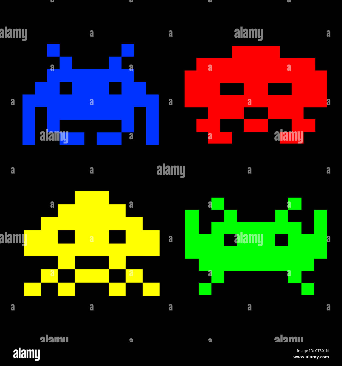
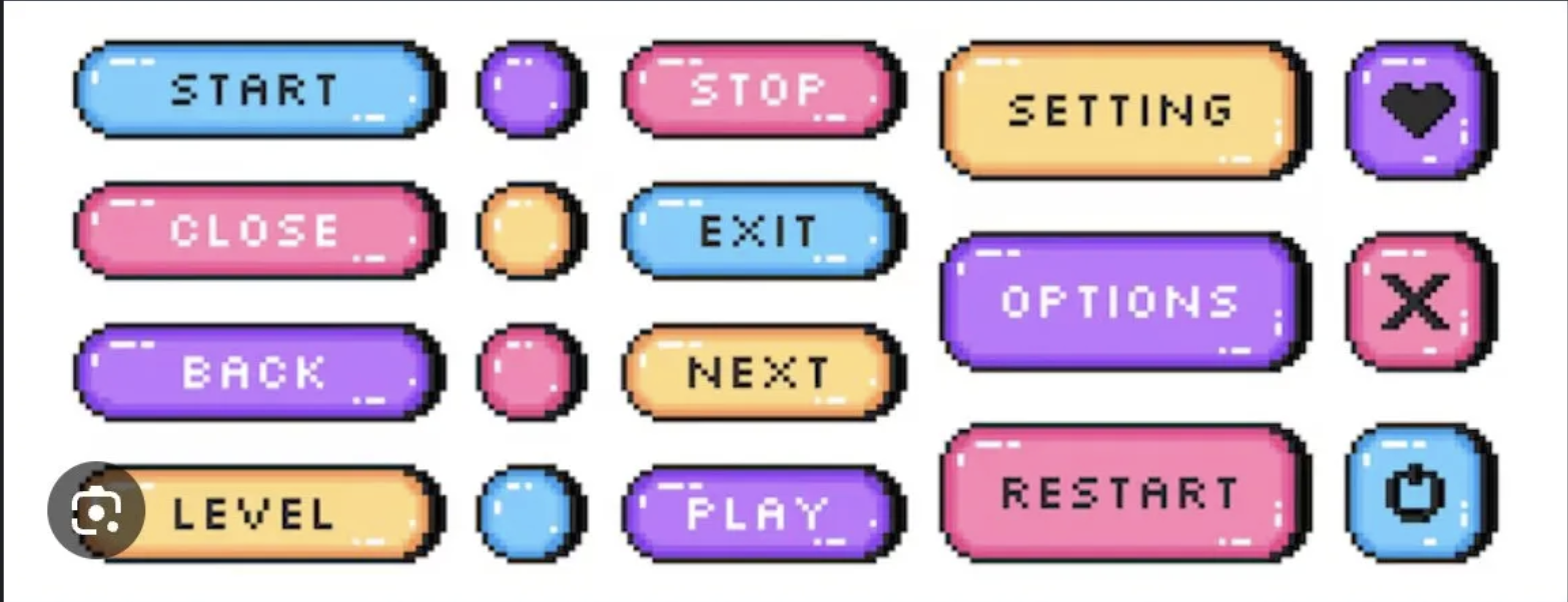
The font I used was from font space. The font, Press Start 2P, matched the arcade game aesthetic I was going for. For the buttons, I gave Claude an inspo pic from Google and it generated the buttons using code.

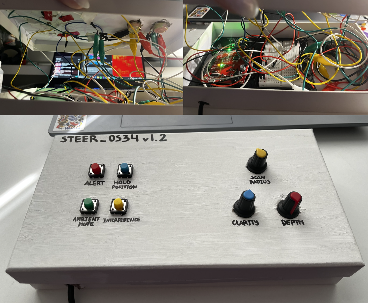
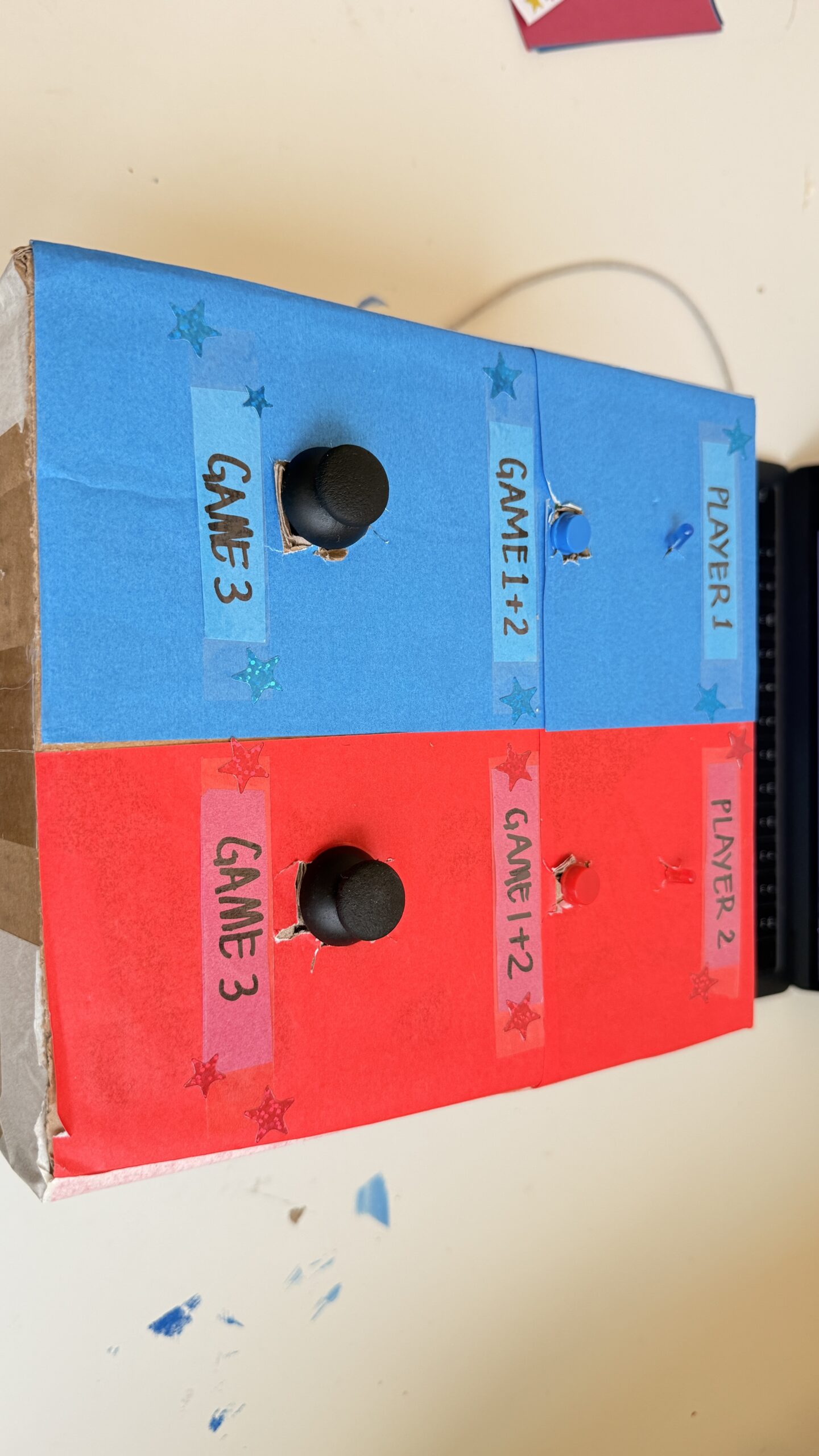
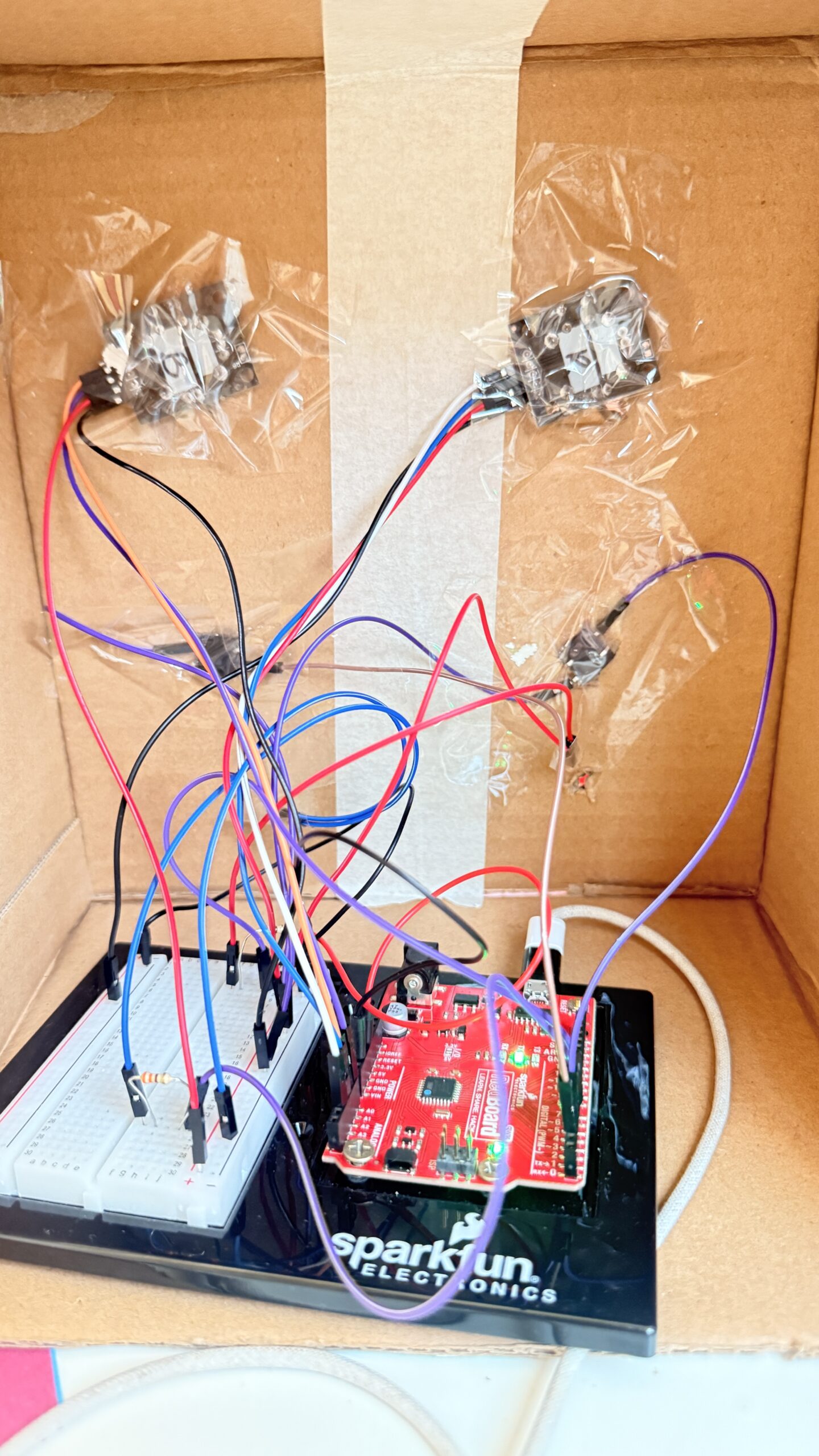
And for the physical aspect, I just used a cardbox I had at home, I used red paper on the right for player 1 and blue paper for player 2. I made “X” shaped cuts for each component that needed to be exposed and taped everything up from the back. I added labels to make it more intuitive and added some stars to match the faint stars in the background of my game.
This is what the box looks like from the back

What are some aspects of the project that you’re particularly proud of?
The main things I’m proud of for this project is the physical aspects. Arduino seemed really intimidating in the beginning, and I also really wanted to create a game that would actually be fun and easy to use. I expected the joystick component to be really difficult to work with, which it was in the start, but I was really excited when I got the hang of it and especially when everything connected to the p5.js sketch as well. Writing the code for so many components also felt intimidating but it actually turned out to be much easier than I thought, they’re all functions we’ve used individually before just combined into one game.
I was initially planning on just leaving my components on the breadboard with the wires exposed. However, the joysticks only working in a specific orientation motivated me to actually put all the components in a box to ensure the game is easy to use. Putting everything in the box was SO difficult, everything kept falling, the tape wouldn’t stick properly and it was a bit annoying to reconnect everything (I used male to female wires for this). However, I’m happy with how the final result came out and it definitely looks like something I would play in the IM Showcase!
What are some areas for future improvement?
I would’ve loved to also get the arcade look on my physical game to make everything look cohesive. I also had more ideas from my p5.js sketch to personalize the design more and maybe draw my own characters, allow the players to choose between different characters, and so on. I would also love to add more mini-games and the memory game! I was really excited about implementing the memory game when I did in as a one-player game, but it was too complicated for two-players. I also did initially have buzzer, which added to the experience since there was an audio feedback, however, unfortunately my buzzer broke at the last minute (one of the pins broke). I think this could be resolved by either adding another buzzer OR using audio on the p5.js sketch. However, for now, it was difficult to find different, appropriate audios in a short-time frame, but this could be something for future imrpovements.