Concept
A physically interactive “Piano Tiles” game where players tap hand-buttons or pedal-buttons in time to falling/color coordinated tiles. Red tiles correspond to hand buttons (pins 2–5), blue tiles to foot pedals (pins 6–9). Finish the song without losing all three lives to win!
Interaction Demo
user testing:
copy_71E82669-1896-402A-A155-F76C8BE9E1AD
Me testing it:
copy_0FB66FA1-2527-4DBE-B6C6-86ACE6076571 2
Implementation Overview
Startup
-Menu screen with background image and “Start”/“Info” buttons
-Info screen explains with instructions on how to play
Song and Difficulty Selection
-Custom “song.png” and “difficulty.png” backgrounds
-3 levels (easy, medium, hard), as difficulty increased, speed of tiles moving down increases
Gameplay
-Tiles fall at a speed set by difficulty
-Serial data from Arduino (1–4 = hand zones, 5–8 = foot zones) drives hit detection
-Score and lives update live; MISS flashes when button misscliks/spam
Game Over
-Game over screen, shows score of the user: whether lost or won
-“Try Again” or “Home” appear and auto-returns to home screen after 5s
Interaction Design
Color coding: red/blue zones on screen match button colors
Audio cues: Crazy Frog sample plays in background
Lives and Score: heart icons and score button reinforce progress

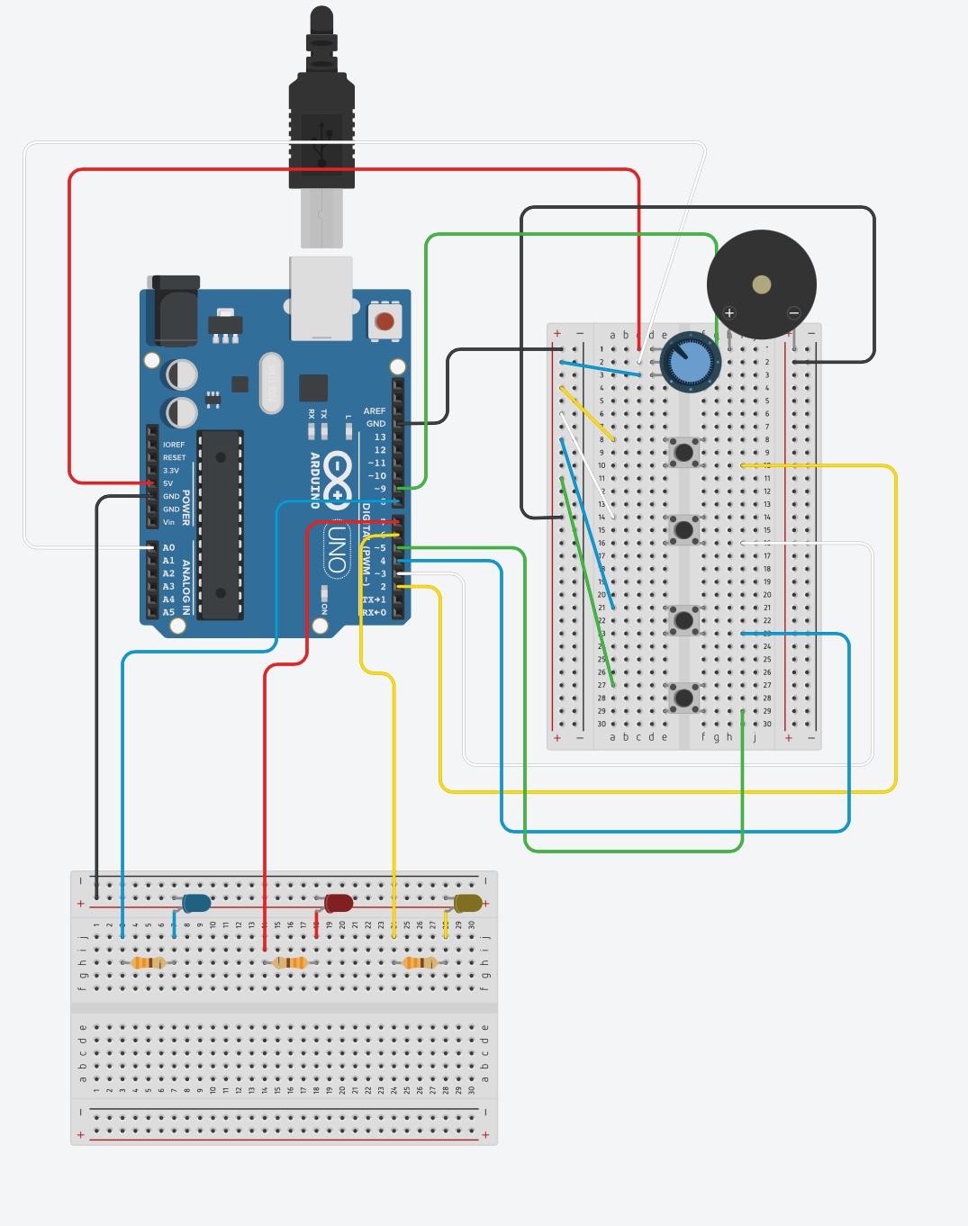
Arduino Sketch
const int pins[] = {2,6,  3,7,  4,8,  5,9}; // even indices = hand, odd = foot

void setup() {
  Serial.begin(9600);
  for (int i = 0; i < 8; i++) pinMode(pins[i], INPUT);
}

void loop() {
  for (int i = 0; i < 8; i++) {
    if (digitalRead(pins[i]) == HIGH) {
      int baseZone = (i / 2) + 1;          // 1–4
      int sendVal  = (i % 2 == 0)
                     ? baseZone           // hand: 1–4
                     : baseZone + 4;      // foot: 5–8

      Serial.println(sendVal);

      // wait release
      while (digitalRead(pins[i]) == HIGH) delay(5);
      delay(300);
    }
  }
}
This Arduino sketch scans eight digital inputs (pins 2–9, paired as hand vs. foot buttons), and whenever it detects a button press it:
-
Determines which of the four “zones” you pressed (buttons in pairs 2/6: zone 1, 3/7: zone 2, etc).
-
Adds 4 to the zone number if it was a “foot” button, so hands send 1–4 and feet send 5–8.
-
Sends that zone ID over the serial port.
-
Waits for you to release the button and debounces for 300 ms before scanning again.
Circuit Schematic

p5.js Sketch
let menuImg, infoImg, gameOverImg;
let axelSound;
let songStarted = false;

let serial, canvas, scoreBtn;
let gameState = 'menu';

let useSound = false;
let osc;

function preload(){ //preloading images and sounds
  menuImg = loadImage('menu.png');
  infoImg  = loadImage('info.png');
  gameOverImg = loadImage('gameover.png');
  axelSound = loadSound('axelf.mov');
  songImg = loadImage('song.png');
  diffImg = loadImage('difficulty.png');

}


const tileH = 60, zoneH = 20,
      zoneY = 320, // tiles get removed at this point
      removalY = 400, colWidth = 400 / 4;


// UI buttons for navigation buttons, menu and gameover
const navButtons = { back:{x:10,y:10,w:80,h:30,label:'Back'}, home:{x:100,y:10,w:80,h:30,label:'Home'} };

const menu = { title:'Piano Tiles', start:{x:159,y:222,w:86,h:20,label:'Start'}, info:{x:160,y:261,w:86,h:20,label:'Info'} };

const gameOverButtons = { tryAgain:{x:150,y:180,w:100,h:40,label:'Try Again'}, home:{x:150,y:240,w:100,h:40,label:'Home'} };

// Song and pattern deciding what foot/hand tile goes to what column in order
const songs = [
   { id: 'axelf', name: 'Crazy Frog', sample: axelSound, pattern: [
  { col: 0, isFoot: true  },
  { col: 1, isFoot: true },
  { col: 0, isFoot: true  },
  { col: 2, isFoot: false  },
  { col: 3, isFoot: false },
  { col: 3, isFoot: true  },
  { col: 0, isFoot: false },
  { col: 2, isFoot: false  },
  { col: 0, isFoot: true  },
  { col: 2, isFoot: false },
  { col: 1, isFoot: true  },
  { col: 1, isFoot: false },
  { col: 3, isFoot: true  },
  { col: 1, isFoot: true  },
  { col: 0, isFoot: false },
  { col: 3, isFoot: true  },
  { col: 2, isFoot: false },
  { col: 1, isFoot: true  },
  { col: 0, isFoot: true  },
  { col: 3, isFoot: true },
  { col: 0, isFoot: true  },
  { col: 1, isFoot: true },
  { col: 0, isFoot: true  },
  { col: 2, isFoot: false  },
  { col: 3, isFoot: false },
  { col: 3, isFoot: true  },
  { col: 0, isFoot: false },
  { col: 2, isFoot: false  },
  { col: 0, isFoot: true  },
  { col: 2, isFoot: false },
  { col: 1, isFoot: true  },
  { col: 1, isFoot: false },
  { col: 3, isFoot: true  },
  { col: 1, isFoot: true  },
  { col: 0, isFoot: false },
  { col: 3, isFoot: true  },
  { col: 2, isFoot: false },
  { col: 1, isFoot: true  },
  { col: 0, isFoot: true  },
  { col: 3, isFoot: true },
 { col: 3, isFoot: true  },
  { col: 2, isFoot: false },
  { col: 1, isFoot: true  },
  { col: 0, isFoot: true  },
  { col: 3, isFoot: true },
  { col: 3, isFoot: true  },
  { col: 2, isFoot: false }
] }
];
const songBoxes = [];
// speed increases as difficulty increases
const difficulties = [ {label:'Easy',speed:4}, {label:'Medium',speed:6}, {label:'Hard',speed:8} ];
const diffBoxes = [];


let currentSong, noteIndex=0;
let score=0, lives=3, currentSpeed=0; // set score to 0 and lives 3
let tile=null, missTime=0;
let gameOverStartTime=0, gameOverTimeout=5000;

function setup(){
    songs[0].sample = axelSound;

  canvas=createCanvas(400,400);
  canvas.mousePressed(handleMouse);
  canvas.elt.oncontextmenu=()=>false;

  // audio
  useSound = typeof p5.Oscillator==='function';
  if(useSound) osc=new p5.Oscillator('sine');

  // serial
  serial=createSerial();
  const ports=usedSerialPorts(); if(ports.length) serial.open(ports[0],{baudRate:9600});

  // UI boxes for the song
  songBoxes.push({ x: 129, y: 216, w: 145, h:  75, idx: 0 });

  // and for difficulties:
  diffBoxes.length = 0;

  //levels
diffBoxes.push({ x: 158, y: 182, w:  86, h:  32, idx: 0 }); //easy
diffBoxes.push({ x: 158, y: 235, w:  86, h:  32, idx: 1 }); //med
diffBoxes.push({ x: 158, y: 289, w:  86, h:  32, idx: 2 }); //hard

  // white button that represents score
  scoreBtn=createButton('Score: 0');
  scoreBtn.position(width-90,10);
  scoreBtn.style('background-color','#FFFFFF').style('color','rgb(25,1,1)').style('padding','6px 12px');
}

function draw(){

    // console.log(`x: ${mouseX}, y: ${mouseY}`); used for coordinates for the ui boxes

  background(30);
  switch(gameState){
    case 'menu':            drawMenu();         break;
    case 'info':            drawInfo();         break;
    case 'songSelect':      drawSongSelect();   break;
    case 'difficultySelect':drawDiffSelect();   break;
    case 'playing':         drawGame();         break;
    case 'gameOver':        drawGameOver();     break;

  }
}

function drawMenu()
{

  textAlign(CENTER,CENTER);
  fill(255); textSize(32);
  text(menu.title, width/2, 100);
  drawButton(menu.start);
  drawButton(menu.info);

    // draw menu background image
  image(menuImg, 0, 0, width, height);
}

function drawInfo() {
  // full screen info background
  image(infoImg, 0, 0, width, height);

  // then draw back button on top:
  drawButton(navButtons.back);
}

function drawSongSelect()

{
    image(songImg, 0, 0, width, height);


drawButton(navButtons.back);
drawButton(navButtons.home); }

function drawDiffSelect()
{
    image(diffImg, 0, 0, width, height);
  //  // debug draw the clickable areas
  // diffBoxes.forEach(b => {
  //   noFill();
  //   stroke(255, 0, 0);
  //   rect(b.x, b.y, b.w, b.h);
  // });
drawButton(navButtons.back); drawButton(navButtons.home); }

function drawGame(){

  // Lives
  noStroke(); fill('red'); for(let i=0;i<lives;i++) ellipse(20+i*30,20,20,20);
// Dividers and zones in the game
rectMode(CORNER);
stroke(255); strokeWeight(4);
line(100,0,100,height);
line(200,0,200,height);
line(300,0,300,height);

noStroke();
// draws the 4 coloured hit zones:
const colors = ['#3cb44b','#4363d8','#ffe119','#e6194b'];
noStroke();
colors.forEach((c,i) => {
  fill(c);
  rect(i * colWidth, zoneY, colWidth, zoneH);
});

// draws the falling tiles
if (tile) {
  tile.y += tile.speed;

  if (tile.y - tileH/2 > removalY) {
    missTime = millis();
    advanceTile(false);
  } else {
    rectMode(CENTER);
    noStroke();
    fill(tile.isFoot ? '#4363d8' : '#e6194b');
    rect(tile.x, tile.y, tile.w, tileH);
  }
}


  if(serial && serial.available()>0){
    let raw=serial.readUntil('\n').trim(); let z=int(raw)-1;
    if(z>=0&&z<8){ let col=z%4; let isHand=z<4; handleHit(col,isHand); }
  }


  // keeps count of the score
  noStroke();
  fill(255);
  textAlign(LEFT,TOP);
  textSize(16);
  text('Score:'+score,10,40);
  if(millis()-missTime<500){ textAlign(CENTER,CENTER); textSize(32); fill('red'); text('MISS',width/2,height/2); }
}

function startPlaying() {
  // only play once
  if (currentSong.sample && !songStarted) {
    currentSong.sample.play();
    songStarted = true;
  }
}


function drawGameOver()
{
  if (currentSong.sample && songStarted) {
  currentSong.sample.stop();
}
  image(gameOverImg, 0, 0, width, height);

 let e=millis()-gameOverStartTime;
 if(e>=gameOverTimeout){ resetGame(); gameState='menu'; return;} let r=ceil((gameOverTimeout-e)/1000);
 textAlign(RIGHT,BOTTOM);
 textSize(14);
 fill(255);
 text('Menu in:'+r,width-10,height-10); }

function drawButton(b)
{ rectMode(CORNER);
 fill(100);
 rect(b.x,b.y,b.w,b.h);
 fill(255);
 textAlign(CENTER,CENTER);
 textSize(16);
 text(b.label,b.x+b.w/2,b.y+b.h/2); }

function handleMouse() {
  // game over screen
  if (gameState === 'gameOver') {
    if (hitBox(gameOverButtons.tryAgain)) {
      resetGame();
      noteIndex = 0;
      spawnNextTile();
      // replay sample if any
      if (currentSong.sample) {
        let s = (typeof currentSong.sample === 'function')
                  ? currentSong.sample()
                  : currentSong.sample;
        if (s && typeof s.play === 'function') s.play();
      }
      gameState = 'playing';
    } else if (hitBox(gameOverButtons.home)) {
      resetGame();
      gameState = 'menu';
    }
    return;
  }

  // info screen
  if (gameState === 'info') {
    if (hitBox(navButtons.back)) {
      gameState = 'menu';
    }
    return;
  }

  // navigation (Home/Back) before the game starts
  if (gameState !== 'playing') {
    if (hitBox(navButtons.home)) {
      resetGame();
      gameState = 'menu';
      return;
    }
    if (gameState === 'songSelect' && hitBox(navButtons.back)) {
      gameState = 'menu';
      return;
    }
    if (gameState === 'difficultySelect' && hitBox(navButtons.back)) {
      gameState = 'songSelect';
      return;
    }
  }

  // main menu
  if (gameState === 'menu') {
    if (hitBox(menu.start)) {
      gameState = 'songSelect';
    } else if (hitBox(menu.info)) {
      gameState = 'info';
    }
    return;
  }

  if (gameState === 'songSelect') {
    songBoxes.forEach(b => {
      if (hitBox(b)) {
        currentSong = songs[b.idx];
        gameState = 'difficultySelect';
      }
    });
    return;
  }

  // select difficulty
if (gameState === 'difficultySelect') {
  diffBoxes.forEach(b => {
    if (hitBox(b)) {
      currentSpeed = difficulties[b.idx].speed;
      resetGame();
      noteIndex = 0;
      spawnNextTile();

      // play sample only once
      if (currentSong.sample && !songStarted) {
        currentSong.sample.play();
        songStarted = true;
      }

      gameState = 'playing';
    }
  });
  return;
}


}


function resetGame() {
  score = 0;
  scoreBtn.html('Score: 0');
  lives = 3;
  missTime = 0;
  gameOverStartTime = 0;
  tile = null;
  songStarted = false;   // reset song playing here
}


function handleHit(col, isHandButton) {
  // wrong button type
  if ((tile.isFoot && isHandButton) ||
      (!tile.isFoot && !isHandButton)) {
    missTime = millis();
    lives--;
    if (lives <= 0) {
      if (currentSong.sample) axelSound.stop();
      if (useSound)         osc.stop();
      gameState = 'gameOver';
      gameOverStartTime = millis();
    }
    return;
  }

  // otherwise the normal hit test
  if (tile && col === tile.col
      && tile.y - tileH/2 < zoneY + zoneH
      && tile.y + tileH/2 > zoneY) {
    advanceTile(true);
  } else {
    missTime = millis();
    lives--;
    if (lives <= 0) {
      if (currentSong.sample) axelSound.stop();
      if (useSound)         osc.stop();
      gameState = 'gameOver';
      gameOverStartTime = millis();
    }
  }
}


function advanceTile(sc) {
  if (sc) {
    // check win condition: if this was the last note in the pattern, flag a win and go straight to Game Over
    if (noteIndex === currentSong.pattern.length - 1) {
      isWinner = true; // mark winner
      gameState = 'gameOver';
      gameOverStartTime = millis();
      return;
    }

    if (useSound && !currentSong.sample) {
      osc.freq(currentSong.melody[noteIndex]);
      osc.start();
      osc.amp(0.5, 0.05);
      setTimeout(() => osc.amp(0, 0.5), 300);
    }

    score++;
    scoreBtn.html('Score:' + score);

  } else {
    lives--;
    if (lives <= 0) {
      // lose flag
      isWinner = false;
      if (currentSong.sample) axelSound.stop();
      if (useSound)         osc.stop();

      gameState = 'gameOver';
      gameOverStartTime = millis();
      return;
    }
  }

  // advance to the next note
  noteIndex = (noteIndex + 1) % currentSong.pattern.length;
  spawnNextTile();
}


function spawnNextTile() {

  const p = currentSong.pattern[noteIndex];
  tile = {
    x:    p.col * colWidth + colWidth/2,
    y:    0,
    w:    colWidth,
    h:    tileH,
    speed: currentSpeed,
    col:  p.col,
    isFoot: p.isFoot,
    immune: false
  };
}


function hitBox(b){ return mouseX>=b.x&&mouseX<=b.x+b.w&&mouseY>=b.y&&mouseY<=b.y+b.h; }
Key p5.js Highlights
-preload() loads menu.png, info.png, gameoverwinner.png, gameoverloser.png, and axelf.mov
-drawMenu()/drawInfo() render full screen images before buttons
-handleMouse() manages navigation
-drawGame() reads serial, falls and draws tiles, enforces hit logic
-advanceTile() checks win/lose and plays audio
Arduino and p5.js Communication
-Arduino sends an integer (1–8) on each button press
-p5.js reads via serial.readUntil(‘\n’), maps zone%4 to columns and zone<5 to hand/foot
-Immediate feedback loop: tile hit/miss on-screen mirrors physical input
Proud of
i’m proud of how I designed my pedals to work so that it holds the button right under the top part of the pedal, and it doesn’t activate till stepped on it. I’m also proud of how I soldered the wires together since it’s my first time. I also like how my code aesthetics turned out.
Future Improvements
I was thinking of maybe trying to have a multiplayer mode would be cooler: split-screen hand vs. foot competition, and maybe implementing a leaderboard function: save high scores.