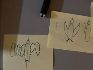
MY CONCEPT:
Around the first or second week of classes, I remember missing my bass that stayed back at home (this was before I knew I could book one here), so I spent a lot of time just thinking about how I could play bass without having one. Nothing really came to mind, but when the professor assigned us this project, I took on the challenge of making a working bass in p5.js.
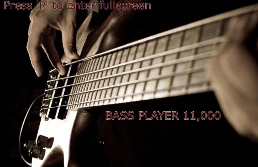
This is the title screen of the experience. To “force” the user to into fullscreen mode, the start button is hidden until fullscreen is activated. Once it’s pressed, the game switches into the bass playing mode which I’ll go into in a bit. First I want to explain talk a bit about the name. Why “BASS PLAYER 11,000”? It’s a pretty straightforward answer. During development, every time I did a “risky” change to the code, I would duplicate the sketch, and I did this 11 times. I only wish I could’ve done it 56 or 58 more times. That would’ve been funny.
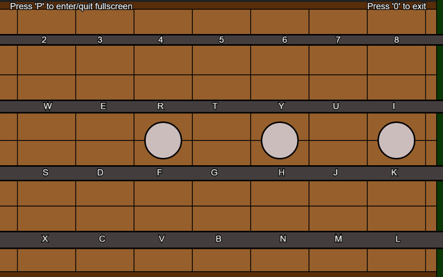 Now, for the bass stage, designing it was the first thing that I did since it was fairly easy. There’s not much to it, I just based it on a regular 4-stringed bass guitar. I also added the keys that play each note. THAT was hard, first I recorded all 32 sounds the bass can make (from frets 0 – 7). Then I have to convert them from .mp4 files to .mp3 files, then I had to upload them all to the sketch. After that, I started with some of the code to load them all. Here is when I encountered my first issue… Since the sketch was loading 32 files one after the other, it took like 10 minutes for it to load, so making changes to it was extremely inefficient. (Since I didn’t know what to do there I designed the starting screen at this point). After getting expert advise, I used a function called “Promise.all”, which loaded all the files at the same time. This reduced the loading time from 10 minutes to 10 seconds, which was, to say the least, pretty good.
After that, the coding for the key binding and fullscreen adjusting was very time consuming, yet simple at the same time. (I would like to admit that, due to desperation, AI helped with the math equation required for the resizing and to fix some code, other than that I did it all by myself).
CODE I’M PROUD OF:
function keyPressed(){
       if (key === "p") {
 fullscreen(!fullscreen());
 return;
 }
  if (key === "0"){
    restartGame();
    return;
  }
 if (gameState !== "playing") return;
  //Now to make the actual sounds, It is meant to be "played" as if it was an actual bass
let index;
      // A string
 if (key === "a") index = 0;
 else if (key === "s") index = 1;
 else if (key === "d") index = 2;
 else if (key === "f") index = 3;
 else if (key === "g") index = 4;
 else if (key === "h") index = 5;
 else if (key === "j") index = 6;
 else if (key === "k") index = 7;
   // E string
 else if (key === "z") index = 8;
 else if (key === "x") index = 9;
 else if (key === "c") index = 10;
 else if (key === "v") index = 11;
 else if (key === "b") index = 12;
 else if (key === "n") index = 13;
 else if (key === "m") index = 14;
 else if (key === "l") index = 15;
   // D string
 else if (key === "q") index = 16;
 else if (key === "w") index = 17;
 else if (key === "e") index = 18;
 else if (key === "r") index = 19;
 else if (key === "t") index = 20;
 else if (key === "y") index = 21;
 else if (key === "u") index = 22;
 else if (key === "i") index = 23;
   // G string
 else if (key === "1") index = 24;
 else if (key === "2") index = 25;
 else if (key === "3") index = 26;
 else if (key === "4") index = 27;
 else if (key === "5") index = 28;
 else if (key === "6") index = 29;
 else if (key === "7") index = 30;
 else if (key === "8") index = 31;
else return;
 sounds[index].play();
To be honest, proud of the whole code, but I guess this bit specially.
IMPROVEMENTS:
There’s a lot of stuff that, because of time and technical difficulties, was cut sort of last minute.
For example, I really really REALLY wanted to make it so that when a note is played, the corresponding fret “lights up” in some way, but I was unable to figure it out. It is definitely posisble, but my theory is that it would’ve required me to “unmake” the design of the bass and start from scratch, and I was NOT willing to do that. Perhaps if I had more chance.
Another thing that was cut was the “Extras” screen. It was supposed to include some “tabs” that showed what keys to press in order to play certain songs. It got cut because switching between 2 screens was hard enough. Also no time. If I only had more time.
EXTRAS/REFERENCES:
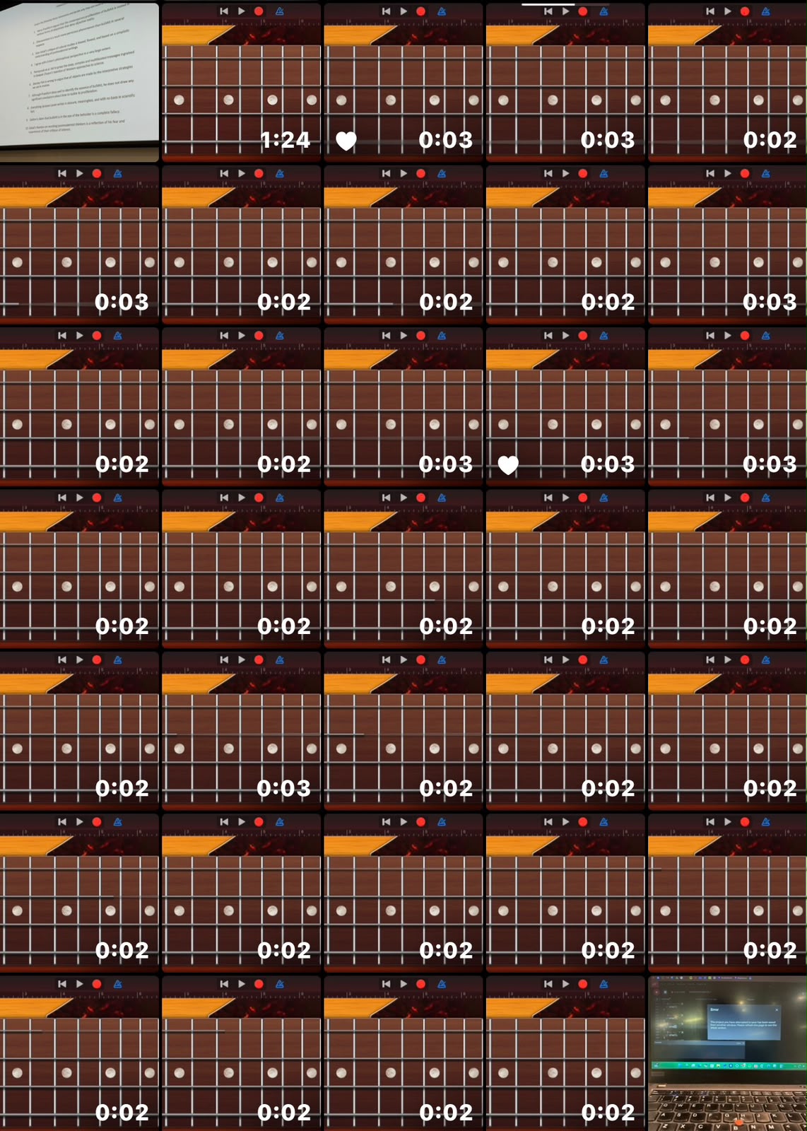
That’s how my gallery looked after all the videos of each note.
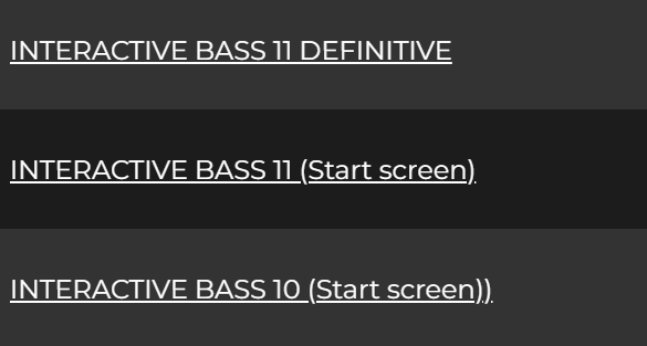
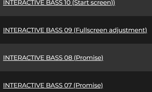
There’s a lot more verisons of the bass sketch, that’s just an example.
For references I mostly used the p5 website and expert advice from the amazing professor. AI was only used to help with some math and improvement of a single code line.
UPDATE!:
So after my presentation I added mainly 2 things.
First, I added music to the starting screen with the examples covered in class. The music is a tape of Metallica’s “Fade to Black” ending bass track.
For the second thing, I initially wanted to make each fret light up when its note is played, but the array stuff needed to do that is way beyond me. So the next best thing was to have the strings light up when a note is played on that string. The code for it was a bit complicated, but I just needed to create a new array with a timer. The timer helps the string light up for just a couple of frames.
Thank you! 🙂