Generative Text Output – Week 4

Concept:

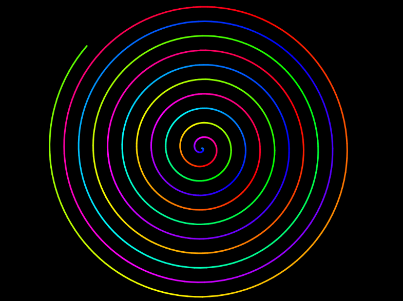
The idea of generating a sketch from text intimidated me at first. I started playing around with random text movements and then came across a cool spiral design (link). This inspired me to create a text spiral. For this project, I used a (‘cringy’) poem called “Middle” that I had written when I was fourteen. It is about a woman trapped in stasis: rooted in place, silenced, and stuck “in the middle of it all” while everything around her keeps changing. I thought that it really fits the spiral imagery, as this shape never closes into a loop. It can keep extending outward indefinitely. Then, I wanted to incorporate this idea of constant change, which is why I added a text box where the user could add words that they want. The user can reset the spiral with the reset button.

Embedded Sketch:

Process:

To make the spiral, I referred to this link as well as the p5 reference page. Following my reference image,


I tried to change the colours of each word slightly in order to create a rainbow effect. I also added some movement by using frame rate. For the buttons, I was inspired by the work of a previous student, Adit Chopra) on the IM website (Link). In my code, I managed to allow the user to add however many words they would like, and it would still appear as a spiral not going outside the canvas. Here is some code I am really proud of:

let newWords = raw.split(/\s+/); //supports adding more than one word at once!!
for (let i = 0; i < newWords.length; i++) {
let wordHue = (words.length * 27) % 360;
words.push(new WordModel(newWords[i], words.length, wordHue));
HueShift = (HueShift + 22) % 360; //Shifts the color of every word already present as the new word is added
}
input.value("");
}

I catered for the user entering multiple words at once. I used Claude’s help to be able to do this. But, to be honest, I am happy to have been able to even do a spiral with changing hues.

//The words are smaller at the start and grow progressively bigger
let h = (this.hue + HueShift) % 360;

noStroke();
fill(h, 55, 92);

if (this.index < ShrinkCount) {
  BaseSize = map(this.index, 0, ShrinkCount, 4, 9)
}
textSize(BaseSize * this.scale);
text(this.txt, 0, 0);
pop();

In the beginning, the words at the center were overwriting each other because of how little space they had. Then, I used ShrinkCount to make the ones at the center smaller and allowed the words to grow bigger towards the end of the spiral.

Reflection:

I like what I did for this assignment, especially that it reminded me of young Leyanah. I am grateful that I have been able to “interact” with her through my work. Still, on a more technical basis, next, I would work on ensuring that none of the words overlap. Right now, some very long words are slightly overlapping with others. On a side note, I am glad that I have tried to apply Norman’s signifiers (adding a reset and add button) to my work, since none of my previous work prompted the user. I hope that some people play around with my spiral and add in words that could continue the poem, or really just be experimental and make something cool (maybe entering many $ signs to make a design? Why not?)

Reading Reflection – Week #4

A few lines into this paper and all I could think of were the Campus Center doors. They are my “Norman doors” (1): always knocking me over to the side or even shutting on me when I pull the handle (of these supposedly automatic doors). I am 3 semesters in, and I have seemingly not understood how to use these doors despite their outrageous yellow signs. I used to think this was just me being scatterbrained. However, Norman’s opening chapter somehow redirected my self-blame back onto their design. By claiming, “I push doors that are meant to be pulled, pull doors that should be pushed, and walk into doors that neither pull nor push, but slide” (1), Norman helped me feel a strange kind of relief. What I did not expect was how technical the rest of the chapter would get about why doors fail. I understood his viewpoint that everyday objects are supposed to be simple to understand and mundane to use. For instance, he notes, “With complex devices, discoverability and understanding require the aid of manuals or personal instruction. We accept this if the device is indeed complex, but it should be unnecessary for simple things” (2).

He develops a fuller framework to make his case (affordances, signifiers, mapping, feedback, and conceptual models), all in service of what he calls “human-centered design” (5): the idea that design should accommodate people rather than the reverse. While I can relate affordances and signifiers to where the Campus doors fail, I want to push back on how tidy Norman makes this framework sound. His framework is almost too persuasive. It retroactively explains every ‘badly designed’ object I have ever used. I keep wondering whether this is the sign of a genuinely good theory, or just a very flexible vocabulary that can be draped over any complaint. His refrigerator story, for example, proves my point. While he seems to be right that the two controls suggest a false mental model, he also admits that even knowing the correct model did not let him operate the fridge properly. This is because the design gave him no way to act on that knowledge. This is the part I find more interesting. Correct understanding and actual usability can come apart entirely. I personally do not think Norman fully resolves that gap. He just treats it as another design failure to be fixed with better mapping.

Nonetheless, I believe that what he discusses is important. When it comes to my work (my generated artworks up to week 3), he made me realize that, so far, I have not been using signifiers. As a result, the user might not discover the full function of the interactivity I tried to incorporate. Without my written documentation, a user might not know that, for example, my first p5 sketch allowed for a change in character as the mouse is dragged. From now on, I will keep this in mind and try to put this into practice as I progress in the course.

Week 3 – Generative Art (OOP)

This week, I spent more time debugging than actually coding. After countless exasperated sighs and ‘break’ walks, I finally came up with something I am satisfied with. Looking back now, I feel like I got a better grasp of object-oriented programming after going through this debugging process.

Concept:

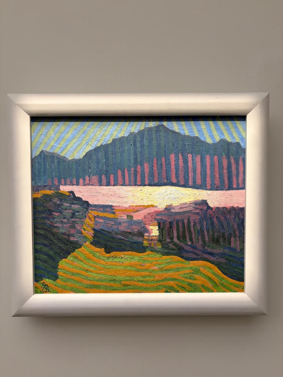
For this assignment, I was inspired by Giovanni Giacometti’s artwork, titled “Vue de Capolago” (View of Capolago). I came across this painting during my visit to Louvre Abu Dhabi. Its playful use of repeated, colorful lines stuck with me.

I tried to recreate the sky, mountain, and field in p5. Since we were assigned the Crawford reading this week, I also tried to incorporate some level of interactivity (‘fridge light level’, so it does not overpower my intention of staying true to the feelings evoked by the original painting). Therefore, I tried to create a change of hues as the user makes the sun set behind the mountains. Clicking anywhere regenerates the whole composition with new random stripe counts, widths, and heights, so each click produces a different but similarly-styled painting.

Embedded Sketch:

Process:

I had so many tabs open in the creation process of this week’s sketch. I referred to articles like this one (Link) and the p5 website in order to use functions like map. This Coding Train video (Link) and this Patt Vira video (Link) were particularly useful in exploring classes and changing gradients. Simply speaking, I built a small set of functions, each describing how to draw one shape given its size, position, and color. Then I used randomness to stamp out a bunch of these shapes with slightly different sizes and positions, and kept them all in lists. Every time, the program walks through each list and redraws every shape in it, but recalculates each shape’s color by blending two preset color sets together. What I am really proud of is how the blend ratio depends on where your mouse currently is on the screen. Clicking throws out all three lists and randomly generates a brand new set of shapes, so you get a totally different layout to look at. Here is a code excerpt of the color blend:

//Mixing the colors according to position of cursor
function drawSky(Mood, HorizonY) {
  background("#cfe3ea");
  for (const s of SkyStripes) {
    const from = color(SkyMidDay[s.ColorChoice % SkyMidDay.length]);
    const to = color(SkySunSet[s.ColorChoice % SkySunSet.length]);
    s.display(lerpColor(from, to, Mood), HorizonY);
  }
}

function drawMountain(Mood, HorizonY) {
  for (const r of MountainStripes) {
    const from = color(MountainMidDay[r.ColorChoice % MountainMidDay.length]);
    const to = color(MountainSunSet[r.ColorChoice % MountainSunSet.length]);
    r.display(lerpColor(from, to, Mood), HorizonY);
  }
}

It took me a while to figure out this logic. This is why I am so proud of it.

Reflection:

I would have loved to spend more than a week on this assignment. This is only because I believe it would have allowed me to experiment more with the aesthetics after having figured out the logic of things. For instance, I imagine changing the fields into a sea with wavy lines as the user clicks on the screen. Nonetheless, I believe I have learnt a lot through this assignment.

Reading Reflection – Week #3

In his book, Crawford critiques the manifold ways we tend to ‘wrongly’ define interactivity. For him, it is more of a “conversation: a cyclic process in which two actors alternately listen, think and speak” (8). I really appreciated how he explained this idea using an analogy of two people conversing. While this helped me understand why the elements of this process are not substitutable, what really struck me was the difference he highlighted between interaction and reaction. He notes the sensation we get from reading, for instance, as describing an “intense reaction, and [that] interaction is not reaction on a higher plane of existence” (13). This can be very useful when it comes to designing for people. It allows us to take a step back and wonder whether our product is actually interactive or just a really well-dressed trigger. He cautions that, in this case, he is “not arguing that interactivity is the sole gauge of merit” (14).

However, this is where I find his language to not really match his claim. While he does mention that not everything needs to be highly interactive to be good, he introduces an interactivity spectrum, arguing that things like the refrigerator light are still technically interactive, just at a very low level. He even calls the fridge interaction “silly and beneath the intellectual dignity of almost everybody” (11). If interactivity were truly just one dimension among many, as he insists, there would be no reason for him to give low interactivity scores to certain things and dismiss them. This brings me to the question he raises in the chapter: “Does interactivity exist in the eye of the interactor?” (11). Saying something is low interactivity instead of not interactive still requires someone to decide where exactly it falls on that 0-to-10 scale, and Crawford never really explains who gets to make that call or by what standard. I think that his own examples suggest the answer is just him (his judgement), hence the name: “Crawford Scale” (15). So while I agree his framework gives us a much richer vocabulary than a strict binary, I do not think it earns the objectivity he implies it has. Nonetheless, this reading helped me ground what we mean by an interactive design, which I will use as a heuristic to evaluate my designs henceforth.

Week 2 – Generative Art

Concept:

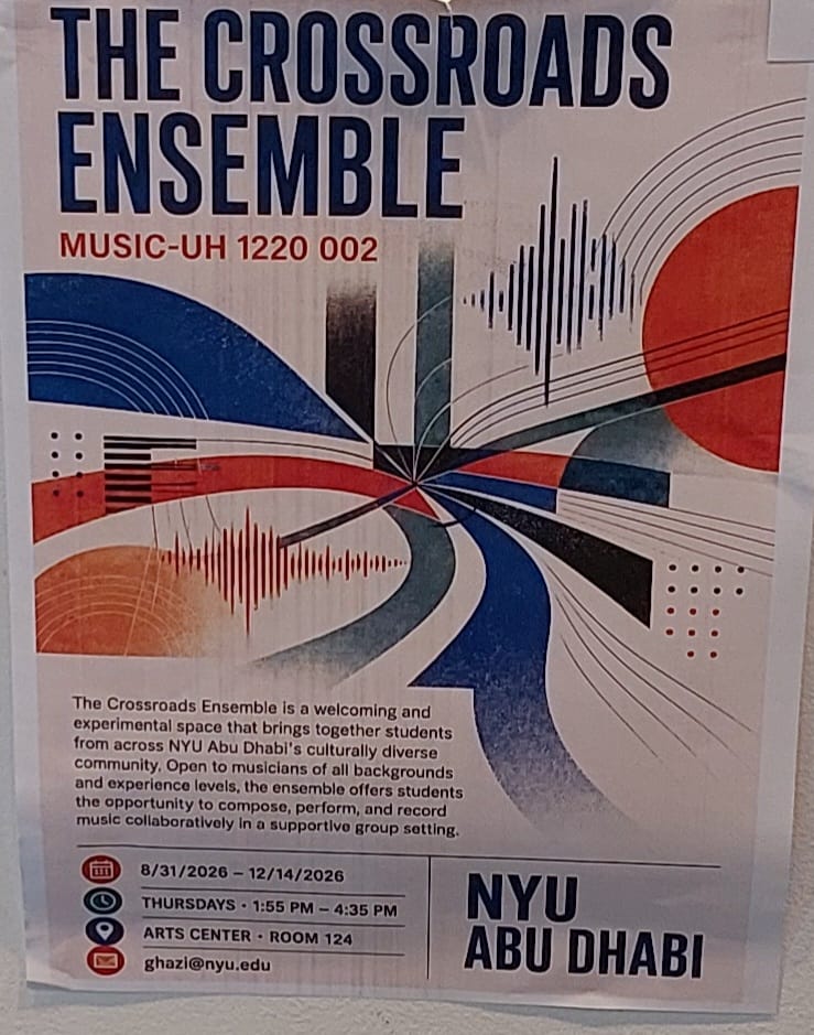
I wanted to play around with randomness for this assignment (hence the many ‘random()’ in my code). This idea was inspired by Casey Reas’ talk on the balance between chance and order. So, I started to experiment with lines (including circles and squares) and leaving their placements, sizes, and colors to fate. At first, it felt too random. I did not have a particular direction or way that I wanted my artwork to look like. This was until… I came across the NYUAD “Crossroads Ensemble” poster near an elevator while going to D2.

This very much inspired me, not only because it reminded me of jazz, but also because it allowed my artistic aspirations to coexist with the computer’s decisions (which I guided). Ultimately, I made an artwork whose composition changes as the cursor is moved around.

Embedded Sketch:

Process:

The process of getting the right forms and shapes was tedious, based on trial and error. The p5 directory was my ultimate ally (mainly because I spent days scrolling through it), which allowed me to use new commands like ‘shuffle’ or even ‘floor’.  I also referred to the code of some students who had already posted on the IM website. For instance, to get the radiating thin lines correct, I referred to Tengis Temuulen’s (Link) ‘Optical Illusion’ to understand ‘for’ loops and the use of ‘cos’ in radial shapes. Once I made the first composition, I modified the code to allow for randomness. I tried my best to incorporate loops (for and while) into my work since we have been working on these during this week in class. Here is a snippet of code I am really proud of:

// radiating thin lines
function drawThinLines(anchorX, anchorY, palette) {
  let centerX = anchorX + random(-100, 100);
  let centerY = anchorY + random(-100, 100);
  let lineCount = floor(random(18, 34));
  let startAngle = random(TWO_PI);
  let spreadAngle = random(PI * 0.6, TWO_PI);
  let ThinLinesColor = color(random(palette));

  let i = 0;
  while (i < lineCount) {
    let angle = startAngle + (i / lineCount) * spreadAngle;
    let lineLength = random(60, 180);
    let endX = centerX + cos(angle) * lineLength;
    let endY = centerY + sin(angle) * lineLength;
    stroke(
      red(ThinLinesColor),
      green(ThinLinesColor),
      blue(ThinLinesColor),
      random(90, 200)
    );
    strokeWeight(random(0.4, 1.6));
    line(centerX, centerY, endX, endY);
    i++;
  }
}

Reflections:

I am proud of what I have come up with in only a week. I believe I have finally grasped how to effectively use loops and arrays, which will be helpful as I progress into the course. For this particular artwork, one thing I would like to improve on is modifying how quickly the composition is changing. At the moment, I feel it is too quick for me to process the changes in composition. I am having to move the cursor very slowly across the screen as a result. I have tried to change the frame rate, but it did not make a difference. This is something I would love some feedback on.

Reading Reflection – Week #2

I like to think of art as a trained lion: tamed enough to be obedient to commands, but still carrying that uncertainty of when it can pounce on you. This is why I was initially skeptical when I first heard about having to create a digital artwork. I thought that involving a computer would strip away the humanness, the emotional weight, that art is supposed to carry. Casey Reas’ talk challenged that assumption of mine. At the beginning of the video, he explains, “The goal…was to make things that are artificial and still had an organic quality to it and try to spot the difference in between” (03:36). This was when I got a glimpse of what this meant. Involving a computer does not necessarily trivialize the thought process of an artist, but can instead act as a medium for creating randomness (or, in the language of my metaphor, the fear of the lion’s pounce). It is indeed that very balance of the artist navigating chance to decide how something should feel that makes coded art legitimate art. I believe Cage would agree, considering his critique as highlighted by Reas: “Those involved in the composition of experimental music find ways and means to remove themselves from the activity of the sounds they make” (16:27).

Even work built on chance still demands that the artist make consequential decisions that shape its direction. For instance, Reas himself claimed to have spent months developing a composition before writing a single line of code. This is what mainly convinced me to move past my preconception and actually appreciate the artistic possibility and the hard work behind coded artworks. Reas’ point near the end about symmetry, about how it taps into the “basic pattern recognition we have in our heads” (28:21), struck me. I did not think that there would be room for imagination in a coded output. Therefore, I am convinced by Reas that the play of structure and randomness is at the core of digital art. However, I still wonder what that balance should actually look like. What level of order and how much chance are to be employed remains very subjective. I do not think this is a flaw in his argument, but rather that it encapsulates what makes an artwork original.

Week 1 Self-portrait

The Concept:

I am ambivert by nature. What does this mean? I am the reserved, quiet person who listens to everyone in a room full of strangers. Yet, when you ask my friends and family, they will tell you I am the most energetic and outgoing person they know. I wanted to capture this concept for my self-portrait.

The idea was to create a character that looks like a normal person (aka the introverted self) at first, but once you get to know her, or rather take the time to get to know her, you discover another version. I thought a lot about what could create a stark difference between the introverted and outgoing self. The answer? My ‘Spiderman’ addiction. So, I made (or at least tried to recreate) a version of ‘SpiderGwen’ that is revealed underneath the normal person graphic as you hover the cursor around. I love the fact that the picture is revealed pixel by pixel since that represents “the effort” of getting to know me. To be honest, I am very proud of going for the idea itself (which some might say was very daring for someone who has never coded before.)

Embedded Sketch:

Implementation:

First, I played around with the different shapes and colors. In this process, the p5js website was really useful because it had visual examples alongside the code. One of my biggest achievements was discovering how to use “bezier()”. Along the way, I was inspired and learnt from the codes of several students who already had their self-portraits published.

For the sake of representing two selves, I had to create two different graphics so I could layer one on top of the other. Once my graphics were ready, I used the p5js website to write this part of code, which I am really proud of:

  //Drawing each version into the buffer
  drawNormalPerson(topImg);
  drawSuperhero(bottomImg);

  ///The interaction
  cursor(brush,0,0);

  // Load the top image
  image(topImg, 0, 0);
}

function mouseDragged() {
  copy(bottomImg, mouseX, mouseY, 20, 20, mouseX, mouseY, 20, 20);
}

Here, I used two global variables to load two different images into the buffer so they can be called when I want them to. The mouseDragged() is a special p5 function that automatically runs every time the mouse moves while a button is held down.

I am also proud of my lips and middle part because I took much time figuring out how to make them look good enough. Here is an extract for the middle part:

//middle part - hair
  img.fill('#2b1203');
  img.bezier(120,200,170,170,190,190,200,119.5);
  img.bezier(120,200.5,122,147,147,122,200,120);
  
  img.bezier(280,200,230,170,200,200,200,119.5);
  img.bezier(280,200.5,280,150,250,120,200,120);

Reflection:

For this assignment, time was my biggest enemy. I wanted to incorporate more things like building in the background of the introverted self and a sky with clouds for when the SpiderGwen appears. What I also tried doing was to replace the normal cursor with a spider (I think that would have been really cool). After countless trial, I could not do it. (I even asked Claude to help me figure this part out, but I still could not do it.) Nonetheless, I am very proud of my work and enjoyed every bit of the creative process I had behind the project. I hope my work inspires someone or reminds them of themselves (to my ambiverts out there!) and makes them smile.