Week 4 Generative Text

For this week’s project, I used arrays and the random() function to create a Resident Evil-inspired quote generator. The program pulls quotes from different characters stored in the array and randomly displays them as text on the canvas.

A part that I am proud of in this program is my array, which stores the quotes. I used objects as well to connect each character to their quote so the program wouldn’t randomly display the wrong character and quote.

// Array with random quotes
let quotes = [
{
character: “Leon”,
quote: “Where’s everyone going? Bingo?”,
},
{
character: “Leon”,
quote: “No thanks, bro!”,
},
{
character: “Jill”,
quote: “You want S.T.A.R.S.? I’ll give you S.T.A.R.S.”,
},
{
character: “Claire”,
quote: “Hey, it’s up to us to take out Umbrella.”,
},
{
character: “Wesker”,
quote: “7 minutes. 7 minutes is all I can spare to play with you.”,
},
{
character: “Jake Baker”,
quote: “Welcome to the family, son.”,
},
];

I created this by using an array to store my quotes and using objects to link each quote to its respective character. I then used the random() function to select an object when the user clicks anywhere on the canvas. The selected quote and character are stored in a variable and displayed using the text() function. I also used different text styles and colors to make it more visually appealing.

One thing that I would like to improve on in my program is using different fonts than the ones already stored in p5js. I feel that would make it more recognizable. I would also like to experiment more with the background and maybe add some images too.

Week 4 – Generative Artwork

Concept

For this assignment, I created an interactive artwork called Don’t Notify Me. It shows a self-portrait of me trying to work on my laptop while a stream of notifications keeps breaking my concentration. Participants can write their own notification, send a blank one, reset the scene, or tap the lamp to switch on focus mode.

A normal notification takes about two seconds to pull my attention away from the laptop. Strangely, a blank notification gets an even faster reaction. Since it gives me no information, I immediately want to know what it means. One or two notifications do not bother me much, but my mood changes as they pile up. After three pings in a row, I start to look annoyed. At five, I lose my patience completely. My expression changes, the scene turns red, my replies become more direct, and the sounds get harsher.

I wanted the experience to be playful, but also familiar to anyone who has struggled to focus while notifications keep appearing. The participant is not just watching me become frustrated. They are the one causing it. Their timing and messages affect my expressions, responses, and surroundings, creating a small back-and-forth between the participant and the artwork.

Code highlight

One part I am especially proud of is the way the artwork uses CSV files to manage its timing and dialogue:

settingsTable = await loadTable("settings.csv", ",", "header");
responsesTable = await loadTable("responses.csv", ",", "header");

currentPing = {
  message,
  createdAt: now,
  reactionAt: now + (
    message ? config.normal_delay : config.empty_delay
  )
};

settings.csv contains values such as the reaction delays, streak window, and mood thresholds. responses.csv contains the character’s possible replies to calm, annoyed, furious, urgent, and empty notifications. Keeping this information outside the main sketch makes the project much easier to adjust. I can change the timing or rewrite the character’s responses without digging through all the drawing code.

The character’s mood depends on the current notification streak:

const score = Math.max(
  0,
  streak - (theme === "dark" ? config.focus_relief : 0)
);

if (score >= config.furious_at) return "furious";
if (score >= config.annoyed_at) return "annoyed";
return "calm";

Focus mode lowers the effective streak instead of erasing it. Tapping the lamp can help the character calm down, but it does not act as if the earlier interruptions never happened.

How this was made

I adapted an earlier p5.js self-portrait and turned it into a scene of me working at a table. The laptop screen faces the character, so the audience sees the back of it. While I am working, my eyes point down toward the screen. Once the reaction delay ends, my eyes move toward the notification and a speech bubble appears.

The controls beneath the canvas use a real HTML text field and buttons. Participants can type a message and press Enter, click Send Ping, send a deliberately blank notification, or reset the scene. Each notification appears as a card inside the artwork, along with a timer showing how long it is taking to catch my attention.

The program also tracks how quickly the notifications arrive. Pings sent close together build a streak, while leaving me alone for long enough resets it to zero. This makes the interaction feel less like pressing a button and more like testing someone’s patience.

Week 4 – Reading Response

The Psychopathology of Everyday Things

One everyday design choice that drives me crazy is the QR-code menu that opens as a full-page PDF on my phone. The restaurant may have made its menu digital, but it clearly was not designed with a phone screen in mind. I end up pinching, zooming, and dragging the page around while trying not to lose my place. The text is usually tiny, and it is not always clear what I can tap. If nothing happens, I cannot tell whether I missed the link, the page is still loading, or the entire menu is just a flat image.

Norman’s argument made me rethink who is responsible for that frustration. My first reaction is often to assume I am doing something wrong, but the real problem is that the menu gives me very few clues about how it works. The signifiers are weak, and there is little or no feedback.

A better version would replace the PDF with a responsive webpage designed for a phone. Large buttons could take users directly to starters, mains, desserts, and drinks. A navigation bar that stays on the screen would make it easy to move between sections without scrolling back to the top. Familiar checkboxes could handle dietary filters, and unavailable choices could be grayed out instead of letting users tap something that leads nowhere. The page should also respond immediately when someone makes a selection. Highlighting the current category or displaying the number of active filters would reassure the user that the tap actually worked. Even a simple loading symbol or useful error message would be better than leaving someone staring at a frozen screen.

The same principles matter in interactive media. An artwork can be mysterious in what it means without being confusing to operate. If clicking, dragging, speaking, or moving affects the work, people need some clue that those actions are possible. That clue might be a change in the cursor, a subtle animation, a sound, or a short instruction. The connection between an action and its result should also make sense. Moving a slider upward might increase the intensity of an effect. Moving the cursor toward an object might cause that object, or something close to it, to respond. If an action affects a completely unrelated part of the screen, the participant may assume the system is broken.

Feedback matters because it lets people know that the artwork noticed them. A color change, sound, animation, or shift in text can be enough to confirm that their action had an effect. Constraints can help too. Limiting the participant to a few meaningful actions, or disabling choices that are not currently possible, does not necessarily make the experience less creative. It can make the available possibilities easier to understand.

The main idea I took from Norman is that repeated mistakes usually point to a design problem. If many people struggle with the same interaction, blaming them does not solve anything. Good interactive media gives people enough information to understand the basic rules. Once they have that foundation, they can explore, experiment, and still be surprised by what the work does.

Week 4 – Reading Response

1. What’s something (not mentioned in the reading) that drives you crazy and how could it be improved?

Something that drives me crazy is using sinks in public toilets because I can never tell if they are motion activated or if I’m supposed to press something down to turn the water on. Sometimes I put my hands under the sink waiting for the water to come out and nothing happens, so then I realize I have to press the top down. I think they could be improved by making it more obvious how the sink works, like having a small symbol or indicator showing whether you need to use the sensor or press the button.

It is such a simple thing, but I always get confused by it but i think its important to note that now after covid-19 almost everything is motion activated which i find super interesting. But even then there are issues with where to put your hands and if the sensor is broken i have to just keep wiggling my hands under it making it an awkward moment, then the person next to you says “That one doesn’t work”.

2. How can you apply some of the author’s principles of design to interactive media?

I can apply Norman’s principles of design to interactive media by making things easier for people to understand and use without having to guess what they are supposed to do. For example, if I make a button on a website, it should actually look like something that can be clicked instead of just looking like normal text. I can also use feedback, like changing the color of a button or showing something on the screen after it is clicked, so the user knows that their action worked.

I think this is similar to the public sink example because when I cannot tell if I need to use a sensor or press something, the design is not making the interaction clear enough. In interactive media, I want to make sure that users can understand what they can interact with, what will happen when they interact with it, and whether their action actually worked. This would make my projects feel less confusing and more natural to use.

Week 4 – Generative Text

Concept:

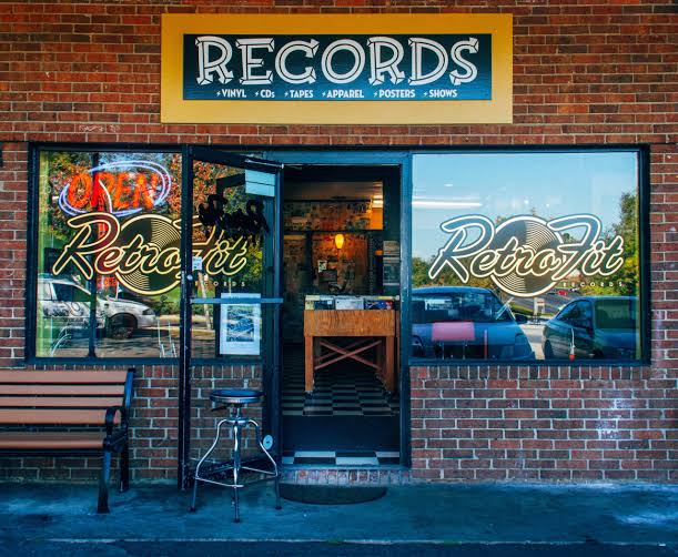
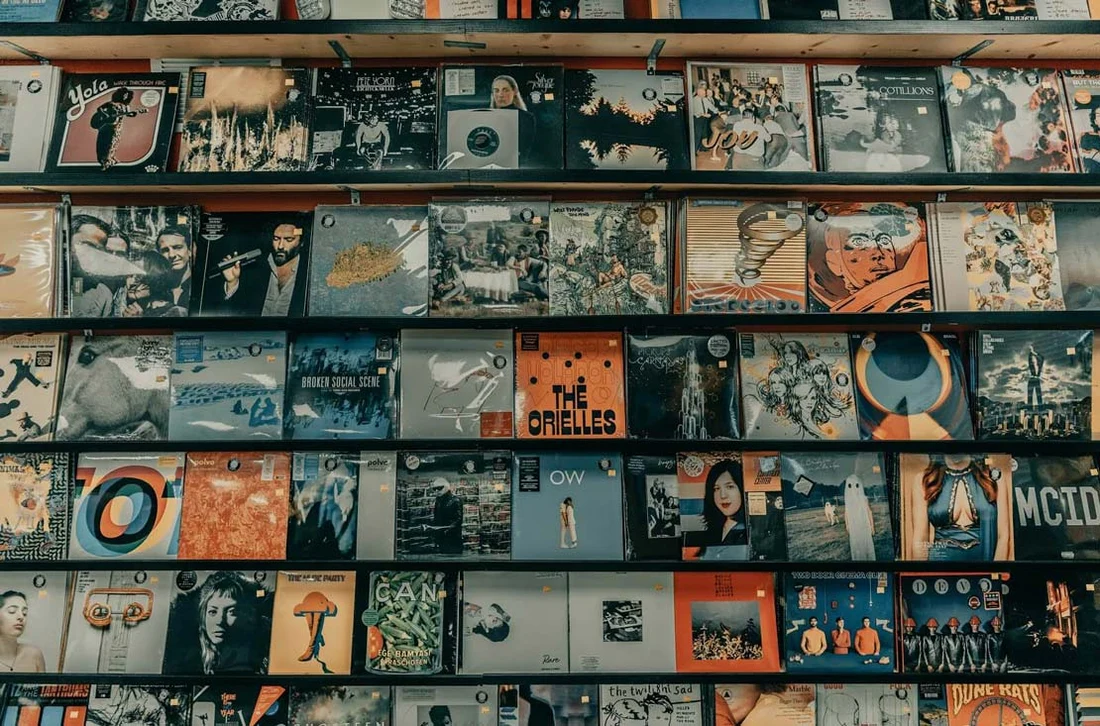
For this assignment, I had absolutely no idea what to do. I tried looking around for inspiration when the idea of incorporating song lyrics came to mind because I listened to music all the time. Once I had the idea of using song lyrics, I decided I could make the project more personal and specifically make use of song lyrics that I really enjoy. When figuring out how to design the project, a few references came to mind: the first being the lyric videos I sometimes see on TikTok (Image 1), the second being the Instagram reels that just have text on a color background (Image 2), and the third being the shared lyrics from Spotify (Image 3).

Image 1
Image 3
Image 2


How this was made:

For this assignment, I wanted to try and use a csv file to store the lyrics so I began by reviewing a video I found titled “p5 js Working with Basic Data + CSV Files” by Jacob Rivkin and the p5 references on csv, in order to get a better understanding of it works. Originally, I planned to only add the lyrics, but once I watched the video and followed along, I decided to add additional information to the CSV file, such as the song title and artists. Once I was able to get the connection to the CSV file working, I added the mouseClicked function so that users can go between the song lyrics. 

After the functionality of the assignment was done, I began working on the visualization of the text. I started with the position of the lyrics, song name, and artist, trying to find a font size and position that would keep each section of text from overlapping because at first when I added alternative fonts some of the longer lyric segments would go a bit off screen due to the font size. In terms of other visual aspects, I tried to keep it a bit simplistic, in a manner similar to the references I had while still having some kind of unexectedness to it, which is where the changing fonts, and text and background color come in. 

Code I’m Proud Of:

async function setup() {
  createCanvas(500, 500);
  
  data= await loadTable('lyrics.csv',',','header' );

  numRows = data.getRowCount();
  songLyrics = data.getColumn('Lyrics');
  songName = data.getColumn('Song');
  songArtists = data.getColumn('Artists');

When I started working on the assignment, I was unsure about how to navigate the CSV files that I almost ended up just using an array to store the lyrics, and at that point I wasn’t even planning to add the other song information. When I found the YouTube video explaining the concept, I found it much easier than I initially thought and was able to incorporate it into my assignment.

Reflection:

Even though I think this is one of the more simple assignments, I think the fact I got to incorporate something I love into it, that being music I personally enjoy, I had more fun throughout the entire process. For future improvements, I would want to add a feature for users to add their own lyrics to be displayed, which I could use to add a more personal touch for the person experiencing the work. Additionally, one thing I wanted to add but wasn’t able to was a gradient-style background, much like the Instagram video reference. As we continue going through the semester, I’d like to come back to this assignment and hopefully add those improvements. 

Week 4 – Reading Response

  • What’s something (not mentioned in the reading) that drives you crazy and how could it be improved?

One thing not mentioned in the reading that could be improved is the car dashboard. Nowadays, many car manufacturers are leaning towards a fully digital car dashboard, moving away from physical control switches, nobs and buttons. I’d like to call this the ‘iPadification’ of cars, a term that may or may not have been used somewhere before, as the dashboards of many modern cars have just become a giant iPad. Many people may think it’s just easier to have everything digitized, but I think when it comes to driving that may not always be a good thing. Focus is very important when you’re on the road, and having the physical buttons and nobs made it easier to tell if you were able to do what you wanted, such as changing the temperature. Additionally, the static nature of physical buttons made it easier to remember where certain features were, allowing drivers to build muscle memory, meaning less focus would need to be given to those tasks. Meanwhile, with a touchscreen, it may be more distracting for drivers, as there are many menus that need to be navigated for different controls, and the overall process may be longer, leading to the driver having to multitask for longer, increasing the chance of them losing focus on the road.

  • How can you apply some of the author’s principles of design to interactive media?

When applying these principles to Interactive Media, since the focus is interaction, I think keeping human-centered design at the forefront is really important. Putting a priority on clearly indicating to users the intention, the means of interaction a project could have, and some kind of indication that something happened represents the affordances, signifiers, and feedback principles, which, for interactive media, may be some of the most important. If a project fails to communicate how it works, what it does, or that something happened, people would likely lose interest in interacting with said project. User attention is also very limited, so for an interactive media project, whether it’s a website, installation, or game, if users are unable to figure out how to use it or if it’s actually working, they will naturally move on, especially if there is another project a few steps away capturing their attention because it has some kind of audio or visual response to the user’s interaction. 

Week 4 – Reading Response

Something that drives me crazy is the automatic entrance doors in C2, because sometimes when I walk towards one of the doors, it does not detect that I am there and stays closed. I usually end up moving towards the other door, only for the original door I wanted to use to suddenly open. I think this relates to Normans ideas of signifiers. There is no clear signifier showing exactly where I should stand for the sensor to detect me, and there is also nothing telling me whether I have been detected. This could be improved by adding a subtle marking showing where the sensor detects people, as well as a small light that turns on once someone has been detected. This would make the interaction much clearer instead of making the user guess what they are supposed to do.


Normans principles can be applied to interactive media by designing with the users perspective and human centred design (HCD) in mind rather than assuming that they will automatically understand how something works. Interactive media should have clear signifiers that communicate what can be interacted with, as well as feedback that clearly shows the user that their action had an effect. I also think mapping is important, because the way someone interacts with something should connect to the result they expect. Overall, Norman’s ideas made me think more about how an interactive experience should communicate with the user through its design, rather than needing instructions to explain how everything works.

Week 4 – Reading Response

  1. “What’s something not mentioned in the reading that drives you crazy and how could it be improved?” 

Something that drives me crazy is the buttons on my hair straightener. Sometimes, while I am primarily using the heat function, the fan function suddenly turns on by itself. I am not sure whether this is a built in safety feature that turns on when the straightener becomes too hot, but I believe this could be improved by applying Norman’s principle of feedback to the design. The straightener could provide a clearer sign of when the fan is activated, rather than having it turn on unexpectedly and without any clear intention of clicking its button from the user.

After reading chapter 1 of “The Design Of Everyday Things” by Don Norman it has become clear to me that when individuals struggle with the design of a product, the issue often lies in poor communication from the designer’s end. Norman therefore introduced the idea of Human-Centered Design which is the ability for a designer to create certain designs around individuals needs, abilities, and behaviors instead of forcing individuals to adapt their capabilities in order to support confusing technologies. 

In order to elucidate his argument, Norman introduced his idea of the fundamental principles of interaction being: discoverability which refers to how easily the user of a technology figures out what they can do. Signifiers are the signals provided to a user in order to broaden their understanding of what to do and where to do it. Affordances which is referenced several times across the chapter and refers to the possible actions that can be done with an object. Mapping refers to the effect of an action or a control that had been designed on an object and how efficient/understandable it is. Feedback should be reciprocated almost immediately and informatively once an action has been taken. And lastly Norman argues that users should be able to develop a clear idea of how systems work through conceptual models. 

Being able to understand these key terms and fundamental principles through Norman’s point of view allowed me to reflect on my previous work in interactive media. I noticed that in some of my previous artworks, I failed to clearly communicate what actions and controls the viewer could take, instead assuming they would automatically understand how to interact with the work. In reality, this assumption could have caused viewers to do nothing, as they may have simply stared at the artwork without interacting with or changing its design as I intended. Therefore, this text brought me to understand that Norman’s principles can be applied to interactive media by allowing interactions to be easily discoverable through clear communications and immediate feedback. For example, if sliding the mouse around the canvas changes the color of the background, this should be communicated in a clear and understandable way through signifying.A clear interaction can also help the viewer understand how their actions and control directly affect and alter the artwork. Understanding these principles will also be meaningful when creating the upcoming video game for our midterm project, as clear instructions and intuitive controls are essential for making the game enjoyable and easy to understand.

Week 4 – Displaying Generative Text Outputs

My Concept: For this assignment, we were tasked to create a generative text output using P5js and the skills that we acquired from class. When assigned the task I immediately thought of creating an artwork that contained the Arabic language and began to brainstorm how I could incorporate this. I then thought of linking this project to the UAE and came up with the idea of using generative text to form the shape and outline of the UAE map through the use of repeated verses of the national anthem in Arabic. This therefore sheds light on Emirati identity and culture whilst also using code to create a generative text output. 

How this was made: Honestly I started off the assignment being really stuck and confused as I was unaware of how I can get the coordinates of the UAE map and allow it to fit into my p5 canvas. I’ve also not had much experience creating my own shapes so therefore I decided to start by watching the Coding Train’s video on custom shapes. After being stuck for a while I decided to ask ChatGPT what the most convenient way of finding the coordinates would be and it said to upload a reference image of the map to another folder and print the image on the canvas using the loadImage function. I later used the mousePressed function to record the coordinates of each point I clicked on the map, which were then displayed in the console. Once I had collected all the coordinates, I added them to a separate folder to keep my code organized and tidy. I then used a loop to connect the coordinates and create an outline of the map. Once the map outline was successfully drawn, I commented out the code that inserted the original image to help avoid confusion and keep the final code cleaner.

Once the outline of the map was created, I stored the national anthem verses in an array which I called “verses” for simplicity. This allows p5 to then randomly select verses from this array. I also used the p5 createGraphics function to create a new layer that is particularly used for the arabic text to be separated from the rest of the canvas before applying the UAE map shape to it. Later, I ensured that the text sizes of the verses varied between 12 and 18, I ensured randomness of the colors of the UAE flag, and random spacing between the verses. The textWidth function that I used was particularly important as it calculated how wide each verse was before adding the next one in order to avoid overlapping. 

Then, most importantly I created a mask in order to keep the text layer primarily inside the UAE map outline. This allowed for only the parts of the text that fell within the UAE shape to remain visible; creating the formation of the map effect. 

Lastly I decided to add some final touches in order to elevate the artwork. I created a sandy background using a beige color; followed by a for loop to add 15,000 small randomly placed ellipses to imitate the effect of sand particles. Each ellipse has slightly different colors, sizes, and transparency, which creates a textured effect that looks like sand. I also decided to incorporate a font that looked like Arabic calligraphy by using the await and load font function. This was pretty easy to do as it required the same skills that I used to upload the image into the canvas. 

Code that I am particularly proud of: I am particularly proud of the way in which I was able to successfully create an outline that looks like the UAE on a map. Despite this being the biggest struggle that I faced when working on this assignment, I am satisfied with the way that it turned out in the end. Initially, I was going to insert all the coordinates required to draw the outline into the main sketch under the draw function. However, I soon realised how messy this would turn out and used a loop that was able to grab the coordinates from a separate folder and create the same effect and outline that I was looking for. 

  // mapImg = await
  // loadImage('UAE.jpeg');
  //image( mapImg, 0, 39, 600, 522);
}

//function mousePressed() {
//console.log("vertex(" + mouseX + ", " + mouseY + ");");}

  beginShape();
  for (let i = 0; i < uaePoints.length; i++) {
    vertex(uaePoints[i][0], uaePoints[i][1]);
  }
  endShape(CLOSE);
}


Reflection and ideas for future work or improvements: Honestly, I am really satisfied with the end result of this project and I do feel as though I was able to successfully display my initial intentions onto the canvas. As for ideas for future work, I felt as though my code could have been organized more efficiently throughout the process as I found myself getting confused with certain functions at some points which forced me to go back and reorganize all of my code from scratch. Therefore I believe that this is a skill that I should carry each time from the start of a project to the end in order to avoid future confusion and uncertainty. As for improvements, I struggled to create the shadow, particularly around the back of the map. Therefore, the shadow appears greyish and white in some areas which I feel creates a sense of visual confusion. In the future, I would like to understand how I can create a more consistent shadow effect to avoid this issue.

Week 4 reading reflection by Daniel Green

Throughout my time of reading Chapter one of this story, I couldn’t help but remember an old Star Wars game that I used to play when I was a little kid with a Nintendo DS. The game, in question, went by the name of “Lego Star Wars: The Complete Saga”, where there was a level in the game’s chapter based on the 3rd Star Wars prequel, Revenge of the Sith, where I was Anakin Skywalker in his yellow plane and I was supposed to fly to a certain destination; however, there was this section of the level where there was a holographic border wall that no matter how hard i tried, i couldn’t bypass it and move on to the next. If I had a dollar for every minute I spent trying to shoot down said wall in order to get through, I’d have enough to buy a $15 burger with fries; not to mention the amount of times in which I tried taking a shortcut around the border wall, but that move was sadly no use! This moment was driving me nuts because the border wall looked as if it shouldn’t be too hard to pass by, but I was having trouble figuring out if I had to either shoot something to disable it or bring something with me to disarm it. After so long, my own brother had to step in and help me figure out that the way to bypass this border wall is by grabbing a purple ball of energy with me and drop it off somewhere near a hexagon shaped bowl that would deactivate the border wall without difficulty. Despite completing the level successfully, I still look back into this memory and think that perhaps there should’ve been some sort of highly responsive clue that would’ve given me an idea of what I should consider finding it in order to move forward through the level faster. I could imagine a mini transparent blue box popping near my Nintendo DS screen popping up and informing me that I need to find this certain ball of energy in order to move forward in the level. Therefore, because of the frustrating situation of this memory of mine, that is why I believe that the idea of signifier, or at least examples of it, should be explained a little more in the reading because the idea can be applicable for any game similar to the one I played where someone is stuck in a section of level and needs a clue about what to do or what to find, similar to my past issue.

All in all, the main principle that I want to try applying into a few of my sketches in interactive media, if possible, is the principle of signifiers. This is because that someone were to face a sketch of mine that required them to activate something via clicking or hovering over an area, but have no idea as to what they must focus on doing in order to achieve said-task, then perhaps a mini clue of sorts should be of existence in order to assist their understanding without holding their hand too much. One has to remember that not all humans share the same intelligence and/or critical thinking skills. It will always be a gamble between whether they are met with a tricky task but are capable of finding out what it is they must do, or they are NOT able to figure out the right course of actions and are in-need of a little hint as to what is the recommended action for them to conduct. It’s as the saying that I think of in my mind goes: the clearer something is without giving too much away, the better performance that you will be able to do in an interactive scenario.

The main idea, from my understanding, is the fact that what makes a video game interactive as it should be is if it is willing to assist the user/player in figuring the right course of action for a task that they are not sure how they must accomplish. The whole thing of an interactive program and the user is for the both of them to be able to communicate with each in order to ensure that they understand each other. Besides, without any tip to help the user move forward in the interactive program, they might as well be staring at a sketch that they cannot interact with any further; something that would make the sketch look like a regular art piece rather than interactive one. Thus, some kind of signifier as to how one can move forward in an interactive program, just like how they’d move forward in a video game, will surely help the sketch stay true to its interactive nature. Overall, these are the thoughts that I’ve gathered from the reading.