Concept
A while ago, I was really into blind boxes with figures. Each time a new collection dropped, I would run from store to store trying to find the exact figure I wanted. But here is the beauty of blind boxes: you never know what you will get. Still, as a teenager with a tight budget but a lot of patience, I found ways to identify the exact figures I needed. The most useful method was simply holding the box and shaking it. Since each figure has its own weight, the feeling in hand and the sound would differ from figure to figure. For my midterm project, I replicated this exact concept, but in a virtual dimension.
A player clicks on the vending machine, also known as the robo-shop, and is then given a choice between nine boxes that look identical from the outside but contain different figures inside. At the top, there is a button that gives an overview of each figure in the collection along with its weight range. The player’s mission is to shake each box and identify their desired figure by the sound it makes.
Making an individual, accurate shaking sound for every single figure with marginal weight differences would be too complicated and difficult to pull off realistically. Because of this, I made one sound per weight range instead (light, medium, heavy). This means it becomes impossible for the player to perfectly identify the exact figure they want just from the sound alone. They know the possible figures and their weights, but do not know which box contains which figure.
This keeps the player more engaged, since they have to rely on careful guessing rather than a guaranteed answer. It also reflects how it actually was in real life, where I would spend hours just shaking and weighing boxes in my hand, trying to figure out which exact box had the figure I wanted, just to find out that both boxes had absolutely different figures than what I wanted, which would send me off to another store, continuing my hunt.
I think this element of luck adds more challenge to the experience and keeps the player more engaged and determined to get their desired figure. It also mirrors the real emotional rollercoaster of blind box shopping, where the uncertainty itself is part of what makes the experience so addictive and exciting in the first place.
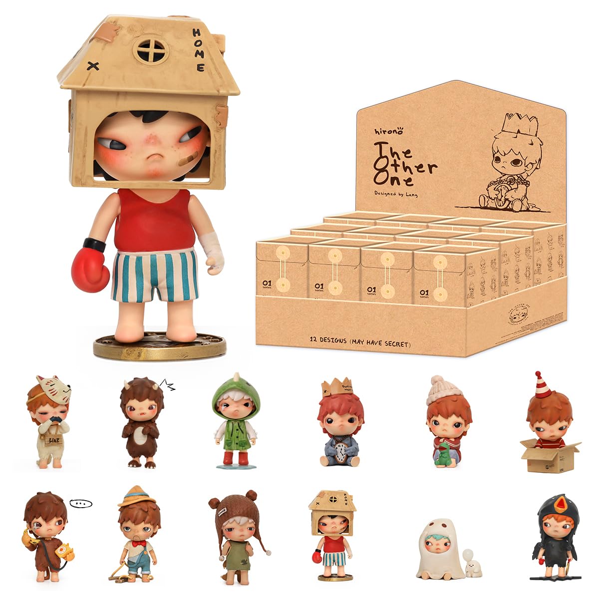
For the figures themselves, I used Popmart’s Hirono “The Other One” series. Hirono is one of the figures I have collected the most myself, and it is also one of the most popular lines among blind box collectors in general. So I thought it would be the most fitting choice for this project. Another reason I went with an existing series is because blind box game needs a whole series of figures and designing an entire original lineup from scratch would take far too much time and level of drawing skill I do not have. Using Hirono’s existing designs let me focus my time on the actual game mechanics.
Parts that went well
Before touching any code, I sketched out the basic flow of the game on paper to work through the core idea first.
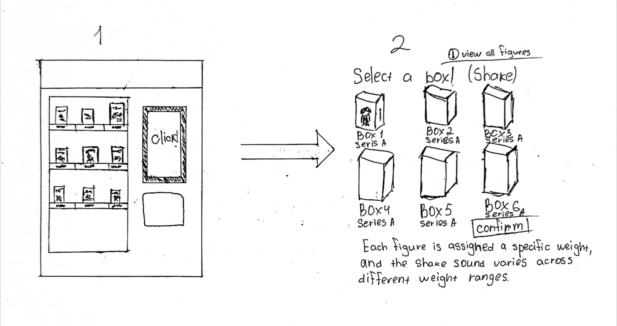
On the sketch you can see two early screens. On the left is the vending machine itself, with a simple grid representing the boxes inside and a small screen next to it. On the right is the box selection screen, where the player picks a box after choosing from the machine.
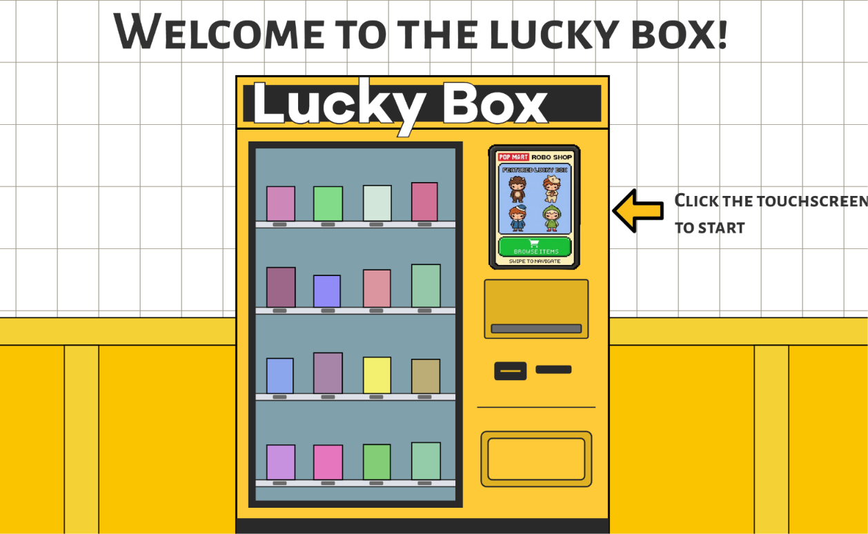
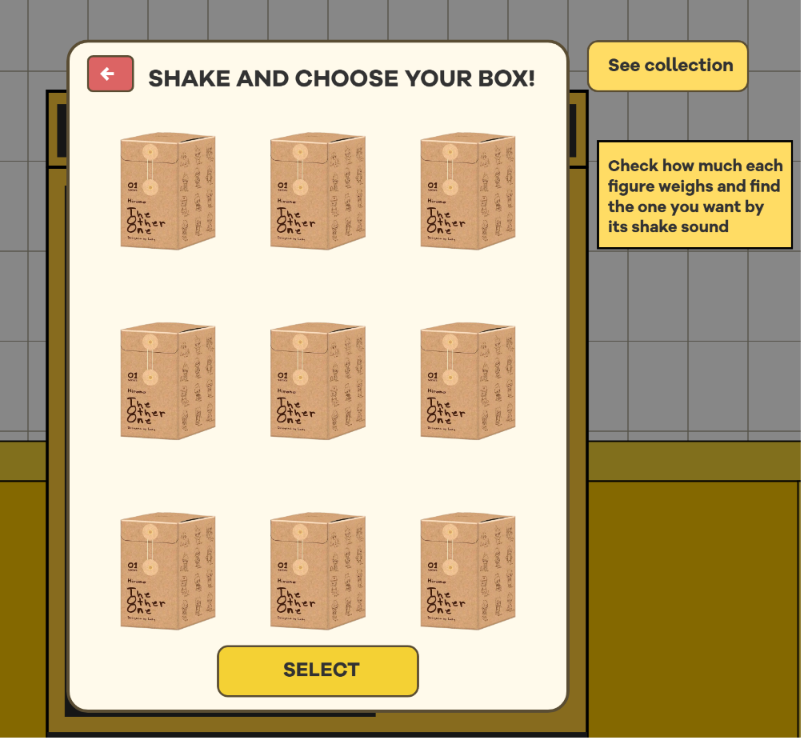
And this is how two screens actually turned out. I added more details to the vending machine, and for the touchscreen I used a pixelated image of actual Hirono figures generated by AI to make it feel more realistic and interactive. I kept the box selection page almost the same as the draft, except it looks less messy.
let pickbox = false
let collection = false
let result = false

// pickbox popup
  if (pickbox) {
    fill(0, 0, 0, 120);
    rect(0, 0, width, height);

    fill(255, 250, 235);
    stroke('#5a4d33');
    strokeWeight(3);
    rect(520, 150, 500, 670, 20);

    fill(50);
    noStroke();
    textSize(24);
    text("SHAKE AND CHOOSE YOUR BOX!", 600, 195);

// collection popup
  if (collection) {
    fill(0, 0, 0, 150);
    rect(0, 0, width, height);

    fill(255, 250, 235);
    stroke(90, 77, 51);
    strokeWeight(3);
    rect(350, 120, 750, 680, 20);

    fill(50);
    noStroke();
    textSize(30);
    text("COLLECTION", 650, 170);

// result popup
  if (result) {
  //very grey overlay
    fill(0, 0, 0, 150);
    rect(0, 0, width, height);

    fill(255, 250, 235);
    stroke(90, 77, 51);
    strokeWeight(3);
    rect(520, 200, 500, 450, 20);

    fill(50);
    noStroke();
    textSize(26);
    text("YOUR REVEALED FIGURE!", 630, 250);


    if (selectedBox) {
      image(selectedBox.img, 640, 280, 280, 280);
      textSize(20);
      text("Weight: " + selectedBox.weight, 705, 570);
    }
Boolean screen states were something I learned to use during this project. It is an interesting way to switch between pages, when you click something, the screen state gets triggered and draws the next page. Clicking a button flips a boolean, and the next frame shows the new popup.
figuresData = [
    { img: hirono1, weight: "light", sound: light },
    { img: hirono2, weight: "medium", sound: medium },
    { img: hirono3, weight: "light", sound: light },
    { img: hirono4, weight: "medium", sound: medium },
    { img: hirono5, weight: "heavy", sound: heavy },
    { img: hirono6, weight: "light", sound: light },
    { img: hirono7, weight: "medium", sound: medium },
    { img: hirono8, weight: "heavy", sound: heavy },
    { img: hirono9, weight: "heavy", sound: heavy }
  ];
 if (selectedBox) {
      image(selectedBox.img, 640, 280, 280, 280);
      textSize(20);
      text("Weight: " + selectedBox.weight, 705, 570);
    }
I used AI to help me find a way to assign each figure its specific weight range and shake sound. The solution was to store every figure as an object in an array called figuresData, with three properties: its image, its weight category (light, medium, or heavy), and the shake sound that matches that category. I needed this because the boxes all look identical, so the game has to remember which figure is inside each one and what it should sound like.
Sketch
(open in fullscreen for proper experience)
Areas for improvement
I think I did a pretty good job recording the shake sound effects, but I realized that for someone who has no experience with shaking blind boxes, it is slightly confusing to tell the difference between light and medium. From my understanding, the lighter ones have more room for movement inside the box, and you can tell that from the sound. Without this kind of context knowledge, though, the difference may be challenging to notice, since the sounds are similar to each other.
I would like to add more figure series to the game, or design my own collection using AI. More series would give the game more variety and replay value, and an original collection would let me avoid depending on existing figures while keeping full control over how each figure looks and how heavy it is.
References
Figures and artwork
Pop Mart, Hirono “The Other One” series
AI tools
Google Gemini to create touchscreen image, also helped to create an array to assign weight and shake sounds to figures
Code and libraries
https://p5js.org/reference/p5/shuffle/
https://p5js.org/reference/p5/mousePressed/
https://p5js.org/reference/p5.sound/
https://p5js.org/reference/p5/fullscreen/
Sounds and music
Background music: Matsuoka, Daisuke, and Asuka Ito. “Map (Night).” Tomodachi Life, Nintendo, 2013.
Tada fanfare sound: https://pixabay.com/sound-effects/musical-tada-fanfare-a-6313/
Shake sound effects: recorded by me