Week 4 – Displaying text

Concept

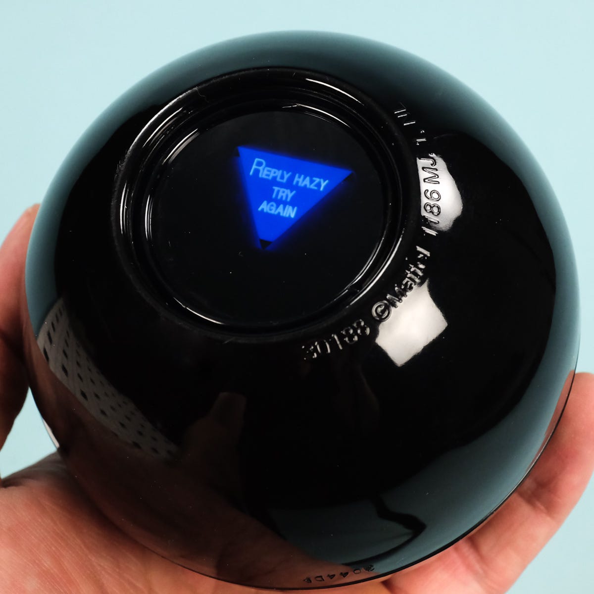
For this assignment I wanted to create something that generates an answer for the user rather than just displaying random pieces of text. I knew that I wanted to make some type of interactive answer giving experience for the user so I thought of making an affirmation box, or some type of fortuneteller and this eventually led me to the idea of a magic 8 ball, since its whole purpose is to answer questions with random responses. My assignment allows the user to think of a yes or no question and then after they click the magic 8 ball, it would give them an answer. The responses are stored in a CSV file and can either be positive, negative, or an unsure answer. I wanted this assignment to feel more alive and playful so I added a moving star background.

Highlight code

// generating answer
  function generateAnswer() {

  let singleRow = [];

  // choose one random row
  singleRow =
  splitTokens(strings[int(random(strings.length))], ",");

  // get the 3 parts from the SAME row
  let start = singleRow[START];
  let middle = singleRow[MIDDLE];
  let end = singleRow[END];

  // put sentence together
  answer = start + "\n" + middle + "\n" + end;
}

// CLICK THE BALL
function mouseClicked() {
  generateAnswer();
}

CSV:

definitely,yes,go for it
most likely,yes,signs look good
without a doubt,yes,you can count on it
probably,yes,things look promising
maybe,yes,but give it time
honestly,no,don't count on it
probably,no,try again later
definitely,no,not this time
unclear,maybe,ask again later
hard to tell,maybe,wait and see

The part of my code that I’m proud of the most has to be the generating answers. I especially enjoyed understanding how random() and splitTokens() work together, with the help of the professors presentations and p5’s reference pages. The program first randomly chooses one row from my CSV filed. SplitTokens() then separates that row wherever there is a comma, allowing me to access each part individually. I learned that this feature is a way to split strings into pieces. One thing I changed from the class example was how the randomness worked. In the poetry example, different rows could be randomly selected, and mixing unrelated words was part of the generation of the poem. But for my magic 8 ball, I didn’t really want to create answers that didn’t make sense and contradicted itself. For example, if I didn’t use split tokens, I could end up with a result saying

Definitely

No

You can count on it

And that wouldn’t have made sense. Instead, I randomly select one row and keep all three parts of that row. This allows the result to be random but still making sense as an answer. I think this was the part where I understood the purpose of the CSV and arrays the most.

Embedded sketch

How this was made

I started by drawing the magic eight ball using the basic P5.JS shapes. I used a reference photo from online to try to mimic the colors and shapes included. I also added a custom font from Google fonts for the title. At first, the font was not working and I wasn’t really sure why. I realized that the name I was using in P5 did not match the actual name of the font file I uploaded. So all I had to do was change the name to make sure both uploads are the same. Once I fix the file name, it worked. I also learned that after using textFont() for the title, P5 continued using that font for the other texts. I only wanted that font for the title so I had to change the font back to Ariel before displaying the magic 8 balls answer.

I wanted the background to have some movement and motion instead of being completely still, so I used everything that I learned last week about classes and raise to create the stars. Each star object has its own x and y position and speed and I stored the stars inside in array and used a loop to move and display all of them. It’s similar to my last assignment, where when it reaches the end of the canvas it returns to the bottom so the movement continues.

For the main text generation, I used loadStrings() to load the responses from a CSV file. Each rule contains three parts of one answer separated by commas and when the user clicks, random() selects a row and splitTokens() separates it into three parts. I then combine these parts with \n so they appear on separate lines inside the triangle. I used P5.JS and the code examples from class as references for the code structure, Google fonts for the title, and ChatGPT to clean up silly mistakes I made when it came to writing the code.

https://p5js.org/reference/p5/splitTokens/

https://p5js.org/reference/p5/push/

https://p5js.org/reference/p5/loadStrings/

https://p5js.org/reference/p5/loadStrings/

https://p5js.org/reference/p5/int/

https://fonts.google.com/selection?lang=en_Latn&categoryFilters=Feeling:%2FExpressive%2FFuturistic&preview.script=Latn&preview.lang=en_Latn

The Magic 8 Ball: What I learned from it | by Two Guys Who Blog | Medium

Reflection 

I enjoyed this assignment because I initially thought generating text would mostly just be putting random words together, but this assignment showed me that text is organized in its own way, depending on how you decide to use it. One challenge was making sure the random answers actually made sense. At first I was selecting each section from a different random row, but that created contradicting answers. If I continue working on this project I would like to make the magic 8 ball to be more interactive. For example I could make it shake for a few seconds before reviewing the answer. Overall I’m very proud of how it turned out and how I use my creativity when it came to displaying text.


Week 4 – Reading

While reading the chapter I really enjoyed how conversational it felt. Instead of overwhelming me with a bunch of theories, the author used stories about everyday things that included confusing doors, and the hotel sink that he couldn’t figure out how to drain. I felt like those examples were funny and lighthearted but at the same time they made his ideas much easier to understand. Before reading this, I honestly thought that if I could not understand how to use something, it was probably just my fault. Something that drives me crazy is when I click a button on a website, and nothing happens, so I don’t know if my click actually worked or not. This could be improved by giving immediate feedback, like changing the button or showing a loading symbol. Norman made me realise that sometimes the design itself is failing to communicate with the user. The quote that really stuck with me was, “profound ideas are always obvious once they are understood.” This really emphasised how good design can feel obvious even though a lot of thought goes into making it that way. The whole point is for it to look effortless and feel like it’s easy to apply, in the users point of view. 

I wanted to connect this to my assignments that I’ve been doing on P5, I realise that I usually focus a lot on aesthetics, like colors, fonts, and how the layout looks like overall. Now I am thinking more about whether someone opening my project for the first time would actually know what to do. Norman explains that good designs should communicate what actions are possible and how to perform them. That made me really focus on how I want my assignment this week (and the rest of the weeks) to be shown. I want my instructions and interactive elements to feel natural instead of making the user guess. This reading changed how I think about design because now I see that the visual part isn’t always the most important part, even though it’s the first thing you see, it’s still needs to be understandable in order for the experience to be clear.

Week 3 – Reading

The reading was actually so much more interesting than I thought it would be. I like that Crawford included playful moments and examples throughout because it kept me more interested while he was trying to explain an idea that could have easily felt more technical. To me, there was one line that really stood out, and that was when he said “interaction is not reaction on a higher plane of existence.” At first I didn’t really think that there was even a difference between reacting to something and interacting with something. I assumed that if something made me feel involved or allowed me to do something, then that was already interactive. Crawford made me question all of that. This also changed my way of thinking about interactions with Code. A computer is not automatically interactive just because I can click something or because something on the screen gets a reaction out of me. Interaction is more like a conversation.

He says both sides need to listen, think and respond. This made me look at the assignments that I’ve been doing in a completely different way. Instead of only asking whether the user can click or move or control something, I started to think about how the computer responds to what the user does and whether there’s a real back and forth happening. I used to think adding something like mousePressed()  automatically made a project interactive because the user could affect it, but now I know it’s beyond all that. So my biggest takeaway from this reading is definitely that interaction is much less simple than I originally thought it was.

Week 3 – Functions, Arrays, and OOP

My concept:

When it came to thinking of what my concept should be this week, I wanted it to somehow relate it to current times. It might not be apparent in this country, but it is autumn season and I decided to portray the fall aesthetic to this assignment. Using classes and arrays, I wanted it to create an interactive scenery. My idea was, having leaves falling off a tree while also having the user have the ability to click the screen and add even more leaves. I wanted the overall code to give off warm and calm vibes in order to emphasize the true feeling of autumn. I used mostly brown, oranges, and yellows to achieve this. In my last assignment I said if I could do anything to elevate my code, it would be randomness, and that’s exactly what I did. The colors of the leaves are all random. I also added a windy motion in order for the falling to look more realistic.

Highlight of my code:

 //leaf class
class Leaf {

  constructor(x, y, size, speed) {
    this.x = x;
    this.y = y;
    this.size = size;
    this.speed = speed;

    // random colors leaves
    this.leafColor = random([
      "#c85d3a",
      "#e58b3a",
      "#d9a441",
      "#a94432",
      "#7a4a00"
    ]);
  }


  move() {
    

    // fallinf down
    this.y = this.y + this.speed;


    // windy
    this.x = this.x + 0.5;


    // returning to the top
    if (this.y > height) {
      this.y = 0;
    }
  }


  show() {

I’d like to say that the highlight of my code is my leaf class. This was my first time working with classes, so I was defiently proud on how it all came together and how I made multiple leaves with their own size, color, and speed. I also used random() to choose between different autumn colors, which helped make the leaves look less repetitive. My favorite part is the move() function because it makes each leaf fall while slightly moving to the side to give it a windy effect. I also added an if statement so when a leaf reaches the bottom, it returns to the top and continues falling. I made it so if the leaf goes pass the canvas, it moves back to the top. As the leaf falls, the y gets bigger and bigger, until it becomes bigger than the height. That’s when it goes all the way back.

How this was made: 

I started off with just a tree branch and a bunch of leaves falling. It felt very dull and plain, and the opposite of what I wanted the viewer to feel. I went on Pinterest to get some autumn inspiration and got inspired by the pale orange sky and the clouds. So I decided to make some more leaves on the branches and on the ground to give a more alive look, as well as some clouds and a sun, all using ellipses. Besides the overall look, I also worked on creating the leaf class that controlled every leaf. Inside the class, I used a constructor to give each leaf its own position, size, speed, and color. I wanted the falling leaves to give me realism so I added the move and show functions. The move() function makes the leaves fall down while also slightly moving to the right to give the effect of wind. The show() function draws each leaf on the screen. I also used an array to store all the leaves object. And a loop that  goes through the array and moves and displays every leaf. I also used mouse pressed so that whenever the user clicks, a new leaf is created at the mouse position. I think a struggle I had was thinking about how I wanted the leaves to fall down. Having them fall all straight looked very unnatural, so I added a small change to their x position to make it look like the wind was pushing them sideways. ( this.x = this.x + 0.5; ). The references helped me significantly when it came to recalling some steps like loops and mouse pressed.

This may contain: a tree with lots of leaves on the ground

References:

https://www.pinterest.com/search/pins/?q=fall%20and%20autumn%20aesthetic&rs=ac&len=12&source_id=ac_hoiAF6sn&eq=fall%20and%20aut&etslf=5522

https://p5js.org/reference/p5/for/

https://p5js.org/reference/p5/class/

https://editor.p5js.org/Aya_Riad/sketches/Wky6-ythQ

Reflection:

I liked how the ending product ending up looking. It has a moving effect that I’m very proud of, and i’m glad I got to learn how to use class and arrays. I think using random colors, sizes, and speeds helped make the leaves feel less repetitive. I also feel like I paid more attention to the aesthetics in this assignment and I feel like the outcome was defiantly worth the effort of creativity. Maybe if I had to work more on this, I’d play around with the movement of the clouds as well. Or maybe learn how to make a more accurate looking leaf, and different types of leaves. Overall, proud.

Week 2 – Reading

Before finishing the video, I genuinely thought that randomness in code is something that simply makes the outcome unpredictable. I didn’t think of randomness as something that could be controlled by the artist, as for the name, random. But throughout watching the video, the idea that stood out to me the most was the relationship between rules and chance. In the middle of the video the lecturer included a quote. “Above all, it’s never a blind chance, it’s a chance that is always planned but always surprising.” I found this saying very interesting because it almost sounds like a contradiction at first. In the beginning I didn’t really get it because how can something planned be considered something with chance. However as the video went on I started to understand that an artist can plan the boundaries without actually planning the exact outcome. Even when a computer is producing different results, the artist is still the person who creates the system and decides what is allowed and what is not allowed.

This concept started to really make sense to me because I feel like it really connected with what I am doing in class the past few weeks. In my work I would want to incorporate randomness through things like colors, sizes, positions, or patterns. I personally would still not give up complete control because I would still have an idea of what I want my artwork to look like, however adding randomness can balance out into something more artistic than it seems. The video made me realise that randomness does not necessarily mean losing control. Instead I can control the rules while allowing the computer to surprise me with what happens within them. Overall, this video made me feel a sense of spontanousness with a balance of structure. All the examples given in the video really inspired me and opened my eyes to new forms of code and graphic designs.  

Week 2 – Animation, Conditionals, Loops

My concept: 

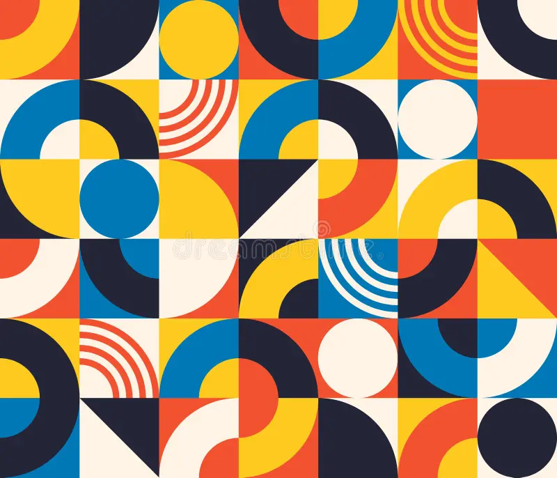
For this assignment, I wanted to create a simple yet impressive work of art. In order to make it visually interesting, I decided to emphasize the geometric patterns using different colors and shapes. I got inspired by a graphic design I found while searching for magazines. The reason why it stood out to me is because of how the simplicity of shapes created a complex looking outcome. I also incorporated what we learned in class, including loops, the circleSize pulses, and if/else statements. I decided to add the pulse effect to make my art work feel less flat. An interactive element was also used, where the user could click the screen to change the theme of colors. There are 4 different color themes, after it goes through all 4, it goes back to repeat.

Highlight of my code:

I’d like to say my favorite part of my code has to be the interactive element. Every time you click, the theme number increases and the colors of the artwork change. The reason why I’m proud of this specific part of my code is mainly because I got to incorporate something I learned in high school into my work. It’s a pretty simple code, yet it led to the most creative part of my project. I numbered every shape, and depending on how many times you click, decides what color theme is picked. Because I didn’t want to make the code confusing and overwhelming with a huge list of colors, I made some shapes set as a permanent color. I filled the half circles and a rectangle to a beige color to somehow still have a link or unity to all the themes.

// ORIGINAL COLORS
  if (theme == 0) {
    color1 = "#f45132";
    color2 = "#ffca28";
    color3 = "#0781b7";
    color4 = "#202236";
  }

  // PURPLE COLORS
  if (theme == 1) {
    color1 = "#74a7fe";
    color2 = "#874efe";
    color3 = "#b18cfe";
    color4 = "#7b219f";
  }

  // BURGUNDY COLORS
  if (theme == 2) {
    color1 = "#5c0700";
    color2 = "#791a3e";
    color3 = "#9a244f";
    color4 = "#00364a";
  }

  // B&W COLORS
  if (theme == 3) {
    color1 = "#d6d6d6";
    color2 = "#7a7a7a";
    color3 = "#444444";
    color4 = "#232323";
  }
function mousePressed() {
  theme = theme + 1;

  if (theme > 3) {
    theme = 0;
  }
}


Embedded sketch:


How was this made:

I started off my code by dividing the screen into 4 rows. I started creating my shapes, alternating between rectangles and ellipses, depending on which shape I want to be overlapped. When I decide to add the pulsing effect on the ellipse, I add the circleSize code into the coordinates. When it came to the third row, i wanted to add repeated lines. I thought that was the perfect time to practice my loop code. Instead of coding every line individually, i only had to coordinate the first line, and duplicate the rest. It moved 10 units to the right until I got all my lines in order. When it came to the clicking to switch the theme part, I had to google how to do. Fortunately, the first like I found was the reference page teaching me how to use mousePressed. https://p5js.org/reference/p5/mousePressed/ And of course, the whole inspiration to my art was an abstract patterned magazine design that immediately caught my eye. I tried my best to match the colors as well. https://www.dreamstime.com/bauhaus-seamless-pattern-abstract-square-tiles-circle-triangle-retro-print-minimal-style-geometric-figure-vector-image217690822 After some advice from my professor, I later added another loop to create the rectangles in the background. Instead of coding each rectangle individually, the loop automatically moves 100 pixels across and down the canvas, making my code shorter and more efficient.


Reflection:

I really enjoyed this assignment but if I had to change something, it  might be to change the shapes and experiment a bit more. I would decrease the size of the shapes in order to make it look more pixelated, and give it an old computer effect. I would also try to add a new moving effect that doesn’t require any input from the user. Like moving shapes or changing colors. After watching the video as well, I would’ve liked to incorporate more randomness. Overall, I’m very proud of my work and use of class material. I’m happy with how interesting it is to look at and how much effort i put in order for that to happen.


Week 1 – Self Portrait

My Concept:

As this was my very first time coding in p5, I wanted to make sure I created a portrait that represented me but still simple enough to build with the coding skills I’m learning. I decided to incorporate my hijab in this assignment to really showcase my national identity. I wanted to emphasize on the shapes by making my portrait cartoon style. I’m pretty satisfied with the outcome and I’m glad it all came together at the end.

Highlight:

One of my favorite parts of my code has to be creating the eyeliner. Although it seems like a small detail, it took me a while to mirror it properly. I’m also not the best at triangles, so this really got me practicing. I really wanted to include the eyeliner into my portrait because it added some individuality to an otherwise simple portrait and made it feel more me. Anyone who knows me knows I love incorporating eyeliner into my look, so this made my portrait feel more personal. The lashes were also something I was proud of. Simply because I thought it elevated the eyes more.

// left lashes
line(151, 208, 145, 202);
line(156, 205, 153, 198);

// right lashes
line(249, 208, 255, 202);
line(244, 205, 247, 198);

//eyeliner
triangle (152,218,140,207,150,210);
triangle(248, 218, 260, 207, 250, 210);


Embedded Sketch:

How this was made: 

I mainly used what I learned in class to create my self portrait. I started with the ellipses to build the main parts, which include the body, the face, the eyes, and the hijab. I wanted the shapes to really be emphasized, so I tried my best to incorporate almost all of them. Sometimes I had to go back to p5’s reference page when I forgot how the coordinates go. (https://p5js.org/reference/)  I also looked at last years projects to help me better understand how to utilize the arc code. There was an error to my code which I couldn’t figure out, and that is when I used AI to help me fix it. Turns out I added one too many coordinates to one line. Overall, the portrait was built from what I learned and experminetd myself.

Reflection:

This assignment made me so much more comfortable with using coordinates and understanding how different shapes can come together. Something to reflect on is how time consuming mirroring can be. I wanted my portrait to be symmetrical and I tried my best to do so. In the future I’d like to experiment with a moving element and more complex shapes, and possibly some interaction. Overall, I am very satisfied with both the process and the final product.