Week 4_Data Visualization

Concept

As a big movie lover, I decided to visualize the popularity of movies released this year by creating a movie theater. I used worldwide box-office gross as a measure of popularity, with each audience member representing a fixed amount of revenue. Therefore, the higher the movie’s gross, the larger the audience in the theater.

Progress

I started by splitting the data into the movie name and its gross revenue, then adding them to the movies array I created. After that, I began working on the visuals, such as the seats and projector. I also added yellow light coming from the projector to make it more cinematic. I then created the circles that represent the audience and had them spawn on random seats. I did not want the audience to look too messy, so I used specific Y-coordinates that are chosen randomly, which keeps the circles organized while still making their positions feel random.

To make it easier to distinguish the large number of audience members, I also changed the color range of the circles instead of having them all be the same color. Finally, I calculated the number of circles based on each movie’s gross revenue by dividing it by 10 million. I felt that this was a reasonable scale because it allowed the differences in revenue to be visible without creating an overwhelming number of circles.

My Code Highlight

What I am most proud of is the interactive part of the project. It was a bit tricky, especially figuring out the calculations and making the number of audience circles change depending on which movie is selected. I used conditions based on where the mouse was clicked to determine which movie was selected. To make the interaction more obvious, I also changed the button color when it was clicked so it is clear which movie is currently selected.

One cool thing I learned was how to add my own font. I had to add the font link to the index.html file, and then I was able to use the font in my p5.js project.

//////CHANGE NUMBER OF AUDIENCE WHEN CLICKING ON A MOVIE//////
function mouseClicked() {
  for (let i = 0; i < movies.length; i++) {
    let x;
    let y;

    if (i < 3) {
      x = 45 + i * 185;
      y = 40;
    } else {
      x = 140 + (i - 3) * 185;
      y = 140;
    }
    if (mouseX > x && mouseX < x + 140 && mouseY > y && mouseY < y + 70) {
      selectedMovie = i;
/////RESET CIRCLES AND DRAW NEW ONES WHEN CLICKING ON A MOVIE//////
audience = [];
drawAudience();
    }
  }
}

Reflection

I’m really proud of this project, and I think I utilized the things I learned in a good way. If I were to improve it in the future, I would spend more time making the visuals more detailed, such as adding more realistic theater elements and improving the layout and typography. I would also like to give the user more options, such as adding more movies to choose from or allowing them to interact with the audience in different ways.

Week 4_Reading Respone


While reading The Design of Everyday Things, I found the author’s principles of good design agreeable, but I felt that he was a bit biased. He mainly put the blame on the machine and the design, including the engineers and designers, but said little about the user. I think everyone contributes to a product’s efficiency because there are many people who can be oblivious to simple instructions and fail to utilize the product properly. However, some of his examples were exaggerated. For instance, he made the door example seem like a bigger problem than it actually is. On top of that, he kept repeating many of the same points, which felt distracting to me.

One of the design failures that drives me crazy is oversimplification. The author touched on it, but I want to dive deeper into it. I think minimalism is one of the reasons for this. It has become a new aesthetic to avoid having many labels and other visual elements, which can lead to little to no signifiers. You can barely find symbols on some devices, let alone clear instructions. Because of this, I think simple designs do not necessarily equal effective designs. We need to move away from prioritizing the minimalist aesthetic and instead include understandable signifiers. It may not result in the simplest-looking design, but it would make the design more understandable.

I think the principles mentioned in the reading are incorporated directly into interactive media because having good design means creating a better interactive experience, as long as those principles are applied correctly. Feedback, for example, directly relates to interactivity because it makes the system seem like it is responding to the user’s input. It can be applied through audio, or through a visual change, which enhances the overall experience and satisfaction. But to me, discoverability is the most important one because if this principle is not applied correctly, then everything that comes after loses importance. If you never understand how the device is supposed to work, then why would you give attention to the other principles? This is especially important in interactive design, where mutual understanding is an important factor to consider.

Week 3_Reading Response

After reading the chapter, I kind of agree with the author’s definition of interactivity, and I liked how he used conversation as an example. I also think the author put into consideration the different perspectives on what interactivity means. I understand why some definitions may seem subjective because people find it easier to relate one meaning to another word, but by doing that, the meaning can become more vague and less accurate. This can cause people to misunderstand or misuse the word in different contexts.

One of the things that grabbed my attention was the difference between reaction and interaction. A reaction is more of one action responding to another action, while there is no real ongoing exchange between the two. For instance, the branch-breaking example in the chapter, something happens, you do another action in response, and then it ends. Interactivity, on the other hand, is a give-and-take relationship where influence is an important part of the process. The user influences the computer, but the computer also influences what the user does next.

I think to build a successful interactive system, you need to have clear guidelines so both the user and the computer can understand one another. What are they communicating? How is the computer listening to the user, and how is it responding? With all of that comes the idea of influence: how is the user influencing the computer’s behavior, and how does the computer influence the user in return? You cannot just add a random interaction and call it a day. There needs to be a purpose behind it. Are you trying to get across a message? Is the program dependent on the user’s choices? For my p5 sketches, I think I could make the interaction more meaningful by letting the user’s actions actually influence how the artwork develops, and also give the user more control over what they can influence.

Week 3_Generative Art

Concept

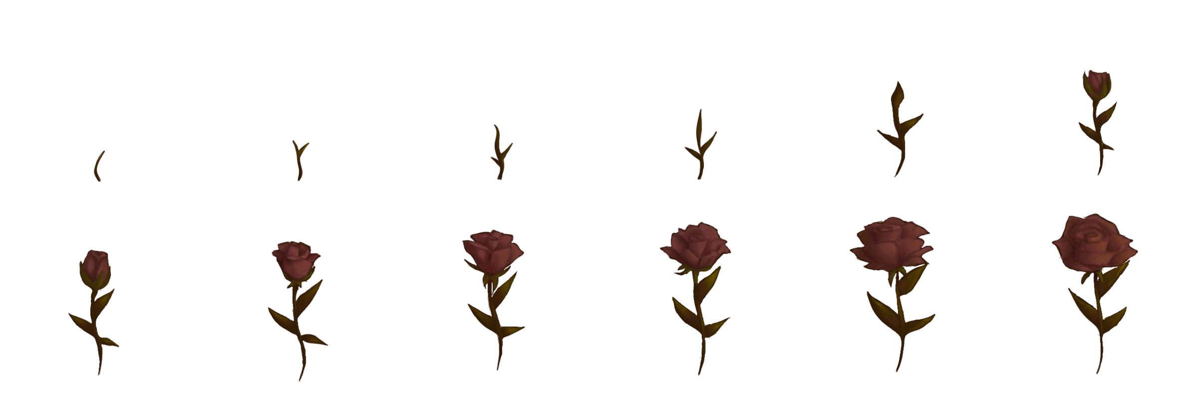
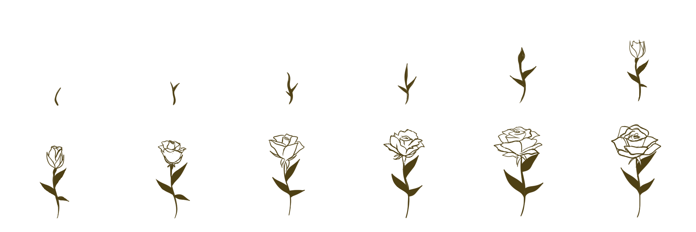
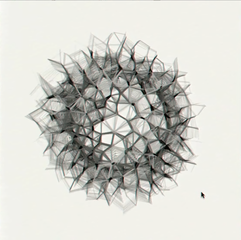
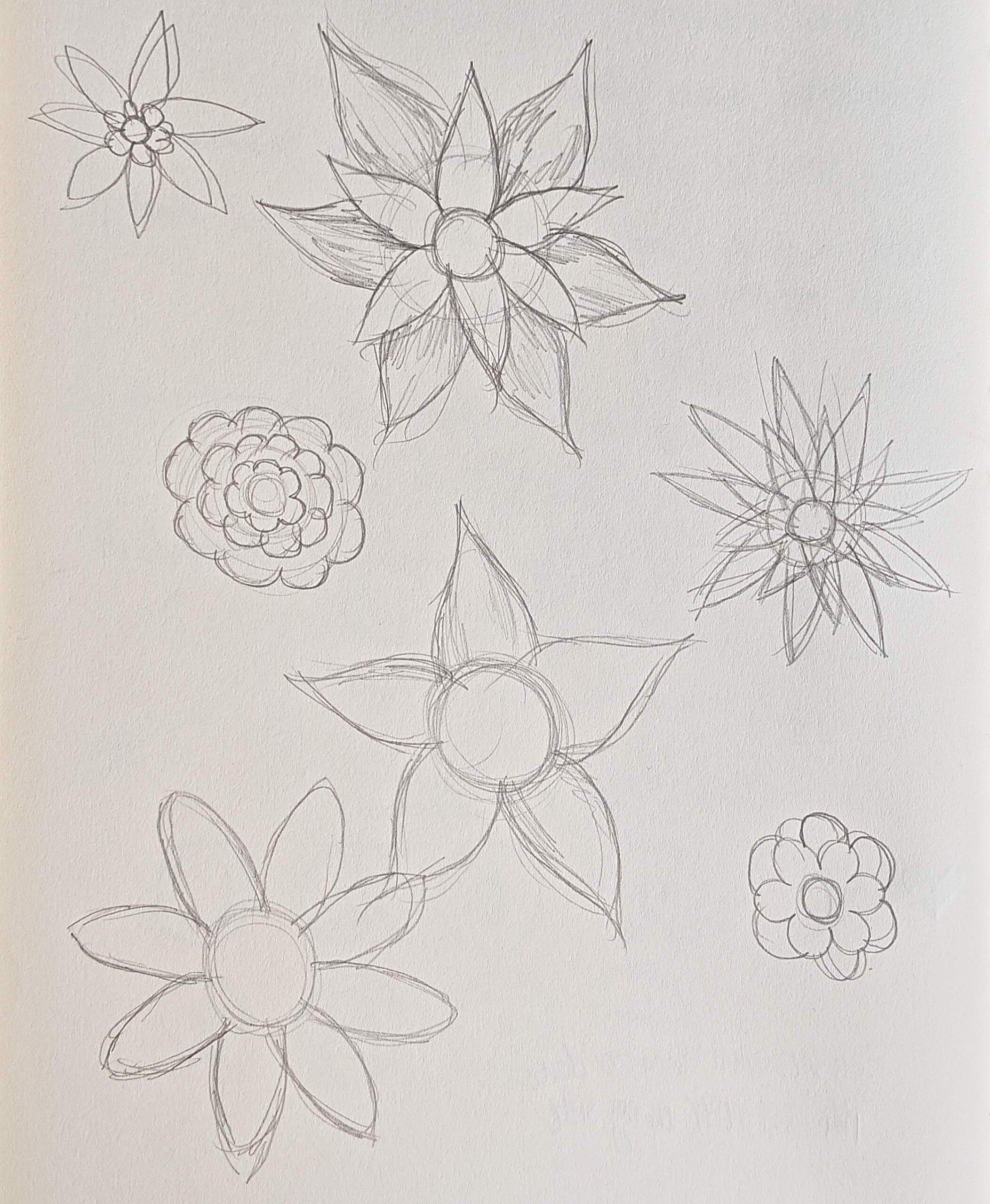
The main inspiration for this project came from a certain artwork in Casey Reas’ Eyeo talk on chance operations. I really liked the idea of shapes emerging from within other shapes, so I wanted to explore that idea through something more natural. What better example of something emerging than a flower blooming? I sketched a couple of different flower shapes first so I could have them as references while coding.

Progress

I started by creating a class for the flowers and defining their properties. Then I drew the flower and its petals, and used a for loop to add multiple flowers to an array. After that, I experimented with adding inner petals to each flower, which made the blooming process more visible.

But one problem I ran into was figuring out how to make the inner petals appear after the outer petals instead of growing at the same time. I wanted the flowers to feel like they were actually blooming. I solved this by making the inner petals start growing only after the outer flower reached a certain size. This created a delay between the two layers and made the blooming process feel more realistic. I then added different colors to the outer and inner petals and made sure they were not the same color.


While looking at the result, I noticed that all the flowers had the exact same angle of rotation, which made them feel too repetitive. I changed the rotation to be random for each flower, giving them more variation and a more natural feeling.

Finally, I wanted to add an interactive element. I imagined the mouse cursor as a kind of magical sensor: when it gets close to a flower, it makes the flower bloom faster. This makes the viewer feel like they are affecting the growth of the flowers just by moving through the artwork.

//INCREASE GROWTH SPEED WHEN MOUSE IS NEAR FOR OUTER PETALS//
   let distance = dist(mouseX, mouseY, this.posX, this.posY);
   if (distance < 80) {
     this.size += 0.7;
   } else {
     this.size += random(0.05, 0.5);
   }
   //DELAY THE INNER PETAL SIZE INCREASE//
   //INCREASE GROWTH SPEED WHEN MOUSE IS NEAR FOR INNER PETALS//
   if (this.size > 12) {
     if (distance < 80) {
       this.innerSize += 0.6;
     } else {
       this.innerSize += random(0.2, 0.4);
     }
   }

Reflection

I am really proud of this project because I explored many different ideas and developed a deeper understanding of the concepts I was working with. If I were to alter anything, I would experiment with adding more variations to the flower shapes. However, I chose not to include this in the final piece because I felt that too much variation could make the artwork feel messy and take away from the blooming effect.

Week 2_ Generative Art

Concept

After browsing tons of references and inspiration, I decided to make something with dimensions that feels deep and interesting to look at. So I decided to work with triangles because I think they create cool shapes when overlapped. I wanted to keep it simple, but with a deeper feeling.

Progress

I started by creating triangles with random coordinates, but to give them a more unified and organized look, I kept one end of the triangles unified at a certain point. I then gave them random shades of grey with transparency to create a deeper feeling. After watching YouTube videos, I learned the crosshatching technique, so I decided to add it to give the piece more texture. Then, I decided to add color to experiment, so I created a colour palette and added it. The references I used were mostly YouTube videos and the examples attached to the course website.

My Code Highlight

Although it’s not complex, I really like the crosshatching part of my code. I think it can be used in a lot of artworks to give them nice texture and feeling, especially because of how easy it is to code.

for (i = 0; i < 1000; i++) {
      stroke(0, 20);
      rect(random(width), random(height), 50);
      circle(random(width), random(height), random(20, 80));
    }

Reflection

After this project, I think I’m better at handling the basics, so I want to experiment more. I am hoping to incorporate more animations and try out more complex shapes, as well as, use symmetry and grids. But most of all, I want to create more 3D-like art pieces and experiment with making my work feel more dimensional.

Week 2_ Reading Response

After watching the video, I realized that I tend to focus on precise lines and shapes in my drawings. You could say I’m a perfectionist. When you’re holding a brush, you’re the one controlling its movement. Every stroke is intentional, and every move is calculated. I think that’s how I’ve always understood order in art: everything is controlled and deliberately placed.

But what fascinated me was his take on order and chaos, and how they coexist in every art piece. It actually changed my perspective on what order is in art. It’s not necessarily about perfection, but about control. You can “guide” the lines in a certain way to shape a meaning without having to control every single detail. For example, when mixing a colour palette using acrylic, you might not always get the exact colour you wished to achieve, and that’s the beauty of it.

I agree with his view on control, and how you decide how far you push it and how far you constrain it. I think it all comes down to knowing and choosing which elements to alter and which to keep unpredictable. And just like he also mentioned, you might get a little inspiration from things you never would have thought of.

week 1 self-portrait

Concept

For this assignment, I decided to approach the project from a more artistic perspective. My vision was to create an abstract artwork using a variety of shapes and colors. Therefore, I focused more on the visual composition and construction of the shapes rather than on interactivity.

Progress

Before beginning to work on the code, I sketched what I had in mind in a sketchbook. This made it easier to plan and determine where each part would be placed. I then went on YouTube to look for tutorials on how to code curves, which are a major part of my assignment. After finishing the line art, I began working on the colors and adding different shapes. I also decided to create some of my own shapes, such as the flower, which was fun to experiment and try out. Lastly, I wanted to add something more to the background, so I looked up different pattern examples for inspiration.

My code highlight

A part I am proud of is the pattern I created for the background. It was something new and interesting for me to learn, and I enjoyed seeing how a simple pattern could make the overall artwork feel more complete. I wanted to experiment with different types of patterns and explore how they could change the mood of the artwork, but unfortunately, I did not have enough time to try them out.

background(80,150,70, 150)
  fill(80,150,0);
  strokeWeight(3);
  rectMode(CENTER);
  let space = 50;
  for (x=0;x<width+50;x+=space){
    for (y=0;y<height+50;y+=space){
       line(x,y,x+space,y);
       line(x,y,x,y+space);
      circle(x,y,5)
      stroke(200,100,150,150)
      circle(x,y,15)
    }
  }

Reflection

There were many things I was hoping to add to my project. One of them was an interactive element, which unfortunately was not working for some reason. I also wanted to add more details and elements to make the artwork feel even more abstract and visually interesting. For my future projects, I hope to learn more about animation and explore different ways to make my projects more interactive. I also want to learn more tips and techniques that can help me code more efficiently and speed up my workflow.