Midterm Project
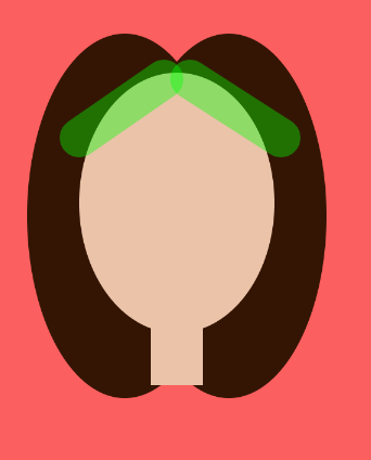
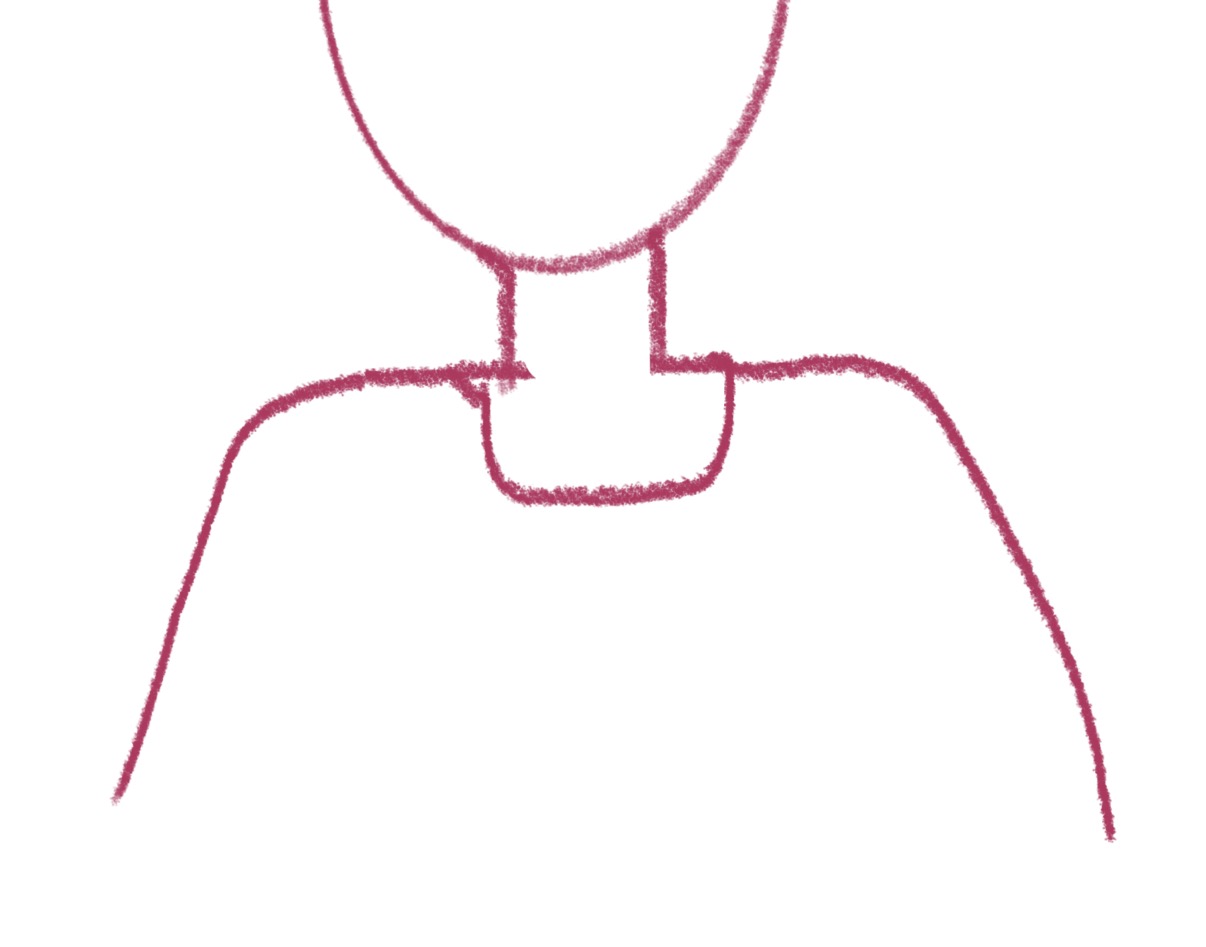
My Sketch
Documentation
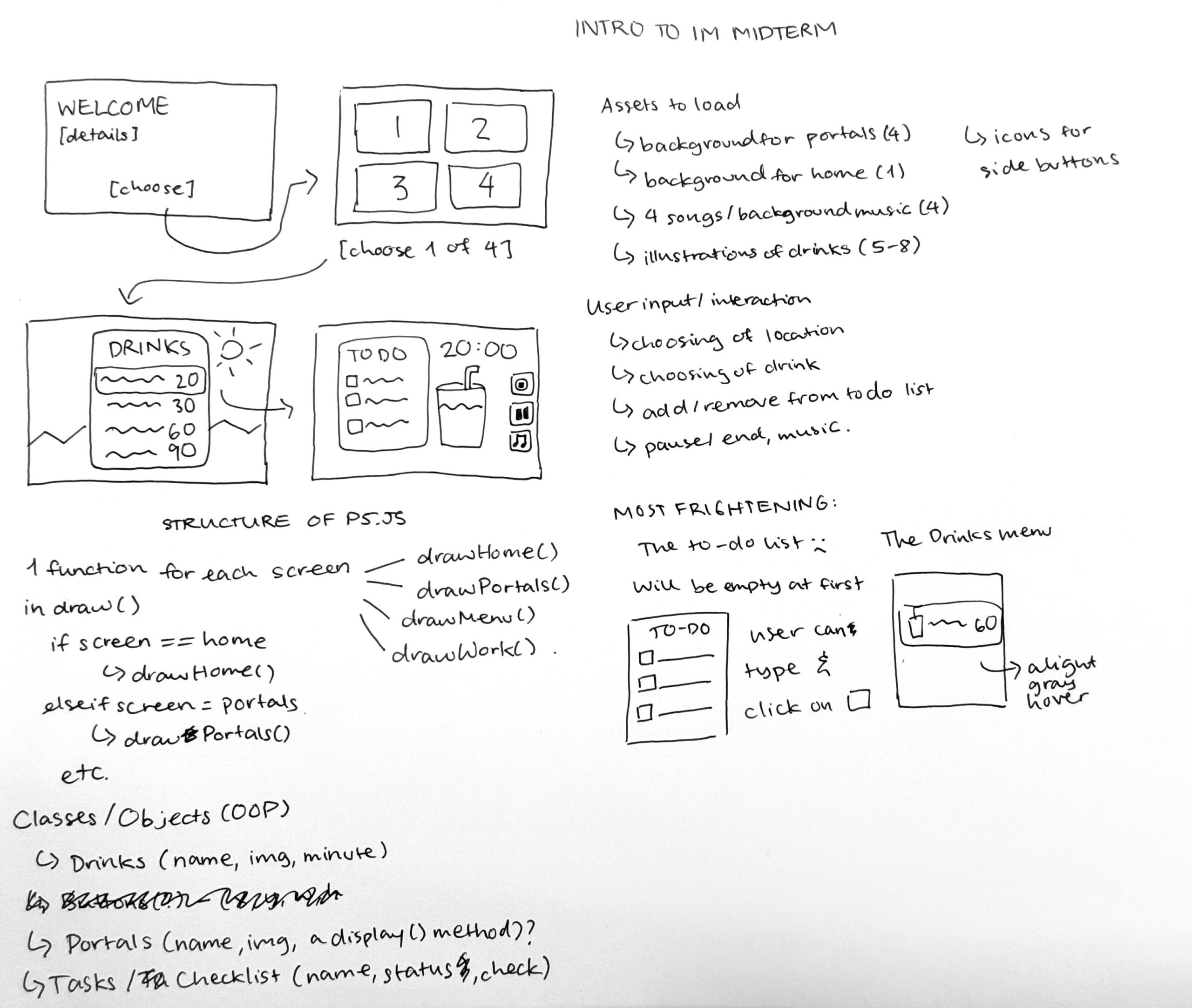
Note: This documentation picks up from my previous post “Week 5 Midterm Project Idea,” which outlines my idea and describes the overall structure and concept of my study/work-with me experience. You can see my Demo Midterm here.
My midterm demo covers ~20% of my full project, which isn’t a lot, so creating the remaining ~80% was a brain-racking ride that in hindsight, I think I enjoyed (minus the debugging parts…)! I’ll try to keep this post concise and not too lengthy, but you can also look at the code of my project, which has comprehensive comments that explain why I did the things I did.
How has my concept changed overtime?

When I came up with the concept for the Midterm Progress check, I thought it wouldn’t changed at all. But midway through the process, I realized the graphics don’t look coherent, I don’t find my project too personal/attached to my interest/personality. When studying, I often want to detach from the real world and instead teleport to a fantasy ethereal universe. I’ve always been in awe by Studio Ghibli’s movies and I’ve always thought that if I could live anywhere, I would live in those movies (see this article). So I built my program around that! Each of the portal now takes the user to a scene from a Studio Ghibli movie, and accompanying them is Totoro, my favorite Studio Ghibli character! I was incredibly happy when I found this direction because it made my experience so much more meaningful to ME and also different from the other existing study-with-me apps available out there.
The 4 backgrounds are from the 4 Studio Ghibli movies: From Up on Poppy Hill, The Wind Rises, When Marnie Was There, and Spirited Away. (See References).
My Code Highlight
It’s really difficult to have particular code highlights because I’m just so proud of the whole project as a whole, and every portion has its fair share of difficulties and I’m attached to every line of code…That said, I learned A LOT from creating the countdown timer and drawing the walking Totoro.
For the countdown timer, I found this YouTube tutorial which was really helpful. But theirs was a lot simpler since the countdown starts from when the sketch was first drawn. I wanted mine to only start counting down when my work session starts, and be pause-able, and this was when the complexity starts to creep in.
Basically, millis() always return the number of milliseconds since you run the sketch. For example, to create a 60-minute countdown, you would want to keep track of when millis() reach 60 * 60 * 1000 (to convert from minute to milliseconds). But because I had 3 other screens prior to when my session start, I also have to keep track of how much time was spent on those screens, so that I can subtract that time from millis(). Additionally, because I had a Pause button, it even complicates the math even more. I have to capture how the how much time the sketch has run for until when Pause was clicked. This way, I can resume the countdown timer correctly. (Please see my code comments from line 399 for more specific explanation)
//timer -- EXPLANATION BELOW READ CAREFULLY
  //sessionStart is the milliseconds on home screen, portals screen, menu screen
  //sessionTime is the seconds since the session ellapsed/started. the milliseconds since the session started = milliseconds since the sketch is drawn MINUS time spent on other screens. i convert "the milliseconds since the session started" to seconds by dividing over 1000 and int() essentially gets rid of the decimals
  //In case the timer is paused (detected by global variable paused), we want to stop the timer.
  //when the timer is resume, it should not take into consideration the time we were on "break"
  //hence we either subtract sessionStart from the millis() so far (if we hve never paused) or from pauseStart (which is the no. of millis when paused)
  let now;
  if (paused) {
    now = pauseStart;
  } else {
    now = millis();
  }
  let sessionTime = int((now - sessionStart) / 1000);

  //the countDown takes drink.price (the number of minutes of the timer) times by 60 to convert unit from minutes to seconds. then MINUS "the seconds since the session ellapsed/started."
  countDown = drink.price * 60 - sessionTime;

  //countDown should stop at 0 and never gets negative
  if (countDown < 0) {
    countDown = 0;
  }

  //convert to minutes and seconds
  let mins = floor(countDown / 60);
  let secs = countDown % 60;
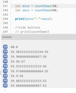
let mins = floor(countDown / 60) – Flooring is important to get a whole number for the minutes. This was what happened when I didn’t floor!
For the Totoro sprite, I got it from this library. I thought it would be easy since we did cover sprites in class, but spoiler: I was wrong!
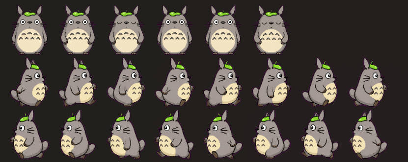
My approach was to keep the spritesheet and draw only the appropriate selection since image() allows us to specify where from the original image do we want to extract (col * frameW, row * frameH, frameW, frameH). I also kept track of the direction Totoro is facing, which is left, right, standing on the left, or standing on the right. Depending on Totoro’s current direction, I will determine what the next “direction” is. For example, if it is walking facing the right, it should stop when it reaches the edge and stand for 2 seconds before turning and walking left. This was done through conditional statements.
function drawTotoro() {
  //totoroW and totoroH is the width and height of totoro in the original sprite png photo
  //spriteH and spriteW is the width and height that totoro should be drawn on the screen
  //keep the sprite proportional by multiplying it by totoro's width and height ratio
  let spriteH = height * 0.2;
  let spriteW = spriteH * totoroW / totoroH;

  //this is what the sprite sheet looks like
  //STAND (6 frames only)
  //WALKING RIGHT
  //WALKING LEFT
  let row, frames;

  if (totoroDirection == "right") {
    row = 1; frames = 8;
    totoroX = totoroX+ totoro_speed;
    //image coordinates is top left corner, so we want to stop BEFORE it hits width. other wise it will go off screen
    if (totoroX >= width - spriteW) {
      totoroX = width - spriteW;
      totoroDirection = "standright";
      //just when totoro starts to stand, i add 2 seconds to the CURRRENT moment and save it in pauseUntil. when millis() is pauseUntil, totoro should walk again(see later)
      //this is because there is no stopping condition for totoro standing. walking stops when totoro hits either end, but standing doesnt stop unless we tell it to stop.
      pauseUntil = millis() + pause_time;
    }
  } else if (totoroDirection == "left") {
    //same with above
    row = 2; frames = 8;
    totoroX = totoroX - totoro_speed;
    if (totoroX <= 0) {
      totoroX = 0;
      totoroDirection = "standleft";
      pauseUntil = millis() + pause_time;
    }
  } else {
    // else bc  if its not going left or right its standing
    //standing only has 6 frames so if we dont have "frames" or if "frames" is set to 8, totoro will disappear for a split moment because the column 6 & 7 of row 0 in the spritesheet is empty (transparent)
    row = 0; frames = 6;
    if (millis() > pauseUntil) {
      if (totoroDirection == "standright") {
        totoroDirection = "left";
      } else {
        totoroDirection = "right"
      }
    }
  }

  // change frame every 6 draw() calls; since draw() runs 60 times/1 second, totoro changes frame 10 times a second
  //floor basically bc it ensures that we are cutting the spritesheet in proper columns (column 0, 1, 2, 3, etc). other wise it can be 0.1, 0.2, 0.3, ...which cuts totoro :(
  let col = floor(frameCount / 6) % frames;

  image(spritesheet, totoroX, height-spriteH, spriteW, spriteH, col * totoroW, row * totoroH, totoroW, totoroH);

  //totoro should always be walking at the bottom, so y-coordinate stays constant
}
In the original spritesheet, there are 6 frames for standing and 8 for walking. The line let col = floor(frameCount / 6) % frames; calculates which frame Totoro should be in (hence it is the column). I had a bug initially with let col = (frameCount / 6) % frames. Like millis(), frameCount() counts how many times draw() has run; dividing by 6 slows it down so that Totoro’s short legs aren’t moving crazy fast; and modulus wraps the animation again to frame 1 when it has reached frame 8 (col 0 and col 7).
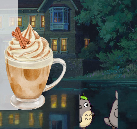
The image aside shows what happens if I didn’t floor(). I referred to Claude for help and debugging, and basically it explains that frameCount / 6 can produce a decimal number (not every number is divisible by 6) so the column/frame, instead of being 1, 2, 3, 4,…can be 2.5, for example. This means that the image displayed will be Totoro’s right half of frame 2 and left half of frame 3. floor() solves that problem!
Another highlight in general is that my program is highly responsive. Almost all of the placement of elements are placed in relative to the dimensions of the canvas. It’s obviously not rocket-science but figuring out where to place something is such a painful process since it often involves trial and error.
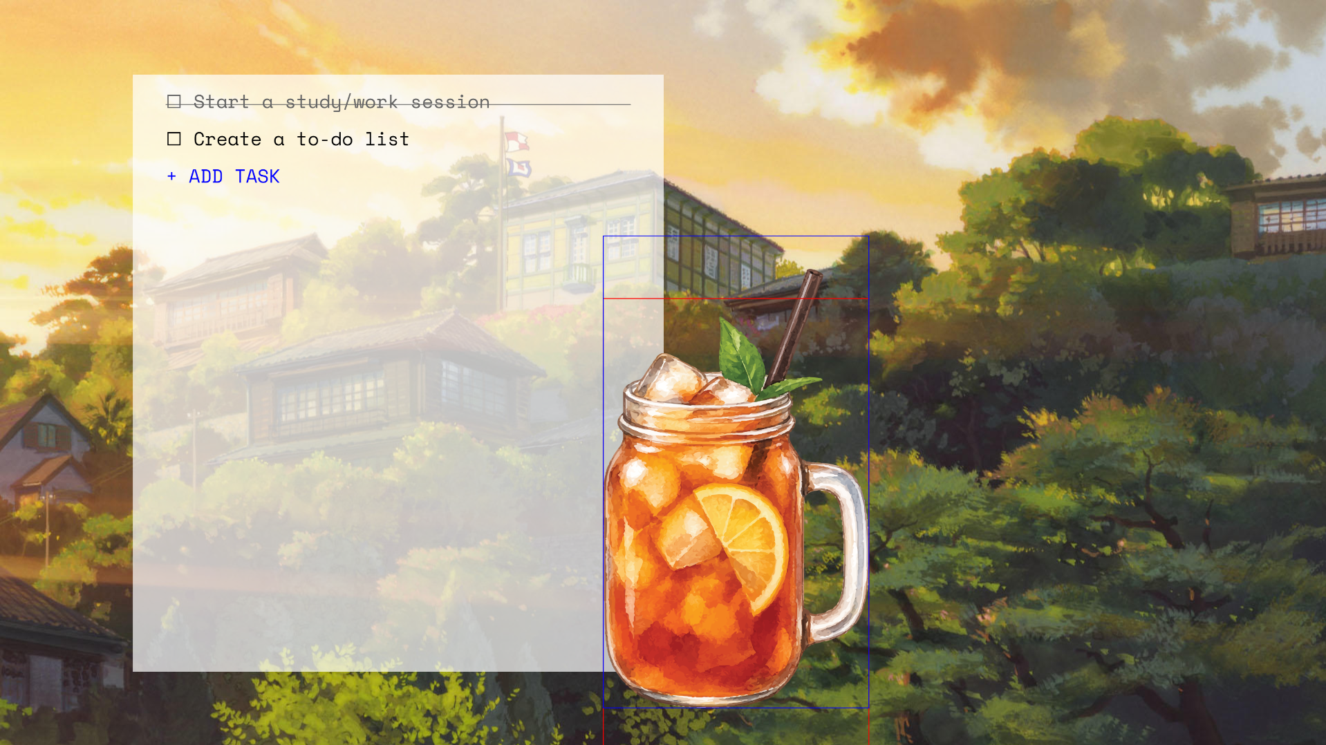
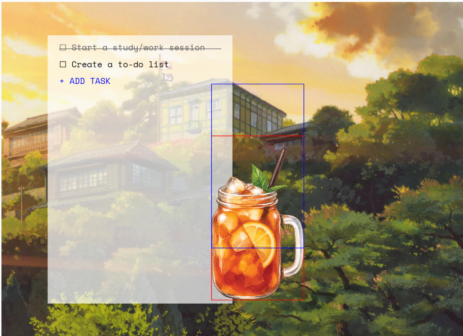
How this was made
For the overall structure, please look at my Midterm Progress post. From screens 1, 2, and 3, (home, portals, menu), it was just a matter of displaying things correctly and making sure the buttons work. Instead of using the button() element, I created all of my buttons manually, meaning, they are primitives with text on top and I detect “clicks” and “hovers” by tracking if mouseX and mouseY are between the boundaries of the “buttons.”
An annoying issue I had at the beginning was that my images became blurry as I resize my window repeatedly (see photo below); my original code is in the photo.
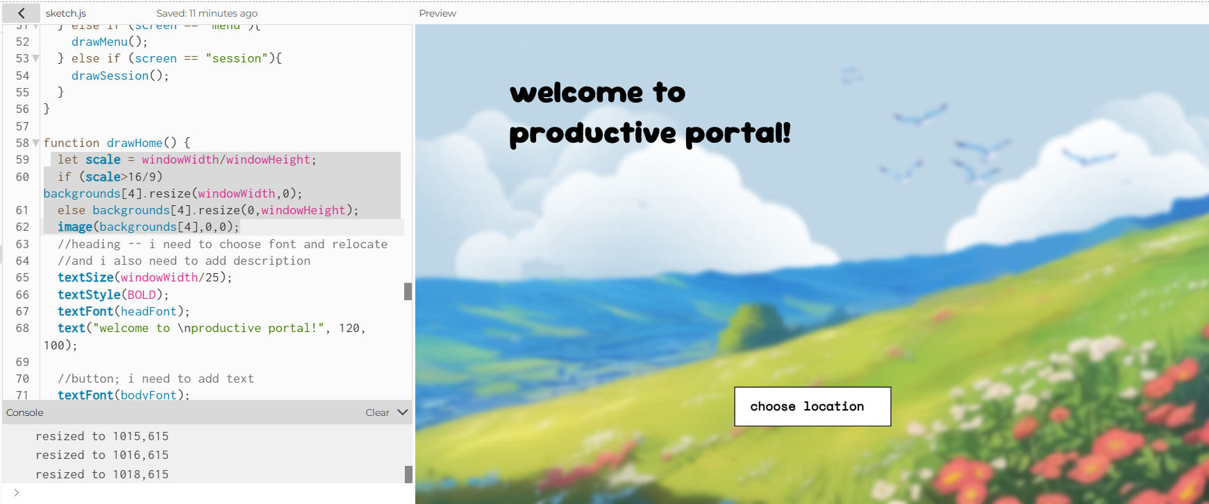
This happened because resize() makes direct changes to my original image, and the approach I did to fix this was to create a function that displays the original image in whatever size and dimensions I want to. This way, the original image is kept intact, and when I resize my window, the image is taken from the high-res original.
//the function that fixes this problem:
function drawImg(img) {
  let w, h;
  if (width / height > 16 / 9) {
    w = width;
    h = width / (16 / 9);
  } else {
    h = height;
    w = height * (16 / 9);
  }
  //parameters: img, x,y,w,h
  image(img, (width - w) / 2, (height - h) / 2, w, h);
}
Screen 2 uses a bit of math to display the 4 portals stored in an array into a 2×2 grid (i loops from 0 to 4 exclusive).
let x = (i % 2) * (width / 2); //this is the column!!!
let y = floor(i / 2) * (height / 2); //for row
You can hover the mouse over each portal and see the name and description. This also subtly indicates that the portals are “clickable.” The hover effect is actually really simple as well. Each portal has a corresponding rectangle and some text on top. When mouseX and mouseY is within the boundaries, the rectangle is filled a semi transparent black and the text is white. Otherwise, there is noFill(). So technically, the description is always physically there, but we can’t see it because they were set to be transparent.
For Screen 3, the Menu, the drinks are objects created from the class Drink. Each drink contains a name, an image (address), a price, etc. When displaying the menu, I loop from 0 until the length of the menu (which is 8) and use the incrementing loop variable to determine the y position of the drink on the menu. This way, the menu displays a list of drinks, where each drink is listed on after another.
for (let i = 0; i < drinksMenu.length; i++) {
    //height * 0.22 is the starting y-position of the first drink; the drinks are
    //placed height * 0.085 lower than another, so I made use of the variable i
    drinksMenu[i].displayOnMenu(i * height * 0.085 + height * 0.22);
  }
For the Session screen (Screen 4), it’s the main and whole point of the experience, so it’s not a surprise that it was the hardest to built.
I first started with the to-do list. The to-do list was structured as a 2D array, each task is stored as [name of task, true/false (completed)]. I had the most difficulties figuring out how to get the input. I initially wanted to use input(), but I couldn’t figure out how to get the input() on top of the canvas. I even tried creating a separate canvas using createGraphics() to make the input bar relative to that new canvas, so I can easily move it around, but in the end there was a lot of trouble so I had to find another way.
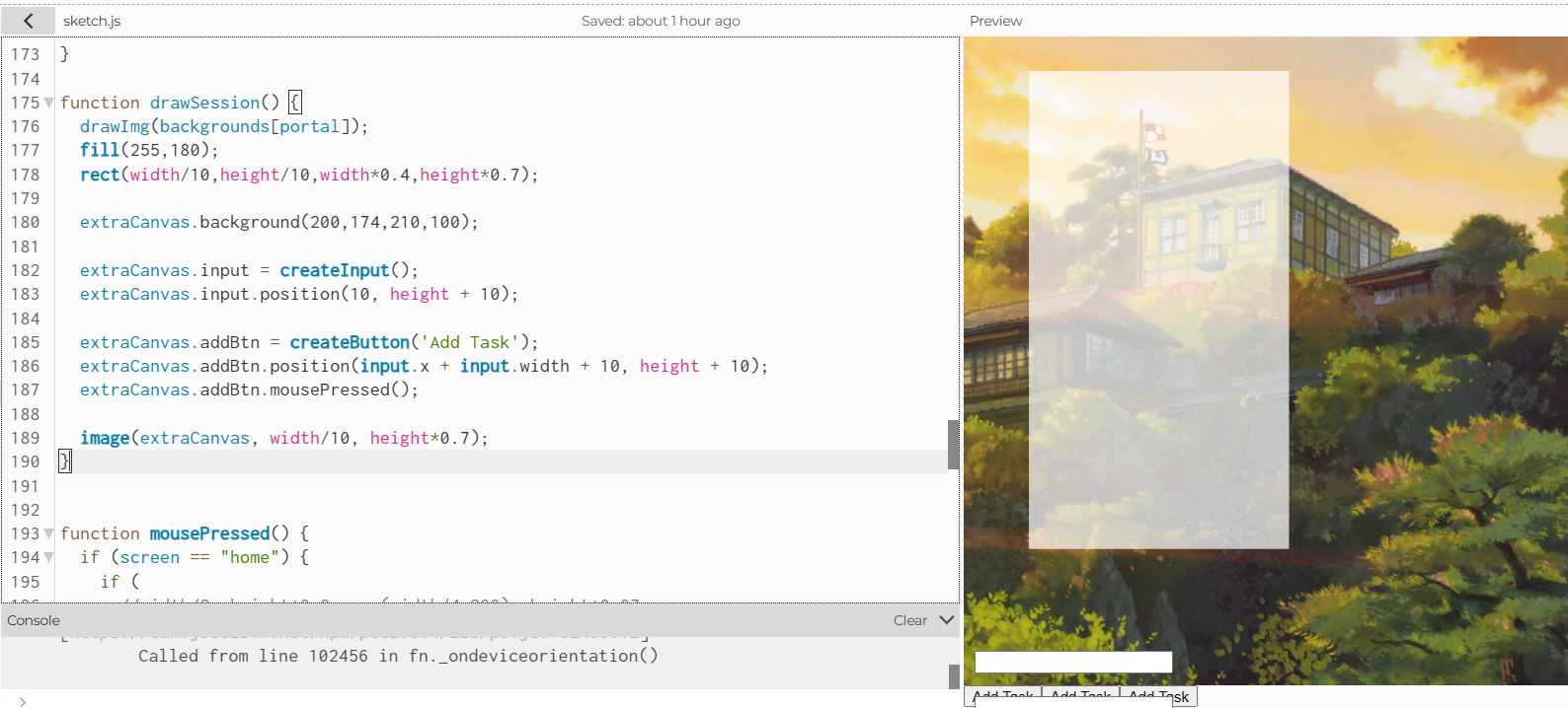
drawSession() is also called repeatedly so there were a bunch of input()I asked Claude how else I could have done this, and Claude told me to use prompt() as an alternative. prompt() is a JavaScript function and it basically asks for an input using a pop-up. I implemented that, it works, however, one thing I absolutely dislike about it is that it ruins the fullscreen experience. When you’re on fullscreen and you add a task, the prompt will take you out of fullscreen mode (because it’s a browser thing) and then when you’re done, you have to enter fullscreen mode again. It’s might be a minor UI/UX thing, but overall, it makes the experience a bit less seamless.
The drink is a static PNG and they are watercolor, hand-drawn graphics form Canva (see References). Initially, I wanted to draw the drinks myself and create variations of them so that when the countdown reaches halfway, the drink becomes half empty, and when the countdown finishes, the drink is empty. However, due to the time-constraint, I couldn’t do that, which is a shame. I decided to opt for the Canva graphics in the end since they still look cohesive with the rest of the program (I think this would be better than me drawing low-effort graphics that looks crappy).
For the timer and pause button, look at the “My Highlight Code” section.
The music button is also fun to make, and I honestly think that music adds the liveliness to my program. I store the tracks in an array sounds[], and when the user clicks on the music button, the function changeMusic() is called. song = (song + 1) % 5 allows the change of music to happen: it goes to the next index (song) in the array, and loops back to index 0 if needed.
//array sounds hold NULL at index 0 (since it corresponds to no music), indexes 1 to 4 holds songs
function changeMusic() {
  //always check if it's the NULL one (doesnt work if it is)
  if (song != 0) {
    //first stop wtv is playing
    sounds[song].stop();
  }
  //then change song to the next element (index). we do modulus so that it WRAPS around back to index 0 when the current index is 4.
  song = (song + 1) % 5;
  //anything other than 0, play it and loop it
  if (song != 0) {
    sounds[song].play();
    sounds[song].loop();
  }
}
The end “X” button resets certain variables to its default, stop the music, and take the user back to the Home screen.
Reflection
Most often times when I create and produce something, I try my best to make it something that I can genuinely be proud of. I feel like this project looks simple, but my process was far from that. I spent a ridiculous amount of time on this project, and I’m overall really happy with the final outcome. It’s a huge success in the sense that I stayed quite close to my original plan, I only had to tweak and abort a few features.
The thing that bugs me the most is probably the prompt() that shows up when you click on “ADD TASK.” I’m pretty sure there is another and better way to do it, but I couldn’t figure it out at the moment. If I had more time, I would definitely try and draw the drinks myself to create the “sipping” effect.
Other than that, I would say that I have achieved what I wanted to do with this project. I’m glad I made the change to a Studio Ghibli-themed experience, it feels, now, like something I would actually use to study for my other midterms…I also learned a lot during the process, from new methods and functions to silly mistakes or syntax errors that result in hours of debugging! I don’t think I’ve ever built something this complex in such a short amount of time, but I think it the end it’s definitely worth it.
References
Visuals and Graphics
NONE OF MY GRAPHICS ARE AI-GENERATED WORK. The backgrounds are actual stills from Studio Ghibli.
- My Neighbor Totoro: https://www.ghibli.jp/works/totoro/#&gid=1&pid=24
- From Up on Poppy Hill: https://www.ghibli.jp/works/kokurikozaka/#&gid=1&pid=49
- The Wind Rises: https://www.ghibli.jp/works/kazetachinu/#&gid=1&pid=50
- When Marnie Was There: https://www.ghibli.jp/works/marnie/#&gid=1&pid=22
- Spirited Away: https://www.ghibli.jp/works/chihiro/#frame&gid=1&pid=43Watercolor Drink Illustrations by monicathiffany on Canva
- Strawberry Matcha Latte: https://www.canva.com/photos/MAHHTQUID9Q/
- Mango Matcha Latte: https://www.canva.com/photos/MAHHge6tSNU/
- Matcha Latte: https://www.canva.com/photos/MAHHR732VE4/
- Iced Latte: https://www.canva.com/photos/MAHJ_QeHInM/
- Hot Latte: https://www.canva.com/photos/MAGwIqtf2lQ/
- Cinnamon Latte: https://www.canva.com/photos/MAGxkaNNUGQ/Watercolor Drink Illustrations by MuthStudio on Canva
- Iced Tea: https://www.canva.com/graphics/MAHR-jRNUGA/Watercolor Drink Illustrations by baddesigner on Canva
- Watermelon Juice: https://www.canva.com/photos/MAGbDYSb_v0/
Totoro Spritesheet: https://petdex.dev/pets/totoro
Fonts
- headFont: https://www.fontspace.com/super-frog-font-f119490
- bodyFont: https://fonts.google.com/specimen/Fredoka
Audio
- [click] https://www.myinstants.com/en/instant/mouse-click-sound-63406/?utm_source=copy&utm_medium=share
- [pop] https://www.myinstants.com/en/instant/pop/?utm_source=copy&utm_medium=share
- [white noise — track #1] https://www.youtube.com/watch?v=DIU2f5r5KQA
- [track #2] https://www.youtube.com/watch?v=40tPuU6jrgQ&list=RD40tPuU6jrgQ&start_radio=1
- [track #3] https://www.youtube.com/watch?v=3QbGvoknytQ&list=RD3QbGvoknytQ&start_radio=1
- [track #4]https://www.youtube.com/watch?v=Xps2VVE4Tnk&list=RDXps2VVE4Tnk&start_radio=1
- Youtube to MP3 Converter: https://y2mate.gs/
- MP3 Compressor: https://www.freeconvert.com/mp3-compressor
Tutorials and References
- [countdown timer] https://www.youtube.com/watch?v=rKhwDhp9dcs
- [prompt and alert] https://editor.p5js.org/andytilia/sketches/_XHxfxi9E
- [fullscreen] https://editor.p5js.org/Aya_Riad/sketches/uDjr3R3m-
- [spritesheet] https://editor.p5js.org/Aya_Riad/sketches/XtHkp-A7N
Documentation Illustrations
- [Studio Ghibli’s visuals] https://www.reddit.com/r/ghibli/comments/1cv5afh/which_ghibli_movie_has_the_best_scenery/
All other screenshots in the blog post are my own.
How Artificial Intelligence were used
- ChatGPT refined the descriptions for the 4 portals (not their names, since their names allude to the locations in the movie)
- Claude helped me debug my code (particularly the timer + pause, and the Totoro spite). Claude did not write the code for me, it explains why and where my code was not working so I can find a way around that.
- Claude introduced me to the
prompt()element and taught me, very basically, how to use it.
Artificial Intelligence was not used in any other part of this project.