For my midterm project, I want to create a scooter game inspired by something I have noticed a lot since starting university, which is how chaotic scooters can be around many university campuses. There are always people riding around, almost crashing into each other, going into bushes, or trying to avoid people walking in front of them. I thought this could be turned into a simple and funny game based around trying to survive riding a scooter through campus.
The player will control a student riding a scooter and use the left and right arrow keys to move around different obstacles. The main goal is to survive for as long as possible and get a high score. The player will have three lives, and crashing into things like bushes, students, or other scooters will make them lose a life.
However, I also wanted there to be something unexpected instead of the game only being about avoiding everything. One idea professor Mang suggested was making professors worth bonus points. If a professor appears, instead of avoiding them, the player can purposely crash into them to gain extra points. I think this makes the game a little more funny and gives the player a reason to pay attention to what is coming towards them rather than treating every object in the same way.
Start Screen and Instructions:
The game will begin with a start screen that explains the controls and objective. The player will be told to use the left and right arrow keys to steer the scooter, avoid obstacles, and look out for professors to gain bonus points. The game will only begin once the player presses a key, such as SPACE.
Main Game:
The game will be from a top to down perspective, with the player and scooter towards the bottom of the screen. Different objects will move down the screen towards the player to create the feeling that they are riding forward through campus. These could include students, bushes, other scooters, and professors.
As the player continues, I want the game to gradually become more chaotic, with obstacles appearing more often or moving faster. The score will increase as the player survives, while hitting a professor will give additional points. The player will have three lives, and once all three are gone, the game will end.
Game Over and Restart:
Once the player loses all three lives, they will reach a game over screen showing their final score and possibly other statistics such as how many professors they managed to hit. There will also be an option to play again without having to restart the entire sketch.
Code and Design:
For the code, I am planning to use a class for the different obstacles that appear throughout the game. The objects can have different types, such as a student, professor, bush, or scooter, while sharing things like their position and movement. I also want to use an array to keep track of the different obstacles on the screen.
Visually, I want the game to look like a university campus from above. For now, I will probably use basic shapes while testing the game, and later I want to replace some of them with images and add more details to make the campus environment feel more complete. I also want to add sounds such as a crash sound, scooter sounds, and possibly a different sound when the player gets bonus points.
Most Frightening / Uncertain Part:
The part I am most uncertain about right now is collision detection. Since most of the game depends on the scooter either avoiding or hitting different objects, I need the code to recognize when the player actually touches something. I also need different collisions to have different results. For example, hitting a bush or student should cause the player to lose a life, while hitting a professor should give them points instead.
Another thing I am slightly worried about is having multiple objects moving on the screen at the same time without making the code too complicated, especially since they will have different effects when the player interacts with them.
What I Will Do to Reduce the Risk:
To reduce this risk, I want to start with a very basic prototype before working on the final images and design. I will first create a simple player using a shape that can move left and right using the arrow keys. I will then make one obstacle move down the screen and test whether the program can recognize when the two shapes collide.
Once I get this basic collision working, I can start using the same idea with different types of obstacles and eventually replace the basic shapes with the actual images I want to use. This way, I can make sure the main mechanic of the game works before focusing too much on how everything looks.
What I found most interesting from the reading was realizing that computer vision is less about teaching a computer to see like we do, and more about finding ways to make visual information understandable to it. As humans, we can look at a space and recognize a person or object almost immediately, even if the environment changes. A computer does not automatically have that understanding because a video is initially just made up of pixels. This also explains why computer vision can be more dependent on its environment. Changes in lighting, contrast, or the background that might not affect our ability to see something can make it much harder for a computer to detect.
Because of this, I thought it was interesting that improving computer vision does not always mean making the technology or code more complicated. Techniques like frame differencing can detect movement by comparing one frame to another, while background subtraction can identify something that is different from an already known background. Brightness thresholding can separate objects based on how light or dark they are. However, we can also make these techniques work better by changing the physical environment itself. The LimboTime example especially stood out to me because the creators used a large white background to make the players easier to detect. I would normally assume that improving tracking would require better code, so I liked the idea that sometimes designing the environment around what the computer is capable of seeing can be just as important.
At the same time, I think this ability to track people creates an interesting problem when computer vision is used in interactive art. Tracking someone’s body or movements can make an artwork feel much more responsive because the person can become part of the interaction without needing something like a mouse or keyboard. However, there is a very small difference between a system responding to someone and watching them. I found standards and double standards interesting because the belts physically follow people as they move through the space, making that feeling of being watched part of the experience itself. It made me think that the feeling of being watched doesnt necessarily have to be hidden in interactive art. Artists can use the feeling of being tracked with intent, not only to create an interaction but also to make the person more aware of what it feels like to constantly be observed by technology.
The Minsky story at the start is funny, but I think it explains why computer vision is so hard to appreciate. Seeing feels effortless to us, so it seems like it should be simple, when really it’s one of the things we understand least about our own minds. Levin points out that text already comes as symbols, while video is just rectangles of pixels with nothing telling the computer what any of them are. What I kept thinking about is that human vision isn’t assumption free either. We fill in gaps, fall for optical illusions, see faces in random objects. The difference is that our assumptions are invisible to us, while a computer’s have to be written down by someone. In LimboTime, the program treats the limboer’s head as the topmost point of the middle blob of black pixels. The computer isn’t seeing a head there. A few workshop participants decided what a head is for one afternoon, and the computer can only ever find what they told it to look for.
Looked at that way, each technique in the reading is a different guess about what matters in a scene. Frame differencing guesses that what matters is whatever moves, which is why it works on the Tour de France and fails in an office waiting room. Background subtraction guesses it’s whatever wasn’t there before. Thresholding guesses it’s whatever is darker or lighter than everything else, and brightest pixel tracking is basically a max search over an array. None of this is hard to code. The harder part, and what Levin spends most of his time on, is making the world fit the guess with backlighting, infrared, polarizing filters, or retroreflective material (the same stuff 3M makes for safety uniforms). His conclusion says a scene’s “quality” is defined by the algorithm analyzing it, which means there’s no such thing as a good image in general, only an image that’s good for one particular piece of code. The idea I found most useful is at the end of section three, where he says to choose features that are easy to detect and also carry meaning. The mouth is an easy dark shape to find, and its roundness happens to track vowel sounds. Pupils reflect infrared and also show where someone is looking. Power of real design skill is embodied by the difference of what’s computable and what’s meaningful.
That same idea is also what makes surveillance work, and Suicide Box shows it most clearly. The camera never knows anyone is jumping. It picks up vertical motion through simple frame differencing, the same technique a beginner would use for a game, and the location of the camera turns that motion into a death. Levin mentions in the abstract that computer vision was mostly funded for military and law enforcement, and then his conclusion lists everything it can now track, including identities, facial expressions, gait and gaze direction. In 2006 that probably read as a list of creative possibilities. Reading it now, it sounds a lot like a description of the systems that watch us in airports and on streets.
Since the technology is identical, I think the line between interactive art and surveillance comes down to whether the person being tracked can see what the system sees and gets something back. Videoplace shows you your own silhouette, so you’re playing with the system instead of being processed by it. Sorting Daemon turns people on the street into color swatches, and most of them probably never find out. Cheese sits somewhere in between. The actresses knew they were being watched, and an alarm pushed them to make their smiles look more sincere to a machine. Every interactive piece with a camera does a softer version of this, getting you to move in ways the camera can read. Usually that’s the fun part, but Cheese shows how quickly responding to someone turns into making them perform. If I were to determine for what counts as a head or a smile, I would let people see what’s being tracked instead of hiding the camera and letting it feel like magic.
Midterm Report
I was thinking on notes of what is culturally important to me and values wise. Being from Pakistan, hospitality is a big part of the culture, and I believe I have embodied it in a nuance way. Whenever, my friends and I go out I want to pay for us. There is an element of looking after people that brings me a lot of joy, and I wanted to embody that in the game.
So, I will be making a game where the faster you approach the card reader you win. It will mainly be pressing a key to get to the card reader faster, while the other 2 players reach the machine.
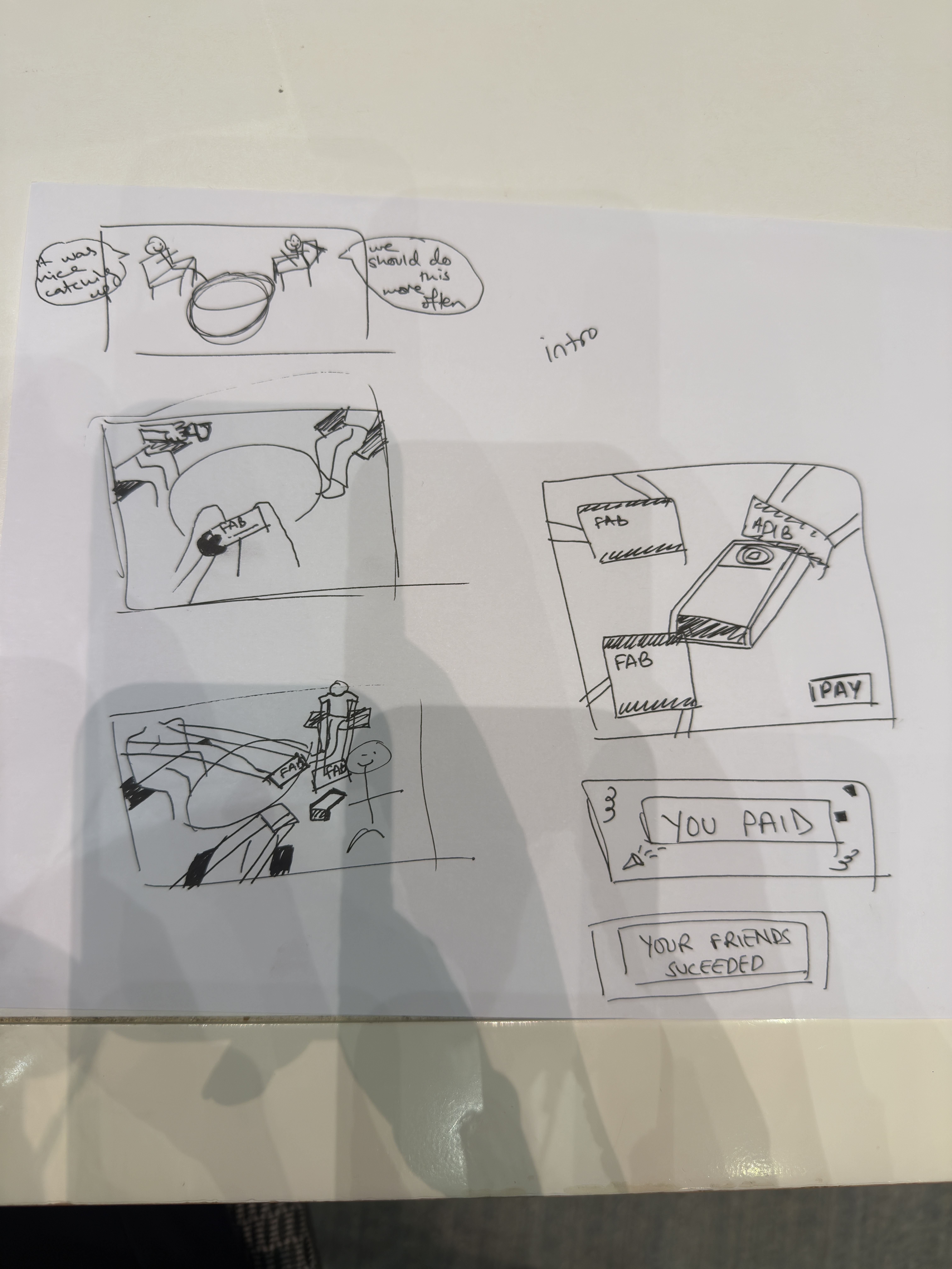
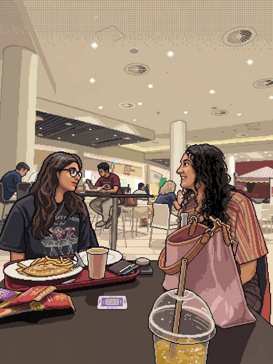
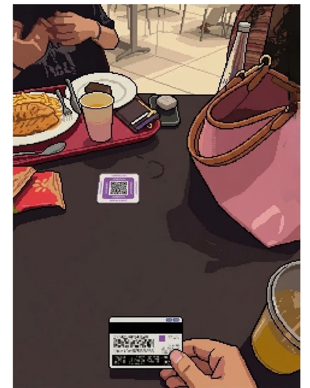
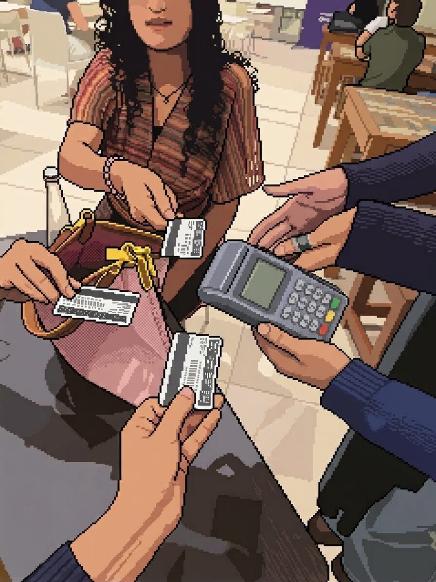
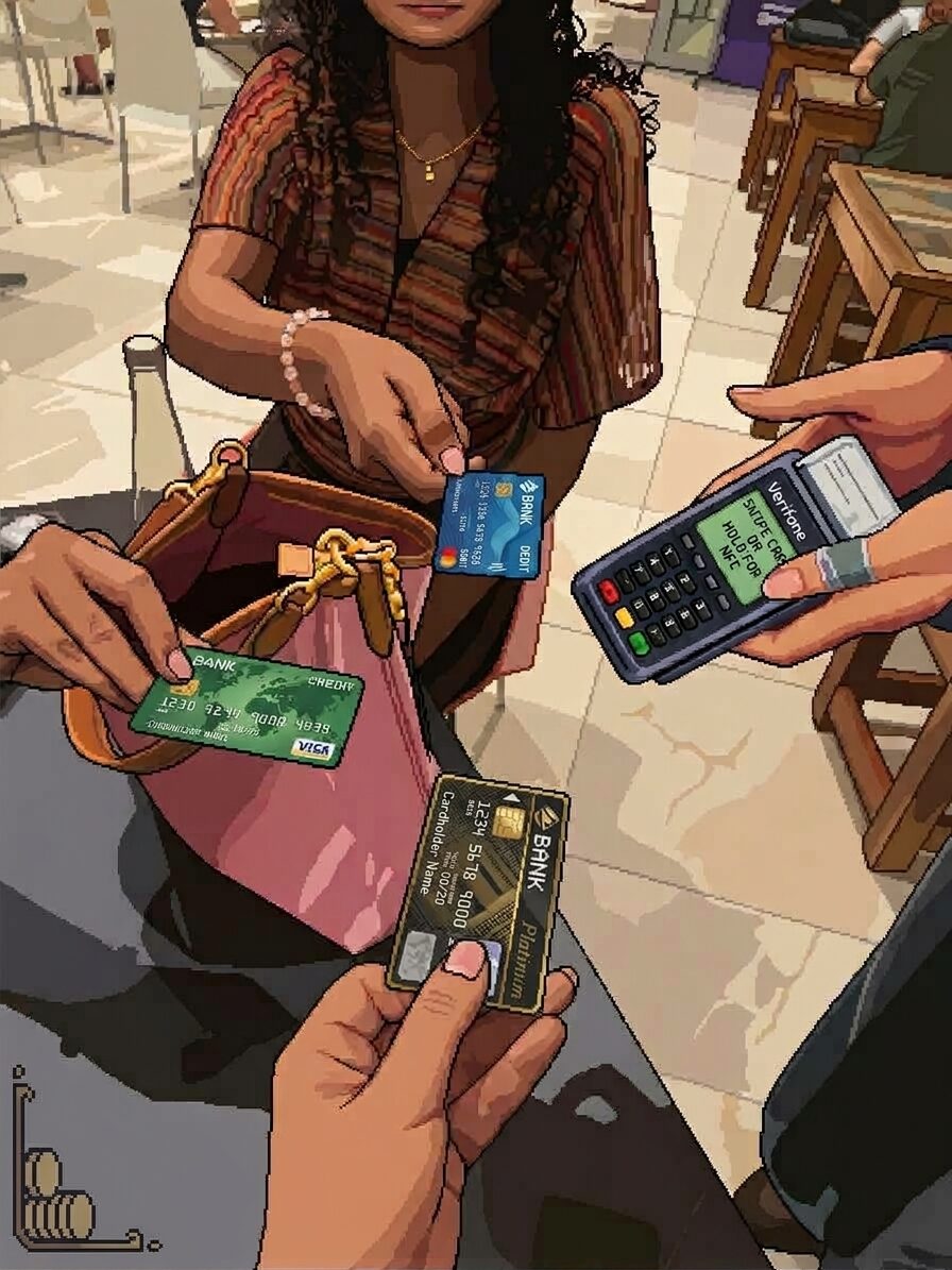
I have prepared the 4 frames that will be needed for the game, and I have made a pixelated version of the frames. I wanted to have the first 3 frames just like appear and kind of build a storyline, and the fourth frame has the game in it.
Here is a wire-frame of the game:
Then, here are the 4 frames of the storyline.
Parts I am worried about
When the user starts playing the game, I am concerned about how the hand would elongate. I will have to parse the image and maybe separate the hands from the arms like save it as a separate asset too. Then, as the user plays the hand extends towards the card machine, so i am concerned about the game mechanics too.
I will be doing something like following to move the separate assets:
progress = 0                        // 0 = start, 1 = touching the card machine

on key press:
    progress = progress + 0.05      // each press moves the card a bit closer

every frame:
    progress = progress - 0.002     // slides back if you stop pressing
    handX = startX + (machineX - startX) * progress
    handY = startY + (machineY - startY) * progress
    draw hand at (handX, handY)

    if progress >= 1: you pay
My project is inspired by the Chinese film A Letter to Grandma. The film deeply touched me because of the way it portrays love, memories, and connection through letters.
Before the age of phones and instant messaging, letters were one of the most important ways for people to stay connected. A letter was not only a way to communicate information, but also a way to express emotions that might be difficult to say in person. This made me think about how we communicate with people today. Although we can send messages instantly, we often do not take the time to carefully write down how we feel. I therefore want to create an interactive experience where people can write, save, and keep their own letters, especially letters expressing their thoughts and feelings towards family and friends.
I also wanted to incorporate some important visual elements from the film. Flowers and birds are meaningful symbols throughout the movie, so I decided to bring these elements into my own work. The flower represents memory, love, and something that continues to grow, while the bird represents the movement of a message from one person to another.
Current progress
At the moment, I have completed the first major part of the project.
The papers are currently hanging and gently moving, creating the feeling that they are suspended in the air.
I am happy with this stage because the basic visual language of the project is already beginning to communicate the idea of letters, memories, and connection.
Next step
My next major goal is to make each piece of paper interactive.When the user clicks on a letter, I want the screen to transition into a writing interface.
The idea for this part actually came from something very simple. Over the weekend, I was bored and found a website where I could just sit down and type. This made me think about how writing itself could become part of the artwork.
The Writing Interface
I also want the writing interface itself to feel artistic rather than looking like a normal text editor.
My idea is to design a visual keyboard on the screen.
When the user presses a key:the corresponding key on the visual keyboard will react,the typed letter will appear on the screen,the text will gradually form into a letter
I also want to introduce a small bird into this interaction.
As the user types, a little bird could fly from the keyboard toward the words on the screen.
The bird would act almost like a messenger, connecting the act of typing with the idea of sending a letter.
This connects back to the original inspiration from the film: a letter is not just text; it is something that carries emotion from one person to another.
Perhaps the ways that computer vision differs from the rest of us humans can be the fact that most of the time, a computer requires itself to be either coded within its software or be connected to a sensory tool, such as a camera, in order to see and analyze its surroundings; unlike a human who already has the ability to analyze their surroundings much more faster and quicker. In addition, the computer will probably have to be connected to a certain engine, such as either a GPU or AI-powered processing system, in order to assist itself in being able to remember a person’s movement while keeping track of their movement at the same time. In our case, the ability to analyze somebody’s movement, whether it be in front of us or not, is already ingrained in our brain to do otherwise. To put it simply into different words, it would seem as if the computers require to have their hand be held and learn the patterns of what to identify and/or be on the lookout for while the humans have a higher chance figuring out quicker what is in front of our eyes with little to no hints needed. Matter of fact, one might say that the computer demands more manual work in preparation of “environment analysis” than us.
Now, if there must be a way for a computer to see and track something based on what we are interested in for it to watch over, there might be some techniques, as inspired from the book, that can be of assistance. The first technique to come in handy is teaching the computer to know the difference black and white, depending on which of the two is the background and which one is the object passing by said-background. This is because of how I believe that in order to help the computer be familiar with the colors of its surroundings and be able to tell the difference between certain color changes, it is often best to have the computer start from small beginnings and train it to practice telling the difference black and white; for example, if the background were to be black and the computer understands that, then it surely won’t be hard for the computer to detect a passing-by object that is the opposite of black, which can somebody in light-colored clothing that the computer may be able to tell and keep track of their movements. Another technique that may be followed by this mentioned one is the ability to identify differences between certain color shifts whenever something gets added to their image. What that means is the computer being able to remember what an original background looks like by default, only to then become capable of identifying when something enters the original image that is indicated by a color shift/addition as evidenced through anything changing within the pixels that the computer is supposed to take note of. For instance, let’s just that it takes the memory of an image featuring an empty office room, only for a security guard to enter said-office; this is become the computer’s obligation to look at both the original empty image and the new one with the guard, and then conclude that there’s been a change in color feature/pixels within the new image and now it must turn its attention onto the new person that had entered. This is all simply about modifying the computer’s vision into being to possess the knowledge of certain colors and how to pay attention to any changes that would come through the form of alternative color and/or pixel switch-ups.
With all of this being said, I personally would like to imagine the computer’s vision affecting its usage in the interactive arts with its tracking/surveillance capacities due to the fact that any works that involve the vision are established to be something unique since the works have the observers become the artist behind this type of complex digital artwork. After all, all the observers have to do is just stand somewhere in between a screen and spot where a camera/sensory tool connected to the computer can see them, and the screen will be able to not only reflect the silhouette of somebody, but also be able to conduct fluent creations of artistic patterns based on the movement of said-person. Now, of course, the capacities are not to be underestimated, for the computer’s vision requires absolutely specific definitions of lighting, background, and how to respond to and follow any changes that are most important to catch onto. Without specific definition of their target surroundings and routine of responding to probable change, the best the computer vision will do is watch somebody move their body but nothing interesting happens other than a shadow being displayed on a screen; a moment like that simply calls for some form of uniqueness in order to add something of value to the artwork plan as it must be executed by the computer vision. Overall, this is just all of my thoughts that I’ve gathered from the reading.
function drawMainMenu(){

    // Laying forth Mickey background
     image(mainMenuImg, 0, 0, width, height);

    // title setup
    textAlign(CENTER, CENTER);
    textFont("Press Start 2P");
    textSize(32);

    // Font color for pink
    fill(255, 80, 180)

    // Title write up
    text("It's Hammer Time!", width / 2, 100)

    // Play Button creation
    rectMode(CENTER);
    fill(255, 80, 180);
    rect(width / 2, height - 130, 220, 80, 15);

    // "Play" being written on said-play button
    fill(255);
    textSize(25);
    text("PLAY", width / 2, height - 130);
  }
Have you guys ever played “Whack-a-mole” before; this can include playing it either in an arcade or carnival fair somewhere in life? Surely we all have had the canon event of stumbling upon the game somewhere in our life, whether it is by accident or by intent of finding entertainment for ourselves. I’m not afraid to admit that I was even among the bunch who have played the game at least once or twice throughout my childhood. WItha that being the case, I figured why not pay my respects to such game via creating a minigame of my on based on iconic game, but with twists and turns to make it feel a bit more “unique” than the original
Now of course, I had to start myself off on an easier note since I am not exactly one to talk when it comes to designing games; in fact, I’m not sure if I ever created a game in my life! Nevertheless, I still have the plan in my head set straight, where it will be in the classic chronological order that I personally believe is very good for any game: game main menu -> instructions of how to play, and then the game itself. The first twist i would like to mention is that instead of moles, users will have to click on, or lay the hammer on with their mouse in other words, on 2d Mickey heads! I still wonder why I would choose that particular target for my game, but in a way to me it… kind of works? But of course it will be up to me to have said-targets operate as they should. From what I can see in my vision, one or two of those Mickey heads will appear in one of the six black holes by random, and will stay there for a few seconds in a way that’ll challenge the user to use his/her fast thinking skills and click on it; in addition, I plan on adding a hammer sound effect to better simulate the action of laying down the hammer on these Mickey heads. But of course, no game is ever without a twist for the sake of its own; in my case, I am considering adding a red Mickey head that will pop up somewhere in the gaps of between one of the two out of the six circles by random. If the user were to click on it by accident, the red Mickey head will have to take the user to a game over screen for about five seconds before taking them back to the main menu!
During this first phase of the game, perhaps what felt frightening to me the most is the set up of the main menu. This is because of how I apparently thought that the “draw” function was all I needed to set up the appearance of my main menu; boy, was I wrong on that! It goes deeper than that apparently, as I had to figure out that the only way to get my main menu up and running with its appearance is by creating another function made specifically for it (as snipped here)! So that was my main solution to debug the issue, which is by creating another new function that would be most accommodating for this task for me. Now, i still have yet to figure out how to not just create my gameboard with the effects needed, but also the sound effects that would fit just right for each element of the game. Even so, I still will do my best in figuring out what must be done in order that my game is indeed operational as expected from me.
What are some of the ways that computer vision differs from human vision?
The main thing I took from the reading is that computers don’t actually understand what they’re looking at. When I see a room, I just know there’s a person standing there or that it’s night outside. A computer only gets a bunch of pixel values, and it has no idea what any of them mean unless someone programs it to look for something specific. Our eyes also work pretty much anywhere, even in bad lighting or a messy room. Computer vision doesn’t. Levin says no algorithm works in every situation, and if the lighting changes or the background gets busy, it can just stop working.
What are some techniques we can use to help the computer see / track what we’re interested in?
There are a few simple ones. Frame differencing looks at what changed between one frame and the next, which shows movement. Background subtraction compares the camera image to a picture of the empty space, so anything new pops out. Brightness thresholding splits the image into light and dark parts, and you can also just track the brightest spot, like a flashlight. What surprised me is how much the physical setup matters. Using a white background, backlighting, infrared light or reflective materials can make the computer’s job way easier. Sometimes it makes more sense to change the room than to write more complicated code.
How do you think computer vision’s capacity for tracking and surveillance affects its use in interactive art?
I think it works both ways. Tracking is what makes a lot of interactive art fun, because the piece reacts to you and your body, like in Videoplace where your silhouette plays with little creatures. But it’s the same technology used to watch people, so there’s always a bit of an uneasy feeling behind it. Some artists lean into that. In Standards and Double Standards, belts turn to follow you around the room, and Sorting Daemon picks people off the street and sorts them by color. Those pieces made me realize how often we’re tracked without even thinking about it. So for me, computer vision makes interactive art more exciting, but it also means artists have to think about privacy and whether people actually agreed to be watched.
Back in school, they wouldn’t give us the WiFi password, so whenever I opened a browser I’d get stuck on the “No internet” page. With nothing else to do, I’d end up playing the offline dino game, and it got really competitive between me and my classmates as we all tried to beat each other’s high scores. That memory is where this game started. I wanted to bring back that same simple, addictive feeling, but make it my own by adding my culture to it. So instead of the dino game, I made Desert Runner. The main character is an Emirati man in a kandura and ghutra, and instead of jumping over cacti he jumps over animals from the UAE desert. He runs through real places in Abu Dhabi, starting at Saadiyat Island and moving on to Sweihan, Al Ain and Liwa as the score goes up, before looping back to Saadiyat.
Design
I kept the core of the original game, which is one character, simple controls and a score that keeps climbing, and changed everything around it to feel Emirati. The character wears a white kandura, a ghutra and a black agal. He is drawn entirely in code using simple shapes with black outlines in a cartoon style, and his arms and legs swing as he runs while his ghutra flaps in the wind. Instead of cacti, the obstacles are desert animals. Snakes, Arabian red foxes, Arabian oryx and camels have to be jumped over, while falcons fly at head height so the player has to duck under them.
Every 250 points the scenery fades into a new area, ordered by distance from Saadiyat, and each place has its own look. Saadiyat has the beach, the sea and dhows. Sweihan has ghaf trees and camel farms. Al Ain has Jebel Hafeet, an old fort and date palms, and Liwa has a sunset over huge red dunes. Before playing, the player sees a start menu with Play Now, Settings, Tutorial and Controls, so they can learn the game first. While playing, there is desert wind with an oud-style melody and a darbuka rhythm in the background, along with sound effects for jumping, dying and reaching a new location. The high score is saved automatically so it stays when the player retries, which brings back the competitive side I remember from school.
Challenging Aspects
The most challenging part was drawing the character and the animals with code instead of using images. Everything is built from ellipses, lines, triangles and custom shapes, and the order they are drawn in matters a lot. The back arm has to come first, then the kandura, then the front arm and finally the head, so that each part overlaps the right way. Getting the ghutra to wrap around the head and hang down to the shoulder took a lot of adjusting of coordinates before it looked right.
Making the character actually look like he was running was another challenge. I used a sine wave so his legs and arms swing in opposite directions, his body bobs slightly up and down, and his ghutra flaps in the wind. The same idea brings the obstacles to life: the snake’s body follows a moving wave so it slithers, and the camel’s legs swing back and forth as it walks. Jumping also took some work. I had to give the character an upward speed when the player presses jump, then pull him back down a little more every frame with gravity, so the jump curves naturally instead of moving straight up and down.
The background was tricky too, because I wanted it to feel like Saadiyat Island while still moving. I split it into layers that scroll at different speeds. The sea moves slowly, the palm trees move a bit faster and the ground moves fastest, which creates a sense of depth. Finally, collisions were difficult because the camel’s neck and tail and the snake’s tongue stick out of their bodies. Using the exact shapes would have made the game feel unfair, so I used simpler invisible rectangles called hitboxes to check whether the player has hit an obstacle.
Risk Prevention
Since the game speeds up over time, one risk was obstacles appearing too close together to jump over. To prevent this, the minimum gap between obstacles grows with the current speed, so there is always enough room to land and jump again. The speed also has a maximum limit, so the game never becomes impossibly fast. To avoid unfair deaths, the hitboxes are slightly smaller than the drawings, so the player only loses when they clearly hit something. The player can also only jump while on the ground, which stops them from jumping again in mid-air and floating over everything.
The game starts at a slow speed and gets faster gradually, so new players have time to get used to the timing before it becomes difficult. Movement is based on how much time has passed rather than on frames, so the game runs at the same speed on both fast and slow computers. Pressing the space bar would normally scroll the web page, so I blocked that to keep the game on screen. The game also works with a mouse click as well as the keyboard. Obstacles are removed once they leave the screen so the game doesn’t slow down the longer you play. When the player crashes, everything resets cleanly so they can try again right away.
For my midterm project, I decided to make Build Your Own Slime. The idea is that the user can create their own slime by choosing the color, face, and charm. After they finish making it, they can play with it by poking, stretching, and shaking it before saving their slime.
For this stage, I started designing the interaction and working on the basic code. I made a slime class and used different variables for the slime’s color, face, charm, and size. I also made different pages for the slime lab, playtime, and the final screen. This helped me figure out how I want the whole interaction to work.
The most uncertain part for me was figuring out how to make the slime feel more like an actual cute slime instead of just basic shapes. I also wasn’t completely sure how I would add the different images and sounds later. So for now, I made a simple sketch/prototype of the idea using basic shapes and emojis. This was mainly to see if the idea and interaction actually worked before spending time making all the final assets.
As I continue working on it I want to replace the basic shapes with PNGs that I draw myself, including different slime colors, faces, and charms. I also want to add background sounds and other small details to make the experience feel more complete and fun. For now, this version is basically a sketch of where I want the project to go and just a basic idea of it, and I’ll keep building on it throughout the next stages.
The part of this project that I am probably the most scared about is making it feel like an actual finished interactive artwork and not just a bunch of buttons with a slime on the screen. I know I want to use PNGs that I draw myself for the slime, faces, and charms, but I am not completely sure how all of those images will work together in the code yet. I also want to add sounds and background noise, which is something I have not really worked with much before. Another thing I am worried about is making the slime interactions like poking, stretching, and shaking actually feel fun instead of just changing the size of the slime. For now, I tried to reduce that risk by making a really simple version first. I focused on getting the main pages and interactions working before worrying about how everything looks.
This code segment is for the poke interaction. To explain, right now when the user clicks the button, it makes the slime smaller as a simple test. In the final version, I want to replace this with a different PNG of the slime being poked, along with a sound effect, so the interaction feels more realistic and fun. This part was a little hard for me because I didn’t know how to set the size and position of the button using the percentages of the canvas. I had to figure out how the width * 0.25 and height * 0.80 worked so the button would be in the right place and the click would actually work.
I started collecting records and CDs last year, and I really enjoy the experience of going into a store and just spending time looking through the records and CDs they have available. However, since I began, I noticed that Abu Dhabi doesn’t have many stores that sell records. Thus, I decided to take matters into my own hands and create a record store experience as my midterm project, where I hope to replicate that same relaxing feeling that I experience when at an actual record store.
Design
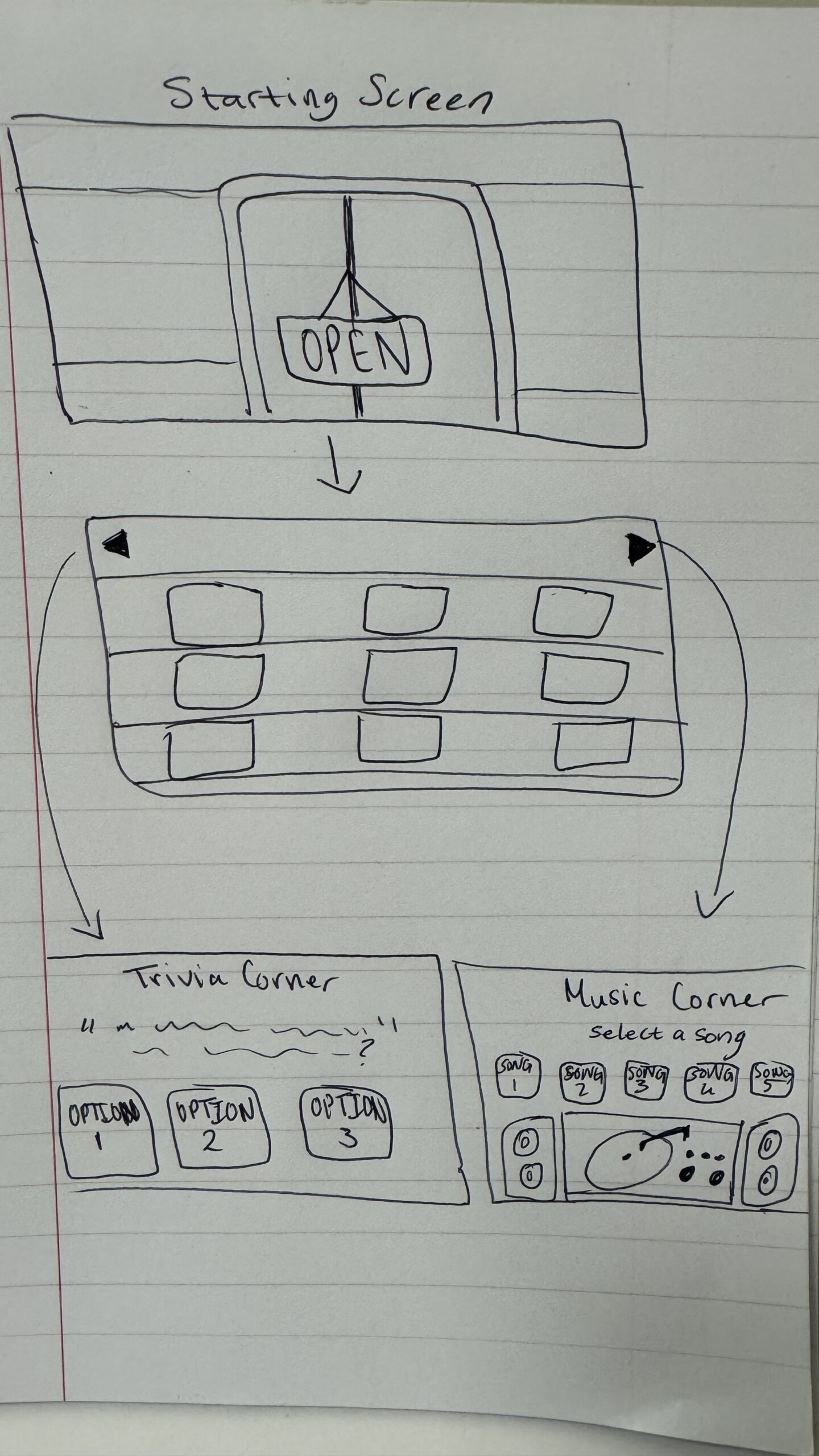
I plan to have the user start outside the store, where they will have to click a button to enter, taking them to the first section, which will be the shelf where the records will be stored. On this page, I plan to have the records move across the screen, where users can click on the records to view the front and back covers and then ‘purchase’ an album if they wish to, and once the album is purchased, it will disappear from the shelf for that session.
From the record, there will be two arrows allowing users to switch between different sections of the store. The first section will be the record corner. Here, the user will be given a small selection of songs, from which they can select one and change the music playing throughout the store.
The last section will be a game corner. In the game corner, users can play a game of music-themed trivia, where questions will be given, and the user has to select the correct answer. This idea for this game was inspired by this music trivia card game my family has in South Africa, but rather than having it be open-ended answers, I plan to make it multiple-choice.
Simple Sketch of how I intend to design the experience.
What’s Frightening
As of right now, my biggest concern with the project is mainly just how I’m going to put these 4 separate sections together and make the navigation between them smooth and seamless. To help a bit with this, I have begun planning how I’m going to implement each individual section first, and I hope doing that makes putting it all together in the end easier.
Another small concern I have is limiting the interaction area for things such as the buttons to start the experience and switch between sections, as well as interacting with records, changing the music, and answering the trivia question, as I haven’t used anything like that for my previous assignments. I do believe it won’t be too difficult a task, and once I learn it, it should be easy to implement for the different aspects of the experience.