Midterm Project

Concept

Color Gate Challenge is a fast and colorful reaction game where the player controls a glowing ball that changes colors to pass through matching gates. The idea came from color-matching and reflex games I used to play, but I wanted to create something that feels more modern and bright, with glowing effects and smooth motion.

The goal of the game is to move the ball through falling gates without hitting the walls. Each gate has a color, and the player must change their ball to the same color to pass safely. If you pass the wrong color or crash into the barrier, the game ends.

My Final Game:

Code Snippet and Parts I Am Proud Of:

One of the parts I am most proud of is how I  control the player, the gates, and the full game system.
Each part of the game (player, gate, and main game) is built as a class, which made it easier to add new features later.

The player’s color can change, and the game checks if it matches the gate’s color before letting the player pass. This made the logic clear and fun.

if (this.player.checkCollision(gate)) {
this.gameOver();
return;
}

This simple check controls the whole challenge of the game.
If the player touches the wrong color or hits the gate walls, the game ends immediately.

I also added a color preview system that shows the next few gate colors, so the player can plan ahead.
It uses small color dots on the screen to help the player see which color to switch to next.

this.upcomingGates.forEach((gate, index) => {
const dot = document.createElement('div');
dot.className = 'color-dot';
dot.style.background = this.getColorString(this.player.colors[gate.color]);
colorPreview.appendChild(dot);
});

Another part I am proud of is how the speed control works. The player can press keys to make the gates fall faster or slower, and there is a live bar that shows the speed level. This made the game more interactive and customizable.

Problems and Future Improvements

At first, the game was too easy because the gates were falling too slowly, and it didn’t feel challenging. I changed the gate speed and added random colors to make it more unpredictable and exciting.

Another problem was keeping everything in the right position when resizing the window. I had to fix the player’s size and position every time the screen changed, using the windowResized() function.

In the future, I want to:

  • Add special gates that move sideways

  • Add sound effects for color switches and collisions

  • Add power-ups that give the player a shield or slow motion

  • Create a moving space background for more depth

  • Add more visual effects like explosions and particle trails

Midterm Project – Music Vent

What is Music Vent?


So I created this music visualizer called **Music Vent**, and the whole idea came from thinking about how we use music when we’re feeling emotional – especially when we’re sad or need to vent. You know how sometimes you just want to put on some music and let it all out? That’s exactly what this project is about.


The point of Music Vent is to create an immersive experience for music listening, especially for those moments when you want to vent through sad music. But here’s the thing – while you’re going through those emotions, there are these cute, colorful elements that somehow bring you ease and comfort.


The Concept Behind It:


I wanted to capture this duality that happens when we listen to music emotionally. On one hand, you have these really comforting, almost therapeutic elements:


– **Flying radio-cloud birds**: These little radios attached to clouds that float across the screen in the most adorable way. They’re like digital companions that keep you company while you’re listening.
– **A beautiful galaxy background**: I created this artistic Milky Way galaxy with twinkling stars and colorful dust clouds that creates this peaceful, cosmic atmosphere.
– **Soft colors and smooth animations**: Everything flows gently and uses calming colors that make you feel at ease.


But then on the other hand, you have the more intense, cathartic elements:


– **Beat-responsive visualizations**: These are the NCS-style spectrum analyzers (those green bar graphs you see in the middle) that react aggressively to the music’s beats. They can feel a bit disruptive to the peaceful vibe, but that’s intentional – they represent the raw emotional energy you’re releasing.


How I Built It


The Technical Setup


I built this using p5.js and JavaScript, and I tried to keep the code organized using classes so it wouldn’t become a complete mess. Here’s basically how it’s structured:


“`class MusicVisualizerApp {
constructor() {
this.audioManager=newAudioManager();
this.visualManager=newVisualizationManager();
this.uiManager=newUIManager();
}
}“`
I have separate managers for handling the audio, the visuals, and the user interface. This way, if I want to change how the audio analysis works, I don’t have to mess with the visual code.


The Audio Analysis Part


This was probably the trickiest part. I needed the system to actually “understand” the music and respond to it emotionally. So I created this mood detection algorithm:


“`javascript
class MoodProfile {
analyzeMood() {
constavgEnergy=this.average(this.analysisBuffer.map(d=>d.energy));
constavgBass=this.average(this.analysisBuffer.map(d=>d.frequencyBands.bass));
constavgHigh=this.average(this.analysisBuffer.map(d=>d.frequencyBands.high));
// Calculate emotional characteristics
this.currentMood.energy=Math.min(avgEnergy*2, 1.0);
this.currentMood.danceability=Math.min((avgBass+this.currentMood.energy) *0.8, 1.0);
this.currentMood.valence=Math.min((avgHigh+avgCentroid) *0.9, 1.0);
}
}
“`


Basically, the system listens to the music and analyzes different frequency bands – like how much bass there is, how much high-frequency content, the overall energy level. Then it tries to figure out the “mood” of the song and adapts the visuals accordingly.


The cool thing is that it can detect beats in real-time and make the black hole effect happen right when the beat hits. I spent way too much time getting the beat detection algorithm right!


Creating the Galaxy Background


I wanted something that felt cosmic and peaceful, so I created this Milky Way galaxy effect. It has about 500 twinkling stars, colorful dust clouds, and these spiral arms that slowly rotate. But here’s the cool part – when a beat hits in the music, the whole galaxy gets sucked into a black hole!


“`javascript
// When beats are detected, everything spirals inward
if (beatDetected) {
this.targetBlackHoleIntensity=1.0;
// Stars and particles get pulled toward the center
}
“`


The black hole effect was inspired by how intense emotions can feel like they’re pulling everything into them. When the beat drops, you see this dramatic transformation where all the peaceful elements get drawn into this swirling vortex with orange and purple colors.


### The Flying Radio-Cloud Birds


This was probably my favorite part to code. I took inspiration from a radio drawing I had made before and turned it into these little geometric radios that fly around attached to fluffy clouds. They spawn randomly from either side of the screen and just float across peacefully.


“`javascript
class RadioCloudBird {
constructor(x, y, direction=1) {
this.cloudColor=random([‘white’, ‘lightblue’, ‘pink’, ‘purple’]);
this.radioColor=random([‘brown’, ‘black’, ‘silver’, ‘gold’]);
this.bobSpeed=random(0.02, 0.05); // Makes them bob gently
}
}
“`


Each radio is drawn using basic geometric shapes – rectangles for the body, circles for the speakers and knobs, lines for the antenna. I had to figure out how to scale everything properly so they’d look right when flying around, but once I got it working, they became these adorable little companions that make the whole experience feel less lonely.


## What I Learned and Challenges I Faced


### Making Everything Feel Smooth


One thing I really focused on was making sure all the animations felt organic and not jarring. I used a lot of interpolation to smooth out the transitions:


“`javascript
// Instead of sudden changes, everything gradually transitions
this.values.bass = lerp(this.values.bass, newBassValue, 0.1);
this.values.energy = lerp(this.values.energy, newEnergyValue, 0.1);
“`


This makes the whole experience feel more natural and less like you’re watching a computer program.


### A Small Touch: Conversation Detection


I also added this feature where if the system detects you’re talking (through the microphone), it automatically lowers the music volume. I Included this interactivity feature because that one feature I really wished to see in music party listening softwares. As someone who used to listen to music bots a lot on discord a lot, I always found it annoying to manually reduce or mute the music bot whenever I wanna speak to my friends while listening. This was the initial inspiration to create this project by the way, but then I got the idea of the concept behind this visualizing experience so I focused more on it.

Here is the project on p5, have fun experiencing it!


Reading reflection –  The Design of Everyday Things

Honestly, the biggest thing for me in this chapter was just how validating it felt. I can’t count how many times I’ve pushed a door that was clearly a ‘pull’ and felt stupid for a second. The whole idea of the “Norman Door” made so much sense, especially since I see it constantly on campus. There are all these big doors with these handles, the kind of signifier that just screams ‘pull me.’ But half the time, they’re actually push doors. What’s even more confusing is that you can go to another building, see the exact same handle, and that one will actually be a pull. It’s like the design is actively working against you, making it impossible to learn or build a consistent mental model.

And it’s not just doors. My friend’s shower is another perfect example. It’s one of those single, modern-looking knobs with absolutely no signifiers, so there are no red or blue dots, no icons, nothing to tell you which way to turn for hot or cold. Every time I use it, it’s this huge guessing game where I have to turn it on and then quickly jump back to avoid getting blasted with freezing or scalding water. It’s a design that creates a genuinely stressful experience out of something that should be simple.

Now I can’t stop noticing this stuff everywhere. It’s made me realize that good design is basically invisible. It just works, and you don’t even think about it. Bad design, on the other hand, is loud and frustrating. So yeah, I guess my main takeaway is that I’m going to start blaming the objects around me a lot more, and myself a lot less.

Midterm Progress

Concept:

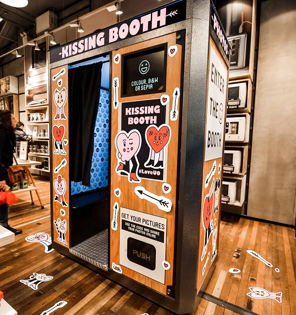
I think it’s safe to say that a lot of events on campus have photobooths, and even stores in malls. I wanted to do something similar, but fully digital. While my current sketch isn’t very aesthetic yet, I plan to model it after the Urban Outfitters photobooth, adding playful visuals and frames to make the experience interactive and fun, like a real-life booth.

The user interacts with the photobooth through a series of pages. They start at the main booth screen, where they can click a button to enter their name on the Start Page. After submitting their name, they move to the Filter Page to see a live video feed and choose a filter by pressing the arrow keys. Once they select a filter and click “OK,” they reach the Frame Screen, where they can take a photo. Finally, the Thank You Screen appears with an option to restart, which loops them back to the booth, letting them take another photo. Each page guides the user step by step, making the experience clear and interactive.

Code design :

All the pages are in their own class.

    • PhotoBooth: The main screen where users start. Displays the booth and a button to enter the next step.
    • StartPage: Handles the user’s name input and the “Start” button to move to the filter selection.
    • FilterPage: Shows a live video feed and lets users choose a filter using arrow keys, with an “OK” button to proceed.
    • FrameScreen: Applies the selected filter to the video and allows the user to take a photo with a camera button.
    • ThankYouScreen: Confirms the photo has been taken and offers a button to restart the booth.
    • Flow control: currentScreen determines which class is displayed, and button/key interactions manage transitions between screens.

Difficulties:

I think that throughout implementing this, the filter page class was the most troubling. I had to use the translate function to mirror my video feed because I wanted a mirrored picture as the result, and I needed it to only apply this to the video, and not the text and button. 

//mirror the video (so it feels like a mirror)

    push();

    translate(width, 0);

    scale(-1, 1);

    image(this.video, 0, 0, width, height);

    pop();

Another key part of the project is the filters and how the selection works. Each filter is applied as an overlay on the live video feed, and the user can browse through them using the left and right arrow keys. I also made sure the selection loops continuously, so moving past the last filter brings you back to the first one.

 //sepia filter overlay

    if (this.filters[this.currentFilter] === "sepia") {

      fill(112, 66, 20, 60);

      noStroke();

      rect(0, 0, width, height);


      //black & white filter using canvas filter

    } else if (this.filters[this.currentFilter] === "bw") {

      push();

      tint(255, 255);

      drawingContext.filter = "grayscale(100%)";

      translate(width, 0);

      scale(-1, 1);

      image(this.video, 0, 0, width, height);

      drawingContext.filter = "none";

      pop();

    }


nextFilter() {

    //go to next filter (wraps around)

    this.currentFilter = (this.currentFilter + 1) % this.filters.length;

  }


  prevFilter() {

    //go to previous filter (wraps around)

    this.currentFilter =

      (this.currentFilter - 1 + this.filters.length) % this.filters.length;

  }

To deal with, or let’s say minimize the risks with these two implementations, I first tested them out in a separate sketch on p5.js, and when I made sure they worked how I wanted them to, I added them to my project flow. I also added console logs to help me debug and then removed them once everything was working as expected.

Lastly, this project really tested my understanding of how order matters. I had to use .hide() a lot to make sure buttons and features weren’t carried on between screens. 

Reflection:

Now that the structure is solid, I can focus on making it look appealing. I’m open to any suggestions and even suggestions for my current flow!

Here’s my Sketch:

Week 5 – Midterm Update

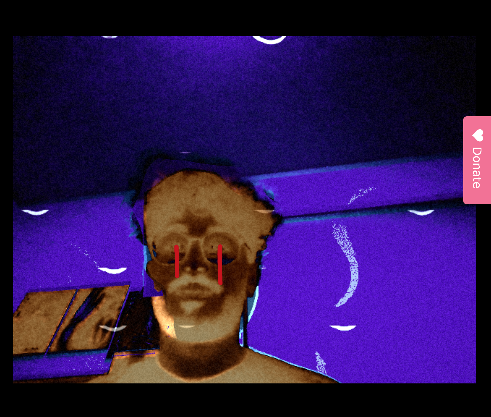
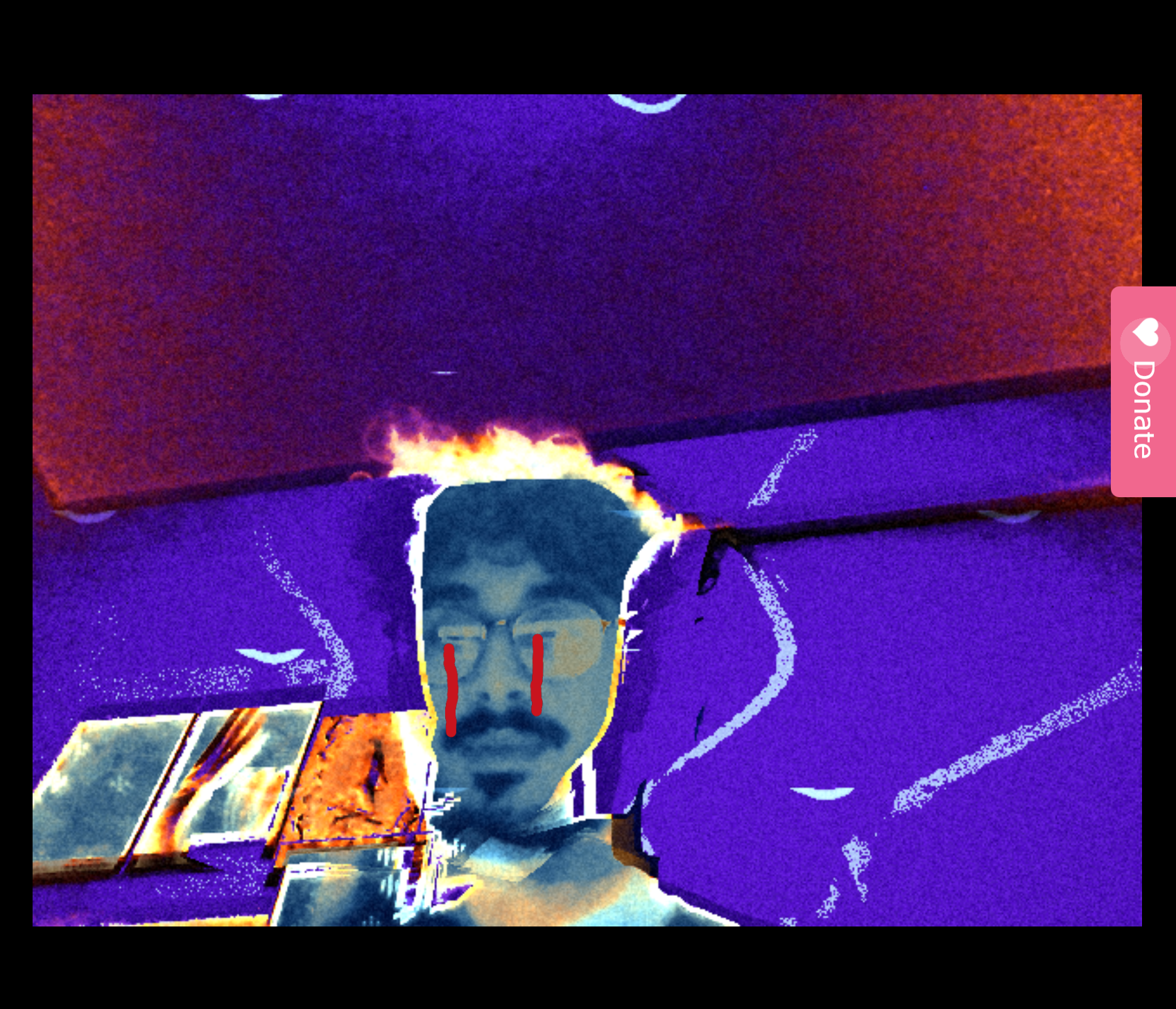
This week I made progress on my midterm project, which is an interactive webcam artwork inspired by Euphoria’s psychedelic aesthetics. The concept is to let users take a live video feed of themselves and transform it into surreal, hallucination-like visuals. By pressing different keys, the user can switch between effects like color-swapping, glowing “UV tears,” and trippy, pulsating backgrounds.

Concept

The idea is to create a personal, immersive experience where the viewer sees themselves transformed under digital hallucinations. The interactivity allows them to “step into” a psychedelic portrait that reacts to their input.

Design & User Interaction

  • The webcam is the canvas: it captures the user in real-time.

  • Pressing different keys (1–4) switches between effects.

  • Each effect is designed to distort colors, overlay glowing shapes, or alter the background to give a hallucinatory vibe.

Sketch

Code Design

I structured the code into separate functions (psychedelicColors(), uvTears(), hallucinationBackground()) so each effect is modular. The keyPressed() function makes it easy to navigate between modes, and the modular design means I can keep adding effects without breaking old ones.

Risk / Challenge

The most intimidating part of this project is achieving truly psychedelic visuals that feel organic rather than random. Messing with pixel arrays and shaders can be complex. To reduce this risk, I started small: I tested pixel manipulation with basic color channel swaps and added some randomized “tear” overlays. Now that the structure works, I can safely experiment with shaders and sound reactivity in later iterations.

Next Steps

  • Experiment with custom GLSL shaders for more advanced visuals.

  • Add sound reactivity so the effects pulse with music.

  • Enhance backgrounds with layered fractals or noise-based distortio

Week 5 – Reading Reflection

Reading the essay Computer Vision for Artists and Designers made me realize how differently computers and humans actually “see.” Our eyes and brains process the world in ways that feel natural: we recognize faces instantly, understand depth, guess intentions from gestures, and fill in missing details without even noticing. Computers, on the other hand, don’t have that intuitive grasp. They just see pixels and patterns. A shadow or a little blur can confuse them. Where we understand context,  like knowing a cat is still a cat even if half hidden, computers rely on strict rules or training data, and they often fail when something doesn’t match what they’ve been taught to expect.

To bridge that gap, a lot of effort goes into helping machines track what we want them to notice. Instead of raw pixels, we give them features: edges, colors, corners, or textures. Algorithms can then use those features to keep track of an object as it moves. More recently, deep learning has allowed computers to learn patterns themselves, so they can recognize faces or bodies in a way that feels closer to human intuition (though still fragile). Sometimes, extra sensors like depth cameras or infrared are added to give more reliable information. It’s almost like building a whole toolkit around vision just to get machines to do what we take for granted with a single glance.

Thinking about how this plays into interactive art is both exciting and a little unsettling. On one hand, the ability to track people makes art installations much more engaging — an artwork can respond to where you’re standing, how you move, or even who you are (as I observed in TeamLab). That creates playful, immersive experiences that wouldn’t be possible without computer vision. But the same technology that enables this interactivity also raises questions about surveillance. If art can “see” you, then it’s also observing and recording in ways that feel uncomfortably close to security cameras. I think this tension is part of what makes computer vision so interesting in art: it’s not just about making something interactive, but also about asking us to reflect on how much we’re being watched.

Assignment 4 – Data Visualization

Concept:

For this assignment, I wanted to create a data visualization that conveys information through motion and color. Initially, I tried using real-world GDP data I downloaded from Kaggle, but I ran into errors because some columns were missing values, and I wasn’t sure how to handle those gaps. So, I decided to create my own fictional CSV file with made-up GDP numbers for a larger set of countries. Each country is represented as a bouncing circle whose size reflects its GDP and whose color adds a visual layer of distinction. The animation gives the data energy and makes patterns easier to notice. I also utilized arrays and a custom class to organize the circles, dynamically managing their movement, size, and color.

Code Highlight:

One part of my code I’m proud of is how the circles move and react to the edges of the canvas. Each circle has its own speed and direction, creating a sense of individuality while still forming a cohesive scene. I also added a feature that displays the country’s name when you hover over a circle, allowing you to read the data without cluttering the visualization.

if (dist(mouseX, mouseY, this.x, this.y) < this.size / 2) {
    fill(255);
    textAlign(CENTER, CENTER);
    textSize(18);
    text(this.name, this.x, this.y - this.size / 2 - 10);
}

Embedded Sketch:

Reflections & Future Improvements:

This project taught me how to combine datasets with visual techniques to make information more intuitive. I realized that adding motion and color can turn raw numbers into an engaging experience. Hover interactions enhanced the usability, making the visualization informative without overwhelming the viewer.

For future improvements, I would like to make the visualization more interactive, perhaps allowing users to filter by region or toggle between GDP and population. I also want to experiment with color gradients or circle trails that respond to velocity, so the data becomes even more expressive. Overall, this project helped me understand how programming, animation, and data can intersect to communicate ideas creatively.


Assignment 4 – Generative Text

Concept

Well, so I wanted to create something that would bring words to life based on their emotional weight. The idea came to me while I was writing an essay and then I was just thinking about how certain words just hit differently; like how “thunder” feels more intense than “whisper,” for example. So I built this visualization that reads emotion data from a CSV file and animates words according to their intensity levels. Each word gets its own personality through movement – high-intensity words explode across the screen in chaotic circles, medium-intensity ones flow like waves, and gentle words just float peacefully. The colors and sizes change too, so you can literally see and feel the emotion in each word. Every 3 seconds it switches to a new word automatically, but you can also hit the spacebar to jump ahead if you’re impatient (like me).

Highlight of the code I’m proud of

The part that really clicked for me was figuring out how to make each letter move independently while still keeping the word readable. At first, all my letters were just clumped together or flying off in random directions, but then I realized I needed to treat each letter as its own little character with its own animation offset.

// Animate each letter individually
for(let i = 0; i < word.length; i++) {
  let x, y, size;
  
  if(intensity >= 80) {
    // High energy - explosive circular movement
    let angle = time * speed + i * PI/3;
    let radius = sin(time * 6 + i) * intensity * 0.5;
    x = cos(angle) * radius * 0.4 + i * 40 - (word.length * 20);
    y = sin(angle) * radius * 0.3;
    size = 45 + sin(time * 8 + i) * energy * 15;
  }
  // ... more animation types
}

Using i * PI/3 and i * 0.6 as offsets made each letter follow the same pattern but at slightly different phases, so they stay connected as a word but each one has its own rhythm.

I’m also pretty happy with how I handled the CSV parsing. I decided to do it manually instead of using a library.

// Parse CSV manually - split into lines then extract values
const lines = csvText.trim().split('\n');
const headers = lines[0].split(',');

// Process each data row (skip header row)
for (let i = 1; i < lines.length; i++) {
  const values = lines[i].split(',');
  csvData.push({
    word: values[0],
    intensity: parseInt(values[1]),
    color: [
      parseInt(values[2]),  // red
      parseInt(values[3]),  // green
      parseInt(values[4])   // blue
    ]
  });
}

Sketch

The visualization cycles through emotional words automatically, or press spacebar to advance manually.


Future Improvements

There are definitely some things I want to tackle next. First, I’d love to add sound. Another idea is to let users upload their own word lists or even type in words manually to see how the system interprets them. Right now it’s limited to my CSV file, but it would be cool to make it more interactive. I also want to experiment with particle effects – maybe letters could leave trails or break apart into smaller pieces for really explosive words.

The color system could be smarter too. Right now I’m manually assigning colors, but it would be interesting to generate them automatically based on the word’s emotional category or intensity. Maybe cooler colors for calm words and warmer ones for energetic words, or even colors that shift gradually as the intensity changes.

Week 4 Coding Assignment

Concept:

When I see words like generative text, I immediately think of the code rain effect that happened in the movie matrix.

(screenshot of the code rain visual effect in the movie matrix)

I intend to recreate this effect by using p5js.

Code that I am proud of:

To recreate this effect, there must be at least two types of objects that we want to define. First, the “word stream” that appears in the screen. Second, the individual elements of the characters. By writing these two classes, the rest of the setup should be easy.

draw() {
    // Slight green variance between streams
    const g = map(sin(this.colorPhase), -1, 1, 180, 255);
    if (this.isHead) {
      fill(180, g, 180); // brighter/whiter head
    } else {
      fill(120, g, 120);
    }
    text(String(this.value), this.x * this.glyphSize, this.y * this.glyphSize);

when writing matrix symbol class, I am proud of these lines of code. by using very simple mathematics, I successfully achieved the effect of having green variance across different streams.

output:

reflection:

after reading the design post, I feel like if i want to add any design to this animation, I would try to add the effect of when users swipe their mouses across the screen, the length of the streams would change or the stream would be stroked by where the mouse is at.


Week 4 – Post Response

Post Response: The Psychopathology of Everyday Things

One thing that drives me crazy, which wasn’t directly mentioned in Norman’s reading, is the “close door” button on elevators. It feels like a control I should have, but in most modern elevators, pressing it does absolutely nothing for ordinary passengers. The button is just there to give the illusion of control, which is frustrating when you actually want the doors to close faster. A simple improvement would be to either remove the button entirely or make it functional for real—perhaps by allowing it to slightly shorten the automatic door timer, while still respecting safety regulations. This would reduce the cognitive dissonance between what the interface suggests and what it actually does.

Another example is the volume slider on phones. While it looks linear, the actual increase in volume is logarithmic to match human perception. This hidden design is clever, but it highlights how designers are constantly manipulating reality to feel “natural.” I find it fascinating—and slightly maddening—how often interfaces are designed to trick our senses into thinking things are more intuitive than they are.

Applying Norman’s principles to interactive media, these insights are extremely valuable. For example, in a music app or video game, sliders for volume, brightness, or character speed should be perceptually adjusted so that changes feel smooth and intuitive. Similarly, buttons or controls should give honest feedback: if an action can’t actually happen (like the elevator door closing instantly), the interface should indicate that limitation rather than pretend otherwise. This reduces user frustration and improves overall satisfaction.

In general, understanding the psychopathology of everyday things encourages designers to consider the gap between perception and reality. By designing interactions that match how humans perceive the world, we can make digital interfaces feel more natural and enjoyable.