
Concept:
The second I heard about the data visualization assignment in class, I thought of color data and the embodiment of them “visually”, because embodying something “conceptual” is just something that fascinates me. So when I settled those thoughts, I began brainstorming the specifics of how I would present the data visually. Inspired by the demonstration in class, I really wanted to do something translucent: not too opaque, form a new color when 2 shapes overlap, and just this “gradient” or colors all over the canvas.
Highlight of code I’m proud of:
I’m pretty proud about the loop, conditionals, and overall execution of the “shapes” and colors because they were disastrous at first and I was finally able to piece them together properly so that shapes of different colors don’t clump together and appear all at once (I keep forgetting draw is a loop function in of its own..)
function draw() {
  if (currIndex < num_rows){

    let i = currIndex;

    let sw = map(age[i], minAge, maxAge, 0.5,10);
    strokeWeight(sw);

    let x = random(10, width-10);
    let y = random(10, height-20);

    let c = color(favColor[i]);
    c.setAlpha(135);
    fill(c);

    stroke(favColor[i]);

    if (gender[i] == 'Male'){
      rect(x, y, age[i], 50);
    }
    else if (gender[i] == 'Female'){
      ellipse(x,y, age[i], random(5,50));
    }
    else if (gender[i] == 'Other'){
      square(x,y, age[i]);
    }
    else {
      circle(x,y, age[i]);
    }

    currIndex++;
  }
  else {
  noLoop(); }
}
Embedded sketch
How Was This Made :
First I briefly visualized in my mind how I wanted the work too look like and went to search in the data library for data sets related to keywords like “favorite colors”, “colors of countries”, etc. and landed on this not so big data set of favorite colors of people of different age, country, and gender. Because the country was not so diverse and didn’t have “values” I could make use of, I removed it along with other location related columns. So eventually, I only had the age, gender, and favorite color columns which I used for size, shape, and color respectively.
I also contemplated a lot on which shape to assign for each gender, especially with the gender “other” and blanks (no gender input). Initially, I hesitated in keeping the empty gender rows because I didn’t know how I would “call” for it or refer to it in my code but I also wanted to keep them to diversify my shapes, so I kept it to experiment with it, and if it didn’t work then perhaps I’d remove them because it’s just 2 rows with empty gender. After I randomly decided the shapes for each gender I started to initialize the artwork: uploading the edited csv file, loaded the file, and assigned variables with values based on the file.
After initialization, I started working on the specific for loop and the if statements in it, which is where I began my recurring mistake of loops inside the draw loop. Half way though the if statements, the work started to display and I realized that things were clumping together; different color of the same shape but different size were clumped together like this:
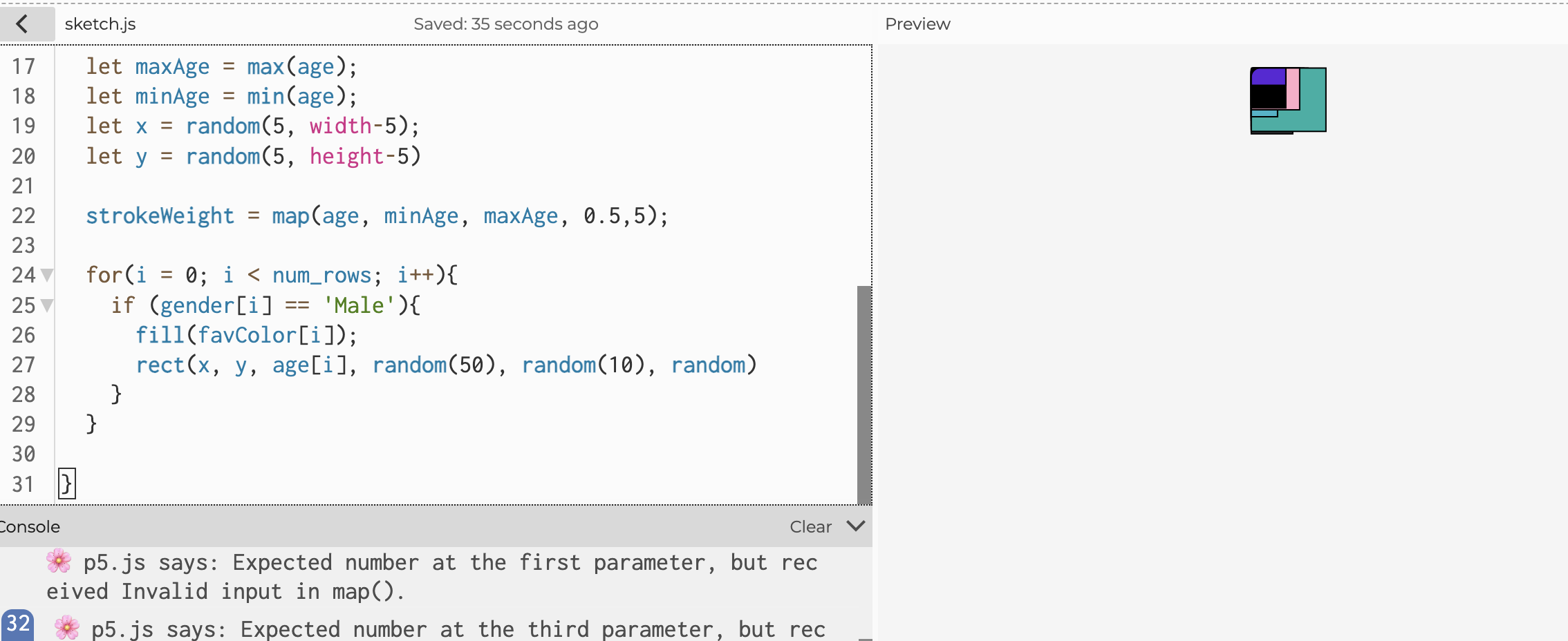
And then I asked Gemini to help me debug and turns out it had to do with the placement of x and y outside of the for loop so I simply placed them inside the loop and it was able to display as separated shapes:
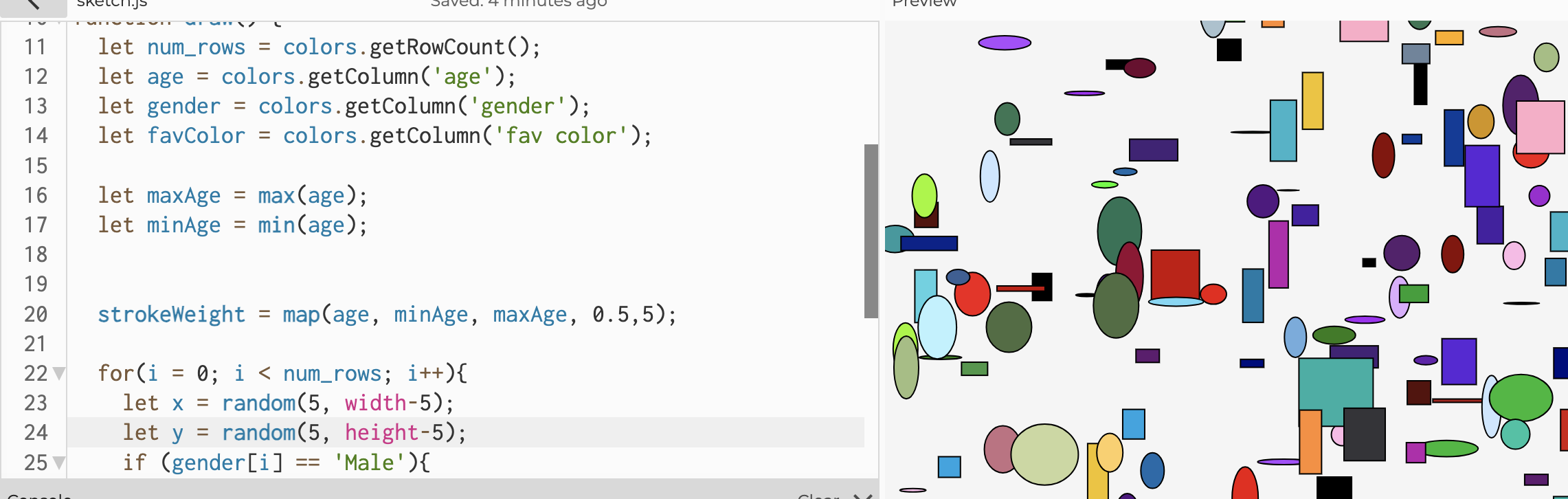
However, this was still not what I wanted because everything just came all at once and I didn’t like that, as well as the opacity of the shapes. I began with the opacity. I first searched for the “alpha” values of each shape but I couldn’t find, not sure if i remembered things wrong, but I then resorted to asking Gemini on how to change the opacity of all the shapes and I landed on setAlpha(), so I just assigned the color[i] to a variable c, and then used c.setAlpha and adjusted the opacity to this:
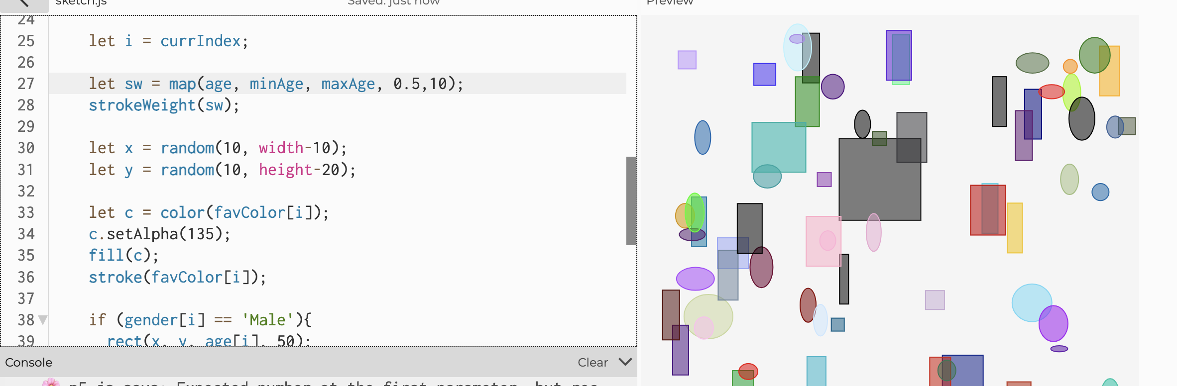
Then I started solving the loop issue, and after examining the code, I realized that it probably has something to do with the “draw” loop, because this has been something that repeatedly happened in my work so at this point I’m pretty familiar with it. I tried to look for ways to stop it, one of them being the noLoop () in draw and loop() in mousePressed that was demonstrated in class, but unfortunately that’s not what I wanted for my art work (although probably would’ve been really useful in my previous work). Finally, I resorted to removing the for loop and entirely relying on the draw function to loop through the file, and it finally worked 😢:
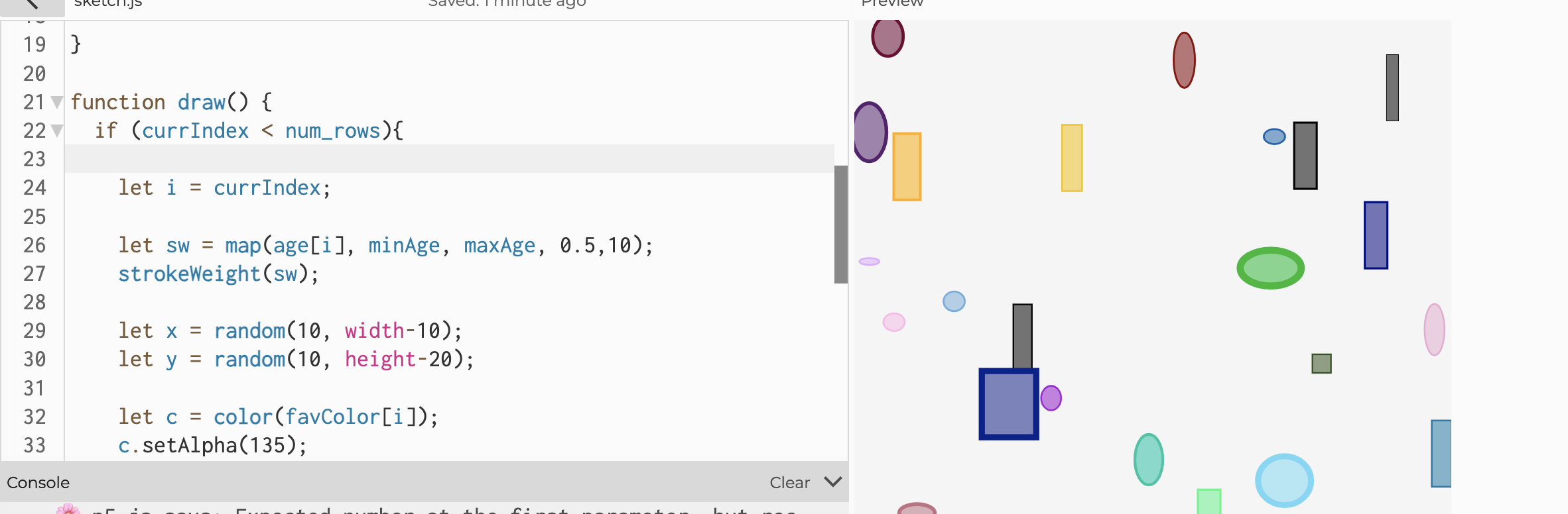
I also wanted to incorporate the feature of map() so I used maxAge and minAge to map the age values to the range 0.5 to 10 for the stroke weight so that the shapes could have another factor to embody the age values other than the size. So you can tell relatively what age corresponds to what color. But one mistake I’ve made during this process was that I forgot to give the map a specific value from age ( age[i] ) and just gave the entire column ( age ) instead, so the stroke wasn’t really visible. However, after I used Gemini to debug, I was able to realize that (along with many other bugs).
Before:
After:
I used Gemini to debug and referred to the p5js reference library for details on the functions and parameters.
Reflection and improvements:
I really enjoyed this work and the process of examining the data, interacting with them and ultimately embodying them visually with each visual component to say something about the data. I do see that this work is perhaps “too simple” but artistically speaking, I don’t know/ don’t see how I could add more things to the work that would be meaningful to the embodiment of the data so I just didn’t force it. I’m really satisfied with this work and the process and hopefully moving forward, I’ll gain more familiarity with the functions and will be able to have more keen senses on my bugs.