
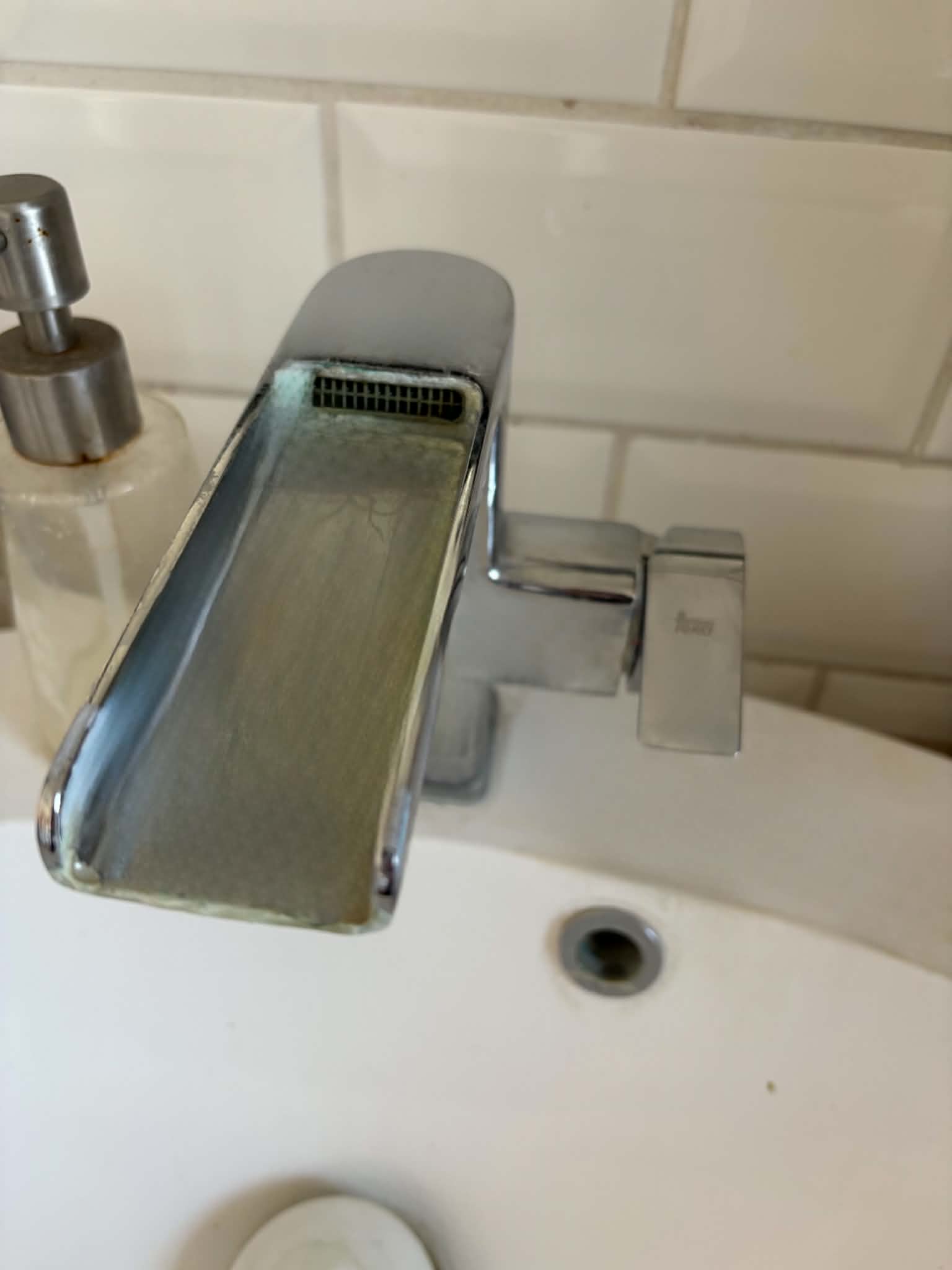
To start with, the reading, especially the examples of the sink in the hotel and the pull-push doors, made me think of a personal example, actually. We have a sink at home in the bathroom, and whoever visits us for the first time, they are always so confused by it, because you have to turn the faucet to the side, not up, to turn it on. (Figure 1) Now, it is on the side and not the top, but other than that nothing really indicates how it should be used. My family and I only know it because we have been living there for years, and I always get surprised when someone asks for help with it, but now that I think of it, it really lacks a good signifier.
For something else that really bothers me with products other than the things mentioned is probably when they overexplain something relatively easy-to-understand function, at the cost of describing something that ACTUALLY needs some description. In the past, whenever I tried to connect a wireless device to my phone or laptop I always had to look it up online how to actually connect it, because each of them has different methods to do so. The reason why I always have to go online is that in the instruction manual, they were too busy talking about how the button with the “plus” signal increases volume and how the one with the “minus” decreases. I understand that this also needs to be said in case someone is having their first time, but I feel like some designers are literally feeding all the information to me. These instruction manuals sometimes make me feel so stupid, and sometimes I think I am the actual designer and maker of the product and know everything about it. I have rarely come across a digital product that gives me proper infomration about the actualy usage of the product and doesn’t talk about the designer, their family and how this is the best product in the world for at least three pages.
To maybe make it more HCD I feel like all these informations could be put to a way more visible place. For example, I sometimes see products that have a little instruction manual on the box itself, so even before buying it I can see and decide if a product like this what I actually need. I knwo that today, everything can be just looked up on the internet, but I don’t think that should replace proper documentation on the product itself.
For IM, I feel like whenever I had to design a website for example, the most common feedback was that “So what do I do now?”. On the web, especially, where you can do SO many things, click your right, left mouse buttons, go up, down, enter, I feel like designing a UI that is either explained how it is dedicated to use, or it can be easily figured out by the user while using. It is easier to lose interest in a website that you can find hundreds of in 5 seconds on the very same device you already have, than a product that you had to spend a lot of money for, waited for delivery, and now finally is in your hands. I feel like for this reason, designing a website, a game or anything like that is even more important to take into consideration the role of affordances and signifiers, as the author mentions. They need to comunicate what can be done (like, if I click my right mouse button, will anything happen, or am I just wasting my time) and how that can be done. I think a good example of that was the menu for the restaurants. Using symbols can help, as they are not bound by language, colours (as usually red indicates wrong and green correct) or anything that can be understood by a large amount of people.