Chapter One of “The Art of Interactive Design,” Chris Crawford uses the example of conversation to explain the importance of feedback. He points out that just like in a conversation between people, where you expect immediate and relevant responses to keep the dialogue going, interactive systems also need to provide clear and timely feedback to keep users engaged.
Applying this idea to my artwork or interactive sketch, I should think of the system as if it were another person in a conversation with the user. If the system doesn’t respond quickly or appropriately, it’s like talking to someone who doesn’t reply or doesn’t give useful responses. This would make the interaction feel disconnected and less interesting.
In my p5.js sketch with bubbles, if the outer circles don’t react well to user interactions, it’s like having a conversation partner who ignores what you say. For example, if the outer bubbles don’t clearly expand or contract in response to user actions, or if clicking on a bubble doesn’t produce a visible effect, it would be frustrating for users. They wouldn’t get the feedback they need to understand what’s happening or adjust their actions.
To improve this, I should make sure that the artwork responds clearly and promptly to user actions, just like a good conversation partner would. This means making the outer bubbles change size in a noticeable way when interacted with, and adding visual or sound effects when bubbles are clicked. This approach makes the system feel more alive and engaging, similar to how a lively conversation keeps people interested and involved.
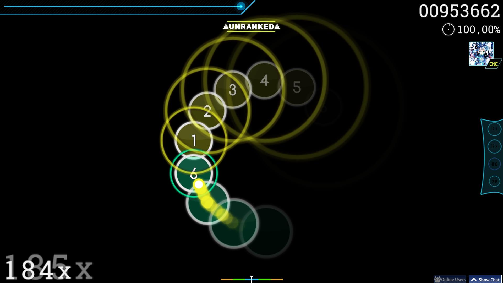
In this project, I utilized objects and classes to recreate one of my favorite rhythm games called OSU. I took inspiration from OSU’s circles mode gameplay where the player needs to click on the ‘beat’ circle once an outer contracting circle coincides with the inner ‘beat’ circle, in time with the rhythm as referenced in the image below.
Highlight:
During the creation of this sketch, I began by simplifying the interface and establishing the core functionality. I decided to start with a canvas containing a set number of circles. When a viewer hovers their mouse over the canvas, outer circles corresponding to the initial circles would appear. These outer circles would contract until their diameter reached zero, then expand again up to a predefined maximum diameter. Additionally, if the viewer clicks on a circle while the outer circle is either within or touching the inner circle, both the inner circle and its respective outer circle would disappear.
To achieve this, I first developed the Bubble class to handle the drawing of the initial circles on the canvas. Next, I created the outerBubble class, which managed the appearance and resizing of the outer circles. I designed functions to make these outer circles appear and update their diameter accordingly.
// Create an outer expanding circle for the bubble
bubblepopper() {
let outerCircle = new outerBubble(this.x, this.y, 150, this.colorValue);
this.outerBubble = outerCircle;
expandingBubbles.push(outerCircle);
}
A key challenge was ensuring that the outer circles correctly enveloped their respective inner circles. I solved this by calling the outerBubble class functions from within the Bubble class, which allowed the outer circles to align precisely with the inner circles.
function mousePressed() {
// Remove bubble and expanding circle if clicked within the bubble and near the circle
for (let i = 0; i < bubbleList.length; i++) {
if (bubbleList[i].click() && expandingBubbles[i].diameter - bubbleList[i].radius < 5) {
bubbleList.splice(i, 1);
expandingBubbles.splice(i, 1);
}
}
The most difficult part of the project was making the circles disappear when clicked at the right moment. I tackled this by using the splice() method to remove elements from the arrays containing both the inner and outer bubbles. By looping through these arrays, I was able to erase the clicked bubbles efficiently.
Reflections:
In completing this sketch, I aimed to enhance the user experience by introducing complexity through a more interactive and skill-based challenge. The current version allows users to pop bubbles when the outer circle is touching or overlapping with the inner circle. However, I realized that this mechanic doesn’t fully capture the level of precision I initially envisioned for the project.
For future improvements, I would like to introduce a condition where the user needs to be very precise with their timing. Instead of allowing the bubble to be clicked as long as the outer circle touches the inner circle in any way, I want to restrict the interaction so that the bubble can only be popped when the outer circle perfectly aligns with the outline of the inner circle. This would require more skill and quick reflexes from the user, making the game more engaging and challenging. The added difficulty would create a more rewarding experience for players as they master the timing needed to pop multiple bubbles in one session.
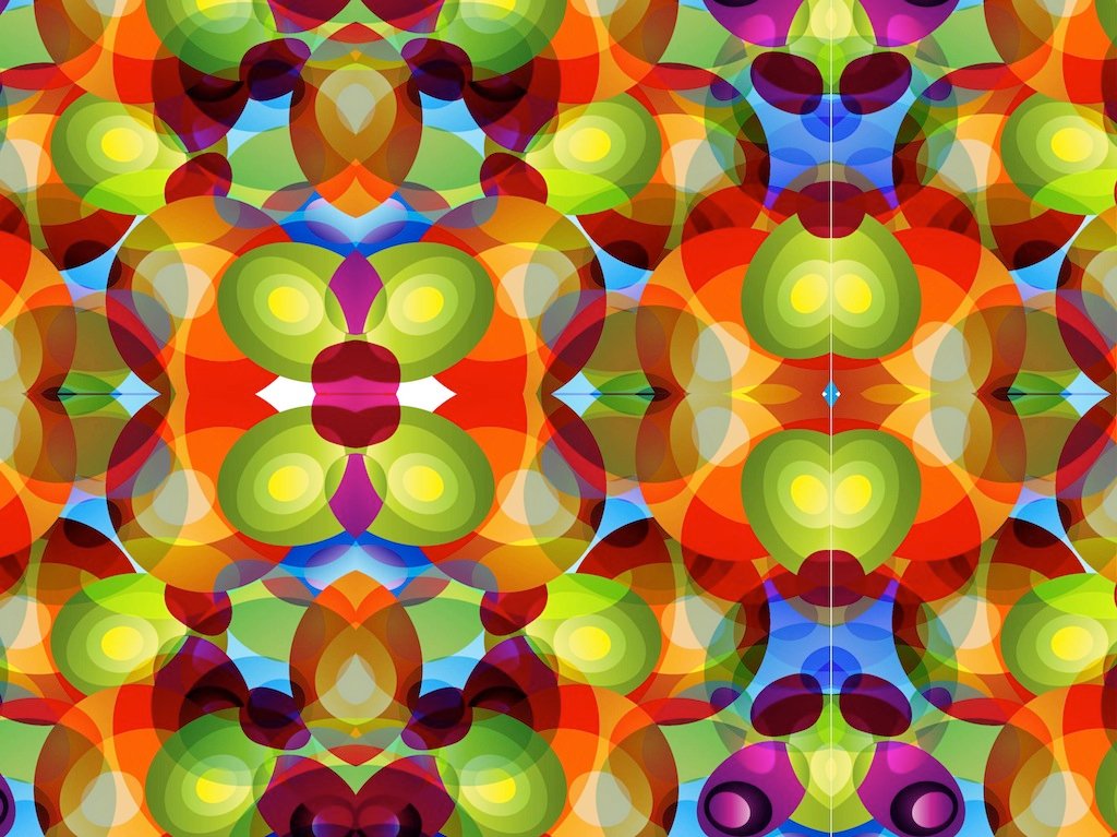
For this assignment my main inspiration came from my niece, actually, during family lunch, she was playing around with a kaleidoscope, and i remembered how as a kid, I was so intrigued by them. I searched up inspirations and patterns online and i definitely wanted to try and create a design similar to a kaleidoscope. So i created jittery, dot shape that turns into this, flowy dot when you click on the mouse, just as how the shapes change when you rotate a kaleidoscope.
Reflection:
Honestly the code wasn’t as complex and was made up of mostly arrays, OOPS what we did in class mostly, and maybe next time i should try and be more complex with it and try new codes not taken in class, but I’m still very proud of the outcome. However, I did try sin and cos to create the waviness and jitter movements with the shape , which i got inspired from Amna’s previous code last week, and I’d say that’s the code I’m most proud of as it was something new to me that took some time to get right, but after reading about it on the P5 website, I figured it out, turns out it was just coordinates and using the function random to create those flowy movements, and this is the code that allows for the dots to then turn into wavy dots so it can then look like those squares when u click/toggle on the mouse, hence if I remove it the dots would just flow up and down or side to side instead of creating the square trail.
here is code im most proud of:
// Function to move the dot
move() {
// Create two different movement patterns based on `flowDirection`
if (flowDirection === 0) {
this.x += random(-2, 2); // Random jitter in the x direction
this.y += random(-2, 2); // Random jitter in the y direction
} else {
this.x += sin(this.y * 0.05) * 2; // Wavy movement based on the y-coordinate
this.y += cos(this.x * 0.05) * 2; // Wavy movement based on the x-coordinate
}
After reading the article “The Art of Interactive Designs,” I kept thinking about what makes something truly interactive. The author does point out that a good interactive system feels almost like a conversation, like there’s this back-and-forth where the system responds to what you’re doing in real time. It made me realize that a lot of systems or designs we think are “interactive” really aren’t, especially when they don’t actually engage with the user in a meaningful way. If something just sits there and doesn’t respond, it’s basically dead weight, no matter how fancy it looks.
In my opinion, it was interesting how the writer claims that interaction isn’t just about cool or flashy videos. its about making the user feel like there in control and that their input to that piece is important. Sometimes, I would see designs that look amazing but don’t actually respond well to the user. This means that I most likely overlooked my previous artwork I created in p5.js. Yes, I’m proud that I was able to create art that looks cool, but if it’s not responsive or doesn’t react to what the user does, it’s not really interactive in the way it should be.
This article really pushed me into thinking about how I could improve my p5.js sketches to make them more interactive. Right now, for the assignment I’m doing this week, I feel like its a little bit flat, but they respond, but not in a way that feels satisfying. For instance, you can click a cube and it pops out, but that’s about it. I want to bring in smoother transitions, add more control options, and maybe even layer multiple interactions on top of each other. For example, what if clicking a cube changed its color, or if dragging across the screen triggered more than one animation? That’s the kind of engaging interaction the article talks about, and it’s the direction I want to head in. I really believe that real interaction should be immersive, and I think the article agrees on that too . I mean, from what I understood, its not about one thing happening at a time; its about creating a system that is consistently reacting to the user. In the future, I want my own projects to feel like they are alive and responding, not just a list of functions that don’t change.
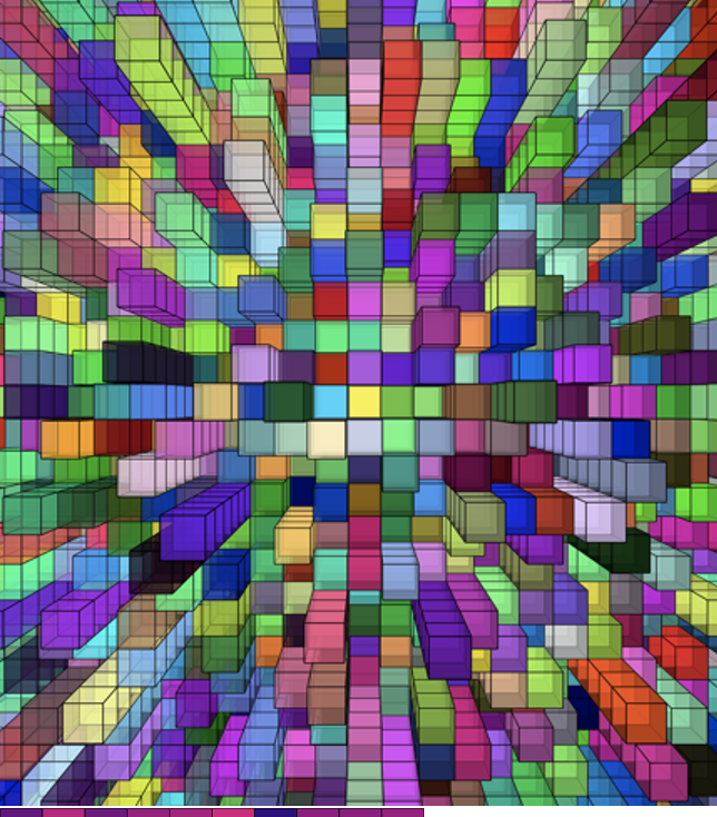
For this art work, I’m going with a concept similar to my previous one and continuing the Velnor Molnar grid art. I was on the lookout for art pieces made with artists who used P5.js, and I found myself inspired by two standout visuals. I was really drawn to this vibrant 3D cube grid. It has so much depth and layers that it just stands out.
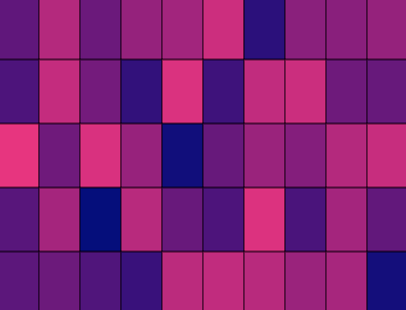
The next source of inspiration is a straightforward yet powerful idea known as the “Fading Grid.” The color changes are truly captivating, producing a gentle fading effect that evolves within the user interaction.
I’m thinking of combining both concepts. I’ll incorporate the 3D cube design and introduce some interactive color fading, drawing from both sources of inspiration. When you click on the mouse, the cubes shift, with the color changing within the user interaction to create movement in a way that feels interactive.I’m really looking forward to seeing how blending these two concepts will influence my final piece of art.
EMBEDDED SKETCH:
Click on the cubes!
HIGHLIGHT OF THE CODE:
One part of my piece where I’m really proud is how I changed the lighting of the cubes based on how the user moved their mouse. As the mouse moves toward a cube, it gets brighter. As the mouse moves away, it gets darker. This makes the background look smooth, which makes the cubes seem to be reacting to the user being there.
In the first chapter of Chris Crawford’s The Art of Interactive Design, I found myself engaged with the foundational ideas presented. From Crawford’s exploration into the nature of interaction as the core of design, one of the key takeaways for me was Crawford’s emphasis on interaction being the core of design. Before reading this, I often saw interactivity as an added feature rather than the fundamental aspect of the user experience. It was like a light bulb went off when he explained that interaction isn’t just about adding clickable elements but about making the whole design process revolve around the user’s actions and reactions. This perspective has made me question my approach to design—am I truly focusing on how users interact with my work, or am I just ticking off boxes?
I agree with him on the definition of interactivity. If I am creating an interactive device/art/product, I should always remember how four parameters, aka listening, speaking, thinking, and responding, work on my idea. I really enjoyed how he explained interactivity with examples, making it easier to even teach my 7-year-old brother about interactivity in technology.
Lastly, on the notion of traditional entertainment like movies being non-interactive, I think that might get shifted with emerging technologies. Digital media, including interactive films, virtual reality experiences, and even interactive web-based stories, demonstrate that interactivity can be a fundamental aspect of various media forms. The rise of these new media formats challenges the traditional notion that interactivity is limited to games or other explicitly interactive experiences.
A strongly interactive system, as described in The Art of Interactive Design, goes beyond just reacting to user input; it creates an ongoing back-and-forth between the user and the system. Crawford talks about the system as “listening, thinking, and speaking,” meaning it responds in meaningful ways to what the user does. In my p5.js sketches, I want to improve user interaction by giving more immediate feedback and making the system react in a way that feels more real or personalized if that makes sense. For example, much like how in Minecraft your actions (building or destroying) immediately affects the world around you, like destroying the wrong block could lead to a flood, same with my designs, I want to make my sketches change and evolve with user input. Furthermore, instead of having a single click trigger a known/set action, I want the system to adapt and change based on the actions similar to how Spotify creates personalized playlists based on previous songs you’ve listened to. So basically, the previous user inputs influence the sketch’s future outcomes. I can also add depth by layering interactions, like having multiple variables such as colors, shapes, or movement change in response to user input, which I am implementing right now to my sketches and giving it a go, as I do believe it gives a more appealing look to the system. I also just found out, that you can add sound effects on P5, which I hope we get to learn that, during the semester, as I’m sure everyone can agree sound enhances any type of design. Hence, by incorporating these elements into my sketches and designs, I aim to create more interactive and engaging sketches that feel alive and responsive, aligning with Crawford’s vision of true interactivity.
After watching Casey Reas’s assessment of randomness in art, I’m convinced of its valuable role, especially in the STEM field, where it allows researchers to predict and analyze randomness in their subjects. His explanation reminded me of a study where Japanese researchers used algae to optimize their rail transport system. The algae grew in random, unpredictable ways, yet always found the most efficient pathway to form a network based on the pattern or map of the space in which it was cultured. (In 2010, a team of researchers from Japan and the U.K. fed a slime mold with nutrients arranged to imitate the nodes of the Tokyo subway system. The resulting network closely resembled the actual subway network, leading to the development of biologically inspired adaptive network design.) This study highlights the potential of introducing randomness to the template designs of objects, something Casey Reas often emphasizes in his work.
When it comes to incorporating randomness in my own projects, I find it most effective in creating animations. For example, using a random number generator and initializing it to a variable, then applying that variable as an argument for certain shapes in my self-portrait sketch, allowed me to simulate the movement of the ‘mouth’ shape, giving the illusion of the sketch talking. To me, randomness is most enjoyable and useful when applied in animations.
In the balance between total randomness and complete control, I prefer maintaining more control over an object while leaving some variables to function randomly. This approach not only makes the model more reliable but also allows me to observe and understand the specific randomization patterns more clearly. Much like in research, where we use a “control” scenario to keep experiments fair, having a balance between control and randomness helps detect how certain variables influence the behavior of others.
In this project, I draw inspiration from the geometric artworks discussed in: COMPUTER_GRAPHICS_AND_ART_Aug1977. My goal with this project was to explore the potential of ‘for’ loops to generate grids of symmetrical, curved lines, creating a structured, rhythmic design. However, I hoped to disrupt this symmetry by introducing heavy distortion, with the intention of simulating the visual effect of mind fog. The resulting artwork presents a uniform arrangement of curves that distort and displace when the cursor hovers over it, evoking a sense of disorientation and randomness—mirroring the feeling of brain fog.
Highlight:
I’m particularly proud of the distortion animation I added to this sketch. By utilizing the dist() function, I created interactive conditions that are activated when the mouse hovers over the Bézier curves. Using an if statement, I introduced random increments within a range of negative to positive values to the variables used as arguments for the original Bézier curves. This approach helped change the positions of the curve lines at random, adding distortion and creating the brain fog effect that I intended. Additionally, reducing the frame rate helped give the animation a 90’s cartoon effect aesthetic.
While working on this project, I experimented with creating symmetrical grids and distorting the curves to simulate mind fog. Initially, I focused on generating the grids using for loops, but as I introduced interaction through mouse hover effects, I realized how much potential this had to enhance the dynamic nature of the piece. The use of dist() and if() functions to trigger random distortions worked well in creating a more immersive experience.
Looking back, I think there’s room for improvement in making the distortions more fluid and gradual. Currently, the randomness of the distortions can feel abrupt, so in future iterations, I would explore using easing functions to smooth the transitions.
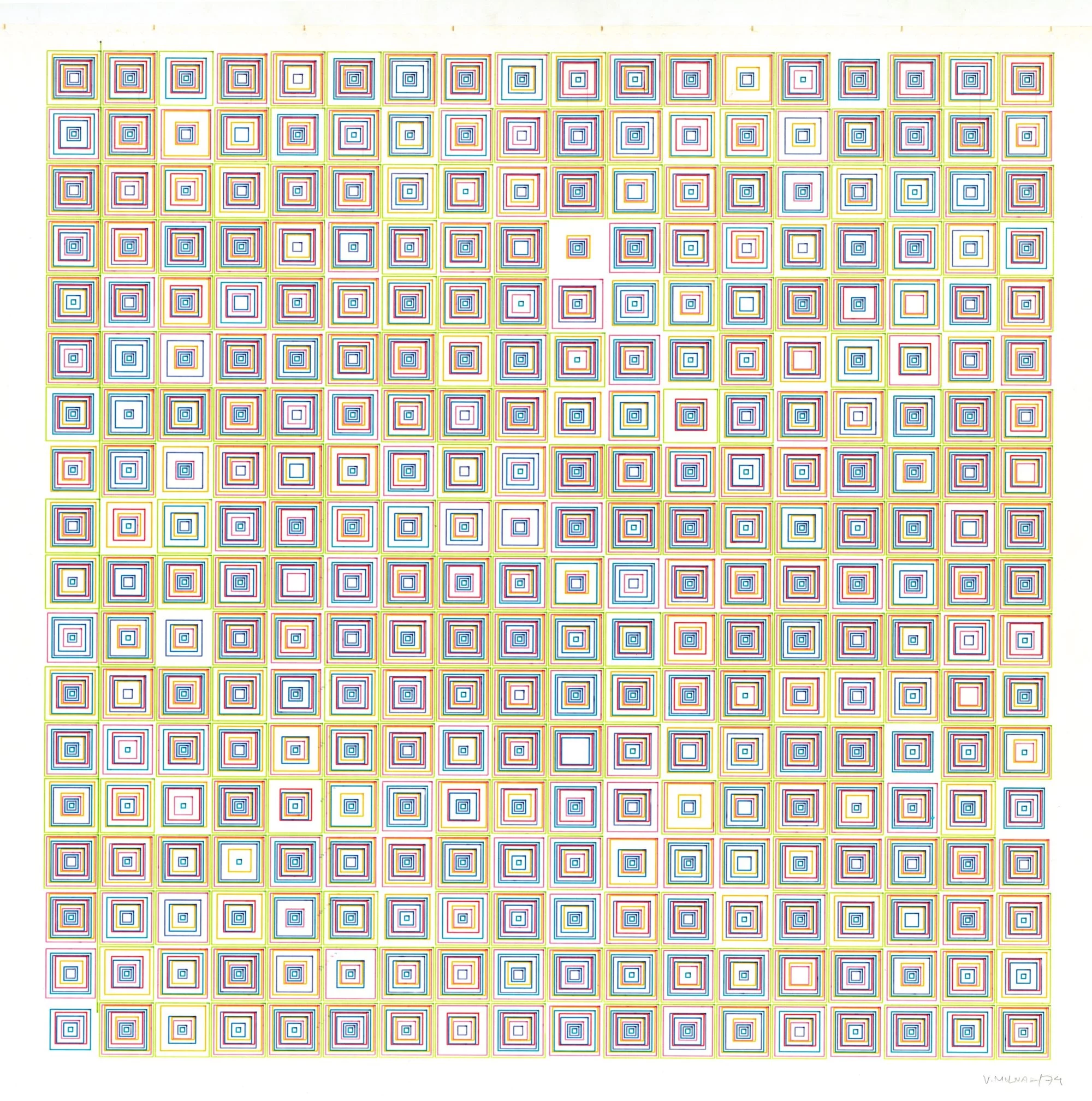
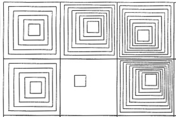
Two artists have caught my eye for my concept: Vera Molnár and Dr. Bill. Vera Molnár’s use of grids and squares with small touches of randomness was something I thought of as cool and want to bring to my own piece, especially after watching Casey Reas and learning how randomness can create unique art pieces. Her piece “(Dés)Ordres” shows an example of balance between order and chaos by introducing little changes in color and shape within a structured grid (Molnár, 1974). I want to do something similar by using a grid of squares and making each square unique, creating a sense of predictability within the order. The second artist’s art, Dr. Bill’s, has inspired me to incorporate interactive elements into my artwork (Kolomyjec, n.d.). I plan to incorporate an interactive element where the colors of the squares shift as the viewer moves their mouse across the screen, making it engaging.
To be more specific about my design, I will use the loop function to add squares all over the canvas. However, like Molnár’s designs, I’ll also add squares within the squares, but I’ll be using randomness to change either how the square moves or how big it is inside the square, or the colors of the square. Also, I wanted to make it more interesting by picking one color on one side of the canvas that changes with the user and the mouse interaction with it. In addition to that, I wanted to make it a vibrant piece by adding random colors, but as I said, I’ll be choosing one specific color that changes within the interaction of the viewer and the mouse. Hopefully, by combining Molnár’s structured randomness with Dr. Bill’s generative interaction, I am aiming to create a dynamic and engaging piece, by working with order and unpredictability, to make something that evolves with each viewer’s interaction.
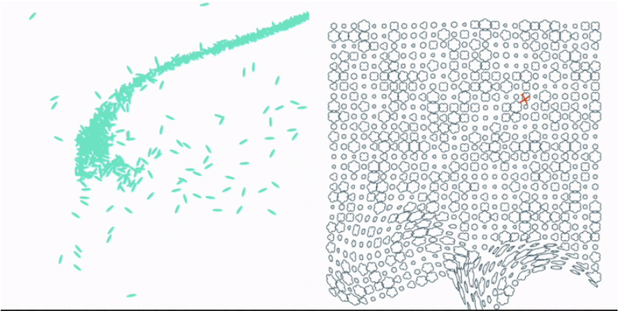
The images below are Vera Molnár and Dr. Bill’s work that inspired my piece:
Dr.Bill
Vera Molnar
SKETCH:
HIGHLIGHT:
One part I’m really proud of is figuring out how to make the cubes “shake.” I used the “random()” function to add small random movements to the X and Y coordinates of each square. By setting “randomShakeX” and “randomShakeY to values between -3 and 3, the squares move slightly, creating a subtle shaking effect.
It took me a while to get this right and was the most time-consuming part about my code. I started out by testing different ranges for the movement and tested the effect with various square sizes. After some trial and error, I found the perfect balance where the shaking felt noticeable but not too chaotic. This part of the code may seem little, but it makes the design feel more dynamic and playful, which is something I was excited to achieve. In the end, I was proud of how it turned out because it brought my art piece together, which proved Casey Reas’s message of how small random changes can make a big difference in how a design feels.
heres a code snippet on how to do it:
// Adding random movement to create an effect of shaking (inner squares)
let randomShakeX = random(-3, 3);
let randomShakeY = random(-3, 3);
// Draw three inner squares with the shaking effect, decreasing in size.
rect(x + randomShakeX, y + randomShakeY, 30, 30);
rect(x + randomShakeX, y + randomShakeY, 20, 20);
rect(x + randomShakeX, y + randomShakeY, 10, 10);
}
}
}
REFLECTION:
One thing I learned from this assignment is how randomness can play a big role in art.It adds variety and surprises that make the piece more engaging. One thing I want to improve is to add more interactions with the user in my piece. For example, I had an idea where pressing a key on the keyboard would change the shapes, and using the arrow keys could adjust the size of the shapes. Along those lines, I’d like to eventually turn the art into a game where people can play with the shapes and make their own patterns that fit their personalities. It would be more fun to do this with the art piece.I’m happy with how the code turned out, though. It makes me feel like the art piece fits with who I am by being colorful and unique.