Concept
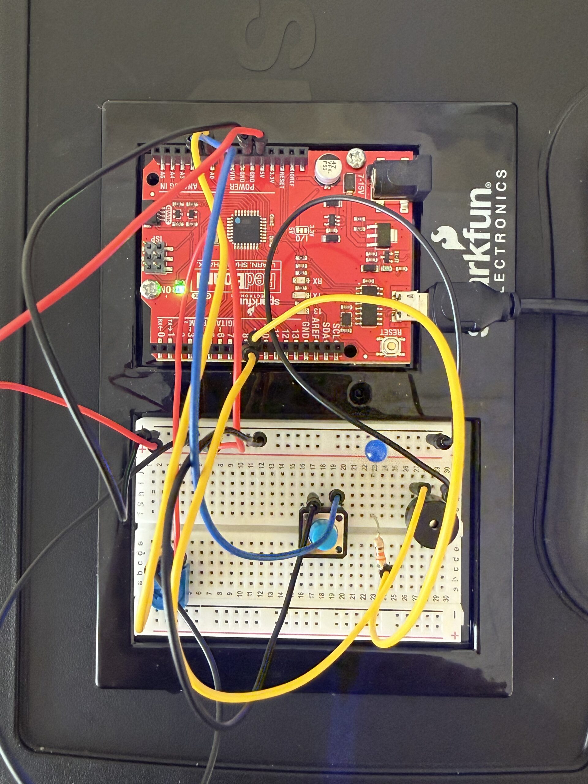
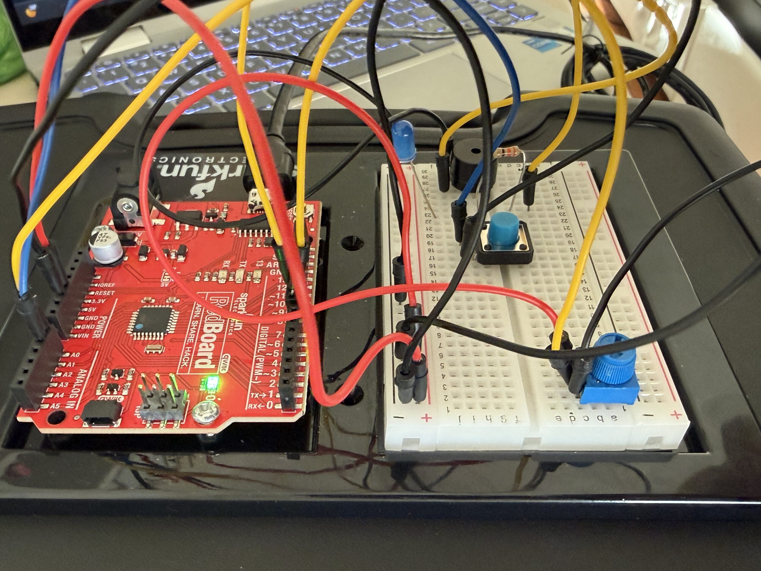
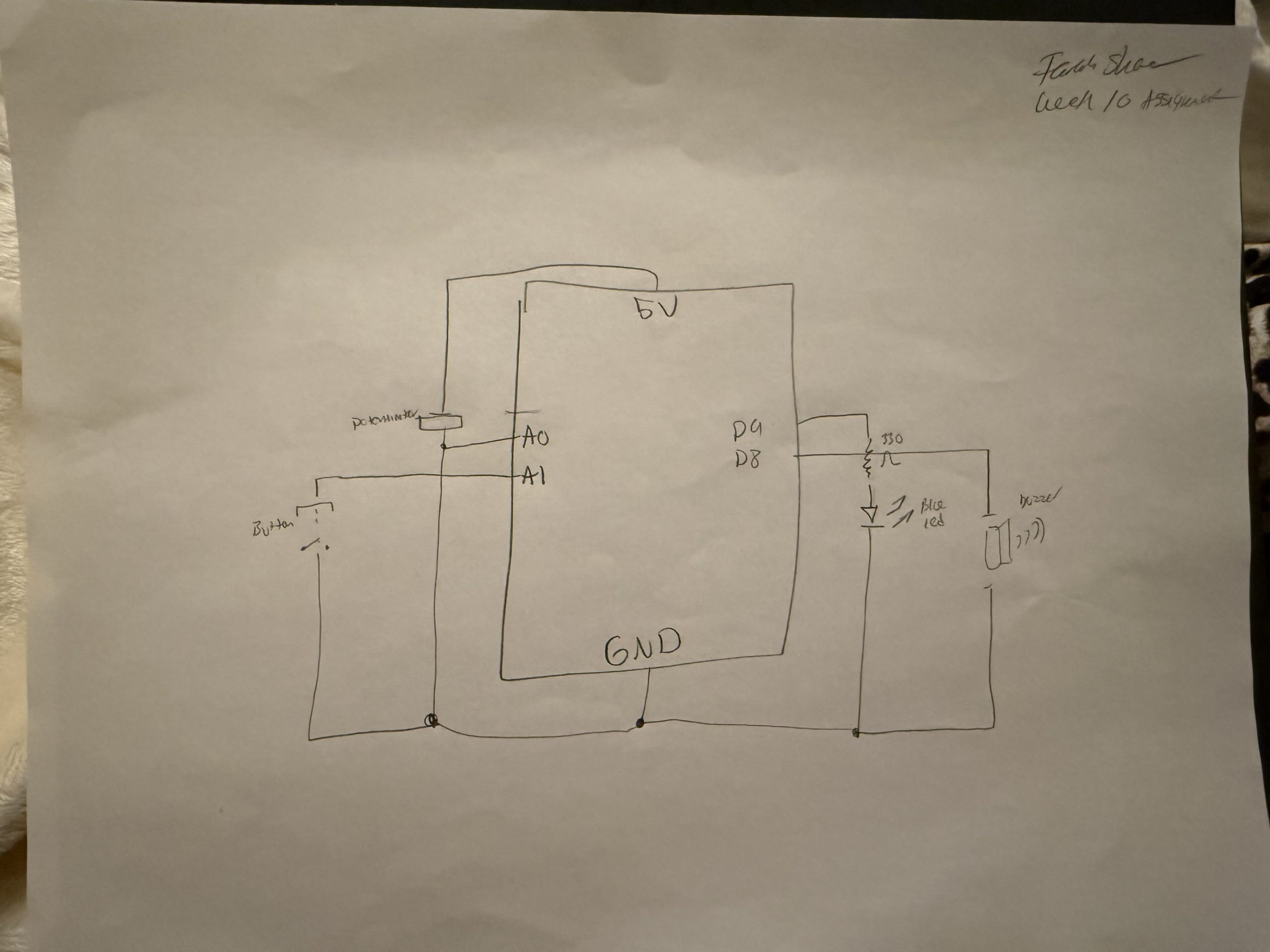
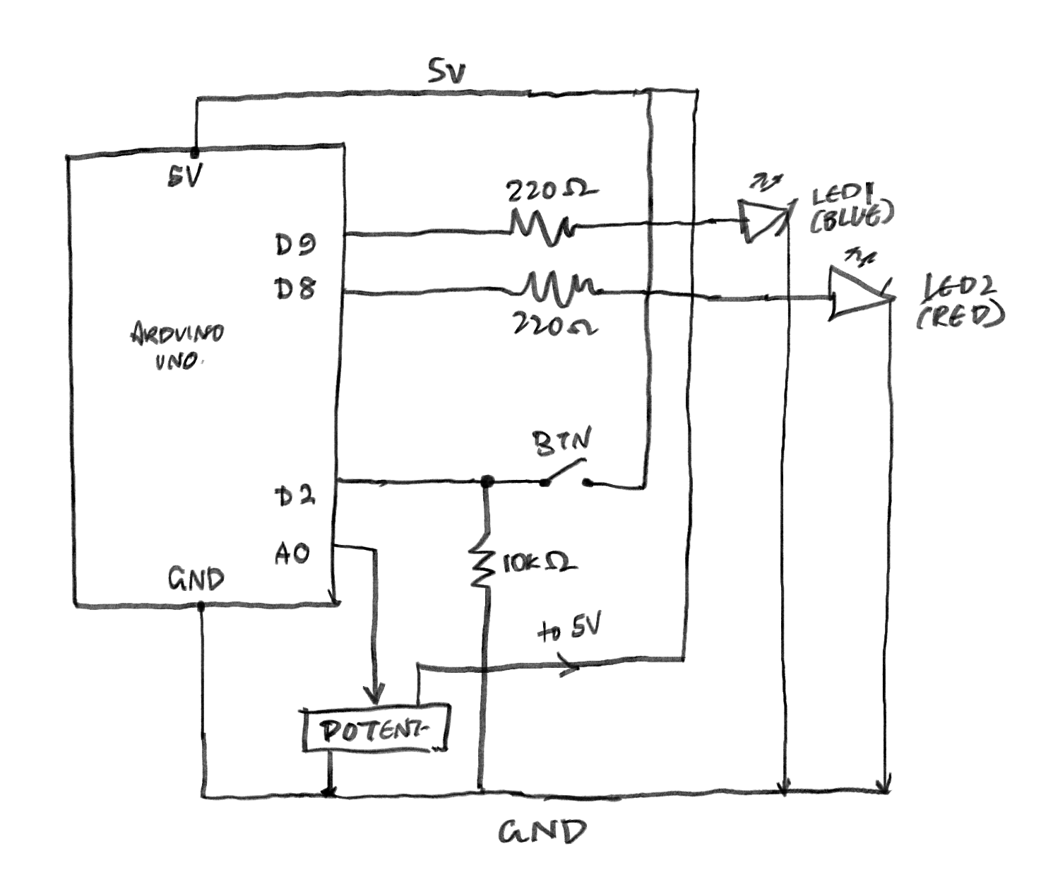
My project is a simple interactive lighting system using one analog sensor and one digital sensor. I used a potentiometer as the analog sensor and a pushbutton as the digital sensor. The idea is that the potentiometer controls the brightness of one LED, while the button controls whether the other LED turns on or off. I wanted to make a small circuit that shows two different ways Arduino can read input and control output. This project is simple, one LED changes gradually, while the other only has two states, on and off.
How I made it:
const int potPin = A0;      // potentiometer connected to analog pin A0
const int buttonPin = 2;    // pushbutton connected to digital pin 2
const int ledDigital = 13;  // LED controlled by the button
const int ledAnalog = 9;    // LED with adjustable brightness

void setup() {
  pinMode(buttonPin, INPUT_PULLUP);  // use the internal pull-up resistor for the button
  pinMode(ledDigital, OUTPUT);       // set digital LED as output
  pinMode(ledAnalog, OUTPUT);        // set analog LED as output
}

void loop() {
  // read the potentiometer value from 0 to 1023
  int potValue = analogRead(potPin);

  // convert the potentiometer value into a brightness value from 0 to 255
  int brightness = map(potValue, 0, 1023, 0, 255);

  // control the brightness of the LED on pin 9
  analogWrite(ledAnalog, brightness);

  // read the button state
  int buttonState = digitalRead(buttonPin);

  // when the button is pressed, turn on the digital LED
  // when the button is not pressed, turn it off
  if (buttonState == LOW) {
    digitalWrite(ledDigital, HIGH);
  } else {
    digitalWrite(ledDigital, LOW);
  }
}
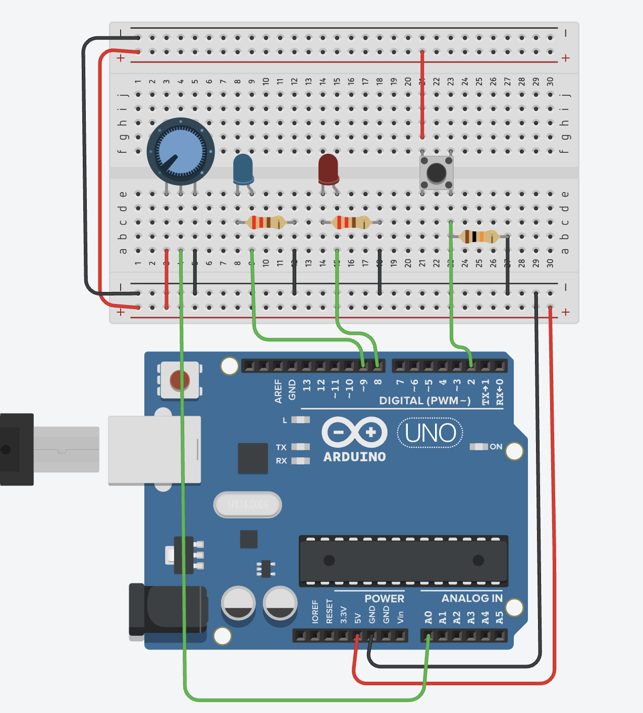
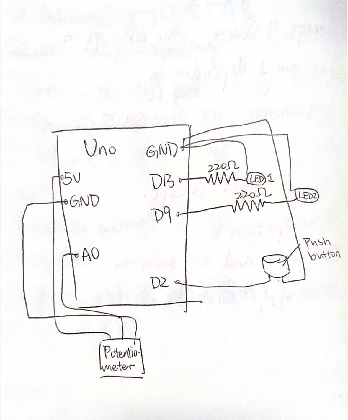
First, I built the circuit in Tinkercad because I do not have a physical Arduino with me right now. I added an Arduino Uno, a potentiometer, a pushbutton, two LEDs, and resistors. Then I connected the potentiometer to 5V, GND, and A0 so Arduino could read its analog value. After that, I connected the pushbutton to pin 2 and GND so it could work as a digital input.
Next, I connected one LED to pin 13 for simple on and off control, and another LED to pin 9 so I could control its brightness with PWM. In the code, I used analogRead() to read the potentiometer value and map() to change that value into a brightness level from 0 to 255. Then I used analogWrite() to change the brightness of the LED on pin 9. For the button, I used digitalRead() to check whether it was pressed, and then I turned the LED on pin 13 on or off.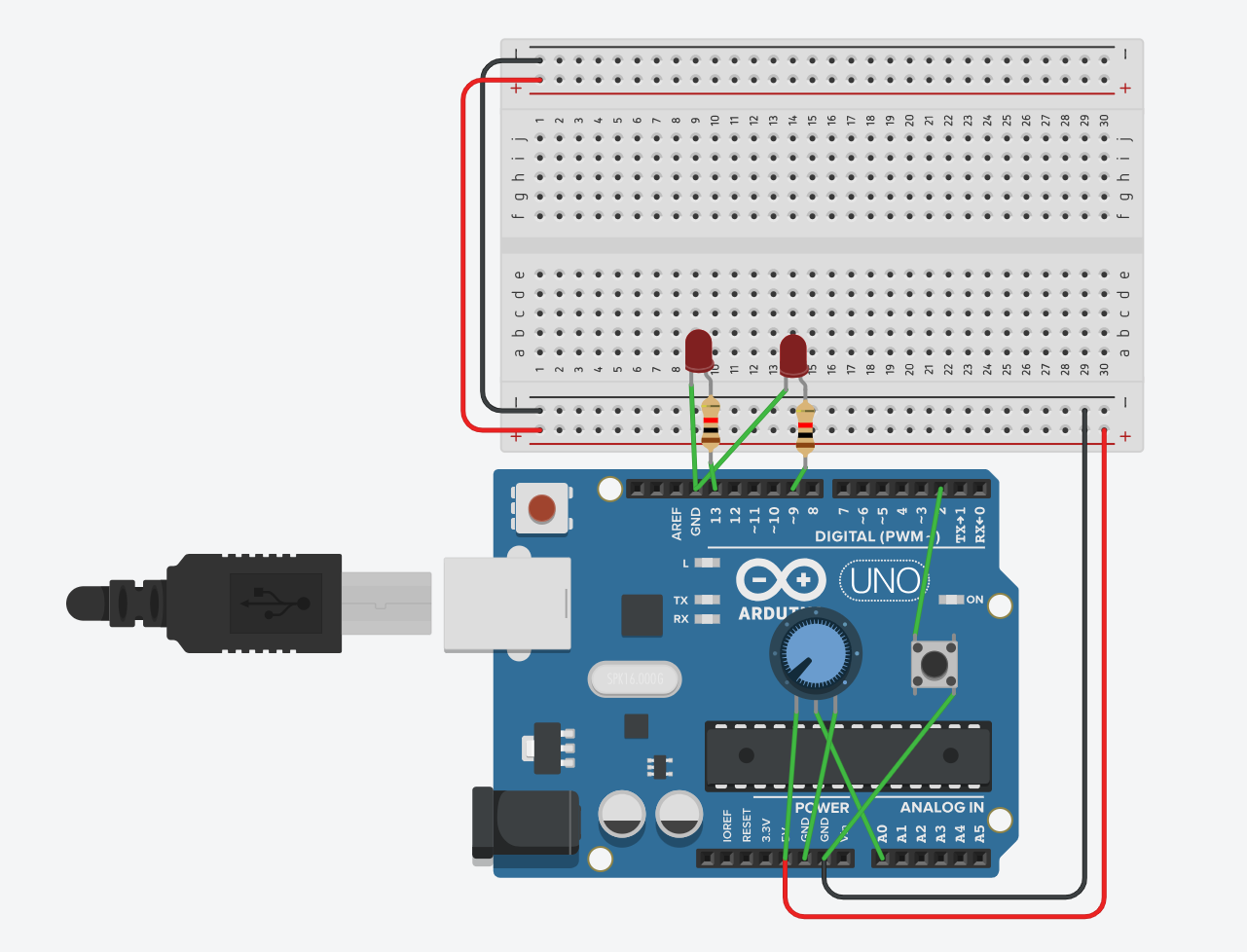
What I’m proud of
I am proud that I solved a problem by checking my circuit carefully. At the beginning, I placed the button incorrectly, so LED2 could not light up. At first, I thought the code might be wrong, but later I realized the problem was in the button connection. After fixing the button placement, the circuit worked correctly.
This mistake helped me learn that in Arduino projects, the wiring is just as important as the code. Even if the code is correct, the circuit will not work if one part is connected incorrectly. I think this was an important learning moment for mebecause I am still new to Arduino.
Conclusion
Overall, this project helped me understand the basic difference between analog input and digital input. I learned how a potentiometer can control LED brightness and how a pushbutton can control an LED in a simple on/off way. I also learned how important it is to test carefully and fix mistakes step by step. However, this is my very fist time to learn Arduino, so this project might be a bit lack of creativity. But during the process, I learned the basics of Arduino.