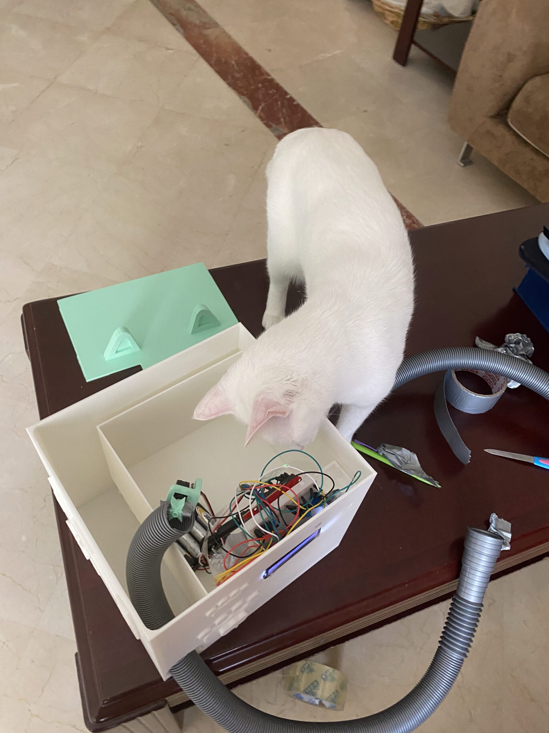
Week… 9? 10? – Reading Response

Since I don’t have that much time this week (staying with my Aunt means I do, in fact, need to go see all of her Cricket matches and record them), my reading responses are going to be significantly shorter than usual… sorry!

Her Code Got Humans On The Moon

  • Looking at the Artemis II mission is making me a bit sentimental.
  • Also she’s so cool, her programming job at MIT was a temporary thing… what…? And accidentally invented the concept of software engineering…?
  • Lauren once simulated playing astronaut and crashed it by hitting the wrong program, and then it got flagged as a real risk. Then, NASA said astronauts wouldn’t do that… and… well…
  •  This reading was pretty self-explanatory and easy to understand so I don’t. have anything to say which would not clash with the reading’s text, but she’s really, really cool. I was contemplating double majoring in IM and Mathematics and I think this confirmed it for me. 🙂

Emotion & Design: Attractive things work better

  • I would like to see all of his teapots… and why would he buy them if they weren’t that functional… Why would you make a Carelman pot impossible to use? What is the actual function of a tea pot? What makes a teapot desirable? Why would you buy a teapot that makes you work harder than you should? He uses all of these teapots too… (actually mood makes sense…)
  • “Usable but Ugly” does make sense. Would I rather have a cup that looks cute and takes me a bit longer to finish, or a cup that takes me very short to finish but looks really ugly? What if you find a solution that’s cute but also works well? 

  • In MYP Product Design, we learnt about ACCESSFM when designing anything, which featured A(ccessibility) and F(unctionality). Why do we think we can compromise on either when we can find a solution that fits both at once? People DO judge books by their covers, so we should work towards that. 
  • Psychology is everywhere! You study what people like to make a product that they will use. I didn’t know we had a judgemental system that tells us what’s good or bad, so it’s cool how you can literally trigger positive affect by pleasing design. Pleasing design makes you feel more creative while negative design makes you focus less on the design and more on the contents. That’s probably why important signs are very basic.
  • There’s three levels – visceral (does it look/feel/sound good instantly), behavioral (is it actually usable) and reflective (what does owning this mean to me, what does it say about me). I never thought about the third one consciously. 
  • Norman wrote The Design of Everyday Things (yay!) and then admitted that he wrote it too focused on logic and missed the emotional side completely, and then wrote this to fix it HAHAHA.
  • I guess TL;DR is that pretty and functional are not opposites… and nice-looking things do perform/get treated better. That’s literally also how it works with people as well (unfortunately).

Reading Response – Week 10

Norman,“Emotion & Design: Attractive things work better”

This is so interesting. I’ve thought about design quite often because it’s something I’m always interested in, but the way Norman explains it made me think about design outside the box. The idea that “attractive” or “pretty” things actually work better is something I never fully considered before. I used to think functionality comes first and that’s it, but now I’m realizing that looks and feelings can change how we experience it. One part I thought of was the idea of modernization. As someone with OCD, I used to want everything to be in a very specific and controlled way, at least the things I could control. Recently, though I’ve started to realize that a bit of chaos or imperfection can actually be better. Norman’s examples of teapots reminded me of older designs and advertisements. In the past, designs were mainly focused on solving problems and functioning well, while aesthetics didn’t matter as much. Now, because of technology and how easily we can solve everyday problems, aesthetics have become much more important.

Norman’s idea of feelings and the “science of emotions” explains how our emotions shape the way we interact with the world. At the same time, I think this idea can be tricky. A design might try to create a specific emotion for users, but not everyone will feel the same way? This is where design becomes complicated, because emotions are not universal. Still, we often rely on shared associations, like color symbolism, to guide those emotional responses. For example, European street lights have been trending recently on social media because of their yellow lights. Now, whenever people reference European streets or a certain “vibe,” it automatically connects to that lighting. Adding on to the city designs, streets and roads specifically, I usually think of New York and how the streets are structured. I used to believe that everything being clean, organized, and “perfect” was better, so I would compare it to how roads are designed in the UAE and imagine how beneficial it would be if they were more like New York. But now I realize that what looks visually appealing or aesthetic is not always what functions best.

Overall, this reading made me realize that design is not just about making something work, but about how it makes people feel while using it. In my future projects I want to experiment with this idea of ‘attractiveness’ as well as focusing on the feelings from my perspective as the artist/creator but also the audience’s perspective.

Her Code Got Humans on the Moon

I always think about fate and destiny, which I personally find very beautiful. If Margaret’s 4 year old daughter Lauren didn’t pre-launch the system, then they wouldn’t have discovered that flaw and she wouldn’t have been able to think about a solution. Thinking about Margaret’s perspective, I expected her to get mad over the “ruined” project, but instead she treated it as an opportunity to improve the system. That mindset really stood out to me because it shows how mistakes aren’t always setbacks, they can actually prevent bigger failures later.

I also found it interesting how people were punching holes into stacks of cards to represent code, and how everything had to be perfect before running it because there was no room for edits. This made me reflect on how different my experience with coding is today because I’m constantly editing, fixing, and experimenting with my code which I now am very thankful for this flexibility. Back then, one small mistake could cost so much time and effort, which means they had always think carefully. This connects a lot to my own work and even my daily habits. I always know that there is a command z button I can press and have everything how it used to be, and I know that I can always go back and fix things. But reading this made me question whether I’m sometimes too dependent on that flexibility instead of thinking things through more deeply from the start. Like I always say to my friends, I wish there was a command z button in life so I can go back.

Overall, I think Margaret’s story inspires me to be more aware of the “impossible” or unexpected scenarios, because there is always a possibility of things going wrong. I also want to start using bugs as opportunities for growth in a more intentional way because normally, I just fix the issue, learn from it, and move on, but now I’m thinking about how I can actually expand from a single mistake, whether that’s improving the system, adding new features, or preventing future errors. I guess I’ll have to experiment with that next time.


Week 9 reading


Reading 1(longer one):

One idea I got from the reading is that beauty is not just decoration. Attractive design can actually change how people feel, and that feeling can affect how well they use something.

I also thought it was interesting that people do not always choose things only because they are the most efficient. Sometimes we choose objects because they feel enjoyable, elegant, or comforting. That makes design feel more human, not just technical.

Another idea is that emotion affects thinking. When people feel relaxed and positive, they may become more open, creative, and flexible. But when they feel stressed, they focus more narrowly. This made me think that design should match the situation people are in.

The reading also made me think that usability and aesthetics should not be separated too much. A product may work well in a mechanical sense, but if it feels unpleasant, the whole experience is weaker. Good design should care about both function and feeling.


Reading 2(shorter one):

Margaret Hamilton did more than write programs. She helped make software into a serious field. At first, software was not even treated as an important part of the Apollo mission, but later it became central to success.

I also think the article has a strong message about responsibility. Hamilton understood that small mistakes in code could become huge real-life dangers. That makes her work feel very modern, because today we still depend on software in high-stakes situations.

The article also suggests that great inventions are not only about one person. Hamilton was a major leader, but Apollo software was built by a large team, including many women whose work is often forgotten. That makes the article partly about hidden labor and recognition.

Reading Reflection Week 8: Aesthetics, Auto-Saving and Appeal

Norman makes a really interesting argument that I see throughout daily life of how a positive mood is really a partnership of the aesthetics vis a vis the usability of the product. I mean, whenever I upgrade my own technology, I see a lot of benefits from the upgrade and with that, I can see how it does influence my thinking. As an example, with my previous Xiaomi phone, I found a lot of workarounds for say installing apps that aren’t available in my region or even some hidden features that made my use of the device much more intuitive.

However I’d like to extend his argument by saying that brand loyalty does also play a factor in our thinking. I upgraded to a Google Pixel phone and I think I mostly got sold on it, because of the abudance of features and the whole Google brand. I mean, I’m enjoying the phone don’t get me wrong, but when I encunter a minor issue, it doesn’t really appaul me, more so I’m patient but particularly because I strongly side with Google as the brand value of it. So there’s definitely an argument to made there that if you are loyal and trust a brand, then your thinking is based off it.

With regards to Hamilton, I think it’s really interesting that there was a time where people thought that humans didn’t need support or help because NASA just assumed that astronauts are equipped with a higher degree of knowledge. Nowadays, we constantly make mistakes (I mean even writing this I almost forgot to save my work 😭) and I couldn’t imagine living with technology without error checks. And I think some people do get offended or at least frustrated with error check screens as they’re so constant and everywhere. But man, imagine if we didn’t have them. What kind of society would we live in?

Midterm Project – Strawberry Yurt Cafè

Concept

For my midterm, I created Strawberry Yurt Cafè, a cozy cafe game. I was inspired by a vlog by Gazi (https://youtu.be/eBt0nV0Y1Y0?si=4Hjy9PetN7n4hHwU) where she coded a game in one night, and that made me want to create a game for my own project too. I did not make mine in one night, but that idea encouraged me to build atmospheric game. I was also inspired by lo-fi playlists, and I wanted the game to feel soft and calm.

This project ended up being very different from what I originally thought I was going to do when I first posted my midterm ideas. My direction changed a lot during the process, but I think that actually helped me find a project that I enjoyed. Since I have been studying in cafes a lot recently, I liked the idea of making a cafe game ran by someone who loves strawberries.

Process

I started by outlining the main parts of the game that I would need to make:

  1. The cafe environment
  2. The kitchen area,
  3. The drinks,
  4. The recipe book, the ingredients
  5. The customers

After planning those pieces, I moved into sketching.

I first drew the strawberry-themed cafe, the seller. I decided that the cafe would sell cakes and drinks, but the player would be the barista helping the seller prepare drinks for customers. Since the cafe has a dome-like shape, it reminded me of a yurt from my home country, Kazakhstan, which is a traditional home that my ancestors used to live in, so that is why I decided to call the game Strawberry Yurt Cafè.


After that, I chose the main color palette of the project. I focused mostly on pink, brown, and beige tones because I wanted the game to look warm and cozy.


Then I started drawing the individual assets so the drinks, ingredients, and customers. I also sketched the different stages of making drinks, so the player could visually see the process step by step.


I sketched the ingredients for the drinks like strawberry jam, matcha, milk, ice cream, strawberries, tea, whipped cream.


After I designed a variety of animal customers and ended up making nine different versions. I also created the recipe book logo in Adobe, which helped give the interface a more finished look.

How the Project Works

The game begins on an intro screen with instructions. After the player clicks Start Shift, the game moves into the cafe scene, where a customer appears with an order bubble. The player can open the recipe book, choose a drink, and then move into the kitchen scene. In the kitchen, the player has to click the ingredients in the correct order to prepare the drink before the timer runs out. If the correct recipe is followed, the customer reacts happily; if the wrong ingredient is added or time runs out, the customer reacts negatively.

One part I am proud of is how the game combines visuals, interaction, and sound to create a full atmosphere. I used my drawings to build the aesthetic of the game, and I also found sound effects for the ingredients, recipe book interactions, and customer mood changes. The game includes cozy background music when it starts, which helps support the feeling I wanted the player to have. Even though the gameplay is simple, I think it succeeds in giving the user a cute and relaxing experience.

Code Snippets

I structured data for the drinks so each one could have its own recipe and ingredient positions:

const DRINKS = {
  "strawberry latte": {
    steps: ["tea", "strawberry milk", "cold milk"],
    ingredients: [
      { target: "strawberry milk", ingredient: "strawberry milk", x: -155, y: -110 },
      { target: "cold milk", ingredient: "cold milk", x: -4, y: -107 },
      { target: "tea", ingredient: "tea", x: 139, y: -109 },
    ],
  },
};

By I creating a DRINKS object where each drink stores its ingredient order and the positions of the ingredient icons in the kitchen scene. Each drink has a recipe, and the game checks whether the player clicks the ingredients in the same order as the steps array. The ingredients array also tells the game where to place each ingredient on the screen. Because of this, I could add multiple drinks without rewriting the whole game logic every time.

Another code section I found important is the function that handles what happens after the player delivers a drink.

function finishDrink(deliveredCorrectDrink) {
  state.scene = "cafe";
  state.recipeBookOpen = false;
  state.ingredientsVisible = false;

  if (deliveredCorrectDrink) {
    state.goodDrinksMade += 1;
    state.reactCostume = "love";
    playEffect("sound-effect-twinklesparkle-115095", 1);
  } else {
    state.badDrinksMade += 1;
    state.reactCostume = "mad";
    playEffect("551543__philracoindie__8-bit-denyerror-sound", 1);
  }

  clearCurrentDrink();
  scheduleNextCustomer();
}

This function basically controls the result of the player’s action. After the player delivers a drink, the game goes back to the cafe scene. Then it checks if the drink was correct or not. If it was correct, the game adds one point to the good drinks counter, changes the customer reaction to happy, and plays a positive sound. If the drink was wrong, it adds one point to the missed drinks counter, changes the reaction to mad, and plays a different sound.

Reflection and improvements

One of the main problems I ran into was with the visual side of the project. At first, I wanted to create and draw some of the assets directly with code, but the results looked off and did not match the soft, cozy style I imagined. Because of that, I decided to draw the assets myself instead. After that, I also had some issues with image transparency, since some files showed unwanted white backgrounds or did not blend well into the game at first. Fixing those problems took time, but it helped me understand that sometimes hand-drawn assets and image cleanup work better for a project like this than trying to build everything only through code.

There are still many things I would like to improve in the future. I would like to add more drinks, more customer reactions, and more animations in the environment. I also think the game could cooler if I added more interactions in the cafe itself. Still, I am very proud of this project because it gives the exact kind of cozy experience I wanted to give to the user.


Week 7 means… MIDTERM! (╥ω╥)

You might need to open this on a different tab for the hand gestures and camera to work here! Aaaand this for phone (but some parts are a bit different.) The cursor still works on this though.

Preface…? (And Concept)

Before I actually get into my project, I’ll tell you about how terrible my process was, for the sake of transparency. I started off with making a visual novel: think if you combined Doki Doki Literature Club, Butterfly Soup, and Persona… or something (but not a shoujo one. That definitely did pop up in my head, though.) I had my laptop out and thumbnails ready to go…

Ryuji (Persona 5): "I'm an esteemed scholar (Just opened my laptop.)"

…and then I ended up moving between 5 houses, 2 countries and five states in the span of 3 weeks. Yippee! The weekend the crisis started was the weekend I was expected to cram my project, and so, the cramming did NOT happen.

Ryuji (P5): "Bad news about my academic career Guys (Just closed my laptop)"

During these three weeks, while jumping from one house to another, I was also jumping from idea to idea: 14-year-old me was geeking out because I had the time to actually make a video game… except now not in great circumstances and constant power cutouts. I gave up on the visual novel idea (despite having some sprites ready </3) and tried to make a rhythm game, and then the issue of (one) copyright and (two) not having my keyboard with me resulted in a bigger headache figuring out the music than the coding itself. I tried to make a pixel game, and then realized that it would take me a long time to translate my ideas into pixel art and be satisfied with the amount of time I had.

One thing I really did want to include in my project was my artwork, and I realized very late, that why don’t I make a dress-up game? I used to play those games religiously on my dad’s Dell laptop while he would sleep in the afternoons when I was a kid, and now, I could make my own! I love fashion and since I’ve been holed up in each of the houses I’m staying in (Indian families are huge), I’ve missed dressing up a lot. In some way, I might be projecting onto this project. So… my concept is:

Short version: Hand-made Picrew with my own drawings and my own website code.

Long version: The short version explains it pretty well. I wanted the interface to be sketchy, as if I hand-drew it, and I wanted it to look very simplistic so that users would pay more attention to the character they were making. Then, you can also download your own version of the character! This would be a prototype for me to figure out how I could create this, and if it went well, I would reuse my code in the future to make a more extensive page (maybe even with backgrounds…).

Process

Firstly, I thumb-nailed. The first is before I started drawing the characters, and the second is after I finished all the elements for the characters. As you can see, I didn’t follow this exact layout, but it did help.

To make sure I didn’t end up spending too much time on this (since I didn’t have much time to begin with), I forced myself to set a fixed time restriction when drawing each element out on Procreate. I gave myself 3 hours, and here’s the results. You can see the elements much better on the game:

To make sure that when I layered each element over each other, you wouldn’t see the layers below, I made sure to color the lines with white in case. (Hence the lack of color… if I had more time I would have variations in color). To also make some cuter elements, I drew some more things out. .

Title! I tried to be consistent with my drawing style when I drew this.

I just layered the elements I drew to make two characters. Easy Peasy.

I started by putting (and renaming) my elements into folders on p5.js for each category, and then establishing each category and the layer order they would be stacked in (since all images are .pngs).

const LAYER_ORDER = ["base", "socks", "shoes", "pants", "tops", 
                     "accessories", "eyebrows", "eyes", "noses", 
                     "mouths", "hair", "hands"];

From there, I started building the sidebar and the overall layout of the game.

While I struggled with the hand tracking interaction, I was somewhat happy with the outcome. Using ml5’s handPose, I tracked only the tip of the index finger and mapped it to the canvas.

let indexFinger = hands[0].keypoints[8];
let tx = map(indexFinger.x, 0, 640, 0, CW);
let ty = map(indexFinger.y, 0, 480, 0, CH);
fingerX = lerp(fingerX, tx, 0.3); 
fingerY = lerp(fingerY, ty, 0.3);

However, I struggled with how to “click” without a mouse, and so I used a hover timer system. If I held my finger over a box for long enough, it would trigger the action:

let foundID = getHoverID();
if (foundID !== null) {
  if (foundID !== currentHoverID) { 
    currentHoverID = foundID; 
    hoverTimer = 0; 
    isLocked = false; 
  }
  if (!isLocked) {
    hoverTimer++;
    if (hoverTimer >= clickDelay) { 
      triggerAction(); 
      isLocked = true; 
    }
  }
}

// the arc cursor:
if (hoverTimer > 0 && !isLocked) {
  let arcEnd = map(hoverTimer, 0, clickDelay, 0, TWO_PI);
  strokeWeight(4); 
  arc(fingerX, fingerY, 35, 35, -HALF_PI, arcEnd - HALF_PI);
}

I turned it to 55 frames: not too long or short. I also added a circle that fills around the cursor to see the timer count down, which made it easier for the user to understand.

For the sketchy feeling of the boxes, I drew it so the buttons redraw with slightly different lines every frame, and it made it look much more fun.

render() {
  push(); stroke(0); strokeWeight(this.isMain ? 4 : 2); 
  fill(this.isOver() ? 240 : 255);
  
  randomSeed(this.x + this.y + floor(millis()/150));
  beginShape();
  vertex(this.x + random(-3,3), this.y + random(-3,3));
  vertex(this.x + this.w + random(-3,3), this.y + random(-3,3));
  vertex(this.x + this.w + random(-3,3), this.y + this.h + random(-3,3));
  vertex(this.x + random(-3,3), this.y + this.h + random(-3,3));
  endShape(CLOSE);
  
  noStroke(); fill(0); textAlign(CENTER, CENTER);
  if(customFont) textFont(customFont);
  textSize(this.isMain ? 32 : 18);
  text(this.label, this.x + this.w/2, this.y + this.h/2 + (this.isMain ? 5 : 2));
  pop();
}

For sounds, I had different sounds loaded for different actions. I had background music, and three different click sounds (for buttons in the sidebar, anything other buttons, and any of the items individually):

bgMusic = loadSound("song1.mp3", () => {
  bgMusic.setVolume(0.6);
  assetLoaded();
});
sfxItem = loadSound("click_item.mp3", assetLoaded);
sfxUI = loadSound("click_ui.mp3", assetLoaded);
sfxSidebar = loadSound("click_sidebar.mp3", assetLoaded);

if (aid === "start_btn") { 
  sfxUI.play(); 
  appState = "HELP"; 
  if (bgMusic && !bgMusic.isPlaying()) bgMusic.loop(); 
}

To make sure that when I reset the game, it would ask me for confirmation (in case I accidentally put my hand on the reset button), I used this code:

function drawModal() {
  fill(255, 230); noStroke(); rect(0, 0, CW, CH); // translucent overlay
  drawStaticBox(CW/2-150, CH/2-100, 300, 200);
  fill(0); textAlign(CENTER, CENTER); textSize(26);
  
  if (modalState === "RESET_CONFIRM") {
    text("Are you sure?", CW/2, CH/2 - 40);
    new SketchButton(CW/2-110, CH/2+20, 100, 40, "YES").render();
    new SketchButton(CW/2+10, CH/2+20, 100, 40, "NO").render();
  }
}

// in triggerAction():
if (modalState === "RESET_CONFIRM") {
  if (aid === "mod_yes") { avatar.reset(); sfxUI.play(); modalState = "NONE"; }
  else if (aid === "mod_no") { sfxUI.play(); modalState = "NONE"; }
  return; // early return stops anything else from firing
}

To save the image of the avatar, I used p5’s get() to screenshot the avatar preview region of the canvas and save it as a .jpg.

else if (aid === "save_btn") { 
  sfxUI.play(); 
  get(382, TOP_H+2, 366, CH-TOP_H-BOT_H-4).save('doodle','jpg'); 
  modalState = "SAVE_DONE"; 
}

I calculated the coordinates to make sure this crops cleanly no matter what the avatar is wearing. However, I think I messed this up on the mobile version (⇀‸↼‶).

I was really proud of the UI and how everything looked (somewhat) cohesive with each other, even though I drew some parts and coded other parts. And… even though this isn’t a coding part… I’m also really proud of my drawings. I’ve been in art block for a bit, so this forced me to draw (which helped somehow). ( ⸝⸝´꒳`⸝⸝)

Improvements (and our favorite thing… problems):
  • Originally when making the cursor, I struggled because I thought I should use a pinch action to select each box. That did NOT work due to the size of each box. So, I changed it to an (as others referred to it) x-box loading cursor with the circle to show how long you’re holding it before it selects. Worked pretty well!
  • There’s no color… which I really did want to put but I didn’t have time. While I do like the sketchiness of this, it would have been cooler to have more options and colors.
  • Also I have a lack of body diversity (race, body shapes, even gender) so I am SOAnyone else have this problem? : r/picrew SORRY! This was not intentional at all… I probably can’t even make myself on this, to be honest. This IS a prototype so I promise if I make a proper version, it’ll be very diverse.
  • On the mobile version, I can’t do computer vision. It also took me an hour to figure out why my code (which I altered for mobile)  wasn’t working on itch.io, so I would say the mobile version is worse than the desktop version.
  • I struggled with computer vision for an embarrassingly long amount of time. I still think it’s wonky, because I have to move my hands in really absurd distances and places to hit just a few buttons. The mouse is so much easier to use.
  • One thing I DID resolve was that while I was arranging images in the sidebar, due to the canvas size of each image being 1000×1000, it ended up looking tiny in each box. To fix this, I sorted the categories based on where on the canvas they were located (face were top right, feet were bottom right, etc.):
let zone = ["eyes", "eyebrows", "noses", "mouths", "hair"].includes(catKey) ? FACE_ZONE : (["shoes", "socks"].includes(catKey) ? FEET_ZONE : BODY_ZONE);

…and used this code to individually zoom in:

const FACE_ZONE = { x: 700, y: 120, w: 70, h: 70 }, FEET_ZONE = { x: 600, y: 670, w: 200, h: 200 }, BODY_ZONE = { x: 600, y: 200, w: 300, h: 300 };

I have more I want to say but I think this may turn into an essay, so I’ll leave it at that.

I hope that, at least, you all enjoy this! (੭˃ᴗ˂)੭
Credits

The Sanderling Brush on Procreate | This instrumental for background music | This cute font | The JJK S3 OST (good work music) | MixKit for sound effects

Midterm project : Bakkar Ramadan Game

Concept:

Oy, “Hello” in the Nubian language , My concept is my favorite Ramadan series teaching students new lessons everyday in the holy month of Ramadan offering wisdom and importance of community as well ass offering awareness to children and adults since it the series was a great success in Egypt and The Arab World. It is also the first 100% created Egyptian cartoon series started in 1998. It also introduces the Nubian culture which on of the rich, unique, and strongly continuing cultures in Egypt.

Bakkar (TV Series 1998– ) - IMDb

So how does it work and what am I proud of:

Initializing all images and assets

let startImg, homeImg, bakkarImg, hassonaImg, mapImg, mapSceneImg;
let teacherImg, rashidaImg, friend1Img, shalabiImg, friend2Img, shalabi2Img;
let storeShelfImg, storeAsset1Img, storeAsset2Img, bagImg, shopSignImg;
let button;
let homeMapStartTime = 0;


Hassona is Bakkar friend guiding him through the game. I added Typetext message. HassonaStoreIdx and hassonaMapIdx starts at 0 and counts up to the full length of the map and home  scene text, making it appear letter-by-letter.

let homeTypeText = "حسونه: يا بكار يلا نجمع فلوس الزينة رمضان\nHassona: Yalla Bakar Lets collect the money for the Ramadan decorations";
let homeTypeIdx = 0;

const hassonaMapText = "حسونة: اضغط Space للتكلم مع أصحابنا والجيران!\nHassona: Press Space to Talk to our Friends and Neighbors!";
const hassonaStoreText = "حسونة: اسحب الأغراض للشنطة عشان تشتري!\nHassona: Click & Drag objects to the Bag to Buy!";
let hassonaMapIdx = 0;
let hassonaStoreIdx = 0;


This is the pinned message at the top giving instruction. I added a white speech box to make it more clear to see the message.

fullText.substring(0, idx) slices the full string to only show characters up to idx, creating the typewriter effect.

function drawHassonaBanner(fullText, idx) {
noStroke();

// Dark semi-transparent backing strip
fill(0, 150);
rect(0, 0, width, BANNER_H);

// Hassona avatar
image(hassonaImg, ICON_PAD, ICON_PAD, ICON_SIZE, ICON_SIZE);

// White speech box
fill(255);
rect(BOX_X, ICON_PAD, BOX_W, BANNER_H - ICON_PAD * 2, 8);

// Typewriter text inside box
fill(0);
textAlign(LEFT);
textSize(14);
text(fullText.substring(0, idx), BOX_X + 12, ICON_PAD + 18, BOX_W - 22, BANNER_H - ICON_PAD * 2 - 10);
}


This function draws the Hassona intro banner on the home screen. It waits 2 seconds after the scene starts. I used Chatgbt to learn more about how to use time countdown before it shows an image or an object as well as typer style of text banner. Also there is a debugMode to help with seeing where the collision boxes are I got it form Claude because I struggle to envision where everything goes.

function drawHomeTypewriter() {
if (millis() - homeMapStartTime < 2000) return;
image(hassonaImg, 10, 10, 100, 100);
fill(255); rect(120, 20, 650, 100, 10);
fill(0); textAlign(LEFT);
text(homeTypeText.substring(0, homeTypeIdx), 140, 50, 600);
if (frameCount % 2 === 0 && homeTypeIdx < homeTypeText.length) homeTypeIdx++;
}


Every frame, updateRashidaTrail saves Bakkar’s current position to a history array, trims it to TRAIL_DELAY frames long, then positions Rashida at the oldest saved position — making her follow Bakkar with a slight delay. drawRashida simply draws her sprite at that calculated position.

function updateRashidaTrail() {
posHistory.push({ x: x, y: y });
if (posHistory.length > TRAIL_DELAY + 1) posHistory.shift();
if (posHistory.length > 0) {
rashidaX = posHistory[0].x - RASHIDA_W * 0.5;
rashidaY = posHistory[0].y + (charH - RASHIDA_H) * 0.5;
}
}

function drawRashida() {
image(rashidaImg, rashidaX, rashidaY, RASHIDA_W, RASHIDA_H);
}


For the collision I used a fixed hitboxoffset  so when my character collides with an object it gets detected, and the it either stops the object from going through the object or transitions to the next scene

The moveCharacter function moves using arrows and it minus the amount of steps towards a specific direction like x or y in negative which the left side or positive side which to the right side. If moving horizontally doesn’t cause a collision, it applies the new X; if moving vertically doesn’t cause a collision, it applies the new Y. This way the player can slide along a wall instead of getting completely stuck when hitting it diagonally.

function checkCollision(cx, cy, ox, oy, ow, oh) {
return (
cx + hitboxOffsetX < ox + ow &&
cx + hitboxOffsetX + hitboxW > ox &&
cy + hitboxOffsetY < oy + oh &&
cy + hitboxOffsetY + hitboxH > oy
);
}

function collidesWithList(nx, ny, list) {
for (let obs of list) {
if (checkCollision(nx, ny, obs.x, obs.y, obs.w, obs.h)) return true;
}
return false;
}

function moveCharacter(obstacles) {
let nx = x, ny = y;
if (keyIsDown(LEFT_ARROW)) nx -= step;
if (keyIsDown(RIGHT_ARROW)) nx += step;
if (keyIsDown(UP_ARROW)) ny -= step;
if (keyIsDown(DOWN_ARROW)) ny += step;
nx = constrain(nx, 0, width - charW);
ny = constrain(ny, 0, height - charH);
if (!collidesWithList(nx, y, obstacles)) x = nx;
if (!collidesWithList(x, ny, obstacles)) y = ny;
}


In the store scene it shows the amount of money collected in the variable  moneyTotal and then we have an object bag with a specific x,y,w, and h to drop object in the bag.

function drawStoreScene() {
image(storeShelfImg, 0, 0, width, height);

image(bagImg, bagZone.x, bagZone.y, bagZone.w, bagZone.h);
fill(255); textAlign(CENTER); textSize(14);
text("Drop to Buy", bagZone.x + 90, bagZone.y + 30);

// Money HUD sits below the banner
fill(0, 180); rect(0, BANNER_H, width, 48);
fill(255, 215, 0); textSize(20); textAlign(CENTER);
text("Money: " + moneyTotal + " EGP", width / 2, BANNER_H + 33);


It loops through storeItems and draws each one that hasn’t been bought or placed yet, then if the player is currently dragging an item it draws it following the mouse. Finally it handles the error message, dialogue, back button, and draws the Hassona banner last so it always appears on top of everything else.

for (let itm of storeItems) {
if (!itm.inBag && !itm.placedOnMap) {
image(itm.img, itm.px, itm.py, 100, 100);
fill(255); textSize(18); text(itm.name, itm.px + 50, itm.py - 10);
}
}
if (dragging && scene === 'store_scene') {
image(storeItems[dragging.idx].img, mouseX - 50, mouseY - 50, 100, 100);
}
if (millis() < statusTimer) { fill(255, 0, 0); text(statusMessage, width / 2, height / 2); }

drawDialogueUI();

fill(255); textSize(18); text("Press 'B' to Return to Map", width / 2, height - 30);

// Hassona banner drawn last — always on top
drawHassonaBanner(hassonaStoreText, hassonaStoreIdx);
if (frameCount % 2 === 0 && hassonaStoreIdx < hassonaStoreText.length) hassonaStoreIdx++;
}


drawBakar draws the player , drawDoor draws a brown rectangle for the home door, drawStoreEntrance draws the shop sign image, and startGame switches to the home scene, hides the start button, records the start time, and resets Rashida’s position and trail history.

function drawBakar() { image(bakkarImg, x, y, charW, charH); }
function drawDoor() { fill(101, 67, 33); rect(doorX, doorY, doorW, doorH, 5); }
function drawStoreEntrance() {
image(shopSignImg, storeDoor.x, storeDoor.y, storeDoor.w, storeDoor.h);
}
function startGame() {
scene = "home_map";
button.hide();
homeMapStartTime = millis();
rashidaX = x - RASHIDA_W - 10;
rashidaY = y;
posHistory = [];
}


Draws a small semi-transparent dark badge in the top-right corner just below the Hassona banner, displaying the player’s current cash total in gold text.

function drawMoneyHUD() {
// In map_scene, cash badge sits just below the Hassona banner
fill(0, 180); rect(width - 190, BANNER_H + 8, 170, 40, 10);
fill(255, 215, 0); textSize(16); textAlign(CENTER);
text("Cash: " + moneyTotal, width - 105, BANNER_H + 30);
}


with each interaction with each store asset and their x,y positions, name, and image that was initialized in the beginning of the code.

function initStoreItems() {
storeItems = [
{ name: "Lantern", img: storeAsset1Img, cost: 10, shelfX: 100, shelfY: 300, px: 100, py: 300, inBag: false, placedOnMap: false, mapX: 0, mapY: 0 },
{ name: "Decor", img: storeAsset2Img, cost: 15, shelfX: 300, shelfY: 300, px: 300, py: 300, inBag: false, placedOnMap: false, mapX: 0, mapY: 0 }
];
}


I wrote the dialogue  with each interaction with each character  and their x,y positions, name, and image that was initialized in the beginning of the code.

function initNPCs() {
npcs = [
{ name: "Teacher", img: teacherImg, x: 100, y: 200, completed: false,
greet: "Bakar! Help with Ramadan decorations?",
opts: [{ text: "Yes! (Collect 10 EGP)", reward: 10, reply: "Good luck!" }] },

{ name: "Friend", img: friend1Img, x: 200, y: 600, completed: false,
greet: "Bakar! I saved some money for the decorations!",
opts: [{ text: "Thanks! (Collect 15 EGP)", reward: 15, reply: "Yalla habibi!" }] },

{ name: "Friend2", img: friend2Img, x: 380, y: 600, completed: false,
greet: "Hey Bakar! I have some money for decorations!",
opts: [{ text: "Thanks! (Collect 15 EGP)", reward: 15, reply: "Happy Ramadan!" }] },

{ name: "Shalabi", img: shalabi2Img, x: 560, y: 200, completed: false,
greet: "Bakar ya basha! Khawd el floos!",
opts: [{ text: "Shukran! (Collect 25 EGP)", reward: 25, reply: "Ramadan Kareem!" }] }
];
}

Sketch:

Areas I would like to improve:

I would to improve a lot of things like the quality of the pixelated, adding more assets to ramadan decoration, more interaction between Bakkar and the NPCs. I honestly, had an idea in mind to make an interactive immersive game, but due to circumstance it was a bit difficult to create it. There so much more things I think I could have added it to my project to make it more unique. I feel the most unique part of it is a simple introduction to Egyptian community and culture. I could also add the music effects from the music series. I also did not end the game because I want to work on improving it and make it into a true RBG game similar to starview valley and add different quests and games. Therefore, I would like to add more dialogues between the character to learn about them and there role and stories in the series.


“you have no idea how ALONE you are” : Midterm Project

We know.
We know music can alter the state of the human mind. When you’re happy, a sad song can sway your happiness. When you’re sad, a joyful song can sway the latter. Music can make you feel alone, it brings out parts of your personality that may otherwise be hidden.

Music can shape us, but what if it could shape the environment around us?

“you have no idea how ALONE you are” is the title of my midterm project.

 *Graphics & Memory intensive. 4GB RAM is advised.

Space is so unfathomably vast, that we are but like atoms to mountains amid it. Thus, it is only natural for feelings of solitude and loneliness to be invoked in this alien world beyond our blue horizons. This is exactly the emotion the project targets: to invoke feelings of this loneliness, one that we all have felt at some point in our lives.

And what could accentuate that feeling, or perhaps evoke it from slumber to wake? One avenue is certainly music. The music I have chosen for this project is aligned with the genres of science fiction, of terror and upbeat, and of solace and emotion.

I was inspired by the timelessness of the Temple of Karnak (Egypt), with towering pillars making us feel small and very much alone.

Favorite Code Snippet:

let half = {
  x: boxSize.x / 2,
  y: boxSize.y / 2,
  z: boxSize.z / 2
};
let closest = {
  x: constrain(spherePos.x, boxPos.x - half.x, boxPos.x + half.x),
  y: constrain(spherePos.y, boxPos.y - half.y, boxPos.y + half.y),
  z: constrain(spherePos.z, boxPos.z - half.z, boxPos.z + half.z)
};

let dx = spherePos.x - closest.x;
let dy = spherePos.y - closest.y;
let dz = spherePos.z - closest.z;

let distanceSq = dx*dx + dy*dy + dz*dz;

return distanceSq <= radius * radius;

As the game is 3D, I decided to implement collision detection (wouldn’t be much of a game otherwise).

This uses Axis Aligned Bounding Boxes (AABB) as extended upon in the book Real Time Collision Detection.

I really loved how simple yet effective this part of the logic was. It really helped save resources (as compared to my other, independent and failed attempts).

The Toughest Part:

I had absolutely no idea how the final project would look like until 3 days before submission. The reason: I had to script in my own game engine and graphics rendering pipeline, shaders, etc. before attempting to even build anything in the map. That was a significant amount of trust I had to place inside of my own capabilities, and I’m glad I trusted myself. The final result wasn’t what I initially planned for, but it looks awesome!

Known problems:

Unfortunately, with this project came a lot of problems. Firstly, any graphics, interfaces, etc. that I attempted to implement continued to fail. Thus, I was unable to implement any interfaces to tutorials.

Furthermore, the collision detection works properly, but I use a dumbed down version of collision handling. This was so as to prevent the browser consuming egregious amounts of memory, and to reduce lag spikes. There are some points where stuff glitches, but those are few and far between.

Development Process:

The development process entailed me working on the entirety of the project (unless otherwise stated). I wrote the code, sourced PBR textures from PolyHaven (free textures!) and audio from PixaBay (free with credit!) I used google to search for collision detection algos, and came across the book on collision detection on google. AI was used for only sourcing out textures and audio files. I didn’t fancy it too much beyond that.

Week 7: Midterm Project

Concept

Ella’s Panaderya is an interactive experience set inside a Filipino bakery, also called a panaderya. The piece invites users to explore the space, click on pastries to learn about them, control the music playing on the radio, and interact with a pot of champurado. My goal was to create something that felt warm and nostalgic to Filipino while informative for those  who aren’t.

Final Sketch!

How This Was Made

The sketch was built in p5.js using a game state system to manage which scene is displayed at any given time. Each state has its own draw function that renders the appropriate graphics. The bakery scene uses a photo background with clickable regions mapped onto the pastries and interactive objects in the image. To find the correct coordinates for each pastry, I used a temporary debug line was added inside drawBakery() that displayed live mouse x and Y values on the canvas as the mouse moved. It was easier to pinpoint the top-left and bottom-right corners of each item and calculate the width and height of each clickable zone. I just removed debug line  once all coordinates were set.

Temporary DeBug line:

fill(255, 0, 0);
textSize(10);
text(mouseX + ", " + mouseY, mouseX, mouseY);

Each pastry is a class that has its position, dimensions, name, and description. I made it so when you click a pastry, a popup displays that information. The champurado pot has its own layer with a top-down bowl drawn using shapes, a stirring animation, and a milk interaction that lightens the color of the champurado. The radio buttons are mapped to coordinates on the bakery image  (same as the pastries) and control three songs using the song functions learned from the class.

Reflection & Future Improvements

This project came together under a time crunch, so there are a few things I would have liked to develop further. The biggest one is the fan: the original plan was to make it interactive, cycling through speed settings with a sprite-based spinning animation to show the blades actually turning. Given more time, that would have added another layer of life to the bakery scene. I also would have liked to refine the popup sizing and positioning across all pastries, and possibly add a zoomed-in image for each one rather than just text. Overall though, I think the piece  succeeded in creating a small, explorable slice of a Filipino bakery that feels interactive and grounded in real cultural context.

Week 8 – Midterm Project

Sketch link!

Describe the overall concept of your project (1-2 paragraphs)

My project is a puzzle solving game with an “Ancient Egypt” theme. I wanted to have theme that related to me and since I’m Egyptian, this theme only made sense. Initially, I planned to use cartoon-like images of landmarks in Egypt, but I couldn’t find any images online of what I wanted or there wasn’t enough variety. I also can’t draw so I ended up just using realistic images instead (which I think I found through a website called freepik, but it was so long ago that I don’t even remember anymore). I had a rough plan of how I wanted the different screens within the game to look like in Canva (included in my midterm progress documentation), most things stayed the same in my final project. I found a font online called “khamenet,” which I decided to use throughout. I feel that this really added to the vibe of my project. 

As for the game aspect, I settled on having each piece just be a square, rather than actual puzzle shaped since that would’ve been too difficult to code. The user can move the pieces around using their mouse. I didn’t add any instructions for my game as I felt it was self-explanatory, I tested it with my siblings and they both were able to play the game without any instructions. The only thing that I needed to point out was the ‘peek’ button. The peek button allows the user to see a preview of what the image they’re putting together looks like on the board itself. Initially, I was planning to just have a small reference image at the bottom of the screen, however, the peek overlay option ended up being more helpful and looks more seamless than having something in the corner. While the user plays, there’s background music and a ‘ding’ whenever a piece is placed correctly, if the user turns of the sound, both of these audio elements are muted/stopped. In addition, while the user plays, the game keeps track of the time taken, number of pieces placed, and number of moves taken. Finally, at any point, if the user gives up, they can press the menu button at top right to go back to the main menu. If they do not give up and complete the puzzle successfully, there’s a victory cheer (called a zaghrouta) that plays as well as an ending screen with their time taken. They can press anywhere to restart.

Describe how your project works and what parts you’re proud of (e.g. good technical decisions, good game design) 2-3 paragraphs

For the start screen, the main interactions are choosing the image and the difficulty level. The user can select each of these elements by clicking on them using the mouse. If the user presses within the coordinates of the element, their choice is recorded and the game proceeds accordingly. By default, if the user does not click on anything, the first image is selected and the difficulty is easy. The user can see which option is selected as the selected image has a border around it and selected difficulty is darker in color. Finally, the user starts the game by pressing within the boundaries of the lines around the work “START”. As long as the user is on the start screen, there is some music in the background.

I’m really proud of the aesthetic and the look of my start screen, since I wasn’t sure how closely I would be able to match the idea I had put together on Canva. However, luckily everything came together really nicely. I was really happy with the visual feedback to the user selecting the image and difficulty.

On the game screen, there’s a puzzle board on the left where the user puts the pieces together, a piece tray on the right where all the pieces start out scattered, and a few buttons at the top to control different things. First, top left, there’s the peek button. This button (as described earlier) allows the users to see a light preview of the full image overlaid on the puzzle board. I’m really proud of this element since I didn’t really have a plan of how I wanted to display the preview, so the fact that in the end, it ended up being something so simple is really nice.

// shows a preview of the image being solved, as a background 
function drawPeekOverlay() {
  let img = getSelectedImage();
  if (img) {
    push();
    tint(255, 70);
    imageMode(CORNER);
    image(img, 10, 120, 600, 600);
    pop();
  }
}

Next to the peek button is the volume button which simply either toggles all the sound on or off, which includes the correct ding sound and the background music. A possible improvement is keeping the ding sound audible even when the user silences the music since I feel like that audible feedback can be more helpful.

In the middle at the top there’s an info bar that tracks the time elapsed, how many pieces have been placed out of the total, and the number of moves taken. The time elapsed is tracked by calculating the difference between millis() and the startTime that was recorded when the puzzle began, and counts placed pieces by looping through the pieces array each frame. Finally, on the top right, there’s a menu button which simply takes the user back to the start screen at any point.

As for the actual puzzle, when buildPuzzle() is called it creates a PuzzlePiece  object for every cell in the grid and scatters each one at a random position inside the tray using random(). Each piece stores which row and column it belongs to, so it knows its exact target position on the board. The drag and drop system uses three separate p5.js mouse functions working together: mousePressed() picks up the topmost unplaced piece the user clicked on by looping backwards through the array, mouseDragged() updates the piece’s position to follow the mouse every frame, and mouseReleased() drops it and calls trySnap() which checks if the piece landed within 30 pixels of its correct target — if it did, it locks into place exactly and the border around it turns green. The dragged piece is always moved to the end of the pieces array so it draws on top of everything else. When all pieces are placed, the background music stops, the zaghrouta audio plays, and the state switches to WIN which triggers the win screen on the next frame.

class PuzzlePiece {

  constructor(id, col, row, cols, img) {
    this.id = id;
    this.col = col;
    this.row = row;
    this.cols = cols;
    this.img = img;
    
    // calculate piece size based on the no. of cols and board size
    this.w = 600 / cols;
    this.h = 600 / cols;

    // current position, updated in buildPuzzle
    this.x = 0;
    this.y = 0;
    
    // target position (where the piece actually belongs on the board)
    this.targetX = 10 + col*this.w;
    this.targetY = 120 + row*this.h
    this.isPlaced = false;
}
draw() {
    push();
    // draw the actual image slice
    if (this.img) {
      let sliceW = this.img.width / this.cols;
      let sliceH = this.img.height / this.cols;
      let sliceX = this.col * sliceW;
      let sliceY = this.row * sliceH;

      imageMode(CORNER);
      // draw slice at current this.x and this.y
      image(this.img, this.x, this.y, this.w, this.h, sliceX, sliceY, sliceW, sliceH);
    }
    // draw border based on 'state'
      noFill();
      if (this.isPlaced) {
      stroke("#2a7a2a"); // green, if correct
      strokeWeight(3);
    } else if (this === dragging) {
      stroke("#e59828"); // orange, if being moved
      strokeWeight(3);
    } else {
      stroke("#6b2705");
      strokeWeight(1);
    }
      rect(this.x, this.y, this.w, this.h);
      pop();
    }

    // check if the mouse is touching this specific piece
   contains(mx, my) {
    return mx > this.x && mx < this.x + this.w && my > this.y && my < this.y + this.h;
  }
// snap logic
  trySnap() {
    let d = dist(this.x, this.y, this.targetX, this.targetY);
    if (d < 30) {
      this.x = this.targetX;
      this.y = this.targetY;
      this.isPlaced = true;
      return true;
    }
    return false;
  }
}
Describe some areas for improvement and problems that you ran into (resolved or otherwise) (1-2 paragraphs)

I think one main area for improvement is having actual puzzle shaped pieces rather than just squares. I think that would’ve definitely my idea across more, however, considering my skill set and based on tutorials and p5.js reference page, square seemed more feasible. I think adding instructions to clarify what the peek button does would’ve also been helpful, but my hope was that the user would just play around with the buttons and eventually discover it themselves (or ask me how to view a preview and I would guide them to use the button). I also would’ve loved to add some visual animations associated with the background music and also have different music/audio for each picture, but I completely forgot about the sound requirement till the last minute so there was a bit of a time constraint there.

I ran into a few problems throughout writing the code for this project, however, at this point, most of the problems have slipped my mind. One thing that I do remember since it was added last minute is that when I added audio files, my code was stuck in an endless loading loop. I was stuck on that for around 10 minutes, thinking maybe the files are just taking longer than usual to load, before I checked back through our class notes and realized I needed to add the sound library to my index.html file. Luckily, that wasn’t too big of an issue. Whenever I did run into any problems with my code (debugging) or was stuck with how to begin or how to proceed with specific features, I did get some help from Gemini as it would guide me on what topics to cover, give me links to videos to refer to, and what pages would helpful from the p5.js reference so I felt that I learnt a lot more that way.