
Create Your Rhythm
Concept:
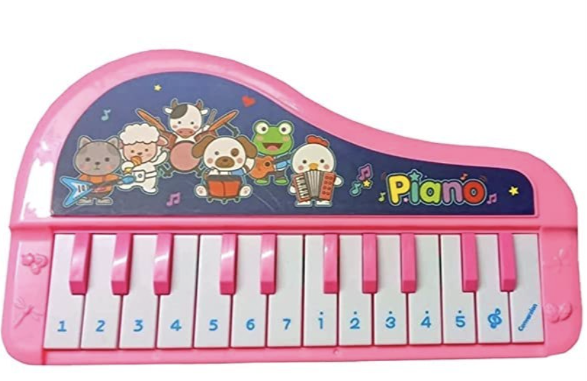
During class when Professor Mang was explaining the homework for Tuesday, my younger brother was actually sitting next to me and watching nursery rhymes (to be specific he was watching Mary had a little lamb) which I found funny because I then started to think about the project and different elements related. I also remember having a small toy piano (I had the one that looked like the piano and the one that looked like the toy) so then I started to wonder if I could create the keys and make my own music and to maybe try creating the same sounds for Mary had a little lamb.


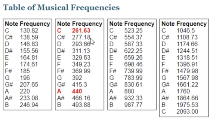
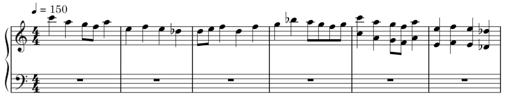
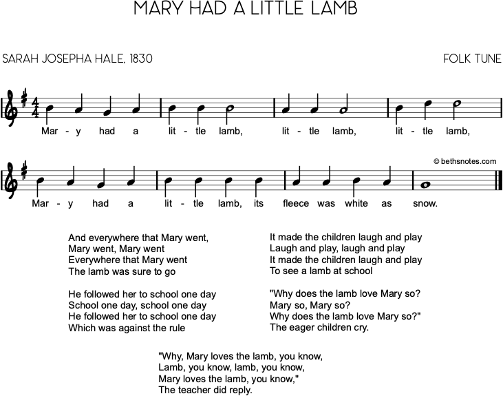 I was able to create the song! and not just for Mary had a little lamb but also just experimenting with the notes to create my music! (3-2-1-2 (Ma-ry had a) 3-3-3 (lit-tle lamb) 2-2-2 (lit-tle lamb) 3-3-3 (lit-tle lamb) 3-2-1-2 (Ma-ry had a) 3-3-3-3 (lit-tle lamb whose) 2-2-3-2 (fleece was white as) 1 (snow)!!!!)
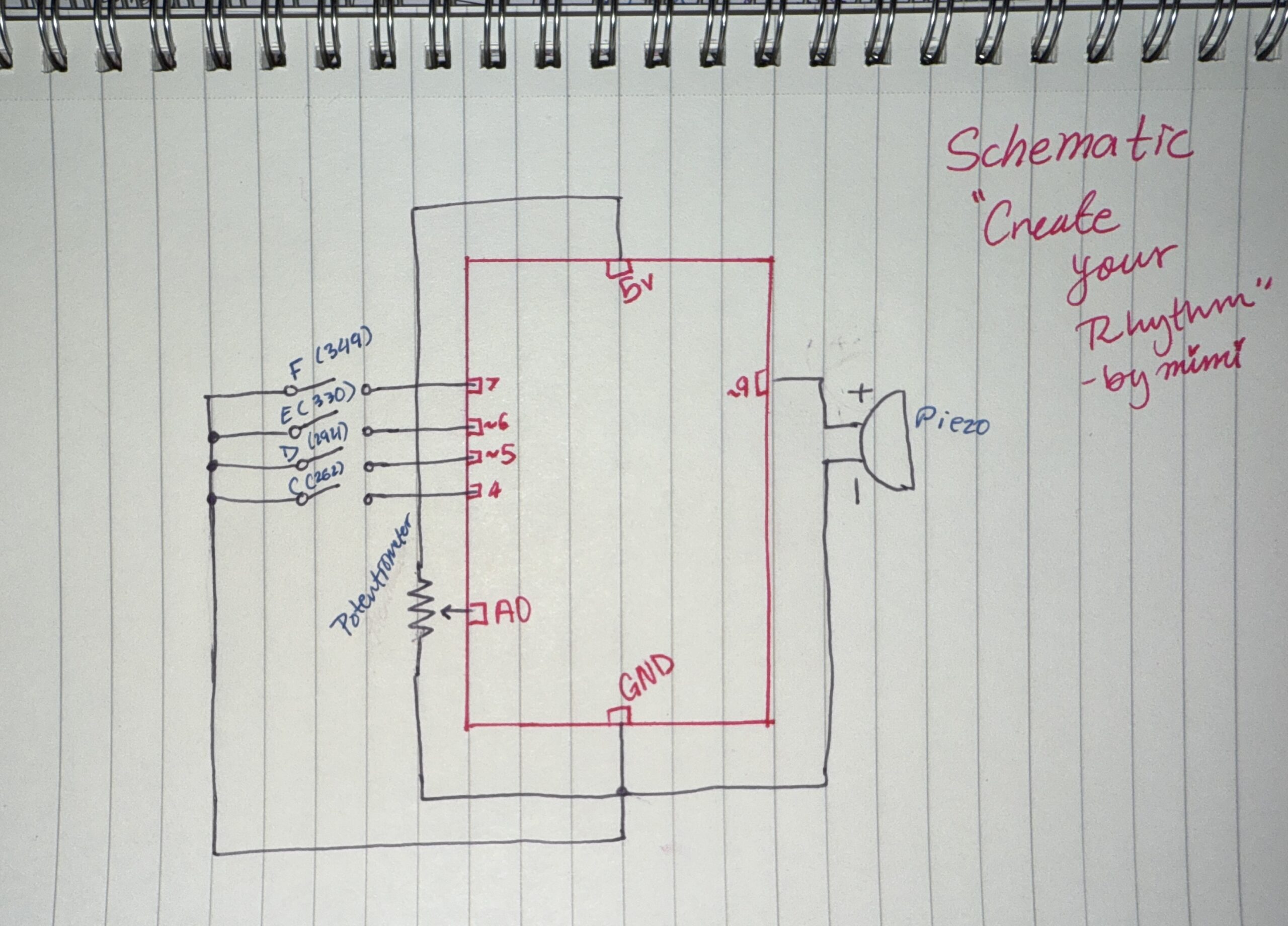
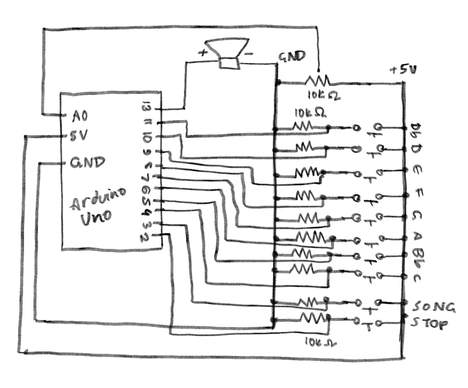
Hand-drawn schematic:
How this was made:
I used the tips from Professor Mang, he also advised us to use a ruler which is something I didn’t do last time but honestly compared to my first schematic this is so easy to read -my first one not that organized. Also I always like doing the schematics as I go then I do a final neat and organized one so I can easily look back at it.
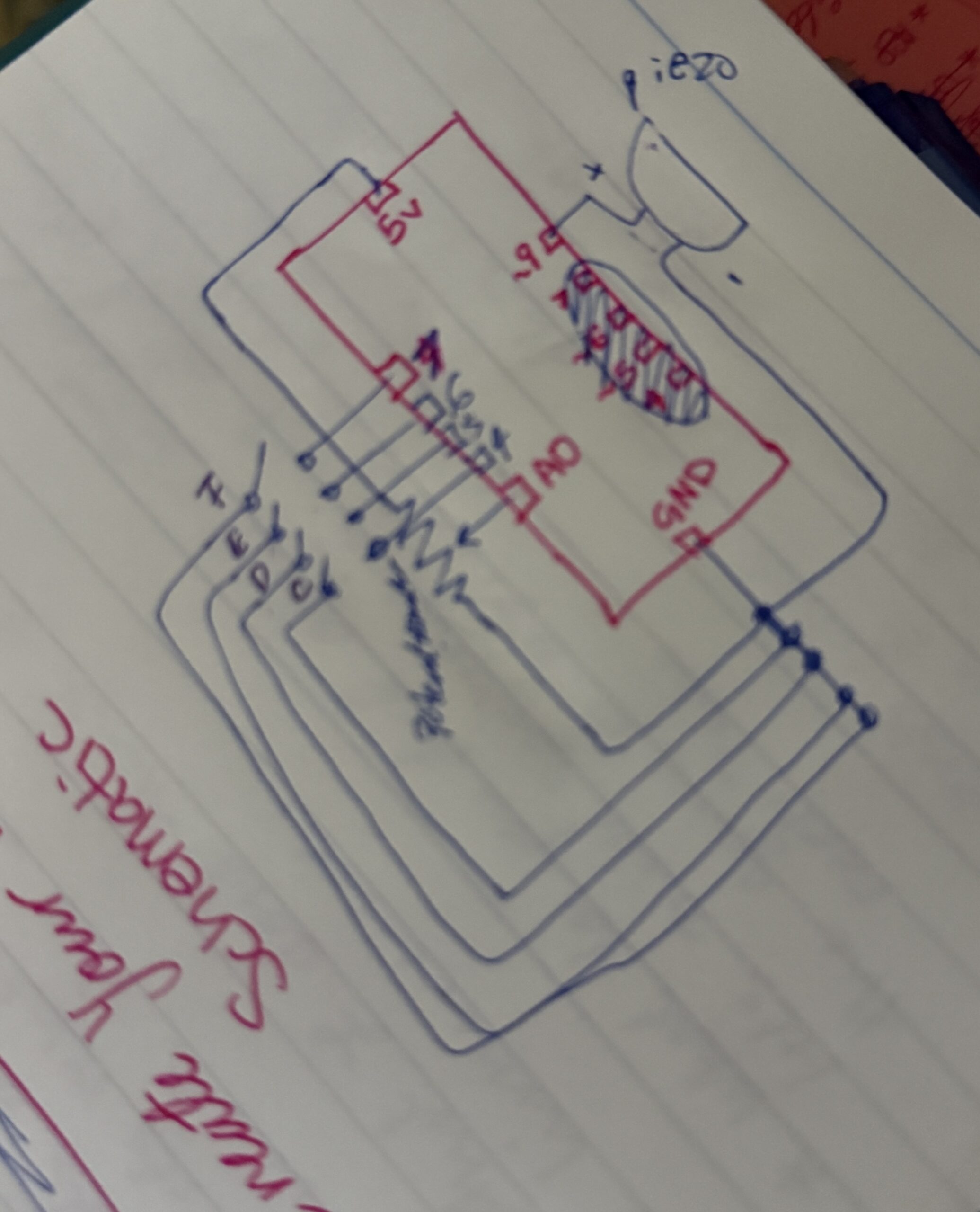
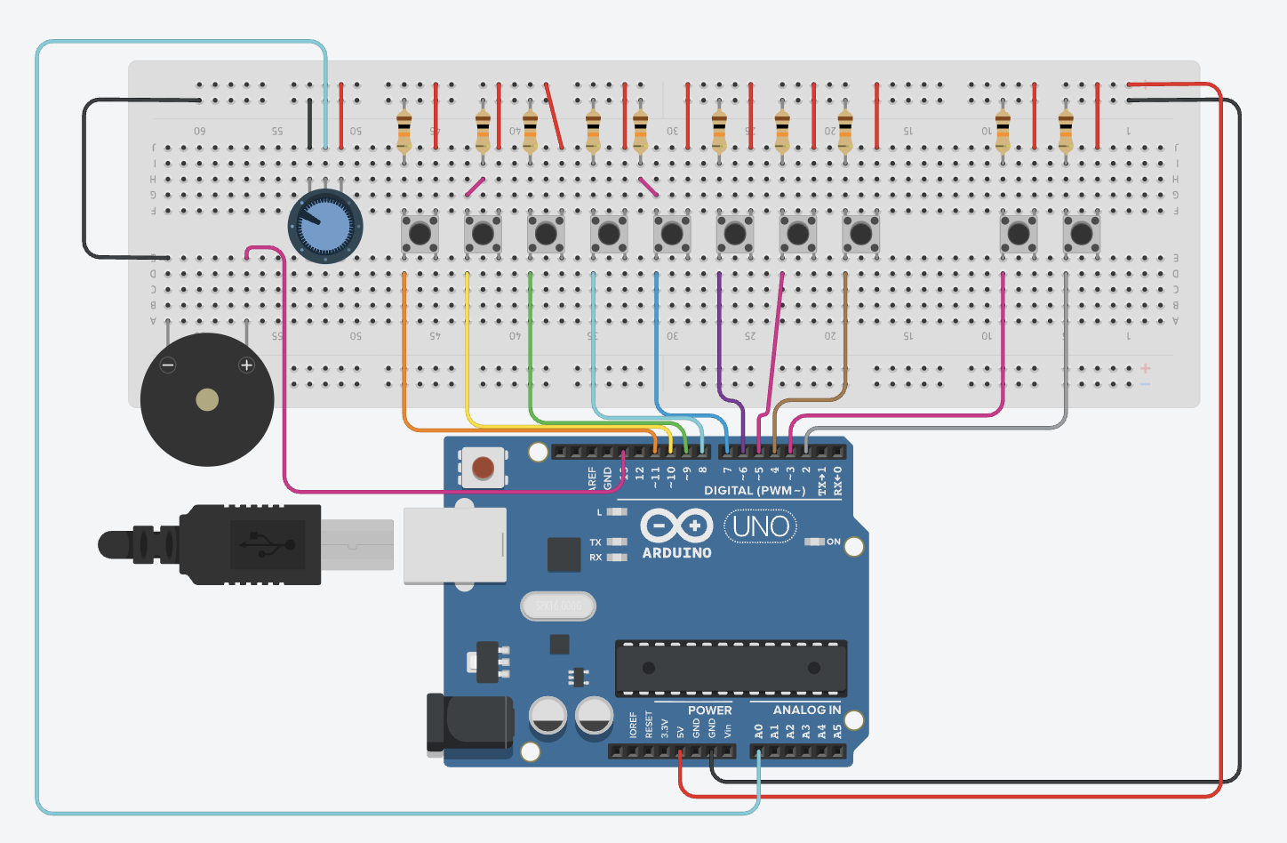
Image: (Link)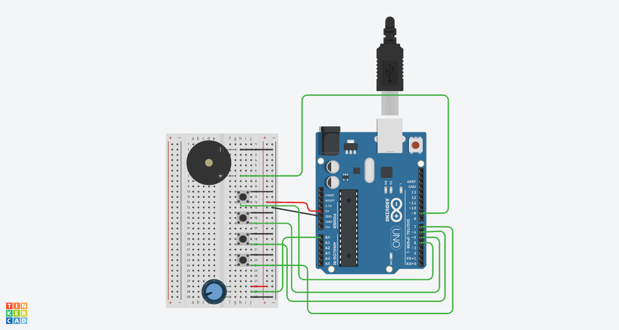
How this was made:
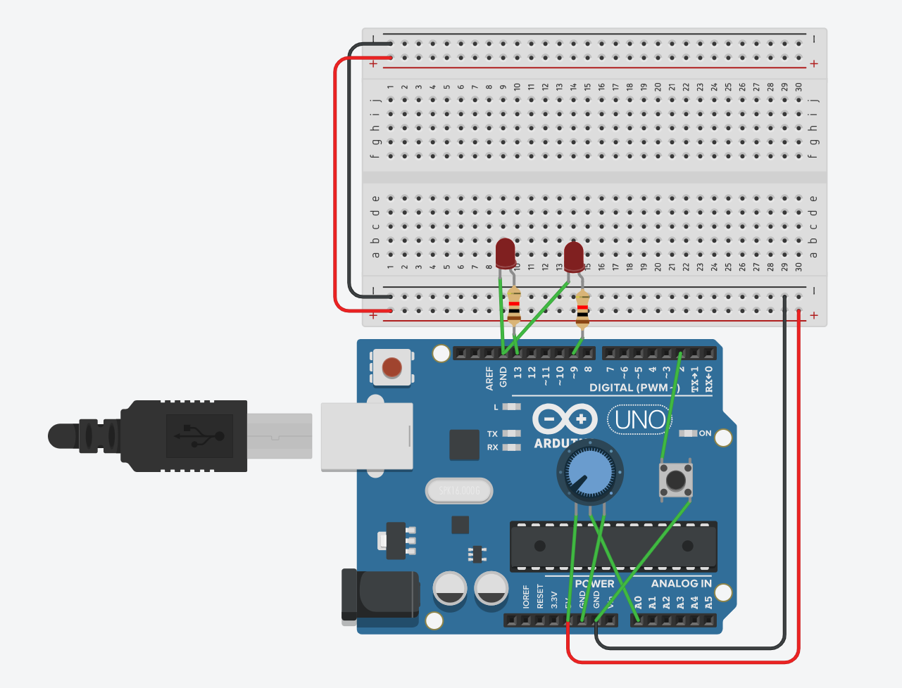
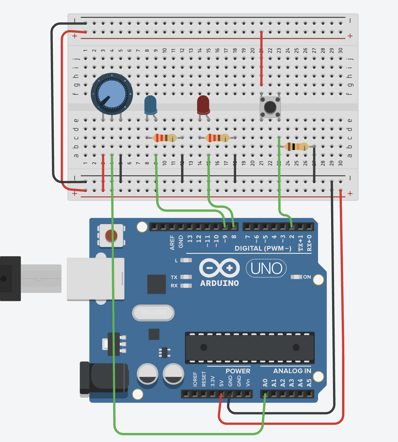
First I duplicated my last project because I think it’s easier to just edit instead of start brand new. I just changed the LED lights, removed them, and added the piezo and connected the positive side (h7) to pin ~9 with a green wire I used Pin ~9 because like we learned in class it is a PWM pin that can handle the pulses and in my case its needed to create different sound frequencies. Then the negative side of the piezo (h2) to (-) connected with a black wire to GND. After I made sure GND is connected to (-) and 5V is connected to (+) I was able to focus on the buttons and add 4 different buttons (Button 1 plays Note C, Button 2 plays Note D, Button 3 plays Note E, and Button 4 plays Note F). I placed the buttons in a row across the middle of the board with the legs in columns g and e. Each button has one side connected to the negative rail with a black wire and the other side connected to its specific digital pin (4, 5, 6, or 7) with a green wire. I also decided to line them up this way to create something similar to a real piano keyboard. For the last part I just moved the potentiometer because I needed more space for the four buttons and they follow the similar position of my last project.
Code:
// C++ code
//
void setup() {
  pinMode(9, OUTPUT); // the piezo speaker

  // setting up all the buttons
  pinMode(4, INPUT_PULLUP); //Button 1=Note C
  pinMode(5, INPUT_PULLUP); //Button 2=Note D
  pinMode(6, INPUT_PULLUP); //Button 3=Note E
  pinMode(7, INPUT_PULLUP); //Button 4=Note F
}

void loop() {
  int sensor = analogRead(A0);
  int multi = map(sensor, 0, 1023, 1, 4); //when the dial is changed the sound does too

  //when button is pressed and the dial is changed then the notes are multiplied=higher pitch
  if (digitalRead(4) == LOW) {
    tone(9, 262 * multi); //C=262
  }
  else if (digitalRead(5) == LOW) {
    tone(9, 294 * multi); //D=294
  }
  else if (digitalRead(6) == LOW) {
    tone(9, 330 * multi); //E=330
  }
  else if (digitalRead(7) == LOW) {
    tone(9, 349 * multi); //F=349
  }
  else {
    noTone(9); //when nothing is pressed there is no sound
  }

  delay(10); //10 mil.sec. delay
}
How this was made:
For my code, in the setup first I highlighted pin 9 because thats for the Piezo -my speaker. Then I set up pins 4, 5, 6, and 7 for my buttons while using INPUT_PULLUP so I wouldn’t have add any extra resistors or wires on the breadboard since I can easily use tinkercad’s built-in resistors. Then I created a loop and used analogRead(A0) to first check the sensors and then inside because the dial gives a number from 0 to 1023, I used the map function (which I learned from ARDUINODOCS) to change that number into a small number that goes from 1 and 4. I called this variable multi (short for multiply) which allows me to change the pitch higher just by turning the dial. For the music I used the if/else structure which I am familiar with from p5js and because I wanted to create keys I followed the notes so button 1=262 a C note and it goes on (of course I checked the music notes to do this). And then based on each dial as it increases the numbers also increase by multiplication. I basically ended the code with else noTone(9) (for the tone function) so when the button is not pressed there is no sound coming from the Piezo and like always a 10ms delay at the bottom just to keep the loop from running too fast and making the sound glitchy.
Resources:
- Always Professor Mang and Ayas lecture notes!
- https://www.youtube.com/watch?v=uYgp3lAfolo [song Mary had a little lamb]
- https://www.youtube.com/watch?v=eCbP7EHaTFk [to look at how to make music in tinkercad]
- https://www.youtube.com/watch?v=Bby2xAzFVGQ [looking at how to use buttons specifically and the piezo]
Reflection and future improvements:
Honestly, I’m super proud of what I created. Like always, the first time is confusing, complicated, and annoying but comparing myself to when I first did those tutorials to now creating my own rhythm, I’m so happy with how this turned out! I was actually playing it out loud for my siblings too. Overall, I think creating something in different formats while keeping it creative, personal, and fun is always something I look forward to doing. When it comes to the piano and my personal connection to it, honestly I think younger Moza would be so proud and amazed to see that I actually made those keys and notes using code and Arduino(tinkercad), because that’s just so cool! For future improvements, I think I did really well (fun fact: I actually created two projects: the first was simple, but for this one, I pushed myself to see what else I could do!) In the future, I want to experiment even more and keep pushing my limits. 🙂

