Sketch
* In order to play the game, go to p5 sketch and give access to the camera!
Concept
I created a game that is controlled by user’s video input. In Russia, we play a clapping game called “Ладушки” (ladushki; in English it’s called Patty Cake), where you need to match the rythm of the other person clapping, as well as their hands (right to right, left to left, two hands to two hands). A cute kind girl in the room welcomes the player to play this game with her, starting the game after a short tutorial.
However, if the player fails to match the girl’s rythm and handpose, she will get more and more upset. With more mistakes, the girl will clap faster, and her anger will distort the environment and sound around her. What happens if you manage to fail so many times that she reaches the boiling point? Play and find out.
Proccess of Development & Parts I’m Proud of
Sprites & Design
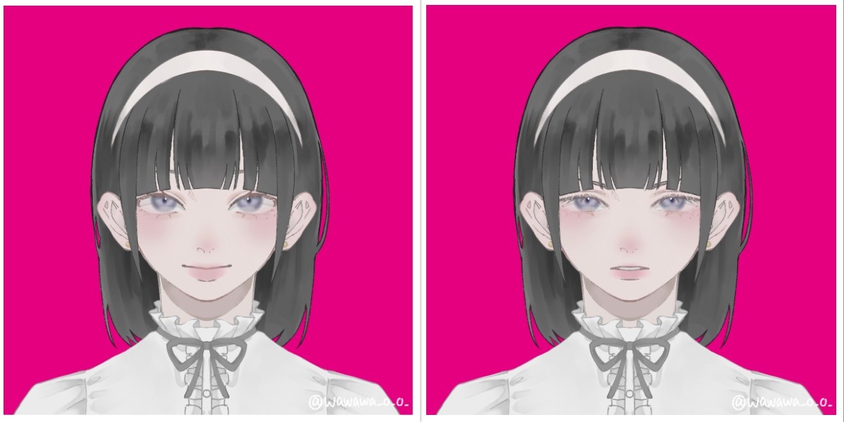
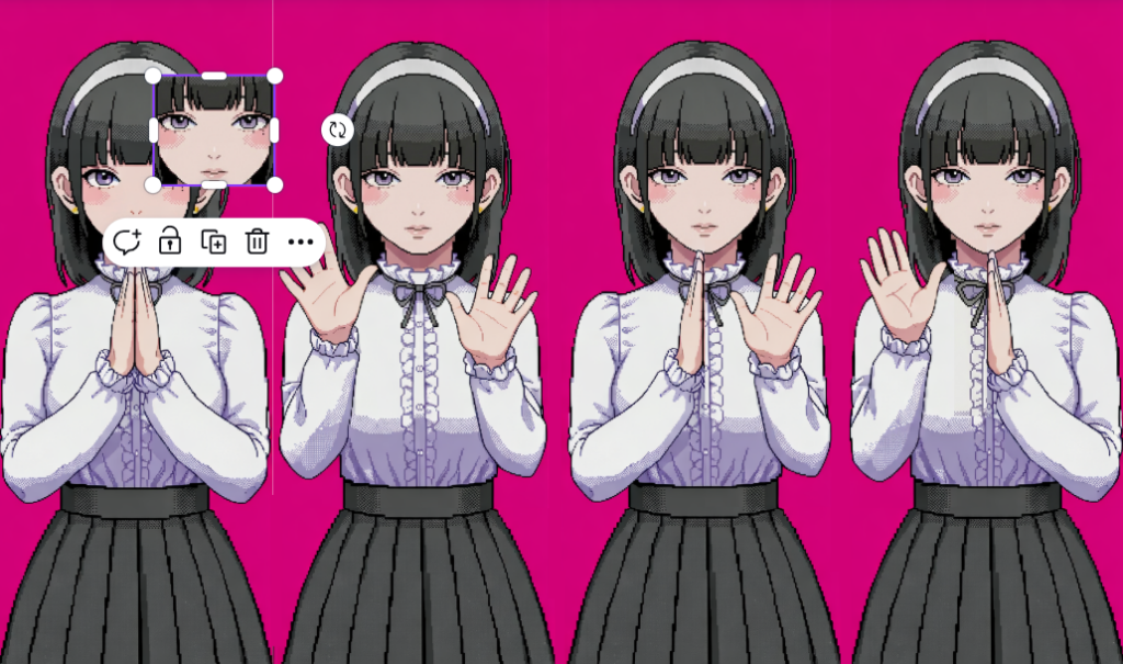
To create the sprites, I first created a character on Picrew, so I can later edit the image of a complete, well-designed in one style character. I chose the design of the girl to be cute-classy to fit the mood of the game.
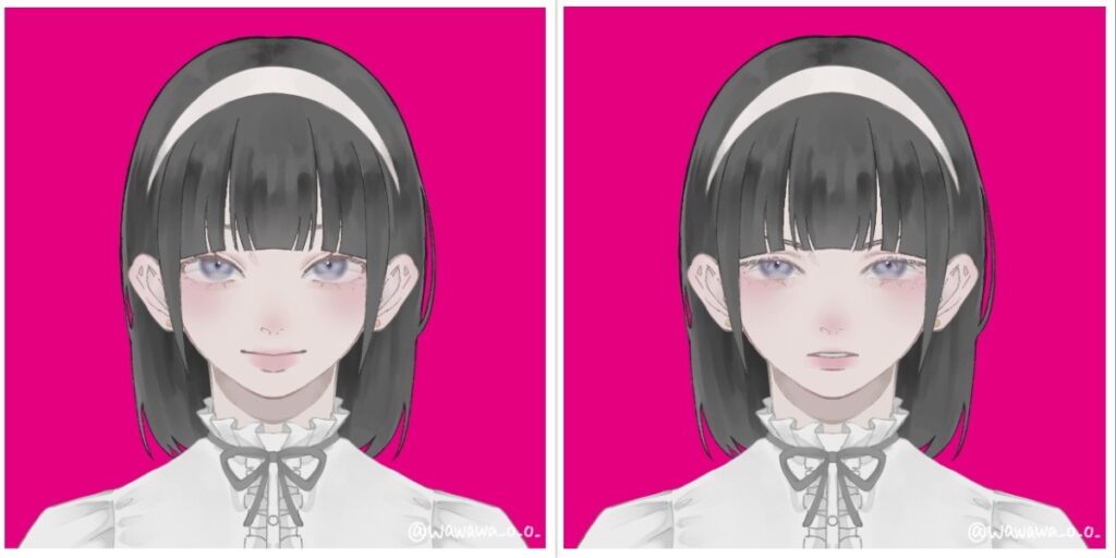
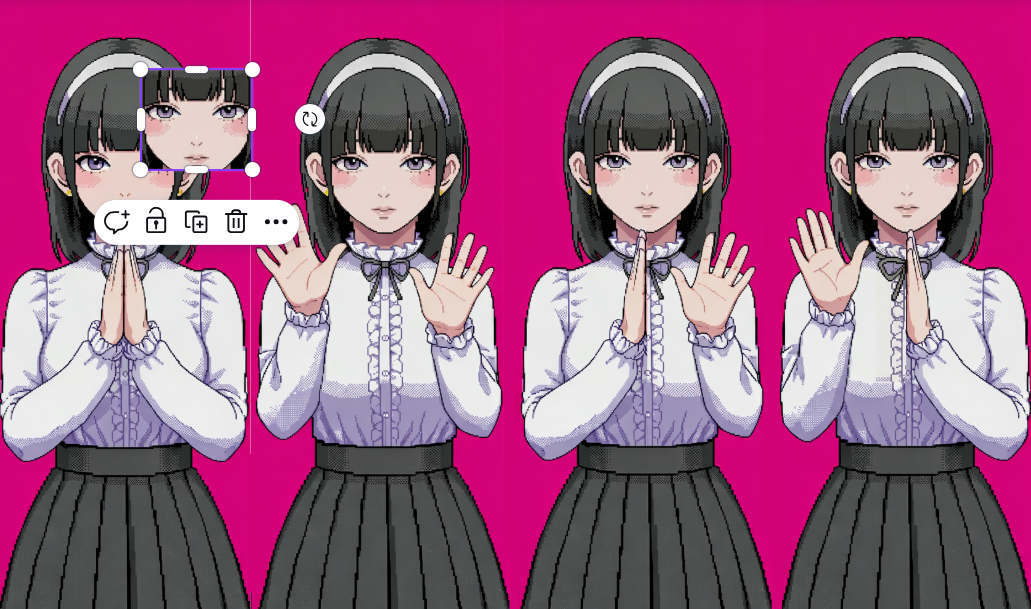
After that, I inserted the photo to Nano Banana to pixelate to 16-bit and extend the image. After that, I edited the image in Canva, so all the faces, hands positions are properly aligned, and the image has all 4 positions with 4 different faces.
Sound
The sounds from the game were generated and/or taken from open-source copyright free resources. The background music was created using Suno AI using the following prompt:
Dreamy chiptune instrumental, midtempo, modular sections built for easy tempo shifts, Playful square leads carry a singable main motif, doubled an octave up on repeats, Soft, bouncy drum kit with rounded kicks and brushed snares; bubbly sub-sine/square bass locks to a simple walking pattern, Light 8-bit arps and gentle pitch bends sparkle at phrase ends while warm, detuned pad layers smear the edges for a cozy, nostalgic arcade glow, Occasional breakdowns thin to arps and pad swells before the full groove pops back in with extra countermelodies for an intensifying, joyful loop, playful, nostalgic, light, warm, soft, gentle, bright
Other sounds, such as clapping sounds, screaming sound were taken from Pixabay.
I had a lot of manipulations with sound for its speeding up/distortion for creepy effect.
update() {
  //for sounds
  let current_rate = map(this.level, 50, 100, 1.0, 1.3, true);
  soundtrack.rate(current_rate);
  if (this.level >= 70) {
    let intensity = map(this.level, 70, 100, 0, 0.3);
    distortion.set(intensity); // set the distortion amount
    distortion.drywet(map(this.level, 70, 100, 0, 0.2));
  } else {
  distortion.drywet(0); // keep it clean under level 70
  }
Here, I use few methods from p5.js sound reference page. Background soundtrack is connected to the distortion variable that can be seen in the code. By mapping the rate (speed of the soundtrack) and intensity (the distortion amount), as well as drywet value (for reverbing) and connecting all these values to the background soundtrack, the sound effect and background music slow but noticeable change is created.
ml5
The fundamental part of my project is hands tracking, which was implemented using ml5.js HandPose ML model.
The implementation process was carefully explained in my previous post since it was the first step in the development. I didn’t change this part since then, but I built up on closed palm pose detection: I added the following condition:
//DISTANCE BETWEEN THUMB AND PINKY is also counted for state of the hand
//define what means when hand is open and set status of the user's hand positions
if (hand.keypoints && hand.keypoints.length >= 21) {
  let isHandOpen = (
    hand.keypoints[4].y < hand.keypoints[2].y &&
    hand.keypoints[8].y < hand.keypoints[5].y &&
    hand.keypoints[12].y < hand.keypoints[9].y &&
    hand.keypoints[16].y < hand.keypoints[13].y &&
    hand.keypoints[20].y < hand.keypoints[17].y &&
    abs(hand.keypoints[4].x - hand.keypoints[20].x) > abs(hand.keypoints[5].x - hand.keypoints[17].x));

  if (isHandOpen) {
    if (hand.handedness === "Right" && hand.keypoints[20].x - hand.keypoints[4].x > 0) {
      leftOpen = true;
    } else if (hand.handedness === "Left" && hand.keypoints[20].x - hand.keypoints[4].x < 0) {
      rightOpen = true;
    }
  }
}
The condition abs(hand.keypoints[4].x - hand.keypoints[20].x) > abs(hand.keypoints[5].x - hand.keypoints[17].x)); measures the distance between pinky tip and thumb tip and compares it with the distance between knuckle of index finger and pinky, ensuring that the palm is fully open and not tilted. The condition hand.keypoints[20].x - hand.keypoints[4].x < 0 checks if the distance between pinky and thumb tip is positive, ensuring that the user shows the inner side of the palm to the camera, not its back side.
Other parts
One part that I’m proud of in this code is the typewriter text effect in pixel dialogue window.
//draw text like a typewriter
function draw_text(t, anger_level) {
  //add shaking for higher anger levels
  let shakeAmount = 0;
  if (anger_level > 40 && anger_level < 100) {
    shakeAmount = map(anger_level, 40, 99, 0, 5, true);
  }
  // random offset
  let offsetX = random(-shakeAmount, shakeAmount);
  let offsetY = random(-shakeAmount, shakeAmount);

  let currentIndex = floor(text_counter / text_speed);
  if (currentIndex < t.length) {
    text_counter++;
  }
  let displayedText = t.substring(0, currentIndex);

  push();
  translate(offsetX, offsetY);

  textFont(myFont);
  textSize(19);
  noStroke();

  fill(0);
  textAlign(CENTER, CENTER);
  rect(width/2, height*0.9, width*0.6+15, 40); //lines from side
  rect(width/2, height*0.9, width*0.6, 55); //lines from up/down
  //dialogue window
  fill(237, 240, 240);
  rect(width/2, height*0.9, width*0.6, 40);
  fill(0);
  text(displayedText, width/2, height*0.9);
  pop();
}
Here, if-condition checks on which index in the text we are currently on (default is set to 0 since text_counter = 0), if it’s less that the length of the desirable output string. If it is, it increments a counter. The counter is being divided by text speed (set to 2 frames), and the current index displayed is a rounded to lower number result of this division with the help of floor() function. Substring function converts the initial string to an array of characters using starting index (0) and ending index which is exactly the current index we’re reevaluating every time, and then it outputs the string captured between these indices. This way, a small pause (of 2 frames) between drawing each letter is created, creating an effect of typewriting.
In the final part of the function black rectangles are created under the main gray dialogue window, creating a pixel-style border to it.
Another valuable part of the code here is the shaking. In other parts of the code the shaking technique is almost the same: the offsets by x and y that depends on the anger level are passed to translate() function, changing the coordinates origin. Thanks to that, the whole dialogue window displayed has this new coordinate origin each time the function runs if the condition is satisfied, creating an effect of shaking.
Apart from that, the core of my code is the class “Girl” which controls almost everything connected to the girl charachter, from her speech to comparing handpose states. Also, I have some independent functions, like detect() that recognizes and returns the handpose state of the player and tutorial running that explains the player the rules of the game (by controlling and modifying some class public variables as well).
To control the game state, when it should run the tutorial, when the main part is being played, and when it’s over and needs a restart I use game states. For resseting, player is prompted to press “ENTER” on the final screen to fully restart the game by triggering the resetting function that sets all global variables back to default state and creates a new Girl object with new default attributes:
//reset the whole game upon calling this function
function resetGame() {
  // reset global variables
  game_state = "START";
  state = "CLOSED";
  text_counter = 0;
  screenFlash = 0;
  girlImages = [];

  girl = new Girl();

  // reset girl's variables
  girl.current_state = 0;
  girl.level = 0;
  girl.change_state();
  endStage = 0;
  endTimer = 60;


  // reset the audio
  soundtrack.stop();
  soundtrack.rate(1.0);
  soundtrack.setVolume(1.0);
  distortion.set(0);
  distortion.drywet(0);
  soundtrack.loop();
}

...

function keyPressed() {
  ...
  if (keyCode === ENTER) {
    if (game_state === "GAME_OVER") {
      resetGame();
    }
  }
...
}
My code is pretty big but I feel like explained parts are the most interesting ones. I believe I have some inefficient parts in my code (such as hardcoded ending speech and its progression) but they all work now without lagging or taking long time to load, so I believe that at least for this projects it is fine to leave them like that.
While writing the code, I used the following resources:
-
- p5.js reference
- ml5.js reference
- The Coding Train Handpose video
- Gemini (Guided Learning Mode) for debugging and searching for functions of p5.js (such as substring function in typewriter, for example)
+just googling some methods and clarifications
Problems
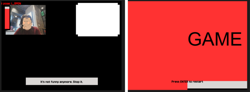
Throughout the development of the project I ran into a lot of problems and small bugs but I will describe one that actually taught me a very useful trick.
I had a lot of visual parts that required precise positioning of the object, as well as I had different effects applied to them. Offsets of the object that were limiting its shaking, the mode of displaying the object (rectMode, imageMode), aligning, the translating conditions etc. were different for many parts. However, when you assign imageMode in one place globally, and then somewhere else you set another imageMode, and then in the third place you just use it without assigning expecting the default mode — the whole sketch turns to complete chaos. As you can see on the photos, I had video being aligned to another part of the screen, the textMode being set to some weird value, font style dissapearing, and textbox moving out of the screen. I learned how to isolate the styles (with the help of Gemini), as in this example:
function draw_video() {
  push();
  imageMode(CORNER);
  image(bg_img, 0, 0, width, height);

  //layer that gets the room darker as the anger level rises
  rectMode(CORNER);
  let mask_level = map(girl.level, 20, 100, 0, 180);
  noStroke();
  fill(0, mask_level);
  rect(0, 0, 640, 480);
  pop();
By surrounding the code block with push() and pop(), the style and code inside the block becomes isolated and doesn’t impact other parts of the code. It was really helpful, so I used it almost everywhere in my project!
Areas for Improvement
There’re some parts of my project that can be significantly improved and parts I don’t really like.
First of all, the final screamer, I feel like it is not scary enough to really make a great impact on the user. The concept was to have that cuteness vs. creepiness contrast. So, in contrast for a small childrens’ game and cutesy design, I wanted to make a really impactful and creepy screamer in the end, additional to other glitch/creepy effects. Turned out that making a scary screamer is actually a very hard job. I tested a few of the screamers versions, asking my friends to test the game so they can tell which one is scarier. I stopped on the current version because it was more unexpected, since it appears mid-sentence and has some stop-frame picture and not zoomed video or something else. Still, I feel like there’re ways to make this part much more surprising and scary that I wasn’t able to come up with.
Another part I could work on more is the design. I can’t draw, so in order to create visual assets I used picrew, editing AI (described earlier). However, I think that sprites created could be more fitting, and maybe I could have added additional sprites for more smooth pose-change, and sprites of a “still” pose. It is a bit hard to do in time-constraits and lack of skill, but I’m sure it’s something I can think about in the future.
Also, I believe I could introduce more unified control system. While playing, the user doesn’t touch the keyboard and only show their hands to the screen, but to progress through the tutorial and ending scene they need to press some buttons. I believe it is not really good to have these two controls systems mixed so maybe one of the improvement can be introducing some additional poses (like peace sign, maybe?) instead of keyboard pressing.