User Testing Final Project

I think it was pretty easy for my user to figure out how to use/play the game but I believe that’s mainly because I gave them a glove with foils attached to the fingers, so it was quick to understand what to do. By that, I mean that they understood that touching fingers in the glove would trigger the ballerina to dance.

But they did get confused about the rules of the game. And the idea of losing points and the ballerina falling were not fully working yet, so they were confused on how to win or lose. I didn’t create an instructions page yet so that is part of the reason.

One particular feedback I got was that it was difficult for them to use the glove. Some presses would not work, or they would have to press harder. For that, I will need to find a way to stick my aluminum foils to the glove in a neater more seamless way.


User Testing

Week 13 – User Testing

So I let my siblings test it out and they were able to figure out the basic idea pretty quickly, that they needed to press the colored arcade buttons when the falling tiles reached the hit line on screen. The colors helped a lot because they made the connection between the physical buttons and the tiles more obvious. But they were confused at first about when exactly they were supposed to press, since there were no instructions during gameplay, so they needed a few seconds of trial and error to understand the timing.

I think the mapping between the controls and the experience worked well because each button matched a lane and color on screen, which made the interaction feel natural. Once players understood that each button controlled a specific lane, they were able to continue without much help. The physical arcade buttons also made the experience feel more immersive compared to using a keyboard.

I think the strongest part of the experience was the atmosphere. The background visuals, projector reveal screen, sound design, and glitch effects made the game feel tense and it matched the theme and concept well. They especially liked the reveal screen because it felt like a reward after completing each round and made them curious about the story.

The main area that could be improved is clarity at the beginning. One of them were unsure whether to press buttons immediately or wait for the tiles to reach the bottom hit line. I found myself explaining the timing and the goal of “rebuilding the signal” so they could progress. To make this clearer, I could improve the instruction screen by adding a short visual example or animation showing exactly when to press the buttons (like a quick tutorial).

(Also, I noticed I wrote 4 rounds but its kind of 5 because you have to play again to go to the final message…I am thinking about just reducing it maybe its too long of a game??)

Week 14 – PawPortion User Testing

Some users were able to understand how the system worked overall, but there was confusion around the IR sensor. A few people tried to press it like a physical button, and they were unsure how hard to press, how close their hand should be, or how many fingers to use. I think this confusion happened because they interpreted it as a button rather than a proximity sensor, so the mapping between the control and the action wasn’t immediately clear.

Despite that, most users understood the general flow of the experience and were able to move between interacting with the machine and observing the outcome. One part that worked especially well was the portion size. The amount of pet food dispensed felt accurate, and the servo motor’s opening and closing motion was smooth and consistent. However, there was a small issue where some pieces of pet food would fly out from the sides, which could be improved with better containment.

The main part I had to explain was how to use the IR sensor properly. For one user, I also had to point out that they needed to place the bowl under the dispenser, even though there was a visual instruction. This might have been specific to that user, but it suggests that the instructions could be made more noticeable or clearer for first-time users.

Conway’s Prism – User Testing

Brother 1 User Testing:

Explained info: Rules of con way’s game of life

Project Walk Through:

Bonus – 9 year old brother test subject:

Conclusion:

From my first brother, he didn’t really know how to navigate the website, and I think this is due to the lack of knowledge of how simulations work in general, and I only briefly explained what Conway’s game of life is to him. To be more nitpicking, the paused and running text on the top left of the grid doesn’t seem to be very noticeable by both siblings and I had to tell them both the simulation was paused when they were just clicking the grid hoping to start something. The rest of the buttons aren’t really used either unless I explicitly tell them about it, maybe one part is just them not knowing what to do at all for the video. But what I think the core issue is the fact most people aren’t familiar with how simulations work.

The experience itself works pretty well, it does its purpose in showing something cool entirely made by the user, I however wish I was able to add more external controls, but my potentiometer pins broke while I was trying to add that and the joystick module just would not fit with my design, so I had to resort to controlling the simulation through p5js (I did add some keyboard shortcuts).

For how to solve the issue of the lack of knowledge, I think If I had time I would add some tutorial overlay when the website is first loaded in, so like when you first launch you get a short brief explanation of what every button does in a speech bubble style, have the user do what the tutorial is asking them to do before moving on to get them familiar with the controls. I should also make the pause/running indication more visible, maybe by changing the grid outlines or the background from red -> green or something along the lines, something more “obvious.” A big fat “PAUSED” in the middle of the grid could work too!

The buttons aren’t really intuitive for anyone who isn’t aware of simulations in general, fast, slow, random, clear, presets all were buttons ignored unless I explicitly mentioned, so this should also be fixed with my how to use overlay tutorial type of thing. However the process of clicking on the grid and seeing stuff react when the simulation started seemed to make them understand the mapping pretty instantly! So I think I would call this project a success, just simply lacking some intuitive upgrades to the UI.

Final Project – User Testing

PRESSYR – User Testing Reflection

VDO:

https://youtu.be/GeI6QWZyzsk?si=tPqhPQI3fib59SSb

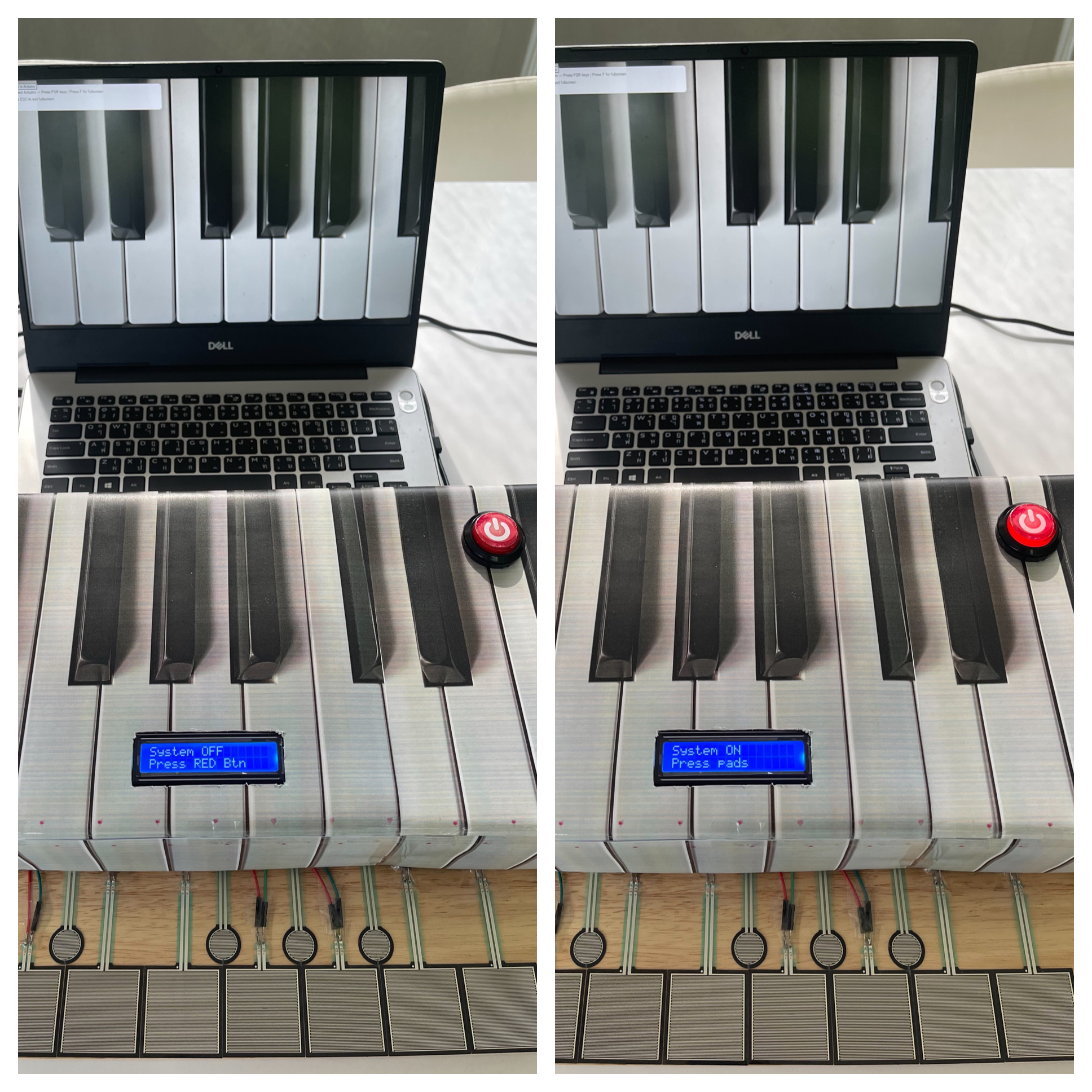
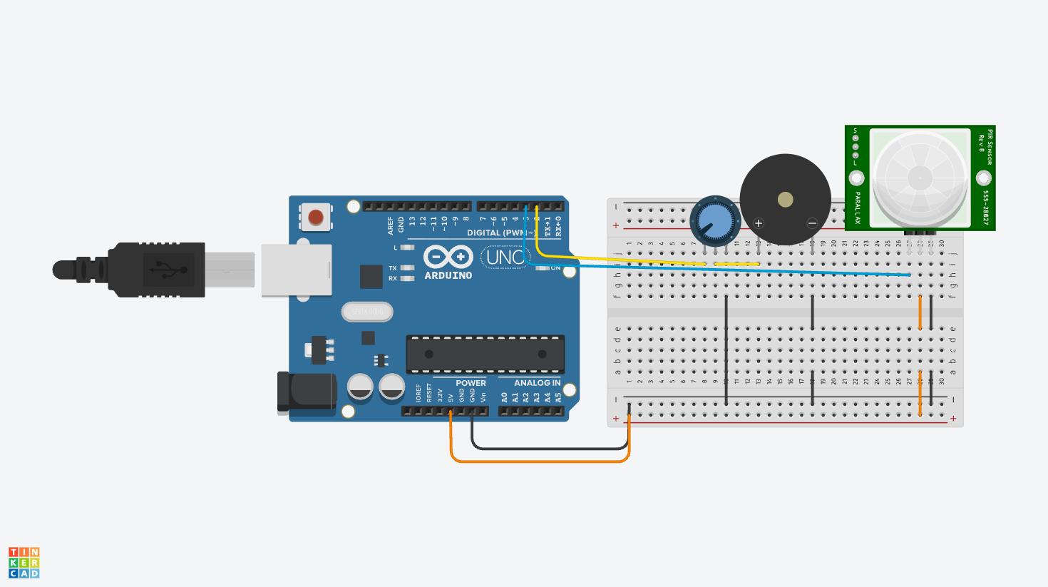
For my final project, I created an interactive piano-inspired instrument called PRESSYR using Arduino, FSR pressure sensors, a CD74HC4067 multiplexer, an I2C LCD display, an arcade power button, and a p5.js visual and sound interface. The project allows users to press pressure-sensitive pads to play musical notes while also generating sound and visuals on a computer screen.

User Testing Process:

I conducted user testing with four participants. During the testing session, I intentionally did not give them detailed instructions at first because I wanted to observe how naturally they could understand and interact with the project on their own.

One thing I noticed immediately was that almost every participant was initially confused about what the device actually was. However, most of them could somewhat guess that it was related to a piano or music instrument because the cardboard enclosure visually resembled piano keys. In addition, my house already contains a real piano, and everyone who participated already knew that I play the piano, so this context may also have influenced their assumptions.

The main confusion at the beginning was understanding what to press first and how to start interacting with the system. Fortunately, the LCD screen helped guide users by displaying “Press RED Button” when the system was off. This instruction helped participants understand that the red arcade button was the actual starting point for interaction.

After turning the system on, some participants were still slightly confused about what to do next. I think this happened for two reasons. First, the instructions on the LCD were written in English, and second, some participants did not immediately understand what the word “pads” referred to. Even so, after a short moment of exploration, every participant eventually understood that the pressure-sensitive pads were musical inputs that played notes like Do, Re, Mi, Fa, Sol, La, Ti, Do.

Observations During Interaction:

One interesting observation from the testing session was that participants rarely looked at the computer screen visualizations while playing. Instead, they focused almost entirely on the physical pads and their hand movements.

I believe this happened mainly because users had to concentrate on pressing the pads accurately and listening to the melody from each key being produced. Since the sound feedback already confirmed that the interaction was working, participants did not feel a strong need to constantly look at the screen. The laptop screen was also positioned slightly farther away from the pads, which may have reduced visual attention even more.

Although it is possible that the visual effects on the screen were not large or attention-grabbing enough, I personally think the stronger reason was that users naturally prioritized the physical interaction and audio feedback over the visual component.

What Worked Well:

Several aspects of the project worked successfully during testing:

– The arcade power button clearly communicated the ON/OFF state of the system.
– The illuminated LED inside the arcade button provided immediate visual feedback.
– The LCD instructions helped guide users through the interaction process.
– The pressure-sensitive pads successfully triggered sound and visuals consistently.
– Users eventually understood the interaction flow without requiring direct explanation.
– The piano-inspired physical design helped communicate the musical concept of the project.

Areas for Improvement:

Some participants commented that the pressure pads felt larger than actual piano keys. This feedback was valuable because it highlighted how the scale of the interaction affected the realism of the experience.

In future versions of the project, I would like to:
– Reduce the size of the pads to better resemble real piano keys.
– Improve the visual prominence of the p5.js animations so users notice them more easily.
– Add clearer visual labels or symbols for first-time users.
– Experiment with different layouts and materials for a more polished interaction experience.
– Explore using velocity-sensitive audio or multiple sound layers for more expressive musical interaction.

Reflection:

This user testing session helped me realize how important clarity and interaction flow are in physical computing projects. Even though the project technically functioned correctly, small design decisions such as wording, placement of instructions, and physical scale strongly affected how users understood the experience.

Overall, the testing process was extremely useful because it revealed areas where the interaction was intuitive and areas where users still needed additional guidance. It also helped me think more carefully about how people naturally approach unfamiliar interactive objects for the first time.

Week 12 – Reading Response | DESIGN MEETS DISABILITY

This text was fun to read, especially as someone somewhat interested in creating disability tech in the future. I agree with Barnes’ statement that “design depends largely on constraints.” We design projects to work around human problems. E.g. chairs are made of different heights because humans come in different heights, and want a chair they can sit on comfortably (which is their purpose). Headphones come in different styles because some people prefer overhead while others prefer buds that go inside your ears instead. So, when we go into designing for problems, we can’t just look at the surface level problem. We need to dig deeper, which is what a lot of designs fail to do, especially in relation to disability and accommodation. I found it interesting that disability inspired good design and not the other way around, because I would have expected it to be the other way.

Regarding the paragraph titled “discretion,” I have also wondered about this. I liked this quote a lot in the text too: “mediocrity can result in people being further stigmatized by the very products intended to remove barriers.” Having a disability is already so frowned upon, so it is heartbreaking to see that design can further perpetuate this. A disability is a part of you, so why are we hiding that aspect and promoting shame? I’m glad today that we are going against this, for example, in making prosthetic limbs customized and flashy. I saw someone make their prosthetic leg look like a gun (not that I’m endorsing violence, but it’s cool nonetheless to customize and make statements with your disability that aren’t just statements related to that).

As a glasses wearer myself, it’s funny for me to see people wear fake glasses for the sake of fashion, or as the text puts it, wearing glasses as a “medical necessity” to a “key fashion accessory.” However, that also made me reflect that maybe, in my head, I have this belief that is actually supporting the incorrect belief that disability has to be something isolated. By encouraging glasses as a fashion statement, we are normalizing a disability, which is a thing we need to do more often, especially with other disabilities. I liked the point in the text where it states, “brightly colored frames exist, although they are still a minority taste.” While this is slowly decreasing today with the rise of “cool girls wearing funky frames,” I do agree that this was much more prevalent when I was younger (I was, in fact, victim to wireless rectangle glasses that made me look at least 5 years older than I actually was.) Hearing aids is actually something I wanted to talk about before I completely finished reading the text, because people did try and hide the fact that they were wearing hearing aids earlier, but now, singers use earplugs that look similar to hearing aids all the time to prevent becoming deaf. Interesting. (Another thing I find intriguing as a person with disabilities: there are many times where things aren’t socially acceptable until a person (or multiple) of a high social standing do something.)

When you design something, it is highly unlikely that your product is accessible to every single person on Earth, whether it be for people with certain disabilities, or even people without. I liked the example of the flying submarine, or any product that has so many features but become overburdened. It reminded me a lot of apps that have way too many features to be accommodative, but end up becoming overwhelming instead. By trying to solve one problem, you cause another problem instead. I never thought that by removing features you can make things more accessible, so I liked reading that point.

Disabilities are very complex, and the word itself is an umbrella term for so many things. Thus, disability is not monolithic, and not heterogeneous. Ultimately, there is no fixed way to decide how to design to accommodate, so the best thing we, as designers, can do is understand who our product aims to benefit, and whether this product would benefit from a more simplistic, complex, bright or subtle design. That’s what makes every designer and their work different to others: how we decide to think when we face a problem.

Harry Potter Theme Musical Instrument

Learning Tinkercad, I built a Harry Potter theme song musical instrument that uses both digital and analog sensors to play the iconic melody. The PIR motion sensor (digital) detects when someone is nearby to trigger the song, while the potentiometer (analog) allows dynamic control over the playback speed and pitch variation, creating an interactive magical experience.

Check the Tinkercad here: https://www.tinkercad.com/things/7rPWu9K1P2T/editel?returnTo=%2Fdashboard&sharecode=CMCKEgjwUaqW1OCp9xhFPli3PX6svXP-iPPxgq9R69U

Digital Circuit

The circuit is built on a breadboard connected to an Arduino Uno. The design features: PIR Motion Sensor connected to Digital Pin 2 – detects motion to trigger song playback, Potentiometer connected to Analog Pin A0 – adjusts playback tempo/pitch modulation, Piezo Buzzer connected to Digital Pin 8 – outputs the Harry Potter theme frequencies, Power connections from 5V and GND to the breadboard power rails

The PIR sensor acts as a motion detector-when someone waves their hand over it, the circuit recognizes movement and initiates playback of the Harry Potter theme. The potentiometer serves as a control dial; turning it varies the speed at which notes are played or adjusts the pitch offset, giving the player expressive control over the melody.

PIR detection → Read potentiometer value → Play frequencies on buzzer.

Highlighted Code Snippet (Proud of This!)

// PIR sensor triggers playback
if (pirSensor == HIGH) {
  int tempo = map(potValue, 0, 1023, 200, 600);  // Potentiometer controls speed
  
  for (int i = 0; i < melodyLength; i++) {
    int notePitch = melody[i] + pitchOffset;  // Add potentiometer-based pitch variation
    tone(buzzer, notePitch, tempo);
    delay(tempo);
  }
}

The map() function elegantly connects the analog potentiometer reading to playback tempo, so rotating the dial smoothly speeds up or slows down the song. This creates a responsive, instrument-like feel rather than fixed playback.

int pirSensor = 2;
int potentiometer = A0;
int buzzer = 8;

// Harry Potter theme frequencies (simplified)
int melody[] = {294, 330, 392, 440, 494, 523, 587, 659};
int melodyLength = 8;

void setup() {
  pinMode(pirSensor, INPUT);
  pinMode(buzzer, OUTPUT);
  Serial.begin(9600);
}

void loop() {
  int motionDetected = digitalRead(pirSensor);
  int potValue = analogRead(potentiometer);
  
  if (motionDetected == HIGH) {
    int tempo = map(potValue, 0, 1023, 150, 500);
    int pitchOffset = map(potValue, 0, 1023, -50, 50);
    
    for (int i = 0; i < melodyLength; i++) {
      int notePitch = melody[i] + pitchOffset;
      tone(buzzer, notePitch, tempo);
      delay(tempo + 50);
    }
    noTone(buzzer);
  }
}

Reflection

This project taught me how digital and analog sensors complement each other. The PIR sensor provides binary input (motion yes/no), while the potentiometer gives continuous analog data for fine-tuning. I was initially unsure if the PIR sensor would register properly in simulation, but discovered that sensor sensitivity is crucial – sometimes you need to calibrate which digital pin captures the signal. The biggest challenge was mapping the potentiometer smoothly to tempo without the song becoming too fast or choppy. Using Arduino’s map() function solved this.

Screen Recording 2026-05-01 at 12.13.31