Arduino Mini Piano Using FSR Sensors (Analog & Digital Interaction)
Github:
https://github.com/skyorachorn/Intro-to-IM/blob/7363a1a2ac99fb91f95ab5c65de378ffd1688e4b/Week10_Piano_R4_assign.ino
Youtube:
https://youtu.be/HsH6VOBfLoQ?si=giDxkueRMkSCnZ7J
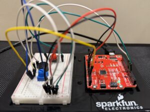
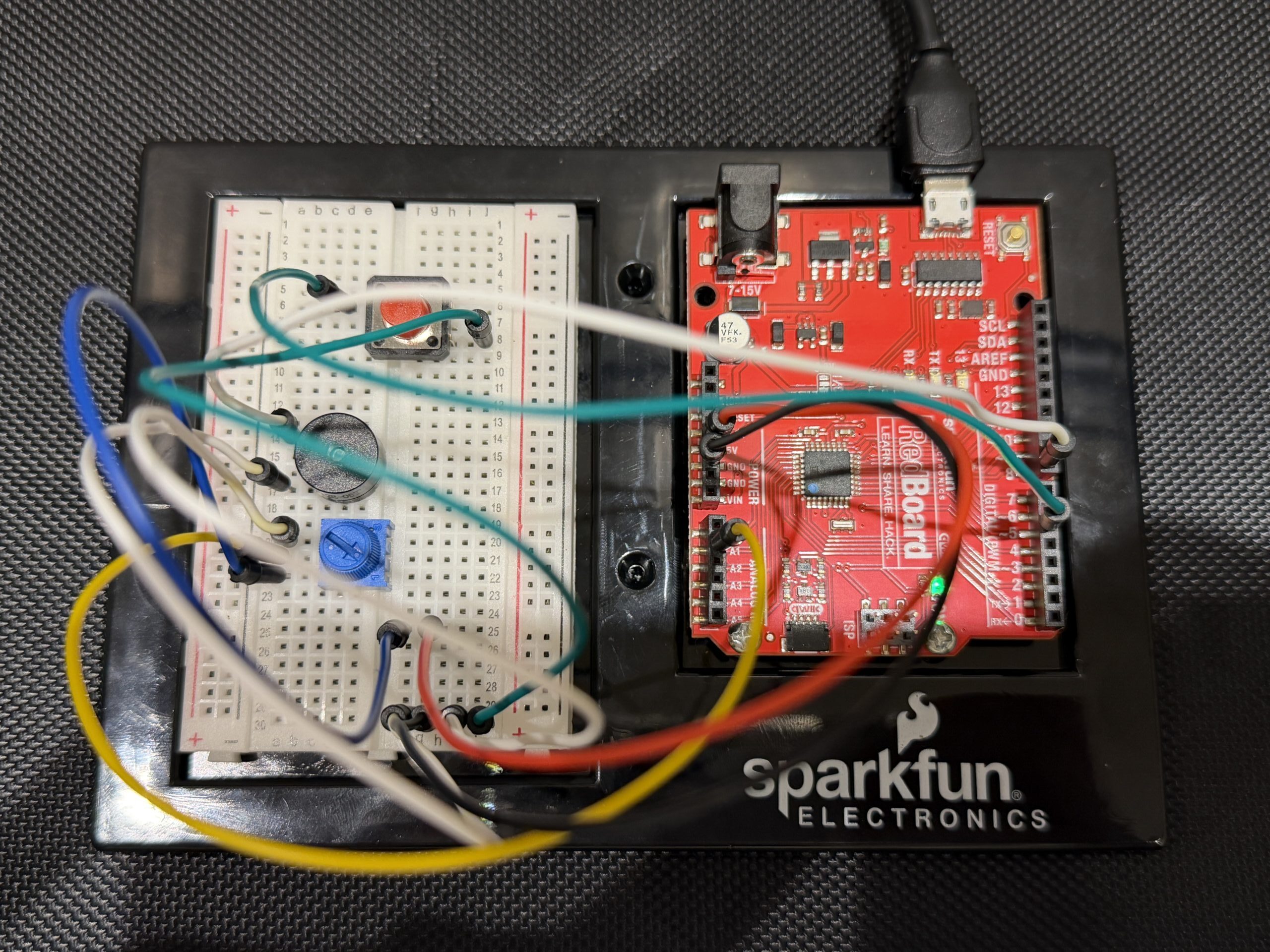
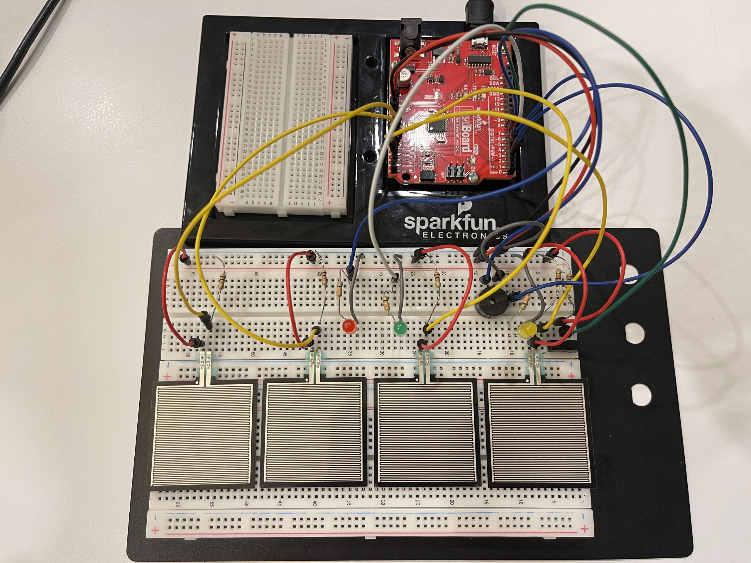
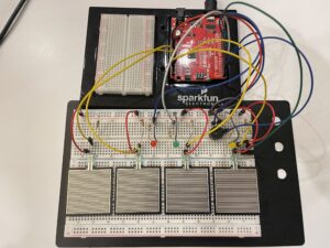
Picture of Mini Piano:
Concept
In this project, we created a simple interactive mini piano using Arduino. The system combines both analog and digital inputs to control LEDs and sound output. The main goal was to explore how analog sensor data can be translated into both visual and auditory feedback in a way that feels responsive and engaging.
The project brings together multiple components working at the same time:
- Analog input through Force Sensitive Resistors (FSRs)
- Digital input using a switch for overall control
- Analog output through a PWM-controlled LED for brightness variation
- Digital output using a red LED and a buzzer for clear feedback
Each FSR functions like a piano key. When pressure is applied, it changes the resistance, which affects the analog value being read. This value is then used to control both the pitch of the sound from the buzzer and the brightness of the LED, making the interaction feel more dynamic depending on how hard the user presses.
All FSRs are connected using a voltage divider with a 10kΩ resistor, and their values are read through analog pins A0 to A3. The system also includes several indicators:
- The yellow LED shows when the system is turned on
- The green LED represents the analog output, adjusting brightness based on input
- The red LED lights up when a stronger pressure threshold is reached
- The buzzer produces sound corresponding to the input
- The switch acts as the main ON/OFF control
⸻
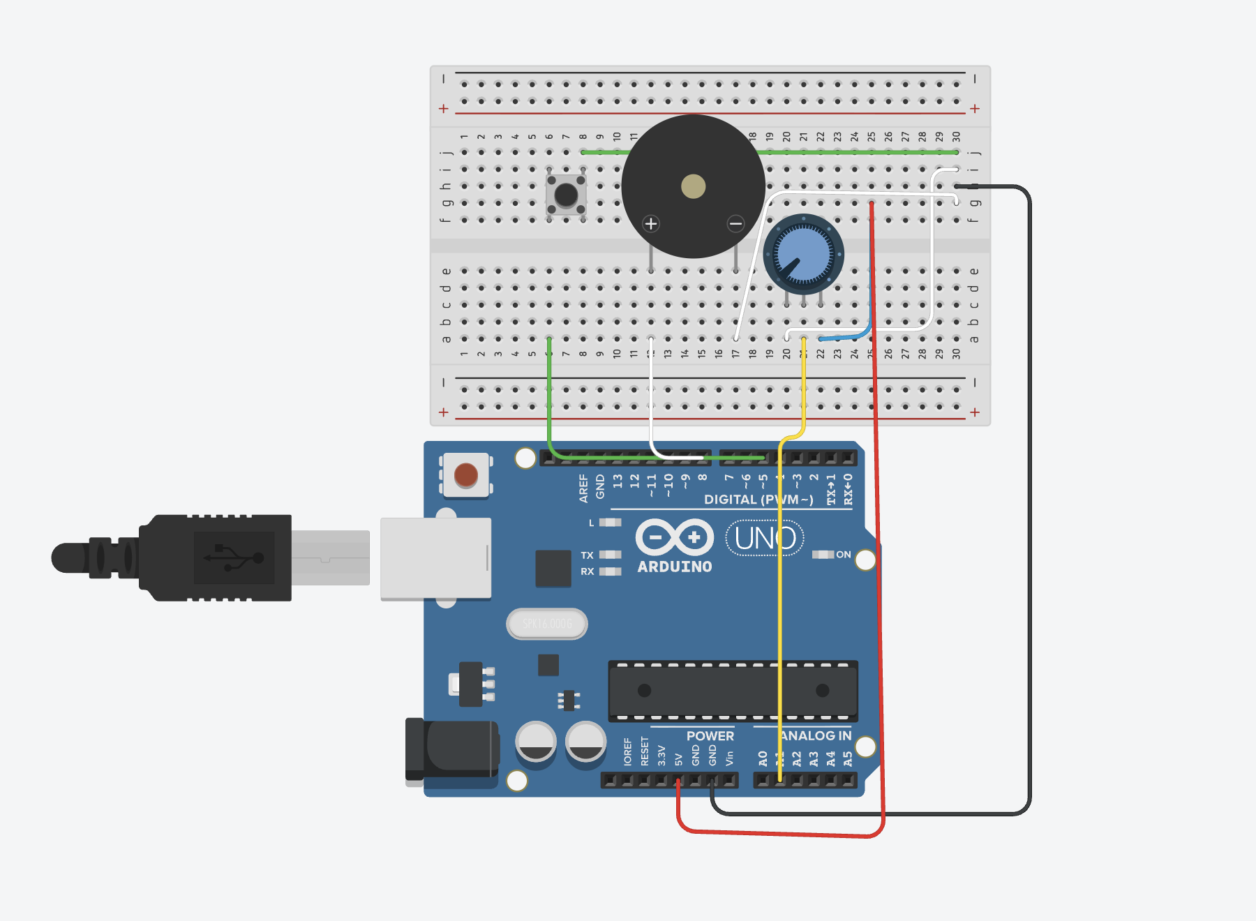
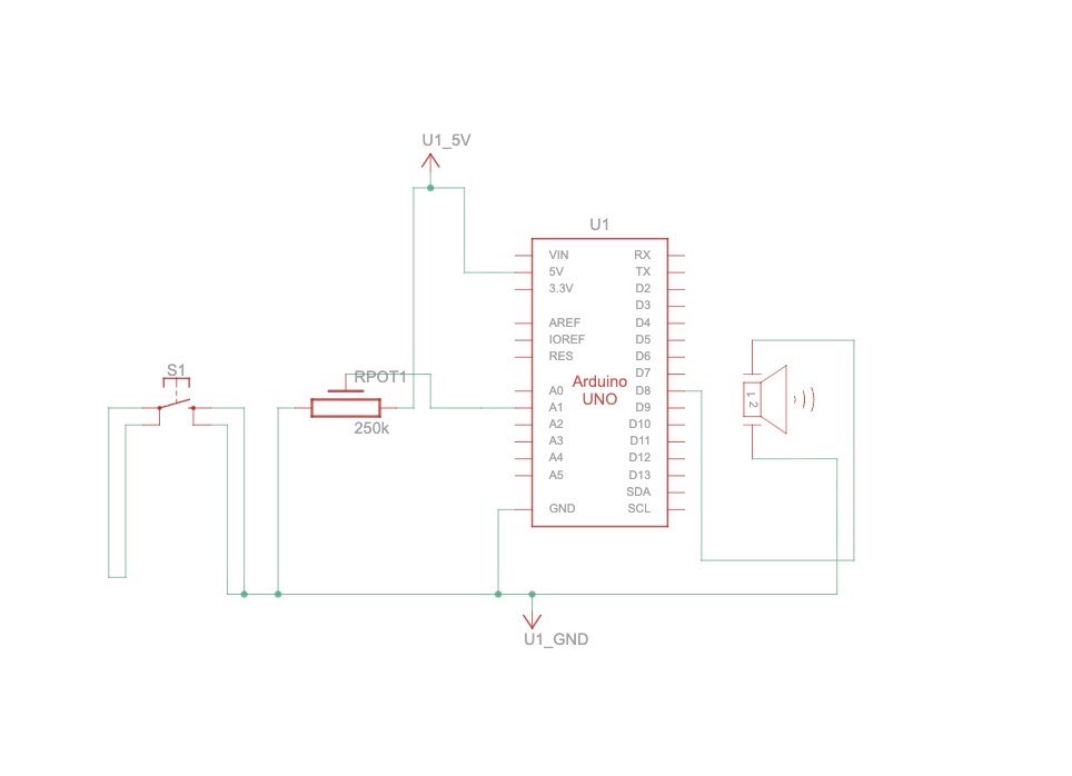
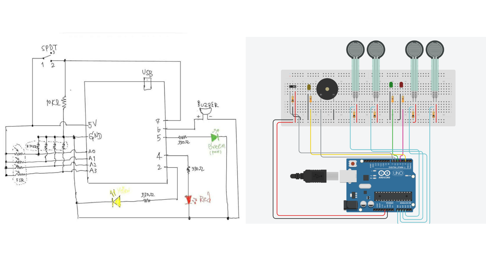
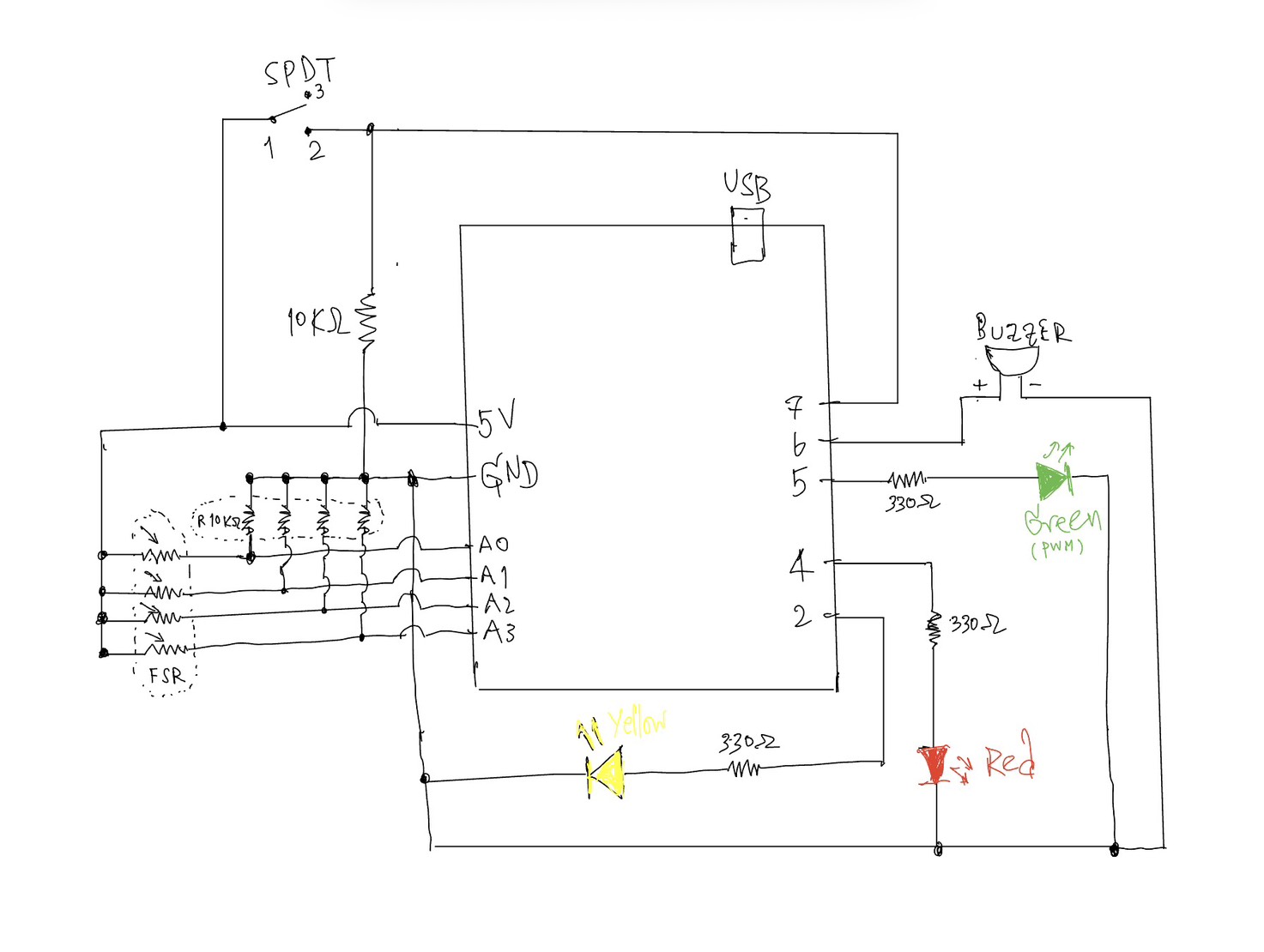
Circuit Design:
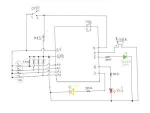
Each FSR is connected using a voltage divider with a 10kΩ resistor. The analog values are read from pins A0–A3.
• Yellow LED → System ON indicator
• Green LED → Analog output (PWM brightness)
• Red LED → Hard press indicator
• Buzzer → Sound output
• Switch → Turns system ON/OFF
The switch is connected with a 10kΩ pull-down resistor to ensure a stable digital input.
⸻
How It Works:
The system starts by checking the switch. When it is OFF, everything stays inactive, so no LEDs light up, and no sound is played. Once the switch is turned ON, the yellow LED lights up to show that the system is active, and the Arduino begins reading the values from all the FSR sensors. It then compares these readings to figure out which sensor is being pressed the most. Based on how much pressure is applied, the input is grouped into three levels: light, medium, and hard. Each level is mapped to a different note, where a lighter press produces a lower pitch and a stronger press produces a higher pitch. At the same time, the outputs respond to these changes. The green LED adjusts its brightness using PWM depending on the pressure, the red LED turns on when a strong press is detected, and the buzzer plays the corresponding note.
Tinkercad Link | Demo | Code
1. When the switch is OFF:
• All LEDs are off
• No sound is played
2. When the switch is ON:
• Yellow LED turns on
• Arduino reads all FSR values
3. The system finds the strongest pressed sensor
4. The pressure is divided into 3 levels:
• Light
• Medium
• Hard
5. Each level maps to a different note:
• Lower pressure → lower pitch
• Higher pressure → higher pitch
6. Outputs:
• Green LED brightness changes (analog)
• Red LED turns on if pressure is high
• Buzzer plays the corresponding note
⸻
Smoothing & Timing:
To improve stability:
• Sensor readings are averaged to reduce noise
• A smoothing formula is used:
smoothed = (old * 3 + new) / 4, which corresponds to 75% of the previous value and 25% of the new reading.
• millis() is used instead of delay() to control reading intervals (~8ms)
This allows continuous sensor reading without blocking the program.
⸻
Interaction Design:
This project demonstrates:
• Continuous analog interaction (pressure → brightness + sound)
• Discrete digital interaction (switch ON/OFF, red LED threshold)
• Real-time responsiveness using non-blocking timing
⸻
Code highlight:
This section of the code is the one I am most proud of, because it shows how analog input from the FSR sensors can be translated into both sound and LED behavior in real time.
// ---------- Find strongest press ----------
int strongestIndex = 0;
int strongestValue = smoothVals[0];
for (int i = 1; i < 4; i++) {
if (smoothVals[i] > strongestValue) {
strongestValue = smoothVals[i];
strongestIndex = i;
}
}
// ---------- No press ----------
if (strongestValue < PRESS_THRESHOLD) {
analogWrite(GREEN_LED, 0); // green LED off
digitalWrite(RED_LED, LOW); // red LED off
noTone(BUZZER); // stop sound
currentNote = 0; // reset note
return;
}
// ---------- Determine pressure level ----------
 int level;

 if (strongestValue <= LEVEL_1_MAX) {
   level = 0;   // light press
 }
 else if (strongestValue <= LEVEL_2_MAX) {
   level = 1;   // medium press
 }
 else {
   level = 2;   // hard press
 }

 // ---------- Select note ----------
 int nextNote = NOTES[strongestIndex][level];

 // ---------- Play sound ----------
 if (nextNote != currentNote) {
   tone(BUZZER, nextNote);   // play note
   currentNote = nextNote;   // update
 }
// ---------- Analog output (PWM LED) ----------
int clipped = constrain(strongestValue, PRESS_THRESHOLD, MAX_PRESS); // limit range
int brightness = map(clipped, PRESS_THRESHOLD, MAX_PRESS, 0, 255); // map to PWM
analogWrite(GREEN_LED, brightness); // set brightness
// ---------- Red LED (hard press) ----------
if (strongestValue > HARD_THRESHOLD) {
digitalWrite(RED_LED, HIGH); // turn on red LED
} else {
digitalWrite(RED_LED, LOW); // turn off red LED
}
Reflection
We both thought about adding a piano-like element to our Arduino for this week’s project, so we then decided to move forward with that idea. It was really interesting to see how different inputs could change the sound and how that made the interaction feel more alive. Instead of just having one tone, being able to play different pitches made it feel more responsive and a bit more like an actual instrument.
We really enjoyed the whole process and how the project turned out. Setting up the code in Arduino and Tinkercad helped us see how the system fits together step by step. It was also fun to be able to actually try it out after, since we could clearly see and hear how our inputs directly affected the output.
Overall, this project gave us a better sense of how input values can be interpreted and used in different ways. It made us more aware of how even simple changes in input can lead to noticeable differences in how a system responds. Because of this, we would definitely consider integrating sound into our future projects as well.
Future Improvements:
There are several possible improvements for this project.
1) each FSR could have its own LED instead of using a single shared LED. This would provide clearer visual feedback for each key and make the interaction more intuitive.
2) the sound quality could be improved by using a better speaker module instead of a basic buzzer, which would produce a richer and more musical output.
3) the system could be expanded to support more notes or a full musical scale, allowing more complex songs to be played.
Conclusion:
This project shows how simple components like FSR sensors can create an interactive musical instrument. By combining analog and digital inputs and outputs, we can design expressive and responsive interfaces.
References:
• Arduino Documentation
https://www.arduino.cc/reference/en/
• Analog Input Tutorial
https://www.arduino.cc/en/Tutorial/BuiltInExamples/AnalogInput
• PWM (analogWrite)
https://www.arduino.cc/en/Tutorial/PWM
• Voltage Divider Explanation
https://learn.sparkfun.com/tutorials/voltage-dividers
https://docs.arduino.cc/language-reference/en/functions/time/millis/
https://youtu.be/JZ44h-jy0p4?si=LTeRxI9Gy2SYuQWJ
https://youtu.be/QYYigxRwXfc?si=fmBr9DmXWSOYV1rm
https://youtu.be/CvZ-SGJ8fGo?si=kRXJ7upESpJA1Qsh