Concept
Every time I walk into Madame Tussauds, I feel this strange mix of excitement and also superficiality from the figures I am encountering. Because you’re standing next to someone you’ve only ever seen on a screen, except they’re not really there, and yet it still feels like you “met” them. It’s staged and curated, but somehow still memorable in a way. That exact feeling is what I want to recreate for my midterm, but in a digital format.
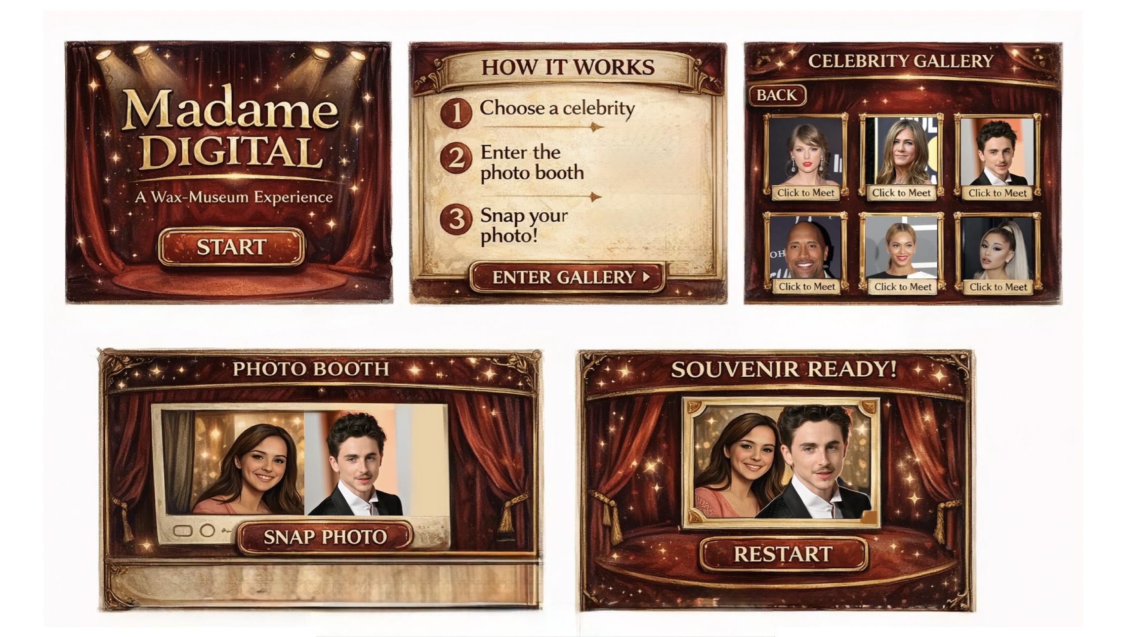
I don’t want to build another game where you’re trying to score points or beat something. I want to build an experience you move through. My idea is to create a wax-museum inspired digital space where you browse through celebrities, pick one and take a photo with them in a photo booth setup.
The whole concept revolves around that illusion of artificial closeness. You’re not actually meeting anyone, but you still walk away with a cute memory. I want users to feel like they stepped into a staged exhibit for a few minutes and left with a souvenir!
Design
Visually, I don’t want this to look like a bright and cartoonish app. I want it to feel sort of dramatic in a way, with a dark background and clean and polished looking framed celebrity cards.
I actually like that wax museums feel a little staged and exaggerated. I want the digital version to embrace that instead of hiding it.
The experience will start with a dramatic opening screen with soft background music. Nothing moves until the user presses start. That intentional pause kind of mimics standing outside an exhibit before stepping in.
After that, there will be a short instruction screen, and then the gallery. The gallery will show multiple celebrity cards. When you click it, you’ll move into the photo booth scene.
In the photo booth, your webcam will appear next to the celebrity you chose. There will be a snap button with a camera shutter sound, and then a final screen showing your “souvenir.” From there, you’ll be able to restart without refreshing everything, because I don’t want the experience to feel like it just cuts off.
Sound is also very important for my interactive experience. The gallery will have background music, and I might let it shift slightly depending on the celebrity chosen. Small things like that will make it feel less flat and boring and more alive.
Frightening Part
The webcam honestly scares me the most. The whole idea depends on that photo moment. If the camera doesn’t work, the entire concept kind of collapses. Browsers can be weird about permission sometimes, and I don’t want to build this whole dramatic museum and then realize the main interaction fails.
Reducing Risk
Instead of leaving the webcam for later, I’m going to test it early. I want to make sure the camera actually works and shows up inside the canvas and that I can capture a image from it before I build everything else around it.
Testing the technical parts like the camera webcam early will make the rest feel less stressful, because once I know the main interaction works, I can focus on the atmosphere of my experience, which is honestly the part i care about the most.