Concept
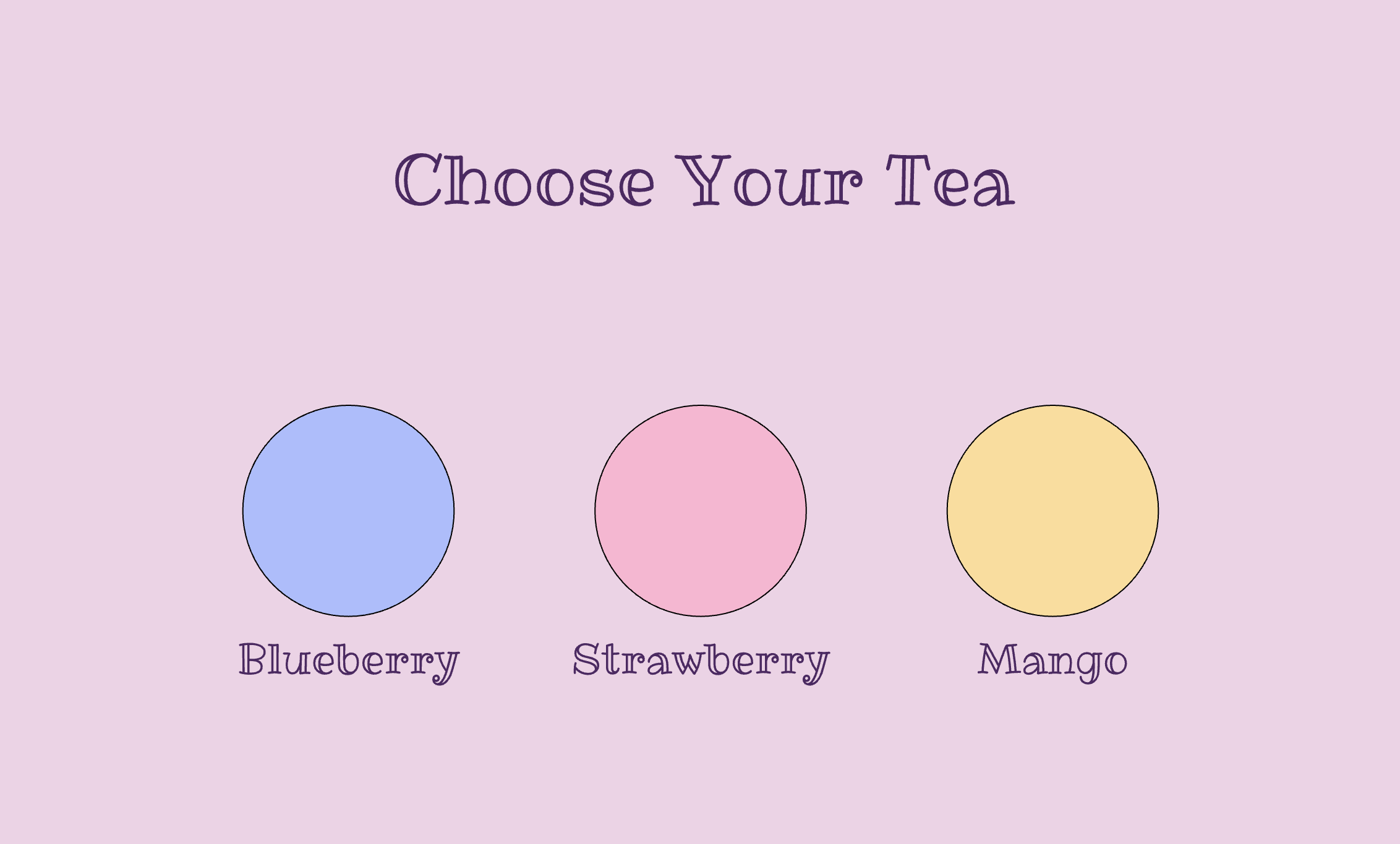
My midterm project is an interactive drink‑building experience called Boba Builder. The idea is simple, the user moves through different screens to create their own custom boba drink. It is an interactive and customizable experience and where they choose a tea flavor, add toppings, decide on ice, pick a straw or umbrella, and then see the final drink displayed at the end.
Design
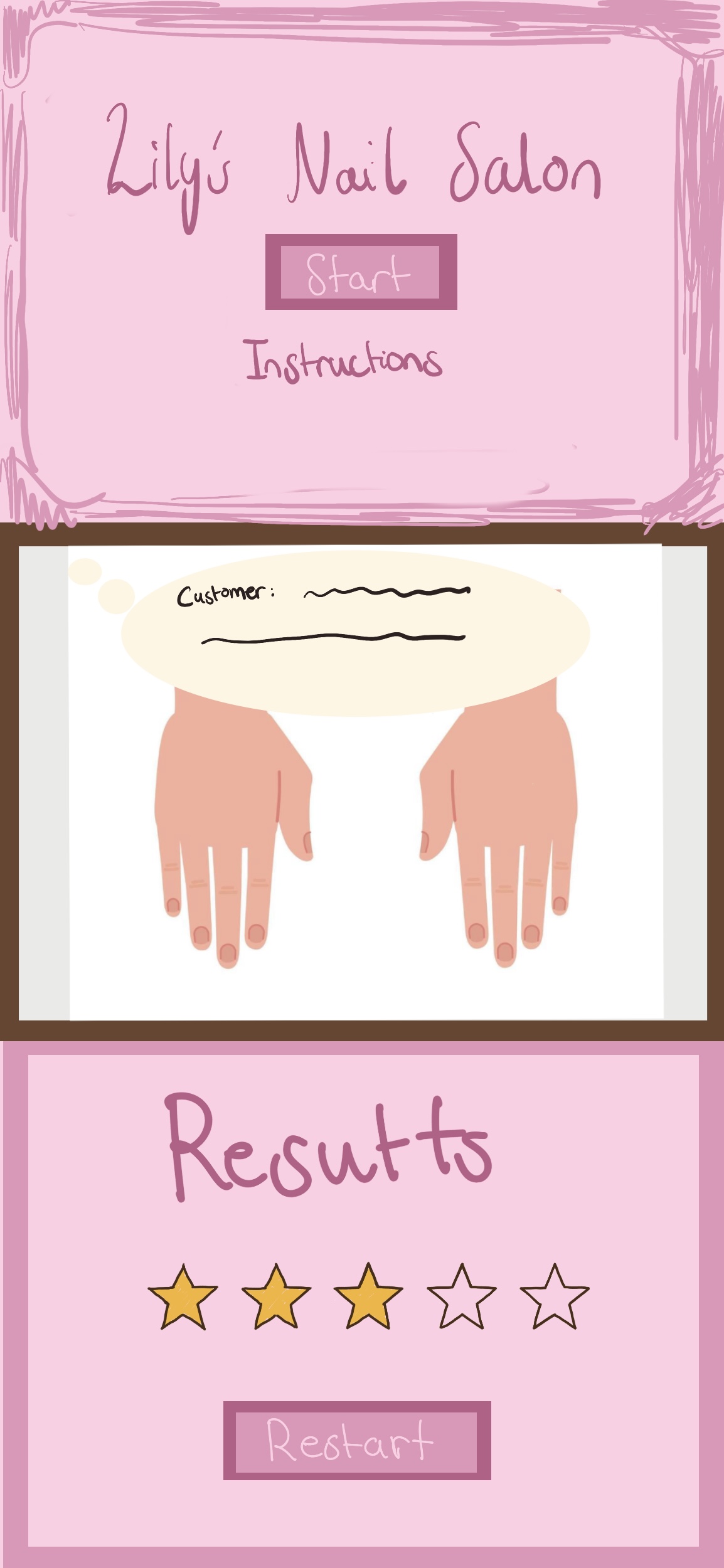
For my design I want my game/ interactive experience to have a playful theme with mostly colors being pastel, I want the theme to be a cute and fun experience. I want my game to be understood easily and for the player to be guided through each screen knowing what to do and everything is easy to follow.
The flow of the experience is straightforward: it starts on the main screen, then moves to the tea selection, followed by the pouring stage. After that, the player chooses their toppings, decides whether they want to add ice, and then decorates the drink. The final screen shows the completed boba based on all the choices the user made.
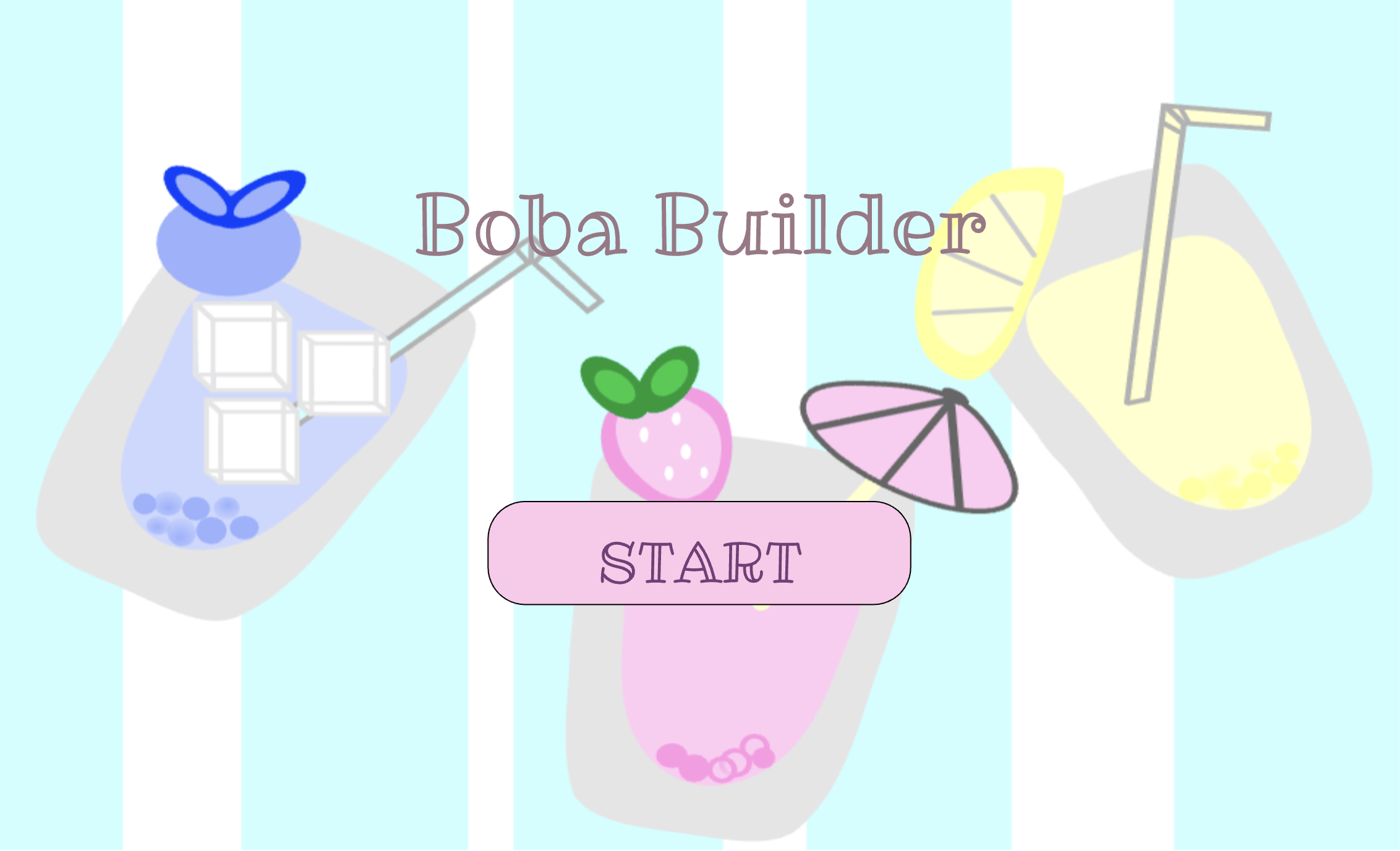
For the final outcome of the boba, I’m hoping the completed drink will look similar to the boba on my start page, with the ice, fruit, umbrella or straw, boba, and the different tea flavors all coming together after the user picks how they want their customizable boba to look like.
I drew the background in Procreate, and I plan to create all the other visuals there as well before importing them into p5.js.
Challenging Part
Since I want to draw my own visuals for almost everything, the most challenging part for me is handling all the visual assets while keeping everything aligned in fullscreen mode. I need to make sure they load correctly and stay positioned properly on different screen sizes. Currently, any click on the start screen takes you to the next page. I’m going to fix this so the game only starts when the player actually clicks the start button.
Reducing Risk
To reduce the risk I will probably load everything as soon as possible so that it would be easier for me to experience how everything will align together and I will look on p5’s reference to see if there is anything that would help with ensuring all assets will be fit to the full screen and will be positioned properly on different screen sizes. To avoid the issue of the screen changing on any click, I’m going to find tutorials to help with this issue and try finding something on p5 references that might help. This means the game will only start when the player actually clicks the start button.
References
- p5.js Reference: keyTyped() Used to implement the “press f for fullscreen” interaction. https://p5js.org/reference/p5/keyTyped/
- p5.js Reference: windowResized() Used to keep the canvas responsive when the browser window changes size. https://p5js.org/reference/p5/windowResized/
- Fullscreen Example: Class Slides (Week 5)
- Google Fonts: Ribeye Marrow font used in the project https://fonts.google.com/specimen/Ribeye+Marrow