Reading Reflection – Week 8

When I read Norman’s idea that attractive things “work better,” I realized it actually matches how I react to design in my everyday life. I do feel more drawn to things that look nice, whether it is a cute device, a clean app layout, or even good packaging. When something looks appealing, I automatically feel more positive toward it, and I am more patient when it has small issues. At the same time, I do not think beauty should be more important than usability. I believe designers need to balance both, because something that looks good but does not function well is frustrating, and something that works well but looks boring is not enjoyable either. His point made sense to me, but I also think he focuses a lot on emotion, and not every situation works that way.

The reading about Margaret Hamilton made me think about how different the tech world is today compared to her time. I personally have not felt underestimated in technical classes, and I do not feel like there is discrimination toward women in the spaces I am in now. But I know that fifty years ago it would have been a very different experience, and her story shows how much pressure she worked under. It also connects to Norman’s idea about emotion. She had to work in a very stressful environment, and that pressure probably forced her to be extremely focused and careful, which is what Norman describes when he talks about how negative emotions narrow thinking. Her story made me think about how serious and impactful technical work can be, and how much responsibility goes into writing code that other people depend on.

Week 8 Assignment

My concept

For week 8’s assignment, we were asked to create a switch that uses the human body to complete a circuit, but without using our hands. I wanted something simple but still interesting, so I decided to build a foil‑based touch switch that activates an LED when my elbow connects two pieces of aluminum foil. The idea behind my switch is that the body can act as a conductor: when the two foil pads are separated, the circuit is open, and when my elbow touches both at the same time, the circuit closes and sends a HIGH signal to the Arduino. I liked this idea because it felt playful and intuitive,  instead of pressing a button, I’m using a part of my body that normally isn’t used for electronics. Once everything was wired correctly, the LED lighting up from just a touch of foil felt surprisingly satisfying.

The demo and setup

Video:

Photo:

Photo: 

The schematic:

The code I’m proud of 

The part of the code I’m most proud of is the core logic that actually makes the switch work. Even though it looks simple, this was the section I spent the most time understanding and debugging. It reads the input from the foil and decides whether the LED should turn on or off. Once the wiring was correct, this logic worked instantly and reliably.

int state = digitalRead(switchPin);   

if (state == HIGH) {                  
  digitalWrite(ledPin, HIGH);         
} else {                              
  digitalWrite(ledPin, LOW);          
}

This snippet represents the entire interaction: the Arduino constantly checks the state of the foil switch, and the LED responds in real time. After all the debugging I went through, seeing this simple logic finally work felt incredibly rewarding.


Github link: https://github.com/mhraalnuaimi/week8assignment/blob/main/foil_switch.ino 

Problems I faced

This assignment ended up being much more challenging than I expected, not because of the code, but because of the wiring. At first, nothing happened when I touched the foil, the LED stayed off no matter what I did. I kept adjusting the foil, retaping wires, and trying different ways of touching it, but the Arduino wasn’t detecting anything. I assumed the foil wasn’t conductive enough or that my body wasn’t completing the circuit properly.

Eventually, I started debugging step‑by‑step. The most important test was touching the bare wire from pin 2 directly to the 5V pin. When I did that, the LED turned on immediately. That moment told me that the code, the LED, and the Arduino were all working perfectly. The problem had to be somewhere in the breadboard wiring.

After more testing, I discovered the real issue: the second GND wire connected to the resistor row was pulling the signal LOW permanently. Because of that, pin 2 could never go HIGH, even when the foil was touched. Removing that incorrect GND connection instantly fixed the problem. Once the wiring was corrected, the foil switch worked exactly the way it was supposed to.

I also rebuilt the foil pads so that the bare metal of the wire touched the bare foil directly, which made the connection much more reliable. After that, the LED responded perfectly every time my elbow bridged the two foil pieces.

Reflection 

This assignment taught me a lot about how sensitive breadboard wiring can be. I realized that most Arduino problems aren’t caused by the code, they’re caused by one wire being in the wrong row or one resistor being connected incorrectly. Debugging forced me to slow down and test each part of the circuit logically instead of guessing. The moment I isolated the issue and saw the LED turn on from the foil switch felt incredibly rewarding.

I also enjoyed experimenting with different ways of activating the switch, like using a metal pen instead of my elbow. Overall, I’m proud of how much I learned from this process. Even though it was frustrating at times, it made me more confident in reading circuits, understanding pull‑down behavior, and debugging systematically. Next time, I’ll double‑check my wiring before assuming the code is wrong, it would have saved me a lot of time.

References 

Arduino Documentation: digitalRead()

https://docs.arduino.cc/language-reference/en/functions/digital-io/digitalread/ I used this page to understand how the Arduino interprets HIGH and LOW signals from my foil switch.

Arduino Documentation: pinMode()

https://docs.arduino.cc/language-reference/en/functions/digital-io/pinmode/ I used this reference to confirm how to correctly set pin 2 as an INPUT so it could read the foil connection.

Arduino Documentation: Digital Pins

https://docs.arduino.cc/learn/microcontrollers/digital-pins I used this explanation to understand how input pins behave electrically, especially how they float without a proper pull‑down or pull‑up resistor.

Arduino Tutorial: Digital Input Pull-Up

https://docs.arduino.cc/tutorials/generic/digital-input-pullup I used this tutorial to compare my physical pull‑down resistor setup with Arduino’s internal pull‑up option and understand why my circuit needed stabilization.

Class slides

I used the class slides to review how switches work, how breadboard rows connect, and where resistors should be placed in a circuit.

Arduino cheat sheet

I used the cheat sheet to quickly double‑check syntax for digitalRead(), digitalWrite(), and pinMode() while writing and editing my code.

AI  usage debugging (ChatGPT)

I used AI to help me debug the circuit step‑by‑step, especially to isolate the issue with the misplaced GND wire and confirm that the code itself was working correctly.

Midterm Final Project

My overall concept:

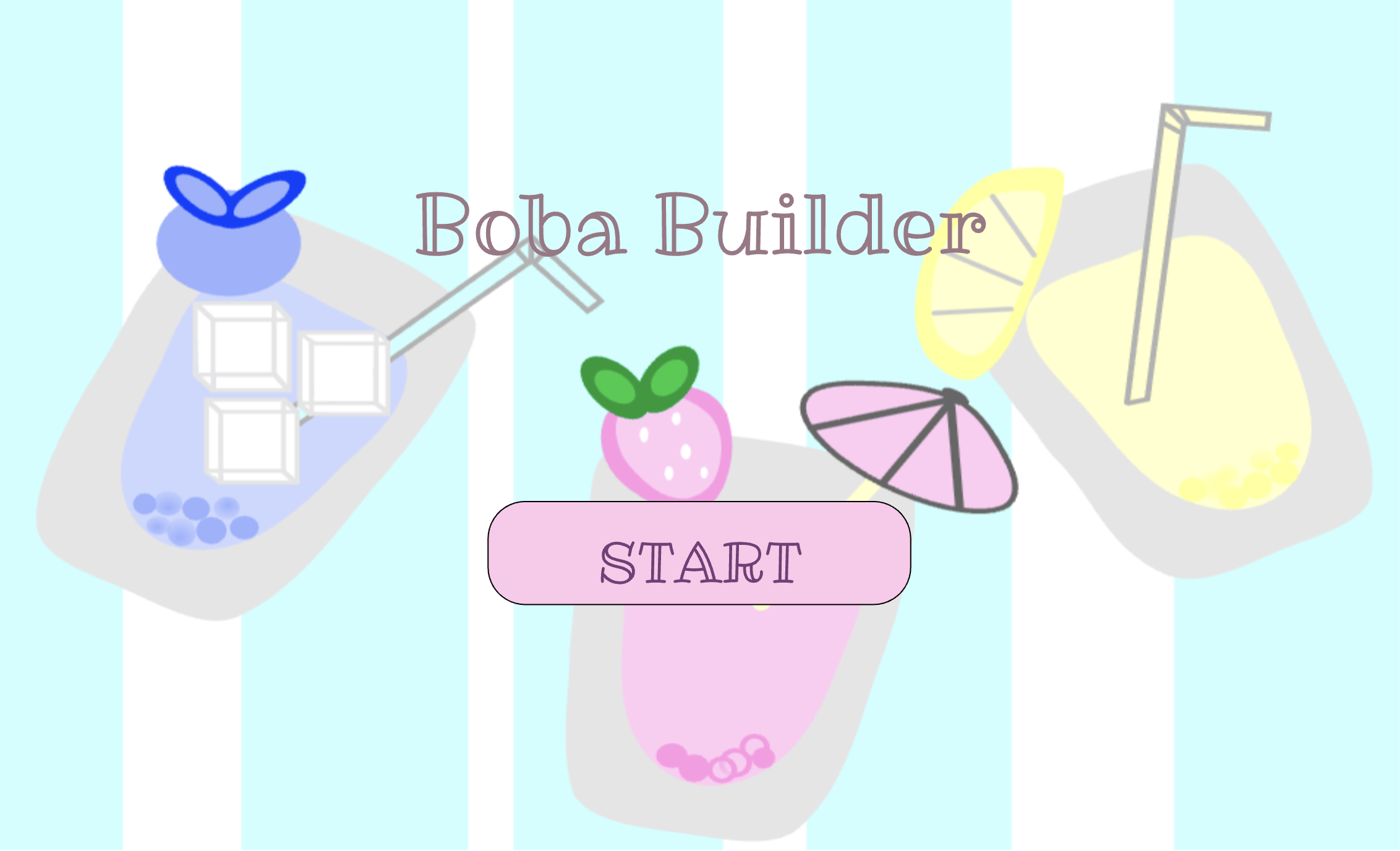
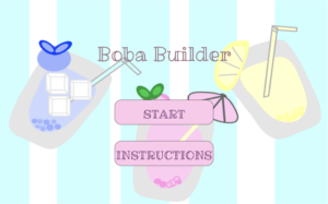
My project is an interactive game called Boba Builder, where the player gets to create their own custom bubble tea drink. I wanted the game to feel fun and give the user a cute, customizable experience, almost like a small digital cafe where you can design a drink however you want. The idea actually started because I was craving matcha, and at first I wanted to make a matcha‑themed game. But then I realized matcha doesn’t have many color or topping variations since it’s always green, so it didn’t feel very customizable. That made me think about other drinks, and then I remembered how popular boba tea was around 2020-2022 during the COVID era. I mean, it’s still popular now, but that was the time when it really became a trend. I liked how many different combinations you can make in real life, and that inspired me to turn it into a game where players can mix and match their own drink.

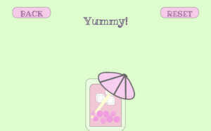
The main goal of my project was to make the player feel like they are actually building something step by step. Each screen represents a different part of the drink‑making process, and the choices the player makes show up inside the cup. I wanted the final drink to feel personal, like something the player actually created, and I liked the idea that every person could end up with a completely different drink. The game doesn’t have winning or losing; it’s more about creativity, enjoying the process, and having a fun little experience.

Final Project: 


How My Project Works: 

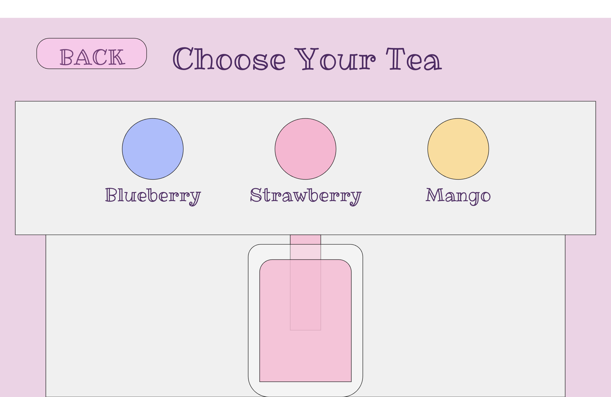
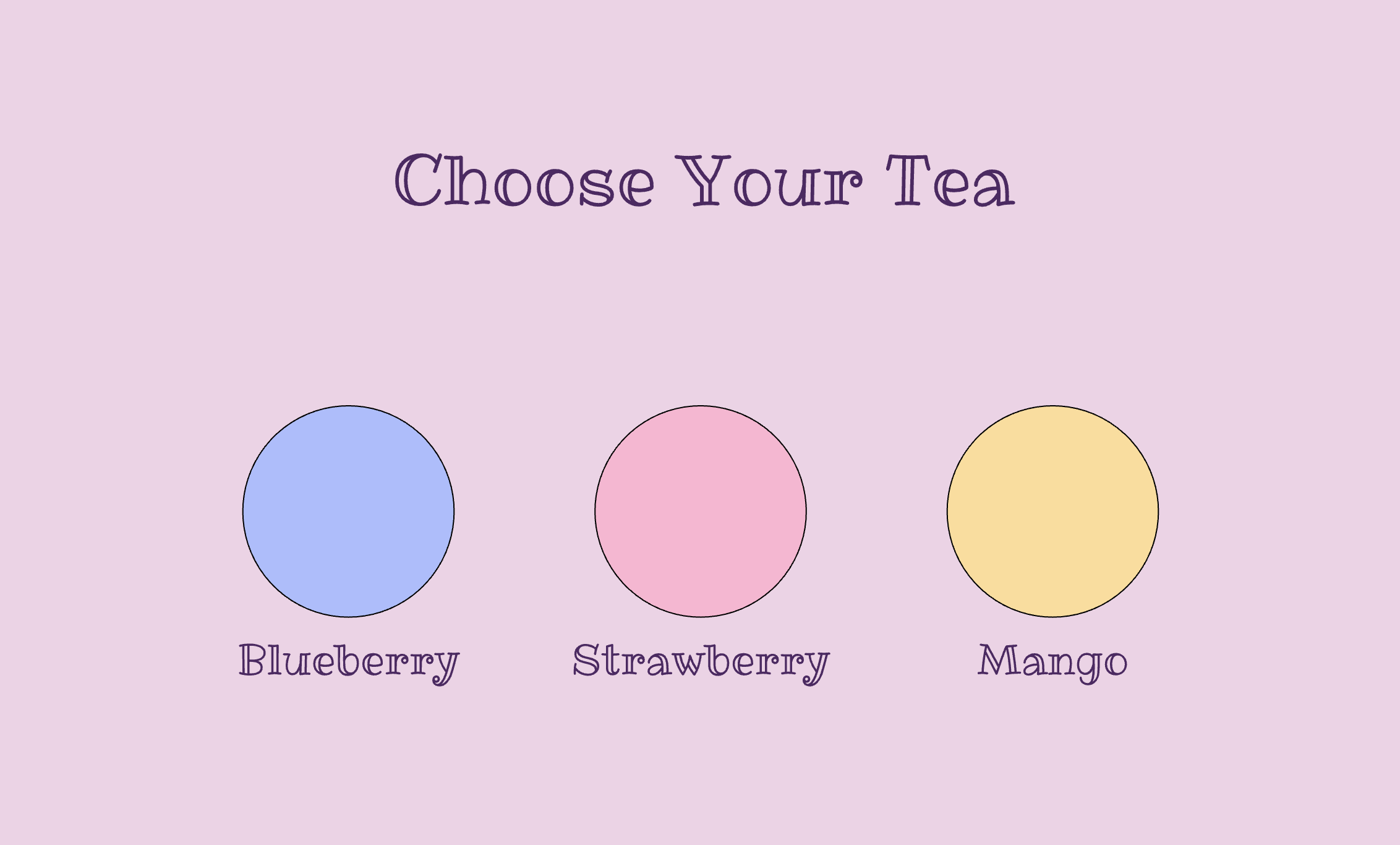
The entire game I built uses the same coding ideas we learned in class, which made it easier for me to understand how to structure everything. My project works using a state system in p5.js. This means the game changes screens depending on what the player chooses. For example, the game starts on the start screen, then moves to the tea screen, then the boba screen, then the ice screen, and so on. Each screen has its own buttons that let the player pick what they want to add to their drink. When the player clicks a button, the game updates a variable like chosenTea, chosenBoba, or chosenIce. These variables are then used inside my drawCup() function, which updates the cup and shows the player’s choices as they build their drink.

if (state === "start") {
  drawStartScreen();
} else if (state === "tea") {
  drawTeaScreen();
} else if (state === "bubbles") {
  drawBobaScreen();
} else if (state === "ice") {
  drawIceScreen();
} else if (state === "straw") {
  drawStrawScreen();
} else if (state === "color") {
  drawColorScreen();
} else if (state === "finished") {
  drawFinalScreen();
}

I also used object‑oriented programming to create my buttons. I made two classes: a Button class for rectangle buttons and a RoundButton class for circle buttons. Each button has its own position, size, color, and label. Both classes also have a clicked() function that checks if the player pressed the button. This helped me reuse the same code for all my buttons instead of rewriting it over and over. It made my project much more organized and easier to manage.

class Button {
  constructor(x, y, w, h, fillColor, textColor, txt) {
    this.x = x;
    this.y = y;
    this.w = w;
    this.h = h;
    this.fillColor = fillColor;
    this.textColor = textColor;
    this.text = txt;
  }

  draw() {
    fill(this.fillColor);
    rect(this.x, this.y, this.w, this.h, 30);
    fill(this.textColor);
    textSize(width * 0.035);
    text(this.text, this.x, this.y);
  }

  clicked() {
    return (
      mouseX > this.x - this.w / 2 &&
      mouseX < this.x + this.w / 2 &&
      mouseY > this.y - this.h / 2 &&
      mouseY < this.y + this.h / 2
    );
  }
}

The game also uses sound effects and background music. The background music plays throughout the whole game, and when the player pours tea, the pouring sound plays. When the pouring sound finishes, the game automatically moves to the next screen using pour.onended(nextState);. I also added sounds for boba, ice, and other actions to make the game feel more interactive and satisfying. At the end of the game, the player sees their final drink with all the choices they made.

What I’m Proud Of:

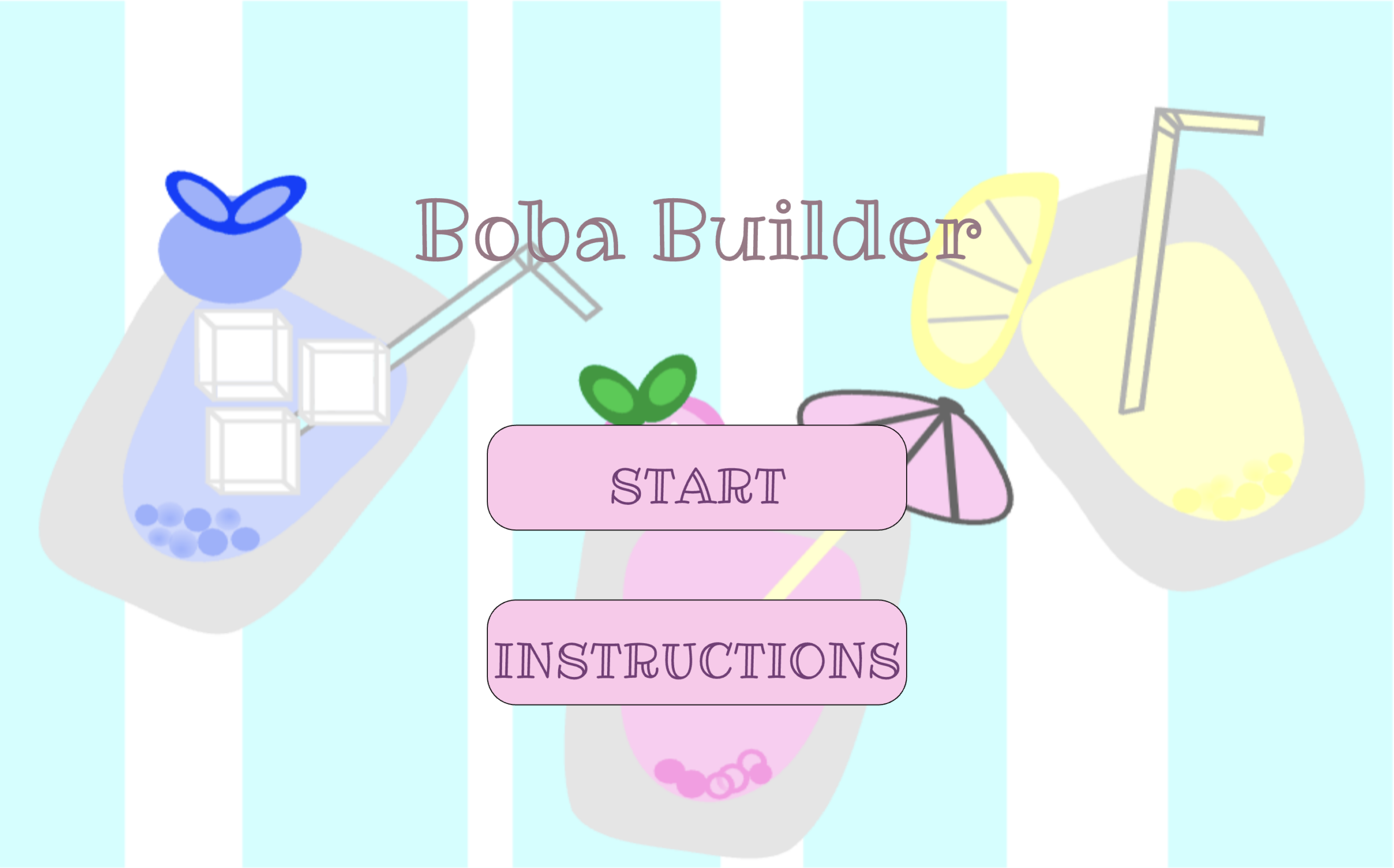
I’m really proud of how the whole game feels like a real drink‑making experience. The cup updates step by step, and the player can see their drink change as they make choices. I’m also proud that I figured out the back button issue. Now, on every screen, the player can go back to the previous page without breaking the game, which took a lot of testing and fixing. I’m also proud of the visuals I drew in Procreate. I made the start‑screen background, the toppings, and the decorations myself, and I think they make the game look cute and fun.

Another thing I’m proud of is the button system I created. I made a separate buttons.js file and used classes to organize all my buttons. This made my code much cleaner and helped me understand object‑oriented programming better. I’m also proud of how I used sound effects to make the game feel more real and less boring. The pouring sound, the drip sound, and the ice sound all add to the experience and make the game more satisfying to play.

I’m also proud that I solved some difficult bugs. The back button and the lag issues were really frustrating, but I kept trying different things until I fixed them. It felt good to finally get everything working the way I wanted.

Areas of Improvement & Problems I Faced:

One area I want to improve is how the layout works on different screen sizes. I used windowWidth and windowHeight to make the game responsive, but sometimes the buttons or text still look a little off on very small or very large screens. In the future, I want to create a better scaling system so everything stays in the right place no matter what device the player uses, even on phones.

I also had problems with the back button. Sometimes it didn’t reset the right variables, so old choices stayed on the screen. Other times, the game lagged because something was being recreated inside the draw() function instead of only running once in setup(). These issues took a long time to figure out, and I had to test many different things before I finally fixed them.

Another challenge was making sure the cup updated correctly with all the player’s choices. I had to keep track of many variables and make sure they all worked together without breaking anything. It was confusing at first, but once I organized everything and cleaned up my code, it became much easier to manage.

References: 

– Pouring sound:  https://freesound.org/people/piotrkier/sounds/700153/ 

  • I used this sound for when the tea pours into the cup.

– Drip sound:  https://freesound.org/people/Neotone/sounds/75345/ 

  • This sound plays when the player chooses boba or a color.

– Ice sound:  https://freesound.org/people/giddster/sounds/386431/ 

  • This sound is used when the player adds ice to their drink.

– Background Music: https://freesound.org/people/Mrthenoronha/sounds/370293/ 

  • I used this as the soft background music that plays during the whole game.

– Audio Editing Tool: https://clideo.com/editor/ 

  • I used this website to trim and edit my audio files so they fit better in the game.

– Font Used: https://fonts.google.com/specimen/Ribeye+Marrow 

  • This is the custom font I used for the text in my project.

– p5.js reference: https://p5js.org/reference/p5.MediaElement/onended/ 

  • I used this p5 reference to learn how the onended() function works. This helped me understand how to make the game move to the next screen after the pouring sound finishes.

Drawings:  

  • I used Procreate to draw the visuals for my project, including the start background and the toppings. I created each drawing myself and exported them as PNG files so I could use them for my game.

Ai usage: 

  • For my project, I mainly used ChatGPT to help me understand and fix problems that were confusing or hard to figure out on my own. One issue I had was that when I changed the size or position of something in my sketch, other parts of the layout sometimes reacted in ways I didn’t expect, especially because I was using a lot of percentage‑based values like width * 0.5 or height * 0.7. ChatGPT helped me understand how p5.js handles screen sizes and why certain numbers can affect the spacing of different elements. I also used ChatGPT to understand why my instructions text wasn’t breaking into separate lines and it was written in a way that wasn’t aesthetically appealing. It explained how the \n symbol works in p5.js and how text alignment affects multi‑line text, which helped me format my instructions correctly. Another major problem was my back button. Sometimes it took me to the wrong screen, sometimes it kept old choices even when restarting th whole p5 game, and sometimes it even made the whole game lag. ChatGPT helped me understand that this can happen if the order of resetting variables and changing states is wrong, or if something is being recreated inside the draw() function when it should only happen once in setup(). After learning this, I reorganized my code and fixed the issue. ChatGPT also helped me understand why my game lagged at certain moments by explaining that loading images or creating new objects inside the main loop can slow everything down. Finally, I asked ChatGPT to explain how the onended() function works for sounds, which helped me understand why I needed pour.onended(nextState); for my tea‑pouring animation. All the coding, design, and decisions in my project were done by me; ChatGPT only helped me understand confusing parts and figure out why certain things weren’t working the way I expected.

Week 5 – Midterm Progress

Concept

My midterm project is an interactive drink‑building experience called Boba Builder. The idea is simple, the user moves through different screens to create their own custom boba drink. It is an interactive and customizable experience and  where they choose a tea flavor, add toppings, decide on ice, pick a straw or umbrella, and then see the final drink displayed at the end.

Design

For my design I want my game/ interactive experience to have a playful theme with mostly colors being pastel, I want the theme to be a cute and fun experience. I want my game to be understood easily and for the player to be guided through each screen knowing what to do and everything is easy to follow.

The flow of the experience is straightforward: it starts on the main screen, then moves to the tea selection, followed by the pouring stage. After that, the player chooses their toppings, decides whether they want to add ice, and then decorates the drink. The final screen shows the completed boba based on all the choices the user made.

For the final outcome of the boba, I’m hoping the completed drink will look similar to the boba on my start page, with the ice, fruit, umbrella or straw, boba, and the different tea flavors all coming together after the user picks how they want their customizable boba to look like.

I drew the background in Procreate, and I plan to create all the other visuals there as well before importing them into p5.js.

Challenging Part

Since I want to draw my own visuals for almost everything, the most challenging part for me is handling all the visual assets while keeping everything aligned in fullscreen mode. I need to make sure they load correctly and stay positioned properly on different screen sizes. Currently, any click on the start screen takes you to the next page. I’m going to fix this so the game only starts when the player actually clicks the start button.

Reducing Risk

To reduce the risk I will probably load everything as soon as possible so that it would be easier for me to experience how everything will align together and I will look on p5’s reference to see if there is anything that would help with ensuring all assets will be fit to the full screen and will be positioned properly on different screen sizes. To avoid the issue of the screen changing on any click, I’m going to find tutorials to help with this issue and try finding something on p5 references that might help. This means the game will only start when the player actually clicks the start button.

References

  • p5.js Reference: keyTyped() Used to implement the “press f for fullscreen” interaction. https://p5js.org/reference/p5/keyTyped/
  • p5.js Reference: windowResized() Used to keep the canvas responsive when the browser window changes size. https://p5js.org/reference/p5/windowResized/
  • Fullscreen Example: Class Slides (Week 5)
  • Google Fonts: Ribeye Marrow font used in the project https://fonts.google.com/specimen/Ribeye+Marrow

Week 5 – Reading Reflection

When I think about computer vision, I usually think of it as the way computers “see,” mostly in apps, websites, or phone features. After learning more about it, I realized that computers do not see anything the way humans do. Humans take in a whole scene at once, but computers break everything into tiny pieces like pixels, brightness, and movement. They notice small details that we might miss, but they also miss the bigger picture that humans understand naturally.

My own experience with things like Face ID and Snapchat filters shaped how I reacted to the topic. Unlocking my phone with my face feels normal and easy now, and Touch ID on a Mac makes things even faster. At the same time, I do not trust every technology that tracks people. I feel fine when big companies use it, because I honestly have the mentality of why would they want to use my data out of  the billions of people using their platforms. However if it is a random app or something that could be hacked, then I wouldn’t want them to easily track me. That made me understand why computer vision based artworks can feel both creative and unsettling at the same time.

I think surveillance in public spaces is important for safety, but using it in art is kind off weird. It can be meaningful, but it can also feel invasive depending on how people are being watched. The idea of a machine constantly observing people makes me a little uncomfortable and weirded out honestly, but also curious about how far this technology will go. I do not think computers will ever fully understand human behavior the way humans do. Emotions, intentions, and intuition are probably never going to be experienced by computers.

If I were to design an artwork with computer vision, I would focus on tracking gestures or movement instead of faces. That feels less personal and more playful and fun to experience. I also think artists should have limits when using real people as data, especially when people do not know they are being recorded. Overall, learning about computer vision made me think more about how much we rely on it and how it affects both everyday life and creative work.

Week 4 – Reading Reflection

When I read about Chapter 1 of The Design of Everyday Things, the first thing that comes to my mind is how confused I felt using Brightspace when I first came to NYUAD. The author explains that when something is designed poorly, people usually blame themselves instead of the system that created it. That stood out to me because that is exactly how I felt. I kept thinking I was the problem and that I just was not understanding how to use it I had trouble when uploading my assignments,  and when trying to find professors’ feedbacks. Before NYUAD, I used Google Classroom, and everything there felt simple and clear and it was easy to use and understand. Brightspace felt crowded and all over the place which made it hard to navigate. After reading this chapter, I realized my frustration was not only about me. It was also about the design itself.

The chapter also talks about how designers sometimes assume everyone thinks the same way they do. That made me think about how different people use technology in different ways. Some people grow up using all kinds of apps and websites, so they get used to complicated layouts and things that could be considered “confusing” to other people. Others do not have that same experience, so they might feel lost more easily. I noticed this with WordPress too. The first time I used it, I had no idea where anything was. It felt overly crowded and confusing. After using it many times, I slowly got more comfortable. That helped me understand why designers need to think about all kinds of users, not just people who already know similar platforms.

There are also websites that feel easy right away. To me Amazon is a good example. The search bar is easy to find when trying to search for the product you’re looking for, the cart is always in the same place and when you click it you could see what you added there, and checking out or tracking an order is simple. You do not have to guess what to do next. Even simple games like Wordle are easy to understand and use. So it gives the idea that the interaction they offered suits any type of person even people that don’t even know how to use technology. When you open it, you already know what to do without instructions. That shows how good design can make something feel natural to someone.

Overall, this reading made me pay more attention to the design of the things I use every day. I started noticing how much design affects whether something feels stressful or simple. It also made me think that simple design is usually better. I am still wondering how designers decide how much is too much. Adding more features can be helpful, but it can also make things more confusing. Finding the right balance seems difficult, and I am curious about how designers figure that out.

Week 4 – Assignment

My concept

For this week’s assignment, I made a generative fortune cookie. I wanted to create something that is fun to interact with, but also use what we learned about loading data from a CSV file. Instead of letting the computer pick totally random words, I organized my CSV so each row had the same structure: subject, adjective, action, object, place, and warning.

I liked the idea of copying how real fortune cookies work so in my sketch, every time you click, the program picks one row from the CSV and turns it into a fortune. This makes the project interactive and gives it that “mysterious” fortune cookie feeling not knowing what you will read next. I also tried to center everything so it looks like an actual fortune paper coming out of a cookie.

Highlight of my sketch

One part of my project that I’m proud of is how I drew the fortune paper. I wanted it to look clean and centered, so I made a separate function called drawPaper() just for that. This helped keep my code organized and made it easier to adjust the design. The function draws a big white rectangle with rounded corners to look like the paper sticking out of the cookie, and then I added a soft shadow underneath it to make it stand out more.

Here’s the code for that part:

function drawPaper() {
  noStroke();
  fill(255);

  rectMode(CENTER);
  rect(width/2, 360, 360, 110, 12);

  fill(0, 0, 0, 25);
  rect(width/2, 365, 360, 110, 12);
}


Embedded sketch

How this was made

I made a CSV file where every row followed the same pattern. Keeping the format consistent was important because if one row had a missing comma, the whole sentence would break.

In preload(), I used loadStrings() to load the CSV and loadFont() to load my font that i downloaded from google fonts. In setup(), I created the canvas, set the font, centered the text, generated the first fortune, and used noLoop() so the sketch doesn’t constantly refresh.

The main logic happens in generateFortune(). I used random() to pick a random line from the CSV, then split() to break it into pieces. Each piece goes into a variable, and then I build two full sentences using those variables.

The mouseClicked() function calls generateFortune() and then redraw(), which updates the sketch only when the user interacts (by clicking it basically) . This makes it feel less chaotic.

Reflection and future ideas

This project helped me understand how external data works in p5.js. At first, I didn’t get how a whole line from the CSV could turn into separate words, but once I understood how split() works, it made sense. It showed me how generative text can be structured instead of random.

One challenge was keeping the CSV formatted correctly. If one row had an extra space or missing comma, the whole sentence would come out wrong. Fixing that helped me understand how important clean data is.

In the future, I want to try mixing pieces from different rows instead of using one row at a time. That would make the fortunes even more varied. I also think it would be cool to animate the cookie cracking open or have the fortune slide out instead of just appearing, and also try making the fortune cookie look more realistic, and I also want to trey adding animation because it would make the interaction feel more fun.

References

p5.js documentation I used the official p5.js reference to look up functions like loadStrings(), loadFont(), random(), split(), noLoop(), redraw(), text(), triangle(), and rect()https://p5js.org/reference/

Google fonts I downloaded the font I used in my sketch from Google Fonts. https://fonts.google.com/

CSV file I created my own CSV file for this project and formatted it myself.

Ai usage I used AI to help me brainstorm and generate some of the sentences for my CSV file (subjects, adjectives, actions, objects, places, and warnings). I edited and formatted everything myself when creating my own CSV file on google sheets.

Week 3 – Reading Reflection

Reading Chris Crawford’s chapter made me realize that I never really thought deeply about what “interactivity” actually means. I always assumed anything on a screen was interactive, but Crawford explains that real interactivity is like a conversation where both sides listen, think, and respond. When I compare that to the apps and games I use the most, like TikTok, Tetris, and Block Blast, I can see how they fit his definition. These apps react to what I do, and I react back, so it becomes a cycle. Crawford also talks about how the word “interactive” gets thrown around too much, and I agree because I’ve seen products or websites call themselves interactive even when they don’t respond to the user at all. Sometimes a site has so many buttons, menus, or pop‑ups that it feels more overwhelming than interactive. His point about needing two “actors” made sense to me because a system that only shows information without responding to the user isn’t really interacting. It made me think about how much I value visuals, animations, and feedback because those things make a system feel alive and responsive, not just decorative.

The reading also made me reflect on my own p5 sketches and how they fit into Crawford’s idea of interactivity. So far, I’ve made things like my panda portrait and class exercises with bouncing balls and patterns. These sketches react in small ways, but they don’t fully “listen, think, and speak” back to the user yet. Crawford’s definition made me realize that I want my sketches to respond more directly to what the user does. I want to add animation, movement, and user‑controlled elements so the sketch feels like it is reacting to the person using it. I also want to make something that feels more like a small game or a mini‑movie, where characters move and interact with each other. The reading helped me understand that interactivity is not just about visuals but about creating a back‑and‑forth experience. By the end of the semester, I hope my sketches feel more alive and fun, and I want users to enjoy interacting with them. I’m inspired by old pixel games from the 2000s because they feel nostalgic, simple, and playful, and I want to bring that feeling into my work while also making sure the interaction follows the cycle Crawford describes.

Week 3 – Assignment

My concept:

For this week’s assignment, I created a generative artwork using arrays and objects. I followed the bouncing bubbles example we worked on in class, but I changed it to make something more colorful and fun. The main idea is that the user can click anywhere on the canvas to add bouncing circles. Each circle has a different size, speed, and color because all of those values are random.  I wanted to keep the idea simple while practicing the coding concepts we learned, especially storing objects in arrays and updating them inside a loop.

My concept was to make something interactive that didn’t rely on complicated visuals but still felt fun to use. Since we learned how to create our own objects and store them in arrays, I wanted to build a sketch where the user could generate many circles without manually drawing each one. The bouncing bubbles demo from class inspired me a lot, especially the way each object moves on its own. I also liked the idea of randomness and repetition, which are common in generative art. I wanted the user to help create the final image, so every time the sketch runs, the result is different since they could be different colors and sizes.

How the Project Works:

I started by creating an empty array called shapes, which stores all the circles that appear on the screen:

let shapes = [];

Whenever the user clicks, a new Shape object is created at the mouse position. I used .push() to add it to the array so the sketch can keep track of every circle the user creates. I wrote a Shape class that gives each circle its own position, speed, size, and color. The class also includes functions that make the circle move, bounce off the edges of the canvas, and display itself.

The sketch also includes a simple interaction where pressing any key removes the last circle from the array. This gives the user some control over how crowded the canvas becomes.

Inside the draw() function, I used a for‑loop to update every circle in the array. The loop calls move(), bounce(), and display() for each object. This is what makes the animation run smoothly and allows all the circles to move at the same time.

Embedded Sketch:

Code Highlight:

One part of the code I’m proud of is the loop that updates all the shapes:

for (let i = 0; i < shapes.length; i++) {
  shapes[i].move();
  shapes[i].bounce();
  shapes[i].display();
}

This section shows how useful it is to create your own objects. Instead of writing separate code for each circle, one loop controls everything. It keeps the sketch organized and makes it easy to add or remove shapes.

Reflection and future ideas:

This assignment really helped me understand how arrays and objects work together in a sketch. In the beginning, I kept forgetting small things like using .push() or making sure my variable names matched exactly, and those tiny mistakes caused a lot of errors. Since JavaScript is case‑sensitive, even one wrong letter would break the whole thing, so I had to get used to being more careful. Once I understood how everything connected, the array, the class, and the loop, the project became much easier and honestly more fun to work on. I enjoyed playing around with random values for the colors, sizes, and speeds because it made the artwork feel more alive and unpredictable.

If I had more time, I would love to expand this sketch by adding different types of shapes instead of just circles, or maybe adding fading trails behind the shapes as they move. I also think it would be interesting to experiment with sound interaction or simple physics like gravity to make the movement feel more dynamic. Overall, this assignment made the concepts we learned in class feel much clearer, and it showed me how these techniques can be used creatively instead of just technically.

References:
  • p5.js Reference – random() https://p5js.org/reference/p5/random/
  • p5.js Reference – ellipse() https://p5js.org/reference/p5/ellipse/
  • p5.js Reference – color() https://p5js.org/reference/p5/color/
  •  Reference – mousePressed() https://p5js.org/reference/p5/mousePressed/
  • p5.js Reference – keyPressed() https://p5js.org/reference/p5/keyPressed/
  • Class example: Bouncing Bubbles (Intro to IM)
  • I used AI only to help me fix small mistakes in my code, especially when I had red error lines and couldn’t figure out what was causing them.

Week 2 – Reflection

When I watched Casey Reas’ Eyeo talk on Chance operations, I started thinking differently about how i use control in my art. Reas explains that the computer is not just a tool that follows orders, but a creative system that can use chance in a planned way. One part that really stood out to me was when he talked about artists like Sol LeWitt, where the instructions are the artwork and the final image is just one version of many possibilities. That made me realize that art does not always need to be fully planned to be meaningful. I noticed that in my own work I usually avoid randomness, especially when I paint portraits. I like to control the faces, expressions, and details, and I feel like adding random elements could ruin the image I worked hard on. I like knowing what the final result will look like and follow the structured plan of how it’s suppose to turn out. But Reas helped me see that even when a system creates something unexpected, it still comes from the artist’s ideas and decisions. Making me realize even when mistakes are made, sometimes it still helps us see that it can turn the thing we are creating better (whether it’s planned or not).

Before watching the talk, I thought randomness mostly made things messy and out of control. Now I understand that randomness can be planned and guided by rules. Reas explains how simple systems can create complex behaviors, and that really changed how I think about art. If I use chance in my own projects, I want to start with movement. Movement creates emotion and makes the artwork feel alive, and letting it behave in a slightly unpredictable way can make it more interesting. I also think randomness can make my projects more unique instead of looking repetitive. At the same time, I believe there needs to be a balance between chaos and structure. If a project is formal or important, too much randomness can feel a bit overwhelming, confusing or disrespectful. For me, the best balance is when I control the main rules but let chance decide small details, like position or scale. After watching Reas’ talk, I see chance not as something that ruins my work, but as something that helps me explore new ideas and think differently when working with projects, art, assignments, writing and etc.