Reading Responses: A Brief Rant on the Future of Interaction Design made me rethink that my initial interpretation of the original word rant stood out as I think the author’s deliberate refusal to provide a clear solution, emphasizing instead that identifying the problem is a necessary first step toward meaningful innovation. At first, I found this frustrating because I tend to expect readings especially in terms of design to propose directions. This discomfort actually revealed an assumption I hold which is that good design thinking must always be solution-oriented. As the author challenges this by suggesting that premature solutions can limit imagination and that real breakthroughs actually come from long-term research driven by awareness and curiosity. This made me question my own approach in interactive media projects, where I often rush to “make something” rather than sit with the problem deeply. It raises an important question for me whether am I prioritizing productivity over genuinely understanding the limitations of current interaction algorithms?
Another idea that sparked my interest was the critique of alternative interaction methods such as voice, gesture, and even brain interfaces. The author argues that many of these still fail to match the richness of embodied interaction, particularly the role of the hands in creating and understanding spatial systems (page 2). This resonates with my own experience using voice assistants or gesture-based controls which feels convenient but rarely intuitive for more complex tasks. I found the comparison between adult tools and children’s “toys” (page 3) especially provocative, as it suggests that simplifying interaction to a single finger may actually reduce human capability rather than enhance it. This connects directly to my current practice in digital design, where I rely heavily on screens and touch inputs. The reading encourages me think more critically about whether my work reinforces this limitation or challenges it. Ultimately, I now see interaction design not just as making interfaces easier, but as expanding what humans can do and this shift in perspective feels both challenging and motivating.
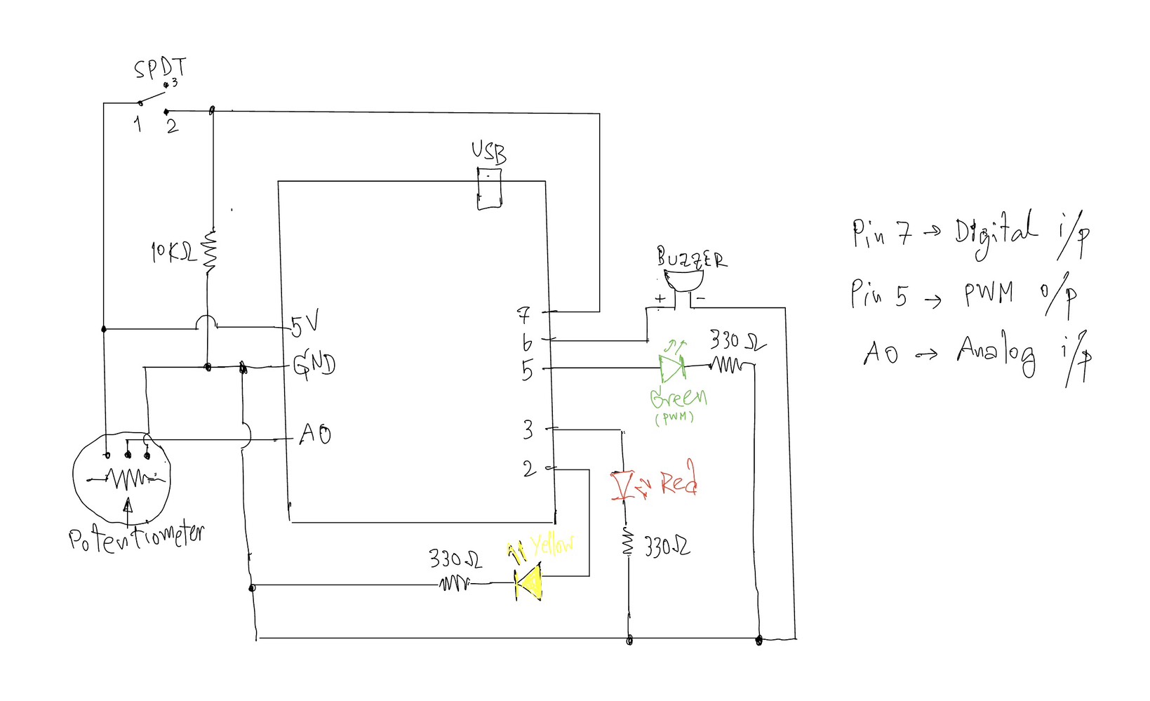
This project explores the use of both analog and digital inputs in Arduino by combining a potentiometer and a switch to control multiple outputs in a meaningful way. The goal was to clearly demonstrate the difference between discrete digital control (on/off) and analog control (gradual change) through LEDs and a buzzer.
The system is designed as a simple “alert level controller.” The switch acts as a master control, while the potentiometer simulates changing intensity levels.
⸻
Components Used:
• Arduino UNO
• Potentiometer (10K) – analog sensor
• SPDT Slide switch – digital sensor
• Yellow LED – digital output
• Green LED – analog output (PWM)
• Red LED – warning indicator
• Buzzer
• Resistors (330Ω for LEDs, 10KΩ for switch)
• Breadboard and jumper wires
⸻
How It Works:
1. Digital Control (Switch + Yellow LED)
The SPDT slide switch is connected using a resistor (10KΩ).
• When the switch is OFF → the system is inactive and all outputs are off.
• When the switch is ON → the system activates, and the yellow LED turns on.
This demonstrates a digital output(discrete), where the LED is either fully ON or OFF.
⸻
2. Analog Control (Potentiometer + Green LED)
Once the system is ON, the potentiometer is used to control the brightness of the green LED.
• The potentiometer outputs a value from 0 to 1023 using analogRead().
• This value is mapped to 0–255 using map() to control LED brightness.
• The green LED gradually becomes brighter as the potentiometer is turned.
This demonstrates an analog output, where brightness changes smoothly instead of instantly.
⸻
3. Threshold Behavior (Red LED + Buzzer)
When the potentiometer reaches a high value (above a defined threshold), the system enters a warning state:
• The green LED turns off
• The red LED turns on
• The buzzer starts to sound
This creates a clear transition from a normal state to a warning state, adding a more interactive and creative behavior to the system.
⸻
Code I proud of:
if (potValue < THRESHOLD) {
      // analog mode: dimmable green LED
      brightness = map(potValue, 0, THRESHOLD, 0, 255);
      analogWrite(GREEN_LED, brightness);

      digitalWrite(RED_LED, LOW);
      noTone(BUZZER);
    }
    else {
      // if >= threshold -> green LED off, red LED on, buzzer sounds
      analogWrite(GREEN_LED, 0);
      digitalWrite(RED_LED, HIGH);
      tone(BUZZER, 1000);
    }
Reflection:
This project helped me clearly understand the difference between analog and digital signals in Arduino. The switch provided a stable binary input (HIGH/LOW), while the potentiometer allowed continuous control.
One important concept I learned is the voltage divider, which is used in both the potentiometer and the pull-down resistor setup. It ensures stable and readable input values.
I also learned that analog interaction is not always perfectly linear (as earlier I tried the other sensor like Press Sensor FSR402), which is why the potentiometer was a better choice for demonstrating smooth brightness control.
Overall, this project successfully combines multiple inputs and outputs into a simple but interactive system.
⸻
Conclusion:
By combining a digital switch and an analog potentiometer, this project demonstrates:
• Clear digital vs analog behavior
• Smooth LED fading using PWM
• Conditional logic with thresholds
• A simple interactive system design
One idea that stood out to me in Physical Computing’s Greatest Hits and misses is the author’s challenge to the assumption that how commonly used project ideas lack originality. Before reading, I often felt that repeating familiar interaction concepts such as sensors, mirrors, or gesture-based inputs was somehow “less creative.” However, the text argues the opposite that recurring themes actually provide a foundation for innovation, since variation and context are what make a project meaningful. This really shifted my perspective on creativity. Instead of just focusing on being completely original, I now see value in how a project frames interaction and meaning. For instance, the discussion of theremin-like instruments highlights how simple gestures (like waving a hand) can feel empty unless they are placed within a meaningful context. This made me reflect on my own projects, where I sometimes prioritize technical implementation over the meaning of interaction. The reading makes me think, am I designing interactions that actually “mean” something to the user, or just demonstrating functionality?
Another idea that I found particularly interesting is the critique of “low-structure interaction,” especially in examples like video mirrors or body-as-cursor systems. The author points out that while these projects are visually appealing, they often lack depth because they only mirror user input without really encouraging intentional or meaningful engagement. This made me rethink what really makes an interactive system successful. I used to assume that responsiveness alone such as tracking movement or generating visuals was enough. But now I realize that interaction design also requires structure, constraints, or a clear “language” of interaction, This connects to the guideline of reflecting critically rather than just describing, because it really challenges my assumption that having more technology = better interaction. But instead, the reading suggests that simplicity with intentional design can be more powerful. It leaves me with an important question: how can I design interactions that guide users toward meaningful experiences, rather than just reacting to their presence?
One idea that strongly challenged my assumptions in Making Interactive Art: Set the Stage, Then Shut Up and Listen is the argument that artists shouldn’t interpret their own work for the audience. The statement “don’t interpret your own work” (page 1) directly confronts how I usually approach creative projects, where I often need to explain my intentions to make sure people get it. This reading made me realize that over-explaining actually limits the audience’s freedom to engage with the work. If I pre-script how users should think or act, I am essentially controlling their experience rather than designing for interaction. This connects to my own experience in IMA projects, where I sometimes prioritize clarity over openness. The reading pushes me to rethink this balance instead of ensuring understanding through explanation, I should design interactions that naturally guide interpretation. But this leaves me with how much ambiguity is productive before the interaction becomes confusing rather than meaningful?
Another idea that stood out to me is the concept of interactive art as a “conversation” rather than a finished statement in pages 1-2. The author emphasizes that once the work is built, the creator should “shut up” and listen to how users respond through their actions, interpretations, and even misunderstandings. I found this particularly interesting because it reframes user interaction as something dynamic and evolving rather than something to be controlled. The comparison to directing actors in pages 2-3 helped me understand this more deeply just like actors must find their own emotional meaning whereas users must discover their own way of engaging with the work. This idea challenges my tendency to design interactions that are a bit too rigid.
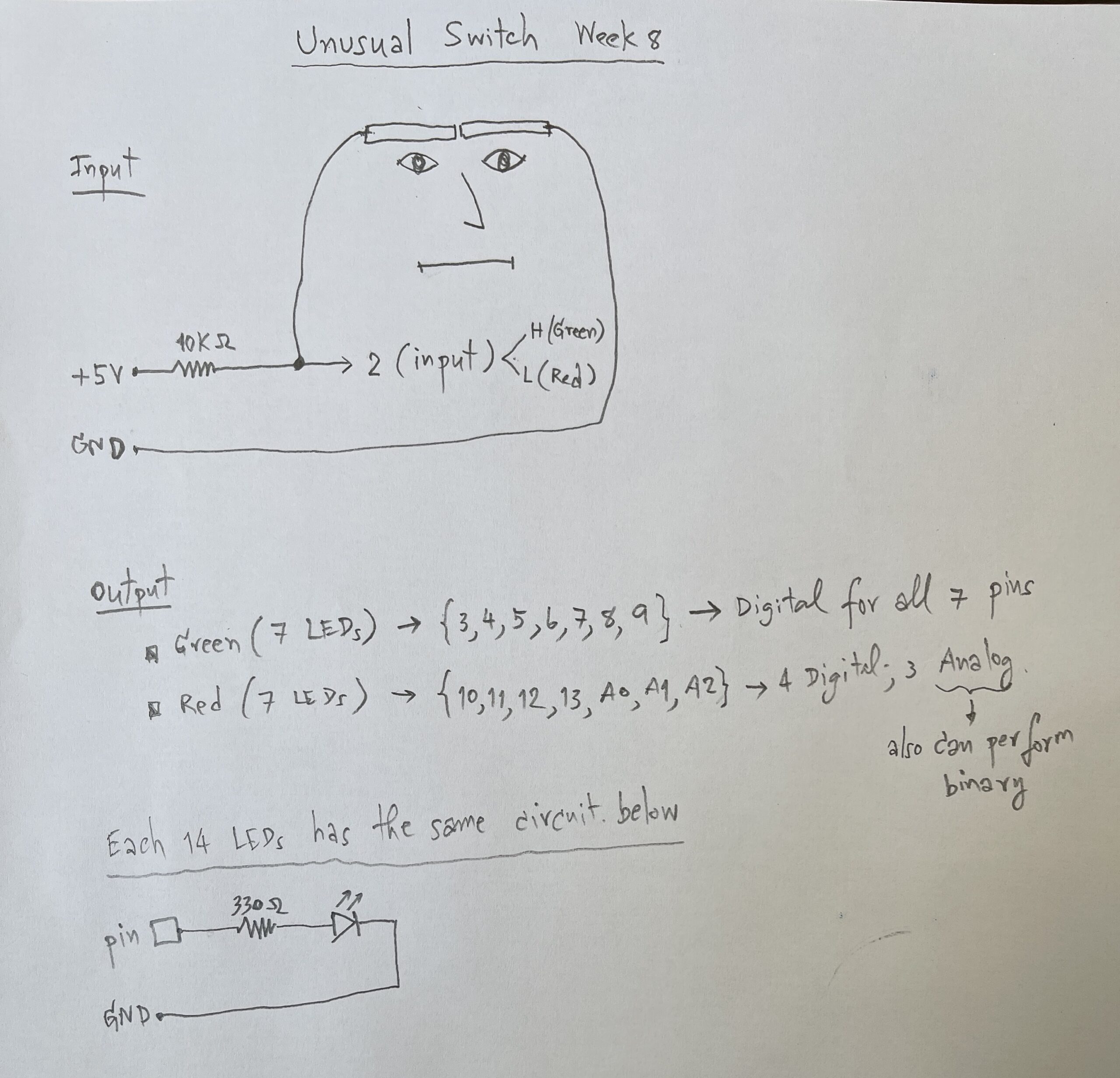
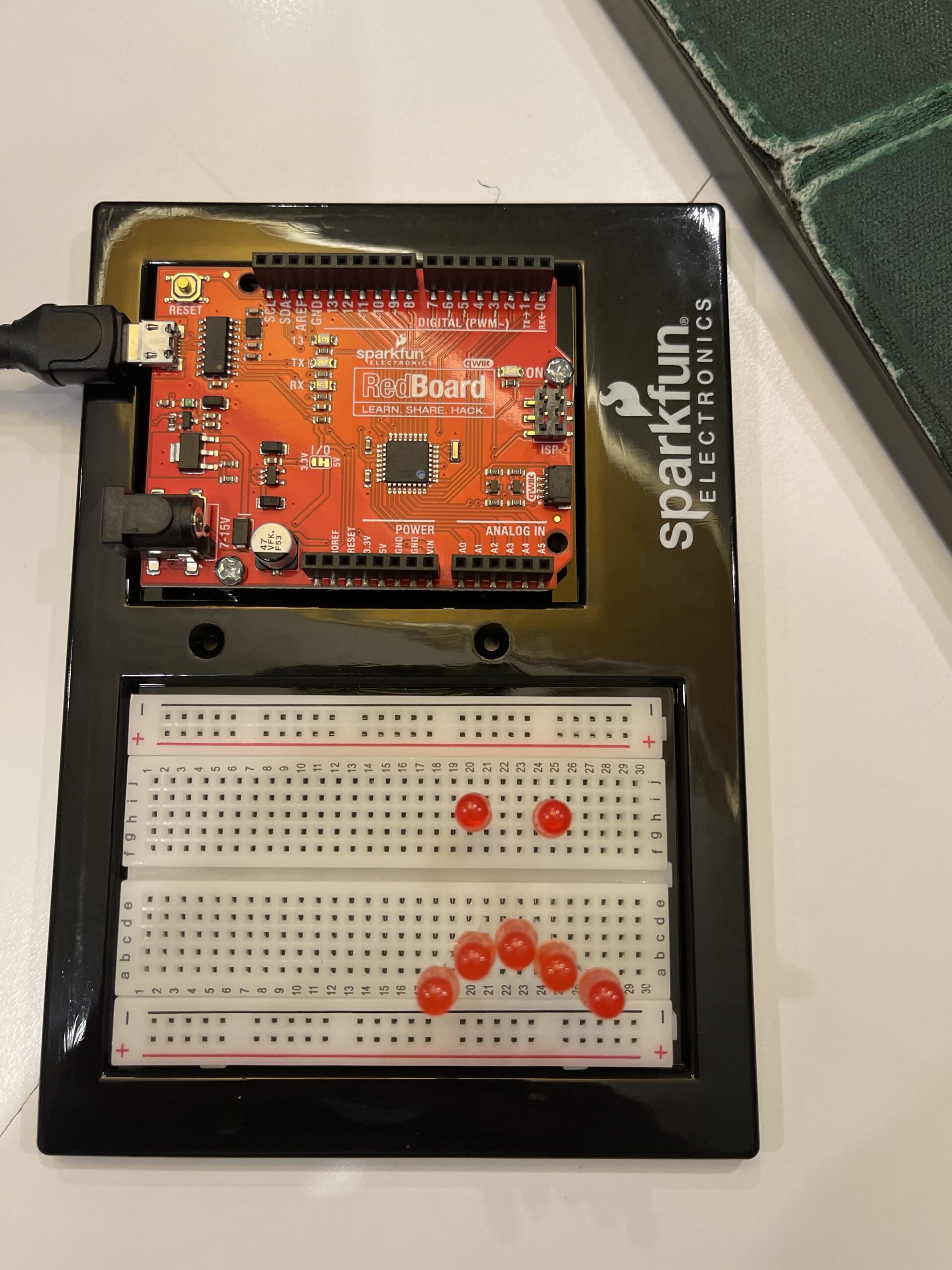
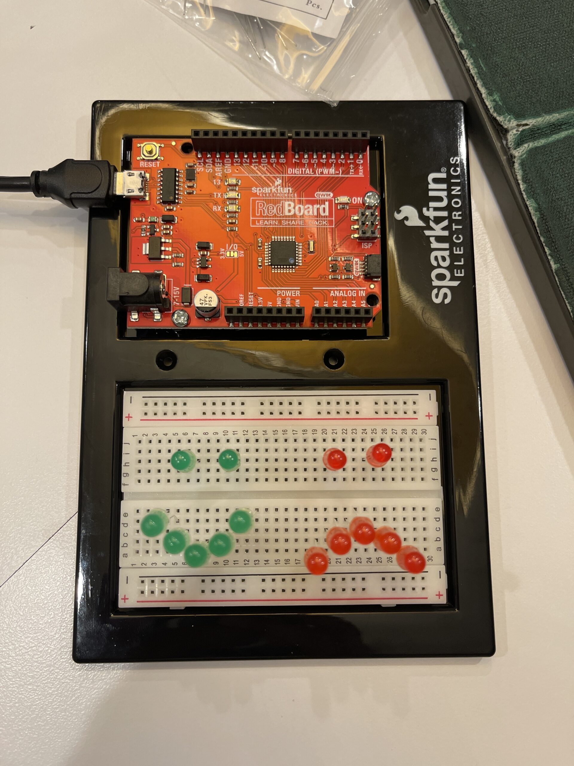
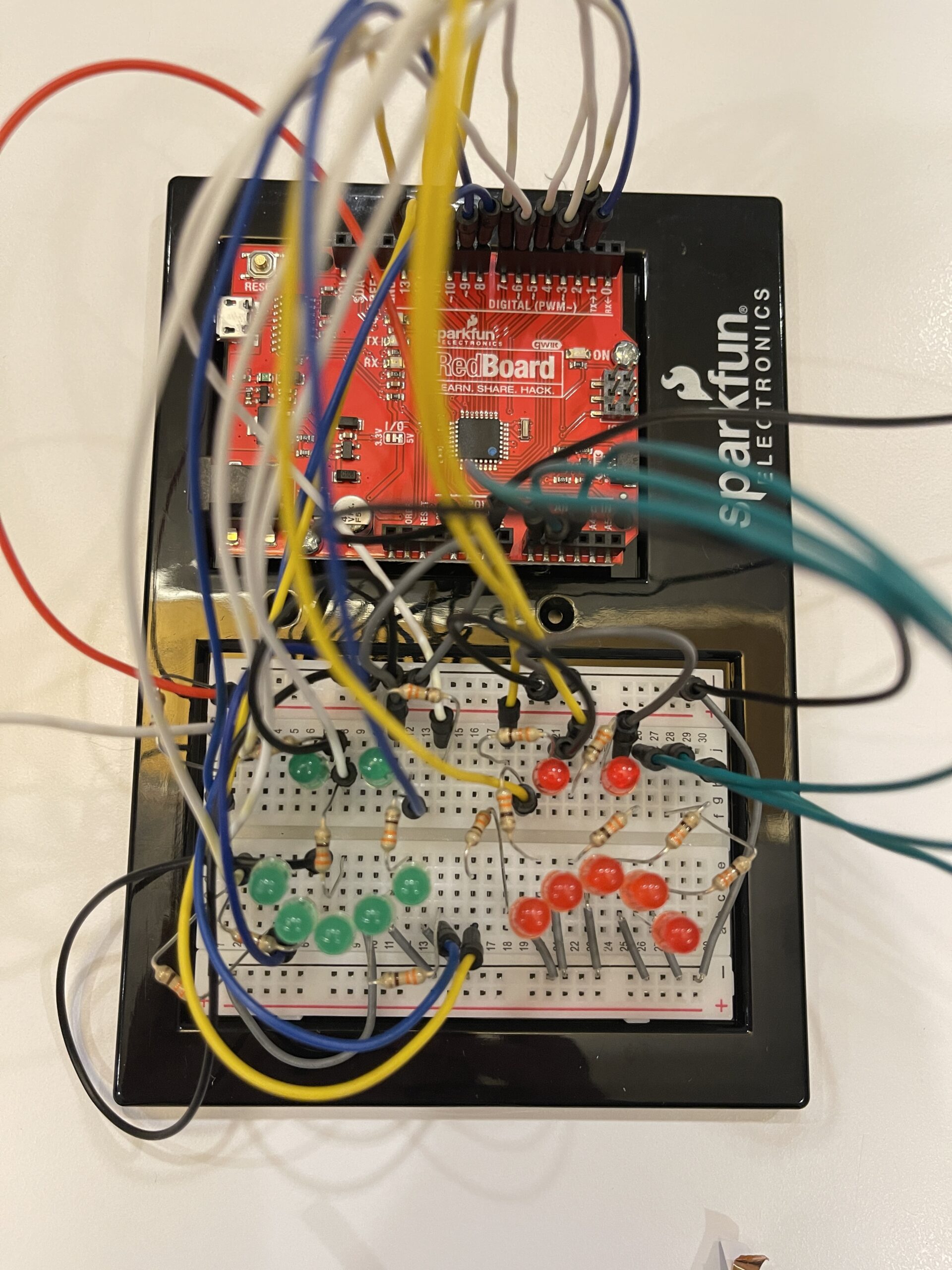
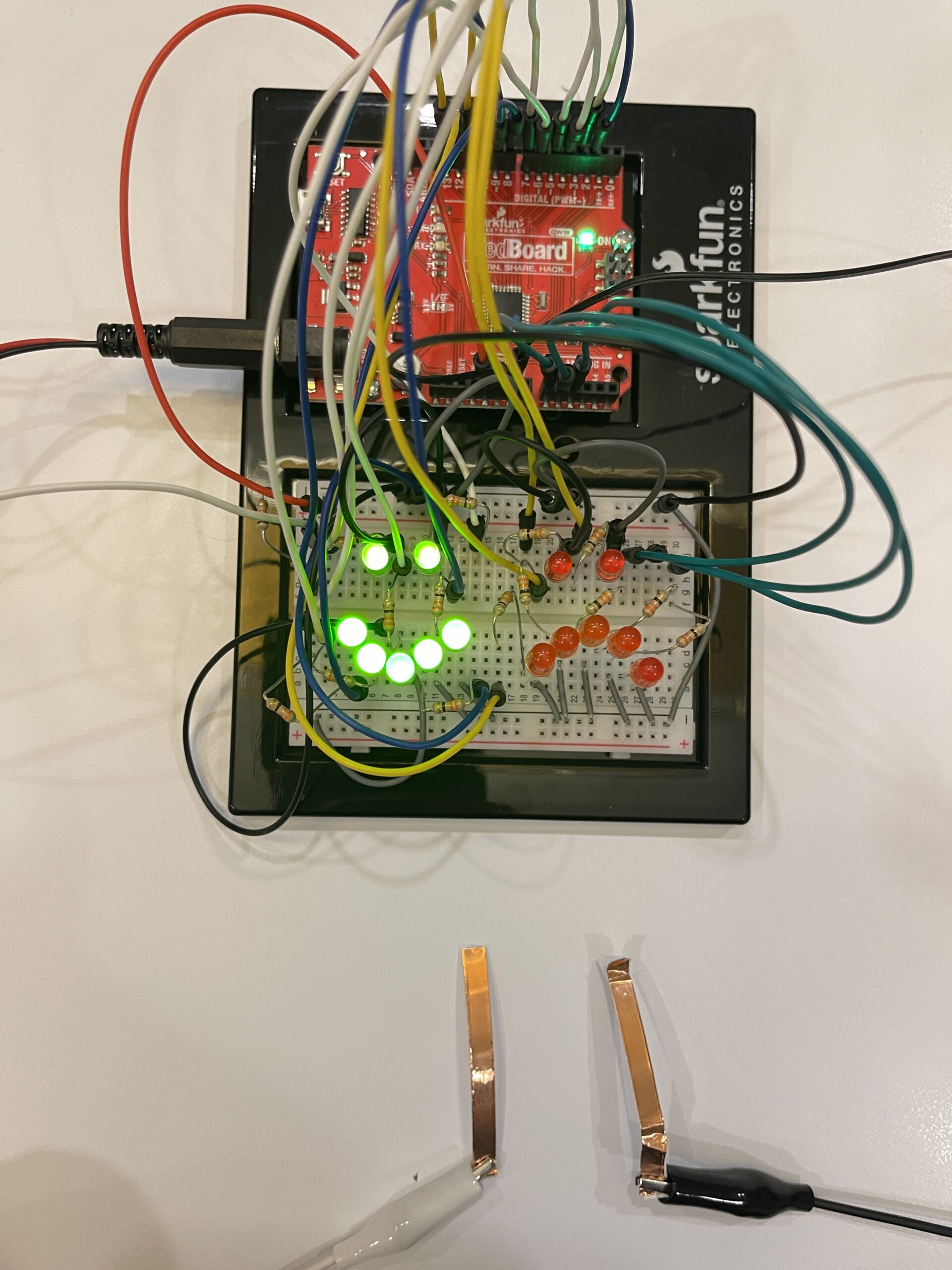
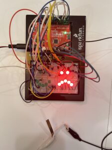
This project explores a hands-free switch using facial movement. Instead of using hands, I used eyebrow movement as an input. When I frown, the system detects it and turns on a sad red face. When I relax my face, it switches to a happy green face.
How it works:
The system uses a digital input to detect whether the switch is ON or OFF. This input is controlled by copper tapes to contact triggered by eyebrow movement.
If the input is HIGH, the green LEDs (happy face) turn on.
If the input is LOW, the red LEDs (sad face) turn on
Each LED is connected to a digital pin with a 330Ω resistor to limit current.
Red LEDs and green LEDs are connected to separate pins so they can be controlled independently.
⸻
Code that I proud of:
if(state == HIGH){
  // Normal face → Green LED lip
  for(int i=0;i<7;i++){
    digitalWrite(greenPins[i], HIGH);
    digitalWrite(redPins[i], LOW);
  }
} else {
  // Angry face → Red LED lip
  for(int i=0;i<7;i++){
    digitalWrite(greenPins[i], LOW);
    digitalWrite(redPins[i], HIGH);
  }
}
Problem encountered:
Initially, I tried connecting multiple LEDs to one pin, but I learned from Professor Aya’s lecture that Arduino pins have current limits. I solved this by using multiple pins and resistors.
Reflection:
This project helped me understand how digital input works and how the human body can be used as an interface. It also taught me polarity and about current limitations and proper LED connections. I found it interesting that something as simple as facial movement can be turned into an interactive system.
Connecting to the other article, for this article I found a fascinating contrast between emotional design and highly technical engineering. Hamilton’s work on Apollo software emphasised much more on reliability, error prevention, and anticipating human mistakes, especially in stressful situations where users (astronauts) could not afford confusion. This aligns with the idea from the design reading that in high-pressure contexts, systems should prioritize clarity and function over aesthetics. However, both readings highlight the importance of understanding overall human behaviour whether it is just emotions affecting usability or human error affecting software systems. Personally, this connection made me rethink of design as not just visual or technical, but deeply resonating with human creativity and thinking. It also made me appreciate how Hamilton’s foresight in error-handling actually reflects a kind of “design thinking,” even in engineering. Together, the readings suggest that good design whether it’s interfaces or software comes from anticipating and seeing how humans actually act, think, feel, and make mistakes.
Another aspect of the Hamilton reading that I found particularly meaningful was how her work challenged both the technical and social assumptions about software and who could create it. At the time, software wasn’t even considered a central or prestigious part of engineering, and yet Hamilton insisted on its importance, eventually creating the term “software engineering.” This made me reflect on how new fields or ideas are often undervalued until their impact becomes undeniable. I also found it significant that she anticipated human error such as the famous Apollo incident where the system prioritised critical tasks during overload which directly connects to the idea of designing for real human behaviour rather than ideal users. This raises a broader question for me which is how many current technologies today are still being designed under unrealistic assumptions about users? Overall, this reading reinforced my understanding that innovation isn’t just about technical skill, but also about challenging norms and recognising problems that others overlook.
In the reading on design and emotion, The idea that “attractive things work better”, caught my attention not because they’re objectively more functional, but because they change how we think and feel while using them. This challenged my assumption that usability is purely logical and efficiency-based. I realized that whenever I feel relaxed or positive, I would actually be more creative and tolerant of small problems, which aligns with the author’s argument about positive affect enhancing breadth-first thinking. This made me reflect on my own experiences with technology and even on my own projects as sometimes I focus too much on making things technically correct and being a perfectionist rather than enjoyable. It also raises a question for me was that if aesthetics can make users overlook flaws, is there any risk that designers might rely too much on appearance instead of improving actual functionality? I think the reading suggests a balance, but it leaves open how far that balance should go in real-world design.
Another idea from this reading that stood out to me was the contrast between positive and negative affect in shaping how we process information. The author explains that negative emotions can actually improve focus and depth of thinking, especially in stressful situations. This made me reconsider my assumption that feeling “good” is always better for performance. In fact, I can relate this to moments when I am under pressure such as before exams or deadlines where I become more focused and detail-oriented. However, this also raises a question that how can designers intentionally design for both emotional states? It seems difficult to create a system that supports both creative exploration and precise decision-making at the same time. This tension made me realise that design is highly dependent on context, and that there is no single “best” design and that only the designs that are appropriate for specific emotional and situational conditions.
This reading challenges the common stereotype that computer vision has to function similarly to human vision by highlighting how opaque digital images are, meaning that computers cannot interpret them without algorithms. It shows that computers basically cannot function if there were no algorithms to program them. Unlike humans that can constantly interpret context, different types of objects and different meanings, computers rely on simplified techniques, algorithms and systems such as frame differencing, background subtraction and brightness thresholding to detect movement or presence. For example, the reading explains that frame differencing compares pixel changes between frames, while background subtraction depends on differences from a stored image of the scene. This actually made me realise that computer vision is actually much more dependent on certain conditions having to work than I really initially thought. For instance, background subtraction only works if lighting and contrast are carefully designed. This shows that seeing for computers is more about structured assumptions. Meanwhile, the reading shows that we can actually guide what computers see by designing the background and physical environment, such as using high contrast, stable lighting or even infrared to improve detection. This connects to the idea of interactive media, where it’s not just coding systems but also designing physical and visual conditions that shape interaction.
What I felt was most interesting was how computer vision’s ability to track people overlaps with surveillance, and how artists actually engage with this. The reading discusses works such as Sorting Daemon and Suicide Box, where tracking systems are used to monitor and analyze people, sometimes raising ethical concerns about profiling and data collection. This made me question whether interactive art using computer vision is actually empowering participants or not. On one hand, projects like Videoplace create an embodied interaction where the human body becomes part of the system, but on the other hand, surveillance-based works turn viewers into objects of analysis. I think this is what makes computer vision powerful in art as it can both engage and critique. However, the author seems somewhat biased toward presenting computer vision as accessible and empowering for artists, while not fully addressing issues such as privacy and ethical risks. This raises a question: as computer vision becomes easier to use, how should artists balance creativity with responsibility? I also wonder whether using computer vision in interactive art always requires some level of surveillance, or if there are ways to design systems that avoid this dynamic altogether.
My midterm project, The Polyglot Galaxy, is an interactive generative text artwork that visualizes multilingual greetings as floating stars in a galaxy environment. The project expands on my Week 6 text generator into a more immersive interactive media system that implements text, sound, animation, state-based interaction and computer vision.
As each time the user clicks on the canvas, a greeting phrase from a different language is stamped onto the screen. Over time, these phrases accumulate and form an interstellar constellation like galaxy. Within the frame, it will display 4 different voices for my project I changed from a 400, 400 to a 600, 600 frames in order for the game to look a bit larger and I decided to split the frame into 4 quadrants consists of upper left, upper right, lower left and lower right. The visual aesthetic is inspired by space, glow, and floating motion, which represents languages as stars in a shared universe.
The visual aesthetic focuses on glow, floating motion, and cosmic space imagery. The project also includes a webcam frame that reacts to movement and brightness in the camera view. When the user moves or dances inside the camera frame, the brightness changes and the stars twinkle more strongly, making the interaction more interactive and playful. Sound is also integrated to create an immersive environment where clicking produces different audio effects and ambient music will be played during the interaction.
Progress Made:
During this spring break, I made improvements to both the visual interaction and the system structure. Firstly, I implemented a blinking glow effect using sin(frameCount) to animate and increase the brightness of the instruction text and the star-like greetings. This creates a subtle pulsating effect that help reinforces the galaxy atmosphere in the frame.
Secondly, I added 8 bursts that have tiny sparkles in the galaxy which was an idea implemented from Dan Shiffman video on the coding train and when the user clicks on the canvas. These small particles would spread outward like tiny dwarfs or planets and a bit like dancing stars. This gives the interaction a more dynamic, lively and playful feel.
Furthermore, I introduced some state-based interaction using a start screen and play state. When the project first loads, a start screen appears with instructions. After clicking, the user enters the interactive galaxy mode where phrases can be stamped.
Another major improvement is how I integrated more of the webcam computer vision. Where I had the camera showing the player of the game. The camera brightness is found by sampling pixels from the webcam feed. This brightness value then controls the speed and intensity of the interaction, meaning the stars react to movement or lighting changes in the camera frame.
Lastly, I also improved the layout and interface to make it more readable by adjusting the position of the instruction text and ensuring it fits nicely within the frame. Moreover, I felt that the background music plays continuously during the play state to create an atmospheric soundscape as I decided to have music that resembled galaxy in space.
Code
Below is the code I am particularly proud of, and the core logic used to capture webcam data and calculate brightness for interaction:
cam = createCapture(VIDEO); // use computer cam
  cam.size(160, 120);
  cam.hide();
}

function updateCamBrightness() {
  cam.loadPixels();
  let sum = 0;
  // sample pixels +40 for faster
  for (let i = 0; i < cam.pixels.length; i += 40)
// +40(RGBAx10) for faster and get realtime
{
    let r = cam.pixels[i];
    let g = cam.pixels[i + 1];
    let b = cam.pixels[i + 2];
    sum += (r + g + b) / 3;
  } // bright->r,g,b will high and sum will high

  let samples = cam.pixels.length / 40;
  camBrightness = sum / samples; // Avg brightness = 0..255
}
Sampling every 40 pixels helps reduce computational load while maintaining responsive interaction. This allows the program to run smoothly even while performing real-time visual updates.
I am also proud of the 8 sparkle burst effects, which adds immediate visual feedback when users interact. Despite its simple implementation as a lightweight particle system, it significantly improves the sense of energy and responsiveness in artwork while maintaining a good performance.
Challenges I encountered involved browser permissions and webcam access. In some environments, the camera simply doesn’t activate unless the page is running in a secure context or the user explicitly allows permission. To avoid interface issues, I chose to hide the raw camera feed and use it primarily as a data source for interaction.
Another challenge was to balance visual complexity with performance. Since the project involves having multiple animated objects and real-time pixel analysis, I needed to optimize certain processes, such as sampling pixels at intervals instead of trying to process the entire image frame.
In the future, the user interface could be improved further with clearer interaction prompts and more refined visual transitions.
Things to Improve for the Future
Although the project works well still there are several areas I would like to improve in the future.
Firstly, I would like to expand the number of languages and phrases in the dataset as currently the phrases come from a JSON file, but increasing the diversity of languages could make the galaxy feel richer and more global.
Moreover, I want to improve the visual design of the stars and glow effects such as by adding stronger particle systems, gradients, or shader effects could make the galaxy feel deeper and more immersive.
In addition, I would like to refine the interaction between the webcam and the visuals. Because as of now the brightness only affects twinkle speed, but in the future it could also influence star size, color, or particle behavior.
Last but not least, the sound design could be expanded because of now clicking produces different sound effects depending on the screen quadrant, but I would like to develop a more reactive sound system where the music evolves as more languages appear in the galaxy.
Overall, I felt like this project really helped me to explore how generative text, animation, sound, and computer vision can combine into a playful interactive media experience.
References
• Daniel Shiffman. (2019). The Coding Train: p5.js Tutorials.
https://thecodingtrain.com/
These tutorials helped me understand concepts such as webcam capture using createCapture(), particle systems, and generative animation techniques used in this project.
• p5.js. (n.d.). p5.js Reference.
https://p5js.org/reference/
The p5.js documentation was used as a reference for functions such as loadJSON(), sin(), map(), createCapture(), and frameCount that are used throughout the project.
• Casey Reas and Ben Fry. (2014). Processing: A Programming Handbook for Visual Designers and Artists. MIT Press.
• Coding Challenge 78: Simple Particle System
My midterm project, The Polyglot Galaxy, is an interactive generative text artwork that visualizes multilingual greetings as floating stars in a galaxy environment. The project expands onmy Week 5 text generator into a more immersive interactive media system that integrates text, sound, animation, state-based interaction, and computer vision.
As each time the user clicks on the canvas, a greeting phrase from a different language is stamped onto the screen. Over time, these phrases accumulate and form a constellation-like galaxy. Within the frame, it will display 4 different voices. The visual aesthetic is inspired by space, glow, and floating motion, which represents languages as stars in a shared universe.
For Week 6, I introduced webcam interaction as a form of real-time input. Instead of functioning only as a background element, the camera actively influences the visual behavior of the system. The brightness detected from the live webcam feed controls the twinkling speed and intensity of the text objects. This transforms the artwork from a static generative system into an embodied interactive experience where the audience’s movement directly affects the visuals.
function updateCamBrightness() {
  cam.loadPixels();
  let sum = 0;
  for (let i = 0; i < cam.pixels.length; i += 40) {
    let r = cam.pixels[i];
    let g = cam.pixels[i + 1];
    let b = cam.pixels[i + 2];
    sum += (r + g + b) / 3;
  }
  camBrightness = sum / (cam.pixels.length / 40);
}
I am particularly proud of successfully integrating computer vision into a generative art system in a simple yet meaningful way. Rather than just implementing complex face detection (which would be rather computationally heavy and technically advanced), I chose brightness-based interaction. This decision balances technical feasibility, performance efficiency, and conceptual clarity.
Moreover, I am also proud of the object-oriented structure of my code. The GreetingText class encapsulates the floating animation, glow effects, blinking, and camera-reactive twinkling within a reusable system. This makes the project scalable and organized as more text objects are generated over time.
One major challenge I encountered was browser permission and issues related to the webcam. In some environments, the camera feed just doesn’t function unless the sketch runs in a secure (HTTPS) context or after the user grants camera permission. I addressed this by using the webcam primarily as a data input rather than relying on it as a visible visual component.
For improvements I would like to imagine as we know after the midterms we would be focusing on more hardware related stuff and therefore I would like to incorporate the functions of a camera where if you swipe left it would display a phrase in a language and if you swipe right it would display another language in another phrase and if you swipe up does another phrase in another language.
References
-Course Lecture Slides: Week 6 – Computer Vision & DOM (Introduction to Interactive Media)
-Daniel Shiffman, p5.js Video and Pixels Tutorials
-p5.js Documentation: createCapture(VIDEO) and pixel processing
-Creative Coding approaches to camera-based interaction in interactive media