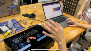
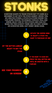
For our user testing we waited to include the box piece we had built to test out its functionality. We focused on the intuitiveness of the buttons and a turn pot to select choices. To help in clarity we labelled the buttons, but from our first user test, we realized that it would be even better to include an instruction sheet to summarize the main point of our stock trading program. We limited our instructions to only 4 main points that cover every feature included on the box, and we made sure that the language used was very clear and concise.
To match the clarity of the instruction sheet, we made sure to separate our main buttons with the selection knob in the center to highlight the difference of the buttons and separate their function from each other.
Finally, our user discussed that the sounds felt very interactive and reacted well with the buttons being pressed i.e cashier sound when sell all button is pressed.
By placing the speakers on the side of the box, the user also had an element of surprise as they were not typically expecting a sound to accompany their button press, making the interaction much more enthralling.
Below are some elements of our project, as well as a link to the videos of our user testing process.
https://drive.google.com/drive/folders/12kkwuDz9aOtw_oJ0Va5f3_14Ctc2HzHd?usp=sharing


