Week 8- Reflection

In “Emotion & Design: Attractive Things Work Better,” Donald Arthur Norman puzzles over the question of why things with attractive designs work better. Similarly, Robert McMillan touches upon how Margaret Hamilton’s improved code to fix a bug that wiped out the navigational data used by the Apollo 8 crew. While reading these articles, I could not help but think that we consider a design attractive if it enables us to use a product without risk or extra effort. When McMillan argues that attractive things allow people to use their creative abilities to the fullest, this statement implies that well-thought-out design enables us to make the most out of a product.

As I often find myself dissatisfied when an app or a program crashes, I believe that thorough product testing is crucial for creating an attractive design. Had NASA approved Hamilton’s suggestions, it would have allowed her to create a better code and minimize the risks for the astronauts. These articles demonstrate that researchers and scientists realized the importance of an attractive design and now see it as something that brings enjoyment, enhances people’s cognitive and creative abilities, and improves a product’s usability.


Final Midterm: Generative Gallery: A Digital Art Experience

Concept: 

Whenever I step into an art gallery, I am captivated by the stories each artwork tells, the vibrant strokes on the canvas, and the interplay of light and shadow. Inspired by these immersive experiences, I wanted to recreate a similar atmosphere, merging the tranquility of a gallery with the excitement of interaction. My vision for the p5.js Art Gallery centered around creating a dynamic and immersive digital space that embodies the essence of generative art. Influenced by the interplay of light and space, I aimed to design an environment that encourages exploration and creative expression. Extensive research into contemporary digital art installations and interactive galleries inspired the overall concept, guiding me in the creation of an engaging and visually captivating experience for visitors.

The central idea behind my project is to encourage users to explore the art at their own pace and immerse themselves in the diverse creations on display. To achieve this, I plan to incorporate interactive elements such as virtual paintings that users can admire, virtual sculptures they can examine from all angles, and informational pop-ups that offer insights into each artwork. By subtly integrating these interactive features, I aim to evoke curiosity and invite users to engage with the art, thereby fostering a unique and personalized gallery experience for each visitor.

Wireframes I drew for my project:
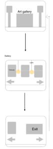

In planning the sketch, my approach involved meticulous consideration of user experience and interaction design.. By integrating logical operations, including conditional statements, loops, and rendering functions, I aimed to ensure a seamless and engaging user journey within the gallery. Hand sketches and diagrams were instrumental in mapping out the flow of user interactions and visualizing the logical structure of the coding process, facilitating a more systematic development approach.
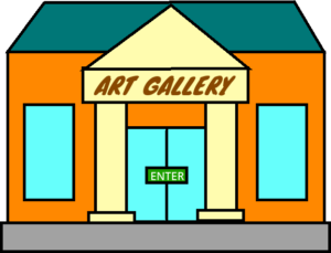
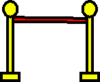
The pictures of the art gallery are all drawn by me using online tools. I carefully made the inside and outside parts, paying close attention to the lights, light switch, floor, and the way out. Using my creativity and computer skills, I worked hard to create a detailed and accurate representation of the gallery.

Parts I’m Proud of and Challenges Overcome:

  • Figuring out when the mouse touches the artwork:

I’m proud of this code because it lets the artwork respond when I click the mouse near it. This part specifically deals with showing the spiral artwork on the screen and checking if I’m clicking near it.

// Function to render the spiral
function renderSpiral(x, y, r) {
  push(); // Save the current drawing style settings and transformations
  translate(x + sposX, y); // Move the origin to the specified position
  image(frameIMG[1], -r / 1.8, -r / 1.8, r * 1.1, r * 1.1); // Display the image with the specified dimensions
  pop(); // Restore the previous drawing style settings and transformations

  // If mouse pressed
  if (mouseX < x + sposX + r/2 && // Check if the mouse's X position is within the specified range
      mouseX > x + sposX - r/2 && // Check if the mouse's X position is within the specified range
      mouseY < y + r/2 && // Check if the mouse's Y position is within the specified range
      mouseY > y - r/2 && // Check if the mouse's Y position is within the specified range
      mouse) { // Check if the mouse is pressed
      rect(0, 0, width, height); // Draw a rectangle covering the entire canvas
      for (var i = 0; i < spiral.length; i++) {
        push(); // Save the current drawing style settings and transformations
          spiral[i].render(width / 2.5, height / 3, r / 5); // Call the render function for the spiral object
        pop(); // Restore the previous drawing style settings and transformations
      }


This code checks if I’m clicking near the artwork by looking at where I click and comparing it with the artwork’s position and size. If I click close to the artwork, it shows more spirals on the screen, giving a cool effect that changes when I interact. Making this work well was a bit tough. I had to make sure the program could understand where I’m clicking and when it’s close to the artwork. Getting the right balance between showing the spirals and detecting my clicks accurately was important to make sure the interaction feels smooth and fun.

  • Switching the user perspective from scene-to-scene.

I’m proud of this code because it helps smoothly switch what I see in the program, going from one scene to another without any sudden jumps. This part, called ‘Screen,’ takes care of showing different pictures and managing the sounds in the background.

// Check if the screen is outside or inside
if (screen == 0) {
  push(); // Save the current drawing style settings and transformations
  // Display image outside screen
  image(sIMG[0], 0, 0, width, height);
  pop(); // Restore the previous drawing style settings and transformations

  // Display principal text
  push();
  translate(width / 2, height / 1.1);
  image(sIMG[2], -100, -15, 200, 30); // Display the image with specified dimensions and position
  pop();

  // Render Art Gallery
  agRender(); // Call function to render the art gallery
} else {
  push(); // Save the current drawing style settings and transformations
  // Display image inside the screen with dynamic x-position
  image(sIMG[1], sposX, 0, width * 2.5, height);
  pop(); // Restore the previous drawing style settings and transformations
}


The above codeIt makes sure that the sound keeps playing smoothly in the background while I move between scenes, making the whole experience more immersive and enjoyable.When I’m outside in the program (screen = 0), it shows the right picture and puts the main text in the correct place, making it look nice and organized. Making this work well was a bit tricky. I had to make sure that the images changed in a way that didn’t feel sudden or strange, and that the background sound kept playing without any interruptions. Finding the right balance between the pictures and the sound was important to make the whole experience feel smooth and natural.

  • I made sure to focus on small details. For instance, when you hover over the door, it creates a knocking sound, but it won’t keep making that sound repeatedly as long as you hover over it. The knocking will only happen again if you move your cursor out of the door and then back onto it. Also, I made sure that the initial music only plays the first time the door is opened, and it doesn’t play every time after that. This way, the music doesn’t overlap with itself. Also I added a sound effects for the light switch, moving to the right and left etc.


Areas for Improvement and Future Work:

Moving forward, there are several areas in my project that I recognize could be refined to enhance the overall user experience and elevate the sophistication of the artworks. One key aspect for improvement lies in enriching the interactive elements within the gallery. For instance, I plan to incorporate more diverse and dynamic interactions with the displayed artworks, enabling users to manipulate shapes, colors, and other visual elements to create a more engaging and immersive experience. By introducing additional interactive features like the ability for users to leave virtual notes or comments on specific art pieces.

Looking ahead, my future work on the project will revolve around integrating advanced generative art techniques to create more intricate and visually captivating artworks. I am particularly interested in exploring the application of complex algorithms and procedural generation methods to produce intricate patterns, textures, and visual effects, thereby adding depth and sophistication to the displayed artworks. I am also keen on delving into the use of machine learning algorithms to develop art that dynamically adapts and evolves in response to user interactions or external stimuli, thereby creating a highly immersive and personalized art experience.


Final Project:


References:

  • https://editor.p5js.org/mk7592/sketches/Q3_SYFuO6

Week 6- Midterm Process 2

Progress on Generative Gallery: A Digital Art Experience

In the recent updates to the p5.js Art Gallery, I’ve made significant strides in personalizing the overall experience. By creating detailed interior and exterior images entirely by myself through online platforms, I’ve successfully revamped the visual aspects of the gallery.

I’ve implemented interactive canvases within the gallery, allowing users to engage with and contribute to the artistic space. Visitors can now explore their creativity and interact with the digital canvases, fostering a more dynamic and engaging experience. I have also incorporated a user-friendly slider with arrows, enabling seamless navigation back and forth within the canvases, enriching the overall exploration process. To enhance the ambience and user experience, I’ve added a convenient light switch feature, allowing visitors to adjust the gallery’s lighting to their preference. An exit option has also been integrated, enabling users to smoothly return to the main page without any inconvenience.

Looking ahead, my next steps involve integrating a carefully curated sound element to complement the visual art, creating a more multisensory experience for visitors. Additionally, I plan to continue my work on advancing the generative art features, exploring new techniques and patterns to further enhance the overall artistic experience for our esteemed visitors.

These updates represent a significant step forward in creating a more personalized and interactive environment.

Week 5- Reading Reflection

As I read through the article on computer vision in the context of art and interactive media, I couldn’t help but draw parallels to real-life situations and experiences where computer vision is becoming increasingly relevant.

The article’s emphasis on the need to adapt computer vision algorithms to specific physical conditions struck a chord with me. In my daily life, I’ve noticed how computer vision applications in security systems have evolved. For instance, surveillance cameras that rely on computer vision algorithms are often used in shopping malls and airports to monitor crowds and detect unusual activities. These systems work best when lighting conditions are optimal and when individuals are easily distinguishable from their surroundings. However, in poorly lit areas or crowded environments, the effectiveness of these algorithms can be compromised. This reminds me of the article’s suggestion to optimize physical conditions to enhance the performance of computer vision systems.

The article’s discussion of multimedia authoring tools for computer vision applications made me reflect on the broader impact of these tools in various industries. For instance, the use of computer vision in augmented reality (AR) and virtual reality (VR) applications has become increasingly popular. AR applications like Pokémon GO and VR experiences in gaming rely on computer vision to track users’ movements and provide immersive experiences. These technologies have not only revolutionized gaming but also found applications in fields such as education, healthcare, and training simulations.

Can machines replace art? No, because art is all about human creativity and feelings. Technology can help artists create and share their work, but it can’t replace the uniqueness and emotions that artists put into their creations. Art also brings people together, makes us think, and raises important questions that machines can’t do. So, instead of replacing art, technology works alongside it to make new kinds of creative stuff.

Week 5- Midterm Progress 1

Generative Gallery: A Digital Art Experience

Concept: 

The concept of the art gallery is to create an immersive and interactive digital art experience that showcases the power of generative art and Object-Oriented Programming (OOP). The gallery is designed to engage visitors in a multi-sensory journey through four distinct exhibits, each of which highlights different aspects of generative art.

Project Components:

  • The background will be an image of the art gallery.
  • There will be a soothing sound effect in the background
  • On screen text will provide information about the art.
  • The project will be implemented using object-oriented programming.
  • When you start the project, a screen with instructions will be displayed.
  • You will be able to interact with the project by clicking on the screen to look at the art.
  • I will include a “Start Again” button, allowing you to start a new session without having to refresh the page or restart the sketch, ensuring a seamless experience.

This code just displays the exterior and interior of the art gallery.

Challenges:

Creating a Generative Gallery: A Digital Art Experience in p5.js will be an exciting project. It will come with some challenges I’ll have to work through. I’ll need to create complex art that changes in real-time, making sure it runs smoothly. I’ll need to design buttons and stuff so people can use the art easily. I’ll also have to think about how it will work on different screens and use a way of coding called object-oriented programming, which will be kind of like making different building blocks for the art. Finding and fixing mistakes in the art will be tough, but I’ll learn a lot. Making sure the art is well-documented will be important for others who might want to understand it. Despite these challenges, I’ll be proud of the result – a cool digital art experience that I hope everyone will enjoy.

Week 4- Reading Reflection

In reflecting on the reading by Don Norman, several key points resonate with my experiences and beliefs about design and human interaction with technology.

Firstly, the notion of increasing complexity leading to frustration and errors in everyday technology is something I can readily relate to. The author’s examples of intricate car dashboards and home automation systems align with my own encounters with technology. It’s evident from user complaints and product reviews that many people share this frustration when faced with overly complex interfaces or systems.

Norman’s emphasis on human-centered design (HCD) makes complete sense to me. It’s evident that products and services designed with a deep understanding of human needs and behaviors tend to be more successful and user-friendly.

Regarding bias, while Norman’s perspective leans toward user-centered design principles, I view this as a positive bias. Prioritizing user needs in design is fundamental to creating products and services that genuinely serve their intended audience. It aligns with my belief that technology should adapt to human needs, not the other way around.

In terms of changing beliefs, this reading reinforces my conviction that technology should be user-friendly. It reminds me of the importance of designers striking a balance between innovation and usability, especially in today’s fast-paced tech environment. The reading raises questions about how designers can keep pace with emerging technologies while ensuring that these technologies remain accessible and intuitive for users.

Assignment 4- Rain Rain Go Away

Concept: 

I wanted to come up with a concept that accomplishes both the display of text and the loading of data. During the weekend, I saw my cousin’s daughter listening to the nursery rhyme “Rain Rain Go Away.” The objective of the code is to generate a visual representation featuring clouds and animated falling text, drawing inspiration from the lyrics of the nursery rhyme “Rain Rain Go Away.


Highlight of Code:

function createClouds() {
  // Create cloud objects based on CSV data
  for (let i = 0; i < cloudData.getRowCount(); i++) {
    let x = float(cloudData.getString(i, 'x')); // Get x-coordinate from CSV
    let y = float(cloudData.getString(i, 'y')); // Get y-coordinate from CSV

    let textToShow = "";
    // Assign different text to each cloud based on its position
    if (i === 0) {
      textToShow = "rain";
    } else if (i === 1) {
      textToShow = "rain";
    } else if (i === 2) {
      textToShow = "go";
    } else if (i === 3) {
      textToShow = "awayyy";
    }

    // Create a new cloud object and add it to the clouds array
    clouds.push(new Cloud(x, y, textToShow));
  }
}


for (let i = 0; i < cloudData.getRowCount(); i++) {: This line initiates a for loop. It will iterate through each row of data in a CSV file, and the loop variable i is used to keep track of the current row number.

let x = float(cloudData.getString(i, ‘x’));: This line extracts the x-coordinate for a cloud from the CSV data. It uses the cloudData.getString(i, ‘x’) function to get the value of the ‘x’ column in the current row and converts it to a floating-point number using float().

let y = float(cloudData.getString(i, ‘y’));: Similar to the previous line, this extracts the y-coordinate for a cloud from the CSV data. It gets the value of the ‘y’ column in the current row and converts it to a floating-point number.

let textToShow = “”;: This line initializes a variable textToShow as an empty string. This variable will be used to determine what text should be displayed by each cloud.

The following if-else statements are used to assign different values to textToShow based on the value of i, which corresponds to the current row in the CSV data. Depending on the value of i, different text values are assigned:

If i is 0 or 1, textToShow is assigned the value “rain.”
If i is 2, textToShow is assigned the value “go.”
If i is 3, textToShow is assigned the value “awayyy.”

clouds.push(new Cloud(x, y, textToShow));: This line creates a new Cloud object with the extracted x and y coordinates and the assigned text value (textToShow). The new cloud object is then added to an array called clouds. This array will store all the cloud objects that will be displayed and animated later in the sketch.


Reflection:

Reflecting on the code, I can identify both positive aspects and areas where improvement is needed:

I’m pleased with how I’ve integrated external data from a CSV file. This allows for dynamic positioning of clouds based on the data. I’ve used conditional statements (such as if-else) effectively to assign different text values to each cloud based on its position. I’m following an object-oriented programming (OOP) approach by creating cloud objects.

While the code currently assigns text values based on specific conditions, I recognize that it could be made more scalable. A more flexible approach would enable it to handle a variable number of clouds and text assignments based on the CSV data itself, making it adaptable to different datasets.

Week 3- Reading Reflection


In the initial chapter of Chris Crawford’s book, “The Art of Interactive Design,” titled “What Exactly is Interactivity?” the author delves into the concept of interactivity and attempts to provide a comprehensive definition.

Reading this text, I find myself nodding in agreement with the author’s perspective on the term “interactivity.” It’s evident that the author is critical of how the term is used and misused in contemporary discourse. The comparison of interactivity to a conversation, where two actors alternate between listening, thinking, and speaking, is thought-provoking. This made me question: How well does this metaphor hold up when we apply it to different contexts, especially in the digital realm where human-computer interactions can be vastly different from human-human conversations?

The author’s critique of the misuse and overuse of the term “interactivity” in various contexts, from marketing to technology, is a valid point. The example of a laundry detergent labeled as “specialized terminology” humorously illustrates this point and serves as a reminder of the potential for specialized language to lose its meaning.

The discussion about the subjectivity of interactivity is thought-provoking. The idea that interactivity might exist in the eye of the interactor raises questions about how we define and measure it, especially in various contexts where it might manifest differently.

The author’s exploration of what isn’t interactive, such as printed books and movies, challenges traditional definitions and prompts me to reconsider what truly constitutes interactivity. It’s a reminder that not all forms of communication or media can be classified as interactive.

Assignment 3- Fireworks!

Concept:

The concept behind my code is a joyful celebration brought to life through a fireworks simulation. It all started with a personal inspiration – something that never fails to make me happy. I wanted to capture that happiness and express it through code, turning it into a dynamic and interactive fireworks display.

At first, my code was a simple attempt at creating a fireworks animation. It lacked the functionality to launch fireworks interactively. It looked like this:

However, during my programming class, I learned how to incorporate user interaction. Now, when the mouse is pressed, the fireworks are generated. So, my code has evolved to include this interactive feature.


Highlight of Code:

The update() method in the provided code is a central part of the fireworks simulation. It controls the behavior of a firework object based on whether it has exploded or is still ascending in the sky.

update() {
    if (this.exploded) {     // Update particles if the firework has exploded
      for (let i = 0; i < this.particleCount; i++) {
        this.particles[i].update();
      }
      if (this.particleCount === this.particleEnded) {
        this.alive = false;
      }
    } else {                 // Accelerate, move, and draw the firework until it explodes
      this.accelerate();
      this.move();
      this.draw();
      if (this.vy >= 0) {
        this.explode();
      }
    }
  }

if (this.exploded) { … }: This condition checks whether the firework object has already exploded. The code within this block is executed if the firework has exploded..

Inside this block, there’s a for loop that iterates through all the particles of the firework’s explosion, which are stored in the particles array. It calls the update() method for each particle. This is responsible for updating the position, velocity, and appearance of each particle as they move away from the explosion point.

After updating the particles, there’s another check to see if the number of particles that have ended (burned out) is equal to the total particle count (this.particleCount). If this condition is met, it sets the alive property of the firework to false. This means that all the particles have completed their animation, and the firework is considered no longer active.

else { … }: This section of the code is executed when the firework is still ascending in the sky and has not yet exploded. It corresponds to the earlier phase of the firework’s motion.

this.accelerate();: This method is called to apply an acceleration to the firework. Typically, this acceleration represents the effect of gravity, causing the firework to fall faster as it ascends.

this.move();: This method updates the position of the firework, simulating its movement upward in the sky.

this.draw();: This method is responsible for drawing the firework on the canvas, typically as a line representing its trail as it rises.

if (this.vy >= 0) { … }: This condition checks whether the vertical velocity (vy) of the firework has become non-negative, indicating that the firework has reached its peak height and is about to explode. If the condition is met, it calls the explode() method to initiate the explosion phase.

Reflection:

The code successfully achieves the initial concept of creating an interactive and visually appealing fireworks display, effectively simulating the behavior of fireworks with a personal touch through mouse interaction. While the code does a decent job at creating realistic fireworks, there’s room for improvement in enhancing visual effects, such as diverse particle shapes, a broader range of colors, and smoother transitions, to make the display even more captivating.

For future work and improvements, several exciting possibilities exist. These include experimenting with enhanced particle effects, introducing a wider variety of colors and color transitions, adding sound effects to complement the visuals, allowing for the simultaneous launch of multiple fireworks, implementing user-configurable parameters for customization, enhancing the visual background for a more immersive environment, optimizing performance for better handling of a large number of particles

Assignment 2- Hearts

Concept:

The concept is to create an animated work of art featuring multiple hearts. Each heart responds to the mouse’s proximity in two ways: it beats faster as the mouse gets closer, and its color transitions. This adds an interactive and dynamic element to the artwork.


Highlight Code:

I’m particularly proud of the updateHeartbeat function. This function calculates the distance between the mouse and a heart and adjusts the heart’s speed based on that distance. It’s a key part of the interactivity and dynamic behavior of the artwork. Here’s the code snippet:

function updateHeartbeat(heart) {
  let d = dist(mouseX, mouseY, heart.x, heart.y - heart.heartSize);
  let threshold = 100;
  if (d < threshold) {
    heart.heartSpeed = map(d, 0, threshold, 2, 4.5);
  } else {
    heart.heartSpeed = 1;
  }
  if (heart.heartbeat) {
    heart.heartSize += heart.heartSpeed; 
  } else {
    heart.heartSize -= heart.heartSpeed; 
  }

  if (heart.heartSize > 350 || heart.heartSize < 100) {
    heart.heartbeat = !heart.heartbeat;
  }
}

This function dynamically adjusts the heart’s size and speed based on the mouse’s proximity, creating a lifelike beating effect.

Reflection:

In reflecting on my code, I’m proud of how it’s well-structured and effectively brings the interactive artwork to life. However, I recognize that there’s always room for improvement and experimentation. First, I’d like to explore smoother transitions by experimenting with various easing functions for size and color changes. This can add a more organic feel to the animation. I also think it would be intriguing to introduce more complex color schemes or patterns for the hearts instead of a simple color transition. Custom heart shapes could bring diversity to the artwork, and randomly assigning them could make it even more engaging. To ensure optimal performance, especially with a larger number of hearts, I’ll consider implementing techniques like offscreen rendering. Adding user controls for adjusting parameters interactively, such as heart count, animation speed, or color schemes, would provide a more personalized experience for users. Additionally, enabling users to export their creations as images or animations would enhance sharing possibilities.