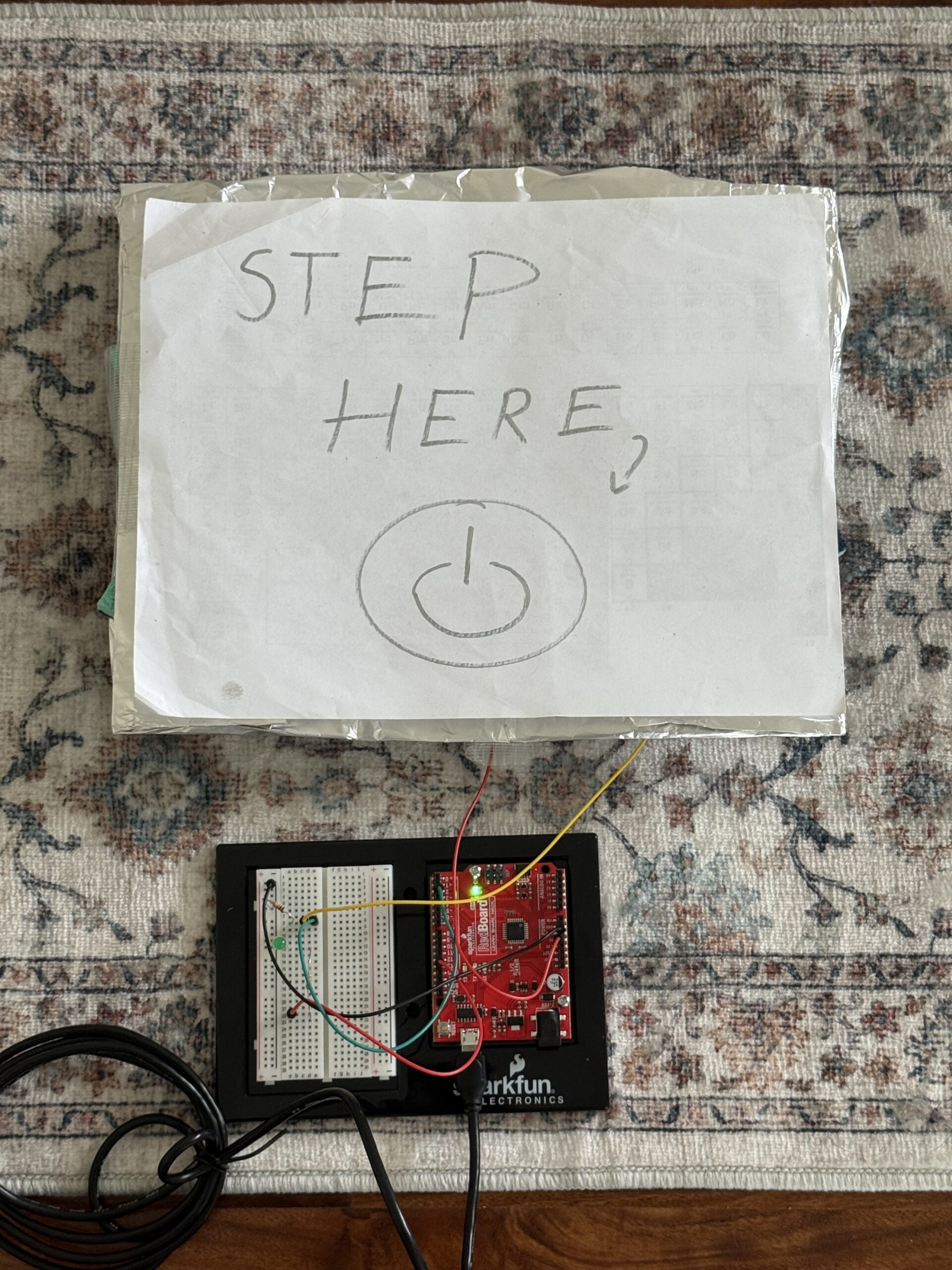
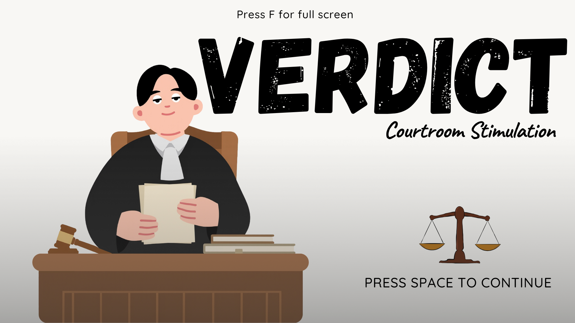
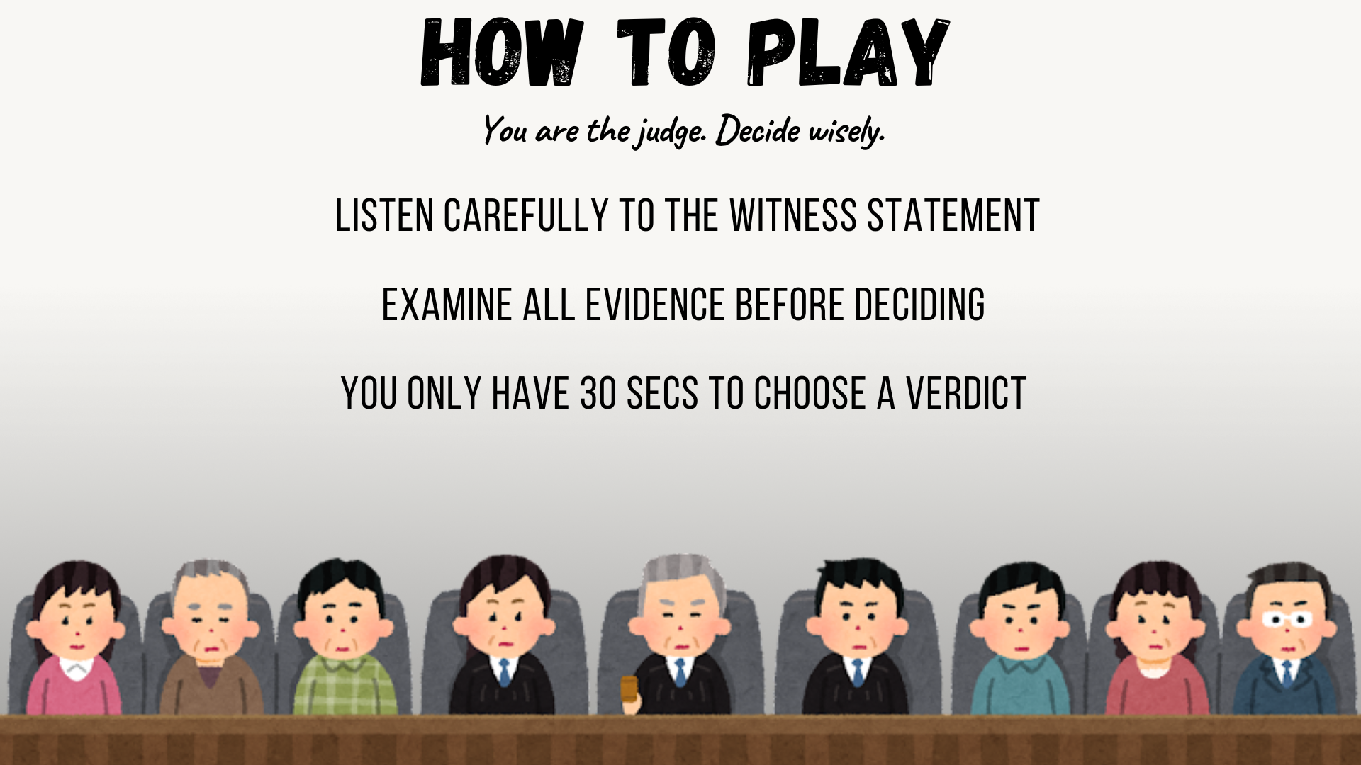
Here is the final sketch:
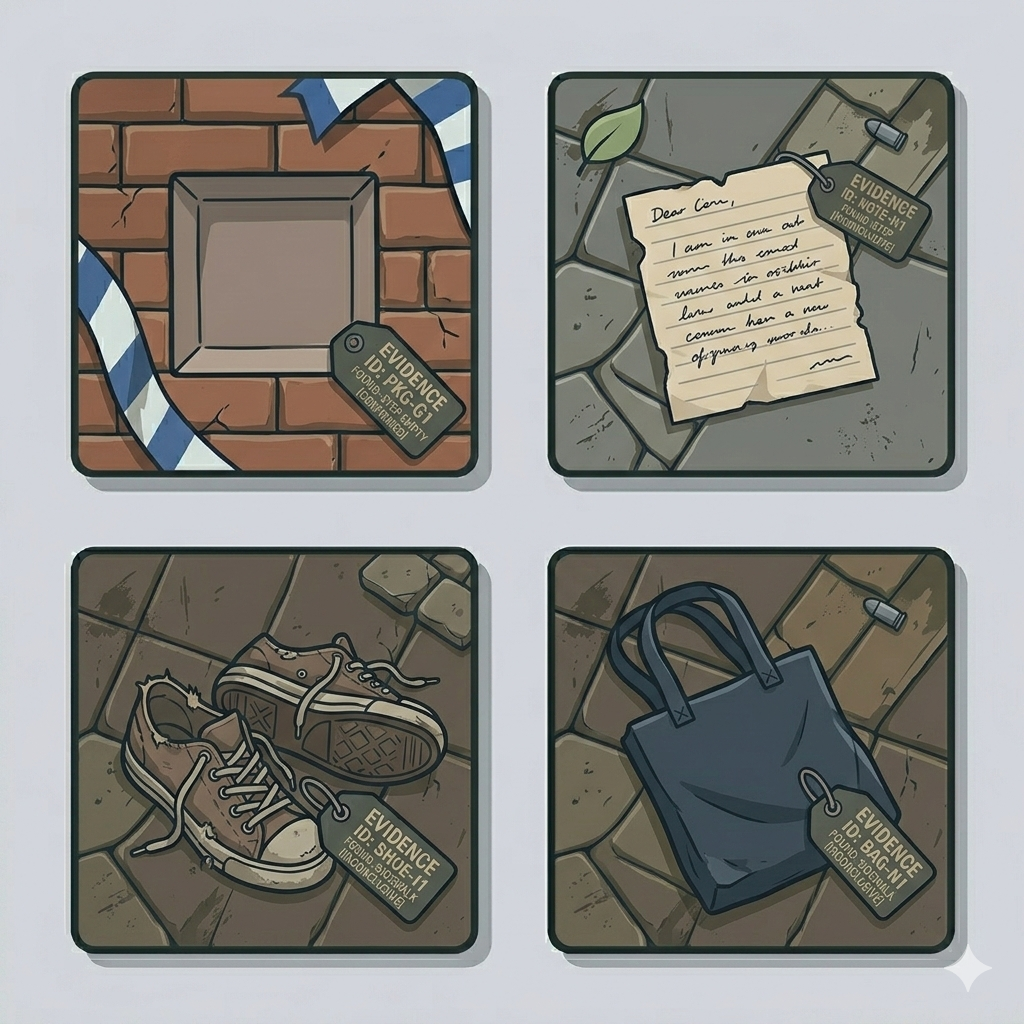
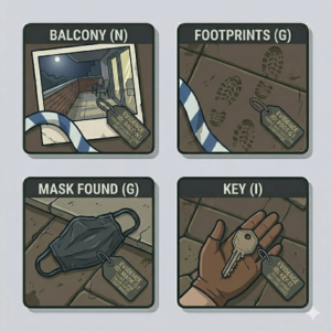
Examples of the evidence pieces:
 Overall Concept
For my midterm project, I created an interactive court trial simulation where the player takes on the role of a judge. The experience lets the player go through a courtroom scenario where they listen to the defendant’s and witness statements once you click on any of the characters, then examine 5 pieces of evidence, and decide whether the defendant is guilty or not guilty, and then you will get your result, whether you are correct or incorrect.
I wanted the project to feel immersive, as if you were inside a courtroom drama. Instead of just presenting information passively, I designed it so the player has to actively click through the dialogue, review the evidence using a slider, and make the final decisions. My goal was to combine the narrative, interaction, and sound design into one experience that feels like a small narrative game.
How the project works and what I’m proud of
The entire project is built with the state-based system that you showed us in class, which I found very useful to keep things organized. I used a global variable called state to control which screen is currently being duspayed and inside the main draw function, I check the value of state and call different functions, like drawcover, draw instruction, draw trial, draw evidence, draw verdict, and draw result. I also used oop for the clickable characters and for the different scenarios, which was useful because I can easily add or edit scenarios. I then created variables and uploaded images of evidence, in which I used a four-loop and arrays, that loop through every evidence item in the current case and create the image path using the case number and index, like 101_0.png, then store it into an array for the evidence. For the actual case randomizer, I used the random function currentCase = random(cases) and loadEvidenceForCase(currentCase). I made sure to name the evidence files in an index form with the case number, so the system can find them and match each piece of evidence with each case.
I am especially proud of how I structured the interaction system. On the trial screen, the player can click on any of the different characters (defendant, lawyer, witness) to open the statement pop-up. I used a Boolean variable popup to control the visibility and a counter variable popupstage to track the dialogue progression. This created a small dialogue that allows the statements to unfold step by step instead of appearing all at once, which i though made the game feel more controlled.
Another part I am proud of is the dynamic evidence loading system. Instead of manually loading each image one by one, I created a function that loops through the selected case evidence and builds the image file paths automatically. The images are stored in an array and displayed using a slider that lets the player scroll through them. This made the project more scalable because I could easily add more cases without rewriting a large portion of the code. Here is the code:
// load only the 5 evidence images for the current case
function loadEvidenceForCase(caseObj) {
  evidenceImages = []; // resets the evidenceimages array so old case images dont stay

  for (let i = 0; i < caseObj.evidence.length; i++) {
    //loop through every evidence item in the current case
    let imgPath = `evidence/${caseObj.caseNumber}_${i}.png`; //creates the image path using the case number and index, like 101_0.png
    loadImage(imgPath, (img) => {
      //load the image from that file path
      evidenceImages[i] = img; // when the image finishes loading, store it in the evidenceimages array
    });
  }
}

function preload() {
  coverImg = loadImage("cover.png");
  titleFont = loadFont("title font.otf");
  bodyFont = loadFont("body font.ttf");
  instructionsImg = loadImage("instructions background.png");
  trialImg = loadImage("trial.png");
  verdictImg = loadImage("verdict.png");
  correctverdictImg = loadImage("correct verdict.png");
  wrongverdictImg = loadImage("wrong verdict.png");
  clickSound = loadSound("clicking sound.wav");
  backgroundSound = loadSound("cover and instructions music.wav");
  gaspSound = loadSound("gasp.wav");
  gavelSound = loadSound("gavel sound.mp3");
  statementSound = loadSound("statement.wav");
  tickingSound = loadSound("tic.wav");
}

function setup() {
  createCanvas(windowWidth, windowHeight); //makes canvas fill entire screen

  backgroundSound.setVolume(0.4);

  // create characters
  defendant = new Character("Defendant", 417, 325, 1);
  lawyer = new Character("Lawyer", 500, 325, 1);
  witness = new Character("Witness", 840, 325, 1);

  //evidence button (which is hidden until trial screen)
  evidenceButton = createButton("View Evidence");
  evidenceButton.position(1050, 660); //
  evidenceButton.size(200, 50); // button width/height
  evidenceButton.style("background-color", "255");
  evidenceButton.style("color", "rgb(11,11,11)");
  evidenceButton.style("font", "tileFont");
  evidenceButton.style("font-size", "18px");
  evidenceButton.style("border-radius", "15px");
  evidenceButton.style("border", "3px solid black");
  evidenceButton.mousePressed(() => {
    if (currentCase) {
      // only open if a case is selected
      state = "evidence";
      evidencePopup = true;
      currentEvidenceIndex = 0;
      evidenceSlider.value(0); // reset slider
      justOpenedEvidence = true;
      evidenceButton.hide(); // hide it until trial screen
    }
  });
  //create slider for evidence (hidden until popup opens)
  evidenceSlider = createSlider(0, 4, 0, 1); // 5 pieces of evidence (0–4)
  evidenceSlider.position(550, 550);
  evidenceSlider.style("width", "200px");
  evidenceSlider.input(() => {
    currentEvidenceIndex = evidenceSlider.value();
  });
  evidenceSlider.hide();
}

function draw() {
  evidenceButton.hide();
  evidenceSlider.hide();

  //background music control depending on current game state
  if (
    state === "cover" ||
    state === "instructions" ||
    state === "trial" ||
    state === "evidence"
  ) {
    if (!backgroundSound.isPlaying()) {
      backgroundSound.loop();
    }
  } else {
    backgroundSound.stop();
  }

  //ticking sound that only plays during verdict decision
  if (state === "verdict") {
    if (!tickingSound.isPlaying()) {
      tickingSound.loop();
    }
  } else {
    tickingSound.stop();
  }

  //different screens depending on game state
  if (state === "cover") drawCover();
  else if (state === "instructions") drawInstructions();
  else if (state === "trial") drawTrial();
  else if (state === "evidence") drawEvidence();
  else if (state === "verdict") drawVerdict();
  else if (state === "result") drawResult();

  //tool to help me
  fill(255);
  textSize(16);
  textAlign(LEFT, TOP);
  text("X: " + mouseX + "  Y: " + mouseY, 10, 10);
}
Areas for improvement and problems
One of the biggest problems I ran into was managing alignment and the systems; at one point, changing the rectmode(CENTER) and textAlight (CENTER, CENTER) affected other parts of the code unexpectedly. So I had to learn how push and pop isolate the styling changes and where exactly to put them so they don’t affect the entire sketch. Another challenge was getting all of the evidence images to load correctly. Some of the files had different extensions like jpg or png, which caused loading errors because in the four loop, I only put the png extension. So I had to fix the file names and make sure the loading function matched the correct format. That taught me how sensitive the file paths are and how important consistency is. If I were to improve this project further, I would refine the visual design so it feels more polished and fix up the formatting of the buttons. I would also introduce a scoring system or a branching narrative so that the decisions feel even more impactful. The core system does work well, but I just think there is room to push it even further.
References and AI usage
I used this YouTube video and the reference page to better understand the scale function and implement it in my sketch, which I used for the characters: https://www.youtube.com/watch?v=pkHZTWOoTLM
https://p5js.org/reference/p5/scale/
I also used this P5 reference page to understand the drawingContext function, which I used to add shadows to my characters
https://p5js.org/reference/p5/drawingContext/
For Ai I mainly used ChatGPT. I sometimes ran into bugs where changing the position or layout of something in my sketch would unexpectedly affect other parts of the program. So ChatGPT helped me debug these issues by explaining what parts of the code might be interfering with each other and suggested ways to fix them. I also used chagpt to help me figure out a system for loading all of the evidence images into the game, since my project had around 100 pieces of evidence, and manually loading each image would have been inefficient. With ChatGPT’s help, I implemented the loop system that automatically loads evidence images from the evidence folder using the case number and image index. Another area where ChatGPT helped me was structuring my case scenario. It suggested using the const keyword when defining the cases so that the data could not accidentally be reassigned later. This helped keep the case info organized and protected from being changed while the game runs. It also provided some information on how to structure each case object, like adding a case number.
For the visual evidence, I used Gemini to generate the individual evidence images. All the coding decisions and implementations were done by me; the AI tools were used as guidance for debugging, structuring the code, and generating the visuals.