This weekend I was wokring on a replication study where I had to deal with data of mulitple repos. Somewhere in the process I encountered a csv which had two columns, release version and last pull request associated with that. I needed to figure out on average how many pull requests the repo used per release. When I sat of the IM assignment I thought by not display that csv on a graph using p5. This was the motivation for my work.
Initialy I wanted to make a tree on which branches represent the version number and the leaves represent the pull requests. But after some hassle I figured out that the data I have is not as hieracial and evenly distributed to create a presentable tree. After which I settled down on a graph represenation of the data.
First and the hardest part was to figure out how to represent it. cuz the amount of value was alot. I decided to group the major and minor version togather and make bins of the of the numbers of Pull requests. Even though it gave less information, the output was at least readable and understandable. In coding the grouping was the hardest part, because I had to read the array and keep track of the of what I have read and match it with the next coming value. and that is also the part I am most proud of figuring it out. The AI assitance for that is mentioned in the end.
// Loop through data row by row
  let lastGroup = "";   // keep track of the last major.minor group
  let y = paddingY;     // starting from Y position
  let groupCount = 0;   // how many PRs in the current group
  let maxBins = 0;      // track maximum number of bins for X-axis

  for (let r = 0; r < data.getRowCount(); r++) {
    let pr = int(data.getString(r, 0));
    let version = data.getString(r, 1);

    // Major.Minor for grouping
    let parts = version.replace("v", "").split(".");
    let group = `v${parts[0]}.${parts[1]}`;

    // New group  discovery
    if (group !== lastGroup) {
      y += yStep;
      groupCount = 0;
      lastGroup = group;
Sketch
AI Assistance
I asked for functions like replace() and split(), to manipulate the data values. I also asked AI to help me tidy up the code in terms of formating and variable names. The most major contribution which is not mine is the following line of code
// Update maxBins if needed
let bins = groupCount / binSize;
if (bins > maxBins) maxBins = bins;
this was didn’t change anything in the ouput but it is useful if the file size is increased significantly. I let it be there as I deem it “Nice to have” or “Good COding practice”.
In reading “The Psychopathology of Everyday Things,” I was struck by how often I have blamed myself for “operator error” when, in reality, I was just a victim of bad design. Don Norman’s breakdown of the disconnect between engineers — who often design with a logic that doesn’t match human behavior — and actual users was eye-opening. One thing that drives me crazy, which Norman doesn’t specifically detail, is the modern design of “smart” appliances that replace physical knobs with touchscreens.
Trying to set a timer on a touch-based stove while my hands are wet or covered in flour is an exercise in pure frustration. The lack of a physical affordance (something to grab and turn) and the absence of immediate haptic feedback make the interface feel fragile and unresponsive. This could be vastly improved by following Norman’s principle of discoverability –incorporating tactile controls like physical dials that naturally signal how they should be operated without me having to look away from my cooking to navigate a sub-menu.
When applying Norman’s principles to interactive media, I see a clear path forward through the use of signifiers and natural mapping. In a digital environment, we don’t always have physical objects, so signifiers become our primary tool for communication. For example, in a complex mobile app, instead of hiding features behind ambiguous icons, designers should use signifiers that clearly communicate “where the action should take place”. Furthermore, applying natural mapping—like having a volume slider that moves vertically to represent “more” or “less” — takes advantage of biological standards that lead to immediate, intuitive understanding. By focusing on human-centered design and assuming that users will make mistakes, we can build interactive media that feels like a helpful collaboration rather than a “fight against confusion”.
For this assignment, I moved away from abstract shapes toward a conceptual exploration. The project uses Object-Oriented Programming to manage a dense grid of hundreds of independent “Bit” objects. The artwork functions as a digital ecosystem that transitions from a chaotic, flickering state of binary data to a structured, symbolic heart shape when the user provides “attention” via a mouse click.
3. Concept
My goal was to visualize the friction between cold machine logic and human emotion. I wanted to create a “hidden” layer of data that only reveals itself through interaction. The aesthetic is inspired by classic terminal interfaces — matrix-green on a deep black background — but the focus shifts to how human interaction (the mouse) acts as a lens, organizing random 0s and 1s into meaningful language and iconography.
4. Process and Methods
I populated the canvas using a nested loop that instantiates Bit objects which allowed every single character on the screen to have its own internal state, managing whether it currently displays a binary digit or a human word.
To make the background feel “alive,” I implemented a probability check within each object. By giving each bit a 2% chance to flip its value every frame, I created a shimmering effect.
Instead of a simple radius, I utilized a heart curve equation which creates a high-definition mathematical boundary that filters the grid, determining which objects should “corrupt” their binary state into human text.
5. Technical Details
Unlike a standard distance check, which creates a simple circle, I implemented an algebraic heart curve. The challenge was that p5 coordinates are pixel-based and grow downwards from the top-left (0,0). To make the equation work, I had to translate every point in the grid into a normalized local space relative to the cursor.
// 2. COORDINATE NORMALIZATION:
// Transforms pixel coordinates into a math-friendly scale (-x to +x) centered on the mouse position.
let x = (this.pos.x - mouseX) / 150;
let y = (this.pos.y - mouseY) / 150;

// 3. ALGEBRAIC HEART CURVE:
// Formula: (x^2 + y^2 - 1)^3 - x^2 * y^3 <= 0
// If the result is negative, the coordinate is inside the heart shape.
let heartEquation = pow(x*x + pow(-y, 2) - 1, 3) - pow(x, 2) * pow(-y, 3);

// INTERACTION LOGIC
if (mouseIsPressed && heartEquation < 0) {
  // If inside the heart boundary, reveal a human word
  // 'frameCount % 20' creates a shifting glitch effect within the heart
  if (this.currentText.length === 1 || frameCount % 20 === 0) {
    this.currentText = random(humanWords);
  }
} else {
  // Revert to background binary logic
  this.currentText = this.binaryState;
}
The background’s “breathing” light effect is driven by a sine wave. By adding the x coordinate of the object to the frameCount inside a sin() function, I created a horizontal phase-shift, resulting in a light ripple that moves gracefully across the grid.
// 4. TRIGONOMETRIC PULSING:
// Uses a sine wave to cycle brightness based on time and X-position
let pulse = sin(frameCount * 0.05 + this.pos.x * 0.02);
let brightness = map(pulse, -1, 1, 60, 200);
6. Reflection
This project was a bit of a shift in my style of works, where I dipped more into the artistic side rather than just the technical. My main challenge was mastering the balance between the machine code and the heart. Initially, the heart appeared distorted because I hadn’t accounted for the rectangular aspect ratio of the canvas. By learning to normalize the X and Y scales independently of the pixel count alongside changes in sizes, I achieved a more crisp silhouette. Using push() and pop() to isolate the font styles of individual objects allowed me to create a dual-identity system where “Machine” and “Human” layers exist in the same space without visual conflict.
When I read about Chapter 1 of The Design of Everyday Things, the first thing that comes to my mind is how confused I felt using Brightspace when I first came to NYUAD. The author explains that when something is designed poorly, people usually blame themselves instead of the system that created it. That stood out to me because that is exactly how I felt. I kept thinking I was the problem and that I just was not understanding how to use it I had trouble when uploading my assignments, and when trying to find professors’ feedbacks. Before NYUAD, I used Google Classroom, and everything there felt simple and clear and it was easy to use and understand. Brightspace felt crowded and all over the place which made it hard to navigate. After reading this chapter, I realized my frustration was not only about me. It was also about the design itself.
The chapter also talks about how designers sometimes assume everyone thinks the same way they do. That made me think about how different people use technology in different ways. Some people grow up using all kinds of apps and websites, so they get used to complicated layouts and things that could be considered “confusing” to other people. Others do not have that same experience, so they might feel lost more easily. I noticed this with WordPress too. The first time I used it, I had no idea where anything was. It felt overly crowded and confusing. After using it many times, I slowly got more comfortable. That helped me understand why designers need to think about all kinds of users, not just people who already know similar platforms.
There are also websites that feel easy right away. To me Amazon is a good example. The search bar is easy to find when trying to search for the product you’re looking for, the cart is always in the same place and when you click it you could see what you added there, and checking out or tracking an order is simple. You do not have to guess what to do next. Even simple games like Wordle are easy to understand and use. So it gives the idea that the interaction they offered suits any type of person even people that don’t even know how to use technology. When you open it, you already know what to do without instructions. That shows how good design can make something feel natural to someone.
Overall, this reading made me pay more attention to the design of the things I use every day. I started noticing how much design affects whether something feels stressful or simple. It also made me think that simple design is usually better. I am still wondering how designers decide how much is too much. Adding more features can be helpful, but it can also make things more confusing. Finding the right balance seems difficult, and I am curious about how designers figure that out.
For this week’s assignment, I made a generative fortune cookie. I wanted to create something that is fun to interact with, but also use what we learned about loading data from a CSV file. Instead of letting the computer pick totally random words, I organized my CSV so each row had the same structure: subject, adjective, action, object, place, and warning.
I liked the idea of copying how real fortune cookies work so in my sketch, every time you click, the program picks one row from the CSV and turns it into a fortune. This makes the project interactive and gives it that “mysterious” fortune cookie feeling not knowing what you will read next. I also tried to center everything so it looks like an actual fortune paper coming out of a cookie.
Highlight of my sketch
One part of my project that I’m proud of is how I drew the fortune paper. I wanted it to look clean and centered, so I made a separate function called drawPaper() just for that. This helped keep my code organized and made it easier to adjust the design. The function draws a big white rectangle with rounded corners to look like the paper sticking out of the cookie, and then I added a soft shadow underneath it to make it stand out more.
I made a CSV file where every row followed the same pattern. Keeping the format consistent was important because if one row had a missing comma, the whole sentence would break.
In preload(), I used loadStrings() to load the CSV and loadFont() to load my font that i downloaded from google fonts. In setup(), I created the canvas, set the font, centered the text, generated the first fortune, and used noLoop() so the sketch doesn’t constantly refresh.
The main logic happens in generateFortune(). I used random() to pick a random line from the CSV, then split() to break it into pieces. Each piece goes into a variable, and then I build two full sentences using those variables.
The mouseClicked() function calls generateFortune() and then redraw(), which updates the sketch only when the user interacts (by clicking it basically) . This makes it feel less chaotic.
Reflection and future ideas
This project helped me understand how external data works in p5.js. At first, I didn’t get how a whole line from the CSV could turn into separate words, but once I understood how split() works, it made sense. It showed me how generative text can be structured instead of random.
One challenge was keeping the CSV formatted correctly. If one row had an extra space or missing comma, the whole sentence would come out wrong. Fixing that helped me understand how important clean data is.
In the future, I want to try mixing pieces from different rows instead of using one row at a time. That would make the fortunes even more varied. I also think it would be cool to animate the cookie cracking open or have the fortune slide out instead of just appearing, and also try making the fortune cookie look more realistic, and I also want to trey adding animation because it would make the interaction feel more fun.
References
p5.js documentation I used the official p5.js reference to look up functions like loadStrings(), loadFont(), random(), split(), noLoop(), redraw(), text(), triangle(), and rect(). https://p5js.org/reference/
Google fonts I downloaded the font I used in my sketch from Google Fonts. https://fonts.google.com/
CSV file I created my own CSV file for this project and formatted it myself.
Ai usage I used AI to help me brainstorm and generate some of the sentences for my CSV file (subjects, adjectives, actions, objects, places, and warnings). I edited and formatted everything myself when creating my own CSV file on google sheets.
One of the reasons products fail in real life is due to over-engineering. I know this wasn’t explicitly mentioned in the chapter, however it fits the description of designing a product that solves a simple problem in an complicated way. However, besides following the perspective of an engineer when designing the products, there is another play at hand. Control, many don’t realize it but over-engineering are done on purpose to control the people. It’s not that these people don’t understands how humans work, rather they understand how they work exactly. What do I mean by that?
Let us take printers for examples. Modern printers are so frustrating to work with, I absolutely hate dealing with them, you have to download their specified app, then press some button 2 times for 5 seconds or some nonsense to turn on blue tooth mode, and honestly half the buttons on the printer you will never end up using in your life. But that’s not it, it’s the fact you need all cartridges filled to print something.
Let’s say you want to print a document in black and white, and you don’t have any colored ink cartridges, the printer won’t let you print the document unless you have everything filled. Not to mention you need to use the printer’s brand specific cartridges which are most probably overpriced. All this is done so that the customer keeps on buying only their products for the printer. Besides my vent, it is true that most of the time products are over-engineered due to engineer’s not taking in the perspective of the average Joe. For the midterm project specifically, I plan on implementing proper feedback and instructions so that the user feels in control the entire time, and don’t have to second guess anything they do while playing the game.
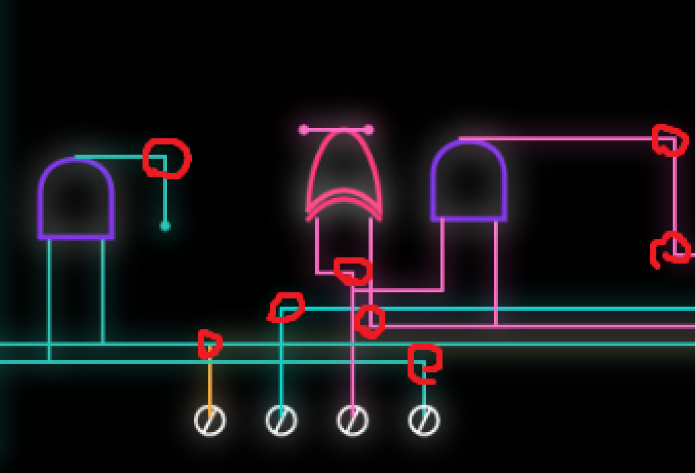
This took a while to make but I am quite happy with how it turned out! First my reference for this was this Reddit post I saw about the visualization of a 4 bit adder. I thought it would be a perfect idea for data visualization, going back to the roots of how a computer performs calculations. This idea gave birth to this p5.js digital version.
Implementation:
The core logic of this code was simply drawing paths and gates at the time I specified them to draw them at. I will show an example of what I mean.
The coordinates are drawn manually, in a segments.
And what I mean by segments, is the areas highlighted with a red circle, any part of the path which switches direction is the segment I note down, and we use a drawpath function to draw a straight line from one segment to the next.
Now this is the paths we set, but how do we draw them? Once we click the start button, we have a variable that keeps track of this and when it is true we start drawing everything. Example:
Here we check if a certain time has passed before we start drawing the path of the 3rd bit that goes from the first point to the first and gate. We use our drawpath function to get it drawn with a duration of 1.5 seconds that we specified. And since is the last path to the gate that we are drawing it to, we draw the and gate right after! Repeat this with every single path and gate and we have our sketch done… (Absolutely tedious)
Before moving on to the code I am proud of.
The nToB function converts a number no into its binary representation with n+1 bits. It works by checking each bit from the most significant to the least significant:
– no >> i shifts the number i bits to the right, bringing the target bit to the least significant position.
– & 1 extracts that bit (0 or 1).
– b.push(…) adds the bit to the array.
The result is an array of 0s and 1s representing the binary digits of the number, with the most significant bit first.
I am quite proud of the function I wrote that draws the paths and here is why.
// We use a signal here to keep track of everything. Uses progress (pr) to interpolate coordinates between wire nodes
function drawPath(pts, pr, col) {
  push();
  drawingContext.shadowBlur = 15; // Creating neon glow through canvas shadow context
  drawingContext.shadowColor = color(col);
  stroke(col);
  strokeWeight(2);
  noFill();
  let segs = pts.length - 1;
  let cur = floor(pr * segs); // Identifies which wire segment the signal is on
  let sPr = (pr * segs) % 1; // Progress within that specific segment (0.0 - 1.0)

  // Draws all wire segments that the signal has already "charged"
  for (let i = 0; i < cur; i++)
    line(pts[i].x, pts[i].y, pts[i + 1].x, pts[i + 1].y);

  if (cur < segs) {
    // lerp() calculates the point between A and B based on sPr percentage
    let x = lerp(pts[cur].x, pts[cur + 1].x, sPr);
    let y = lerp(pts[cur].y, pts[cur + 1].y, sPr);
    line(pts[cur].x, pts[cur].y, x, y);
    fill(col);
    circle(x, y, 4); // The "head" pulse of the path flow
  }
  pop();
}
The function itself takes 3 parameters, the points which are arrays of segment objects, the current progress of our path, and the color of the path.
What do I mean by segment objects? An object in java script can be made as such: {x:400, y:500} for example, where x and y are properties of the object, and 400 and 500 is the value of these properties (It is quite similar to how dictionaries work in python, if you wanna read more on java script objects go here). And for each path we have an array of these segment objects. For the progress, there a small function that takes in the start time, and the duration of the path and calculates the progress based on how much time has passed. And finally the color simply takes in a hex value. After that we define the design of the path and then we get into the main logic of the function.
The function itself is pretty well commented so I will briefly explain how the logic goes.
We first check how many segments the path has, and identify what segment we are currently on, and how much have we progressed through that specific segment (This is calculated by using the duiration we want givern in the code). We have a loop that draws every segment we have completed on screen, but how do we draw the incomplete segments giving us that smooth animation? Simple! That is where linear interpolation comes in play (Really look into this function if you are doing animations it is splendid).
If our current segment is before the last segment, we draw the path of the current segment, but we don’t wanna draw the full thing if we have not reached it yet yes? that is where we use the variable that tracks how much of the segment we traversed. So for example if we traveled 60% of the way of segment 2, we fully draw segment 1 and draw up to 60% of segment 2. We draw a circle at the point we are to have that leading circle animation of the path. And boom! That is how we get the smooth animation of the paths being drawn! Pretty nifty no?
Anyway besides that, the gates were simply messing around with bezier curves and a lot of trial and error till I got the shape I wanted.
Reflection:
I am very happy with how it turned out, however I wish to eventually remake this with a more… automated logic, since drawing everything manually was a pain, and if we have more than 4 bits this would simply take way too long to do. So if there is something I would want to improve about it, is to try lessen the manual aspect of writing this code and instead try to automate it, maybe with random segment points within a certain boundary could work.
For this week’s assignment, I wanted to create something that felt relatable and personal instead of just random words being generated. Since we learned how to load data from a CSV file and generate text from it, I thought it would be fun to make a NYUAD Advice Generator. The idea was to take simple words from a file and turn them into small pieces of campus advice that feel random, questionable, but still kind of make sense.
I liked the idea of the computer choosing the advice instead of me hardcoding every sentence, because it makes the sketch feel unpredictable and sort of personalized in a way. Every time you click, you get something different, which makes it feel more interactive and less fixed and predetermined. I also wanted it to look clean and centered, so it feels like a actual little advice card instead of just text floating on a screen.
Highlight of Sketch:
One part of the sketch that I am most proud of is how I organized the text generation into a fucntion called generateAdvice(). Organizing all those lines of code into one function made it so much more organized and easier for me to call the function rather than repeatdly rewriting the lines of code.
// I created a function for the lines of code that generate the advice for a more efficent and easy to use code, and this way i can call the functiin anywhere in my code without having the repeatdly write these lines again.
function generateAdvice() {

  //these lines of code were heavily inspired by the random poem generator example from class.

  // this line picks a random line from advice.csv file.
  let randomLine = lines[int(random(lines.length))];

  // this line splits the words from the array by commas
  let row = split(randomLine, ",");

  // after splitting the csv line, row is now an array and each position in the array holds one word from the the advice file, and these lines of code  extract each word using the index constants i defined at the top of the code.

  //these lines of code are similar to the poetry example from class but are organized in a clearer and more consice way that fits my code.
  let scenario = row[SCENARIO];
  let action = row[ACTION];
  let item = row[ITEM];
  let location = row[LOCATION];

  // these lines of code build the advice clearly.
  adviceLine1 = "If you feel " + scenario + "...";
  adviceLine2 = action + " with your " + item + ".";
  adviceLine3 = "Go to " + location + ".";
}
I am also proud of how I centered the card and used width and height instead of random numbers. That made the layout feel more intentional and organized. It was defintely a small detail, but it made the whole sketch look more put together and versatile for all screens and canvases.
function drawCard() {

  // centered card dimensions usinf height and width to avoid magic and hardcore numbers.
  let cardWidth = width * 0.7;
  let cardHeight = height * 0.7;

  //// the rect() starts drawing from the top left corner, so if i want the card in the middle of the screen,i have to move it left and up by half of its size, and this makes the card sit exactly in the center. x being horizontal position and y being vertical.
  let cardX = width / 2 - cardWidth / 2;
  let cardY = height / 2 - cardHeight / 2;
Embedded Sketch:
How This Was Made:
I started by deciding what kind of text I wanted to generate, and once I chose the NYUAD advice idea, I created a CSV file with single words separated by commas, just like the poem words example from class. Each line followed the same structure so that the program could read it properly, and the sentences/advice would make sense to a certain extent.
Then in my code, I used loadStrings() inside preload() to load the file before the sketch starts. In draw(), I used random() to pick one line from the file and split() to separate the words by commas. After splitting, the row becomes an array, and I used the index positions to take out each word from the array
.Once I had each word stored in its own variable, I built the final advice sentence using string concatenation (which is a fancy term that means putting pieces of text together), just like the poem generator example from class. I then displayed the text using text() and centered everything on the screen. I used noLoop() so the advice only changes when the user clicks, and mouseClicked() to restart that loop. This makes the sketch interactive instead of constantly refreshing on its own.
Reflection and Future Ideas:
Overall, I think this project helped me better understand how loading data works in p5. At first, I didn’t fully understand what split was doing, but after working through it step by step, I realized it’s just turning a string into pieces that I can access individually. That made the whole idea of generative text feel less intimidating and confusing.
There were definitely small moments of confusion, especially when thinking about where the text generation should go and how it compares to the professor’s example. But figuring that out helped me understand the structure of draw(), noLoop(), and mouse interaction much more clearly.
In the future, I would like to experiment with more complex text structures, maybe adding more variables per line or creating multiple sentence formats. I also think it would be interesting to combine generative text with animation so the words themselves feel more dynamic and for the whole sketch to just be more entertaining visually. Overall, really proud of this cute little sketch.
I used Generative AI for feedback, which is how I came up with the idea of instead of putting all the lines of code under the draw function, to create a generateAdvice() function for a more organized code. It also helped me generate the words for the csv file, as it was quite difficult to create that many variations.
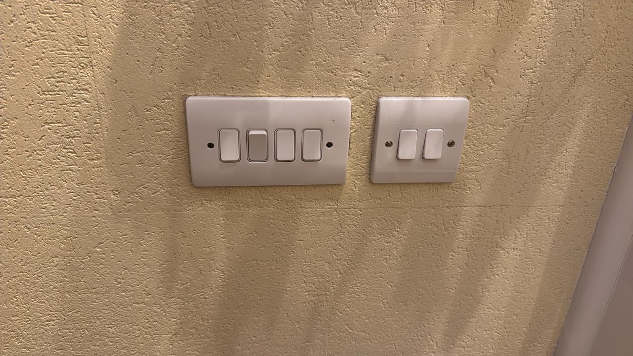
This reading is probably my favorite reading so far. It triggered me to reflect on various objects we encounter daily that are not very efficient, and have not had a change in their mechanisms for years. When reading about mapping lights to their switches, it reminded me of my own house, where we have a set of switches near the main door.
Even after living in this house for around 10 years, I still flick multiple switches until I find the one I need. The placement of the switches is especially inefficient because some of these switches are for lights outside the house in the front yard, and some are for lights inside the house.
It took me a while to think of something that functions inefficiently besides what was already mentioned in the reading, because I feel like Norman covered some of the core ones. Then, I remembered my electric toothbrush. My electric toothbrush is the most basic Oral-B model, and it only has one button (as do most electric toothbrushes). On top of this button, the word “timer” is written, indicating that this button is a timer. However, this button is also the same button I use to turn on the toothbrush. I was always confused about how to trigger the timer, and I did not have access to the manual to check. It took me around a year to realize that the toothbrush vibrates in a specific pulsing pattern for a short 2 seconds after 2 minutes of being on. I always wondered why the toothbrush would randomly vibrate weirdly mid-brush, and then I connected the dots. Using Norman’s definitions, this is an issue with the feedback of the system. How was I to know that the timer had started? While to me specifically, I think something like a light or a sound would’ve been a better indicator for the timer, I actually think this design is the most accessible design. It means deaf and blind people can still sense the toothbrush’s vibrations to know the timer is up. So, I think sometimes designs can seem inefficient to some people, but in reality they are designed this way to make them functional to everyone no matter their abilities.
This is a clear example of an item that affords timing your brush, but has poor design with signifiers that allow the usage of this feature. Norman’s argument on the importance of designing products keeping in mind the complexity of humans and eliminating the thought that how to use a feature you create will be obvious to its users can be applied to our interactive media projects. Interactive media is all about experience and interactivity. Without clear instructions from the artist on how to interact with their artwork or their game, users cannot maximize their experience. Imagine how frustrating it would be for a user to play a game with no instructions on how to control the game or about the main goal of the game. The game loses its purpose to entertain, because the user is frustrated with figuring out how to work the game.
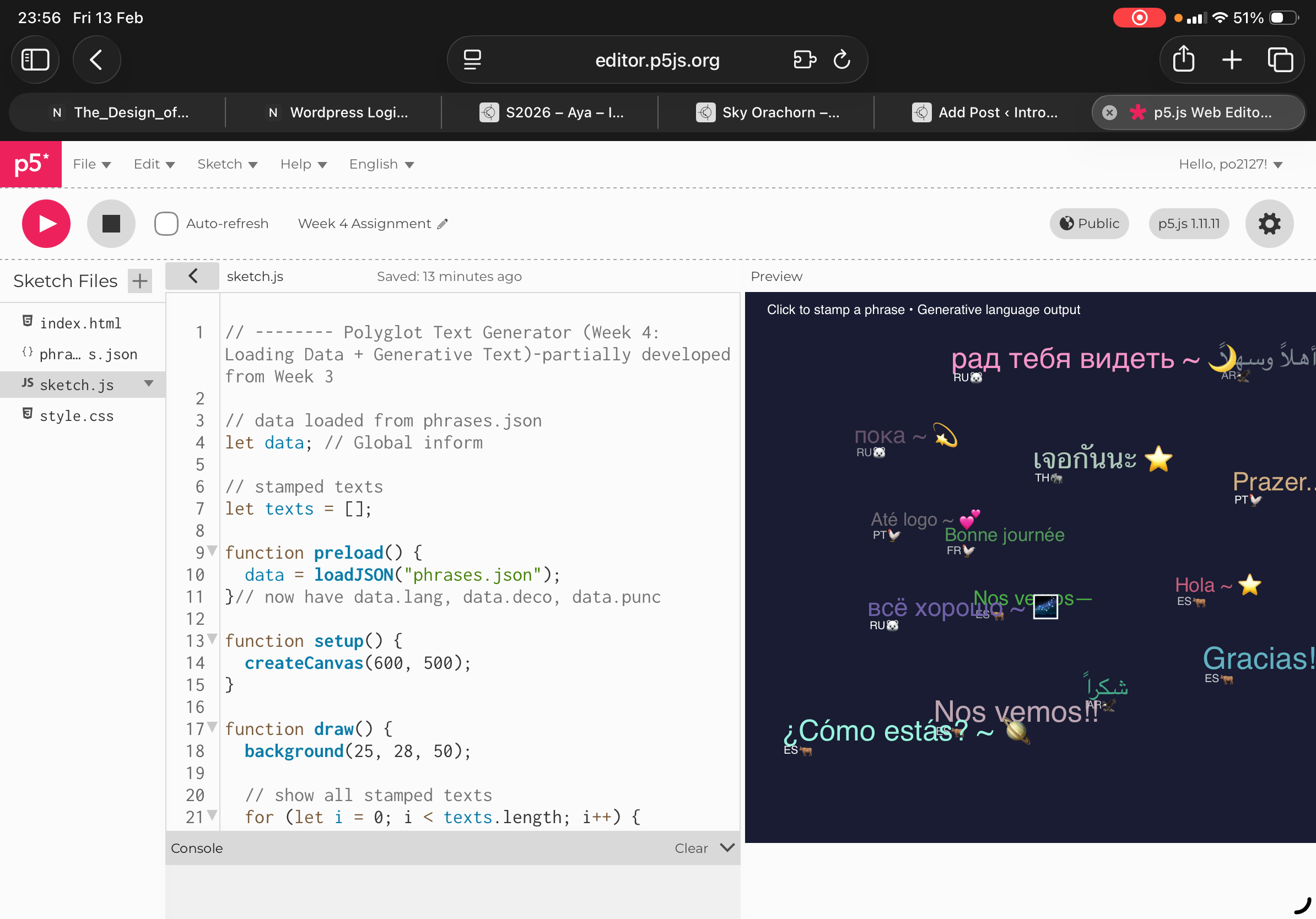
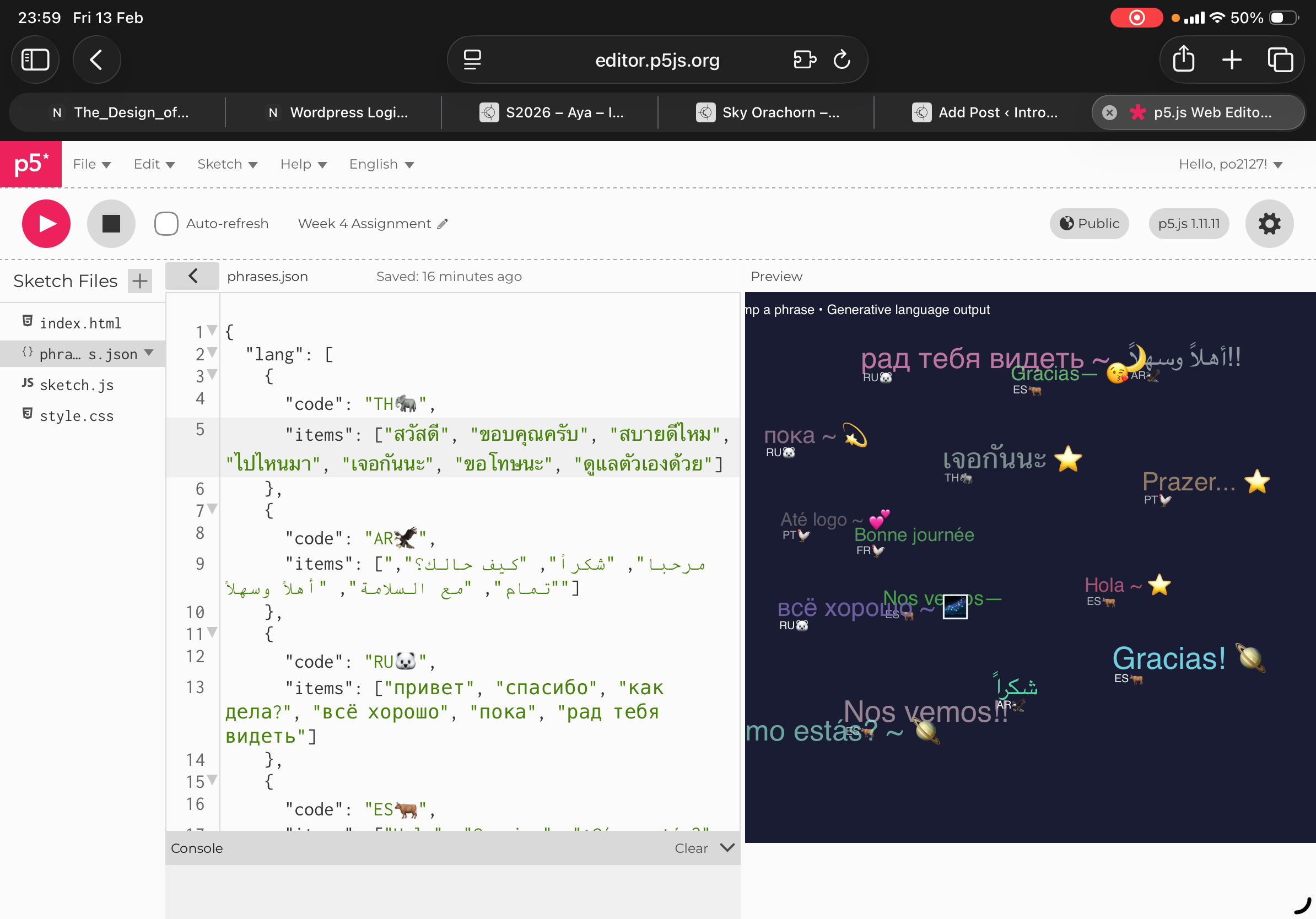
For the concept of my work, I based on what I partially developed from week 3 where last time I did a bubble generative text from the mouth drag, and how after dragging the mouse after the output would make lots of bubbles react, thus this time I did greetings and simple phrases from each of the languages that I speak. From watching the video tutorial 1.4 on JSON Data I was able to break it into 3 sections language, punctuation, decoration where for each greeting or word language I set a random variable deco where output randomly decides to go along with language, punctuation and decoration respectively. Once again ranking all of the arrays within the square brackets.
The key codes that I am proud of were the code stamped texts: Where I let text = array and where I set the function to put the line 56 (main text) and line 61 the emoji run it into the array. Secondly, for the IF text length I inputted the function where if text length is more than 20 this means that in the 21st click after running output my result. Would come out as. The first phrase that showed in the first click after running the output would disappear . Also lastly I inputted a sin(frameCount) function as currently my code after running output has some blinking going on so I ran it into a way that it would appear as wave that run smoothly.
In terms of what I think I could improve in the future would be to play around with functions that everytime that a text have “burst up” and burst everytime that we click. So overall is to explore more with varieties and different animations , etc.