Week 13: User testing

Link to Video

Are they able to figure it out? Where do they get confused and why? Do they understand the mapping between the controls and what happens in the experience?

I had two users test my final project, “Tokyo Flight,” and they were able to figure out how to play the game using the physical airplane controller I built. The instruction page was helpful overall, but they initially got confused because it first explained how to play the game within p5 only. This made it very confusing for them to understand how to use the physical airplane to control the plane on p5. The tester eventually understood the mapping between the controller and p5. However, the button on the physical airplane took them some time to understand how it works. Thus, I need to improve the instruction page to clearly explain how to play the game using the physical airplane.

What parts of the experience are working well? What areas could be improved?

The airplane on p5 successfully received sensor values from the accelerometer, so the main feature of the game was working perfectly. Specifically, the airplane on p5 moved vertically according to the tilt of the physical airplane. However, one of the LED pins was not working properly due to a loose wire connection. I had to fix it manually during the game to get the LED to light up. To rectify this issue, I am thinking of using a glue gun or tape to make the connection stronger so the wires do not come loose during the game. Furthermore, the testers told me that the entire experience was a bit too laggy, which made it difficult to play the game. To fix this, I moved all the files to VS Code and used Live Server, which resolved the lagging issue.

What parts of your project did you feel the need to explain? How could you make these areas more clear to someone that is experiencing your project for the first time?

I definitely need to improve the UI of the p5 interface, since some text are overlapping with each other, and the Airplane Collection page has poor UI design. Specifically, the point values are hidden behind each box, so users cannot easily understand how many points they need to get to unlock each skin. I also realized that I needed some kinds of background music to make the atmosphere better, based on the tester’s feedback. I added Ghibli music since the main theme is about this ghibli movie called Wind Rises. The tester also told me that the accelerometer is very sensitive and that depending on the delay, sensor values are sent to p5 too quickly. This causes the tilting movement of the physical airplane and the airplane movement on p5 to be sometimes mismatched. I will experiment more with the delay values on arduino to find the best delay value that avoids lag or mismatch between the real tilting movement and the airplane movement on p5.

SpideySense User Testing

User Testing Video

Are they able to figure it out? Where do they get confused and why? Do they understand the mapping between the controls and what happens in the experience?

Other than the Arduino port selection part,  she didn’t really get confused. Once that step was done, the controls felt intuitive. Pressing the button to make the character jump is simple and easy to understand, so the connection between the action and the game response is clear. One thing to note is that right now, using a button makes it feel very easy, but once it’s implemented on a glove where the player has to “shoot” like a webshooter, it will be more challenging to coordinate. So while it’s simple now, the final version will require more precise timing and movement.


What parts of the experience are working well? What areas could be improved?

The game itself is running smoothly,  jumps feel responsive, movement is predictable, and the player gets instant feedback, which keeps it engaging. It’s easy to pick up and play without much explanation. The main thing that could be improved is the platform spacing and variation. Right now, the platforms are a bit too similar, so the game can feel repetitive. I tried making them more random before, but that sometimes caused impossible jumps. Ideally, I want to add more variety and challenge without breaking the game’s fairness. 


What parts of your project did you feel the need to explain? How could you make these areas more clear to someone that is experiencing your project for the first time?

The part that needed the most explanation was still the Arduino port selection. It’s a technical step that interrupts the flow and could confuse someone who hasn’t done it before. I want to find a way to skip it or make it automatic so players can get into the game immediately.

Conducting User Testing Week 14

User testing Video
Have people try your project without giving them any
prompts/instructions and see how they use it

https://youtu.be/KjYdtzcL7hw

Sidenote: I advice to lower the volume of the video since there were people being loud nearby


• Are they able to figure it out? Where do they get confused and
why?

At first, I forgot to mention in the instructions page what the potentiometer was, which is why the person who tried my game couldn’t figure out what was the tool that controlled the size of the sphere. After this, although it didn’t take her long to understand how the potentiometer worked, she commented that it would be helpful to have a small description of how it is used.

Do they understand the mapping between the controls and
what happens in the experience?

Fortunately, they did understand what the potentiometer was doing to the sphere and expressed her interest in the interaction.

• What parts of the experience are working well? What areas could be improved?

Although so far everything in my sketch and Arduino works as I wanted

  • The sphere shrinks and grows in response to the potentiometer
  • the songs change in response to the button
  • the red LED turns on when the sphere reaches the maximum or minimum size
  • the green LED turns on when the sphere reaches a small range (between 290 and 300)
  • the “winning” size triggers the end page and then the user can go back to the homepage
  • there is a homepage and an introduction page

I feel like I could add a last component to make it more interactive, which would be the spinning of the sphere with another potentiometer. I think I could also make the growth and shrinking of the sphere far more smoother, and maybe add some exciting element for the winning page. While I am aware that on the surface this interactive project seems simple, it has forced me to push myself far outside my comfort zone, and I am happy with my progress so far.

• What parts of your project did you feel the need to explain?

Like I previously mentioned, I realized I failed to explain in the instructions how the potentiometer works and how it can be identified by those who don’t know what it is. I also realized I need to explain what happens when the spheres reaches the incorrect sizes that trigger the red LEDs and what triggers the “win”.

  • How could you make these areas more clear to someone that isexperiencing your project for the first time?

I believe it would be best to introduce this information in the instructions page since this is the most efficient way to inform the user while also keeping their focus on the information before splitting their attention to the p5 sketch/screen  and the Arcade/arduino game box.

User Testing

IMG_0901

Today I had a few people try my project without giving them any instructions, just to see how intuitive it actually is. Since the website isn’t fully finished yet, some parts were definitely confusing at first. People weren’t totally sure what the experience was supposed to be, and the lack of intro screens made it feel like something was missing.

But honestly, the four buttons in the p5 interface made a huge difference. Even without explanations, most people understood pretty quickly that each button does something to the robot. They started clicking around, testing what each one does, and exploring on their own. The mapping between the controls and the robot’s movement felt clear to them, which is a good sign.

Still, because the rest of the experience isn’t complete yet, they didn’t really understand why the robot was moving or what the larger goal of the project was supposed to be. This is where most of the confusion happened. I found myself needing to explain the story/context and what the robot is meant to represent , which means that once the website is finished, I need to make sure the narrative is communicated immediately and visually, without me talking.

Overall, the parts that are working really well right now are:

  • the p5 buttons

  • the immediate direct feedback

  • the fact that people naturally experimented

The parts that need improvement:

  • clearer intro

  • clearer purpose

  • smoother connection between the physical robot and the digital scenes

Once the full website and story screens are built, I think the experience will make a lot more sense for first-time users. For now, at least the controls are intuitive so that’s a good foundation to build on.

Week 13: Final Project User Testing

For this week’s user testing, I invited my good friend Clara to be my test subject. Clara has never stood on a skateboard before and this was her first time. I try to tell her as little as possible but I did tell her to feel free and grab the table in front of her if she felt unsafe or if she lost her balance.

First I asked her to simply step onto the board; this is good for me to see where her feet would naturally stand. I’m also going to use Clara as the average height of a female user from now on.

Then I got a shot from further away to see how she was naturally adjusting to the board as she got on. I pay special attention to how people bend their knees and adjust their arms when they’re leaning on the board.

Lastly, I told her to try and lean far back and far forward to see if she was comfortable.

Are they able to figure it out? Where do they get confused and why? Do they understand the mapping between the controls and what happens in the experience?

Prior to Clara, I’ve also had a few other people step onto the board and everyone so far has understood how to step onto the board safely and slowly.

However, first-timers always express that either tilting forward or backward is initially a little scary, but the other way was fine; more people indicated that leaning backward made them more nervous than learning forward.

The controls are pretty intuitive based on what I’ve asked Clara and the many other unofficial test users. Afterall, you simply learn forward or backward once you’re on the board.

What parts of the experience are working well? What areas could be improved? 

People who have never stood on a skateboard before were really excited to try; everyone so far approaches the experience with caution so that part is working great. I believe the fact that the board is stationary calms a lot of people’s nerves. It did come to my attention that a lot of people on campus might be wearing very casual and loose footwear on the day of the showcase (sandals, crocs, etc), so I should probably restrict loose footwear that doesn’t hold your foot in place very well.

I’m going to make a slideshow explaining everything about the project for people who are lining up to try if there’s someone already playing with the project.

What parts of your project did you feel the need to explain? How could you make these areas more clear to someone that is experiencing your project for the first time?

I felt like I had to explain to people that whether you skate goofy or regular was not dependent on your dominant hand, and that they should do what feels more natural to them. 

I think a quick tutorial on how to stand on a skateboard before the game starts would be great. In addition to that, I’ve placed some colored tape to indicate where to stand and especially where not to stand (like the tail).


Week 13 User Testing

IMG_9844

During testing, users were initially unsure that the robot was an interactive system. This uncertainty came from the absence of clear cues inviting them to engage with it. Once interaction began, the rotational feature worked well because it was clearly displayed on the screen and responded in a way users understood. The FSR pad required more investigation, since the connection between pressure input and system feedback was less obvious. Many users spent extra time experimenting to figure out how the pressure sensor influenced the experience. Another practical issue that surfaced was wire management. When users spun the device, exposed cables sometimes tangled, which interrupted the interaction and caused hesitation. This showed that the physical setup needs better organization to keep the experience smooth and uninterrupted. Overall, while the rotation feedback was intuitive, the pressure-based control and cable layout required explanation. Clearer visual guidance, simple onboarding hints, and proper cable routing would make the system easier for first-time users to understand and operate.


Week 13- User Testing

Are they able to figure it out? Where do they get confused and why? Do they understand the mapping between the controls and what happens in the experience?

The one thing I did not make very clear is where they should point the light to, which are the light sensors. I think testing this with people that have done IM classes before was not suitable because they knew how each sesnor looked like therefor knew how to trigger them. So the light sensors and water sensors should be intergrated in a way that allows the user to understand what they should do to trigger the sensor.

  • What parts of the experience are working well? What areas could be improved?

I think the overall functionalities of the sensors work well, and the thresholds are defined well. I want to make all the wires connected to the Arduino and bread board sit more neatly because they do get tangled at time. I also want to make sure that the the wooden case around my project has a small hole or opening to let the connection from the laptop to the Arduino.

  • What parts of your project did you feel the need to explain? How could you make these areas more clear to someone that is experiencing your project for the first time?

One part of my project that I needed to explain more clearly was how users should interact with the sensors—specifically, where to point the light for the light sensors and how to activate the water sensor. Because many of the people I tested with had prior IM experience, they already recognized what the sensors looked like and intuitively knew how to trigger them, which made it harder for me to notice confusion. For a first-time user, however, the mapping between their actions and the project’s responses is not immediately obvious. In future iterations, I want to better integrate or label the sensors so that users can naturally understand where to shine the light or where to place the water without requiring external explanation.

DEMO of User Testing:

IMG_8795


Week 14: User Testing

User Testing Video Documentation

Based on my user testing, it seems like people mostly are able to figure out my project. There weren’t any points of confusion in terms of what needs to be done, and it was clear that every time they pressed a button for a lit up lantern, the score went up.

However, one point of concern by one user was that after connecting to the Arduino, the game started so quickly that they did not realize that it had even started. Maybe I could add a kind of countdown timer after the Arduino is connected so that the user can prepare for the game to begin.

I didn’t have to explain anything to the users during any of the tests, and the simple 3 pointer instructions at the beginning were enough for the users to understand what they had to do. The project is obviously still in progress, and there are parts missing including the panel box for the buttons, the speaker attached to the laptop for the music, and maybe even a shade over the lanterns so the light is more visible. Overall, I believe the interaction design was clear and the communication between the p5 interface and Arduino was smooth.

Week 13 – User Testing

When I gave people a chance to try my game, they were generally able to figure it out easily. From my experience during the midterm project, I learned that providing clear instructions is very important, and I applied that lesson here. At first, players were surprised to see apples used as controllers, but I am happy with this decision because it made the game more engaging and encouraged curiosity. The instructions I provided explaining that the red apple moves the character to the right and the green apple moves the character to the left made it easy for them to understand the mapping between the controls and the game actions.

One small point of confusion was that I wrote “touch the apple,” but in practice, players needed to press or squish the apple for the character to move. This is something I can clarify better in the instructions for future users.The part of the game that worked well was moving the character from one side to another, as it felt natural and responsive. Another improvement suggested during user testing was related to catching items: originally, the character caught food near her legs at the very bottom of the screen, but after the suggestion, I moved the catch area so it aligns better with the character’s position. This made the game feel more intuitive and enjoyable.

The part of the experience that required more explanation was how the apples work as physical controllers. While users understood the concept after reading the instructions, I could improve this by adding a visual cue or short tutorial in the game showing how to press the apples to move the character. Overall, clear instructions, intuitive controls, and small adjustments based on user feedback made the game easy to understand and engaging, but highlighting the physical interaction more clearly could improve the first-time experience.

Please see below the user testing video:

User Testing

Week 14 – User Testing

User Testing Summary

Video Link (Private Youtube): https://youtube.com/shorts/3OV1dg049Hw?feature=share

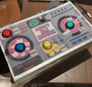
I conducted two user-testing sessions: one with the full DJ booth box and one with just the exposed buttons. In both cases, users were able to understand how to interact with the project immediately, even without instructions. People naturally pressed the buttons, experimented with the toggle button, and quickly recognized that the setup functioned as a DJ booth. The simplicity of the interface encouraged playful exploration, and users said they had fun triggering beats and seeing the visuals respond.

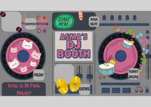
Layout of the DJ Booth:

Here’s what it looks like so far:

Usability & Understanding

Overall, users were able to figure out the controls very quickly. There was no major confusion about what each button did, and the mapping between the buttons and the sounds felt intuitive once they pressed a few of them. Because the interface uses familiar affordances like large, brightly colored arcade buttons, users instantly understood the “press to activate” logic. The toggle switch for the looping beat was also understood without explanation after users interacted with it once.

What Worked Well

The strongest aspect of the experience was the clarity and simplicity of the interaction. The four push buttons and the toggle button created a direct, satisfying feedback loop between touch, sound, and visual response. Users consistently said the experience was fun and easy to use. Those who tested the version with the box especially appreciated the “Start Here” label placed near the main looping beat, which gave them a clear entry point into the experience.

Areas for Improvement

The main improvement I identified was the potential to add a potentiometer to control volume or effects. However, I realized that adding more components might clutter the interface and overwhelm first-time users. The current minimal setup (four buttons and one toggle) supports quick understanding and keeps the user experience simple. If I had more time, I would explore adding more features only if they didn’t compromise the clean layout or intuitive interaction.

Things I Needed to Explain

I found that I didn’t need to explain much during the tests. The only times I stepped in were when users were curious about the internal electronics or how the p5.js visuals were generated. In terms of interaction, everything was clear on its own. If I were to improve this project further I could also add a feature where users could play back the beat they just created, but I didn’t want to overwhelm myself with the coding too close to the date of the showcase. Overall, though, the project communicated itself very effectively.