Week 4: Generative Text Output

My Concept

This project is Barbie-themed quote generator  where the user can pick different moods and see a random quote associated with each mood. The mood options, such as “Empowered Barbie”, “Sassy Barbie” and “Sad Barbie” each trigger a quote that is supposed to motivate the user and uplift their mood.

Code Highlight

The most challenging part of this project was integrating randomly changing quotes based on user selection. To achieve this, I set up a function to handle button clicks, where each button is linked to a specific mood and quote. I also added hover effects and smooth transitions to create a more interactive experience.

// Quote Generator Page
function displayQuotePage() {
  tint(255, 180); // Makes background a little more subtle)
  image(bg, 0, 0);
  noTint();  

  // Title and text layout
  textAlign(CENTER); 
  textFont('Montserrat');
  textSize(36);
  fill('#ff3385');  
  text("Choose your mood:", width / 2, 50);

  // Mood options
  textFont('Open Sans');
  fill(0); 
  textSize(24);
  text("Empowered Barbie", width / 2, 110);
  text("Sassy Barbie", width / 2, 160);
  text("Sad Barbie", width / 2, 210);

  // Quote section
 if (quote !== "") {
    fill('#ff3399');  
    noStroke();
    rect(150, 280, 400, 80, 15);  
    fill('white');
    textSize(22); 
    text(quote, width / 2, 310);  
  }

Reflections

The concept for this project was inspired by the diversity of Barbie characters and the different moods they represent. Barbie has always reminded me of the kind of uplifting quotes I use in my projects, which makes me feel better and motivated.

Looking back, one area for improvement would be the design. Since I didn’t have much time this week, I focused more on the interactivity aspect. Ideally, i would add elements like animated transitions or colorful backgrounds that change based on the selected mood. I’d also love to add sound effects or background music to better the mood and make the experience even more immersive. I was also thinking about taking user’s name to make the experience feel more personal. Overall, I’m happy with the way it turned out as i used a lot of new elements.

Embedded Sketch

Week 4 — Reading Response

One thing that drives me crazy is poorly designed shower faucets, especially the ones with a single handle where it’s difficult to tell how to adjust temperature or water pressure. Many of these designs lack clear signifiers, making it frustrating to figure out whether turning the handle left increases temperature or pressure, or if pulling or pushing it has any effect at all. Sometimes, the hot and cold indicators are either missing, faded, or counterintuitive, leading to a trial-and-error process that often results in an unexpected blast of freezing or scalding water.

In interactive media, Norman’s principles can be applied similarly to enhance usability. Just as a well-designed shower faucet should make its function immediately clear, interactive elements in digital experiences should signal their purpose intuitively. For example, buttons and interactive objects should provide visual and/or tactile feedback, such as glowing when hovered over or vibrating when clicked (the type of feedback varying depending on the intended users). Proper mapping in digital interfaces—like ensuring a swipe-down gesture naturally leads to scrolling down—mirrors the idea of making physical controls feel intuitive. Without such authorial intent and thought in the design, interactive media can be confusing and can often lose its original intended meaning as a result. By focusing on basic HCD principles, interactive media can create smoother, more engaging experiences that minimize user frustration.

Week 4: Reading Response

One of the most annoying things that drives me crazy is how frustrating it is to use and deal with printers. For instance, the interfaces on our printers on campus are unnavigable. Simple things, such as wanting to print double-sided, have to be queued from the computer and cannot be changed at all in the printer interface. When the printers run out of paper, they simply error out but do not attempt to reprint once you add more paper. In my opinion, printers should not delete jobs from the print queue until they have been successfully confirmed to have been printed.

I think responsive designs, such as feedback mechanisms as mentioned in the reading, are important for giving users an intuitive sense of how a system will react to their input. For instance, when programming a site, on-hover CSS effects are incredibly helpful for users to understand when an element is clickable. Other techniques, such as user testing, are also crucial, where you watch people use the systems you build. If a user is not able to intuitively figure out how to use something I built, I usually take it as a sign that it’s not as simple as I had originally thought, and that it likely needs to be redesigned.

Week 4: Graduate School Applications

Overview

My concept this week is inspired by the past two semesters (and years) I have spent on graduate school applications. For my data, I sourced a list of self-reported applicant statistics for Computer Science programs. To preprocess the data, I used Python Pandas to drop unnecessary columns and rows that didn’t contain a GPA score. I also truncated the data to 10,000 rows, since I figured that 963,845 data points might be a bit unnecessary for my purposes.

df = (
    pd
    .read_csv('gradcafe.csv')
    .drop(columns=['comment', 'gre_quant', 'gre_verbal', 'major', 'season', 'date_of_result', 'gre_awa', 'date_added', 'applicant_status'])
    .dropna(subset=['undergrad_gpa'])
    .query('decision == "Accepted" or decision == "Rejected"')
    .query('undergrad_gpa <= 4.0')
    .reset_index(drop=True)
)
df[:10000].to_csv('gradcafe_cleaned_10k.csv', index=False)

Discussion

The piece is centered around the at times reductionist nature of graduate school applications, and applications of other natures (e.g., visa applications). These applications often hinge major aspects of your life on how well a sheet of paper communicates your story to the fatigued person reading it on the other side, tasked with reviewing hundreds of applications in a single sitting. The stakes can feel prolific, where years of your life depend on these single decisions. Furthermore, applicants pour their life stories into these applications–providing another level of vulnerability.

I chose to use GPA as the reductionist metric in this case, which appears slowly as the person’s profile disappears. It emphasizes how these applicants, while not in all cases, often get reduced to numbers and metrics to quantitatively compare and evaluate. This process often does not acknowledge the nuance, story, and personhood of applicants.

Code

Week 4 — Assignment

Ideation / Research

I first started off with wanting to pursue an idea that was artistic but also made sense in terms of its value as data visualization. I personally believe that data visualization is a great way to tell a story and send a message, whether it be sociopolitical or otherwise. First, I had to find a dataset (.csv file) that I wanted to work with. For this, I went to a website called Kaggle which had a bunch of fun and interesting data files for users to download for free. After browsing around for a while, I came across one that had the nutritional information of 80 different cereals, presumably in the US. In another class, I had a discussion with a fellow student who told me that in the US, many food products, despite appearing diverse, are owned by only a handful of companies, essentially being a market full of monopolies. Given that the US prides itself on how democracy fosters free markets, I was surprised to learn that monopolies exist within this system, as they seem to contradict the principles of a free market. To explore this contradiction, I decided to use the cereal.csv dataset to create a visualization that highlights the monopoly in the cereal industry. Each animation and effect is designed with a particular purpose, conveying meaningful insights about this issue.

Process / Code Review

For the cereal nodes, I wanted their colors to reflect their sugar content, making it easy to visually interpret how much sugar each cereal contains. To do this, I used the ‘map()’ function to scale the red intensity based on the sugar level, where low-sugar cereals are black and higher sugar cereals appear redder than black. This creates an intuitive color gradient that emphasizes the nutritional differences between cereals.

  for (let cereal of cereals) {
    let sugarLevel = cereal.sugar; // scale from 0-15
    let redColor = map(sugarLevel, 0, 15, 0, 255); // more sugar = more red
    fill(redColor, 50, 50); // red tones based on sugar content
    ellipse(cereal.x, cereal.y, 10, 10);
  }
}

To connect each cereal to its parent company, I created animated lines that gradually extend from the manufacturer to each cereal. Instead of appearing all at once, the lines animate over time, emphasizing the idea of hidden connections between brands that aren’t immediately obvious.

animationProgress = min(animationProgress + 0.02, 1); 

// drawing animated connections
stroke(0, 0, 0, 100); 
for (let link of links) {
  let midX = lerp(link.start.x, link.end.x, animationProgress);
  let midY = lerp(link.start.y, link.end.y, animationProgress);
  line(link.start.x, link.start.y, midX, midY);
}

Finally, I added subtle movement to the cereal nodes. Each one has a slight floating effect, created by modifying its x and y positions with sine and cosine functions. This gives the visualization a dynamic, organic feel rather than a static diagram. The manufacturers remain fixed, symbolizing their stronghold over the market, while the cereals drift slightly, reinforcing the idea that individual brands may seem independent but ultimately remain tied to their parent companies.

// floating effect for cereals
 for (let cereal of cereals) {
   cereal.x += sin(frameCount * 0.01 + cereal.offset) * 0.5;
   cereal.y += cos(frameCount * 0.01 + cereal.offset) * 0.5;
 }

+ Additionally, when hovering over a manufacturer, its abbreviated initials expand to reveal the full company name. This design choice symbolizes how large corporations often remain anonymous at first glance, its domineering presence only becoming recognizable when we, as consumers, dig deeper.

Reflection

Surprisingly, the hardest part of this assignment was actually loading and properly parsing the csv file. As you can also see in the code, there’s a good amount of debugging that for the csv file. Initially I had use ‘loadString()’, however, I quickly realized that ‘loadString()’ treats the CSV as a single string rather than structured data, making it difficult to extract individual values. To fix this, I switched to ‘loadTable()’ with the “csv” and “header” options enabled, which allowed me to access data in a more organized way using column names. Even after switching to “loadTable()”, I ran into issues where some rows had missing or improperly formatted values. To handle this, I added debugging statements, such as console.log(table.columns); to check the structure and console.warn() messages to flag any problematic rows. I also included a check for undefined or null manufacturer values to prevent errors from breaking the program. Overall, I think I really enjoyed doing this project because I felt like I was able to incorporate a lot of meaning into it. Through the process, I realized that I particularly find interest in embedding social commentary in my works. I think adding a bit more interactivity could be the next step.

Final Work

Week 4 – Generated Text

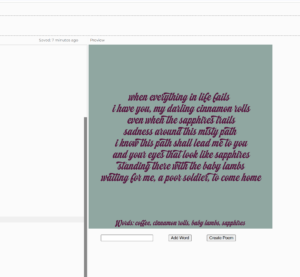
For this week’s assignment, I decided to create a generated text using p5.js.  As a fond lover of poetry and humour, I decided to write a code for a poem generator. Basically, the user would input 4 or more words, and the generator would place those words in an incomplete poem randomly. For this, I created an input box for the words, and a button for creating the poem. On click, the words are randomly placed in a pre-written incomplete poem, creating a unique and sometimes comical piece of poetry.

This is a screenshot from one poem I randomly generated.

One part of the code I’m particularly proud of is the input box. I never created these before so it was interesting to try something new.


// to create input box 
input = createInput();
input.position(40, height + 20);

// for 'add word' button
addButton = createButton('Add Word');
addButton.position(input.x + input.width + 50, height + 20);
addButton.mousePressed(addWord);

// for 'create poem' button
generateButton = createButton('Create Poem');
generateButton.position(addButton.x + addButton.width + 50, height + 20);
generateButton.mousePressed(writePoem);

I also  liked to experiment with new fonts, adding external files into the code for the first time.

function preload() {
  font = loadFont('machineryscript.otf')
}

Embedded sketch:

Overall, I am pretty happy with how my code turned out. I could definitely improve some aspects of it, maybe add some more elements, or create a refresh button. I would also like to try and add features more multiple random poems, instead of one.

Week 4 – Reading Response

  • What’s something (not mentioned in the reading) that drives you crazy and how could it be improved?

This right-handed desk chair is used in many schools and universities. I remember they had these chairs in my classroom during J-term in Paris, and even during some exams in high schools. The way they are designed doesn’t make it easy for some of us to actually use it efficiently.

  1. The work surface is way too small to actually keep all the necessary items on the tabletop. Keep your notebook, you don’t have space for your laptop, or your water bottle, or your pencil case. What’s the point of having a tabletop if it’s too small to use?
  2. The chair is quite literally designed for right-handed users. I have left handed friends who considered this chair as their No. 1 enemy. The fact that it isn’t accessible to about 10% of the world’s population speaks for itself.
  3. The stability and comfort factor. Since it’s going to be more weighted on one side, there is a high chance of wobbling and falling over. Moreover, these chairs are hard plastic, it’s not the most comfortable or built for prolonged usage.

How can we fix this? Personally, I believe that we can just eliminate this design from the world completely, but as designers we must find solutions, not exterminate problems (sadly). To fix this, I think we should increase the desk surface first. Introduce movable parts and extended writing surfaces for your extra stuff. Number two, consider a left handed version, maybe a side wing that can be tucked away. Finally, consider making the chair more ergonomic, a more comfortable material, and maybe even cushioned.

  • How can you apply some of the author’s principles of design to interactive media?

To apply the author’s principles in interactive media, I think we should consider discoverability and human-center designing. For example, using his principle of affordance, we can design a button in such a way that it looks like it is meant to be pressed. Or applying signifiers and using arrows in interactive art. We could apply theory of mapping, and structure a control in a way that users can navigate the page easily. We could also add interactivity to show quick feedback, maybe changing colours on clicking, or audio cues. Finally, we can design conceptual models or basic structures on “how to use” a specific interactive media piece.

Week 3: Reading Response

Before the reading, I thought interactivity was just another word for engagement. I thought that books, movies and anything with a user interface were interactive. But now, I understand that there is a difference between the two and that the word interactive has been majorly overused specially over the last couple of years and mainly for marketing purposes that it has lost its true meaning. Interactivity is closer to a conversation that includes the metaphoric acts of listening, thinking, and speaking (input, processing, output), while engagement is more of a one-sided conversation where there is only output (content) that the audience reacts to. 

What I consider to be the characteristics of a strongly interactive system is one that has all the features to make it interactive in the first place. It has to receive an input, process the  information and produce an output based on the input. All 3 aspects have to be good, and one cannot be the substitute of the other. Something highly interactive for me would make it easy for the user to input (good user interface), quickly process the information (have an efficient system) and produce an accurate output.

To improve the degree of interaction in my p5 sketches, I would try and work on each interactivity aspect individually so that they’re all equally good. For the input: I’d use more of the key and mouse functions and I would make the sketch more aesthetically pleasing, maybe including simple instructions for the user to understand what he’s supposed to do. For processing, I’d use more variables and OOP instead of hardcoding everything in order to make the code run smoother. And as for the output, I’d try and make sure that the program actually does what it’s supposed to do and that it is accurate in its reactions by testing multiple times.

Week 2: Random Faces

For this project, I got inspired by an animation of random skulls and so I decided to create random smiling faces since I find that using the arc function is somewhat of a challenge and I wanted to practice.The design is generated dynamically with each frame using random values for color and size to create a unique variation every time. The face is composed of basic shapes, including an ellipse for the head, a rectangle for the neck, and circles for the eyes.

My favorite part of this project was using variables to link the eyes and neck to the face so that they automatically adjust to the face’s size and position.

ellipse(skullX, skullY, skullW, skullH)
let neckX = skullX - skullW/4
let neckY = skullY + skullH/4
let neckW = skullW/2
let neckH = skullH/2
rect(neckX, neckY, neckW, neckH)
let eye1X= neckX
let eye2X = neckX +neckW
let eyeY = skullY - skullH/4

One challenge I faced was making the smile look natural. While the arc function works, I’d like to experiment with other approaches to create a more natural expression.

Things I’d like to improve is  adjusting the background colour. Since, it is  randomized, it sometimes blends too much with the skull, making it less visible. So refining how colors are assigned could enhance the contrast and visibility of the design. Also, I’d like to create random facial expressions instead of just a smile.

Week 2: Reading Response

Casey Reas’ talk about randomness, the intersection between chaos and order, and how art is a form of manifest result made me rethink my definition of what I consider art. I used to see art as paintings where an artist would express his thoughts using shapes or colours, or music where the musician expresses his feelings through notes. To me, art had to be a byproduct of human expression, random and never perfect. As a result I never thought of anything digital as art simply because there is no human aspect to it. However, Casey Reas’ talk about making something artificial have an organic quality made me reconsider. If we just apply natural randomness or disorder, we can make digital creations count as art. The way I plan to do that is by using human expression as inspiration for randomness, the same way buildings and body tissues were used in Reas’ talk. For example, I’d love to maybe use voice frequencies, heart rhythms or random patterns of brain activity to experiment and incorporate randomness into my work to create expressive digital paintings. 

I feel like the optimum balance between total randomness and complete control is somewhere in between. While randomness introduces unpredictability, making a piece feel organic and alive, control ensures coherence and intentionality. By setting parameters, we can guide the chaos in a way that still reflects human intent. As Casey Reas mentions we are the creators of the code and we can implement constraints even with randomness.