Reading Reflection – Week 4

I feel like I have spent a lot of time complaining about design issues throughout my life. That’s why I’m especially annoyed that it took me so long to actually think of them when I’m being given the platform to complain. But now I would gladly list the following two that drive me crazy:

The sensor faucets: I have been to so many bathrooms in malls and airports that require your hand to be so close to the sensor for them to work that if you move your hand away to actually wash it, the water stops running. I’ve literally had to keep one hand at the sensor while I attempt to wash one hand at a time. I understand the premise of sensors for water conservation, but this design can easily be improved if the sensor facility is designed such that it senses your hands at the right distance so that they can stay together under the running water.

The writing tablet chairs: My coaching center in the last 2 years of high school had these chairs, and they were my worst enemy. I hate everything about them. The table is too small, it is designed for right-handed people, I can’t get up without clearing the entire “table”, and I can’t rock the chair even a little bit without toppling over. Again, I understand that these were made for small spaces, but the design could be improved by making simple movable extensions for the table part (so at least a decent notebook can fit)  that people can add, make the material of the chair more comfortable so that students (who would be sitting on these for long durations) don’t have back pain, and introducing left-handed versions.

I think the way to apply the author’s principles of design to IM is by truly understanding this phrase that he uses, “emphasizing understandability and usability”. In my own sketches, I’ve noticed that I often rely too heavily on the assumption that my audience will share my intuition. But as Norman explains, intuition varies from person to person. What feels obvious to me as the creator may not be obvious to someone encountering the project for the first time.Therefore, my IM projects should have more signifiers to create more affordability in their designs. This can mostly be through visible cues that reduce ambiguity and increase chances for the user to know exactly how to interact with the piece. I think there is a sense of balance that can be achieved between intuition and explicit direction, and that sweet spot is what makes user interaction truly effective.

Week 4 – Reading Reflection

Reading Norman’s The Psychology of Everyday Things made me notice how often bad designs are excused focusing on the supposed incompetence of the users. For instance, his discussion of Norman Doors was something I could absolutely relate because on multiple occasions, I personally have pushed the wrong side of a glass door only to feel clumsy and inobservant even though, as he points out, the real failure is in the design and not the user (me). That shift, blaming the design instead of the user, was oddly liberating. It reminded me that designs should communicate clearly and if I can’t figure out, the system image is broken. I started thinking about my own sketches for the weekly productions in p5: sometimes when I code and interaction, I get worried that people may not use it ‘the right way.’ But Norman’s text made me realize that I am responsible for building the right signifiers, the visual or behavioral cues that make the action discoverable.

Another part that stuck with me was Norman’s point that designers often create for how they wish people behave, and not how they realistically behave. This discrepancy, I realized, is the reason behind a lot of products failing to flourish as much as they were projected to. I found myself guilty of the same, to be frank; I oftentimes assume people will read the readme.md file or be patient enough to try different keys until something interesting happens. But in reality, users tend much more to attain instant feedback/gratification from an interactive device in this age of technology. It is far beyond ambitious to expect users to get a PhD on my product before they put their hands on that.

Norman’s framework of affordances, signifiers, mapping, and feedback gave me a checklist (literally like a cheat code) that I can use in my projects. I will ask myself upon drafting the project whether it:

  • shows what’s possible through the interface
  • maps actions to outcomes naturally
  • provides a meaningful/satisfying feedback

I want to reimagine some of the (slightly) interactive sketches keeping Norman’s (very reasonable) propositions and later compare them with their counterparts to visualize the narrative I have already subscribed to.

Week 4 – Reading Reflection

Reading the first page of chapter one, I almost thought I was doing a reading on wayfinding–essentially the study of how we navigate our environment. Afterall, the push-pull dilemma of a door is pretty much universal regardless of what background and culture you come from. However, this chapter would continue to prove much more broad and discuss real world UX beyond putting handles on one-way push doors.

Norman comes from a background in engineering, so naturally interacting with machinery is something he has a vast perspective on. Let’s talk about where Norman says “When people fail to follow these bizarre, secret rules, and the machine does the wrong thing, its operators are blamed for not understanding the machine, for not following its rigid specifications.” In Crawford’s reading last week, he compared interaction to having a conversation, which I agree with for the most part. However, I do find it interesting that when a machine fails on us we understand the burden of successful “communication” is undoubtedly on us. This takes me away from the conversation analogy as there is always realistically no one solely at fault for a misunderstanding between two humans.

One of my favorite points of the reading is that we should strive for human-centered design(HCD). As Norman says, “Good design starts with an understanding of psychology and technology.” Realistically, how can there be design without a greater understanding of human cognition? For example, we all know what an arrow has a side it’s pointing at– the way its edges align to a sharp point naturally makes our brain look at the sharp point and what follows it.

That transitions nicely to how this applies to us interactive media majors. When it comes to applying Norman’s principles of design to interactive media, I believe we need to not only invite both like-minded and nonlike-minded friends to test our projects, but consider all their perspectives equally. As Norman says, “Engineers are trained to think logically. As a result, they come to believe that all people must think this way, and they design their machines accordingly.” We ideally should engage those who aren’t also “engineers.”

As for something that drives me crazy and how it could be improved, I really want to rework certain parts of highline pathing. There are certain areas especially near the staircases down to the ground floor that have such poor pathing. You would need to either walk over the grass or detour by a good 5 meters just to follow the intended path rather than your desired path. This semester they even added a bush on the grass area to block you from cutting through the grass– talk about remedial design…

Week 4 – Text Generative Art

For this piece, I wanted the text to be the artwork. I was drawn to generative typography and to the way Arabic calligraphy sometimes forms circles and wreaths. That felt right for motivation: words orbiting you like support. Using p5.js, I kept the idea simple: move, rotate, repeat and let those small rules create rhythm.

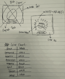
Before I touched the code, I mapped the whole idea on paper. I drew quick thumbnails of a circle in the center, tested where the English and Arabic lines should sit (which one tilts left/right), and marked the button at the bottom so the composition felt grounded. I sketched a few ring sizes to see how the wreath should feel, then noted font options next to each sketch (tall/condensed for English, warm/legible for Arabic). I even made a mini color chart with high-contrast pairs to keep legibility strong. That paper plan made the coding step feel like tracing: I wasn’t guessing; I was just implementing a layout I’d already tested by hand.

The code is organized so the flow is clear. In `setup()` I make the canvas, center the text, and place a button at the bottom. In `draw()` I set the background color, then call one function to draw the ring and another to draw the button. The ring function repeats the Emirati Arabic line around a circle  so it looks more like art created through text. Inside the ring, I tilt the English line one way and a slightly larger Arabic line the other way. When I click the button, the quote, colors change, so every press feels like a fresh poster.

Conceptually, I’m showing the message in two voices. English gives punch and clarity; Emirati Arabic gives warmth and a playful touch with design. The outer Arabic circle feels like community, something steady around me while the inner cross of lines pulls my eye back to the center. Bright, high-contrast colors keep it readable and energetic.

I did hit a bump halfway through when I started messing with Arabic fonts. The letters were not connecting and looked wonky, basically it was unreadable. This set me back a good two hours since I started on a new P5js file as Prof Mang suggested, with just the most simple form of the code before I realized the issue wasn’t my code; it was the font itself. Some fonts don’t include proper Arabic shaping, and p5 will fall back to whatever it can. Then I switched to a full Arabic font (like “Noto Kufi Arabic”) and Instead of downloading the font I embedded it into the HTML which fixed my problem. This was a good learning lesson as it gave me more confidence in my coding abilities. I was so sure that I had probably messed up the code, I didn’t even give myself a chance to consider that the font was the issue.

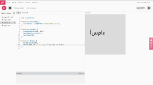
Here is an image of the issue I was facing:

I’m most proud of the code that draws the Arabic ring. It took me a while to understand not just how to do it, but how I wanted it to feel. I kept imagining the words circling like quiet encouragement, not static but not too free flowing, it was really about finding that in between. Getting there meant a lot of trial and error: turning things a bit, nudging them outward, letting each repetition change in a small way so it didn’t look stiff. When it finally worked, the text stopped feeling like code on a screen and started feeling alive. That moment when something frustrating becomes simple and meaningful is why this section is my favorite.

 // outer ring (Arabic repeated around a circle)
  textFont(AR_FONT);
  let r = min(width, height) * 0.38; // radius
  let copies = 24; // how many stamps
  let spin = frameCount * 0.005; // slow rotation

  for (let i = 0; i < copies; i++) {
    let angle = spin + (TWO_PI * i) / copies; // angle around circle
    let wobble = sin(frameCount * 0.02 + i) * 4; // tiny breathing
    let size; // Cycle the text size
if (i % 3 === 0) size = 16;
else if (i % 3 === 1) size = 18;
else size = 20;
    push();
    rotate(angle); 
    translate(0, -r + wobble); 
    textSize(size);
    text(quotes[qIdx].ar, 0, 0); 
    pop();
  }

Going forward, I want to push the typography and build patterns from text itself experimenting with new pairings (e.g., Amiri or Markazi), and exploring grids, spirals, lattices, and simple art made only from words. I’ll play with  rotation and translations to see how meaning shifts as the pattern changes. If I had more time to work on this I would focus more on the interactivity part and less on the generative art part. Although this made a cool visualization, maybe I could explore with the users typing a feeling which would then be met with a motivational quote to match/ respond to that feeling. Overall, this was a great learning experience and made me more confident in using text for generative art.

Week 4 – Reading Response

Reading Don Norman’s The Psychopathology of Everyday Things made me completely rethink how I interact with technology on a daily basis. One line that really stayed with me was Norman’s insistence that “the relevant components must be visible, and they must communicate the correct message” (pg. 3). I realized how often I silently blame myself when I struggle with a poorly designed interface, whether it’s an oven with cryptic icons, an elevator with unlabeled buttons, or even a website with a confusing layout. Norman flips that perspective and argues that it is the designer’s responsibility to make the user successful. That shift felt empowering. It reminded me that confusion is not a personal failing but often the result of flawed design.

One example that drives me crazy, which Norman doesn’t mention, is airplane in-flight entertainment systems. The touchscreens frequently misregister input, and there’s rarely any immediate feedback. Even on otherwise advanced planes like the Emirates A380, the interface feels outdated and uninspired. Sure, it plays movies and basic games, but there is so much room for innovation. Applying Norman’s principle of feedback could solve part of this problem: a simple progress indicator would reassure me that my action registered and prevent the endless cycle of frustrated tapping. Beyond that, design could take a leap forward by enabling features like screen-mirroring from passengers’ devices, turning the system into a productive and personalized workspace. As Norman argues, “discoverability” should make it obvious what is happening and how to proceed, even in a stressful environment like an airplane cabin.

I also saw direct parallels between Norman’s ideas and my own work in interactive media. His discussion of signifiers felt especially relevant. In my p5.js projects, I often rely on subtle cues like highlight effects, error messages, or color changes to guide the user’s next step without lengthy instructions. This reading made me more intentional about those choices: I now see them as part of creating a coherent conceptual model that helps users immediately understand what actions are possible. For instance, in my recent race-car animation project, I could add small speedometer icons that signal users to click the cars and make them go faster instead of just writing instructions on the screen which feels bland. This would transform the interaction from guesswork into an intuitive and engaging experience, exactly what Norman argues good design should do.

For class discussion, I keep wondering whether “invisible design” can actually go too far. Minimalism may look sleek, but as Norman points out, interfaces still need to guide users toward the right actions. I’m curious whether making an experience completely over-simplified might strip away the sense of play and discovery that makes interacting with technology satisfying in the first place.

Overall, I really enjoyed this reading because it challenged the way I usually think about design. I found myself agreeing with most of Norman’s arguments, especially his claim that bad design, not user error, is often the root of frustration. This idea resonated with me because it takes some of the pressure off the user and reframes design as a partnership between human and object. I also liked how approachable and almost conversational Norman’s writing style was, it made the large concepts and conceptual models feel accessible rather than overly academic. If I had to critique anything, it would be that at times the examples felt a bit dated (doors and washing machines don’t feel as urgent as today’s complex digital interfaces), but even so, the principles were timeless. Rather than feeling frustrated, I came away from this reading motivated to pay more attention to how things around me communicate their use, and to design my own projects with more empathy for the user.

Week 3 – OOP Assignment

Hi everyone,

For this week’s work on OOP, I wanted to build on what we did last time implementing a bouncing ball with OOP. I wanted to make it kinds more interactive this time. I wanted to take a familiar p5.js example and make it more dynamic by implementing proper OOP principles, allowing the balls to not only bounce off the walls but also collide realistically with each other.

I created a `Ball` class that bundles together all the data (properties like `x`, `y`, `xspeed`, `radius`) and the functions (methods like `move()`, `display()`, `bounceWalls()`) that define what a ball is and what it can do. This makes the main `sketch.js` file much cleaner and more manageable. Instead of tracking dozens of separate variables for each ball, I can simply create an array of `Ball` objects and let each object manage its own state. And this what gave me the freedom of creating a lot of new balls whenever the mouse is clicked.

One of the most interesting parts of this project was implementing the collision detection between the balls. A simple approach where every ball checks against every other ball can lead to a glitch where they get stuck. When Ball A collides with Ball B, they reverse direction. But in the same frame, when Ball B checks against Ball A, it reverses direction *again*, undoing the bounce.

The highlight of my code is the solution to this problem in the main `draw()` loop. By using a nested loop where the inner loop starts at `j = i + 1`, I can ensure that every pair of balls is checked for collision exactly once per frame. This prevents the double-bounce glitch and is much more efficient.

Here is the snippet for the collision logic:

for (let i = 0; i < balls.length; i++) {
for (let j = i + 1; j < balls.length; j++) {
let ball1 = balls[i];
let ball2 = balls[j];
// Check the distance between the two balls
let distance = dist(ball1.x, ball1.y, ball2.x, ball2.y);
// If they overlap, trigger the collision resolution function
if (distance < ball1.radius + ball2.radius) {
resolveCollision(ball1, ball2);
}
}
}

Week 3 – Exquisite Candidate

Inspiration

I found myself thinking about the current state of political discourse—how it often feels chaotic, random, and almost nonsensical. Arguments and personas could go totally random, as if different parts have been stitched together to form a strange new whole.

This immediately brought to mind ancient myths, like the 人头马身 (the centaur), a creature with the head and torso of a human and the body of a horse. This became my core visual metaphor: what if I could create political “centaurs”? I could randomly pair the heads of recognizable political figures with symbolic, abstract bodies to represent the absurdity and randomness of political rhetoric.

The project needed a name that captured this idea. I was inspired by the Surrealist parlor game, “Exquisite Corpse,” where artists collaboratively draw a figure without seeing the other sections. My program does something similar, but with political figures, or “candidates.” The name clicked almost instantly: Exquisite Candidate.

Description

Exquisite Candidate is an interactive artwork that explores the chaotic nature of political identity. By clicking the mouse, the viewer generates a new “candidate”—a hybrid figure composed of a randomly selected head and a randomly selected body.

The heads are abstract but recognizable vector drawings of political figures. The bodies are symbolic and thematic, representing concepts like power (“suit”), vulnerability (“stripped_down”), foolishness (“sheep”), or emotional immaturity (“baby with tears”). The resulting combinations are surprisingly (at least for me the creator) humorous or poignant, creating a visual commentary on the fragmented and performative nature of public personas. To bring these abstract figures to life, Gemini helped me generate part of the many vector-based drawing functions for the assets.

Code

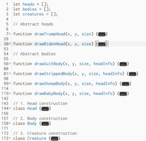
The program is built on an Object-Oriented structure with three main classes: HeadBody, and Creature. This keeps the code clean, organized, and easy to expand.

A challenge I encountered was with the “baby with tears” body. My initial design was simple: the Body object would draw itself, and the Head object would draw itself. But the tears needed to be drawn on the face, which is part of the Head object. How could the Body object know where the head was going to be drawn? Unfortunately, until submission, I haven’t figured out how to implement this successfully.

Week 3 – Digital Art

Unlike week 2, which lacked user interaction, I wanted this project to focus on having user interaction project an artwork. However, at the same time I didnt want user to think to much in producing the result. So I arrived at the conclusion of making the user press random keys to produce a sort of a simple artwork.

The artwork I was inspired by is from our video.

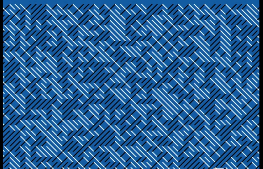
I noticed that if I have grids of the canvas with each grid having a random diagonal value, it can produce something like this. Of course, the same direction meant the same color.


The random colors are stored in an array that looks like this:

this.palettes = [
      ["#fefae0", "#606c38", "#bc6c25"],
      ["#0f0f0f", "#e63946", "#f1faee"],
      ["#f1f1f1", "#118ab2", "#ef476f"],
      ["#22223b", "#f2e9e4", "#c9ada7"],
      ["#faf3dd", "#2a9d8f", "#e76f51"]
    ];

The first is for the background of the canvas, the second one is for the left diagonal and the third one is for the right diagonal. I did no mention how to change the colors randomly. Feel free to explore and find out how to change colors. Pressing randomly keys might help.

placeRandomDiagonal() {
    //wait if full
    if (this.gridFull()) {
      return;
    }
    //get randomindex to palce the diagonal line
    const randIndex = floor(random(this.emptyIndices.length));
    const i = this.emptyIndices.splice(randIndex, 1)[0];
    
    //get random direction 1 is left 2 is right diagonal
    const dir = random([1, 2]); 
    //get random strokeWeight
    const w = random(1, 5);
    this.cells[i] = { dir, w };
    //call reset to check if its full
    this.scheduleAutoResetIfFull();
  }

This is the code that I wanted to share. This is the place Random Diagonal function, It first gets the random Index to palce the diagonal lines and chooses the random direction and random stroke weight. At the end the of the function it calls another function which simply checks if the grid is full. If it is, it calls the reset function.

//grid cells are stored in 1D array while canvas is 2D so this is to conver linear index to 2D position
//const x is column number
const x = (i % this.cols) * this.cellSize;
//row number
const y = floor(i / this.cols) * this.cellSize;

//each are multiplied by cell size to get pixel coordinates 
//ex cellsize is 20, col is 5 anat i =7. that means 7%5 = 2 column 2 which is 40, row is at 7/5 = 1 at 20, so index 7 maps to position 40,20


The hardest part about this code was the transition of 1D arrays to 2D canvas. Since the information that stores the grid cells are in 1D array, I had to find a method to map each index to a coordinate in the grid. This is done here, the specifics are explained in the comments.

For future Improvements, I think that making mouse clicks have another action on the artwork. Maybe changing the diagonal lines can make the artwork more interactive. Rather than diagonal, it can try different angles with each mouse click.

Week 3: PING (Objects & Arrays)

(up to two players! WASD for top side and IJKL/arrow keys for bottom side)

I thought about how I wanted to build upon what I had last week and I arrived at the idea of using something to interact with the bouncing ball mechanic. At first, I thought about making an air hockey game where you could drag the paddle but I didn’t know how to create an opponent that could respond to what you do. And it couldn’t be multiplayer since there’s only one mouse, which led me to using keyboard keys to control the paddles.

I began to build two separate objects that can be controlled by wasd and arrow keys respectively– a lot like the old web games I would secretly play in my computer science class with my classmates back in elementary school.

Using Classes and this.

Last week when I presented my project to professor Aya, she suggested that I learn how to use class so I could make it easier on myself to organize my code and objects. So this week I delved into classes and have a pretty good grasp on it now. Here are two classes I made– the ball and the top paddle.

class ball { //class creates a re usable template: let ball1 = new ball(x,y,r)
  constructor(xPos, yPos, radius){ //creates the initial state
    //this referes to the object currently being created
    this.xPos = xPos;
    this.yPos = yPos;
    this.radius = radius;
    
    this.ballXspeed = ballXspeed;
    this.ballYspeed = ballYspeed;
    this.ballMoving = false; //boolean to help reset ball
    
  }
  move() { //this is a method, a function that belongs to just one object
    if (!this.ballMoving) return; //if ball is still then do nothing
    
    this.xPos += constrain(ball1.ballXspeed, -maxSpeed, maxSpeed)
    this.yPos += constrain(ball1.ballYspeed, -maxSpeed, maxSpeed)
    
    //BOUNCE: CHECKS LEFT AND RIGHT EDGE
    if (this.xPos > width - this.radius || this.xPos < 0 + this.radius) { 
      this.ballXspeed *= -1;
    }  
  }
  
  reset(){
    this.xPos = width/2;
    this.yPos = height/2;
    this.ballMoving = false;
    
    //setTimeout(function, delay) delay is in milliseconds
    setTimeout(() => { //the arrow =>
      this.ballXspeed = random([-ballXspeed, ballXspeed]);
      this.ballYspeed = random([-ballYspeed, ballYspeed]);
      this.ballMoving = true;
    }, 2000);
  }
  
  scoreDetection(){
    //CHECKS TOP AND BOTTOM EDGES
    if (this.yPos > height - this.radius) {
      adjustScore(1,0); //top side scores 1
      this.reset();
    }
    if (this.yPos < 0 + this.radius) {
      adjustScore(0,1); //bottom side scores 1
      this.reset();
    }
  }//closes score detection
  
  display(){
    ellipse(this.xPos, this.yPos, this.radius *2);
  }
} //ends class ball
class topPaddle {
  constructor (xPos, yPos, paddleWidth, paddleHeight, xSpeed, ySpeed){
    this.xPos = xPos;
    this.yPos = yPos;
    this.baseY = yPos; //initial yPos 
    this.paddleWidth = paddleWidth;
    this.paddleHeight = paddleHeight;
    this.xSpeed = xSpeed;
    this.ySpeed = ySpeed;
  }
  
  display(){
    fill(255)
    rect(this.xPos,this.yPos,this.paddleWidth,this.paddleHeight);
  }
  
  move(){
    /* Keycodes
    W = 87
    A = 65
    S = 83
    D = 68
    */
    if (keyIsDown(87)){ //TOP
      this.yPos += this.ySpeed * -1; //negative because 0 counts down
    }
    if (keyIsDown(65)){ //LEFT
      this.xPos += this.xSpeed * -1;
    }
    if (keyIsDown(83)){ //BOTTOM
      this.yPos += this.ySpeed ;
    }
    if (keyIsDown(68)){ 
      this.xPos += this.xSpeed;
    }

    //RESTRICTIONS 
    this.xPos = constrain(this.xPos, xBoundary, width-xBoundary)
    this.yPos = constrain(this.yPos, this.baseY-yBoundary, this.baseY+yBoundary)
    
  } //closes move()
}

I really enjoyed using methods to help organize my code and operate on an object-oriented basis. 


Not too far into writing the classes for the paddles, I realized I was recreating the game pong. This is literally how pong was made– someone wanted to test bouncy ball physics and moving paddle collision and made pong.


Implementing Arrays

I already experimented with arrays last week when dealing with for() loops so this week I wanted to use them in a different way: to track scores for each side. I made two arrays– one called topCounter and one called bottomCounter. If the top side won round 1, they would have 1 added to their array and have it console.log’d into the console.


Designing with Variables

Since we learned push() and pop() in class last week, I’ve been wanting to use these techniques to make more organized stroke() and strokeWeight() functions. 


Beyond that, I used a lot of variables to help with the numbers so changing the variable number in the top of the code would change all of the related values throughout the code conveniently and often symmetrically. For instance, I would get the midpoints between the two ends of the lines to have the score number displayed there.

//LEFT CENTER LINE
    line(
      0,height/2, 
      0+sideLineMargin,height/2
    )
    //CENTER LINE
    line(
      (width/2)-centerLineMargin,height/2, 
      (width/2)+centerLineMargin,height/2
    )

//lots of code inbetween

// TOP SIDE SCORE
    text(topScore, 
        ((width/2)-centerLineMargin + 0+sideLineMargin)/2,
        height/2
        )

I also found the rectMode() and textAllign() functions to be incredibly helpful.


Adjust Gameplay Parameters

Initially, the back and forth between the two players felt very predictable and un-engaging. It was slow and ran at a consistent speed, which also meant there was only so many things you could do to change the trajectory of the bounce.


So I did two things, I made the paddles have way more vertical movement than it did initially, and I added a speed multiplier that really shaked the game at its core. 


Every time a player would collide their paddle with the ball now, the ball would speed up by 4%, which is seemingly small, but builds up very quickly to overwhelm players.

//BALL ATTRIBUTE
let ballXspeed = 6;
let ballYspeed = 5;
let speedUpFactor = 1.04; //105% each time it collides with paddle
let maxSpeed = 14; //limits the speed of the ball

//lots of code inbetween

if (ballCollidePaddle(ball1,topPaddle1,"Bottom")){
    ball1.ballYspeed *= -1;
    ball1.ballXspeed *= speedUpFactor;
    ball1.ballYspeed *= speedUpFactor;
}

However, it would get to a point where p5js wouldn’t really render it at a high enough fps for it to be fair to the players, so I added a max speed cap of 14-ish into the move() method for the ball to make sure it would be fast but not too the point of absurdity.


Difficulties Endured


Thankfully p5js didn’t crash half a dozen times during the development like it did last week, but I had some technical struggles.


When I built the second paddle object in the bottom, I completely forgot to constrain the y-value of the paddle which created quite a humorous moment when my girlfriend wanted to test the paddle movement with me.


The math behind colliding a circle with a rectangle was pretty confusing to figure out, but I also didn’t want to use circles as paddles so I tried a lot of methods until I made it work by checking the x-edges overlapping.

let xOverlap = 
    (ball.xPos + ball.radius > paddle.xPos - paddle.paddleWidth/2) &&
    (ball.xPos - ball.radius < paddle.xPos + paddle.paddleWidth/2);
  
  if (!xOverlap) return false; //checks if ball collided with paddle early

When I tried to embed it onto wordpress, the arrow keys kept trying to scroll the embed for me so I had to add another set of controls on IJKL.

Gameplay Strategy & Technique

In testing my friends and I found a few strategies and techniques that help with winning rounds. One of the strategies is to back up as the ball approaches max speed; this really helps by giving you more time to react and save the ball. 


Another technique we accidentally found out was double-tapping the ball to have it gain the speed multiplier several times on the same receive.


My friends and I had jolly fun playing against each other even if they thought the game was incredibly difficult.


Conclusion

I had a lot of fun making this project and learning how to use more tools in JavaScript. Making classes felt like an essential part of JS coding that I finally understood today. I can really feel my progress growing every week with every assignment.


I really hope I can repurpose the work I did in this project sometime in the future or even just play it with my friends whenever I open my p5js account.

Week 3 Reading Response

The reading defines interaction to be a cyclic process in which two actors alternately listen, think, and speak. Building on this, I see a strongly interactive system as one that sustains this cycle in a meaningful way, where the user feels their input is not only received but also interpreted in a way that shapes the system’s future responses. In other words, the system doesn’t just react once, but continues to evolve as the user engages with it. I think of strong interactivity as creating a sense of dialogue, where the user’s actions feel acknowledged and the system “remembers” or adapts over time. However, I don’t think strength alone guarantees a good interaction; too much responsiveness without clarity can overwhelm or confuse the user.

I am in the process of choosing my next interactive project for week 3. While I am still brainstorming, unlike week 2’s project that lacked user interaction, I want to create a project where user’s mouse interaction and possibly keyboard interactivity produces an artistic outcome. For example, I could design the sketch so that keyboard inputs that change the “rules of the system,” such as altering font sizes or styles, to produce something like looks like a digital caligraphy. This would make the sketch feel more like an ongoing exchange rather than a one-time reaction. Instead of static outputs, the artwork would emerge from the combination of system logic and user decisions. The key idea is to create a system where user’s input results in a artistic product. I’ll try to take this idea in a direct matter.