Week 5 – Midterm Progress

For my midterm, I knew I wanted to incorporate a machine learning library, specifically for gesture recognition. I initially explored building a touchless checkout interface where users could add items to a cart using hand gestures. However, I realized the idea lacked creativity and emotional depth.

I’ve since pivoted to a more expressive concept: a Mind Palace Experience (not quite a game), where symbolic “memories” float around the screen  – some good, some bad. The user interacts with these memories using gestures: revealing, moving, or discarding them. The experience lets users metaphorically navigate someone’s inner world and discard unwanted memories, ideally the painful ones. Here’s a basic canvas sketch of what the UI could look like.

At this stage, I’ve focused on building and testing the gesture recognition system using Handsfree.js. The core gestures, index finger point, pinch, open palm, and thumbs down, are working and will be mapped to interaction logic as I build out the UI and narrative elements next.

The code for different gestures.

function isPinching(landmarks) {
  const thumbTip = landmarks[4];
  const indexTip = landmarks[8];
  const d = dist(thumbTip.x, thumbTip.y, indexTip.x, indexTip.y);
  return d < 0.05;
}

function isThumbsDown(landmarks) {
  const thumbTip = landmarks[4];
  const wrist = landmarks[0];
  return (
    thumbTip.y > wrist.y &&
    !isFingerUp(landmarks, 8) &&
    !isFingerUp(landmarks, 12) &&
    !isFingerUp(landmarks, 16) &&
    !isFingerUp(landmarks, 20)
  );
}

function isOpenPalm(landmarks) {
  return (
    isFingerUp(landmarks, 8) &&
    isFingerUp(landmarks, 12) &&
    isFingerUp(landmarks, 16) &&
    isFingerUp(landmarks, 20)
  );
}

function isFingerUp(landmarks, tipIndex) {
  const midIndex = tipIndex - 2;
  return (landmarks[midIndex].y - landmarks[tipIndex].y) > 0.05;
}

The sketch link:

https://editor.p5js.org/sc9425/full/n6d_9QDTg

Week 5 – Midterm Assignment Progress

Concept

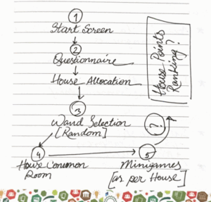
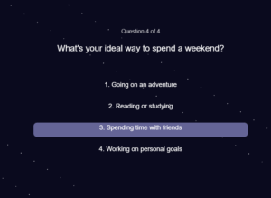
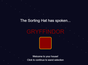
For my midterm project, I’m building an interactive Hogwarts experience. The player starts by answering sorting questions that place them into one of the four houses. Then they get to choose a wand and receive visual feedback to see which wand truly belongs to them. After that, the player will enter their house’s common room and either explore various components in the room or play a minigame to earn points for their house.

The main idea is to capture the spirit and philosophy of each Hogwarts house and reflect it in the minigames, so the experience feels meaningful and immersive. Instead of just random games, each minigame will be inspired by the core traits of Gryffindor, Hufflepuff, Ravenclaw, or Slytherin.

Design

I want the project to feel smooth and interactive, with a focus on simple controls mostly through mouse clicks. Each stage (from sorting, to wand choosing, to the common room minigames) will have clear visual cues and feedback so the player always knows what to do next.

For the minigames, I’m aiming for gameplay that’s easy to pick up but still fun, and thematically tied to the house’s values. The design will mostly use basic shapes and animations in p5.js to keep things manageable and visually clean.

Challenging Aspect

The part I’m still figuring out and find the most challenging is designing minigames that really match each house’s philosophy but are also simple enough for me to implement within the project timeline. It’s tricky to balance meaningful gameplay with code complexity, especially because I already have a lot of different systems working together.

Risk Prevention

To manage this risk, I’ve been brainstorming minigames that are easy to build, like simple clicking games for Gryffindor’s bravery or Memory games for Ravenclaw, while still feeling connected to the houses’ themes. I’m focusing on minimal input and straightforward visuals so I can finish them reliably without overwhelming the code.

Reading Reflection – Week 5

As Levin noted in the article, there is a wide range of opportunities to utilize computer vision for interactive projects in the real world. On the surface level, human vision and computer vision seem similar, but at their core, the differences between them are striking. Human sight is based on context and shaped by years of experience living life, but computer vision is technically just raw pixel data at the start. Computer vision depends on the compatibility of the image with its abilities. If we give it the image of a person in different lighting or a new angle, it can result in unexpected processing outcomes, even though our human vision can easily identify that it’s the same person.

To help computers track what we’re interested in, I think it comes down to building a contrast between the object we wish to scan and its immediate surroundings. The author mentioned several techniques for doing this, such as frame differencing, which compared changes between video frames, background subtraction, which identified what was new compared to a static scene, and brightness thresholding, which isolated figures using light and dark contrasts. What I found most interesting was the use of difference in movement in the Suicide Box project, where it was the odd vertical motion of the persons that was the contrasting event in the image, and what the computer consequently identified as the target.

That said, computer vision’s capacity for tracking and surveillance makes its use in interactive art complicated. On one hand, it can make artworks feel so much more alive, and on the other, like in the Suicide Box project, it leads to significant controversy and even disbelief that the recordings could be real. It’s also interesting to think that what computer vision did in the Suicide Box project, human vision could never do, at least without causing the observer lifelong trauma. So computer vision does not just enable interactive art, but helps raise questions about privacy and control, and reflects cultural unease with the idea of being watched. 

I would also like to add how cool I find it that I’m now learning about these technologies in detail, when as a child I would go to art and science museums to see artworks that would use this technology and leave me feeling like I just witnessed magic; a similar feeling when I got my Xbox One and all the sports games would detect my movement as the characters’.

Week 5 – Reading Reflection

What I enjoyed most in this piece is how it drags computer vision down from the pedestal of labs and military contracts into something artists and students can actually play with. The examples, from Krueger’s Videoplace to Levin’s own Messa di Voce, remind me that vision doesn’t have to mean surveillance or soulless AI pipelines. It can also mean goofy games, poetic visuals, or even awkward belt installations that literally stare back at you. I like this take, it makes technology feel less like a monolith and more like clay you can mold.

That said, I found the constant optimism about “anyone can code this with simple techniques” a little misleading. Sure, frame differencing and thresholding sound easy enough, but anyone who’s actually tried live video input knows it’s messy. Lighting ruins everything, lag creeps in, and suddenly the elegant vision algorithm thinks a chair is a person. The text does mention physical optimization tricks (infrared, backlighting, costumes), but it still downplays just how finicky the practice is. In other words, the dream of democratizing vision is exciting, but the reality is still a lot of duct tape and swearing at webcams.

What I take away is the sense that computer vision isn’t really about teaching machines to “see.” It’s about choosing what we want them to notice and what we conveniently ignore. A suicide detection box on the Golden Gate Bridge makes one statement; a silly limbo game makes another. Both rely on the same basic tools, but the meaning comes from what artists decide to track and why. For me, that’s the critical point: computer vision is less about pixels and algorithms and more about the values baked into what we make visible.

Week 5 – Reading Reflection

The moment I started reading the article I immediately recognized Myron Krueger’s Videoplace from my first week in Understanding IM; I remember it because Professor Shiloh explained that Kreuger was actually manually adjusting the project in the background but making it appear to audiences like an automatic feedback loop. At the time, only computer specialists and engineers had access to complex computer vision technologies; this story is a reminder to me that the development tools that we now take for granted have only become accessible to the majority of the population in the past decade.

How does computer vision differ from human vision?
In the simplest sense, I believe computer vision lacks perspective and has an innate lack of context. Where humans lack in high processing speeds, they make up for in their innate flexible perception of reality of what is in front of them. They ask questions or make comparisons to what may not necessarily be the objectively closest comparison.

When it comes to perspective in AI– artificial intelligence didn’t grow up with an innate curiosity about the world no matter how many “Hello, World!”s it says. A human can look at a boy and a girl who always hang out together and assume romantic context but an AI wouldn’t know that innately; that’s probably why the trope of AI learning human emotions from watching their movies and media is such a common one in our fiction pieces.

Techniques to help the computer see / track what we’re interested in?
I believe the article mentions using bright lighting or at least high contrast backgrounds. However, I’m sure that image training is also very important in today’s computer vision.

Effect of tracking & surveillance in interactive art
I remember when I got my Xbox 360 as a kid and got the Kinect system bundled alongside it. It was such a revolutionary technology back then and now we can recreate the same thing on the software side with just a webcam on p5js! That is incredibly impressive to me.

I never even considered computer vision in surveillance until I read the piece on Suicide Box, which recorded real tragedies of people taking their lives at the Golden Gate bridge. What surprised me is how port authorities counted thirteen in the initial hundred days of deployment whereas the suicide box with its computer vision recorded seventeen. That’s four human lives that were tragically lost and possibly forgotten.


Week 5 – Midterm Progress (VERY) rough draft

(VERY ROUGH) draft of my game

For my midterm project I am designing an interactive memory game called Garden of Sequence. The idea is inspired by the concept of a magical garden where flowers “light up” in a sequence, and the player must repeat the pattern. Each round, the sequence grows longer and playback gets faster, which challenges the player’s short-term memory and focus. The interaction is simple but engaging: the player begins at a menu and presses Enter to start the game. During the playback phase, the game shows a sequence of flowers highlighted one by one with a circle (which i will later change to a glow or shine). Once playback ends, the player’s turn begins, and they must click the flowers in the same order. If they are correct, the game advances to the next round with a longer sequence. If they are incorrect, the game ends and a restart option appears. At any time, pressing “R” resets the game to the menu so a new session can begin.

Right now, I’m starting off with the bare bones of the game and keeping things simple. I’m not too focused on visuals or polish yet because I want to make sure the core concept, gameplay mechanics, and basic UI are working first. The prototype is built with a very clear structure: the flow of the game is controlled by four states, MENU, PLAYBACK, INPUT, and GAMEOVER. Each state decides what gets drawn on the screen and how the player can interact at that moment. I also created a Flower class to represent each clickable flower, which stores its position, size, color, and index. The class has a draw() method to show the flower and a contains() method to check if the player clicked inside it. The flowers  are just circles for now just as placeholders. Other functions like startGame(), restartGame(), and prepareNextRound() handle moving from one round to the next, while makeSequenceForRound() creates a random sequence with the correct length for each round. The updatePlayback() function is what plays the sequence back to the player, it shows which flower is active by drawing a simple white outline circle around it (which will later replace with a glow or other visual effect). Interaction is kept basic: the Enter key starts the game, the R key restarts it, and clicking on the flowers lets the player try to repeat the sequence.

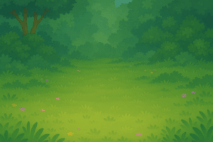
NOT YET IN PROTOTYPE BUT PLANNED FOR THE ACTUAL GAME: When designing the visual elements for Garden of Sequence, I wanted to blend AI-generated assets using chat gpt with my own creative touch. I used AI tools to quickly generate base images such as the background, which gave me a solid starting point and saved time on initial drafts. From there, I created a logo and customized it in Procreate, adding hand-drawn details, adjusting colors, and layering text with the flowers so they felt more personal and unique to the game. For the flowers I used images from google that I liked and removed their backgrounds to make them a png, and tweaked minor details in them to make sure they looked like what I want for my actual game. This mix of AI efficiency and manual drawing allowed me to create visuals that are polished but still carry my own artistic style. Its important to note that these elements are not yet in the prototype but will be added to the actual game later on.

Background:

Flowers: Game Logo for cover page:

The most intimidating part of this project was figuring out how to handle the playback of the sequence and the checking of user input without overlap. The challenge was not only to generate a random sequence but also to display it one flower at a time, with pauses in between, and then smoothly transition to the input phase. If playback and input overlapped, the game would feel broken. To minimize this risk, I stripped the game down to its simplest form. Instead of complex glowing graphics, I used a basic white circle to indicate the active flower. I tested different sequence speeds and lengths until the loop felt reliable. By reducing the visuals and focusing on the sequence logic, I was able to confirm that the core mechanic works before moving on to more complex features such as the sound and design. I’m excited to mess around with the sounds, I feel like it will add a lot of depth to my game especially when users click and get the sequence right I can add a positive noise and an error noise if they get it wrong.

This prototype demonstrates the essential gameplay loop and shows that the memory challenge mechanic actually works in p5.js. With the hardest logic already tested, I now feel confident adding more polished elements such as custom flower drawings, glow animations, sparkles, and ambient sound. The prototype also sets up room for future features like score tracking, or maybe even weather events that could make gameplay more dynamic. Starting small and addressing the most uncertain part first gave me a working structure to build on, along with a clear plan for how to transform this into a polished final project.

Week 5 – Reading Response (Computer Vision for Artists and Designers)

Reading Computer Vision for Artists and Designers made me realize how differently machines interpret the visual world compared to humans. Where my eyes and brain can immediately recognize faces, objects, and contexts, a computer sees only streams of pixel data without inherent meaning. That difference kinda amazes me: what feels intuitive for me (like noticing the mood on a friend’s face) must be translated into measurable rules for the computer, such as brightness thresholds or background subtraction. This gap forces me to think about vision not as a natural act but as a series of constructed processes, something that both reveals the limits of human assumptions and opens new artistic possibilities.

The text also showed me that helping computers “see” isn’t only about coding better algorithms but also about designing the physical environment to be legible to the machine. Techniques like backlighting, infrared illumination, or retroreflective markers are surprisingly simple but effective. I found this point significant because it shifts responsibility back onto the artist or designer: we’re not just programming systems but curating conditions where vision becomes possible.

What I can’t ignore, though, is how these same techniques can easily blur into surveillance. Works like Lozano-Hemmer’s Standards and Double Standards or Jeremijenko’s Suicide Box made me uncomfortable precisely because they expose how tracking technologies, even when playful or artistic, carry power dynamics. If a belt can silently follow me or a camera can count unacknowledged tragedies, then computer vision isn’t neutral, it’s political. This makes me question: when I use vision algorithms in interactive art, am I creating a playful experience, or am I rehearsing systems of control?

For me, the text ultimately sharpened a tension: computer vision is at once liberating, because it expands interaction beyond a keyboard and mouse, and troubling, because it normalizes being watched. As a student studying Interactive Media, I feel I must navigate this duality carefully. A question that stuck with me is how to design works that use computer vision responsibly, acknowledging its history in surveillance, while still exploring its potential for creativity and embodiment.

Week 5 – reading

  • What’s something (not mentioned in the reading) that drives you crazy and how could it be improved?

I wis Norman’s analysis went deeper into economic incentives behind poor design. While he touches on cost-cutting measures, like companies using “the least expensive sound device” that can only beep, or single lights with confusing flash patterns instead of clear displays, he doesn’t fully address whether some companies intentionally create poor user experiences.

I suspect many businesses actually profit from user confusion. Think about subscription services with deliberately maze-like cancellation processes, or software that makes basic functions require premium upgrades (Dark UI/UX patterns). Norman notes that when people struggle with technology, “the people are blamed for not understanding the machine” – but this blame-shifting can be profitable through tech support fees, extended warranties, or forcing users toward expensive premium versions. Apple is notoriously known for doing this.

Norman hints at this when discussing cost reduction forcing designers to use inadequate feedback systems, but I wish he’d been more direct about the perverse economic incentives. Sometimes bad design isn’t just oversight – it’s strategy. Companies know users will adapt and memorise workarounds rather than switch products, especially when switching costs are high.

  • How can you apply some of the author’s principles of design to interactive media?

In my interactive media and web design work, I constantly rely on Norman’s concept of discoverability. Having built apps and websites, I’ve learnt there are established conventions most users already understand – the hamburger menu, colour changes indicating clickable text, or standard navigation patterns.

These conventions work as what Norman calls “signifiers”, they provide clues about what actions are possible and where to perform them. When I use a familiar icon or follow expected layout patterns, I’m leveraging users’ existing mental models rather than forcing them to learn arbitrary new systems in the hopes of a simpler smoother user experience.

Norman’s principle of natural mapping is also significant. Just as he advocates arranging light switches to match the pattern of the lights they control, I arrange interface elements to match users’ spatial expectations. Navigation goes where people expect it, buttons look like buttons with proper visual hierarchy, and interactive elements behave as they should.

The key insight I take from Norman is that good interactive design should feel invisible – users shouldn’t have to think about how to use it. I should be able to show my work to someone who hardly interacts with websites and be confident that they will able to navigate around my work without additional instructions. If I have to add text for something simple, it is a good indicator that I didn’t design my solution well.

Week 4 – Persian generative text

Inspiration

For this week, I was really struggling on what to do I was prompting with Claude AI and decided to go with the generative text option. I knew I wanted to do something with a different language and then decided to go with my mother-tongue, Farsi. Persian poetry is famous and so I wanted to choose a quote that had a theme, replicate that theme in p5.js with shapes and colours.

My name in Farsi ‘خاطره’ means memory, remembrance, longing – something along those lines. It was difficult to find old poetry with that word as it is more modern but I liked the theme of memories and love so I went with the following line from Rumi – Masnavi (مثنوی معنوی)

Rumi is a 13th century poet and was known for his work regarding mystical themes in Islam (Sufism). Majority of his work is in Persian and very famous.

Idea

This was the quote I went with.

let poem = {
persian: “بشنو از نی چون حکایت می‌کند، از جدایی‌ها شکایت می‌کند”,
transliteration: “Beshno az ney chon hekayat mikonad, Az jodayiha shekayat mikonad”,
english: “Listen to the reed flute, how it tells a tale, complaining of separations”,
};
I wanted the words to be floating around, referring to ‘separation’, and. I want the colours / shapes to be pink, hearts just to refer to love.
I also wanted the user to be able to see the quote altogether so that they can see the final image.

Heart

There is no heart shape in p5.js so I was looking at different examples with math function and came across this link. The artist uses sin and cos functions to connect the hearts.  https://editor.p5js.org/marlontenorio/sketches/M_BGUpfKL

I edited it to suit the image in my mind. I made it a function with the size parameter because I wanted the heart to have some sort of pounding effect.

drawHeart(size) {
        beginShape();
        let s = size * 0.5;
        for (let t = 0; t < TWO_PI; t += 0.1) {
            let x = s * (16 * pow(sin(t), 3)) * 0.03;
            let y = -s * (13 * cos(t) - 5 * cos(2*t) - 2 * cos(3*t) - cos(4*t)) * 0.03;
            vertex(x, y);
        }
        endShape(CLOSE);
    }

Interactivity

Click Mouse

I wanted the user to be able to add words or hearts when the mouse is pressed.

function mousePressed() {
    hearts.push(new Heart());
    texts.push(new Text(mouseX, mouseY));
    
    // Limit elements
    if (hearts.length > 15) hearts.shift();
    if (texts.length > 15) texts.shift();
}

I added a limit so the program won’t be too complex. The words added would be from either the Persian, transliteration, or English – and at the point of the mouse. The hearts would simply be added randomly on the canvas.

SpaceBar – pressed

I wanted a way for users to add more words to screen, but a bunch of words. So I added the keyPressed function for the spacebar so that they user can see more words at once.

function keyPressed() {
    if (key === ' ') {
        for (let i = 0; i < 3; i++) texts.push(new Text());
    }


A / a – pressed

I wanted a way for the user to see the 3 versions of the poem at once, so I just used the A button as that trigger.

I have a Text class that will choose random words from the 3 lines verses and then have the floating simulation similar to the hearts. I also wanted these words to have some lifespan and disappear into the background slowly to reference the theme of the separation and memory.

class Text {
    constructor(x = random(100, width-100), y = random(100, height-100)) {
        this.x = x;
        this.y = y;
        this.text = this.getRandomText();
        this.size = random(14, 20);
        this.life = 0;
        this.maxLife = random(400, 800);
        this.dx = random(-0.3, 0.3);
        this.dy = random(-0.2, 0.2);
    }

Here is the display function and how it uses alpha to dictate the opacity. Depending on the life value, the opacity of the text changes.

display() {
    let alpha = this.getAlpha();
    if (alpha <= 0) return;
    
    push();
    textAlign(CENTER, CENTER);
    textSize(this.size);
    fill(340, 50, 90, alpha);
    noStroke();
    text(this.text, this.x, this.y);
    pop();
}

// calculate the opacity value for fading 
getAlpha() {
    let ratio = this.life / this.maxLife; // value between 0 and 1
    // fade in at the first 20% of life
    if (ratio < 0.2) return map(ratio, 0, 0.2, 0, 0.8);
    // fade out at the last 20% of life
    if (ratio > 0.8) return map(ratio, 0.8, 1, 0.8, 0);
    // stay mostly visible in the middle
    return 0.8;
}

Complete poem texts

Whenever the ‘a’ button is pressed, I would add the whole lines of poetry to the texts variable so that it would float around exactly like the singular words. I also added the life parameter as the same so that they disappear at the same time.

function showCompletePoem() {
    texts = [];
    let centerX = width / 2;
    let startY = height / 2 - 60;
    
    // add complete poem texts
    let persian = new Text(centerX, startY);
    persian.text = poem.persian;
    persian.size = 24;
    persian.maxLife = 1200;
    texts.push(persian);
    
    let transliteration = new Text(centerX, startY + 50);
    transliteration.text = poem.transliteration;
    transliteration.size = 18;
    transliteration.maxLife = 1200;
    texts.push(transliteration);
    
    let english = new Text(centerX, startY + 100);
    english.text = poem.english;
    english.size = 20;
    english.maxLife = 1200;
    texts.push(english);
}

It is also important to remove ‘old’ texts from the array once their life is ‘complete’. This gets checked in the draw function.

// remove old texts
texts = texts.filter(text => text.life < text.maxLife);

Next time

Next time, I would definitely want to add some flute noises to really tie the piece together. Next time I should probably add some message to indicate which key / mouse action equates to each action.

Outcome

Week 4: Passing Moments (Data Visualization)

(higher amplitude = longer sleep; larger frequency = longer lifespan)

Conception

In this project I wanted to demonstrate the idea of passing moments and how your total lifespan affects how fast you may perceive each moment. Since I love animals, the project started with me just wanting to play around with some data regarding animals; however, I was struggling to find something interesting.

At first I had some data with brain mass and wanted to compare each animal’s brain mass to body mass ratio using circles but it ended up looking very bland so I completely scrapped that sketch.

Then I looked around online for some more databases until I found one that had both lifespan and sleep durations. I thought I could perhaps make something to visualize the impermanence of life and demonstrate the idea of “passing moments.” You could say it’s a bit of a memento mori in a way for both you and the animal mentioned on screen.

Development

I was thinking of how I could represent lifespan and I thought about the heart rate monitors beside hospital beds. I thought perhaps I could use sin waves to represent life span and have the amplitude and frequency be scaled with different things, so that’s what I went with.

I matched the frequency with their life span 

let frequency = map(chosenMammal.lifeSpan, 2, 80, 0.02, 0.08);
...
sin(x*frequency - frameCount * 0.1)

Then I matched the amplitude with hours of sleep per day

let sleepHours = chosenMammal.totalSleep;
let ampMult = 8;
...
let y = height/2 + sin(x*frequency - frameCount * 0.1) * sleepHours * ampMult;

Together, I was able to use the beginShape() and endShape() functions to create a continuous animated sine wave for the mammal. However, that felt like it lacked a frame of reference so I added another wave behind it in gray to represent humans. This way, it could really put into perspective just how fast each moment for us vs the chosen mammal was. I was quite proud of how this part turned out.

function drawSleepSpiral(chosenMammal, color){
  let sleepHours = chosenMammal.totalSleep;
  let ampMult = 8;
  let frequency = map(chosenMammal.lifeSpan, 2, 80, 0.02, 0.08);
  
  push();
  noFill();
  
  if (chosenMammal == allMammals[21]){ //21 is human
    stroke(200);
  } else{
    stroke(color);
  }
  
  strokeWeight(6);
  beginShape();
    for (let x = 0; x < width; x+=1){
      let y = height/2 + sin(x*frequency - frameCount * 0.1) * sleepHours * ampMult;
      vertex(x,y);
    }
  endShape();
  pop();
}

I wasn’t happy with how the default font looked so I loaded in a very beloved font, Helvetica, into the project with what we learned last week.

textFont("Helvetica");
textAlign(CENTER, CENTER);

I was also thinking of adding a text input for the user to put in how many hours they sleep and compare that to the mammal onscreen but I felt like that took away from the idea of lifespan and sounded more like I wanted the user to acknowledge how healthy their sleep schedule was, which I thought would greatly detract from the memento mori effect I was aiming for.

Lastly I added a mousePressed function to cycle through the database without having to hit the start button each time.

function mousePressed(){
  chosenMammal = random(allMammals); // switch to a new mammal on click
  randomColor = random(colorArray); //changes to a random color with the same click
}
Conclusion / Difficulties Endured

I didn’t even realize I could upload my own files and create folders in the sketch files until this past week so this production piece provided me with a lot more insight into what p5js is capable of.

I initially had some trouble figuring out how to get the data out from the CSV file in a natural and efficient way but then I remembered I could extract each column data as a separate characteristic of my object like this:

for (let i = 0; i < table.getRowCount(); i++) {
  let mammalObject = {
    species: table.getString(i, "Species of animal"),
    bodyMass: table.getNum(i, "Body Weight (kg)"),
    brainMass: table.getNum(i, "Brain Weight (g)"),
    totalSleep: table.getNum(i, "Total sleep (hrs/day)"),
    lifeSpan: table.getNum(i, "Maximum life span (years)")
  };
  allMammals.push(mammalObject) //now i can obtain mammalObject.bodyMass for instance
}//closes for() after appending all mammals

This made the process of finding specific attributes of the chosen mammal so much more convenient and efficient.

I also made sure credit the source of my database at the very end of my code: https://gist.github.com/yppmark/d907dc265a84cac76ba7