Midterm Project: OOO – EEE

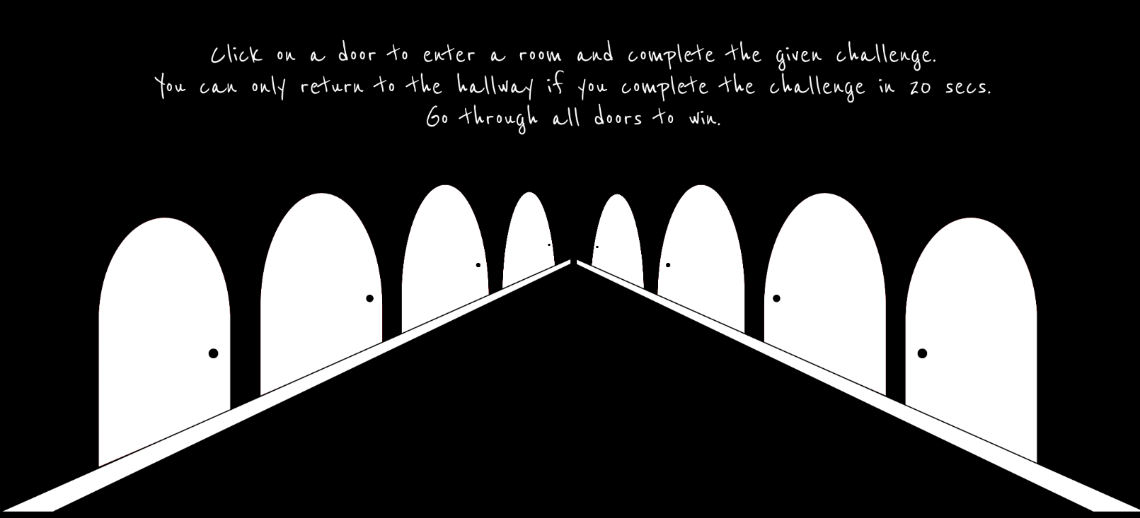
I made a game before that was controlled with keyboard inputs so this time, I wanted to create a game that used different input.
As I was scrolling through Youtube Shorts to find inspiration of my project, I came across a simple game playable with user’s pitch levels. In the video I watched, the character moved up and forward depending on the level of pitch. With this in mind, I tried making simple programs that took user input.


First, I built a program that detected a specific pitch, in this case “C”. If the user sings the pitch, the block is moved upwards and if the user maintains the same level for certain amount of time, the block permanently moves upwards. I made this because my initial strategy was to make a adventure game where the character travels a 2D map and make certain interactions that triggers things such as lifting a boulder with a certain note. This little exercise allowed me to get familiar with sound input and how I can utilize it in the future.

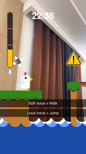
For my midterm, I decided to create a simple game that uses paddles that move left and right. The goal of the game is to catch the falling objects with these moving paddles. The hardest part about the game was obviously moving the paddles depending on the user’s pitch. At first, the paddles were so sensitive to the point that its movement was all over the place even with a slight input of sound. Adjusting that and making it so that it moves smoothly was the key in my game.

While I was testing for movements, I realized that I was making sounds that resembled a monkey. I was making the sounds OOO for the low volumne and EEE to make high pitched noise. So I came up with a clever idea to make the game monkey-themed with falling objects being bananas and the paddles as monkey hands. It made me laugh thinking that the users would have to immitate monkeys in order to play the game. Also, I added a little feature in the end to replay the sound that the players made while playing my game so that they can feel a bit humilliated while playing the game. I thought this was a great idea to bring some humor in my game. I also had to test this multiple times making the game and had to experience it beforehand.

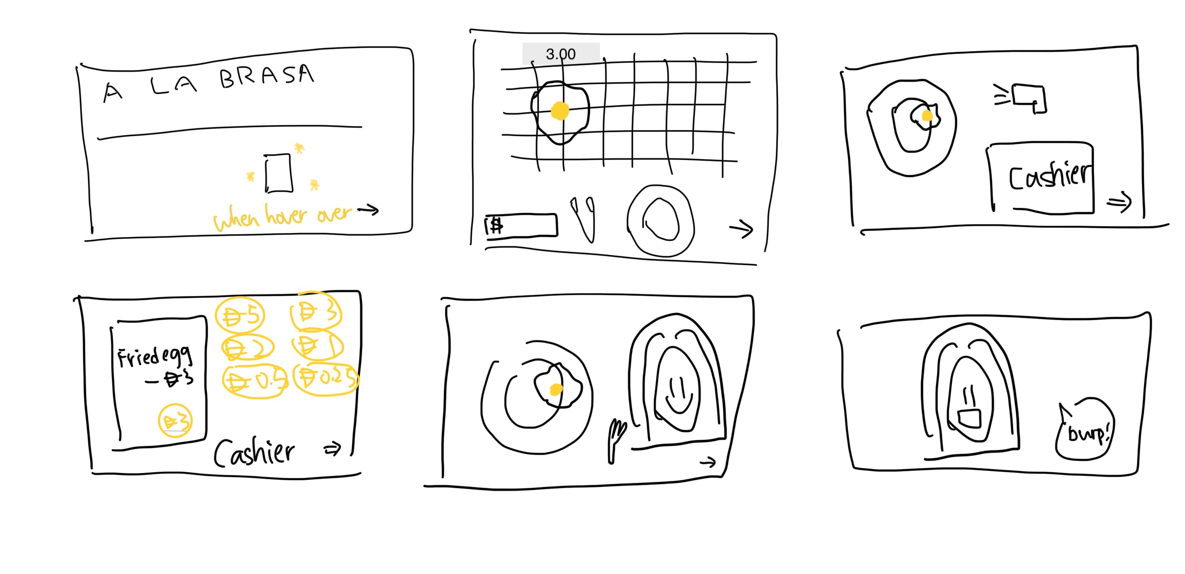
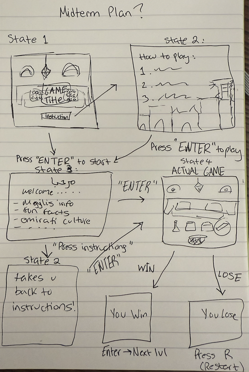
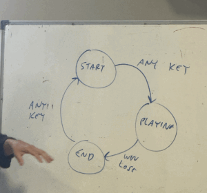
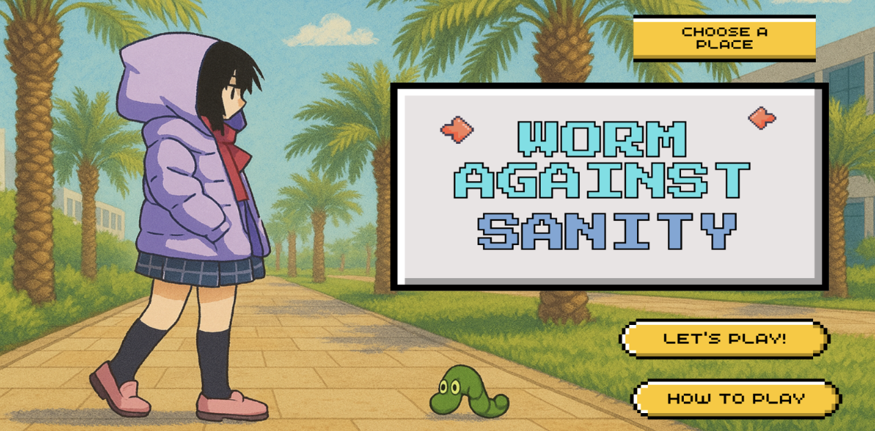
My game is divided into 4 major stages: start screen, instructions, gameplay, and gameover screen. As explained in class, I utilized the different stages so that resetting was easiler.

The startscreen is the title screen. It has 3 buttons: instructions, play and full screen button. Clicking the buttons make a clicking sound. That is the only sound feature I have since my gameplay is hugely effected by sound. Any background music or sound effects effect how the game is played so I kept it to the minimum. Also, making the game full screen effects the game play, so I had the fullscreen feature to fill everywhere else with black.

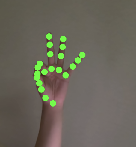
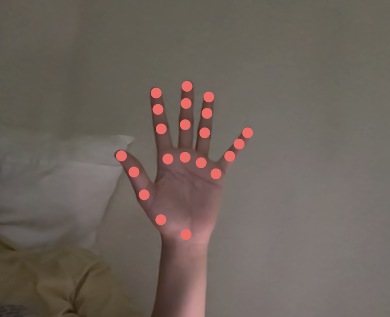
Before playing the users can click the instructions page to find out the controls and calibrate their pitch range. I deliberately say to use OOOs and EEEs for the pitches so that they can sound like monkeys. These pitch ranges are adjustable with up and down arrows and are stored in the local storage so that the settings remain even after resetting the game. I also show a live paddle so that the users can see how their voice with move the hands.

Once they hit play, the core loop is simple: bananas spawn at the top and fall; the goal is to catch them with the monkey “hands” (the paddle) at the bottom. I map the detected pitch to x-position using the calibrated min/max from instructions, I clamp the raw frequency into that window, map it to the screen’s left/right bounds (so the hands never leave the canvas), then smooth it. To keep control stable I added a small noise gate (ignore very quiet input), a frequency deadzone (ignore tiny wiggles), linear smoothing with lerp, and a max step cap so sudden jumps don’t overshoot. the result feels responsive without the little movement I had early on. The player scores when a banana touches the hands and loses a life on a miss; three misses ends the round.

When the run ends, the gameover screen appears with the background art, a big line like “you got x bananas!”, and two buttons: “play again” and “did you sound like a monkey?”. during gameplay i record the same mic that powers pitch detection; on gameover I stop recording and let the player play/stop that clip. it’s a tiny feature, but it adds a fun (and slightly embarrassing) payoff that matches the monkey concept.


I’m especially proud of how I handled pitch jumps. early on, tiny jitters made the hands twitchy, but big interval jumps still felt sluggish. I fixed this by combining a few tricks: a small deadzone to ignore micro-wiggles, smoothing with lerp for steady motion, and a speed boost that scales with the size of the pitch change. when the detected frequency jumps a lot in one frame (like an “ooo” to a sharp “eee”), I temporarily raise the max movement per frame, then let it settle back down. that way, small fluctuations don’t move the paddle, normal singing is smooth, and deliberate leaps produce a satisfying snap across the screen without overshooting. Getting this balance right made the controls feel musical.

For future improvements on the game itself, I want to smooth the frustration without losing the funny chaos. Bananas don’t stack, but several can arrive in different lanes at the same moment, and with smoothing plus a max step on the hands, some patterns are effectively unreachable. I kept a bit of that because the panic is part of the joke, but I’d like the spawner to reason about landing time instead of just spawn time, spacing arrivals so that at least one of the simultaneous drops is realistically catchable. I can still sprinkle in deliberate “double-arrival” moments as set pieces, but the baseline should feel fair.

Midterm Project Documentation: All Day Breakfast

Sketch(f for fullscreen): https://editor.p5js.org/joyzheng/full/tb0uwj2nP

Overall Concept

As a visiting student at NYUAD, I found the made-to-order dining system, particularly at the All Day Breakfast counter, to be very confused. Unlike the pre-made options I was used to, the text-only menus made it difficult to visualize my order. I always confused what and how many did I ordered if there’s no picture (some are arabic food I don’t know) and I often found myself pulling out a calculator to see if my selections added up to a full meal plan.

These frictions made me want to digitalize the experience to an interactive game that aims to gamify the ordering process. The core goal is to provide a more intuitive and visual way for players to assemble a meal, manage inventory, understand the costs, and manage their spending. By turning the process into a game with clear steps and rewards (badges), the project transforms a problem/demand discovered in my life into an engaging and replayable experience.

How It Works

The game guides the player through a six-scene narrative that mirrors the real-life process and menu of getting food at the D2 dining hall A LA BRASA All Day Breakfast Counter.

UI Prototype:

UE:

Scene 1:

Start Screen: The player is presented with the All Day Breakfast counter and prompted to “Ready to Order?”. Clicking the triangle button begins the game. The badge board is also displayed here, showing the player’s progress.

Scene 2:

Choose Food: The player is shown a grill with all available food items. They must first click to pick up a pair of tongs, which then attaches to their mouse. They can then click on food items to pick them up and click on the plate to add them to their meal. The total cost is updated in real-time.

Scene 3:

Scan Items: The player takes their plate to the cashier. They must pick up the scanner tool and move it over each food item on the plate. As each item is scanned, a beep sound plays, and the item is added to a virtual receipt.

Scene 4:

Payment: The cashier opens, revealing a coin tray. The player must pay the total amount shown on the receipt by clicking on coins from a palette and dropping them into the tray.

Scene 5:

Eat: The player sits down to eat. They must pick up a fork and use it to pick up food from their plate and bring it to the character(NYUAD Girl)’s mouth to “eat” it, which plays a sound and makes the food disappear.

Scene 6:

End Screen & Badges: After the meal, the game checks if the player’s actions have met the conditions for any new badges. If so, a special animation plays. The player is then given the option to “Dine in AGAIN!”, which resets the game and starts a new session.

Technical Decisions & Game Design I’m Proud of

I am proud of completing a fully functional and well-designed game within the project timeline, especially after iterating on the initial idea. A key technical challenge was to build the entire game to be fully responsive. The core of the responsive design is a set of helper functions (updateLayoutDimensions, scaleRectangle, scaleValue) that calculate scaling factors based on the current window size versus the original 700×500 design grid. This allows every element to reposition and resize dynamically, ensuring the game is playable on any screen.

It’s also helpful to discuss with Professor Mang to improve the interactivity and replayability of the game. We came up the ideas of implementing the stock management system and humorous badge reward that every NYUAD students who went to this dining hall could resonate with(e.g., never being able to spend a whole meal plan; why is 1 meal plan 33.6? Is that 0.1 for service fee?). I design the inventory as the same as how it usually would be in the counter, for instance, there’s always only a few avocado toast and I just never being able to get tofu omelet till now. Overall, this is also very meditating and educational (in some sense) that it reminds people to feed themselves well in dining hall even when you are rushing in classes and encourage user to do a balanced meal with enough amount of fiber everyday.

// =======================================
// SCENE 2: CHOOSE FOOD
// this function calculates the responsive positions for all food items in scene 2
function buildScene2FoodGrid() {
  // clears the array of food objects to ensure a fresh start each time the grid is rebuilt (e.g., window resize)
  scene2FoodObjects = [];

  // constants that define the original pixel dimensions of the background art and the specific rectangular area within it where the food is displayed
  const sourceImageSize = { w: 1536, h: 1024 };
  const sourceFoodArea = { x: 124, y: 138, w: 1284, h: 584 };
  
  // responsive calculation
  // current on-screen position and size of the food area
  // by finding the scaling ratio between the current canvas and the original background image
  // so the grid always perfectly overlays the correct part of the background art
  const foodGridRect = {
      x: sourceFoodArea.x * (canvasWidth / sourceImageSize.w),
      y: sourceFoodArea.y * (canvasHeight / sourceImageSize.h),
      w: sourceFoodArea.w * (canvasWidth / sourceImageSize.w),
      h: sourceFoodArea.h * (canvasHeight / sourceImageSize.h)
  };
  
  // the calculated grid area is then divided into cells (8 columns by 2 rows) to position each food item
  const columns = 8;
  const rows = 2;
  const cellWidth = foodGridRect.w / columns;
  const cellHeight = foodGridRect.h / rows;
  
  // the size of each food item is based on the smaller dimension (width or height) of a grid cell
  // this prevents the food images from looking stretched
  scaled by 70% to add padding
  const itemSize = min(cellWidth, cellHeight) * 0.7;
  
  // this loop iterates through every food item defined
  for (let i = 0; i < ALL_FOOD_ITEMS.length; i++) {
    // math.floor() and % convert the 1d loop index (i) into a 2d (row, col) grid coordinate
    let row = Math.floor(i / columns);
    let col = i % columns;
    
    // calculates the final top left (x, y) coordinate for each food item
    // starts at the grid's origin
    // adds the offset for the column/row
    // adds a centering offset
    let itemX = foodGridRect.x + col * cellWidth + (cellWidth - itemSize) / 2;
    let itemY = foodGridRect.y + row * cellHeight + (cellHeight - itemSize) / 2;
    
    // a new food object is created with its calculated position and size
    // added to the array to be drawn
    scene2FoodObjects.push(new FoodItem(ALL_FOOD_ITEMS[i], itemX, itemY, itemSize));
  }
}


The most complex piece of code, and the one I’m most proud of, is the logic in the buildScene2FoodGrid() function. Unlike other elements that scale relative to the canvas, this grid must scale relative to the background image itself to ensure the food items are perfectly aligned with the artwork.

This logic calculates a scaling ratio based on how the background image has been stretched to fit the screen, and then applies that same ratio to the coordinates of the food grid. It’s a powerful piece of code that makes the experience feel seamless.

Challenges & Improvements

The development process was a valuable relearning game development. I’m surprised by the amount of free assets resources and tutorials for game development online. I’m also inspired by the Coffee Shop Experience example of how to use p5js to manage a game and toggle between scenes.

One of the most surprisingly time-consuming challenges was a simple debugging session that lasted hours, only to discover I had misspelled “diarrhea” as “diarreah” or “diareah” in different location. This taught me the importance of meticulous checking and creating simple debugging tools to isolate issues early.

I also got the opportunities to explore AI created assets through this project. For this huge amount of assets, AI assets might be the best option for me in order to finish on time. However, I still spent at least half of the game development just to get back and forth for “drawing a good card” of images. To be honest, I want to say Nano Banana didn’t worth the hype for image creation. For game assets development, ChatGPT might be the best choice after trying a few different apps like Midjourney or Canva. This is very lightweight and it also supports transparent background with png, so it could be directly use without manually removing the background.

For the future, I have several ideas for improvement:

  1. Expand to Other Counters: I would like to implement a similar ordering system for the D1 dining hall, which also has a confusing menu.
  2. UI Enhancements: I plan to add a toggle to hide or show the badge board, giving the player more control over their screen space.
  3. More Badges: Adding more creative badges would further increase the incentive for players to try different food combinations and spending strategies.
  4. Scene Refinement: Some scenes are quite dense with assets. In a future version, I might split complex steps into more scenes to make the layout feel cleaner and less cluttered.
  5. Real Implementation: After Midterm, I will demo this to dining hall manager to see if they want to adopt this ordering system or just using a more intuitive and interactive menu to run the dining hall more efficient.

Midterm Project: Twenty Seconds

View Twenty Seconds here:
https://editor.p5js.org/siyonagoel/full/VcTSl8x7V

My Concept:

Twenty Seconds is an immersive minigame experience that aims to make its users uncomfortable. Every part of the project has been developed with the intention that its use should ultimately make someone feel uneasy, and most of this logic is based on things that make me uncomfortable. This also means that some parts of the project may not cause the same level of discomfort for everyone, and that’s okay, but I’ve tried my best to use things that make most of the population uncomfortable. The project essentially features 8 rooms, each of which has a 20-second timer running, and the user has to either complete some sort of a challenge, or sit through a bad experience (like uncomfortable sounds) for 20 seconds. They cannot move to the next room until they complete the challenge in their current room, and they complete the experience only after going through all rooms.

There are some deliberate design choices within this project. To start with, I made sure that there is a very minimal use of color throughout the project. Hence, the only colors you will see are white, black, and red. Initially, I was thinking of only white and black, but after I realised one more color is a necessity, I added red as I find it one of the most uncomfortable colors due to its association with violence. Also, there is no general background music that plays throughout the project, although there are some specific sounds for a few rooms and the pop-up messages. What can be more uncomfortable than silence, when people can actually hear their own thoughts? The font I used—Reenie Beanie—was the best mix I could find between a readable font and human handwriting, something that looks like it was scrawled on a blackboard with chalk.

For my midterm project, I wanted to do something that is a unique mix of both a game and interactive art, and I believe Twenty Seconds captures this quite nicely.

Technical and Game Design:

The project treats each room as a self-contained mini challenge while keeping a single central state (the hallway leads to a door which leads to a room which leads back to the hallway). I am proud of the clear division in my code between different sections, such as resource loading, room initialization, and rendering. For example, preload() gathers all the images and sounds that I use, each initRoomX() sets up the state, and draw() delegates to the current room. Because of this structure, I could easily extend the code every time I wanted to add a new room, and made debugging predictable. Here’s an example:

function initRoom2() {
  roomItems = [];
  
  // Define positions and images for the 4 items
  let positions = [
    { x: 50, y: 130, w: 230, h: 192, img: bedImg, name: "bed" },
    { x: 320, y: 130, w: 230, h: 204, img: labubuImg, name: "labubu" },
    { x: 600, y: 130, w: 162, h: 263, img: toiletImg, name: "toilet" },
    { x: 810, y: 150, w: 220, h: 157, img: sofaImg, name: "sofa" }
  ];
    
  roomItems = positions;  
  
  startTimer();
}

function drawRoom2() {
  background(0);

  // Instructions
  fill("white");
  textSize(30);
  textAlign(CENTER, TOP);
  text("Which of these definitely does not belong in any of our homes?", width / 2, 10);
  
  drawTimer();

  // Draw all room items
  for (let item of roomItems) {
    image(item.img, item.x, item.y, item.w, item.h);
    
    // show the item's name when hovering over it
    if (isMouseOverItem(item)) {
      if (item.name === "bed") {
        fill("white");
        textSize(30);
        text("Spiky bed", 190, 350);
      } else if (item.name === "labubu") {
        fill("white");
        textSize(30);
        text("A labubu", 480, 350);
      } else if (item.name === "toilet") {
        fill("white");
        textSize(30);
        text("Snake toilet", 755, 400);      
      } else if (item.name === "sofa") {
        fill("white");
        textSize(30);
        text("Centipede sofa", 995, 350); 
      }
    }
      
    // failure condition
    checkTimerExpired("You're trapped until you find the right answer >:)");
  }
}

So, every time I had to implement a new room, I would just add its required initRoomX() function and drawRoomX() function to the existing code, along with the required functionality and pop-up logic in the mousePressed() function. Since elements like the pop-ups and the timer were to be used repeatedly for all the rooms, I made sure to structure them as easily reusable functions that I can call in one line without having to paste the same 4-5 lines of code in the code for every room.

On the technical side, there are a couple of algorithms I’m proud of for some of the games. The first is the ones I used for room 1, the room filled with clocks. I used a circle packing algorithm, learnt from here, to generate the placement of the clocks without them overlapping.

// circle packing algorithm for generating non-overlapping clocks
while (attempts > 0) {
  // random position and size of circles
  let r = random(minR, maxR);
  let x = random(r, width - r);
  let y = random(r + topBuffer, height - r);
  
  // Check if position overlaps with existing clocks
  let valid = true;
  for (let c of clocks) {
    let d = dist(x, y, c.x, c.y);
    if (d < r + c.r) {
      valid = false;
      break;
    }
  }
  
  // generate a clock if the position is valid
  if (valid) {
    clocks.push(new Clock(x, y, r));
  }

For the warping of the clock’s hands when the clock “melts”, I created a function called drawMeltingHand() in the Clock class that uses subtle bezier deformation for the cool effect. Before this I had no idea that something known as Bezier curves exist, and found out that there is a p5js function for it when i was searching for ways online to draw curved lines smoothly.

drawMeltingHand(x, y, length, angle, melt, weight) {
    push();
    stroke("red");
    strokeWeight(weight);

    // Midpoint of the hand
    let midLength = length * 0.5;
    let x1 = cos(angle) * midLength;
    let y1 = sin(angle) * midLength;
    // straight first half part of the hand
    line(0, 0, x1, y1);

    // curved tip that bends downwards
    let x2 = cos(angle) * length;
    let y2 = sin(angle) * length + melt * 0.5;
    // bezier(x1, y1, x2, y2, x3, y3, x4, y4)
    bezier(x1, y1, x1, y1 + melt * 0.3, x2, y2 - melt * 0.2, x2, y2);

    pop();
  }

Another interaction design choice I’m proud of is the reversed cursor for whack-a-mole. I thought it would be complicated to implement, but the math actually turned out to be very very simple. If I just subtract from the center of the canvas the distance between the center of the canvas and the user’s real cursor, it would give me the corresponding coordinate for the virtual reversed cursor.

// this calculates the reversed cursor position
// the virtual mouse moves opposite to the user's actual mouse
let centerX = width / 2;
let centerY = height / 2;
virtualMouseX = centerX - (mouseX - centerX);
virtualMouseY = centerY - (mouseY - centerY);

I also really like the implementation of the eyes in room no. 6. I learnt about using the atan2() function for this purpose from here. It’s probably one of my most favorite rooms, because the code wasn’t too complicated, and the resulting effect was still very cool.

if (this.isSpecial) {
  // Static pupil
  pupilX = this.x + this.staticPupilX;  // keep it centered
  pupilY = this.y + this.staticPupilY;
} else {
  // Following pupil
  // tracks the mouse
  // atan2() finds the angle formed by a point, origin, and positive x-axis
  // calculate the angle between the eye center and the mouse position
  let angle = atan2(mouseY - this.y, mouseX - this.x);
  
  // don't want pupil leaving the eyeball
  // Set a maximum distance that the pupil can move from the eye center
  // 15% of the eye’s width or height (whichever is smaller)
  let distance = min(this.w * 0.15, this.h * 0.15);
  
  // calculate new pupil position
  pupilX = this.x + cos(angle) * distance;
  pupilY = this.y + sin(angle) * distance;
}

Problems I ran into:

  1. I made the hallway doors on Canva. So the distance and angle between the doors was based on their relative orientation to each other on the canva surface size. What I didn’t realize was that I would need to have the exact same relative distance between the doors on my p5js canvas as well so that the perspective lines align, and due to this the hallway pathway ended up becoming much broader than I had planned. The only way to fix this would have been to remake all the doors again keeping this in mind, but since that wasn’t a time-feasible option, I left the hallway as is.
  2. Another problem I ran into was with drawing Dali’s clock. While I achieved the effect that I wanted with the clock hands, I cannot say the same for the circular frame of the clock. I wanted the bottom half of the clock to stretch downwards in a wavy shape so it would resemble Dali’s clocks, but I could not figure out how to achieve that effect. I tried asking large language models like ChatGPT and Claude to help with this but their attempts failed quite horrendously. Finally, I settled for the next best thing and just made the bottom part of the clock stretch downwards in a straight fashion. I did this using the following code:
    if (angle > PI / 4 && angle < (3 * PI) / 4) {
      py += map(sin(angle), 0, 1, 0, this.meltAmount);
    }
    

    The if condition selects only the lower arc of the circle. map(sin(angle), 0, 1, 0, this.meltAmount) converts the gradient gotten from sin(angle) into a vertical offset that increases toward the bottom of the circle. So basically, the value returned by sin(angle) in the range 0-1 is mapped proportionally to a value in the range of 0- the melting amount value set by me, and by doing py += , I am able to pull the y-coordinate downwards.

  3. Figuring out the ideas for each room. It took some time, but here’s the reason each room has what it has:
  • Room 1: Clocks and the sound of a ticking clock just makes me really uncomfortable, a room full of them is just terrible. 
  • Room 2: Self-explanatory.
  • Room 3: Needle-in-a-haystack kind of a situation. I grew up hearing this phrase a lot, and I don’t like it.
  • Room 4: I hate the feeling of disorientation. I wanted people to go through a similar feeling but making them deal with a reversed cursor.
  • Room 5: I think there are some sounds that make you want to pull your hair out. I made sure they’re all in this one room.
  • Room 6: The idea of being watched all the time is so uncomfortable.
  • Room 7: Some words in the English language just feel so wrong. I thought a collection of them floating around in a one place would be nice.
  • Room 8: This room was technically to give people a break. So while they can relax and watch rain pouring for 15 seconds, that last 5 seconds the rain turns red, and I think red rain definitely doesn’t make anyone feel more comfortable.

Areas for improvement:

  1. A friend suggested this really cool idea for jumbling up the doors everytime someone returns back to the hallway. This would make the whole experience so much worse.
  2. Currently, the rooms aren’t manipulated by any kind of user input. What I mean by this is that yes the user interacts with the elements in the room, but it’s only through moving the cursor around or clicking. In the future, I would like to add more direct user interaction, such as user text input. I would also like to experiment with machine learning tools like computer vision and use the audience’s bodily movement or facial experiments as inputs.
  3. I purposely chose not to have background music that runs throughout the game, but I think if I really found the perfect music for the ambience I’m going for, I would be open to using it.
  4. In room 5, the sounds stop bluntly when crossing regions. In the future I would implement smooth crossfades, to create a more cohesive soundscape and reduce abruptness, which will make transitions feel intentional and less jarring.

Midterm Project: Worm vs Sanity

Concept

Food has always been something deeply emotional forme  a way to heal, connect, and recharge after long or lonely days. Whether it’s sharing a meal with friends and family or eating quietly in solitude, food always finds a way to lift the spirit. For me, food is more than just fuel; it’s comfort, joy, and sometimes even memory itself. Every dish I eat reminds me of a moment, a feeling, or a person.

But, of course, there’s another side to that relationship  those unforgettable moments when something unexpected shows up in your food: a hair, a fly, a worm, even a tiny stone. It’s disgusting, sometimes shocking, and yet  over time  it becomes something you laugh about. The idea for this project actually struck me when I once found a fly in my food. In that split second, my emotions bounced between anger, disgust, and disbelief and then, later, laughter. I realized how something so small could completely shift my mood and turn an ordinary meal into a story I’d never forget.

It also reminded me of moments with my grandmother. She used to cook for the whole family, and occasionally, there would be a stray hair in the food. Instead of getting angry, I’d turn it into a lighthearted joke so everyone could laugh. Those moments became cherished  not because the food was perfect, but because the imperfections made it real, made it ours. They were messy, human, and full of love.

Through my project, I wanted to recreate those shifting emotions  from disgust and frustration to humor and warmth. I tried to capture the entire emotional cycle we experience in those moments: the anger when something feels ruined, the creepiness of noticing something “off,” and the humor that comes when you finally laugh it off.

  • Anger is portrayed through intense, chaotic visuals  like the “deadly” appearance of the dining hall, the harsh red tones.

  • Creepiness comes through the eerie atmosphere  the bloody dining hall textures, dim lighting, and strange, almost horror-like visual style that makes you feel uneasy, the same way you feel when you find something in your food that shouldn’t be there.

  • Humor ties it all together. I added funny instructions like “Ultimate Guide to impress Worm” that turns disgust into comedy. It’s a playful reminder that these moments, while annoying, are also absurd and relatable  something we can laugh about later.

To make it more personal, I brought in imagery from NYUAD  specifically D2 and the Library, two of my favorite places on campus. They hold countless memories of food, laughter, and friendship, so I wanted to reimagine them in my project. I took photos and used ChatGPT to generate artistic, surreal versions of these spaces  blending reality and imagination. The result is an environment that feels both familiar and eerie, mirroring that strange feeling of discovering something unexpected in what you love.

Lastly, I chose to use hand gestures as one of the interaction method because I wanted the experience to feel physical and expressive, not just mechanical. In real life, our hands are what connect us to food. We cook with them, eat with them, react with them. So, using gestures like moving the left hand to go left, right hand to go right, and closing the fist to jump feels symbolically and emotionally right. It mirrors how our hands instinctively respond when we’re disgusted or startled. We pull back, push away, or clench up.

While it might not be the most conventional control scheme, that’s precisely what makes this project unique  and artistic  rather than a simple computer game. The goal wasn’t to make a polished arcade game, but to create a more embodied experience  one that makes the player aware of their own physical reactions.


How to Play:

At its core, the project is an interactive game centered around a simple but expressive idea: defeat the worms that are being generated from right of the screen before they reach the end of the screen on left.

Players can interact with the game in two different ways:

Keyboard controls — using the arrow keys to move and jump: → to go right, ← to go left, and ↑ to jump.

Hand gesture controls — raise your left hand to go left and raise your right hand to go right. By raise I mean make your hand visible to the camera and when u don’t want to go say left make you left hand unvisible to the sight of the camera. If you make a fist or close your finger the girl will jump.

The basic rule is simple: jump over the worms to eliminate them before they cross the screen. Players have three lives, and if they manage to survive until time >= 900 (meaning the draw function has run 900 times) with at least one life left, they win.

At first, it might feel unintuitive, but as you play, it becomes surprisingly fun and natural  like you’re physically fighting off those unwanted “guests” in your meal.

Parts I’m Proud Of

The part I’m most proud of is integrating Machine Learning into a project that’s not only technical but emotional and personal. As a Computer Science major, I’m always drawn to exploring how technology can express feeling and creativity. Implementing gesture control allowed me to bridge art and code  to make something that doesn’t just work, but feels alive.

I’m also proud of how I personalized the experience. By using NYUAD-specific places like D2 and the Library, I rooted the project in a world I know and love. It gives the game a familiar atmosphere one that other NYUAD students can relate to  while still transforming it into something strange and artistic.

Areas for Improvement 

While I’m proud of how the game turned out, there are several areas I’d like to refine. The hand gesture control, though innovative, can feel slightly clunky at first. I’d like to make it more responsive and intuitive  perhaps by training the ML model with more data or maybe using ML to detect body that can say if a person is turning left or right and the character themself move left or right.

I’d also love to expand the visual storytelling. Right now, the “bloody” D2 gives the right kind of creepiness, but I imagine adding more levels or moods maybe transitioning from a calm dining scene to a chaotic food fight as the difficulty increases.

Problems that you ran into

While building the project, I faced a few interesting technical challenges that pushed me to think creatively about how motion and input are detected and processed.

1. Detecting when the hand is closed (fist gesture):
My first major challenge was figuring out how to detect when the user’s hand is closed. I wanted the “fist” gesture to trigger a jump action, but at first, I wasn’t sure which hand landmarks to compare. Eventually, I decided to track the index fingertip (keypoint 8) and the base of the index finger (keypoint 5).

The idea was simple: if the y-coordinate of the fingertip (hand.keypoints[8].y) becomes greater than that of the finger base (hand.keypoints[5].y), it means the fingertip is lower in the camera frame  in other words, the finger is curled in, forming a fist.

I used console.log(hand.keypoints[8].y, hand.keypoints[5].y) to visualize the values and experimented by opening and closing my hand repeatedly to see when the condition triggered. This trial-and-error approach helped me fine-tune the threshold for reliable gesture recognition. It was satisfying to see the jump action respond accurately once the logic clicked.


2. Managing repeated function calls with hand gestures:
The second issue was with repeated trigger events when using gesture control. Unlike pressing a key  which calls the action just once per pressraising a hand is a continuous motion, so the detection function kept firing dozens of times per second.

For example, calling girl1.jump() or movement functions using hand gestures caused the action to repeat uncontrollably fast. To solve this, I implemented a counter-based system and used a modulus condition to limit how often the action executes. Essentially, if the function was being called too rapidly, I only allowed it to execute once every ten calls.

Similarly, I adjusted the character’s movement speed when controlled by gestures. Instead of moving by this.speed_x each frame (which made her move unrealistically fast), I scaled it down to this.speed_x * 0.005 inside the update_Ml() function. This made her movement smooth and proportional to the natural pace of a hand gesture, giving the game a more balanced and controlled feeling.

This also applied to animation strip changes by updating them every tenth frame, the animation stayed visually consistent without flickering or overloading.


My Sketch :

view only screen link: https://editor.p5js.org/aa11972/full/b224cudrh


Midterm

Inspiration

For this project, I want to create an interactive digital art piece that explores the true scale of reality by gradually zooming from large, natural environments down to microscopic and atomic levels.

Visual Elements

Flower Screen

  • Add a tree, birds, more flowers, a grass field, and the sun for a fuller composition.

  • Include animations such as swaying grass, apples falling from the tree, and birds flying across the screen to make it feel alive.

Leaf Screen

  • Add details like insects, the stem, and a more zoomed-in view of the leaf.

  • Animate insects crawling across the surface to bring a sense of realism.

Cell Screen

  • Show multiple plant cells floating in a jelly-like substance.

  • Design them to resemble real plant cells, with more detail and fluid animation.

Atom Screen

  • Illustrate atoms with orbiting ellipses that cross over each other.

  • Show the nucleus clearly, with protons and neutrons on display.

Interaction: Zoom Functionality

  • Replace the two-finger pinch with a two-hand gesture for zooming, making it more intuitive and reducing accidental zooms.

  • Add smooth zoom animations between levels instead of abrupt page changes, to create a more immersive transition.

Sound Design

  • Integrate sounds that complement each environment:

    • Flower screen: natural ambient sounds (e.g., wind, birds).

    • Leaf screen: subtle insect sounds.

    • Cell screen: soft “jelly-like” sounds.

    • Atom screen: buzzing or electrical sounds.

  • Add a “zoom-in” sound effect to enhance transitions

    (All sounds are sourced from Pixabay.com.)

Machine Learning

To enhance user interactivity, I incorporated machine learning using the ml5 library, which integrates well with p5.js and is relatively simple to implement. I set two thresholds, “close” and “far”, based on the distance of the user’s hands. These thresholds determine when the zooming action is triggered, making the interaction feel more natural and responsive.

Extra details and screenshots

I added a home page to show users the hand gestures and extra button functionalities.

Screen Recording 2025-10-07 at 00.17.22

Challenges

Coming up with creative ideas for this project was challenging, and implementing the zooming feature was especially difficult since I had never attempted it before. Getting it to work smoothly took a lot of trial and error.

This link from p5 was helpful – https://editor.p5js.org/mimimimimi/sketches/SOkckqY_r https://editor.p5js.org/Luxapodular/sketches/rk__bPdcm but also just experimenting with the ease in and out values to make the zoom as natural as possible.

// ===== TRANSITIONS =====
// initiate zoom transition between scenes
function startZoomTransition() {
  isTransitioning = true;        // flag to indicate transition is active
  transitionProgress = 0;        // reset
  
  // Play zoom sound for every transition at 50% volume (if not muted)
  if (zoomSound && !isMuted) {
    zoomSound.setVolume(0.5);
    zoomSound.play();
  }
}

// update for each frame
function updateTransition() {
  if (!isTransitioning) return;  
  
  transitionProgress += 0.03;    // increment by 3% each frame 

  //check if 100% (1)
  if (transitionProgress >= 1) {
    isTransitioning = false;     // stop transition
    transitionProgress = 0;      // reset
    currentPage = currentPage === SCENES.length - 1 ? 1 : currentPage + 1;
    playSceneSound(); // Play sound for the new scene
  }
}

// applies visual zoom effect during transitions
function applyCameraTransform() {
  // create smooth easing curve: slow start, fast middle, slow end
  const easeT = transitionProgress < 0.5
    ? 4 * transitionProgress ** 3      // first half: cubic ease-in
    : 1 - (-2 * transitionProgress + 2) ** 3 / 2;  // Second half: cubic ease-out
  
  // calculate zoom level: smoothly interpolate from 1x to 100x zoom
  const zoom = lerp(1, 100, easeT);
  
  // get the target point to zoom into for current scene
  const [x, y] = SCENES[currentPage].zoomTarget;
  
  // apply camera transformation:
  translate(x, y);     // move to zoom target point
  scale(zoom);         // apply zoom scaling
  translate(-x, -y);   // move back to keep target centered
}

final code – https://editor.p5js.org/kk4827/sketches/9CleTb6y1

MidTerm Project – Shahram Chaudhry

The Sketch

https://editor.p5js.org/sc9425/full/RnrYJ2fls

Concept Development and Final Concept

I originally imagined this project more like a game, where users would have a limited time to quickly label memories as good or bad, and discard the bad ones to “win.” The goal was simple: clean up the mental space by getting rid of what weighs us down. But as I worked on it more, especially while curating the kinds of memories to include my perspective started to shift.

I realized memories aren’t always black or white. They’re messy, layered, and often emotionally ambiguous. A single moment can carry joy and pain, nostalgia and regret. So the project evolved. Rather than forcing users to judge a memory under a timer, I wanted to create a quieter, more reflective experience,  one where the user has gentle control: to reveal, sit with, or discard memories at their own pace.

For instance, I studied abroad in Paris and found it magical: exploring the city, trying new foods, feeling independent. But I recently came across a post by someone who had a completely different experience there. They couldn’t afford daily subway rides, had to walk 6.5 kilometers to class, and got by on snacks. For them, Paris wasn’t the city of love, it was a daily struggle. That contrast stuck with me. Same place, completely different emotional weight. And that’s what Mind Palace became about: subjective memories, and giving people space to decide what they mean and what to do with them.

In terms of the UI, I think I made meaningful improvements during development. Initially, I had a simpler design with a pink color scheme, thinking it would naturally signify the brain or mind because that’s the color of the brain icon. However, when I showed it to classmates, several of them were confused about what it represented. Based on that feedback, I decided to pivot. I found an actual artistic image of a brain online that better communicated the theme, and I reduced its transparency so it wouldn’t overpower the rest of the experience. This way, the background sets the mood and context without distracting from the interactive elements.

The previous design was:


The final design:

How It Works

The Mind Palace starts with a simple instruction screen. Once the user clicks to begin, memories, represented as floating film icons (often associated with memories), gently drift across the screen. 

The user interacts using just their index finger, tracked by the webcam. Initially, I had a gesture (open palm) to reveal a memory, but after feedback in class, I realized it felt a bit unituitive. So I simplified it, now just hovering over a memory for 2 seconds reveals it. It made the interaction smoother and avoided asking users to remember too many gestures.

Once a memory is revealed and the user has had a chance to read it, they can discard it using a thumbs-down gesture. I have made sure that users can’t just hover over and directly discard a memory without it being revealed, because then users will just be discarding random memories. To make the gesture recognition more robust and avoid accidental deletion, I also made sure users had to hold the thumbs-down gesture for a second, so it wouldn’t trigger accidentally.

For resetting the experience, I originally thought about using an “OK” gesture, like saying “I’m done.” But since reset is a pretty major action, and misfires could be annoying, I decided to keep it simple: users just press the Escape key. It also felt kind of full circle, like they press a button to enter and a key to exit. I focused on keeping things intuitive and reflective. I meant to give the user space to engage with each memory calmly, without rushing.

Each memory is intentionally ambiguous. For example: “The last message I never replied to”

This could evoke very different emotions depending on the person engaging with it. For some, it might feel empowering,  a sign of setting boundaries, moving on, or finally letting go of something that no longer serves them. For others, it might bring up guilt, anxiety, or a lingering sense of “what if.” That’s the heart of the project: recognizing that memories aren’t fixed in meaning. What feels like healing to one person might feel like avoidance to another. By keeping the memories vague yet emotionally charged, I encourage reflection, allowing each user to project their own story onto them.

I’m especially proud of implementing gesture recognition. It’s something I’d seen at IM showcases before, but I didn’t think I’d be able to do it myself. Understanding hand landmarks and translating them into reliable, smooth gestures took time, but I managed to make it functional and fairly intuitive. Here’s the core gesture logic I used:

function isThumbsDown(landmarks) {
  const thumbTip = landmarks[4];
  const wrist = landmarks[0];
  return (
    thumbTip.y > wrist.y &&
    !isFingerUp(landmarks, 8) &&
    !isFingerUp(landmarks, 12) &&
    !isFingerUp(landmarks, 16) &&
    !isFingerUp(landmarks, 20)
  );
}

function isFingerUp(landmarks, tipIndex) {
  const midIndex = tipIndex - 2;
  return (landmarks[midIndex].y - landmarks[tipIndex].y) > 0.05;
}

I also made some simple but thoughtful design choices like placing the webcam feed at the top so users can always see if they’re in frame. That helped during testing and made the interaction clearer.

Challenges and Improvements

Gesture recognition was a big concern for me. It’s surprisingly tricky to get right,  too strict, and gestures feel frustrating to perform (and even to code); too loose, and false positives ruin the experience. One major challenge was simply understanding the hand landmark system, there are 21 tracked points per hand, and it took a while to learn which ones corresponded to each finger joint and how to use them meaningfully in gesture logic.

At first, I tried more complex calculations for gestures, but it quickly stopped feeling intuitive. Users had to “perform” gestures perfectly, and the experience lost its flow. Now I’ve simplified it: instead of complicated checks, I just use the thumb and index finger landmarks in straightforward ways, plus a timing delay. For example, the thumbs-down gesture only triggers if it’s held for one full second. This makes it much harder for it to fire accidentally while still keeping the interaction easy and natural for users.

Another improvement  would be adding variety,  either by generating new memory phrases dynamically or letting users add their own. Right now, the memory list is static. Adding this level of customization could make each user’s Mind Palace feel more personal. I also think sound effects tied to each gesture (reveal, discard, reset) would enhance immersion and make the interactions feel more responsive.


Week 6 – Midterm Project Documentation

Copy Paste To Browser For Full-screen Experience:

https://editor.p5js.org/AsmaAlMurr/full/i15QXvk3g

Overall Concept

My project, Majlis Madness, is an interactive game that introduces players to Emirati cultural traditions through play and memory.  The game is set inside a majlis, a traditional gathering space where families and friends share hospitality, food, and conversation. Instead of just learning about this culture through text, the game engages the player with a memory sequence challenge where they must remember the order in which Emirati snacks “glow” and then repeat the sequence, the player has three lives symbolized by a heart icon at the top left. The concept combines cultural storytelling and information with a fun, simple game design so that players learn something new while having an enjoyable experience.

Originally, my idea was to design the game around plants in a garden, where players would memorize the sequence of flowers. While this concept was visually appealing, it didn’t feel personal enough to me. I realized that using snacks in a majlis would be more meaningful, since it directly connects to my own cultural experiences and memories. Instead, I used its basic bones as a shell to create a better version of this game. This shift made the game feel more authentic and gave it a stronger connection to my Emirati traditions.

My Original Game Idea (Prototype):

Inspiration:

The design of Majlis Madness aims to blend visuals, sounds, and interactivity: background images depict the majlis, oud music plays in the background to create atmosphere, and traditional snacks like Vimto, laban, chips, and ice pops become the central objects of the memory challenge. This makes the project both playful and informative, highlighting how cultural spaces like the majlis combine hospitality, tradition, and fun.

On a personal level, I feel a deep connection to the majlis because it has always been at the center of family and community life for me. Growing up, it was the place where I learned the value of gathering, listening, and sharing food. By recreating it in my game, I wanted to honor this space and give players a sense of its warmth, cultural meaning, and social importance. For me, the project is not only about coding a game but also about carrying forward traditions that shaped my own experiences.

For the background of the game, I was inspired by the traditional majlis setting, with its patterned carpets, red cushions, and lanterns that create a warm, communal atmosphere. This space felt like the perfect environment to represent Emirati culture, since the majlis is where people come together to share food, stories, and hospitality. 

For the sound design, I wanted it to feel authentic and true to the spirit of the majlis. After struggling to find the right audio online, I decided to ask a few local friends for inspiration. Their suggestions helped me discover tracks that carried the warmth and cultural depth I was aiming for, which made the game atmosphere feel much more genuine. I decided to stick to the classic tradition of the oud instrument as that is what both my friends and I associate with the majlis setting .

Screenshot on whatsapp where I asked for help for selecting the sound:

Here is an image of a Oud instrument for those who have never seen one:

Soundtrack of Abu Dhabi | National Geographic

How It Works: (Game mechanics)

When the player loads the game, they first see a cover screen with a logo for the game (Majlis Madness) and two options. Pressing ‘Enter’ takes them to a welcome page that introduces the Emirati majlis and explains its cultural importance. There is also an instructions page that gives step-by-step directions on how to play. Once the player starts, they watch a glowing sequence of snacks and then try to click them back in the same order. Each correct click is rewarded with a glow effect and a positive sound, while mistakes trigger an error sound, a red X, and eventually a gameover screen. If the player completes a sequence, they level up and face a longer, more challenging sequence.

Technically, the game uses a state machine to move between phases such as “cover”, “welcome”, “instructions”, “waiting”, “show”, “play”, “win”, and “gameover”.  Images and audio files are preloaded, and the layout is made responsive so the game can adapt to fullscreen sizes.

Planning and Design

(CHAT GPT WAS USED FOR SPECIFIC ARTISTIC ELEMENTS)

Before I wrote a single line of code, I began designing the game on paper. Sketching out screens and flows helped me plan the user experience in a structured way. I connected this process with UI concepts we had learned in class, like keeping instructions simple, providing clear feedback, and creating intuitive navigation between states. Having this roadmap made the actual coding process smoother, since I already had a clear vision of how each part of the game should look and feel.

Initial Planning Sheet:

Whiteboard In Class:

For the visual elements, I combined resources from different places. I gathered some reference images from Google (like snacks and majlis items) and then used ChatGPT to generate cartoon versions of these objects, then further tweaked them on procreate. This gave the game a playful and consistent art style while still grounding it in recognizable Emirati cultural elements. I liked how this workflow let me balance authenticity with creativity, bringing everyday cultural objects into a polished, game-ready format. For assets that were more specific like the glow feature in the game I used procreate on my iPad to draw a glowy circle because that was too difficult to find on google images, so it was better to create that on my own.

I am especially proud of the way my project mixes cultural storytelling with technical interactivity. Adding atmospheric oud music, using Arabic text (“مرحبا”) alongside English, and visually highlighting Emirati snacks that most locals relate with their childhood makes the game feel culturally rich. From a technical perspective, organizing the code into states and using a class for snacks makes the project more readable and user-friendly, while still handling animation, audio, and user feedback effectively.

Code Snippet:

I am particularly proud of the code that handles snack animations and misclick feedback, because it brings the game to life and makes the experience feel way more polished. The way it checks for shaking when a player clicks the wrong snack, enlarging when a snack is chosen, and glowing during active play, adds personality to each object and makes the interactions more satisfying. I also like how the red X sign briefly appears on a misclick before moving to the gameover state, it gives the player clear feedback without being overwhelming. For me, this section shows how I was able to combine logic and creativity: not just making the game functional, but adding expressive details that make it feel engaging and fun.

// Draw snacks with active animations
  for (let i = 0; i < snacks.length; i++) {
    const shaking = wrongIndex === i && wrongShakeFrames > 0;
    const enlarging = clickedSnack === i;
    const glowOnTop = enlarging && state === "play";
    snacks[i].draw(shaking, enlarging, glowOnTop);
  }
  if (wrongShakeFrames > 0) wrongShakeFrames--;

  // when showing a misclick, display the red X sign briefly then go to gameover
  if (state === "misclick") {
    if (wrongIndex >= 0 && xImg) {
      const s = snacks[wrongIndex];
      image(xImg, s.x + s.w / 2 - 30, s.y - 40, 60, 60);
    }
    misclickHold--;
    if (misclickHold <= 0) state = "gameover";
    return;
  }


Debugging 🙁

Debugging turned out to be one of the most challenging but also most important/ rewarding parts of this project. There were times when I stared at the same piece of code for hours and couldn’t see what was wrong, and I realized I needed fresh eyes, either by stepping away and taking breaks or by asking someone else to look at it with me. That process often helped me notice small mistakes I had been overlooking. The class we had last week on debugging strategies ended up being way more useful than I expected for a project of this size. It gave me practical techniques, like breaking problems into smaller parts and testing sections of the code separately, which saved me a lot of time and frustration.

Me when I find the bug after looking for hours, just to realize I had spelt the word “function” wrong:

Debugging 101 : r/ProgrammerHumor

Challenges and Areas for Improvement

One of the biggest challenges I ran into was learning how to use states (this made me want to cry), since I had never worked with them before. At first, it was confusing to manage the different phases of the game and make sure each part made sense (like the cover screen, instructions, and gameplay) and  transitioned smoothly. Over time, I began to understand how states could structure the flow and make the game easier to organize. Another challenge was finding traditional Emirati audio that felt authentic and added to the mood of the majlis setting. I wanted the sound to truly capture the atmosphere, so it took extra effort to search for the right oud tracks that matched the visuals and theme of the game.

For improvements, I would like to add more cultural depth to the game, such as different levels themed around other parts of Emirati hospitality or new backgrounds showing other Emirati cultural settings. Technically, the game could also benefit from smoother animations, for example, fading glows or a more creative transition between states and more positive feedback when a player levels up. While the core mechanics and atmosphere work well, as I learned in this course there is ALWAYS room to expand our games, wether that’s in terms of storytelling or even polishing the technical aspects. Overall, I’m very happy with how this turned out.

week 5 – reading

  • What are some of the ways that computer vision differs from human vision?

As humans, we are able to look at something and classify it no matter the angle, lighting. A computer on the other hand just sees pixels of certain colours and we see the result as a reflection of real life. Then this is how machine learning gets involved, through hundred of images being labelled, colours and patterns identified, the computer is able to tell what it is looking at. That is exactly how my ml model in my midterm is able to detect which hand is which, which fingers are which.

As humans, we are told what is what by our environment and we see this come up with blind people in particular. What we see as green, one may not see it the same way. So in that sense, we are similar.

  • What are some techniques we can use to help the computer see / track what we’re interested in?

Frame differencing – detects motion by comparing each pixel in one video frame with the next. The difference in brightness indicates movement and this requires stable lighting and a stationary camera.

Background subtraction – detects presence by comparing the current frame against a stored image of the empty scene. Areas that differ significantly likely represent objects of interest, but this is sensitive to lighting changes.

Brightness thresholding – distinguishes objects based purely on luminosity and comparing each pixel’s brightness to a threshold value. This works when you can control illumination through backlightin.

By combining these techniques, we can create more complex art representations such as contact interactions (triggering events when a silhouette touches a graphic object), overlap interactions (measuring shared pixels between silhouette and virtual elements), or reflection interactions (computing angles when objects strike the silhouette). Warren’s research shows that once you’ve identified body pixels, implementing sophisticated interactions requires “little more than counting pixels” – making computer vision accessible for creating responsive installations, games, and performance systems where participants interact with virtual creatures or control visual elements through gesture and movement.

  • How do you think computer vision’s capacity for tracking and surveillance affects its use in interactive art?

The surveillance aspect is unavoidable, computer vision in art exists in the same technological ecosystem as security systems and facial recognition.

Different artists engage with this differently. Krueger’s Videoplace uses vision technology playfully where people willingly participate. But Lozano-Hemmer’s Standards and Double Standards explicitly creates “a condition of pure surveillance” using symbols of authority and that visibility of surveillance is the point. Rokeby’s Sorting Daemon confronts automated profiling by making visible the disturbing implications of computer vision used for racial categorisation, using surveillance tools to critique surveillance itself. Jeremijenko’s Suicide Box is honeslty very creepy to me, to see deaths and have them shown really raises questions about who has the right to see those sort of moments.

This is a topic that raises questions on consent and where data of users is being stored. If I was to interact with some art, should I assume that it won’t store any input that I am feeding it

Week 5: Midterm progress

My Midterm Project Concept

Last week, after a long and tiring day, I decided to take a short break and treat myself to a simple dinner. I made a fresh salad, seasoned it well, and added a generous scoop of hummus. I thought that a good meal would help me feel better. However, halfway through eating, I noticed a fly lying right in my food. The sight instantly ruined my appetite and left me feeling uneasy, worried I might end up with a stomach ache. I couldn’t help but think how much better the evening would have been if that fly hadn’t landed in my meal.

Interestingly, a friend later shared a similar unpleasant experience of finding a worm in their food. That conversation sparked an unusual but fun idea for a game: Worm Against Sanity. In this game, the player goes around the campus covering spots like the library, D1, D2, marketplace, and the Palms eliminating worms before they ruin the food.

.One of the most challenging parts of building Worm Against Sanity was making the game seamlessly switch between multiple screens while also animating the girl and worm sprites so that they moved realistically across the canvas. I wanted the opening screen, the play area, and the menu to feel like distinct spaces, but still connect smoothly when the player clicked a button. To achieve this, I kept track of a screen variable that updates whenever a mouse click falls within certain button coordinates. In the draw() function, I check the current value of screen and display the correct background and elements for that state. At the same time, I focused on fluid character and enemy movement. For the girl, I downloaded a running GIF and converted it into a sprite sheet, then wrote logic to cycle through the sprite frames every time an arrow key is pressed, flipping the image when she moves left. The worm uses a similar sprite-sheet approach, but it continuously advances across the screen on its own, updating its frame at regular time intervals and reducing the player’s life if it escapes. Coordinating these mechanics screen transitions, sprite-sheet animation, and frame-by-frame movement took careful planning and debugging, but it created a smooth and lively gameplay experience once everything clicked together.

I also experimented with adding interactive features, such as having the character jump on a worm when I move my hand or make a fist. Although I haven’t fully figured out how to implement motion-based controls yet, I’m actively exploring solutions and refining the concept.

In terms of visuals, I wanted the game to feel lively and unique, so I used AI tools to generate a cartoony illustration of the NYUAD campus to serve as the background for the different screens. This gives the game a playful, campus-specific atmosphere and saves time that would have gone into manual drawing.


My Work so Far


Week 5 – midterm progress

So for my midterm, I want to create some form of art and use Machine Learning. I want to have a visualisation of biology. I want to show a flower and have it keep being zoomed in to the atomic level. I want to use the ML model to detect the pinching motion, and this would trigger the page change.

index.html -> leaf.html -> cell.html -> atom.html

Firstly, I wanted to focus on the ML model and have the motion be detected. I used the ‘Hand Pose Detection with ml5.js’ video from the coding train as a foundation. I changed the parameters just to detect the right hand index finger and thumb.

Currently, I have incredibly basic images for the 4 pages and I will work on making them more aesthetic. The last page has OOP principles from the several atoms and the spinning electrons.

I also want to add some sort of noise to the first 3 images to represent what environment you could find them in. I am also thinking of making the transition between them represent some sort of medium between the 2 images.


class Atom {
  constructor(x, y, rotationSpeed = 0.02, innerOrbitRadius = 40, outerOrbitRadius = 60) {
    this.x = x;
    this.y = y;
    this.rotationSpeed = rotationSpeed;
    this.innerOrbitRadius = innerOrbitRadius;
    this.outerOrbitRadius = outerOrbitRadius;
    this.rotation = 0;
    this.nucleusSize = 20;
    this.electronSize = 8;
    this.outerElectronSize = 6;
  }