Midterm Project: Twenty Seconds

View Twenty Seconds here:
https://editor.p5js.org/siyonagoel/full/VcTSl8x7V

My Concept:

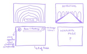
Twenty Seconds is an immersive minigame experience that aims to make its users uncomfortable. Every part of the project has been developed with the intention that its use should ultimately make someone feel uneasy, and most of this logic is based on things that make me uncomfortable. This also means that some parts of the project may not cause the same level of discomfort for everyone, and that’s okay, but I’ve tried my best to use things that make most of the population uncomfortable. The project essentially features 8 rooms, each of which has a 20-second timer running, and the user has to either complete some sort of a challenge, or sit through a bad experience (like uncomfortable sounds) for 20 seconds. They cannot move to the next room until they complete the challenge in their current room, and they complete the experience only after going through all rooms.
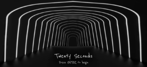
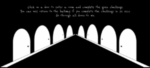
There are some deliberate design choices within this project. To start with, I made sure that there is a very minimal use of color throughout the project. Hence, the only colors you will see are white, black, and red. Initially, I was thinking of only white and black, but after I realised one more color is a necessity, I added red as I find it one of the most uncomfortable colors due to its association with violence. Also, there is no general background music that plays throughout the project, although there are some specific sounds for a few rooms and the pop-up messages. What can be more uncomfortable than silence, when people can actually hear their own thoughts? The font I used—Reenie Beanie—was the best mix I could find between a readable font and human handwriting, something that looks like it was scrawled on a blackboard with chalk.
For my midterm project, I wanted to do something that is a unique mix of both a game and interactive art, and I believe Twenty Seconds captures this quite nicely.

Technical and Game Design:

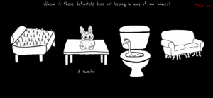
The project treats each room as a self-contained mini challenge while keeping a single central state (the hallway leads to a door which leads to a room which leads back to the hallway). I am proud of the clear division in my code between different sections, such as resource loading, room initialization, and rendering. For example, preload() gathers all the images and sounds that I use, each initRoomX() sets up the state, and draw() delegates to the current room. Because of this structure, I could easily extend the code every time I wanted to add a new room, and made debugging predictable. Here’s an example:
function initRoom2() {
  roomItems = [];
  
  // Define positions and images for the 4 items
  let positions = [
    { x: 50, y: 130, w: 230, h: 192, img: bedImg, name: "bed" },
    { x: 320, y: 130, w: 230, h: 204, img: labubuImg, name: "labubu" },
    { x: 600, y: 130, w: 162, h: 263, img: toiletImg, name: "toilet" },
    { x: 810, y: 150, w: 220, h: 157, img: sofaImg, name: "sofa" }
  ];
    
  roomItems = positions;  
  
  startTimer();
}

function drawRoom2() {
  background(0);

  // Instructions
  fill("white");
  textSize(30);
  textAlign(CENTER, TOP);
  text("Which of these definitely does not belong in any of our homes?", width / 2, 10);
  
  drawTimer();

  // Draw all room items
  for (let item of roomItems) {
    image(item.img, item.x, item.y, item.w, item.h);
    
    // show the item's name when hovering over it
    if (isMouseOverItem(item)) {
      if (item.name === "bed") {
        fill("white");
        textSize(30);
        text("Spiky bed", 190, 350);
      } else if (item.name === "labubu") {
        fill("white");
        textSize(30);
        text("A labubu", 480, 350);
      } else if (item.name === "toilet") {
        fill("white");
        textSize(30);
        text("Snake toilet", 755, 400);      
      } else if (item.name === "sofa") {
        fill("white");
        textSize(30);
        text("Centipede sofa", 995, 350); 
      }
    }
      
    // failure condition
    checkTimerExpired("You're trapped until you find the right answer >:)");
  }
}

So, every time I had to implement a new room, I would just add its required initRoomX() function and drawRoomX() function to the existing code, along with the required functionality and pop-up logic in the mousePressed() function. Since elements like the pop-ups and the timer were to be used repeatedly for all the rooms, I made sure to structure them as easily reusable functions that I can call in one line without having to paste the same 4-5 lines of code in the code for every room.

On the technical side, there are a couple of algorithms I’m proud of for some of the games. The first is the ones I used for room 1, the room filled with clocks. I used a circle packing algorithm, learnt from here, to generate the placement of the clocks without them overlapping.

// circle packing algorithm for generating non-overlapping clocks
while (attempts > 0) {
  // random position and size of circles
  let r = random(minR, maxR);
  let x = random(r, width - r);
  let y = random(r + topBuffer, height - r);
  
  // Check if position overlaps with existing clocks
  let valid = true;
  for (let c of clocks) {
    let d = dist(x, y, c.x, c.y);
    if (d < r + c.r) {
      valid = false;
      break;
    }
  }
  
  // generate a clock if the position is valid
  if (valid) {
    clocks.push(new Clock(x, y, r));
  }
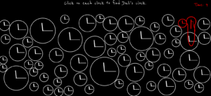
For the warping of the clock’s hands when the clock “melts”, I created a function called drawMeltingHand() in the Clock class that uses subtle bezier deformation for the cool effect. Before this I had no idea that something known as Bezier curves exist, and found out that there is a p5js function for it when i was searching for ways online to draw curved lines smoothly.

drawMeltingHand(x, y, length, angle, melt, weight) {
    push();
    stroke("red");
    strokeWeight(weight);

    // Midpoint of the hand
    let midLength = length * 0.5;
    let x1 = cos(angle) * midLength;
    let y1 = sin(angle) * midLength;
    // straight first half part of the hand
    line(0, 0, x1, y1);

    // curved tip that bends downwards
    let x2 = cos(angle) * length;
    let y2 = sin(angle) * length + melt * 0.5;
    // bezier(x1, y1, x2, y2, x3, y3, x4, y4)
    bezier(x1, y1, x1, y1 + melt * 0.3, x2, y2 - melt * 0.2, x2, y2);

    pop();
  }

Another interaction design choice I’m proud of is the reversed cursor for whack-a-mole. I thought it would be complicated to implement, but the math actually turned out to be very very simple. If I just subtract from the center of the canvas the distance between the center of the canvas and the user’s real cursor, it would give me the corresponding coordinate for the virtual reversed cursor.

// this calculates the reversed cursor position
// the virtual mouse moves opposite to the user's actual mouse
let centerX = width / 2;
let centerY = height / 2;
virtualMouseX = centerX - (mouseX - centerX);
virtualMouseY = centerY - (mouseY - centerY);

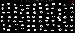
I also really like the implementation of the eyes in room no. 6. I learnt about using the atan2() function for this purpose from here. It’s probably one of my most favorite rooms, because the code wasn’t too complicated, and the resulting effect was still very cool.

if (this.isSpecial) {
  // Static pupil
  pupilX = this.x + this.staticPupilX;  // keep it centered
  pupilY = this.y + this.staticPupilY;
} else {
  // Following pupil
  // tracks the mouse
  // atan2() finds the angle formed by a point, origin, and positive x-axis
  // calculate the angle between the eye center and the mouse position
  let angle = atan2(mouseY - this.y, mouseX - this.x);
  
  // don't want pupil leaving the eyeball
  // Set a maximum distance that the pupil can move from the eye center
  // 15% of the eye’s width or height (whichever is smaller)
  let distance = min(this.w * 0.15, this.h * 0.15);
  
  // calculate new pupil position
  pupilX = this.x + cos(angle) * distance;
  pupilY = this.y + sin(angle) * distance;
}

Problems I ran into:

  1. I made the hallway doors on Canva. So the distance and angle between the doors was based on their relative orientation to each other on the canva surface size. What I didn’t realize was that I would need to have the exact same relative distance between the doors on my p5js canvas as well so that the perspective lines align, and due to this the hallway pathway ended up becoming much broader than I had planned. The only way to fix this would have been to remake all the doors again keeping this in mind, but since that wasn’t a time-feasible option, I left the hallway as is.
  2. Another problem I ran into was with drawing Dali’s clock. While I achieved the effect that I wanted with the clock hands, I cannot say the same for the circular frame of the clock. I wanted the bottom half of the clock to stretch downwards in a wavy shape so it would resemble Dali’s clocks, but I could not figure out how to achieve that effect. I tried asking large language models like ChatGPT and Claude to help with this but their attempts failed quite horrendously. Finally, I settled for the next best thing and just made the bottom part of the clock stretch downwards in a straight fashion. I did this using the following code:
    if (angle > PI / 4 && angle < (3 * PI) / 4) {
      py += map(sin(angle), 0, 1, 0, this.meltAmount);
    }
    

    The if condition selects only the lower arc of the circle. map(sin(angle), 0, 1, 0, this.meltAmount) converts the gradient gotten from sin(angle) into a vertical offset that increases toward the bottom of the circle. So basically, the value returned by sin(angle) in the range 0-1 is mapped proportionally to a value in the range of 0- the melting amount value set by me, and by doing py += , I am able to pull the y-coordinate downwards.

  3. Figuring out the ideas for each room. It took some time, but here’s the reason each room has what it has:
  • Room 1: Clocks and the sound of a ticking clock just makes me really uncomfortable, a room full of them is just terrible. 
  • Room 2: Self-explanatory.
  • Room 3: Needle-in-a-haystack kind of a situation. I grew up hearing this phrase a lot, and I don’t like it.
  • Room 4: I hate the feeling of disorientation. I wanted people to go through a similar feeling but making them deal with a reversed cursor.
  • Room 5: I think there are some sounds that make you want to pull your hair out. I made sure they’re all in this one room.
  • Room 6: The idea of being watched all the time is so uncomfortable.
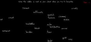
  • Room 7: Some words in the English language just feel so wrong. I thought a collection of them floating around in a one place would be nice.
  • Room 8: This room was technically to give people a break. So while they can relax and watch rain pouring for 15 seconds, that last 5 seconds the rain turns red, and I think red rain definitely doesn’t make anyone feel more comfortable.

Areas for improvement:

  1. A friend suggested this really cool idea for jumbling up the doors everytime someone returns back to the hallway. This would make the whole experience so much worse.
  2. Currently, the rooms aren’t manipulated by any kind of user input. What I mean by this is that yes the user interacts with the elements in the room, but it’s only through moving the cursor around or clicking. In the future, I would like to add more direct user interaction, such as user text input. I would also like to experiment with machine learning tools like computer vision and use the audience’s bodily movement or facial experiments as inputs.
  3. I purposely chose not to have background music that runs throughout the game, but I think if I really found the perfect music for the ambience I’m going for, I would be open to using it.
  4. In room 5, the sounds stop bluntly when crossing regions. In the future I would implement smooth crossfades, to create a more cohesive soundscape and reduce abruptness, which will make transitions feel intentional and less jarring.

Week 5 – Midterm Project Progress

Project Concept & Design

For my midterm project, I wanted to make something that was a little different. Looking at past projects, I noticed that all the sketches used a ton of colors and soft shapes that created an aesthetically pleasing and welcoming environment for the user. So I thought, why not this time, I make the user uncomfortable? Of course, I can’t know the different things that make various people uncomfortable, so this interactive artwork + game is based on things that make me uncomfortable.

Basically, it’s a series of challenges that the user must get through in order to win. But each challenge is supposed to evoke some sort of uncomfortable emotion/feeling (hopefully) within the user. The design is such that there are 8 doors, behind each of which is a challenge that the user must complete. Once the user has clicked on a door, they are trapped in that room until they successfully complete the challenge. Only then are they given the option to return to the hallway and go through another door. The only colors I aim to use across this game is black, white, and red, as I think it throws people off and adds to the overall mood I’m going for.

Production & The most frightening part

There were two things I was most worried about. First was making the hallway. This is because I couldn’t find the right kind of doors online, and had to design my own using Canva, and then go through the complicated process of cutting out backgrounds, resizing, and figuring out the coordinates on the canvas for each door so that they align in a perfect one-point perspective. That said, I’m pretty happy with how the end result turned out.

Second, I had imagined that it would take a lot of work to implement the general algorithm for the game. That means the structure of dividing it into different rooms, coding a timed mini game for each room (while keeping everything in theme), and keeping the user trapped in a room until they solved it. To minimize this risk, I decided to divide the code into different game states, so that whenever I need to add the code for a new door, for example door 2, I can just add the required code and set the game state to room 2 and test it out. Also for elements like the popups and the timer, which get used for every door, I made them into reusable functions so that I can just call them for every door, only with different arguments (popup messages) based on what I want. Hopefully, for every door I can continue to have the format I have implemented now, which is an initRoom__ and drawRoom__ function for each door. Then it’s pretty much just following the same pattern 8 times.

Risks/Issues

My biggest problem right now is that I may have overestimated my abilities by choosing to do 8 rooms. I’m going to have to think of 8 different mini-game ideas that make people uncomfortable and implement it in the given time frame.

Next Steps

Currently I’ve only implemented 2 rooms. I need to implement the other 6, as well as decide on what to do for the end page of the game when the user finishes all the challenges. I also need to decide on a background soundtrack that will run for the entire game. I also haven’t been able to think of a name for this project yet, and that’s pretty important.

It’s much better to view the sketch in full-screen: https://editor.p5js.org/siyonagoel/full/eEPhmUoLw

Reading Reflection – Week 5

As Levin noted in the article, there is a wide range of opportunities to utilize computer vision for interactive projects in the real world. On the surface level, human vision and computer vision seem similar, but at their core, the differences between them are striking. Human sight is based on context and shaped by years of experience living life, but computer vision is technically just raw pixel data at the start. Computer vision depends on the compatibility of the image with its abilities. If we give it the image of a person in different lighting or a new angle, it can result in unexpected processing outcomes, even though our human vision can easily identify that it’s the same person.

To help computers track what we’re interested in, I think it comes down to building a contrast between the object we wish to scan and its immediate surroundings. The author mentioned several techniques for doing this, such as frame differencing, which compared changes between video frames, background subtraction, which identified what was new compared to a static scene, and brightness thresholding, which isolated figures using light and dark contrasts. What I found most interesting was the use of difference in movement in the Suicide Box project, where it was the odd vertical motion of the persons that was the contrasting event in the image, and what the computer consequently identified as the target.

That said, computer vision’s capacity for tracking and surveillance makes its use in interactive art complicated. On one hand, it can make artworks feel so much more alive, and on the other, like in the Suicide Box project, it leads to significant controversy and even disbelief that the recordings could be real. It’s also interesting to think that what computer vision did in the Suicide Box project, human vision could never do, at least without causing the observer lifelong trauma. So computer vision does not just enable interactive art, but helps raise questions about privacy and control, and reflects cultural unease with the idea of being watched. 

I would also like to add how cool I find it that I’m now learning about these technologies in detail, when as a child I would go to art and science museums to see artworks that would use this technology and leave me feeling like I just witnessed magic; a similar feeling when I got my Xbox One and all the sports games would detect my movement as the characters’.

Week 4: Fortune Cookie

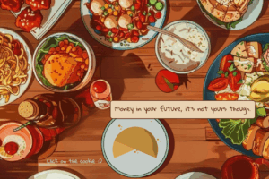
I got my idea for this week’s artwork when my friend and I were talking about common childhood toys, and she mentioned the Magic 8 Ball. This got me thinking about other fortune-telling knick-knacks, when I remembered fortune cookies. I thought it would be really fun to make a digital version of a fortune cookie and populate it with interesting fortunes for users to come across. Just having a cookie on the canvas seemed a little aesthetically boring, though, so I found an image of anime-style food on a table on Pinterest, and chose to draw the fortune cookie as part of that setting and match the same style (to the best of my abilities).

Before I started coding, it took me a long time to decide on how I would draw the cookie. I looked at a lot of pictures online for cartoon fortune cookie, and the final look of it that I decided upon is really a mix of a bunch of photos, and more importantly, a realistic structure through which I though I could animate the effect of the cookie breaking open. Overall though, I am happy with how I mirrored the aesthetics of the background for my own cookie and plate. The fortune texts are a collection of messages I found online as fortune cookie messages and thought were funny.

In this sketch, the program is organized into four main functions: preload() loads the external assets like the background image and the cookie snap sound before anything else runs, setup() initializes the canvas, text settings, and starting positions of the cookie and fortune paper, draw() continuously updates the scene by displaying the image, plate, cookie halves, shading, and animating the cracking motion and sliding fortune paper, while mousePressed() handles the interaction by toggling the cookie state. I particularly like this part of the code:

  // fortune paper
  if (isOpen) {
    fill("#ebd4b4");
    stroke("#4e1408");
    // keep it where cookie is
    rect(xPaper*0.9, height * 0.61, 320, 40, 5);
    
    // fortune text
    noStroke();
    fill("#4e1408");
    textFont('Gloria Hallelujah');
    textSize(14);
    text(fortune, xPaper*0.9, height * 0.61);
  
    // paper sliding effect
    xPaper = lerp(xPaper, xTarget, 0.1);
  }
  
  // animate cookie parts cracking apart
  angleL = lerp(angleL, leftTarget, 0.05);
  angleR = lerp(angleR, rightTarget, 0.05);  
}

function mousePressed() {
  if (!isOpen) {    
    isOpen = true;
    fortune = random(fortunes); // Pick a random fortune
    // Rotate left half outward slightly
    leftTarget = -QUARTER_PI / 2; 
    // Rotate right half outward slightly
    rightTarget = QUARTER_PI / 2; 
    // Slide fortune paper out to the right
    xTarget = width / 2 + 150;
    
    // cookie opening sound
    if (snapSound.isLoaded()) {
      snapSound.play();
    }
    
  } else {
    // reset cookie to closed state when clicked again
    isOpen = false;
    leftTarget = 0;  // Return left half to original position
    rightTarget = 0; // Return right half to original position
    xTarget = width / 2; // Hide fortune paper
  }
}

I think what’s interesting here is the lerp() function. It is what makes the cookie and paper feel smooth instead of jerky. Without it, the halves and the fortune paper would instantly jump to their final positions. Basically what it does is it tells p5.js to move the current value a little closer to the target value on every frame. This creates a gradual transition so that the cookie halves slowly rotate outward like they’re cracking, and the fortune paper slides out as if being pulled, instead of teleporting into place. I also really like the cookie breaking sound I included when it opens and think that it increases the interactive feel in this sketch.

The biggest challenge I faced with this artwork was drawing the cookie and its shadow. It involved translations and well as the arc() function which was completely new to me, and I had to carefully go through its documentation of the p5js site to understand how the different arguments it takes work. The shadow took some trial and error, but I achieved it by first drawing a darker arc on the upper-right edge of the cookie, then cutting it down with a lighter arc. The second arc overlaps most of the first one and leaves only a slim crescent of shadow visible.

Looking forward, I would like to enhance the aesthetics of the cookie so that it looks less flat, and make its shape more closely matching with real fortune cookies. On the interaction side, fortunes could be randomized with different fonts, animations, or even themed backgrounds for variety. Also, right now the paper just sort of slides into the canvas from nowhere, I would like to make it so that it clearly pops out from the cookie, or maybe change the design completely so that it’s like a little slip that users can pull out from the cookie by dragging their cursor. Maybe, I could also add the sound of crinkling paper!

Reading Reflection – Week 4

I feel like I have spent a lot of time complaining about design issues throughout my life. That’s why I’m especially annoyed that it took me so long to actually think of them when I’m being given the platform to complain. But now I would gladly list the following two that drive me crazy:

The sensor faucets: I have been to so many bathrooms in malls and airports that require your hand to be so close to the sensor for them to work that if you move your hand away to actually wash it, the water stops running. I’ve literally had to keep one hand at the sensor while I attempt to wash one hand at a time. I understand the premise of sensors for water conservation, but this design can easily be improved if the sensor facility is designed such that it senses your hands at the right distance so that they can stay together under the running water.

The writing tablet chairs: My coaching center in the last 2 years of high school had these chairs, and they were my worst enemy. I hate everything about them. The table is too small, it is designed for right-handed people, I can’t get up without clearing the entire “table”, and I can’t rock the chair even a little bit without toppling over. Again, I understand that these were made for small spaces, but the design could be improved by making simple movable extensions for the table part (so at least a decent notebook can fit)  that people can add, make the material of the chair more comfortable so that students (who would be sitting on these for long durations) don’t have back pain, and introducing left-handed versions.

I think the way to apply the author’s principles of design to IM is by truly understanding this phrase that he uses, “emphasizing understandability and usability”. In my own sketches, I’ve noticed that I often rely too heavily on the assumption that my audience will share my intuition. But as Norman explains, intuition varies from person to person. What feels obvious to me as the creator may not be obvious to someone encountering the project for the first time.Therefore, my IM projects should have more signifiers to create more affordability in their designs. This can mostly be through visible cues that reduce ambiguity and increase chances for the user to know exactly how to interact with the piece. I think there is a sense of balance that can be achieved between intuition and explicit direction, and that sweet spot is what makes user interaction truly effective.

Week 3: Make a Wish <3

I love Disney animated films, and one of my most favorite movies to date is Tangled. As someone who has the lantern festival at the top of her bucket list (hopefully I will get to cross it out someday), I wanted to recreate the festival + the scene from the movie in my artwork. Since these lanterns are used to make wishes, I wanted my sketch to give its users the ability to “send in” their wishes as well. Thus, there are 2 kinds of interactive elements in this sketch. First, users can click anywhere on the screen, and a new lantern will be generated there. I made these lanterns glow a little brighter than the ones that are generated randomly; it’s a subtle but important difference, I think. Second, there’s a text box where users can type in their wish, and when they press “Enter”, their wish appears on the canvas and floats up and fades away with the lanterns. I really like that part!

There were a couple of new things I learnt through this artwork. First was how to make a gradient background in p5js. I searched online and found this code, which I used as is, just by changing the colors as per my needs. The trick is to use the lerpColor() function which blends two colors to find a third color between them. Second was how to add a text box to take user input and then insert that text in the canvas. For this, I used the createInput() function. I couldn’t really find an aesthetically pleasing position within the canvas to place the text box, so I placed it right below the canvas.

This sketch took a lot of time for 2 reasons. I started by first making just a sketch of a lantern and the little glow orb around it, and after I got the look I wanted, I had to look at the coordinates and do the math so that I could generalize it for the Lantern class. I’m pretty bad with ratios, so this was definitely a challenge. I also ran into the problem of the glow becoming opaque, since the opacity level added up every time the draw() function was called, so the transparency would immediately go away. This was solved by generating the background again under the draw() function. The second reason was the castle. I had to figure out the coordinates for every single rectangle and triangle involved. In the initial idea, the hill on each side of the main castle had a different design, but in the interest of time, I took the design I made first on the left side and flipped it for the right side of the hill using what we learnt in Wednesday’s class. But I am still quite happy with how the silhouette turned out.

I’m particularly proud of the organization of the lantern code:

// spawn a new lantern
if (random(1) < 0.09) {
  // min size = 7 and max size = 15
  let size = random(7, 15);
  // don't want lanterns touching the edges
  let x = random(width * 0.1, width * 0.9); 
  // start at 2/3 the height of the canvas
  let y = height * 0.67;     
  // min lantern speed = 0.3 and max lantern speed = 1.5
  let speed = random(0.3, 1.5);
  // add lantern object to the array of lanterns
  lanterns.push(new Lantern(x, y, size, speed, 30));
}

for (let i = lanterns.length - 1; i >= 0; i--) {
  let lantern = lanterns[i];
  // Move the lantern upwards
  lantern.update();
  // Draw lantern
  lantern.draw();

  // If the lantern has floated off the top of the screen,
  // remove it from the array so it no longer gets updated/drawn
  if (lantern.isOffScreen()) {
    lanterns.splice(i, 1);
  }
}

Making a class for each Lantern object and an array to store the currently visible lanterns made the above part of the code very modular, organized, and easy to understand.

For future improvements, instead of keeping the text separately floating with the lanterns, I would want to transform the text into a lantern as it floats upwards, and make the lantern store the message so that if the user clicks on it while it’s floating it displays the wish stored in it. I would also want to spend more time on the silhouette and make the two sides of the hill different.

Reading Reflection – Week 3

“Any idea worthy of my attention is probably too big and too complicated to be reduced to some schoolmarmish formula.”  I was quite shocked when I read this sentence. Not because I disagree, but because I feel like the whole world should read this sentence. I have always thought that society tries to package thought into neat definitions and slogans, which is not only convenient but, in my opinion, shallow. This line reminded me that oversimplification can actually strip an idea of its essence, turning something profound into something hollow. This reading overall was peppered with ideas that made me question most of what I knew about interactivity. Examples include the idea that many things typically labelled as ‘interactions’ are actually ‘reactions’, that interactivity could be a subjective concept that exists in the eye of the interactor, and that two strong factors cannot, in fact, outweigh the weakness of the third (a principle I personally used a lot).

All this combined, I think there are a few characteristics that would define a strongly interactive system. Firstly, I think the level of interactivity should be “high”. In terms of the metaphors used in the text, that would mean strong listening, speaking, and thinking simultaneously. Secondly, adaptability needs to work both ways. The system should be able to adapt to the user and the user to the system. Thirdly, I think it’s important that the user feel in control, rather than fighting the system, which is what happens when ‘interactive’ systems are built without proper understanding of what interactivity is. Finally, and this may sound vague, but a system is “strongly interactive” when the user’s “interaction” is so absorbing that it makes them not want to stop.  When the author brought up movies, it reminded me of the interactive story game apps that were popular a few years ago, where the user played a part in how the story moved forward. Maybe this is a “low” level of interaction, but it seemed to really have people hooked at the time. That said, I would agree with Crawford that interactivity is more of a spectrum, and it’s important to maintain its balance in artworks.

Through these ideas, I thought about how the user can have the chance to influence my p5js sketches. Maybe this could be through having a say in the color palette or the illustration style, or by having buttons that change the nature of the sketch completely. Maybe clicking on the canvas can add more of already existing elements, or cause different elements within the sketch to interact with each other. The possibilities are endless.

Week 2: Artwork

My Concept

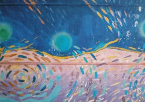
I have a bunch of postcards stuck on the wall next to my bed. On Friday morning, this one caught my eye:

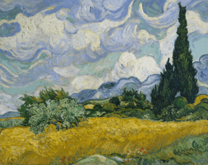
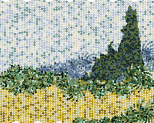
It immediately reminded me of Van Gogh’s paintings (and I think it’s meant to), and I decided that for this assignment I wanted to recreate one of his artworks using a different style. I chose his “Wheat Field with Cypresses” (“The Starry Night” is a tad bit overused), and sought to make it using tiny colored circles. Since for this assignment we had to use loops in some way, I knew I could create waves and spirals of dots to make the kind of “rolling” shapes Gogh used in his painting. I think more than the final result, what I wanted to emphasize in the artwork was the movement of the dots being generated and how that related to the windy, flowy effect in the original painting.

Code I’m proud of
function sky() {
  for (let i=0; i<6; i++){
    // generate circles for the current wave
    let waveY = currentWave * waveSpacing;
    if (waveY <= height * (2/3)) {
      
      // general formula of a wave
      // y = y_0 + sin(kx)*A
      let y = waveY + sin(x * frequency) * amplitude;
      let c = random(skyColors);

      // Store the circle 
      circles.push({x: x, y: y, color: c, wave: currentWave});
    }

    x += xIncrement;

    // Start the next wave after the current wave finishes
    if (x > width) {
      framesSinceLastWave++;

      if (framesSinceLastWave >= waveDelay) {
        currentWave++;
        x = 0;
        framesSinceLastWave = 0;

        // Fill two-thirds of the canvas with sky
        if (currentWave * waveSpacing > height * (2/3)) {
          skyFinished = true;
          stop();
        }
      }
    }
  }
}

I think this part was particularly fun (not really) because it forced me to go back to high-school physics and wave equations. I had to define constants like frequency, amplitude, and wave delay, and figure out their values through trial and error so that I get my desired shape, size, and speed of generation of the waves. There were a lot of new things I learnt through this assignment. For example, I had no idea how to make the trees. That’s when I discovered the beginShape() function, which lets me create any weird polygon I want. Then I realized that I had no idea how to generate the dots so that they stay inside the weird tree shape. Turns out there is some library that I can use for this, but after I decided that that was too much work, I found this code online https://editor.p5js.org/makio135/sketches/O9xQNN6Q  with a pointInPoly() function that was kind of similar to what I wanted. Using this along with Claude, I managed to have two functions that controlled the generation of dots only inside the tree shapes.

I had the most fun while picking out the colors for the different parts of the art piece. I simply used an online color picker (this one specifically) which let me upload the image of the painting, and would give me the hex code of whichever color I placed my cursor on. The hardest part was deciding the coordinates for every vertex of the tree polygons as well as the center points of the bushes and hills. It took a lot of trial and error.

Reflection

I think if I had more time, there are a lot of things I would like to try out with this artwork. For example, I would add an interactive aspect to it where the user could move their cursor around to temporarily jumble up the dots, but then they would float back to their original place and reform the painting. It would be very cool, but I guess complicated to implement as well. I would also like to do a better job in recreating the piece by adding more details, along with experimenting with other shapes beyond waves and spirals. Overall, I believe this assignment has really helped me appreciate how much planning and iteration goes into generative art. It wasn’t just about writing code that “worked,” but about understanding how mathematical ideas like waves or polygons could be translated into visual elements.

Reading Reflection – Week 2

I was almost immediately confused as I started listening to Casey’s lecture. He mentioned that “order is what was brought by a God or Gods into the world.” I guess for a long time I assumed that humans were the ones trying to bring order into this chaotic world. But I just realized, it was only chaotic in our minds. All aspects of nature are, by themselves, so beautifully organized and fit together so perfectly; humans have only served to bring disorder. That’s also what makes this entire concept of “chance operations” interesting; if humans actually bring disorder to nature in the name of order, why are they trying to bring a sense of randomness into their art?

Looking at the various artworks Casey presented during his talk, I noticed that no artwork is truly completely random. Either they have some controlling criterion, for example, the artwork for which he stated, “putting the images wherever they wanted to be, with the constraint that they had to be at 90-degree angles”, or they appear to be random at the start and “order begins to emerge as they follow their behaviors”. That said, I don’t have a confident answer to what I feel is the optimum balance between total randomness and complete control, and I believe it’s a paradoxical statement for such artworks.

Casey provided the instructions for one of the pieces, which caught my eye:

Element 5

F2: Line

B1: Move in a straight line

B5: Enter from the opposite edge after moving off the surface

B6: Orient toward the direction of an Element that is touching

B7: Deviate from the current direction

I found it very interesting that it only took that one last step, and the ambiguity of the word ‘deviate’, to create the randomness in the artwork, because every other step is based on strict rules. 

In my work, I hope to incorporate random elements in the form of colors, shapes, and the way in which they interact with each other and the canvas. Particularly in this week’s assignment, I experimented with the randomness of colors. So while I did set my own array of colors that the program chooses from, the frequency with which the colors are chosen and where they are applied for each constituting element of the image are out of my control. For this artwork, I thought this was a nice balance between randomness and control, so that the final image still bears a certain resemblance to Van Gogh’s original piece, and yet comes out different every time.

Week 1: Self-Portrait

My Concept

A self-portrait should show that part of you that makes you who you are, right? My concept was to depict myself ‘normally’, but when the user clicks on the canvas, they are shown a side of me that not many people know about. I am actually a HUGE ocean nerd: marine life, ocean sustainability, deep exploration, I’m a sucker for it all. Consequently, I also love diving!

So, clicking transports me with my diving gear under the water! My eye shape changes to depict how happy I am and I think the bubbles bubbling upwards is a cute touch.

Code I’m proud of
// bubbles
noStroke();
fill(255, 255, 255);
for (let b of bubbles) {
  ellipse(b.x, b.y, b.size);
  b.y -= b.speed;   // move bubble upward
  if (b.y < -20) {  // reset if off screen
    b.y = 145;
   }
}

I really like how I animated the bubbles to float upwards and out from the snorkel and continue to regenerate. I was already familiar to how to implement such a logic due to my previous coding experience, but it definitely took a bit of trial-and-error to figure out the initial placement, size, and speed of the bubbles.

 My Sketch

Reflection

For future improvement, I would really love to add a kind of gradient of different shades of blue to enhance the underwater effect. I also think it would be pretty cool to have more animations, such as tiny fishes swimming in the background (and maybe a shark).

I think this assignment was particularly fun because I got to use JavaScript in a different creative manner compared to what I am used to. I was able to see my idea come to life just through simple shapes and colors! Overall, this self-portrait is an expression of a space I really care about and hope to get other people to care about too. Help keep our oceans clean, thank you!